Wiser Web Wednesday

Wiser Web Wednesday – a semi-regular link to posts of interest from around the web, by those far wiser than myself:


ABC News
An interesting overview of where your “data” actually is and how it travels around this vast, yet also fairly small (at least in a digital sense), world of ours.

However, the focus for data security is on the development of software, as though we have forgotten that data storage happens in real places on the ground — and not in “virtual” clouds.

Your data is out there (not up there)…somewhere:
Where is your data? It’s not actually in the cloud, it’s sitting in a data centre


The Sydney Morning Herald
As an avid Plex user, its great to see ongoing development and new feature implementation within the service. Australians will now be able to schedule live TV recordings via the Plex web interface — previously unavailable due to local networks insisting their EPG listings were subject to copyright.

Common sense would suggest that you can’t copyright a simple list of program start times but, considering that the commercial broadcasters refuse to stick to their advertised schedules, perhaps they believe the TV guide is entitled to copyright protection because it’s clearly a work of fiction.

The DVR feature is only available to paying Plex Pass subscribers, however depending on how much local network content you actually watch, there may never be a better time to pull the trigger on a paid subscription:
IFA 2016: Plex live TV recording comes to Australia


The Saturday Paper
A new sponsorship deal between the ABC and supplement giant Swisse, doesn’t appear to have everyone entirely on board. Of course it isn’t the first time things have gone awry for the multinational:

The program demonstrated how, after their product’s claims were judged to be unfounded by the TGA, they merely repackaged the same product and put it back on the market. Swisse’s own correspondence with retailers confirmed it.

An interesting read:
Inside Swisse and its vexed ABC sponsorship deal


David Hewson
For the budding writer, some advice from a man who coaxed me through 55,000 NaNoWriMo words a couple of years ago with his Writing a Novel with Ulysses book.

Do I outline everything in detail first? No. I will have a few ideas about where I’m headed but this is a journey into the unknown. I want to be surprised and enlightened along the way because if I’m not the reader won’t be either.

I reckon he knows a thing or two about the craft:
How to start writing a book


The Pelikan’s Perch
A very useful post with some science thrown in for good measure — particularly as air travel with fountain pens is still a point of intermittent discussion in the fountain pen community.

Fly, be free:
How-To: Air Travel With a Pelikan


The Gentleman Stationer
Joe has just updated the Best Pens page on The Gentleman Stationer. If its been a while since your last visit, it is worth a return trip.

You could select from any category you find on this page and be satisfied a great pen will soon be in your hands:
Best Pens


Fountain Pen Quest
After an initial double-take on Ray’s tweet mentioning “Shows and Clubs” (thinking perhaps he may have been launching some sort of pen nightlife section on the blog) — a click through soon clarified things.

This is a great addition to the resources page on Ray’s blog, and a bonus of checking out the page was the reminder it provided of the other useful information posted there (i.e. nib workers, restorers and makers), which had apparently slipped my mind:
Pen Shows and Pen Clubs Added to Resource Pages


Perfect Daily Grind
There are many challenges in developing a successful coffee industry, however some are unique to their region:

Within the archipelago there are 10 main languages, but as many as 748 mother languages are in use. In order to maintain high-quality production, it’s necessary for stakeholders to communicate across both languages and cultures.

Obviously it involves more than just a few plants in the ground:
Indonesian Specialty Coffee: The Challenges & Opportunities


Perfect Daily Grind
The specialty coffee scene in Brisbane really has gone from strength to strength in recent years.

I highly recommend a visit to any (or all) of these:
A Coffee Shop Tour of Brisbane, Australia


Scotch Whisky
I would not have thought India would necessarily be on top of the whisky consumption by country list, however with such a staggering population, I guess things scale fairly substantially.

Right now, the best barley in the business goes to Talisker and The Glenlivet, with both sharing huge popularity in wedding and business function contracts. Weddings might seem paltry to us, but when the guest list is 5,000-strong and the father of the bride wants a bottle of whisky on every table, the numbers skyrocket.

Point taken:
India: Scotch whisky’s wild, wild east

Wiser Web Wednesday

Wiser Web Wednesday – a semi-regular link to posts of interest from around the web, by those far wiser than myself:


Three Staples
Any man who raves about the Delfonics Rollbahn notebooks I’d consider a friend of mine. Here Matt (Mr. Three Staples) turns his hand to the Pilot Prera, and a fine piece of writing ensues.

I love the consideration given to “matching” the other items on the desk. Having never really considered a white fountain pen before, this post is as good as any in leading me towards changing that thinking.

Looking forward to the next guest post – after a few from the Centre Staple first of course:
Discovering the Pilot Prera


Everyday Carry
Ed Jelley with a pretty handy back to school/work guide to pens, particularly if your budget isn’t running in a surplus at the current time.

In it I see the Parker Jotter – my first “I’m going classy exec style”pen from high school. It was a blue section for me back then:
The Best Everyday Carry Pens for School and Work


The Gentleman Stationer
With a few pilot pens already in my collection, the glowing reviews I often see of the Custom 823 place it firmly on my “to purchase” list as well.

It’s nice to see Joe has finally moved his over to the “purchased” side of the ledger. Yet another positive review of a great looking pen:
Pen Review: Pilot Custom 823


Pen Economics
I wrote and published a short piece over the weekend about my first year as a member of the Fountain Pens Australia Facebook group.

If you’ve not as yet read it, this great post from co-founder and admin of the group Jonathon Deans paints a bight picture of the group’s first year, and if future plans are any indication – things are certain to get better and better:
One Year of Fountain Pens Australia!


Alt. Haven
You may have seen a post of mine in the recent past, praising the value represented by some of the paper-based stationery products in Japanese discount store Daiso.

While in the store, more than once I’ve looked at the fountain pens in those cheap packages, and thought better of it. Junee’s thoughts here suggest that was perhaps the correct way to go.
Review: Daiso Fountain Pen


An Inkophile’s Blog
I thought my lead in to this link would contain: well, I”m an …….– and give you the ink that best represents me. In the end I found that to be easier said than done. Have a think about your signature ink.

Adapted from a great article in the August 2016 issue of Pen World magazine, by “Inkophile” Margana Maurer, this colour wheel will get you thinking about your particular signature ink. A link to download the full article in PDF can be found in the post:
Signature Ink And A Color Wheel


London’s Best Coffee
A handy reading list for the coffee enthusiast, and I hope there are at least a few of you reading these pages.

Though all the books will have something to offer coffee professionals, we have in mind the consumer at some stage into their journey of adventure into the world of coffee.

There is no excuse for your coffee table to be sans, well… coffee table books about coffee:
A Guide to Coffee Books for the Novice Explorer and Enthusiast


European Coffee Trip
Quite an in-depth look at the emerging Italian Specialty Coffee scene.

Specialty cafes have a problem to charge more than 1€ for a single shot espresso. That is the regular price in all cafes but the speciality ones.

Tradition, attitudes, law. It’s all here to challenge third wave style proprietors break new ground in a one of the oldest and well established coffee markets there is:
Italian Third Wave Coffee Scene – Does Anyone Know About It?

Belonging — at any level

Yesterday, Dr Jonathon Deans wrote a fantastic post over at Pen Economics recounting the first year of the Fountain Pens Australia Facebook Group. While Facebook call it a group — it is indeed far more than that. It is a community, and a healthy, thriving one at that. With a hat tip to the power of internet good, bringing 730 members (at last count) together both online and in person, in a country this size is no mean feat.

With the first anniversary of FPA now upon us, I am reminded I myself have been a member of the group for a year now as well.

Although I was very happy to be joining the group when things kicked off (managing to get over begrudgingly signing up to Facebook to so), that is really all I can lay claim to. Jonathan on the east coast and Yagan Kiely in the west were — and continue to be — the driving forces behind initially getting things off the ground, and administering a successful online community throughout the past year. They rightly deserve the congratulatory messages now running in a thread on the group’s page.

I encourage you to read Jonathan’s post for a more detailed account of where things came from, and where they are today, along with some exciting new developments coming soon to FPA.

For me personally, the past year as a member of FPA has certainly been an enlightening one. Though I’ve been writing this blog for over three years now, as far as my online presence and social media engagement1 are concerned, a “reserved observer” is how I’d label myself if compelled to do so. I do not have the biggest personality, the largest or most expensive collection of pens, nor the most numerous or brightest inks — but Fountain Pens Australia does.

And here’s the thing — in the community that is FPA, none of that matters. Of course groups like these do not succeed without the larger than life personalities, the regular and frequent contributors, and those with a knack — and a will, for organising and administering such groups. Along with that, they also succeed because of members who may just follow along, adding a couple of comments or snippets of advice from their own experience when they believe it may be helpful.

So I say to the 730 members of FPA: To those who contribute each and every day — thank you. To those (like me) who occasionally join a conversation thread — thank you. To the admins Jonathan and Yagan, and other members of the group with the get up and go to organise bulk buys and meet ups — thank you (and what a fantastic thing it is you do).

It is each and every one of you that is the thread that binds the community together. A shared appreciation of fountain pens yes — but over and above that — the shared feeling of belonging to a respectful and encouraging (dare we say enabling) community. A community where every member truly belongs, and the value of this membership is not tied to the pen or ink collection you bring to the table, nor by the frequency of your posts or conversation threads.

We all belong — at any level of involvement we choose, and the collective force of good that is the group as a whole is something to celebrate.

Happy first birthday, Fountain Pens Australia.


  1. Yes, I did it – I used the word engagement. I’m sorry, marketing told me to. Either that or I could not think of a better word at the time/

Wiser Web Wednesday

Wiser Web Wednesday – a semi-regular link to posts of interest from around the web, by those far wiser than myself:


The Sydney Morning Herald
Former host of the Reckoner Podcast (amongst other things), Peter Wells provides some thoughts around the limitations of podcasts in general, namely discovery and sharing.

Podcasters need to start making shareable content: smaller clips that work on the medium they’re sharing to.

Many points in here upon which I tend to agree:
The problem with podcasts


Six Colors
Vesper held a spot on my iPhone’s home screen for what I’d describe as “a good while” a couple of years ago.

I must admit to having enjoyed using it, however as an avid Drafts user with an active Evernote account at the time, there were only so many places to put those notes.

As a result, I thankfully don’t need to export numerous entries now:
All-star notes app Vesper reaches the end


MacStories
Although there are many features in PDF Expert (both on Mac and iOS) I leave under utilised, it is certainly nice to have them when required.

This latest update to version 2 on the Mac adds some pretty impressive editing features. Thankfully it is a free upgrade for existing users (there is a free trial option on the Readdle website). At AU$89.99 on the Mac App Store it is a significant investment, however you do get what you pay for.

PDF Expert has been my go to PDF viewer and editor across both platforms for some time now, and I’m looking forward to delving a little deeper into the new features:
PDF Expert 2 for Mac Adds Powerful PDF Editing Features


The Pelikan’s Perch
When you’ve got an extensive collection — organise it well. Exactly what it says that a couple of the most well organised collections around contain largely Pelikan pens I’m not sure.

Between David Brennan’s Too Many Inks Filemaker Pro Database, and this one outlined by Joshua using Recollector, there really is no excuse not to get inspired — even if yours starts with a simple spreadsheet:
Review: Recollector Collection Management Software


Jet Pens Blog
Part instructional how-to, part equipment supply room. A great post on the Jet Pens blog about all things Sketchnoting, which makes me want to give it more than the cursory thought I usually do.

Of course every time I think of jumping in, I then think about all of the information I’ll miss while trying to make a coherent sketch which is meaningful to me later.

Yes, perhaps I should have more faith — and if on the fence, perhaps you should too:
Sketchnotes: A Guide to Visual Note-Taking – JetPens.com


Three Staples
Another Three Staples Field Notes review — this time the Starbucks Capitol Hill Edition.

I’m glad to say, I like Capitol Hill more than I thought I would. There are many details in it to appreciate as a Field Notes fan…

A great review as always of a nice bright bunch:
Field Notes: Starbucks Capitol Hill


Whsky Buzz
The Whisky Cabinet author Mark Bylok on the whisky industry and the rise of “no age statement” releases.

NAS whisky does have an unfortunately bad reputation. Equivalent or better whiskies can be produced without the age statements. The thing is, the supply of quality barrels of whisky is decreasing, and we’re feeling that on every level of the whisky being made whether it be the new NAS release or our favourite 18 year old whisky.

Certainly a competitive time for the larger whisky makers, in no small way attributable to trends in other spirits:
Supply, Demand, and Shelf Space – The Story Between Whisky Makers and NAS Haters


Barista Hustle
Key concepts are always worth repeating, and there are plenty to be found at Barista Hustle.

If your roast does have green/stemmy/grassy/savoury flavours then it’s underdeveloped. This means part of the coffee bean is too light and you can taste it. Note: the whole bean doesn’t have to be too light for it to be called underdeveloped.

A little reminder it’s not always just about the roast colour you see:
Roast Development and Colour

Sailor 1911 Large Fountain Pen – Naginata Togi 21k MF Nib

FullSizeRender 4Whether or not you subscribe to the desert island pen mindset, if there was one — and only one pen to take and use from here to well… let’s say, eternity — the decision would most likely be either fairly straightforward or incredibly difficult.

Whichever the case for you, on my side of the desk, this particular Sailor 1911 goes a long way towards making the decision pretty easy. Put simply, it is a fantastic pen with an exquisite nib, and is routinely one of the first re-inked and most often picked up — particularly for longer form writing. So at the current time, would probably be the one packed for that one way trip.

I’ve written before about my good fortune in receiving a number of pens from a kind reader downsizing their collection. The subject of this review is one such pen, which I have now owned for about 12 months.

Look and Feel

As far as the overall styling is concerned, the Sailor 1911 Large (or Full-size as is the moniker these days) in black and rhodium at least, has a classic, office executive type look, yet retains a certain contemporary sleek as well.

I do own a number of black fountain pens, and acknowledge a cigar shaped black and rhodium pen may be considered boring by some. To me, they are things of beauty, though of course we all have our own styling preferences, and yours may differ with mine on this one.

Although gold coloured accents have a certain appeal, as you can gather, I generally prefer rhodium or silver contrast to my black pens, and this particular model ticks all the boxes, from the nib right through to the top-most decorative ring on the barrel, which itself is matched by the clip ring, bookending the black resin body nicely. The slimmer rhodium ring adjacent to the thicker branding one on the cap is then matched by another at the threads on the section. The branding ring itself carries the Sailor Japan Founded 1911 inscription, clearly giving away the heritage from which the 1911 series derives its name.

Onto the nib itself, which sports a decorative braiding pattern at its perimeter, along with the 1911 insignia, Sailor’s anchor logo, and the 21K and 875 gold designations.1 To delineate the Naginata Togi nib from other versions, an “N” is found on the nib’s left shoulder, along with the “MF” (Medium Fine) nib width of this particular model. The overall beauty of the nib is a great match for its writing ability — that I can guarantee.

FullSizeRender 6

So how does the pen feel in the hand after giving it the once over and writing begins? For me personally, the answer is just about perfect, both from a size and weight perspective. At 122 mm (unposted) the barrel has enough length to provide scope for a higher or lower grip on the section, which I will vary at times during lengthy writing sessions.

I’d describe the overall diameter as mid-sized, and very comfortable. The section tapers just a little from the unobtrusive cap threads towards the nib, before flattening out and flaring again ever so slightly — exactly how I like them. On tapered sections which continue right through to the nib collar, I generally feel my fingers are constantly sliding towards the nib, so prefer a flattening of the taper, or even better, something providing that little bit of feedback to my index finger saying: “things stop here”.

FullSizeRender 5

So in general, this is an extremely well balanced pen, with enough heft to use without posting the cap (as I do), however depending on your own particular preference or perhaps hand size — could be used with the cap posted. Interestingly, I have been coming back around to posting a few more of my mid-size pens of late, and I put it down to more frequent use of fuller size models such as the 1911 Large, and suspect my preferred size and weight sweet spot has now readjusted a little.

Specifications

  • Model: Sailor 1911 Large (Full-size)
  • Material: Resin
  • Colour: Black with Rhodium Trim
  • Nib: 21k gold with rhodium plating; Naginata Togi Medium-Fine
  • Filling system: converter & cartridge
  • Length capped: 140 mm (5.5 inches)
  • Length uncapped: 122 mm (4.8 inches)
  • Length posted: 153 mm (6 inches)
  • Diameter: 15.9 mm (0.625 inches)
  • Weight 23.7 grams (0.8 oz)

Some additional specifications courtesy Pen Chalet

There are numerous nib offerings available with 1911 series pens, and although not all remain available, there are also a number of Sailor specialty nibs at your disposal — some examples of which can be found at Nibs.com.

Writing

I’ve mentioned above the 1911 Large is very comfortable to hold and write with, however it’s really all about the Naginata Togi nib as far as this particular pen is concerned.

The Naginata Togi nib is a member of the Sailor Specialty group of nibs, and as explained on Nibs.com:

Provides variable line width depending on the angle of the pen to the paper – the lower the angle, the broader the line. Available in Medium, Medium-Fine, and Broad

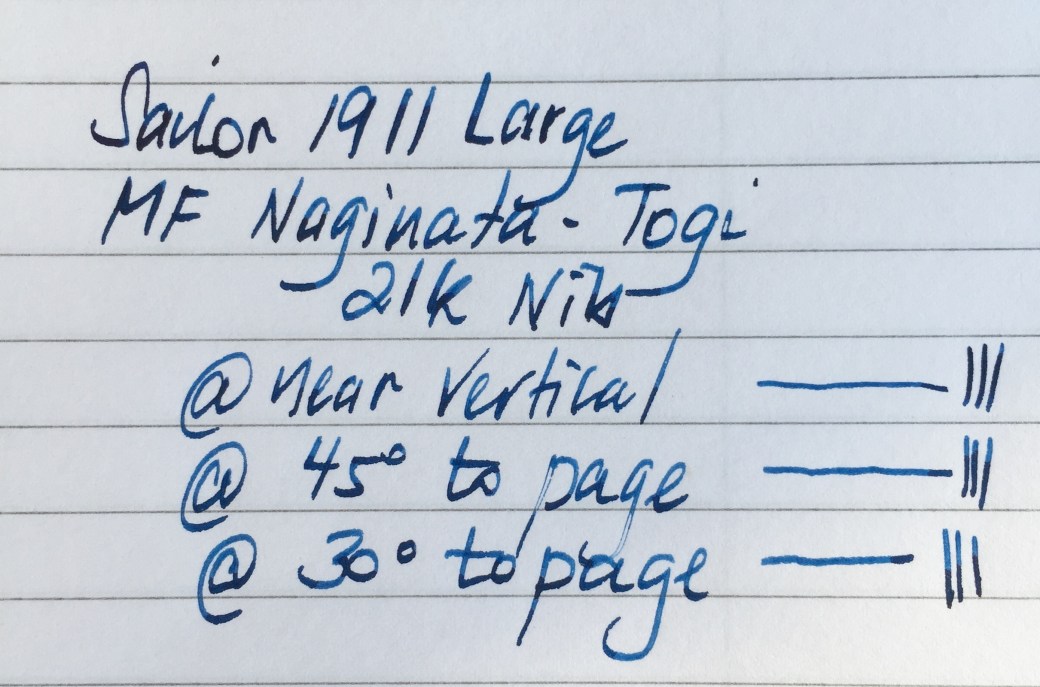
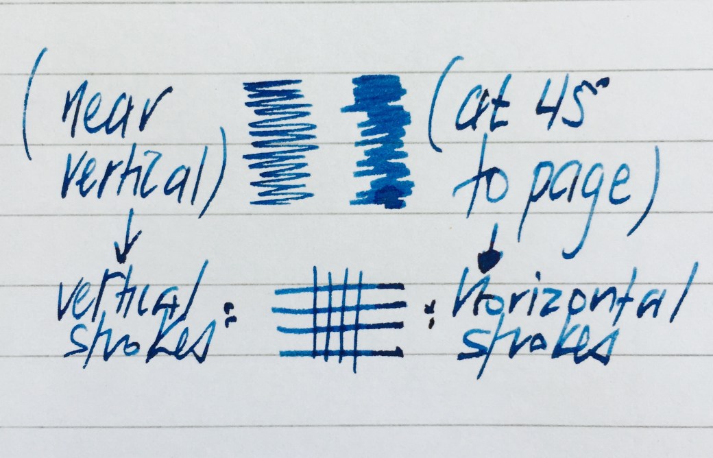
FullSizeRender 7The variation in line width is achieved by a larger than standard amount of tipping material on the nib, which is ground towards a finer point at the tip, widening as it moves away from the actual nib point. Thus, as the pen is lowered towards horizontal, a greater portion of that wider tipping comes into contact with the paper and provides a thicker line. The opposite of course being true as the pen approaches a vertical position. To be honest there is not an overly large amount of line variation, and it is seen mostly on horizontal strokes when comparing near vertical and 45 degree pen angles.

In terms of what you end up seeing on paper — yes, there is some line variation evident through the positioning changes noted above, however it is not a nib designed to achieve graduated line width through pressure — nor is it really suited to changes in line variation mid stroke. Of course with some focused effort this can be achieved, however I think you can imagine the difficulty in changing from a near vertical pen position to 45 degrees or below mid stroke.
IMG_1282

Line variation most evident on horizontal strokes

It is a reasonably firm nib, which I would describe as having a small amount of “give” however there really is zero flex. For standard cursive writing (about 45 degrees in my hand), the nib is an absolute dream. This small amount of give provides for an extremely comfortable writing experience, particularly when writing longer letters or perhaps draft blog posts about itself.
FullSizeRender 8

So where does the line variation of the Naginata Togi nib fit in with the average user? There are a few thoughts which come to mind here. More defined, deliberate writing, for example block printing, perhaps certain lettering types, or languages which use specific stroke widths within letters or phrases. I guess I am thinking along the lines of how one might use an architect ground nib or even your standard stub nib (which, as I’ve noted above, would be better options if a larger amount of line variation is required). One case where I have found the variation handy, is in marking up printed (or even handwritten) pages, and needing to “squeeze in” a few comments in a tight space between lines — vertical we go and those words fit right in.

While the ability to vary the line width is a fantastic option to have with this nib, it is the ability to pick it up and churn out a thousand handwritten words and having the last one as comfortable and enjoyable as the first is where it really shines. The biggest compliment I can give the Naginata Togi nib is that having a unique style of nib does not detract from the purpose I use most of my fountain pens for — medium to long form hand writing (which for me occurs with a fairly standard grip with the pen at about 45 degrees to the page). Of course it depends on the user, however I don’t necessarily think the same could be said about something like a more specific architect ground nib for example.

I say this not to suggest the Naginata Togi is necessarily a better nib than other specific types (which again, for line variation it isn’t), but merely to point out if you are concerned about applications for it — first and foremost (at least in my experience) you end up with an out and out fantastic everyday writing nib.

What you won’t end up with is a “jack of all trades” compromise, and I tend to pick it up just as much if not more (depending on what’s inked) as my Pelikan M805 — an exquisite 18k nib in its own right. So if you don’t intend to use the line variation capabilities much at all, and are simply looking to expand your nib varieties, I’ll say it again — you’ll end up with a fantastic everyday writer out of the deal. Although it is one of the cheaper Sailor specialty nibs (currently adding US$50 to the pen’s US$248.00 list price at Nibs.com), whether or not it is worth the cost is a matter for your budget and conscience I guess.

Not unique to this nib type, though certainly evident on this pen, is the pronounced “sing” it has whilst writing. A feature often described as a squeak or screech, there is a significant noise associated with the nib moving across the paper. More information on this phenomenon can be found on Richard Binder’s site, and is described as follows:

Singing is a harmonic vibration that occurs when friction between the nib’s tip and the paper causes the nib to “stick” and release repeatedly at the resonant frequency of the nib.

Although I’ve not written about resonant frequencies since my university days, I’d have to say in the current context, and given the way the nib writes — it is more music to my ears than annoying to the soul, and perhaps even adds a little more character to the experience of using the pen. I’d suggest it is also part of why I like the nib, most likely contributing to the ever so slight feedback it provides when writing. Whether or not this occurs with other Naginata Togi nibs I cannot say, however I don’t include comment here in a negative sense – more an observation.

Signing Off

The Sailor 1911 Large with the Naginata Togi 21k medium-fine nib. A long enough title in itself. What more can I say? This is simply a fantastic pen all round, and now sits beside the Pilot Custom Heritage 92 as a favourite in my collection.

I’m not someone who writes dozens of letters each week, however if you’ve received one from me in the past year or so, there is a good chance it was written using this Sailor 1911. Once picked up, it exists effortlessly in the hand, following every direction without fail, compromise or question.

If I’m still writing here in 30 years time, I’ve got no doubt many a draft will be written with this pen, however I suspect I might be angling it just a little closer to the page – I’ll be needing those thicker lines by then.


  1. To further explain the 875 gold designation, a definition from Sell Gold HQ:For example 21 karat gold is 87.5% pure gold so a piece of jewellery marked by a European jeweller (or meant for sale in Europe) will be marked 875 instead of 21K.