Reflection. Gratitude. Pondering. All noble and valid uses of a well-defined journaling space. I therefore wonder whether it’s good or bad for some days to simply result in eleven lines of fury.
Why would I even consider…
How can you possibly think…
Why can’t you seem to get yourself to…
Surely, you must be joking…
Sorry, no…
etc…
Does it work? Maybe. Sentiment directed externally generally goes unheard — as intended, of course.
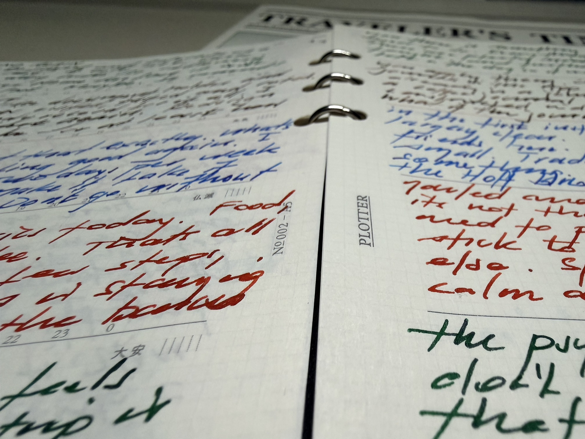
The journal is an A5 Plotter in the Weekly Schedule Refill (PLT0002) which spans a double page spread. A title, 5 lines on the left, 6 on the right. Every day.
The internal monologue? A different story, and a suggestion to berate yourself on a daily basis this post is certainly not. Personally, I sometimes need some stern words if I’ve fallen off whatever path I’d planned to be on at any given time. Or it might simply be that someone has brought me to the point of words on a page, rather than, say, shouting verbal obscenities in the workplace.
So what is the purpose of this post exactly? Well, simply to say that fury constrained to a short journal entry is fury expressed, processed — and hopefully — left behind. It’s out there (or on the page at least). I’ve said it. Done.
Constraints
I’ve mentioned before how a small, A6 page-a-day is a great way to get into a journaling habit if that is your goal. Well, I’m here to tell you, eleven short lines will do it as well. Whilst I’m all for an expansive journal or larger notebook, sometimes enforced constraints can at least provide a conclusion and early completion of one of my daily tasks.
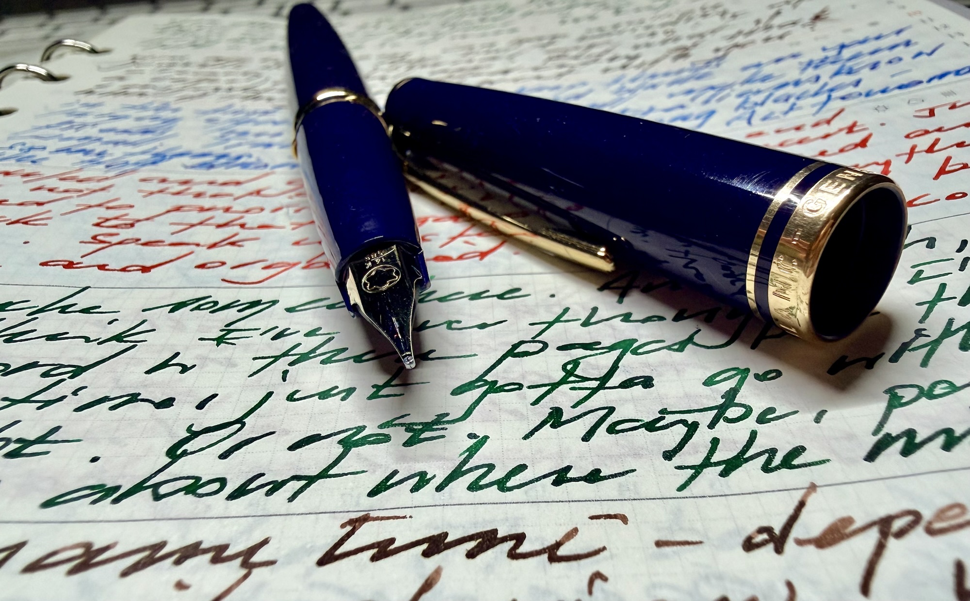
A splendid Montblanc Generation carrying the duties of the day
I find it also forces a certain clarity of thinking. What do I really want to say here? You don’t have long to say it, so get to the point. Yes, some days I’m flat out thinking of something to fill that small space, however a mindful reflection on the taste, texture, and warmth of the first cappuccino of the day? Perfect.
Maybe that’s the quiet power of constraints — whether you arrive with gratitude or grievance, you show up, say your piece, and move on. Eleven short lines — or whatever you’ve got — will do that.
Yes, there has certainly been a considerable amount of that recently. However, I guess the real question lies in whether that’s all there is. Rarely do I see a pen and think it would make for a good blog post. The uniball Zento Signature Model was no different. When you get around to writing about the pens you’ve owned (often for many years), it’s very unlikely a consideration of whether you’ll be simply “adding to the hype” needs to be made.
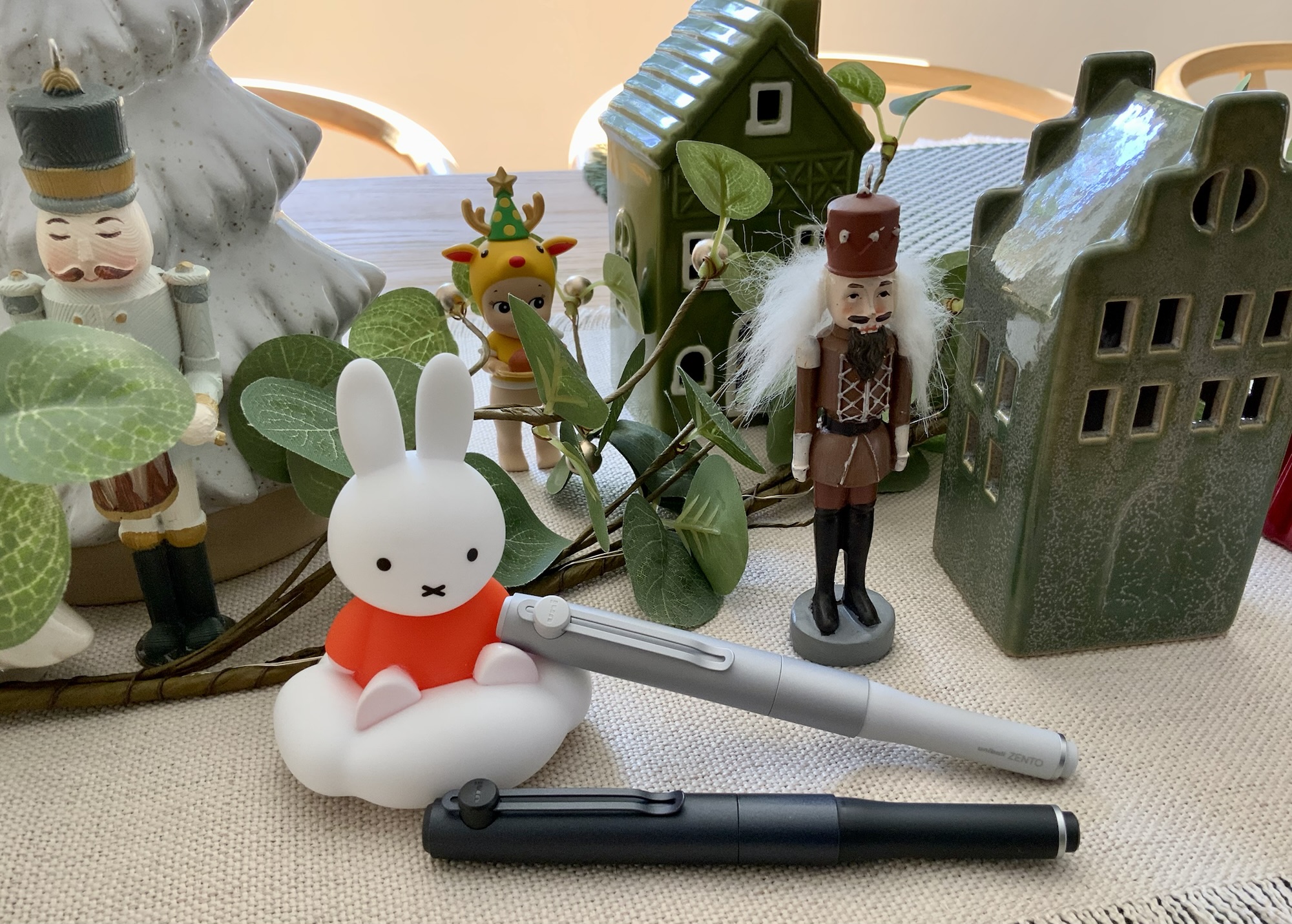
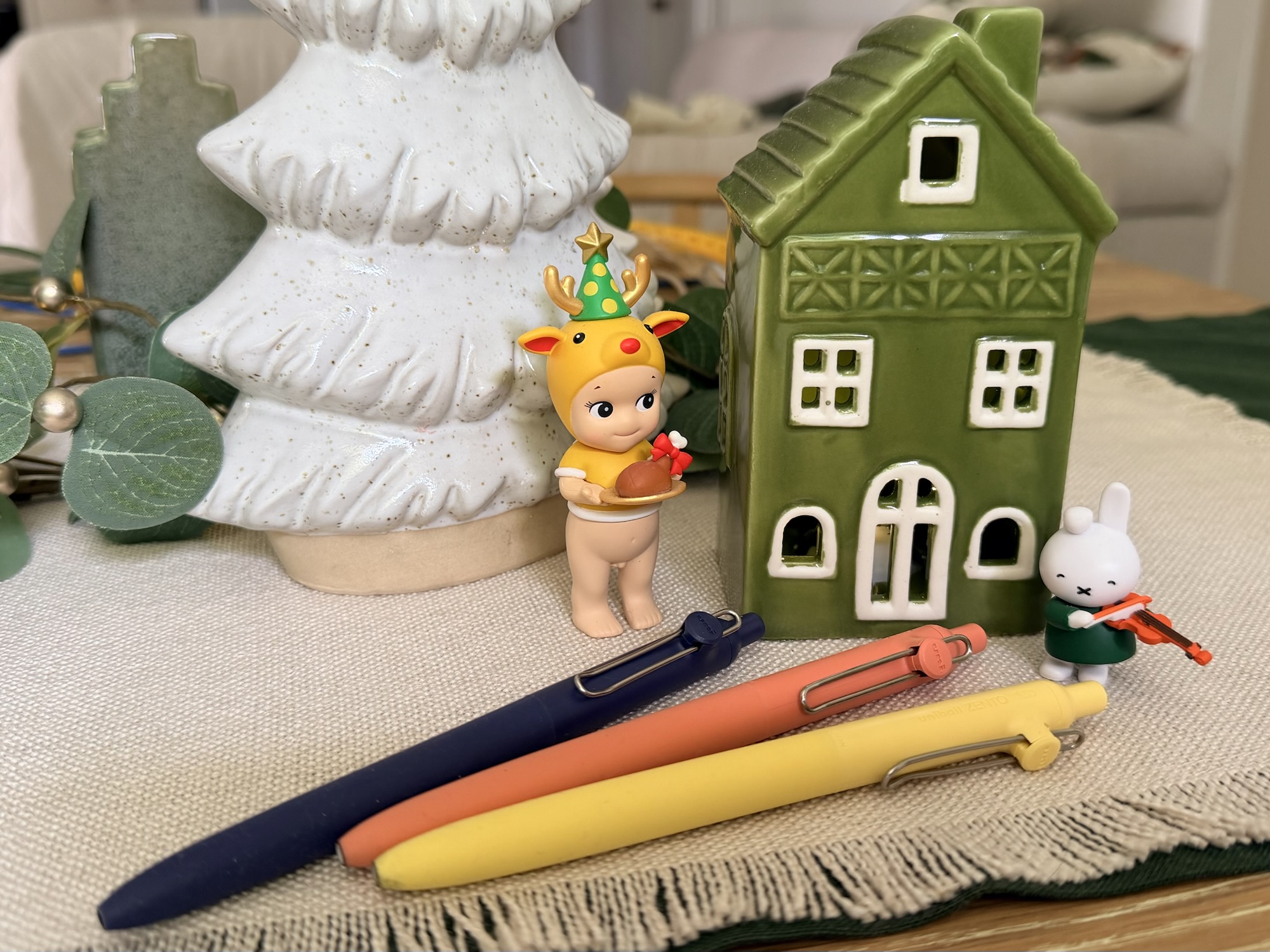
No mini Christmas village was harmed in the production of this post — a timeline also demonstrating how long I have been mulling over these thoughts…
So when it does come up, what do you do? Well, what any self-respecting blogger does: come up with some sort of hype-stoking title and get on with it. The longer (and yes… more infrequently) I do this, the more convinced I become that these aren’t objective reviews. None of them are. They are clearly just opinions, preferences, or more simply: I like it, or I don’t. We perhaps shouldn’t kid ourselves into thinking there is much objectivity here.
Do we really need another post on this pen? No, we don’t, so let’s get to it.
Origins
Strolling the floors of the Itoya stationery store in Ginza (me sounding like that’s a typical Monday…) with a new A5 Orange Plotter and a stack of associated refills, I stumbled across a display of the uniball Zento line of pens. First thought on the Signature model? Oh, that looks cool. Assuming it wouldn’t be too unreasonably priced, I sought a staff member in the hope of purchasing one. Even back then (our family trip to Japan in March 2025), I received polite laughter in response, and a “sold out everywhere” answer.
It’s definitely number 1 officer… The image I snapped in Itoya in the hope of explaining to a team member what I was after. Perhaps the Signature model on the bottom left was already the only one left in Japan…
Only since have I realised the futility of my question that day, and the expectation I might actually find one in stock during the months that followed.
I was fortunate enough to have received the Signature models you see here from a generous friend who tracked them down online, with considerable more nous than myself: I’ll just wait until they’re back in stock (precisely never at my usual retailers for as long as I’d kept checking). So, here’s to great friends that look out for you, for whom I am forever grateful and appreciative.
With a champagne gold colour and 0.7 mm refill size having recently dropped, I’ve not really continued following along to see if availability has improved to any great degree. A cursory glance online suggests it hasn’t.
The Design
My “oh that looks cool” thinking on that cold, wet day in Ginza? Probably two things: the compact design (reminiscent of uni’s Kuru Toga Dive mechanical pencil), and the stark contrast to the three other variants in the Zento lineup. Looking at other more “premium” barrel manufacturer variations on gel pens has never really piqued my interest, given the refills are the same as in their plastic siblings: “well… it’ll be heavier…” and that’s about it.
Side by side, the difference between the other variants and the Signature model is of course striking. Different on its own isn’t enough, and I refer to my earlier point. We are either attracted to, intrigued by, or indifferent to any pen design. The Zento Signature? Colour me intrigued at the time, a sentiment amplified by not being able to get my hands on one. All I could do therefore was create some sort of scenario in my mind about its feel, practicality, and overall vibe in the hand.
A few of the cheaper siblings —Zento Standard model
Upon feeling, toying with, and using the Signature model? Same, better, or worse than the scenario in my mind? Probably about the same. I don’t think I’ve ever had a pen feel exactly as I’d imagined after seeing images or reading about it online. The exception in this case being the refill — I mean, it’s a uni gel refill of some form and was therefore never going to be a big surprise, nor most likely, a disappointment.
The overall length, weight, and balance are usually where any surprises (be they joy or disappointment) lie. Overall, it’s probably a shade lighter than I expected; un-posted, carries just enough length to be usable on a slanted grip (better if held upright); and posted of course is to my hand, a perfect length.
As for balance?
It’s what I’d call very good. In the past, that might rate a perfect though as my pen journey and thoughts have matured over the years, I’ve come to the realisation there probably isn’t an objectively perfect balance to any pen out there. Particularly as your preferred grip will likely be a degree/millimetre or two (dozen) different to mine. You hold your pen upright and print. I mostly am a 45-degree pen to paper hold, and write in some weird print/cursive hybrid of my own making. Who’s right? Well, you are, of course — but then again, so am I — which is precisely the point.
Given the magnets work perfectly to both cap the pen closed and post it for writing, I’d assume posted is the form of use the manufacturer intended. I’m pleased it does either pretty well, and as a long time non-poster of caps, I almost exclusively post the Zento cap when I use it.
The magnets hold the Signature model’c cap firmly posted
Speaking of the cap, the clip which adorns it is very much a fixed proposition compared with the spring-loaded hinging mechanism on the cheaper models. I don’t find it to be an issue, however have noticed the difference occasionally when clipping over a few pages of paper or notebook cover. Aesthetically, I guess it does suit the design of the Signature model a little better, and the “fidgetability” you lose from the springy clip is more than made up for by the magnetic cap closure.
The Refill
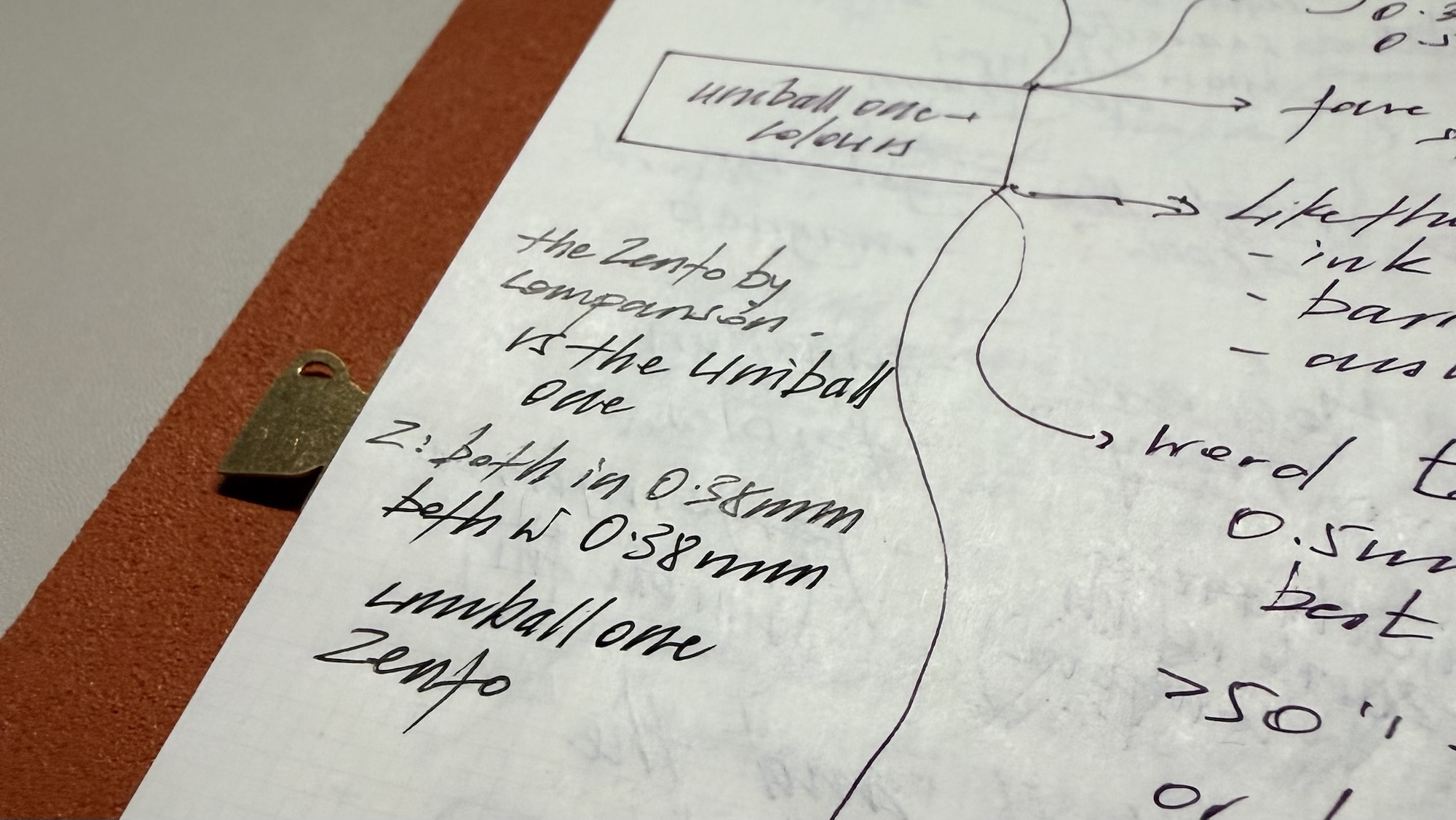
Another hype-first hook here might be to lead with: here is where things get interesting… But to be honest, they don’t. They really don’t. It’s another solid liquid gel-based refill, which I find ever so slightly less enticing than the uniballone refills I’ve been using a lot since that same trip to Japan. Though if I’m honest, sometimes I can’t really decide which I prefer.
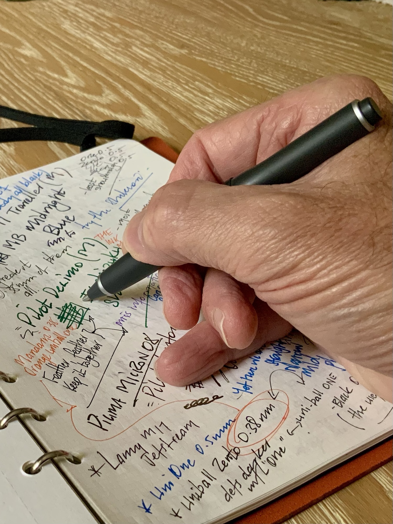
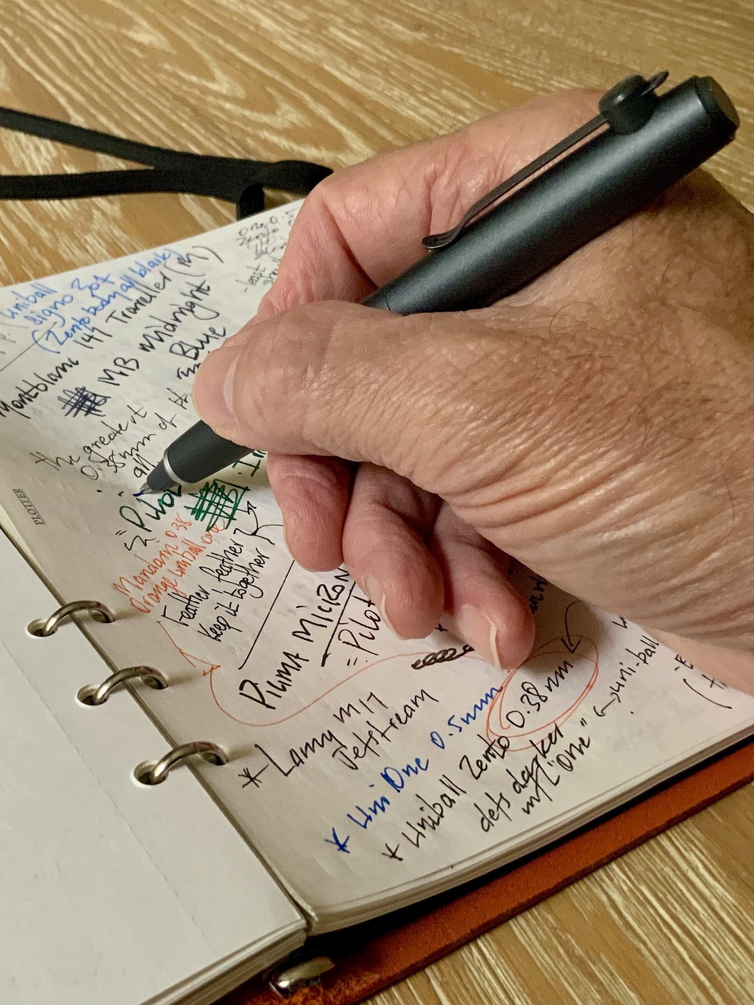
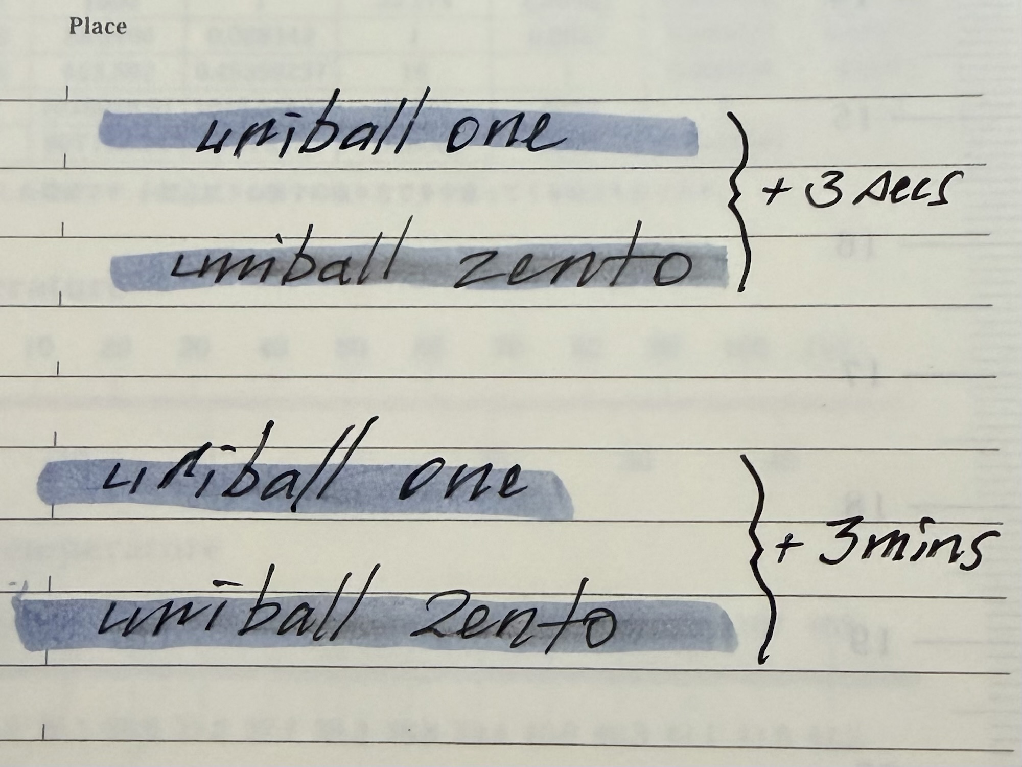
I simply find the uniball one refill a somewhat deeper, darker, more fulsome line at the same tip size as the Zento. In considering how to somehow get this on an image, I think the most striking difference I’ve noticed is when both are subject to an angled view under light. It’s pretty clear the one ink formulation provides a much deeper and darker line. When viewed directly overhead, the difference is pretty negligible, and perhaps why for the most part, I’m happy using either.
The further from the lens, the greater the angleand the lighter the Zento refill becomes – negligible when viewed from above
So, both great, just a little different to one another. Given the options in the Zento line up, I don’t really see much of a problem in recommending a try before you buy (the Signature model) approach. I mean, no-one is buying the top-tier pen to try out the refill, are they?
Conversely, go crazy and buy the Signature model straight up, in the knowledge the uniball one refills will slot straight in there if that’s what you prefer. Or failing that, a Signo 207 or 307 for example (great office workhorse — ask me how I know). Anyone still reading this is most likely a refill swapper anyway, and while I haven’t sought an exhaustive list, you get where this is headed. I doubt you couldn’t find something to your liking that would fit.
Reddit tells you many things, however in considering what might work compatibility-wise, Jet Pens’ list of compatible pens for the Zento refill surely also works in reverse.
Finally, if you are a highlighter, the Zento ink will streak ever so slightly when you go over it. Whether the ink has had time to dry seems to make no difference. I typically use Zebra Mildliners to highlight with, and even after several minutes of dry time, it will reinvigorate the Zento ink and streak things just a little. Not so the uniball one formulation.
I’ve noticed a bit of streaking under highlighters in both my Plotter and Traveler’s Notebook refills – probably dependent on both your paper and highlighter most likely
In conclusion
Whether you are part of this whole hyped up Zento world, or perhaps desperately seeking to join it, on the whole the Zento Signature model is indeed a great pen. I love using it and often reach for it when on calls for both note taking and general fidgeting (the size and magnetic cap closure being very well suited to such a practice).
As with anything though — a mismatch of supply and demand inevitably results in one thing: hype. I’m also the first to argue that rarely does anything live up to hype generated solely by supply and demand, and the Zento Signature is no different. Sure, also easy for me to say with two of them sitting on my desk, however do we have an answer to the title of this post? Most definitely.
The Zento Signature hype? It’s pure ballyhoo — all of it. As much as we get nerdy and love our stationery… it’s just another pen. If I made a pretty good pen with an interesting design, I’d continue to control supply as well (whether uni are doing that or they simply cannot make them fast enough, I haven’t a clue).
Beyond the hype and just the pen? It’s brilliant: a fantastic, appealing design that is infinitely fidgetable; pocketable, yet expands to be a comfortable writer; and a great refill, even if others might suit you better.
So, answering my post-title question: it’s both. You just need to separate the pen from the hype, but unfortunately, it’s the ballyhoo that might make it difficult to get your hands on just the pen.
All I would say in wrapping this up, is that the Zento Signature model is worth whatever you’re prepared to pay for it. But of course that applies to everything. Me? I certainly cannot recommend paying above standard retail. Anything more than that and the ballyhoo wins, which is hardly what the Signature model is all about, yet unfortunately is what defines it at the moment.
A working subtitle of what follows below might be: goals achieved, opportunities missed, and assumptions confirmed. The next-level summary would then kick down to: families put up with a lot when you are exploring your own niche interests and hobbies. This perhaps adds further context to the tales below.
Along with my wife and our two adult children, I recently spent 11 days in Tokyo. Our initial seven nights being unavoidably extended after our return flight was cancelled due to a cyclone threatening our home city of Brisbane. A stressful hour or two ensued, changing flights and extending accommodation, before we realised the fantastic opportunity we had to spend another four nights in such an amazing location. We were indeed thankful all was okay when we returned home, though many weren’t so lucky with damage, flooding, and power losses from the cyclone.
Aims and Plans
I really had no great plans on the stationery front, other than perhaps a leaning towards obtaining a Plotter notebook set up and having a good look around. I’d taken in some “Stationery trip to Tokyo” blogs and YouTube videos before the trip, however as far as a shopping list was concerned, the Plotter was mostly it. That said, I was always going to add to my Traveler’s Notebook setup, and was excited to visit their locations around Tokyo.
On the flip side, I’d also considered what the stationery side of the trip wasn’t intended to be: a search at all costs tour for Japanese exclusives, fountain pens, or endless inks. When you are talking about a couple of hobbies like stationery and coffee, a trip can quickly turn into family members waiting around for you to sample things or satisfy curiosity. Don’t get me wrong — they’d do it every day of the week, however even for me, our family holidays are far more enjoyable without the pressure of me seeking niche, out of the way stationery stores or cafés.
If you have progressed in this hobby to being all-in on fountain pens, then this post will disappoint you. Yes, I still love mine. However, I am very fortunate to probably have enough, and most of my daily drivers are gel or ballpoint these days. With that in mind, you’ll still find plenty of fountain pens at many of the places listed below, although none returned home with me.
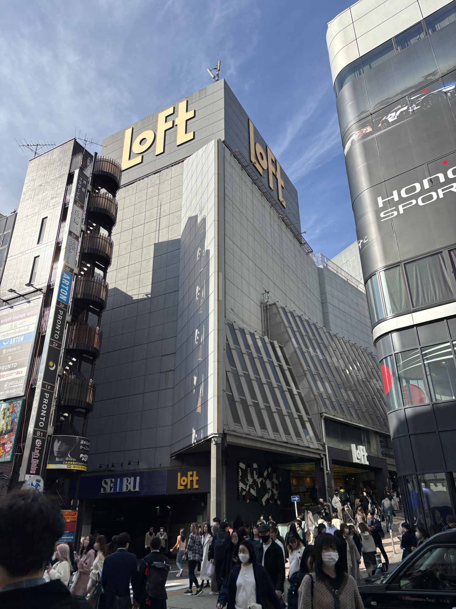
One of the first shops tagged “stationery” on our Tripsy itinerary list, largely due to the proximity to our hotel in Shibuya, however once inside it quickly became apparent as to the magnitude of stationery in Japan. My family happily pointed out we spent a good couple of hours in the store, and I didn’t make it off the basement (aka stationery) level. To be clear, while there are seven floors in this behemoth, you’ll find stationery on the basement level, and I do recommend spending some time on the other floors — maybe for a few minutes before heading back to B1…
Loft in Shibuya — leave yourself plenty of time
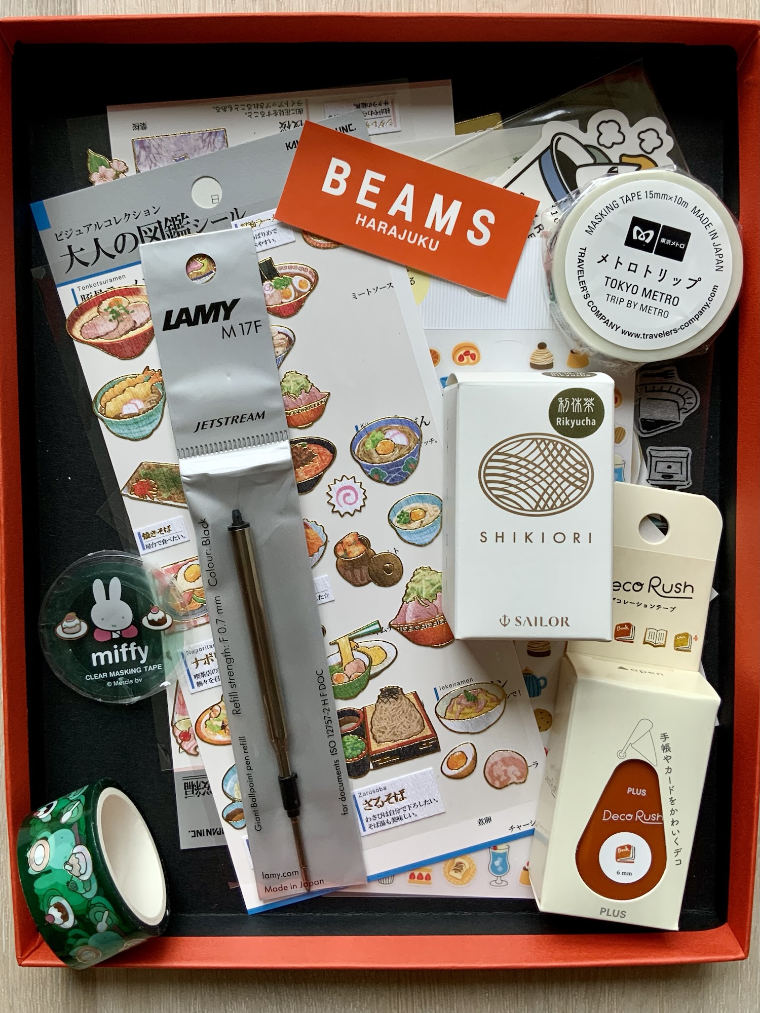
Checkout: Gel pens, a couple of Traveler’s Passport size refills and miscellaneous items (stickers, glue pen etc). Let’s call this an initial “recon” visit. Too many stores to come, and much of the time was spent on the Side-note below. On a return visit, I did pick up a bottle of Sailor ink to replace my ever dwindling Montblanc Daniel Defoe Palm Green. The Shikiori Rikyucha probably falls on the brown rather than green side of the ledger, though you get that with store lighting, aging vision, and looking at the small colour spot on the packaging. Nonetheless, I do like the colour.
The Lamy M17 Jetstream refill. I duly took my ticket from the display and lined up at the register to claim my “1 per customer” M17 refill. I ended up with the black fine (0.7 mm version). It’s a good writer and what you’d expect from the classic oil-based Jetstream ink. I’ve not yet compared it directly with the M16 refill, which incidentally I only have in medium.
Side-note: Plotter paralysis. A good part of that long stay on the stationery floor was spent at the Plotter display, musing on sizes (A5 was the plan before leaving home) and cover colour. I loved the orange, however wasn’t sure how that might play out in the office. The conclusion being: “think about it” and return another day.
Verdict: Like performing a Google search for “Japanese Stationery” and having the results presented to you in person. It’s vast, an assault on your stationery senses (in a good way) and I’m glad I had the benefit of checking out the other places below in the knowledge I’d easily return to Loft to fill in any gaps before we left.
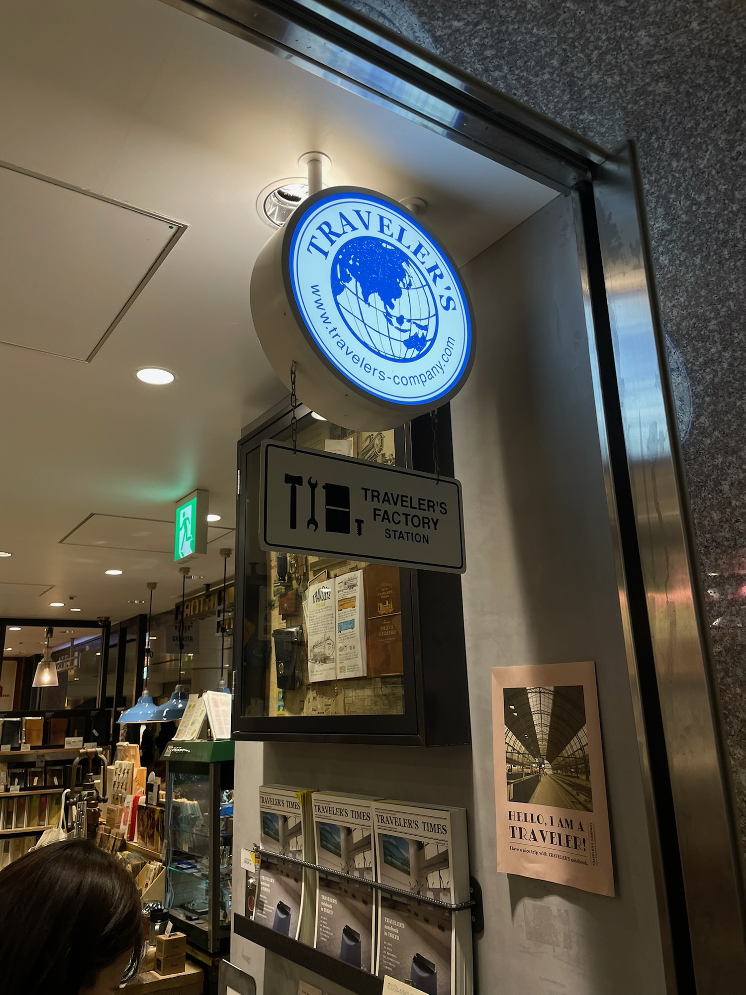
A Traveler’s Notebook theme also heavily influenced the stationery itinerary of the trip (see also Starbuck’s Reserve and TN HQ below). I run a Bullet Journal type setup in my TN, and thought I might pick up some exclusives from the various TN locations we’d visit.
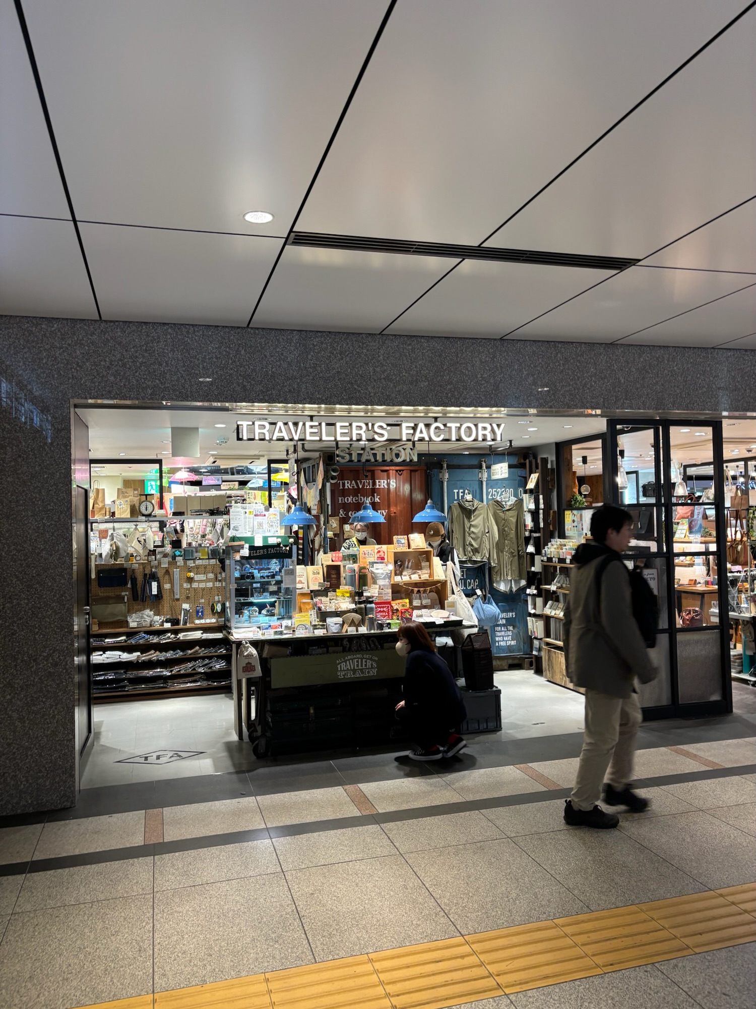
Traveler’s Tokyo Station – underground north exit
You’ll find many a stamp under this sign
Checkout: A few inserts, stickers, postcards, and a good few minutes spent collecting various stamps from the store in a passport refill you can see on the left of the image. They also had a cool main stamp press which aligned your refills nicely and printed the red and green TN Tokyo Station stamp on the cover (far R in the image).
Traveler’s Tokyo Station haul
Verdict: Tokyo Station itself was an amazing building, and it was fantastic to be able to visit the Traveler’s Store. Being the first of a Traveler’s theme of stops, I was excited for what was to come. A quaint store and an enjoyable visit.
After my I-need-to-think-about-this moment from the Loft excursion, I received a unanimous vote of encouragement by my family: are-you-serious-absolutely-get-the-orange-Plotter before entering Itoya. That turned out pretty well, as you can see in the image.
Unlike Loft, Itoya’s many floorswere all stationery (or at least adjacent), however each were smaller in area by comparison. This saw me a little calmer than in Loft, with things segmented floor by floor, thereby providing a little reset between them.
Checkout:Plotter A5 cover in orange “shrink” (pebbled) leather with an antique gold backplate, along with just about every refill I could get my hands on. Until I can convince my favourite pen shop here at home to bring them into the country, it will either be international shipping for refills or my Japan-based niece as a stationery mule whenever she visits us in Australia.
The Plotter in fabulous orange
Side-note: The beginning of a theme and a little hilarity. Itoya was the first time the Uniball Zento caught my eye, by way of a small advertising display in an array of home office desk setups. The Signature Edition would be the perfect “unique find” to take home, given its design and magnetic cap system. Yes, a gel pen no less — and as you can gather, it was decidedly a non-fountain pen trip. Upon enquiring with one of the staff if any were in stock — the answer was a shake of the head and a “sold out everywhere”. It was the same in Loft and multiple Hands stores we visited along the way. Typical. I had set my sights on a pen that was probably the most popular thing to hit the shelves at that particular moment, with no way to get my hands on one before the end of the trip.
The hilarity of it all? Well, there are four variations of the Zento: the Basic, Standard, Flow, and Signature models. I wanted the Signature, which I’ll now be picking up online as they have just popped up locally on Bunbougu (well the lower tiers at least, the Signature model shows sold out — what a surprise). How’s the new “Zento” ink? Well, that I cannot tell you, as I was that obsessed with hunting the Signature model, I totally overlooked picking up a couple of the cheaper variants which were all available. Did someone say tunnel vision? Oh well, you live and learn.
Verdict: Itoya certainly was a joy to visit (along with the luxury shopping precinct that runs through Ginza) with many floors, lots of stationery, and a good deal more fountain pens. I did a quick whip around the fountain pen floor (well ok… perhaps a couple of laps) before moving onto more pressing Plotter purchasing matters at hand.
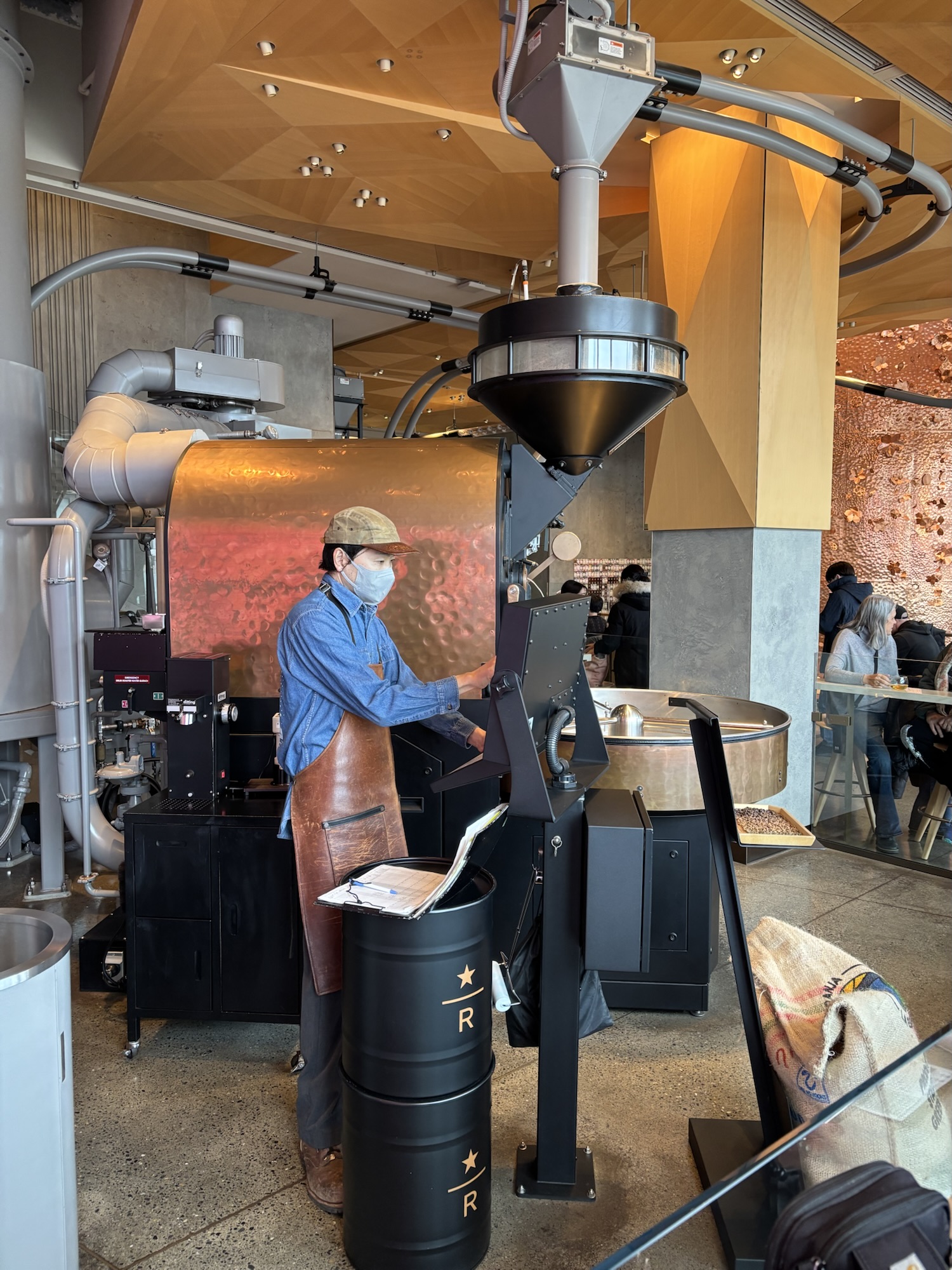
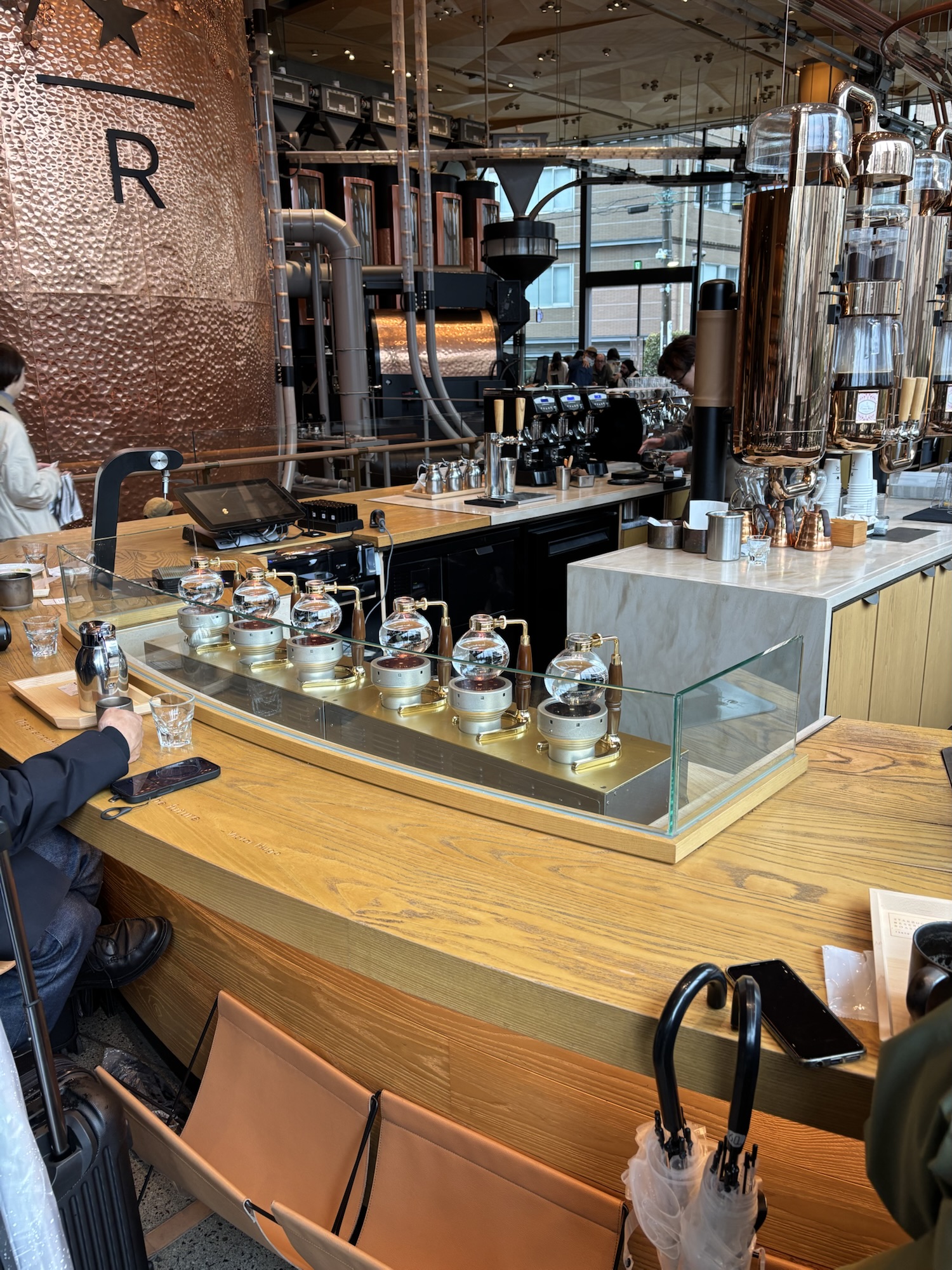
Sure, if you were perhaps a coffee purist this mightn’t be the first stop on your list, however I’d argue it’s essential, simply for a look at the size, scale, and design of this place. I would also add it was here I had one of the best filter coffees of the trip (a Modbar brewed Colombian Pink Bourbon for anyone interested).
Starbucks Reserve – now roasting…
Siphons at the ready if you’d care to sample
But we’re here to talk stationery, and this was peak collaboration time. Starbuck’s Reserve and Traveler’s Company do a fantastic job at providing for those at the intersection of coffee and stationery obsession, and I am certainly here for it.
Checkout: Fairly self-explanatory in the associated image, anchored by a passport sized Traveler’s Notebook and some charm/clip hardware, with some associated passport sized refills and various stickers.
Coffee and collabs – Starbucks Reserve and Traveler’s
Verdict: I love a good collab, and this one was made for me. If you are in the Meguro area, it’s honestly worth stopping by Starbucks Reserve, yes for a bit of stationery (in the corner to your right upon entering), and even if you’re not into coffee, one of those four floors is dedicated to tea. Something for everyone. Loved it.
But wait… there’s more. Adjacent to the roastery is the famous Meguro river, endless cherry blossoms when in season, and if you keep wandering further down a quiet little street, you’ll find…
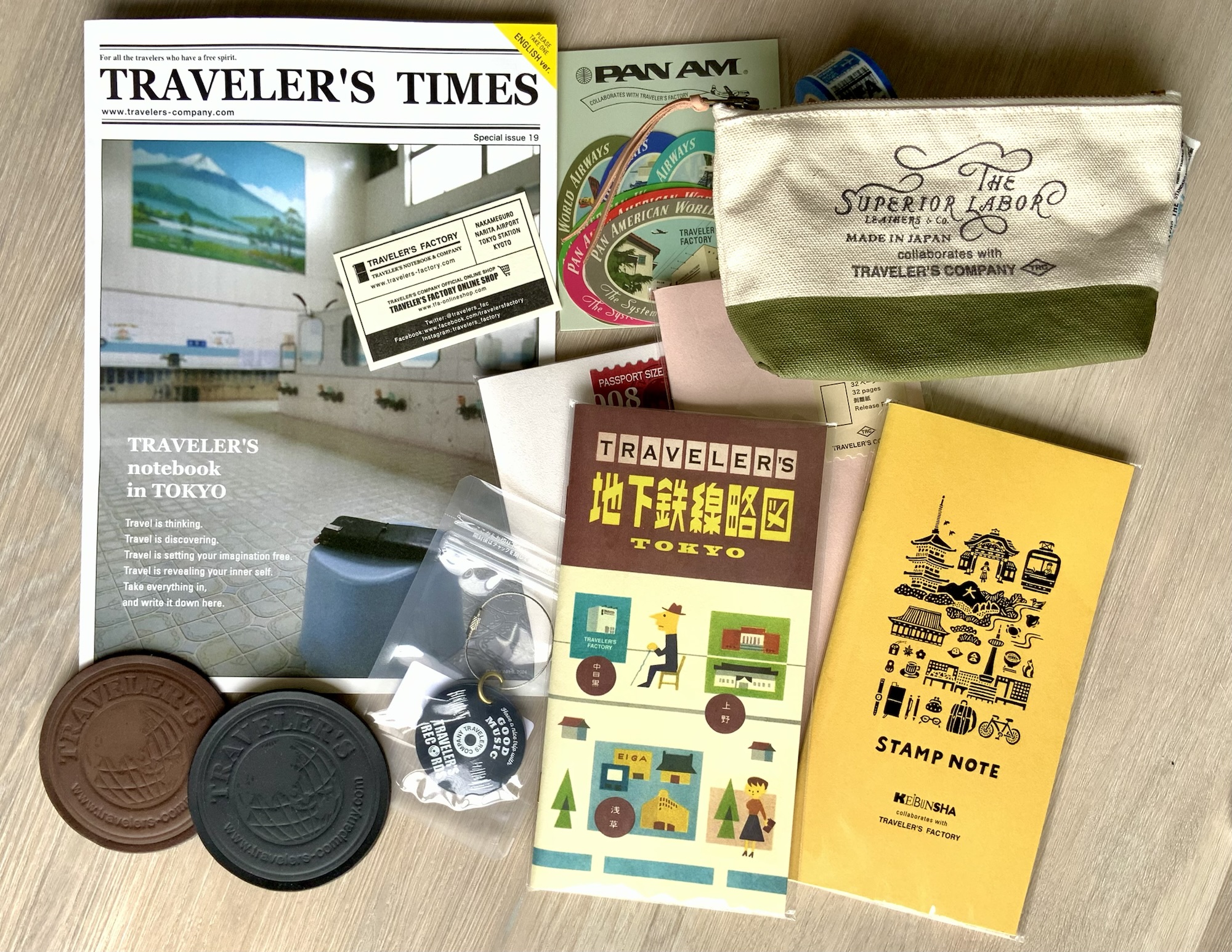
Along with Loft, also an early entry on the stationery list when planning our trip. The Traveler’s HQ. The mothership. Or rather, the quaint little backstreet store that is symbolic of everything wonderful about Japan. There is a quiet hum of customers inside this store which belies the idyllic outer. We did visit on a fairly rainy day, so perhaps things in the surrounding streets were a bit quieter than they otherwise might be. Absolute bliss.
Traveler’s HQ – a quiet back street…
…housing much joy
Checkout: Again, the image tells the story, and my favourites here were the selection of The Superior Labor bags and cases, along with the leather Traveler’s Factory coasters we now have on our side table at home. Some interesting looking refills and stickers were also added to the list — goes without saying.
Traveler’s HQ haul
Verdict: It was great to get along to both the HQ along and the Traveler’s at Tokyo Station. To be honest, I wasn’t entirely sure whether I was buying store exclusives or not, and really just picked up what looked appealing. If you have a specific list when visiting, I’m sure you’d have no trouble filling it. An added bonus? Visiting both locations removed the need to look at the Traveler’s sections in the other stores, such as Hands and Loft.
Customised indeed – from Traveler’s HQ
One thing struck me upon visiting the store, and that was the feel of the craft and workmanship all around you. Sure, your larger players in the stationery realm have their place, however brands such as Traveler’s and Plotter have their cult followings for a reason (and it’s not just the plan-with-me videos on YouTube). There is a sense of the culture in these products. Everything I found wonderful in Japan is encapsulated by brands such as these. The experience was certainly far more valuable than what I brought back, but of course, we all need those little keepsake stationery souvenirs, am I right?
If there was a stationery race on this trip (besides the frantic Zento search…), Hands would be the dark horse, and could rightly stake a claim to victory. Right around the corner from where we were staying, to boot.
For reference, most of what you’d find on the stationery floor in Loft was also available across three or four floors in Hands — minus the people. An easy way to pick up many of the gel pens, stickers, notebooks, and stationery — including Traveler’s and Plotter if you are so inclined. Fountain pens, yes, and a decent array of Pilot CH 912 nib variations if you were in the market.
Certainly not an expensive haul – Zebra bLen; Jetsreams’ Lite touch, One; a Kurutoga; Zebra Clickart markers
Checkout: To be honest, I can’t quite remember, though a good few gel pens, the Zebra Clickart markers, and numerous stickers. A nice addition to the purchases was the Zebra bLen multi-pen, which I picked up in the 2 pen + pencil version. Interestingly I didn’t see many Energels around.
Many stickers and much fun for the travel journal…
Verdict: Your friendly department store (with a wonderful array of stationery and other items) likely kept a secret by the locals so they can avoid the tourist crowds, yet still have just about everything available. We loved our local Shibuya store; however, others were just as impressive, and I picked up a great Apple Watch band at the store in Shinjuku. Definitely worth a look inside when you pass one.
Honourable mentions
7-Eleven — there are more Campus notebooks around Tokyo than I’ve ever seen, and you can easily pick one up at most 7-Eleven stores, along with a reasonable selection of gel pens.
Muji — I didn’t buy anything this trip, however, always good for some stationery basics and great paper in the notebooks.
Kiddyland — Jetstream x Miffy anyone? That and a lot more in here. Release your inner child. You won’t be sorry.
Starbucks — another Campus notebook collab in most neighbourhood stores, a lovely sakura design given they were beginning to blossom during our stay.
I’d also highly recommend travelling with a notebook of some sort, as many of the train stations have their own unique stamps which can be fun to collect along the way. Not to be confused with Goshuin shrine and temple stamps — for these you’ll need a specific notebook, or they can also be obtained on a loose-leaf sheet of paper. More details here.
Most train stations have their own stamp…
I certainly collected a few along the way
No regrets, but perhaps I could have…
Taken more photos of the actual stores, although they will certainly live vividly in my mind. Pictures do speak louder than words. It would have been nice to provide you with some more here. Truth be told, I just don’t think to do it much when I’m deep in discovery or purchasing mode. I’m also a much happier explorer when I’m not thinking “I must take a photo of this for the blog”. In any event, I’m sure you’ll find things covered far better and in more detail elsewhere.
Spent more time buried in fountain pens and been more bullish on seeking those smaller boutique stores and manufacturers. Maybe, maybe not. I needed to get to the more well-known places to see for myself, and I’m certainly happy with what I ended up seeing and buying.
Picked up a Zento in any of the other 3 variants — fool! (We all knew that one was coming, right?)
Signing Off
Glancing through my photos and the stationery items I’ve returned with brings a smile to my face. Sure, as with many trips, you could stay a month and still not get to everything. I had a pretty big list of saved stationery locations before we started, and I certainly didn’t get to them all, however somehow came back feeling as though I’d seen everything I wanted to. Perhaps when what you do see is so amazing, that’s how things turn out in your mind.
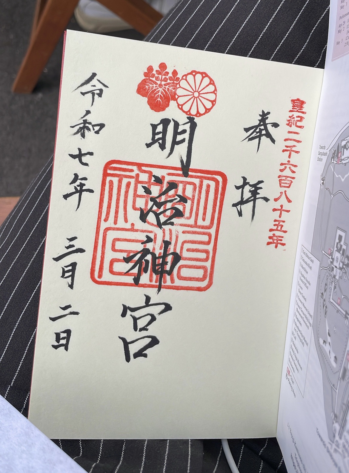
Goshuin from the Meiji Jingu Shrine
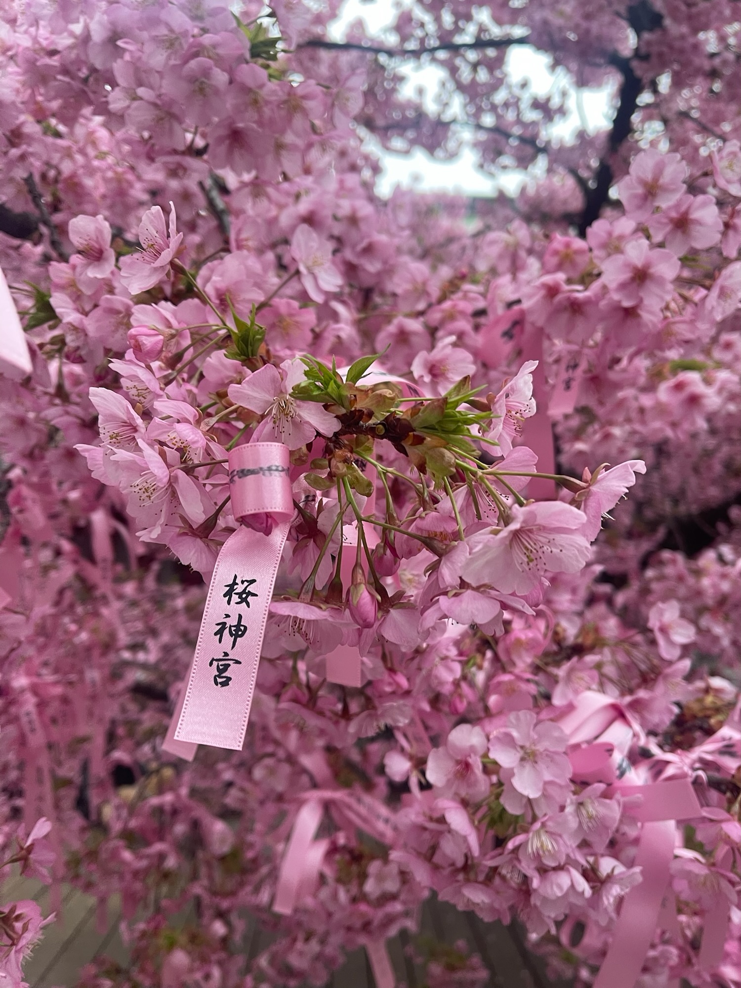
Sakura at the Sakura-jingu Shrine
My advice? Do a bit of research, save all the locations before you go, and simply immerse yourself in whichever ones you make it to — they’re all fabulous. I don’t think you need to be overly strict or obsessed in finding every possible store, particularly on a family holiday anyway. Of course, that is just the opinion of someone who has been fortunate enough to go, and enjoyed every second.
It’s probably also worth noting that this trip was also about 5% stationery and 95% family fun times, which resulted in one of the most memorable trips I’ve taken. There really is nothing like getting out and walking around. Things are best summed up in the Editor’s Note from the Traveler’s Times I picked up at Traveler’s HQ:
There are many things that are being left behind because of the prioritisation of economic efficiency. However, Tokyo’s charm is hidden in places that might otherwise be lost.
If a trip to Tokyo is something you wish to do, then I hope you get there one day. It’s a fabulous place — stationery goals achieved or not.
Running any time between the beginning of December and the following February, my end of year “process” is largely defined by when the mood strikes. Well, that and how easy it is to come up with a theme of sorts for the coming year. Late to the party yes, however, time and energy are mostly spent elsewhere in the lead up to Christmas.
Given I use pen and paper (and I’m sure if you’re reading this, you do too), I feel this process can be a little easier, dictated partially by what I need to set up for the year to come. The final quarter of the calendar year inevitably brings planner season, both a blessing and a curse, given the paradox of choice inevitably confronting us. Ideally, contentment probably reigns supreme if you can find it. A system that works year in, year out. Too many “plan with me” YouTube videos being the very antithesis of a trusted system and a contented mind.
Those of 2024
For the past year, it has been my Traveler’s Notebook (regular size), housing a very minimal Bullet Journal setup, and aside from a few stickers, ruled boxes, and headings, remains decidedly non-decorative.
I enjoyed using my Hobonichi Weeks as a health tracker of sorts, containing daily step count, deep sleep hours, work hours, and workout tracking for the year. Loved it, however I’m not sure an additional standalone journal is really needed, and I’ll be recording the same data this year in a Traveler’s Monthly insert.
A Field Notes is always kicking around for random notes, and in the latter part of the year I finally managed to pick up the Everyday Inspiration cover (a Field Notes x Bellroy collaboration). I had been on a restock waiting list for a good while, given it was the only way of obtaining the grey and orange colour-way (Bellroy do have some other colours in their regular lineup if this combo isn’t your thing).
What really is the goal here? Long term, it’s probably to have things settled in well enough to simply say: “refer to the previous year above” and be done with it. Will that ever really happen? Unlikely, though we can all have our aspirational goals, I guess.
Constants
The Traveler’s Notebook will again be hosting bullet journal duties, this time with a monthly insert to allow for any health tracking I may do over the course of the year. The Field Notes will remain in the mix for any ad hoc note-taking, and is generally with me when the Traveler’s isn’t.
I’m mostly finished with the Moleskine for the moment; however, it will definitely be called into play in 12 months time for year-end review duties. Who knows, if I can somehow trick myself into undertaking a better quarterly review system, perhaps a couple more times before that.
Variables
The desk book. In my mind, a good desk book is significant. Actually no, I think substantial is a better term. It lays flat; handles all types of inks and writing instruments; and come the end of its life should be something like this one. It won’t be quite like that one of course, but as I say: significant.
I’m yet to both finish the Montblanc notebook, nor come across something inspirational to replace it with. I’d also add, the Montblanc curiously does not handle all sorts of inks, or lay overly flat. Okay if you don’t mind a bit of feathering or are mindful of what you use with it.
Plotter. There, I said it. Sure, it seems to be a system surrounded by a bit of interest currently, though probably with good reason. I’m not 100% sure where I’m headed with this, however an upcoming trip to Japan in March will provide a little more in the way of a first-hand look. Who knows what might return in my luggage after that trip.
By process of elimination, the Hobonichi Weeks will not be back in the line-up this coming year. I’ve loved using it, and you never know what the future will bring, though it hasn’t quite made the squad for 2025.
Wrapping up
It doesn’t really have to be that complicated, does it?
No — yet posts like these invariably end up like those step-by-step flow charts, the more you explain, the longer they get. While things don’t need to change each year, the inevitable pull of something a little different always tugs at your thinking.
I think I’ve settled into being mostly content, with a few variations to try along the way. If that’s how things run into the future, then I’m more than happy with that.
I do hope yours is in place, working well, and contentment reigns supreme.
All done. With the Montblanc 100 Day Writing Challenge tools laid down on September 8, we stepped away from our worksheets and prompts to take a look back through 100 entries.
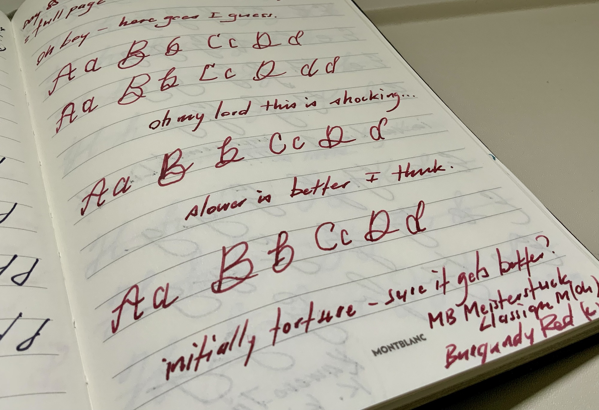
I must say I found this an enjoyable undertaking, having set out (and succeeded) with a plan to limit each day to one A5 page — that is, as manageable as it would ever be. The “challenge”, however, did come in days 80 and beyond, where my not-so-dab hand at calligraphy was brutally exposed. Of course, that was to no-one but myself, and perhaps you dear reader, should I decide to add a few images to this post.
The Tools
Notebook
The canvas hosting my challenge was a “25th Anniversary” edition of Montblanc’s A5 sized#146 Notebook. The anniversary moniker is of course entirely my own making, having bought a pair of these notebooks for myself and my wife on our 25th wedding anniversary a couple of years ago. Monogramming undertaken at the best pen shop in the world completed the picture. Given the challenge honoured Montblanc’s 100th anniversary, it seemed an appropriate occasion to break open and use the notebook.
Tools down and book closed…
More on the pens below, however in terms of paper quality, I find the Montblanc notebooks handle almost anything, except for the wettest of inks and broader nibs. Now, a caveat here: ”wettest” and ”broadest” being extremely relative terms. If you’re reading along here, please understand these are based on the inks and nibs in my collection. One of my broadest and fastest running nibs? The OMAS Ogiva Alba — it’s a “medium” (albeit a European medium). One of my wettest inks? Van Dieman’s Oakwood Brown. Put those two in combination and there is distinct feathering on the page and show through on the reverse. This does not happen for example, with the same ink in my Pilot Custom 823 — a Japanese medium nib.
I would say it’s probably a case of creating a notebook suited to “our” pens and inks if you asked Montblanc, for I’ve typically found my Montblanc inks to be drier than some others. Of course, not being a BB nib type of pen owner, take this commentary how you will.
I do love the Montblanc notebooks, in so far as they really are the complete picture in themselves. The leather cover in a variety of styles (the subject notebook here carries a Saffiano leather cover), the gilded silver paper edging, and just the overall weight suggestive of a quality item. And yes, all of which you will indeed pay for. Probably not one for your daily driver — you most likely don’t want to be buying one every month or so.
Pens
With most typical days involving gel pens (a Traveler’s Notebook bullet journal system) and ballpoints (standard work notes in the office), I like to balance that out with some fountain pens. This mostly involves some other form of journaling, writing or planning in what I’d call a “desk book”. The 100-day challenge was of course a great fit.
As I look back through the challenge (where 80% of the time I captured what I used on the day in a footnote), it was a rotation of the following pens (and inks):
Montblanc 147 Traveller; Medium (Montblanc Royal Blue cartridge)
Pilot Custom Heritage 92; Fine-Medium (Edelstein Tanzanite)
Pelikan M805; Fine (Montblanc Irish Green)
Montblanc M; Medium (Montblanc Burgundy Red cartridge)
Lamy Aion; Medium (Van Dieman’s Oakwood Brown)
Kaweco Ice Sport; Medium (Kaweco Black cartridge)
Parker 75; Medium (Parker Quink cartridge)
Pilot Custom Heritage 92; Fine-Medium (Iroshizuku Shin Kai)
Platinum President; Medium (Iroshizuku Momiji)
Montblanc 146; Medium (Bookbinders Red Belly Black)
Montblanc 144; Medium (Montblanc Burgundy Red cartridge)
Pilot Custom Heritage 91; Fine-Medium (Van Dieman’s West Coast Sunset)
Pilot Custom 742; Sutab (Iroshizuku Shin Ryoku cartridge)
Lamy 2000; Fine (Robert Oster Peach)
A few other non-fountain variants made their way into the mix as well. Two colour variants of the uni-ball Signo 0.7 mm, a Pentel Kerry mechanical pencil, and a couple of Pentel Energels in 0.5 mm and 0.7 mm.
If I had a favourite combination during the challenge, I’d say it was the Pilot Custom 742. I love that Sutab nib, and I hadn’t tried the Iroshizuku Shin Roku before, so I’m thinking that had a fair bit to do with it. In general, I’d say they are all delightful to use, and worked pretty well on the Montblanc paper.
Accessories
This heading — though plural — really only offers one type used a few times through the challenge: stickers. It’s one of those cases where talented sketch-noting would go a long way, however in the absence of that, sticker (stick noting?) additions are it. Here it was a combination Traveler’s Company stickers, a few from a Melbourne creator I picked up at the Rose St Market on a trip to Melbourne last year, and a sticker sheet received with an issue of Standart (a coffee publication).
Much more appealing decoration than my efforts below…
I find the stickers a great way to break up the blocks of text, and are certainly more visually pleasing than my shaky calligraphy efforts.
Speaking of which…
Challenge challenges
I have long held ambitions of becoming better at the more creative side of my writing, and by that I mean the visual side of said writing. Calligraphy is the most obvious choice here; however, I’ve never really had the motivation to start. What better way than rolling through days’ 84 to 93 of the challenge and working on a page a day of modern calligraphy?
Well, shaky at best, simply weird at worst. I’m happy I gave it a shot, although I’m not even sure modern calligraphy is a style I particularly enjoy. To that end, I’m not even sure that some older styles like Copperplate or Spencerian appeal to me either. To say I just need to find something that appeals to me would perhaps be a little flippant. I feel in the back of my mind, the truth probably lies more closely to the fact that I’ll never really get around to putting in enough time to get more proficient — regardless of the style.
Pushing on…Questionable…Could it be working?Calligraphy with comments
As far as writing each day is concerned, that wasn’t difficult at all, and I’m sure anyone reading this is most likely a daily writer as well. Having the prompts? Well, that does make things easier, and is perhaps a lesson learned from me, as someone who never uses them and occasionally resorts to re-writing song lyrics to get something down each day.
Wrapping Up
In summary, the Montblanc 100 Day Writing Challenge was both enjoyable and a success. It does make me wonder why I don’t use more prompts in my journaling, and also why I choose some “challenges” and let others pass by. Whether that changes in the future is another matter, and I’m glad I chose this one — shaky calligraphy and all.