Wiser Web Wednesday

Wiser Web Wednesday – a semi-regular link to posts of interest from around the web, by those far wiser than myself:


Matt Gemmell
As a site member of mattgemmell.com for a little while now, it’s been exciting to hear how things have been coming along with Matt’s novel — even gaining a sneak peek on the odd occasion. That all pales now though, with the recent official announcement and cover reveal.

Summing things up in one quote is probably best left to those who now what they’re doing, so I offer you this from the author:

A scientist is drawn into a race against time to prevent an impending disaster that will claim millions of lives. His allies are an elite covert special forces team, but their adversary is a ruthless man with an unnatural ability, who seeks to hasten the cataclysm.

I for one am excited to soon have my hands on the finished product, and if the above sounds like something of interest to you, sign up to be notified the minute CHANGER is available (later this month) through the following link:
Announcing CHANGER


Stephen Pressfield
What follows in the quote below sounds like a description of many a blog post sitting in my unpublished or drafts folders in Ulysses:

For years I dove in on Page One, put my head down and started hammering keys. That’s not always a bad idea. Sometimes it works. But what usually happened for me was I’d get halfway through before it hit me that I was totally lost. Or I’d finish completely only to realize that I basically had to tear the whole house down and start over.

Of course there is no comparison between this blog and the significant projects Mr Pressfield speaks of. Nonetheless, I’ve also admonished myself with the title of the post on more than a few occasions as well:
Writing Wednesdays: “Just Write the Damn Thing!”, Part One


The Cramped
The Cramped offers a few ideas for indexing your notebooks.

Mine is your typical date, page heading/topic and page number on each line in the first couple of pages of a notebook. Numbering is on the bottom right corner of every right hand page, beginning at 1 and increasing in two’s (I’m not sure why I thought that would be of interest to you however in the context of the link felt compelled to share).

I also highly recommend INDXD, the web service for keeping track of it all:
Some Indexing Methods for Notebooks


jimseven
Having always enjoyed James Hoffmann’s writing on coffee, this was an immediate sign up to receive the newsletter.

While there’ll definitely be more of a business slant to it, I don’t think this will be exclusively written for business owners, not by any stretch. The premise is more that I think there’s inspiration and interest in a variety of  fields connected to, or outside of, coffee. I believe that those of us working in coffee industry are in a place where we need to be challenged and inspired.

Issue one is out, and yes, I enjoyed it. Recommended if you have an interest in coffee and think you might enjoy reading about it (and topics around it) from an industry leader:
A new newsletter


European Coffee Trip
Of course it is very different for those working in the industry, however there is a lot to be said for simply going out and enjoying a cup without too much analysis.

When I am in Italy I actually enjoy drinking espresso with sugar. Although it is not a great quality, it has that Italian taste that I kind of enjoy. I am not searching for the best espresso, when I am there. It’s part of the culture I enjoy, just being in an Italian espresso bar, watching the culture and drinking the espresso, without having to analyze it too much.

Some thoughts on this and a few other things from another industry leader:
7 Questions For Tim Wendelboe


MistoBox
The big catering sized coffee tin is generally a bit of a disappointment in most offices.

If you want to take your coffee to the next level in your office, the name of the game is still finding an easy, convenient solution that isn’t too fussy or too expensive, but still makes really damn tasty coffee.

For me, the solution is an Aeropress with sealed pre-ground doses from home each morning. I’m pretty happy with the results, and a grinder in the office probably mightn’t necessarily work in many of cases:
Ask Seth! Brewing Coffee in your Office


ScotchWhisky.com
Of course it’s about what’s in the bottle, however I’m not immune to being drawn in based on looks alone (am I really that shallow?). Of course a purchase isn’t guaranteed from that point – but that’s often budgetary rather than aesthetically driven.

To get to the point – I like it:
Glen Grant overhauls brand identity
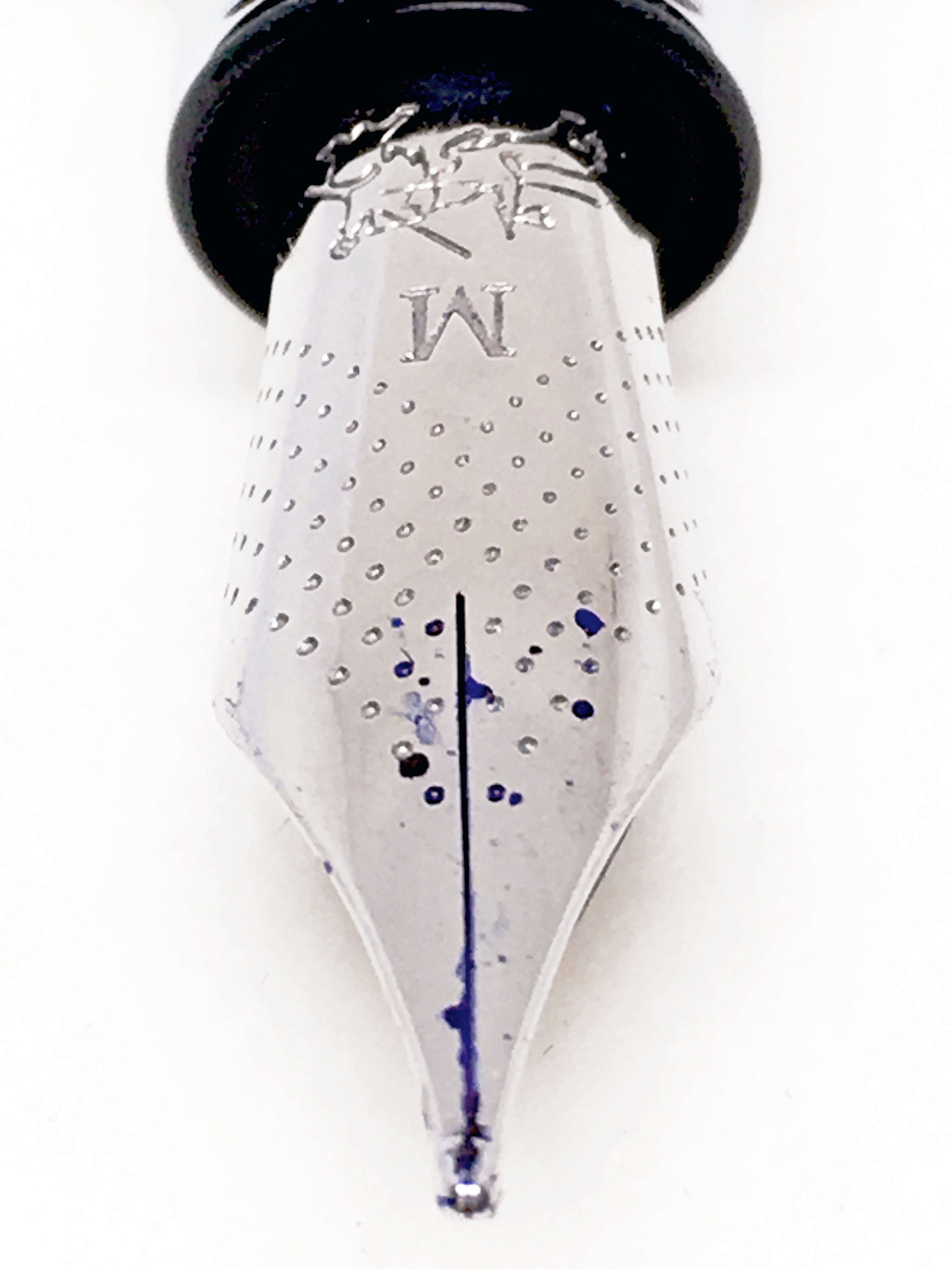
 

Best Fountain Pen
Whenever you read a review of the Pilot Kakuno it’s all about the great nib — and rightly so.

This nib lays down a flawless line and the fine nib is just what the doctor ordered for people who actually want a fine line from their fine nibs.

I continue to raid my son’s stationery drawer every now and then:
Pilot Kakuno Review Fine Nib


From the Pen Cup
An awesome lady with an awesome-laden jar. I’m really enjoying these Pens in Real Life posts Mary is putting together:
Pens In Real Life: The Jar of Awesome


Pen Economics
Another brand analysis — this time looking at that just about everywhere brand that is Lamy. To be honest I cannot recall looking much further than the couple of 2000’s I have in my collection (which I do love) as far as the premium end is concerned:
Brand Analysis: Lamy


The Hyperpessimist
Further to the link above, a viewpoint from a resident in Lamy’s home market, Germany.

I really liked the Safari back then and I also like my Lamy 2000. But their other premium pens? I am completely at a loss why these exist.

In the context of all this, I’ve had to search what the “other premium pens” in Lamy’s lineup actually are (and I say that merely through a lack of knowledge rather than inferring anything else). I suspect this might not be uncommon though.

But I disagree on the cheap segment. So far, Lamy does not have anything to fear from the Pilot Metropolitan (or it’s european variant, the MR) or TWSBI Eco in its home market, Germany.

Another interesting read:
Lamy From Their Home Market


Too Many Inks
In my books there is no one more deserving of some ink samples to play with — or should I more correctly say review. David does a great job in providing us with the very first look at a new ink release from Bookbinders Online, adding to their Snake Ink range introduced earlier in the year.

Being in the market for a nice red, I’m certainly interested, and after all, one can never have too many inks can they?
Three New Bookbinders Snake Inks


MacStories
Despite the fact this is a free app (now with increased features through in-app purchase), I’ve yet to give it a run, which is something I plan on rectifying soon.

LiquidText 2.0 can export every excerpt and note as plain text, which I should be able to import in Ulysses to start writing.

Hmmm…sounds interesting from someone who’d now about such things:
LiquidText 2.0 Brings Support for Multiple Documents


AFR.com
Having used Guvera as my main music streaming service for the past 6-8 months, I’m hoping things are looking up, as recent changes have seen much of my preferred music drop off the service for some reason or another.

The streaming platform has 14 million users in 10 countries, but unlike most subscription businesses, Guvera’s revenue strategy is focused on brands advertising on the platform, rather than subscribers.

In relation to the brand advertisements, Virgin mobile is a heavy one, however part of my love for Guvera (other than supporting an Aussie based startup) is the bonus 1GB of mobile data I receive each month for using the service as a Virgin mobile customer.

Interesting times ahead in a pretty competitive market:
Music streamer Guvera raising up to $100 million through ASX listing


The Bean Brewding Self-guided CBD Coffee Tour

2016-06-04 coffee_tour_frontSpecialty coffee has certainly enjoyed a rise in Brisbane over the past three or four years. Although a number of cafés and/or roasters have emerged in suburban areas, for workers in and around the CBD there has never been a better time to sample some of Brisbane’s finest coffee.

If you are inclined to agree, though are perhaps wondering where to start or visit next, Glenn and George at Bean Brewding have things well and truly covered. The team behind Brisbane’s first and only coffee tours (running since 2012) have devised a handy Self-guided CBD Coffee Tour, mapping your path to some of the better coffee stops across the city of Brisbane.

You can find out more about regular coffee tours of various regions in and around Brisbane, as well as other one-off events on the Bean Brewding Coffee Tour Page, and having attended several, I can highly recommend them.

The tour is a stroke of genius, and reminiscent of the “disloyalty” card which sprang up in London (or so I believe) a few years ago. Regardless of the name, the idea is to guide the budding sipper to establishments where great coffee is served, however might be outside the usual well-travelled radius from your office. Of course I should also acknowledge working in the Brisbane CBD is not a pre-requisite to enjoying the great coffee it has to offer either.

2016-06-04 coffee_tour_list

Listing eight cafés from Margaret St all the way across to Roma St and many in between, the tour operates in a similar way to the well-known loyalty card concept — in which your final stop (in this case the eighth coffee) is free. I’d argue however, the benefits of embarking on this journey far outweigh simply saving a few dollars.

In one sense, yes, it is a geographical journey around Brisbane’s CBD – however it is also a journey through different styles of coffee, roasters, brew methods, and cafe environments. It’s a way to experience something different, yet of a quality endorsed by some of Brisbane’s most experienced coffee drinkers. It’s choosing to step off that well-worn path from the office to your “local” and back.

For me, it is also the unexplored adventure of visiting somewhere a little different, in perhaps an unfamiliar environment — and revelling in the experience for a short while before that inevitable return to those elevator doors back at the office. If you think that’s overstating things a little, perhaps you don’t see your coffee and lunch breaks the same way I do. Fair enough — though either way, I believe you’ll enjoy this tour.

As they say, every journey begins with a single stamp (or something like that anyway), and I’m away. Of course as you can see, the one I have collected so far is at the end of that well-worn path I’ve referred to above, however I’ll get there. You see for me personally, my cafe life is a hopeless combination of familiarity and loyalty (the merits of which I am happy to vigorously defend), so I plan on using this card to do exactly what I’ve suggested above — sample the delights this city has to offer, and with the weather that little bit cooler, there has never been a better time to charge around the city.

So, whether you plan on working from top to bottom, or perhaps random number generating your way around — pick up a card from any of the participating cafe’s and get started. I’ll see you on the trail, or perhaps at the brew bar, and do check in with the hashtag brisbanecoffeetour — I’m sure the guys would enjoy hearing of your journey. Whichever way you go, might I suggest the idea is probably not to get through the entire list in one day.

Though I’m sure if we start early enough…


Wiser Web Wednesday

Wiser Web Wednesday – a semi-regular link to posts of interest from around the web, by those far wiser than myself:


Gorgeous.Ink
With a few Pilot Custom series pens sitting safely in my collection (many among my favourites), I would be lying to say the 823 won’t join them at some point in future.

…this filling system has seals that shut off the ink flow to the feed when the finial is screwed home. When writing more that a paragraph, the user must unscrew this finial approximately 2 mm to allow ink to pass by the internal seal and into the feed.

I’d agree with the conclusion of this great post from Paul, and in keeping with that theme — who’s going to pick one up for themselves? Anyone… anyone…?
Pen Review: Pilot Custom 823


Three Staples
The latest Field Notes Colors edition comes under the Three Staples lens.

Overall a unique and cheerful edition that reminded me once again that there’s never a dull moment in COLORS. But too many less-than-ideal features, like perforation, impractical body paper colors, and no ruling (my least favorite kind) make me place Sweet Tooth towards the bottom of my Field Notes ranking

Certainly a visually impressive edition, however as Jinnie concludes, it comes with a combination of features which certainly won’t suit everyone:
Field Notes Colors: Sweet Tooth


Too Many Inks
Queensland’s favourite ink collector again raises a nib after the scorer ticks over another milestone. This time a Ton of Noodler’s inks.

The post also includes some nice featured images of special editions taken from the ten by ten “grid of champions”:
One hundred bottles of Noodler’s ink


Pens! Paper! Pencils!
Ian takes a look at the music nib variation of the popular Platinum 3776.

I’m able to use this for day-to-day writing, which is not something I can say about other music nibs I’ve tried.

Although things may evolve in future, at the current time this is a key philosophy in the pens I own — there must be some element of everyday usability to make them worthwhile:
Platinum #3776 Music Nib Fountain Pen Review


The Gentleman Stationer
An enjoyable read and great overview of the world of nib customisation.

When you walk away from an appointment with a nib technician, you should have a pen that writes perfectly for you and your writing style.

Depending on your access to a nib technician, there may be some blind experimentation occurring with an online order, though I think on most occasions the results are positive:
An Introduction to Nib Customization


The Finer Point
Although I’m always happy to share samples of them here, as far as any attempt to make a go of the Bullet Journal system myself is concerned — the answer is a resounding no.

Some impressive pages here, however I just couldn’t do it myself. Hats off to those who can and do:
My First Steps into Bullet Journaling


From the Pen Cup
What can I say about this one?

Makes me want to go shopping:
Pens In Real Life: Taking the Gross Out Of Grocery Shopping


The Odyssey Online
Bethany Hargrove with a view on the daily life of a service industry worker, and the not so clear boundaries and customer expectations within it.

People in the service industry are getting paid to talk to their guests. It’s a crude description, but it’s true. I’m on the clock, and I most likely wouldn’t talk to you otherwise. My job is to be nice to people

True enough no doubt, though I can’t help but think some customers would make those dollars a little harder-earned:
Boundaries In Hospitality: Well, It’s Complicated


Daily Coffee News
If you’ve seen the recently updated coffee taster’s wheel (contained in this link), it may look just as overwhelming as the previous version.

With 116 identified attributes, the Taster’s wheel would seem to be a confounding prospect to anyone who doesn’t cup coffee professionally

Simplifying things quite a lot, I think the Drinkers Wheel is a great idea.

By contrast, the Drinker’s Wheel is remarkably simple, offering only six primary attributes: Nuts, Chocolate, Floral, Sweet Fruit, Bright Fruit, and Spices and Herbs

Providing some guidance towards the broader flavour groupings, and once mastered, should serve as a stepping stone to some of the more nuanced flavour profiles of the larger wheel:
This Coffee Drinker’s Flavour Wheel from Belgium is an Interesting Marketing Idea


Fika: to have coffee
What’s not to love about a documentary featuring a way of life in which coffee is an integral part?

Whether it’s with friends, family, or simply a great pen, blank page and potential – I think the Swedes have this one figured out:
The Series


Faber-Castell Ambition OpArt Fountain Pen

IMG_1192fc_ambition

Upon first seeing this pen and turning it over in my hand as all pen enthusiasts tend to do, I wasn’t sure exactly how much use it would see in the grand scheme of my pen usage. It soon became clear the answer to that question was a lot more than I’d envisaged on that first impression.

I have a certain fondness for uniformly cylindrical or straight-barrelled pens, the origin of which I’m a little unclear on, though it is present nonetheless. Perhaps it is the variety in appearance from the usual tapered, cigar-shaped form, or perhaps there is some suitability to my grip and writing style. Further consideration and rumination about such things in preparing this post brings me to the conclusion both are relevant, however I suspect it is more likely form rather than function.

The Faber-Castell Ambition OpArt is another addition to this subset of pens, and became regularly inked over the subsequent months.

Look and Feel

I’ve touched on the form factor a little above, however it bears repeating here. Of course I do enjoy the aesthetics and feel of my tapered pens as well, however find those uniform in diameter end to end pleasing to look at, and comfortable enough during use. As you can see from the images, the Ambition carries such a form factor, as does the Lamy Pur, which I wrote about a little while ago.

FullSizeRender 2fc_ambition

In the case of the Ambition, to accommodate the cap within this style creates both a substantial step down to the grip section, and a very short section once there. In this particular case the step transition is low enough on the pen (due to the very short section) not to worry me. If your particular grip style results in finger placement further down the barrel, there may be an issue. Alternatively, and again depending on your preference, this may provide a means of grip stability or a balance point, which I find occurs with the step on the section of a Pilot Metropolitan.

The overall diameter of the pen is not overly large, giving the impression of more length than there probably is, which incidentally measures 12 centimetres when uncapped, and almost 14 with the cap on (an identical length to a capped Lamy Safari for reference). The overall feel in the hand is one of lightness and even balance, which is unlikely to lead to any undue hand fatigue. Post the cap however and that is another story — more on this below.

The chrome-plated cap and bridge-shaped clip are certainly sturdy enough, and being on the shorter end of the spectrum suit the overall look of the pen. The cap fits flush with the barrel to create the appearance of one smooth form, contrasted only by the colour and texture of the barrel.

FullSizeRender 7fc_ambition


Speaking of which, it is in the guilloche texturing of the barrel which really gives this pen its character. The green colour you see here is listed on the Faber-Castell Australian site as the OpArt Curry edition. Though understandable, in the context of the some of the other colour names like Blue Ocean and Black Sand — it is a somewhat curious choice.

FullSizeRender 4fc_ambitionThe design of the pen gives the appearance the chrome-plated posting knob and section run continuously through the centre of the pen, however of course these are merely fixed to either end of the resin barrel, which ensures the overall weight remains low. In the case of the section, a threaded attachment allows access to the cartridge or converter.

Uncapped, the barrel is bookended by the chrome-plated posting knob and very small section — both of which are proportional in size. With the cap posted, you have a perfect mirror of the capped symmetry of the pen, with the exception of the exposed nib ready for use. The section flows on to the stainless steel nib, which has an attractive pinhole dot patterning, and although not overly elaborate — suits me fine.

Specifications

The following specifications courtesy Cult Pens:

  • Model: Faber-Castell OpArt Ambition Fountain Pen
  • Material: Metal and matt engraved guilloche resin
  • Cap: snap on, chrome-plated (very secure posting)
  • Clip: chrome-plated spring-loaded
  • Weight: 28g
  • Length: 138mm capped, 120mm uncapped, 156mm posted.
  • Stainless-steel nib.
  • Filling mechanism: Standard International Cartridge; Converter
  • Nib: Stainless Steel

As noted above, the Ambition uses a standard international cartridge, or Faber-Castell converter. As is often the case, other converters are likely to fit, however I haven’t specifically tested this.

As far as cost and availability are concerned, the Ambition can be found in variants of colour and barrel design/material at various online retailers:

My local pen stores Pen & Ink (AU$145.00) and The Pen Shoppe (AU$135.00) also have some listings. I would note the quoted prices here are for slightly different finishes, and can approach AU$300.00 for the Coconut Wood model for example.

Writing

The Ambition comes with a stainless steel nib, and it is a beauty. Equal to any of the other steel nibs in my collection, and better than many.

FullSizeRenderfc_ambitionBeing stainless steel, you expect a reasonably firm nib, and is certainly what you find here. A little pressure will provide some give, however a good deal of pressure is required for a minimal amount of line variation, and of course if that is what you are after this pen wouldn’t be high on your shopping list anyway.

The medium nib on the model I own is as smooth as they come, and I don’t believe I’ve seen a single line of a single letter ever skip — from the first stroke onward. Depending on your individual style, the firmness of the nib may dig in a little on softer paper, however with the medium nib I’ve not had any problems across a broad range from office copy paper through to Rhodia or Tomoe River.

The nib is not what you’d call spectacular in appearance, sporting a very small Faber-Castell two jousting knights logo and series of pinholes patterned in V-shaped alignment with the nib, rather than a single breather hole. Finishing things off is the M nib width designation.

Although not a large nib, it is a little longer for its size than some of my others, which suits the overall balance of the pen when writing. As I’ve mentioned, the very short section on the pen will, for many, necessitate a grip above this point a little further up the barrel. The length of the nib assists the balance of this arrangement by providing a little extra reach towards the page.

I do not typically post many of my pens, and I would think the weight of the cap will likely prevent that with the Ambition, even if posting was your usual preference. Once posted, the pen’s centre of gravity is shifted to the join between the cap and the barrel, which is very high, and well above the webspace of your hand. Upon writing this way it almost feels as though the nib constantly wants to lift off the page.

Comparing the weight of the cap in one hand and the pen in the other, the two feel reasonably similar, and upon checking, the cap itself weighs in at over 14 grams. Perhaps not astounding in itself, however if we refer back to the specifications above, the entire pen is listed as 28 grams (I make it 27 however you get the idea)! That is over 50% of the entire weight in the cap alone (many of my other pens are around 30-40%). Although considerable, it is not surprising given the dramatic change in balance when posted — which I would not really think is an option unless you have fairly large hands.

FullSizeRender


Over longer writing sessions, the Ambition is probably not quite as comfortable as some larger diameter pens with a tapered form, however here I am referring to a three or four A4 pages before I began to have those thoughts. As a result, I found most use occurred with tasks such as outlining a post over two or three A5 pages, or using a coloured ink to mark up printed documents and the like. For longer conference call note taking or handwritten first drafts, the level of hand fatigue I’d say was probably a little higher than some of my other pens. Of course that is exactly why I have more than one — and I’m happy this is one of them.

Signing Off

How to sum things up with the Faber-Castell Ambition?

FullSizeRender 3fc_ambitionOverall, it is a well-balanced (sans posting) pen with one of the smoothest stainless steel nibs I own, housed in an unusual and eye-catching finish. I’m quite find of the uniformity in the cylindrical form of the pen, and have no problem with the shortness of the section when it comes to writing. If you are perhaps hesitant to spend in the mid one hundreds, I wouldn’t be concerned in relation to the nib. If the design suits your taste, I’m sure you’ll find the nib an absolute bargain given its performance.

A great combination of attractive form and superb function, though as always, particularly if you have concerns about that section — always best to try before you buy (often difficult I know). I personally found it better for short to medium length writing sessions, and will be happy to pick it up often for such occasions in the future.

Now, I’m off to do other things — I have ambition you know.


Wiser Web Wednesday

Wiser Web Wednesday – a semi-regular link to posts of interest from around the web, by those far wiser than myself:


The Pen Addict
I enjoyed this piece on vintage pens, as I can see myself eventually looking in that direction as my experience continues to grow within the hobby.

Posts such as these will be infinitely helpful when that time comes:
Vintage Pens for People Who Think Vintage Pens Are Scary


The Desk of Adam
Back in my school days, mechanical pencils were certainly in heavy use in the classroom, with rOtring providing most of the supplies for my grade 9 and 10 tech drawing class.

Since then, my desk hasn’t seen the likes of a mechanical pencil very much at all. Great reviews such as these might lead to me reconsidering that situation:
rOtring 600 Mechanical Pencil Review


The Finer Point
The Zebra Sarasa Clip remains a staple in my desk drawer at work, where often the paper and/or situation may not be conducive to my favourite fountain pens.

Anything below 0.5mm tends to be a little fine for me, and the Sarasa has been a go-to for quite some time now:
Zebra Sarasa Clip 0.5mm Review


Pens! Paper! Pencils!
Ian with a great review of what can certainly be described as a very striking looking writing instrument.

Somehow though what I feel when I’m using this pen is that it’s going to create its own history. It’s going to write millions of words, it’s going to create it’s own story, it’s going to write trivial nonsense (as it did while it was with me) and it’s going to write some words that will be very important in some people’s lives

I’m also probably not the only one picturing Ian’s slightly trembling hand ever so delicately placing the pen on that scratch-inducing mosaic table for the photograph:
Yard-O-Led Grand Viceroy Victorian Fountain Pen Review


Alt. Haven
I mentioned in a recent review of the Lamy Nexx and Pelikan Pelikano entry-level pens I didn’t think those two necessarily looked as such. The Twist – to me at least, probably does, which of course doesn’t exclude it from being a great pen for the intended purpose.

However the moulded grip is extremely opinionated. It insists loudly that there is only one right way to hold the pen. You either have to conform or suffer trying to shoehorn the pen to your own writing style. The triangular grip on the Lamy Safari is way easier to handle in comparison. I do not write with the traditional tripod grip and the grip section bothered me greatly.

I would say I have a standard sort of grip when writing, and even I often find myself fine tuning my grip as I go — even with something like a Lamy Safari. Not sure how I’d go with the Twist1:
Review: Pelikan Twist


Sprudge
An outline of the proposed merger between the Speciality Coffee Association of Europe (SCAE) and the Specialty Coffee Association of America (SCAA):

What both groups propose is a hybrid organization, one that hopes to expand opportunities for education, professional development and leadership training, as well as an expanded calendar of events.

With questions raised about the real benefits to the respective membership bases, it will be interesting to see the final outcome.

As simply a keen non-industry observer, probably about the only thing I can offer is an appropriate acronym, which mathematically works quite well – SCA(A+E):
The World’s Largest Coffee Trade Organizations Want To Unify


Observer Business & Tech
I must admit at times I’ve wondered, though probably not enough to actually ask the question of people toiling away at my favourite cafe.

Two gentlemen decided to do just that, and wrote about the answers:
What Are People Working on in Coffee Shops?


ABC News
Coffee may be involved, however this programme has more to do with the great people behind organisations like Mission Australia (many of whom are volunteers) than the beverage.

Mission Australia programme manager Sarah Brown:

Unfortunately we lost some funding down in Brisbane, so we brought the van up here as a great opportunity for us to support our clients

It’s easy to forget the difficulties organisations such as these face in obtaining funding for the great work they do:
How coffee is changing the lives of the long-term unemployed in far north Queensland


The Specialty Coffee Chronicle
I like the idea of this “palate training” process. Sometimes I feel the flavours whose names escape me might just be helped by exercises such as these. That said, perhaps “a little fruity” might just continue to suffice:
The Importance of Exercise: Palate Development


Huffington Post
What sort of effects are you faced with in kicking a caffeine habit? Everything you’d expect really.

Although I can suggest a relatively easy way to avoid them, a piece on said effects here:
What Happens To Your Brain When You Quit Coffee


FlowingData
Although of course you may interested in the average, per person daily consumption of various foods in the American diet since 1970.

For me, the presentation of… well … flowing data caught my eye:
The Changing American Diet


Ulysses Blog
There is a lot to be said about getting down those ideas somewhere, whether related to your novel or not.

If it’s a dumb idea it doesn’t matter. If it’s a lost one it does.

Upon reflection, unfortunately most of mine sit firmly in the former of the above categories:
Ten Things You Should Know About Writing a Novel With Ulysses, by David Hewson


Academic workflows on a Mac
Although I don’t use TaskPaper myself, there are plenty who do, and seem to love it. This sentiment only seems to be growing with version 3.

Most visibly, it allows to collapse or expand items as well as focus on specific projects in the side-bar, thus acting as an outline and not simply a linear task list.

Tempting indeed:
TaskPaper 3


The Brooks Review
Upon reading and listening to concerned voices about Apple’s position in the AI/Big Data realm, I found myself shaking my head thinking: Nah, I don’t agree with that. Why exactly? I’m not one hundred percent sure.

I think however, it is probably something like this:
Avoiding BlackBerry’s Fate


Evolving Economics
Make of this what you will:

Today I want to muddy the waters. Not only is the “we can save the world” TED talk angle that tends to accompany behavioural science stories boring, but this angle also ignores the problems and debates in the field.

I have attempted of late to read a little outside my usual sphere of content. To that end I have been ably assisted by a kind reader providing some audio content for my listening pleasure as well.

More of this reading will likely find its way here on the occasional Wednesday:
Bad Behavioural Science: Failures, bias and fairy tales


  1. Incidentally — I can bust a move; here I’m talking about the pen in the review. Just to be clear ↩︎