Wiser Web Wednesday

Wiser Web Wednesday – a semi-regular link to posts of interest from around the web, by those far wiser than myself:


Sprudge
While this method of brewing doesn’t sound overly enticing, given the content of this post, and those who swear by it, clearly there is some merit — and flavour it would appear.

After 5 minutes of brewing, stir the coffee or swirl the pot gently, and pour coffee slowly. If you would like less grit in your coffee, wait an extra 5 minutes after stirring

My advice would perhaps be to give it that extra 5 minutes:
The Lonesome Art Of Cowboy Coffee


Tools and Toys
A very thorough review of the Ascaso I-Mini coffee grinder by Álvaro Serrano for Tools & Toys. Noted in the review as a sub three hundred dollar machine, it is of course a little more expensive in local Aussie dollars (AU$380.00 from De Bartoli).

The i-Mini is a tremendous grinder that punches well above its weight, and once you take a long hard look at its rivals, it becomes increasingly clear what an incredible value it really is.

For my filter and Aeropress brewing, nothing beats my Baratza as far as I’m concerned. That said – it is certainly nice to read well presented and thought out reviews such as this one — usually what you find on Tools & Toys:
The Ascaso i-Mini Coffee Grinder Review


Five Senses Coffee
Although not all of these categories may be relevant to the choices you make when buying coffee – they are all variables which influence how the resulting brew will ultimately taste.

A great overview of what to consider when buying beans for your brew:
Coffee selection guide: How to choose the beans that are right for me?


Perfect Daily Grind
A look at two establishments applying age-old methods to coffee in Tokyo.

They decided that their coffee was a one-man show, that craftsmanship is more important than a line at the door.

Without a taste test I guess I cannot say how good they are for sure – I’d certainly like to give them a try though:
The Japanese Master Roasters Ignoring the Third Wave


Jimseven
James Hoffmann writing on the ever-increasing popularity of the Geisha variety within the coffee industry.

I’m not writing this as an attempt to claim some superiority in my preferences. I’m writing this because I’m not comfortable with the decision, that appears increasingly collective, that this is the thing we should champion

An interesting read containing some valid concerns around this disproportionately expensive varietal:
On Geisha


Crane Reaction
Todd Crane, formerly of That One Pen, transforms his online home — now covering a broader range of topics on a new blog.

From the man himself:

A place where a husband, father, teacher, science nerd, sports fan, music geek, tech user, pen and pencil dork, etc. tries to keep track of and understand as much as he can.

I’m looking forward to the new content, however to kick things off here — it has to be a pen post of course:

I enjoy some pens you can buy by the dozen at the grocery store and a couple of my pens come from limited batches.

Yep – a good pen can take many forms. As can a great blog. All the best with the new site Todd – it looks great so far:
A Good Pen Matters


The Finer Point
Whether you call them “top” lists, “favourites”, or “highly recommended” as is the case here – it is universally accepted we all have our favourites, be they for our own use; recommendations to others; or both.

Though I’m not necessarily familiar with everything on this list – I think you’d be pretty safe to count on Jenny’s recommendations:
My Highly Recommended List


Pens! Paper! Pencils!
Upon first seeing the images in this post, I thought: yes, that’s a striking design, yet retains a certain degree of class, only for Ian to describe it thus:

It looks like a reptile all dressed up for a night out at a 70s themed nightclub

Regardless of which more closely aligns with your own thinking, this pen would be well worth winning for your own collection. Check out the post for further details:
Twiss Green Lizard Fountain Pen Review


ScotchWhisky.com
To peat, or not to peat. A couple of industry figures give their (at times somewhat irreverent) views on the matter.

Balance and co-existence are probably key words to remember here:
The Debate: Peated whisky: the ultimate dram?


Some Fountain Pen Friendly Budget Notebook Options

2016-07-10 all_three_blog_postIf there is one thing I am somewhat mindful of in this hobby (or obsession if we’re being honest) relating to pens, their associated inks, and paper — it is the cost of feeding the habit. I am not even speaking of bigger ticket items such as a quality fountain pen or leather-bound notebook — simply those everyday stationery purchases we often make.

Of course relative to that new pen purchase, a notebook or notepad remains fairly cheap by comparison, irrespective of brand or manufacturing quality. Although your standard A5 (No. 16) Rhodia pad may come in at AU$7.00 – $8.00, and even the A4 variant only AU$13.00 – $14.00, things can go skyward pretty quickly when stocking up on a few “essentials”. Like many, I have boxes and drawers filled with a collection of such products ready to be called into action when the inclination or need arises.

That being the case, why the need to seek out lower end options? A valid question, and I often ask myself whether I have become someone who buys something just because it is cheap — regardless of quality. However I can assure you I do have some standards, and only search for, test out, and put into ongoing use the products which although may not be perfect, will at least pass those minimum standards and be enjoyable and satisfying to use. I am certainly not going to put up with poor paper just because it was a bargain, spending my writing time cursing at the ink feathering or nib catching on cheap, rough paper.

At times I’ve actually found certain features in some of the cheaper options have suited me a little better than some of their higher priced cousins. Let’s face it though, there is a certain amount of satisfaction to be gained in finding some local, readily available alternatives which reduce the rate at which I burn through those more “premium” products.

I do acknowledge I am lucky enough to have access to many retail outlets given I work in the Brisbane CBD. All of the products here were simply bought off the shelf, and if available online, result in additional postage charges, rendering them less of a budget buy. I do feel for those of you unable to simply walk by in your lunch break, drop a few gold coins and walk out with a notebook or two.

As always, my intention is not to sell these products to you — merely to report in on how I found them to be valid options which are a little easier on the budget. All three I purchased myself, and I have no affiliation with any of the manufacturers or retailers.

Kokuyo Campus B5 Notebook – AU$2.80 DanDa

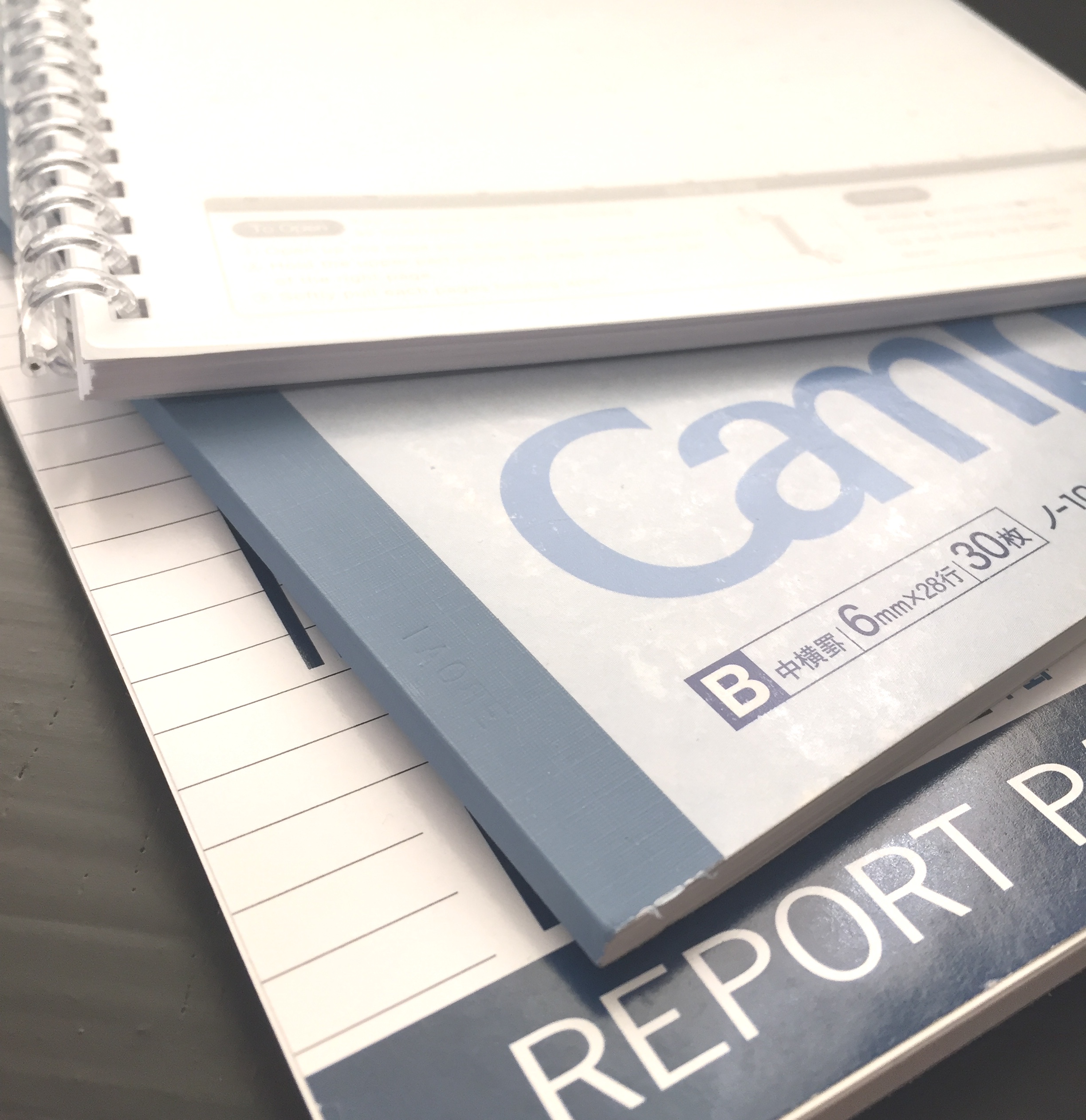
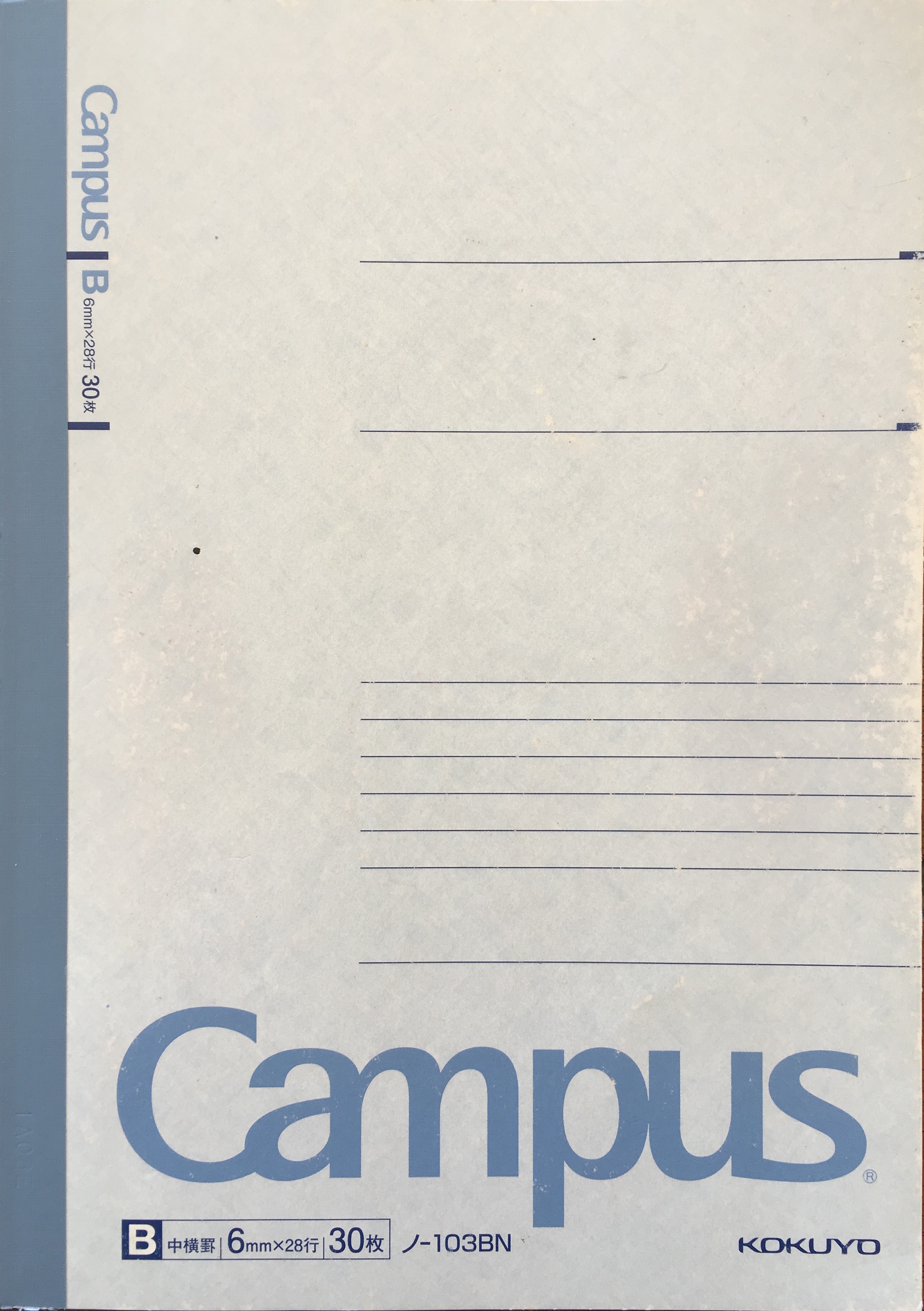
2016-07-10 campus_cover_blog_postThis notebook has been in daily use for the past month or so, and performed extremely well at the task. As you can see the cover is a little worn. “Daily use” generally involves blog post drafts, coffee tasting notes, general notes or song lyrics rewritten to test out a pen or ink. Many and varied content, however a common theme being longhand writing — often several pages at a time.

Design wise, the Kokuyo Campus series comprises a selection of thin, glue bound (external tape reinforced) notebooks unadorned with any additional pockets, closure straps or the like. They actually remind me of a standard school exercise book in many ways (perhaps with the exception of the better paper quality). The cover is simple card stock, which is not overly thick however does the job as intended.

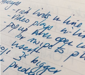
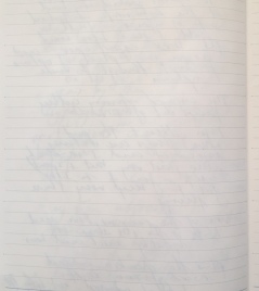
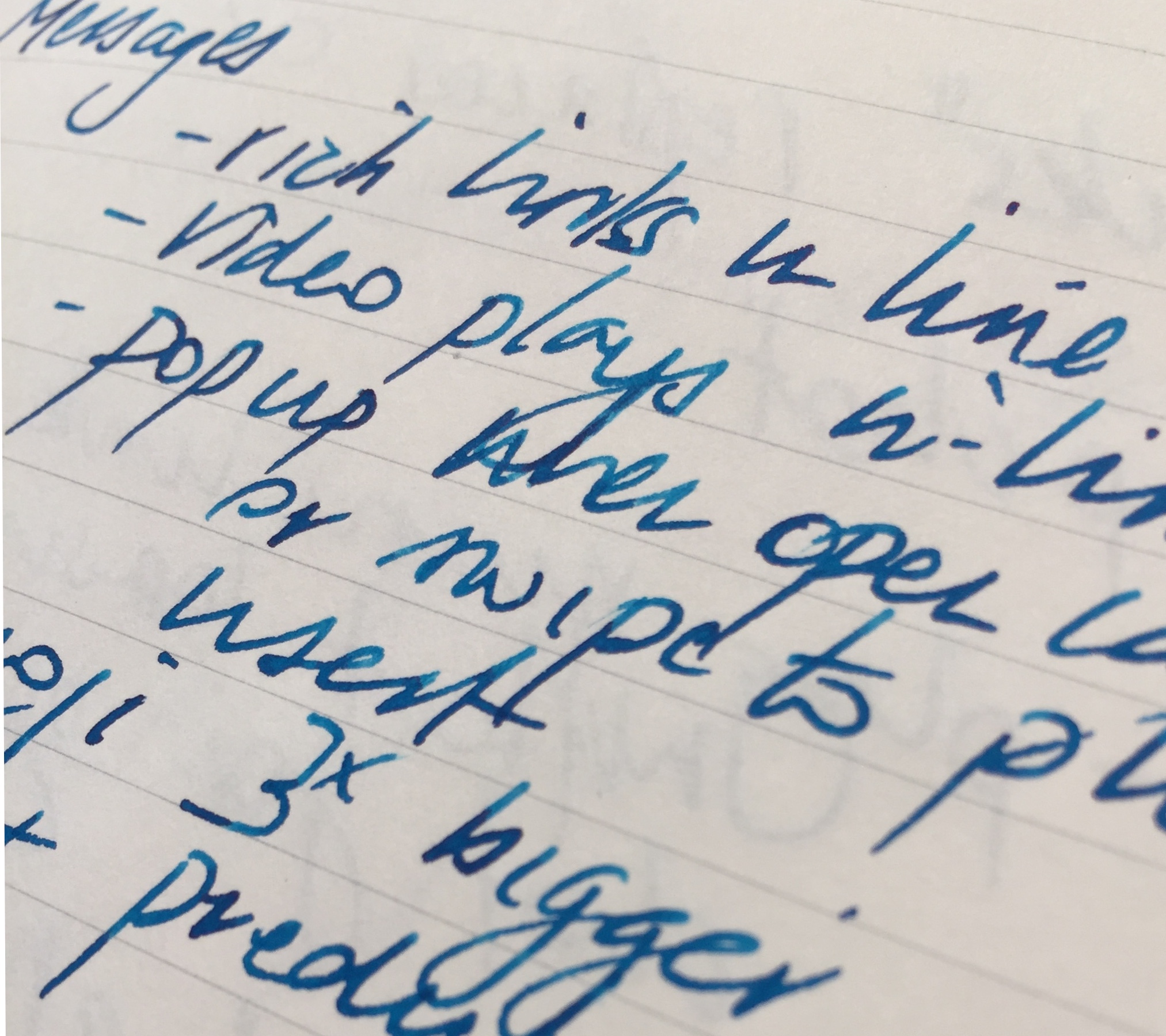
Not having used any of the Japanese made Campus line of notebooks before, the quality of the paper was certainly pleasing, though not a complete surprise given listings with online retailers noting the paper to be decidedly fountain pen friendly. The 70 gsm paper handled my daily writer (typically M or F) fountain pens with aplomb, showing no feathering, bleed through, nor ghosting of any significance. Writing is almost as smooth as you’ll find anywhere — great paper for most fountain pens.
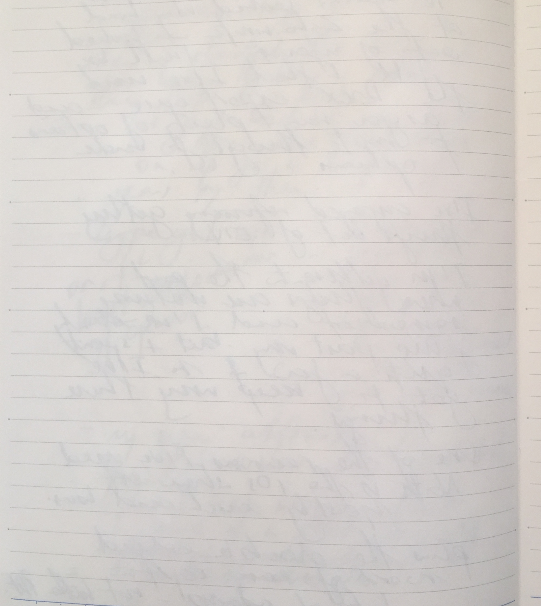
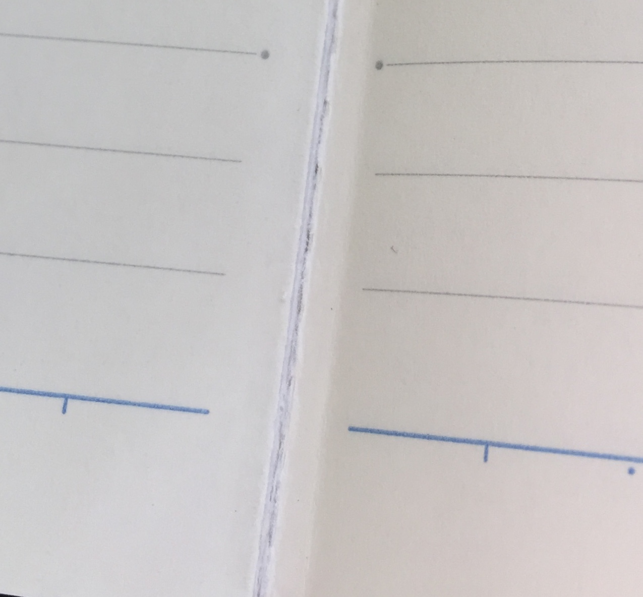
2016-07-10 campus_close_blog_post2016-07-10 campus_reverse_blog_post

With a 0.7 mm Retro 51 refill, the show through was just a touch more evident, however as always I also put this down to my heavier hand when using rollerballs or ballpoints.

The slightly off white paper shade provides a perfect canvas for true ink colour representation, and dry time is comparable to, if not better than some of the heavier weight papers — dependent on ink type of course.

The Campus line of notebooks comes in various sizes in plain, ruled or grid options, and the pre-printed No., Date and bold title lines at the top of the page are a nice touch. Although my numbering always goes in the bottom right corner of each right hand page, other indexing or notations can always take advantage of the field provided at the top.

The model I’ve been using contains ruling at 6 mm spacings, with contains additional 7 mm markings along the top and bottom lines for reference in the vertical plane.
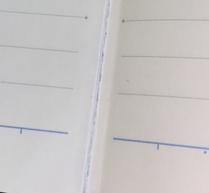
2016-07-10 campus_spine_blog_postOverall I am very impressed with this thin, light, high performing notebook, and if there were any negatives, it is probably only the binding, which is beginning to stretch a little in the initial pages. I suspect I have contributed to this by regularly (and unnecessarily) bending the book back on itself to then lay it flat for writing — probably not the best habit given running the heel of my hand up the open book would achieve the same result. Coming in at 60 pages, I imagine most will have this notebook filled and move on before any real issues are seen with the binding, however it is perhaps best to take at least a little care.

I’ll certainly be buying from the Campus line of notebooks in the future, and if you haven’t already — I’d highly recommend at least trying them out. For the princely sum of AU$2.80, there is not a lot to lose, and as far as I’m concerned is quite the bargain for what you get.

Side Note: The design and evolution of the Campus series of notebooks is also an interesting story.

The Complete Report Pad — AU$2.80 Daiso
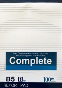
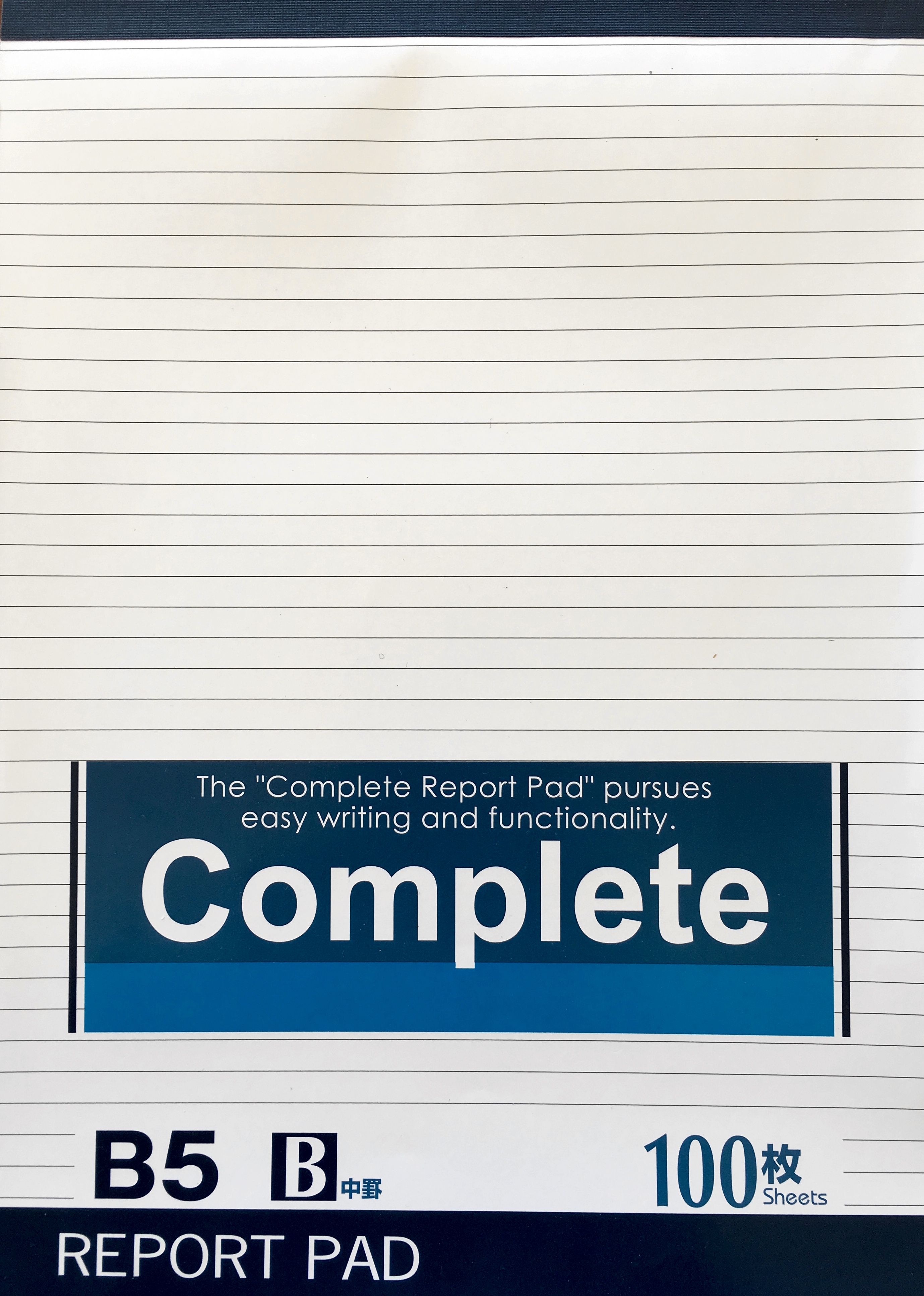
2016-07-10 reporter_cover_blog_postThis particular purchase was driven by the need for a “correspondence” notebook or notepad which was fountain pen friendly, contained tear off sheets, and was a little larger than an A5 Rhodia No 16 notepad.

The specific reason for this being I write a good portion of the letters I send during my lunch break, and often do so sitting at the bar of my favourite cafe in the CBD. Said bar is fairly narrow from front to back, and not therefore suited to the Rhodia A4 sized pad I had been using. Having resorted to the A5-sized Rhodia No 16 instead, ideally I wanted something in between to fill the void, with a B5 sized notepad was of course the way to go.

The Complete Report Pad is an Indonesian made B5 tablet style notepad sold through Daiso, and as noted above — for a bargain basement price.

The top binding is again glue with tape reinforcing, and allows straightforward tearing of sheets from the pad once completed. The front cover is your standard glossy, slightly thicker paper stock, with the rear thickened cardboard. Both do their respective roles as intended, however the front cover is not designed for very rough use.

Of course the most important aspect is the paper. Ruled at 6 mm spacings, the pages also sport a title bar along the top, containing pre-printed Date and No. fields. There are also 6 mm divisions marked at across the top and bottom-most line of each page. The ruling and printed divisions/fields appear on the front facing side of the page only, with the intention of single-sided use.

I’ve not been able to find specifications as far as the weight of the paper is concerned, however a reasonable estimate would be in the order of 70 gsm or so. Whether this is correct or not I am not sure, however the performance is certainly comparable to papers around that type of weight.

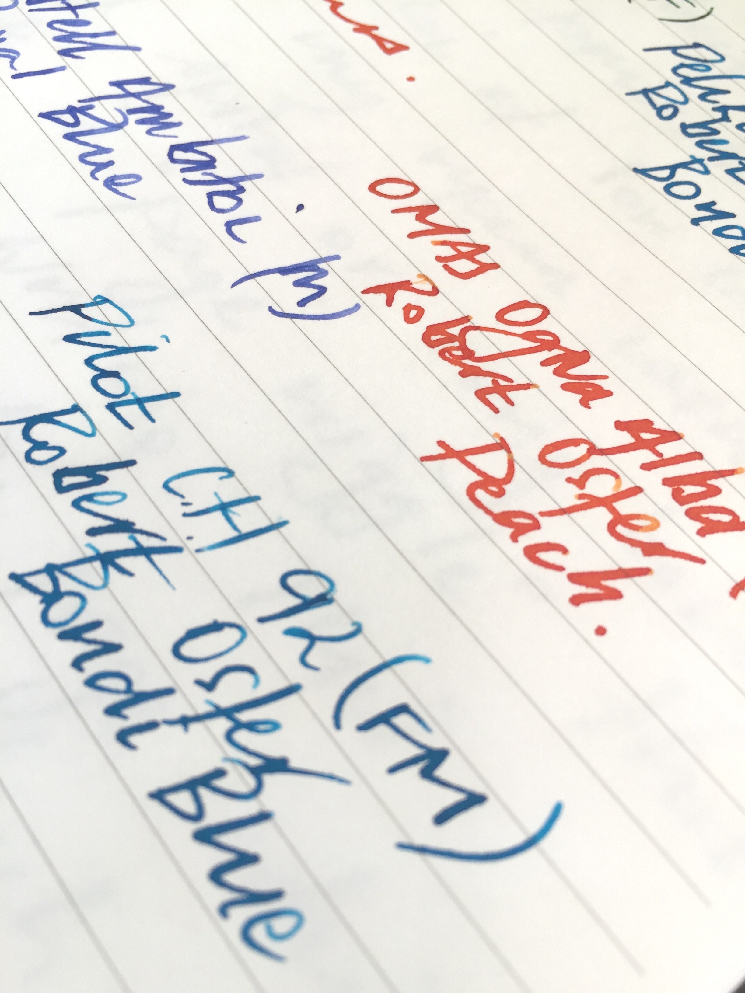
2016-07-10 reporter_close_blog_postWriting performance is very, very good for the price you pay for this notepad. It is not dissimilar to the Kokuyo paper I’ve described above, yet is marginally toothier to the feel. Again I’ve used numerous fountain pen nib types (M and finer) and inks with no problems. A small amount of ghosting with no bleed through; feathering is non-existent; and the overall feel of the paper provides a pleasant writing experience. I’d still describe this paper as being relatively “smooth”, yet of course it is not your Rhodia or Clairefontaine.

There really isn’t too much more to say about this one. For my intended purpose of finding an appropriately sized correspondence notepad, The Complete Report Pad is just about perfect. For the price you can pick these up for, they are exactly the sort of thing to grab a few and leave them in the various places you may jot down a few words or as I do — write a letter.

Wonder if they’ll let me leave a stack on the end of the bar?

Aqua Drops Twist Ring Notebook by Lihit Lab – AU$4.70 Officeworks
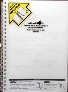
2016-07-10 aqua_drops_cover_blog_postHere is where I’ve really upped the ante, with the 30 page Aqua Drops Twist Ring notebook thundering through the register at a cost of AU$4.70 — almost double the price of the two mentioned above. To me it is still considered a budget option, though in the same store you can pick up a Rhodia No 16 Notepad for a list price of AU$7.16. There is also a B5 sized Aqua Drops notebook listed at AU$5.00 — agin for 30 pages.

The choice here though is not necessarily just price, but some of the utility gained in features of the Aqua Drops Twist Ring — namely the fact it is easily refillable, and those refills can be obtained in plain, ruled or grid loose leaf sheets. A packet of A5 refills will set you back AU$2.95, so in effect, once the notebook is purchased you have endless refills at a similar cost to the products above. I’ve mentioned the B5 size, and refills for this size are AU$3.50.

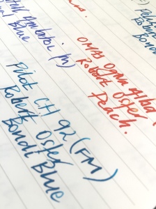
Although the utility of refilling and/or rearranging sheets in this notebook is probably the main drawcard, the writing performance is right up there as well. This is super smooth 70 gsm paper, and any nib or tip will glide happily across its surface. All of your ink colours will shine on the white paper, and while the lines are not overly dominating, aren’t quite as light as the Campus notebook.

If you are a heavy fountain pen user, and use a lot of broader nibs combined with wetter inks, the paper is probably not going to be up to scratch for double-sided use. However for my medium nibs and finer, the only negative is a little ghosting on the reverse of the page. There is no bleed through or feathering to be seen at this end of the nib spectrum, however my European mediums were right on the cusp of feathering with certain inks.
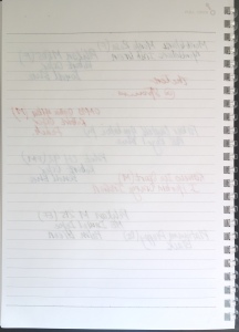
2016-07-10 aqua_close_blog_post2016-07-10 aqua_reverse_blog_post

The refill system is quite straightforward, with a tug on the top and bottom of the page adjacent to the spine when the notebook is open, popping apart the rings. I’ve not had the product long enough to comment on the longevity of the plastic spirals, however they seem strong enough. Fatigue with repeated use may perhaps be a factor, though equally it may not. Being circular in shape, the rings feel quite strong, however I wonder about something like a heavy textbook being dropped on the spirals — which I guess you’d never know until it happened.

My other main quibble, which isn’t unique to this particular product — more so with spiral bound notebooks in general, is the inevitable “page wiggle” which occurs while I’m writing. Unless the pages are a fairly tight fit on the binding, which tolerances generally prevent — I find myself needing to hold the page steady rather than simply resting my free hand on or beside the notebook. Not a big deal however I do find this a little annoying to constantly do.

With a packet of grid refills, I’m planning on using this as a recording notebook for my coffee roasting. Perfect.

Three new notebooks — budget intact

Although this post is not intended to be a head to head comparison of the three products I have described above, I have certainly come out of the experience a little more knowledgeable on the merits of each. Also worth mentioning in addition to those above, is the “X” branded spiral notebook from Officeworks which I have previously written about.

To be honest, I would buy and use all three again. One thing is for certain though, the B5 Complete Report Pad is now my default for written correspondence. I love the size, the paper is great, and sheets tear off with ease. A definite ongoing purchase when the current one runs out.

Of the other two, the Campus Notebook slightly edges out the Aqua Drops, and appeals mainly based on the quality of paper and overall lightweight yet quality construction. The Aqua Drops notebook series I consider a solid option, and for me, would be an ideal “project” notebook, as the option to add, subtract, or rearrange pages (of ruled, plain or grid options to boot) is a real positive. A few sketches and notes as part of a project negates the ongoing “page wiggle” issue of prolonged writing sessions, and tends to be where a lot of spiral bound notebooks I try end up.

As I mentioned above, I do find satisfaction in seeking out lower cost stationery options, which, admittedly aren’t always on point, however the three above are great options to try out for yourself. If they don’t suit? Well, I guess you haven’t really lost much in finding out.
Wiser Web Wednesday

Wiser Web Wednesday – a semi-regular link to posts of interest from around the web, by those far wiser than myself:


Light & Ink
With one method of export in text editing app Ulysses now DOCX rather than Rich Text Format, some workflows may have suffered a little. Although I don’t often export with either, this workaround might be handy for some.

One that’s new to me is Zoho Writer. I installed it after checking the features page and seeing that it did indeed have RTF export. One nice feature is that it also shows up in Ulysses’ share sheet when exporting as DOCX.

Where there’s a will there’s (usually) a way:
Patching the RTF Hole in Ulysses


Katie Floyd
I’ve listened to the Mac Power Users podcast for long enough to know that if one Katie Floyd is reconsidering her Evernote situation then significant changes have occurred with the app. Of course that is exactly what has occurred with recent pricing increases causing many to rethink whether Evernote still has a place in their monthly subscription outgoings:

I understand the need for subscription pricing and sustainable revenue streams for App developers. But sometimes it feels like we’re being pecked to death by ducks.

I must admit for the first time, I’m seriously looking at other options including either dropping my plan down to the plus level or canceling the service all together.

I’ve mentioned on these pages before my slow migration from Evernote to Apple Notes. This remains incomplete, largely due to my extreme apathy towards sitting down and determining if I even need a lot of what remains inside Evernote.

Interesting times ahead with so many alternate apps which may not be exact Evernote replicas, yet might do the job well enough:
Sad Elephant


Fountain Pen Quest
Although my entire fountain pen collection almost fits into the array of Nock Co. cases I picked up in the original Kickstarter campaign a couple of years ago — that is not to say other options do not appeal.

This offering from Visconti, the subject of Ray’s keen eye, is a nice option if requirements call for a more rigid protective case:
Review: Visconti Dreamtouch Leather 3 Pen Holder


Ed Jelley
Upon seeing the Schon design pen pictured around the Internet, my main concern centred around the weight — simply from a personal preference point of view.

While the form factor is great for EDC, the weight of the stainless is just a bit too much for my taste. It’s fairly noticeable when you’re carrying the pen in pocket, and even more so when using it

I’m sure there are those who love the weight, however as always — each to their own in this hobby. There are plenty of great options for everyone.

A thorough review as always from Ed:
Schon DSGN 01S Stainless Steel Pen Review


Alt. Haven
Although I love my fountain pens, I do enjoy using great ballpoints and rollerballs almost as much.

Having a couple of Lamy 2000 fountain pens in my collection, the multi-pen variant of the 2000 line is certainly never far from the pens I consider as “possibles” in terms of future purchases.

Junee with another great review:
Review: Lamy 2000 Multipen


The Pen Addict
I’m a firm believer in highlighting posts such as these, for you never know when those new to the world of fountain pens enter the neighbourhood.

Although good reference posts exist, as far as I’m concerned the more the merrier, given it only increases the likelihood new users will come across information which is highly relevant and useful to the hobby:
Zen and the Art of Fountain Pen Maintenance


The Gentleman Stationer
As I work my way through the many pen reviews around on the internet each week, I have often wondered both (a) how do the prolific reviewers get through all of the pens they have queued up; and (b) how on earth do those reviewers ever get to use the pens they really enjoy and are favourites?

This might be the nerdiest thing I’ve ever written, but I needed to do something.  I didn’t like the feeling that the idea of testing and using different pens was overriding the joy I should be feeling in using them in the first place

The answer is to create a system such as the one Joe mentions here. A great idea, yet one that also reminds me how thankful I am I don’t have to:
Choosing Pens for the Daily Carry


The Pelikan’s Perch
Generally I’m more likely to add different pens to my collection rather than different colours of the same or similar models.

However, this soon to be released offering from Pelikan certainly tempts me to add to the red and the black M205’s currently in my collection.

Brough to you of course where you find all your Pelikan news:
News: M205 Aquamarine Special Edition Demonstrator


Too Many Inks
If I’m remembering the system correctly, this looks like ink number 355 entering the Too Many Inks stable.

BMW Blue didn’t disappoint, thought the scan below doesn’t do it justice, this ink shades very well with the dark areas having a red highlight just like the best of the shading blues from Sailor or iroshizuku. This is one very nice blue, I look forward to using it at the office this week.

Look, I’m very pleased the BMW Blue is an impressive ink and has gone to a good home, however someone has to do the responsible thing and say it: David – please don’t ink and drive1:
Montblanc for BMW Blue


Crónicas Estilográficas
Now that — is an interesting nib:
East Pen Made in Tokyo


ScotchWhisky.com
Having been earlier this year diagnosed with Coeliac Disease, I have a new found respect for the importance of accurate and clear labelling on the products we consume.

Ivan Menezes, CEO of Diageo, said: ‘We believe people should have the best possible information to make informed choices about what they drink: this includes alcohol content and nutritional information per typical serve. Johnnie Walker is one of our largest global brands, which means these new labels will arm millions of people around the world with clear information about what’s in their glass and in a way they can understand at a glance.’

Upon looking at the labelling, the benefits of listing kJ/calories and six further zero’s for the remaining nutritional categories may be questionable, though for the reason I’ve mentioned above, I am not complaining about steps taken in labelling standards.

Besides, I don’t really think you’ll find any negatives resulting from such a move inside your usual bottle:
Johnnie Walker to count calories on labels


jimseven
The struggle to further grow specialty coffee is real.

So here’s the problem: what we perceive as our biggest asset to win and retain customers doesn’t work the way we want it to. Not enough people are interested in upgrading the coffee they drink.

Of course it wouldn’t be a jimseven post without some valid solutions:
A customer conundrum


Sprudge
Although it might be summer in the Northern Hemisphere — it’s always BBQ weather in Brisbane:
Coffee BBQ Rub Is Magically Delicious


  1. Yep. Wow. Not only did I think of that – I actually wrote it. My apologies. ↩︎

What’s Brewing: Colombia San Marcos

I’ve been roasting and sampling quite a few coffees of late — certainly too many to write about all of them. There are however probably a couple worth mentioning — one of which is this beauty produced by a group of small farm-holders under the San Marcos name in the Huila region of Colombia.

The Region

Wikipedia tells us:

Huila (Spanish pronunciation: ˈwila) is one of the departments of Colombia, and is located in the southwest of the country, with Neiva its capital. Colombia’s second highest peak, the Nevado del Huila volcano, is located in the Huila department. The Magdalena River is Colombia’s largest river, and rises in the Huila department, with the river valley containing some of Huila’s most important towns.

Of course much of the country has a strong heritage with its coffee growing regions, and nearby department Quindío houses the National Coffee Park.

Again from Wikipedia:

The National Coffee Park (Parque Nacional del Café) is a theme park located in the department of Quindío, Colombia, 4 km south-west of the town of Montenegro and 11 km west of the departmental capital city Armenia. The park can be reached from a cable car, offers attractions orchid animatronics colorful, global coffee garden, a roller coaster, food stalls based on coffee, Colombian folk architecture, and other attractions.

1024px-Colombian_National_Coffee_Park_195

The Colombian National Coffee Park – Image courtesy Uria Ashkenazy

The Coffee

All information in this section courtesy Ministry Grounds Coffee:

  • Coffee: Colombia San Marcos
  • Region: Huila
  • City: San Marcos, Timaná
  • Variety: Caturra (70%), Colombia
  • Altitude: 1,500 – 2,000 metres above sea level
  • Processing: Fully washed and dried on raised beds
  • Owner: 30 small holder farms
  • Tasting notes: Balanced and clean, with bright orange acidity, intense sugarcane sweetness, and notes of milk chocolate, caramel, honey and marzipan and lingering sweet finish.

The 30 small-holder farms under the San Marcos name, farm in the town of Timaná — located in the south of Huila, 180 km from the state’s capital Neiva, a prime location for growing high quality Colombian coffee.

The San Marcos small-holders are members of the Association of Agricultural Producers of Timaná (Asprotimaná), who have helped this group find access to specialty markets for their exceptional coffee. Created by a small group of coffee growers in 2002 as a way to increase their bargaining power and achieve a better price for their coffee, currently the association has around 150 coffee producing members, who produce on average a total of 10,000 bags of green coffee annually.

The Brew

I often order in South American coffees with the expectation of fairly bold, full-bodied results in the brew. This offering from San Marcos in many ways achieved that, yet with exceptional balance and subtlety as well.

Brewed in a V60 drip filter, the end result was an exceptionally creamy, medium bodied drink, with a smooth, lingering finish. The overall flavour profile I’d describe as choc-orange, however there were definitely notes of blackberry, honey and toffee in there as well.

Whilst not as clean when brewed with the AeroPress, it was very well-balanced in the cup, displaying perhaps a little more of that toffee sweetness. It was enjoyed equally as well by my buds in our little office coffee collective as a start of the day pick me up.

When brewed as Espresso, again, the combination of orange acidity, sweet toffee, and chocolate, made for a choc-orange bomb in a cup. A real winner on all counts. When combined with milk in a cappuccino or flat white, although a little more subtle, the sweetness of the milk and those choc-orange flavours presented a Jaffa milkshake of sorts.

The Finish

This offering from the small-holders of San Marcos is well worth trying, whether you’re a filter or espresso type, and will serve you equally well through either method. If – like me — you are both, then there is a treat in store with this superb Colombian.

It looks as though there is still some available on the Ministry Grounds website (links above), and it would be advisable to get on over and order some, otherwise I might just snap up the rest.


Wiser Web Wednesday

Wiser Web Wednesday – a semi-regular link to posts of interest from around the web, by those far wiser than myself:


The Clicky Post
If you’re around the pen community long enough, you will see the inevitable (or so it seems) progression from wherever people start — to fountain pens. Perhaps even more inevitably, you feel you should be doing the same. Mike knows the feeling, and has written a fantastic post here — and judging by the comments, it struck a chord with many.

Lets say you are one of those people that really doesn’t like fountain pens. Sort of feels like you’re the odd one out or that you have to pretend to like them around the cool kids in order to fit in…

What also concerns me from time to time is how easy it could be to form the impression that to fit in, you need to spend a decent amount of money, and keep spending it.

Of course that isn’t true, yet can be an unintended and entirely innocent consequence of collective enthusiasm (like the point raised in Mike’s post above) — particularly in this age of social media:
Fad or Function? Using what you enjoy…and makes sense


Jake Weidmann Artist and Master Penman
You know things are pretty special when even the shipping process is in itself what I’d call a work of art.

Each certificate of edition bears the authentic JW gold seal; each one individually pressed with our customized embosser. This turn-of-the-century iron cast lion head embosser belonged to an old library on the east coast before it came into our possession. We customized the die to match our vision for the brand and we love the way it’s unified everything we do within the business.

Amazing work — and Works, for that matter if you care to browse a little through the site:
From the Studio


The Gentleman Stationer
One of my favourite notebooks of the past couple of years has been Baron Fig’s Confidant (mine was the Three-Legged Juggler edition). Exactly as Joe mentions here, I too was a regular Moleskine Cahier user until an increased use of fountain pens put an end to that.

Baron Fig uses some of my favorite all-purpose notebook paper. This isn’t Tomoe River paper, however, so if you’re looking for a notebook that will let you run wild with your widest and wettest fountain pen nibs, look elsewhere.

I include that quote simply to emphasise there is a limit to the paper in Baron Fig’s products as far as fountain pens go, however the threshold is a lot higher than you might think for an “all-purpose” notebook. Essentially all of my everyday writers performed perfectly, and I’m looking forward to placing an order once I power through a few more pages of what I am currently using:
Baron Fig Vanguard: A New Direction, and A Good One


The Frugal Fountain Pen
A problem Pilot Prera can be a frustrating thing — and understandably so.

I’ve had a Prera for over a year now and have not had any issues — perhaps just the luck of the draw:
My Problem Pilot Prera


The Sweet Setup
There is nothing wrong with an intermittent reminder to any or all who might listen, regarding either passwords and/or back ups.

This is the former:
The best password manager (and why you need one)


Finer Things in Tech
David Chartier takes a swipe (not just to reply) at iMessage, highlighting where it is lacking compared with other third-party messaging platforms.

Despite those impressive numbers, I strongly believe that, as the iPhone was five years ahead of the industry, iMessage and Messages have been roughly five years behind their competition

All I can really do is mostly nod along, as I see my kids Messenger and Snapchat their way through life with their friends.

Some valid points here:
What’s wrong with iMessage?


Ulysses Blog
Author Kevin Tumlinson discusses some advice for writers on all things writing, and the business of being an author.

I have no active memory of the first time I encountered this advice, but I know what I felt at the time: Pure dread. I hated that advice. It made me sick to my stomach. It made me angry, too, because what I wanted to hear was something along the lines of ‘send the right query letter to a publisher and you’ll get a contract and a big fat check, and you can take the next two years to write the book.’

His advice to aspiring authors on writing isn’t new, however is heard often enough to assume it probably works:
Being an Author Means Being in Business