
I’m not really sure why I began accumulating various refill colours in the Montblanc ballpoint range. Assuming of course you call a grand total of six colours an accumulation – it certainly isn’t a collection by any stretch of the imagination.
A pen requires a refill of course, and with over 12 months of daily Montblanc M ballpoint use well and truly behind me, a single shade throughout that time was never going to suffice. To those fond of their writing instruments, a pen without interesting ink…
Generally speaking
As I’ve mentioned, while this particular list of refills fall short of a comprehensive list, they are a few I’ve rotated through using on a daily basis in the office. The performance of each has been without issue, and I’ve enjoyed blob and skip free output the entire time. In my experience at least, they are high quality, reliable refills.
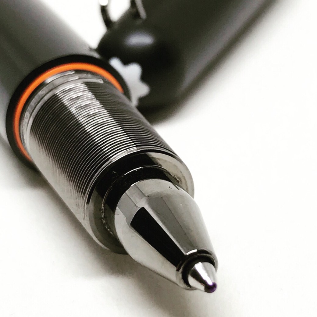
The pen itself has also been rock solid in terms of performance over that time, and I certainly cannot fault it as an everyday workhorse.
Paper has been your typical office copy variety, with daily task lists housed in a variety of notebooks, recent examples include Baron Fig’s Vanguard and Confidant, and also a Field Notes Byline. More extensive note taking during meetings or conference days occurs in a Leuchtturm 1917 B5 soft cover notebook. Phone numbers, ideas and working notes typically end up on a $4.00 per 400 page jumbo A4 lecture pad.
As you’d expect of a ballpoint, all paper types are managed with ease, and as I’ve alluded to above, no ink blob build up develops on the tip — even on the cheaper, low-end stuff.
The inks
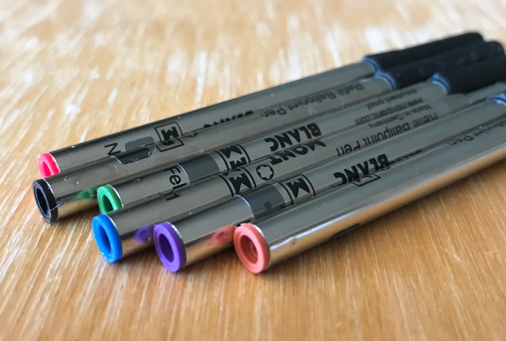
Below you’ll find a couple of thoughts, an example, what I use it for and how much use it gets. I’m not an ink reviewer, and perhaps some may argue ballpoint refills are not worth writing about at all — yet I beg to differ, and here we are.
The illustrations you see are a product of a far more talented hand than mine — my daughter Emily, whom I sincerely thank for contributing a far more interesting take on each colour than I could have imagined (or produced) myself.
For reference, filter by “Ballpoint” on Montblanc’s Refill page. I would recommend proceeding with caution though, for of course nothing but temptation awaits. With the James Dean Great Characters Edition Rebel Red being added since I initially picked up that link, for ”completeness” it was necessary to go out and buy that one as well, and you will find it included below.
All purchases were made at either the Montblanc Boutique, Brisbane, or Pen and Paper, Brisbane.
Pacific Blue
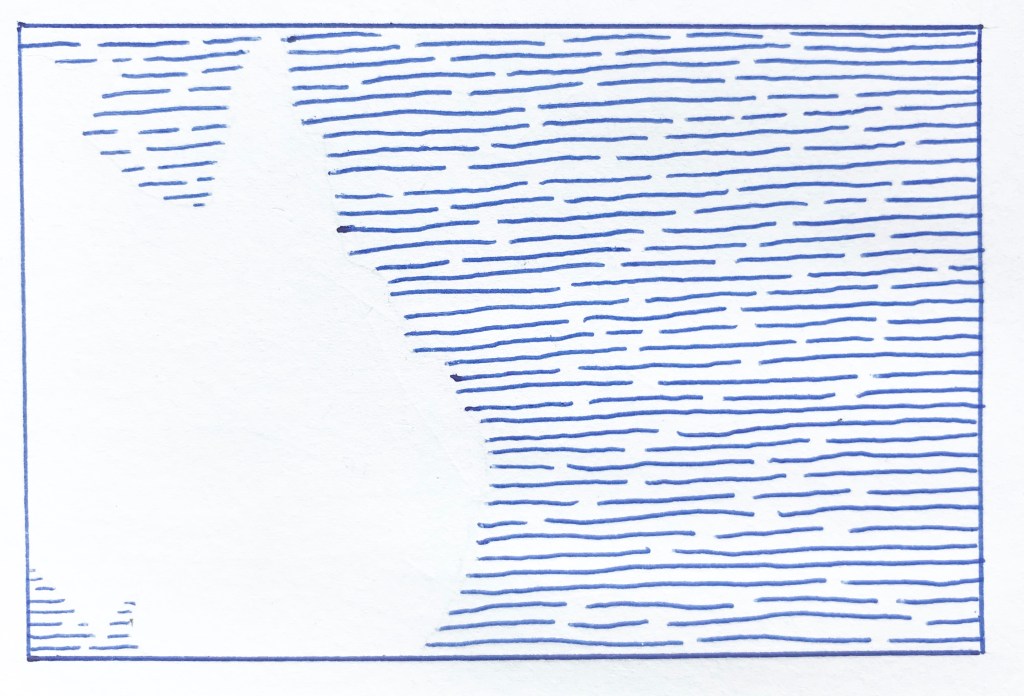
A safe, and perhaps somewhat predictable choice.
Given the choice at the time of a pen purchase, I usually go with blue — and the Montblanc M was no different.
Living on the east coast of Australia, I could probably say Pacific Blue is the most appropriate of any shade to use in the M. Of your “standard” office colours I tend to use blues a little more often than black, which is also the case with my fountain pens. Perhaps I find them a little less overpowering than a page full of black on white. A little calmer perhaps?
In any event, the Pacific Blue would certainly be described as your mid-spectrum shade, and what I’d call a standard blue – if one indeed exists. Lighter? Well I guess there is the UNICEF Blue, and heading towards a greener shade is the Barbados Blue. If you add the Homer Writers Edition into the mix, there is no shortage of options. I can’t imagine there not being something to suit most tastes.
In choosing a blue, I tend to favour mid to darker shades, with the those on the lighter side sometimes coming across a little washed out. The Pacific Blue certainly packs enough punch to hold its own on any page, and also through a copier or scanner should that be part of a page’s journey.
Mystery Black
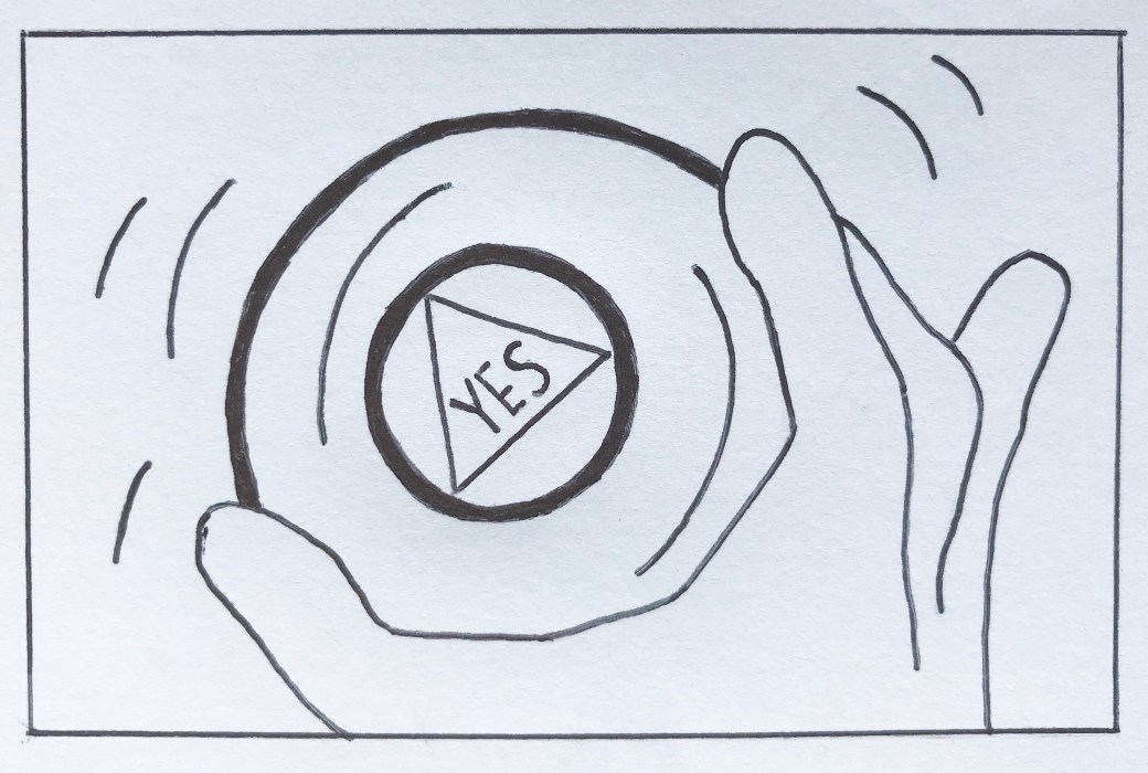
For a bold, strong, executive flourish.
That is, far from anything I really require in a pen, however if you were looking for something like that — this would do it.
With Pacific Blue included in the pen, I also picked up a twin pack of broad Mystery Black refills, in the knowledge the pen would see the majority of its use in the office.
The broad designation is true to its name, and combined with the deep black ink colour, a thick, full line results. It’s black. Very black. What you see is what you get.
There are times when I find the broad tip a little too overpowering (perhaps in conjunction with the deep black), yet on other occasions not so. More so on smaller notebook pages for example. If I had to pick one size and live with it for the rest of my writing days, it would be medium. If you were to then require me to nominate a colour for the same purpose, it would be a much harder choice – though next on the list below would be a contender.
The Beatles Psychedelic Purple

Come for the packaging, stay for the refill colour.
If I’m completely honest about this one, it was more about the box than the refill – at least initially. I imagine anyone fond of a little colour may be of similar thinking. When The Beatles Great Characters limited edition range was released a couple of years ago, I was immediately drawn to the colourful stripes which were part of the branding and design (those pens…). It’s a look I’ve been fond of over many years in the product lines from Paul Smith, providing a little escape from boring business black.
With one of my favourite designs front and centre, and keeping in mind the last time I spent over $1000 on a pen was approximately never, it was time to scan the product line for something else. While my common default in taking this option would typically be fountain pen ink, on this occasion, enter the ballpoint refill.
Psychedelic is indeed a good descriptor, for this one is a “lively” purple – electric you might say? However you describe it, there is enough similarity for this one to sneak by in place of your standard office blue, though as you can see in the associated image it is far from that. It’s The Beatles – there can only ever be one (or four I guess — but you know what I mean).
Performance is everything I’ve mentioned so far, and I do love this colour.
Le Petit Prince Orange
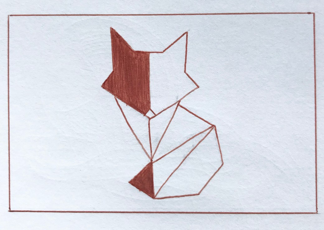
Something a little unusual.
One of the more recent in Montblanc’s Limited Edition releases, and is more an orangey-brown if you will. Based on the colour of a fox, it does makes sense we are not talking too bright an orange. For that, I assume you head towards Lucky Orange. I do wonder whether the fact it is not really brown nor is it really orange may hinder the popularity of this colour, though it probably won’t. I guess there are enough people out there like myself looking for something a little different.

The best part about this refill? The smile it puts on my face when I’m swapping it into the barrel. While not perfect, the accents are certainly a great match, and sometimes — no, most times — it is the little things.
I am quite fond of this colour, despite the fact it is perhaps the least used of the bunch I’ve written about here. As I’ve mentioned, the Beatles Purple is close enough to blue in many cases, however an orange doesn’t lend itself to much of the “official” office work. The same can also be said of the Fortune Green. Nonetheless, it isn’t hard to pick up one of my black gel pens for signing a document if the M contains one of these allegedly “outlandish” refill colours at the time.
You know, the more I doodle about with this colour as I’m writing this, the more I think Montblanc nailed the shade. Fox colour alignment aside, it is strong and definitive in its own right. I wouldn’t call it a bold colour necessarily, however it knows what it is, and faithfully lays down on the page with confidence.
Yep – I like it.
Fortune Green
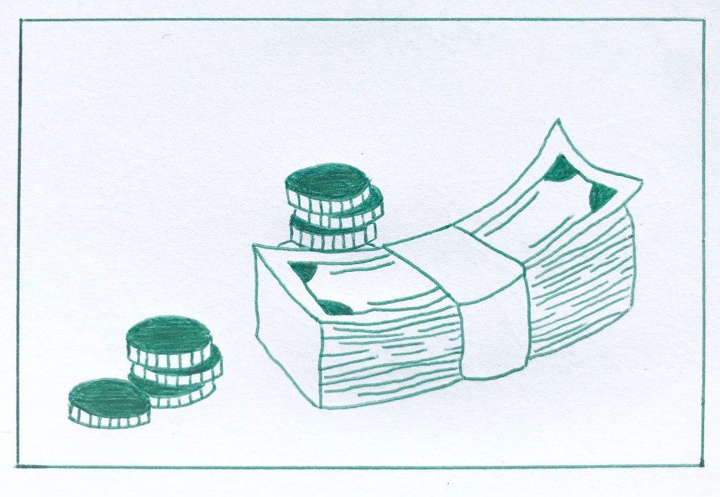
Because I didn’t have green. Enough said.
Bought this one on a whim because, well… again — I’m not sure really. The opening statement above is pretty close to the truth. I am very lucky to have the Montblanc boutique and two other specialist pen shops within two blocks of the office, For impulse purchases just to brighten my day a little (exactly what I needed on that particular day if I recall), there is nothing like a new ink colour — be it bottle or refill. Of course the added benefit of such purchases being they do not break the bank like other emotionally charged retail therapy (the Apple Store is within the same radius from the office, and I’ve indeed brought myself back from the brink numerous times there…). I’m yet to make my fortune, so the green refill it was.
At the time I had no particular colour in mind, and compared a couple of greens (I think the other being Emerald Green), finding the Fortune Green to be that little bit deeper in colour compared with the Emerald version. That being said, although it’s a nice green, still pales compared to the Irish Green fountain pen ink which is one of my favourites. Of course I’m not comparing the ballpoint output to a fountain pen, they are merely at different points of the colour shade spectrum, irrespective of the delivery mechanism.
I tend to use this one for markup notes on longer documents, not necessarily wishing to slash across the pages with a cheap red. I wouldn’t say I’m not fond of this one, however haven’t used it quite as much as the others, likely due to the recency of its purchase.
James Dean Rebel Red
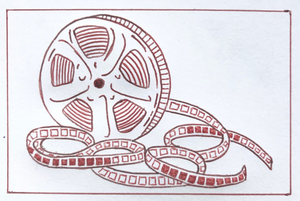
I have to admit — a purchase completely without cause…
Yep — this is what happens when you poke about checking links for a post. You stumble upon yet another colour release which more than likely fills a gap in your current line up.
Montblanc describe the colour of this particular Great Characters edition as being inspired by the red leather jacket worn by James Dean in the 1955 film Rebel Without a Cause.
What can I add here? Well, it is indeed red, though a little more subtle than your typical fire engine type red ballpoint pens, though also a touch brighter than a red velvet or the like. Although it’s early days with this one, I do quite like it.
Perhaps I feel like marking up in red after all…
Signing off
If there is one thing I’m reminded of when I pick up one of these new refills from the array on offer, it’s that I made the correct decision to go with an M ballpoint – despite my fondness for rollerballs. It would seem the ballpoint market is quite healthy, and perhaps more limited editions in this format are sold given it is the cheapest price tier for the pens. I can only assume it isn’t people such as myself poking around looking for different colours which make or break the market segment.
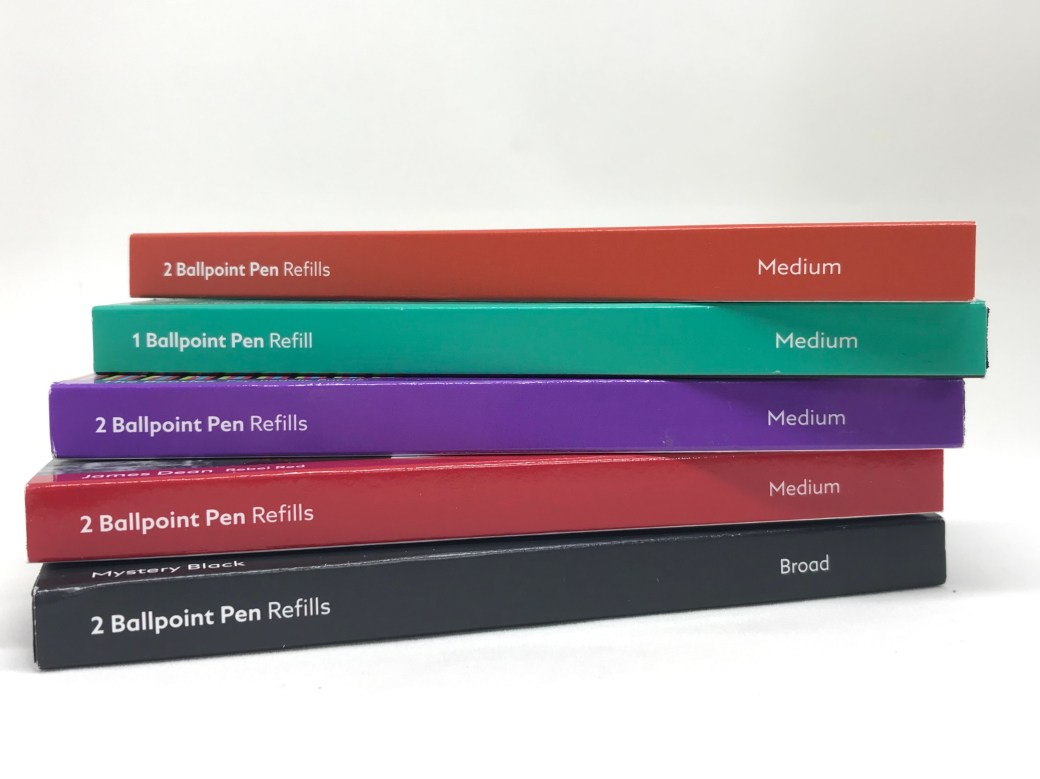
In any event, I cannot argue with the popularity of the ballpoint pen – Montblanc or otherwise. They perform well, are easy to swap (say, if you are someone who likes to accumulate a few different colours…), and offer an extremely practical everyday solution. Sure, most of us in the pens-are-a-passion realm probably aren’t in it for practicality, though when times require it, why not be using something just that little more unique or enjoyable?
You’ll find me with blue, black, or something very close for standard office use, but for anything else it’s open season, and I’d be hesitant to suggest those above will be the last…
The James Dean Rebel Red looks great. First time I see it… might need to try it 🙂
LikeLike
Pingback: Sneaking Back In – Pete Denison
Pingback: Sorry – not with those swirls | Pete Denison