A pen and notebook – 25 years on

Towards the latter part of last year, my beautiful wife and I celebrated our 25th wedding anniversary. As you can imagine there were gifts exchanged, and among them one suitably appropriate for a household (husband?) with an affinity (obsession?) for stationery. Before we get ahead of ourselves, while there is indeed a pen involved in this story, it is not in the “shiny new” way you might be thinking.

In this case, the “shiny new” is a notebook. In recent times I’ve taken to embossed notebooks to mark certain occasions, firstly a 50th birthday, and now the anniversary I’ve mentioned above. In all the excitement, something else quietly slipped by and has just come to me now. Four months later.

You see the bookend which begins this story is indeed a pen, and it was shiny and new quite a few years ago. It hit me just the other day — the pen I received as a wedding gift from my wife is of course also now 25 years old. My first fountain pen. All the way back then. Before the blog. Before any sort of foray into pen nerdery.

The pen

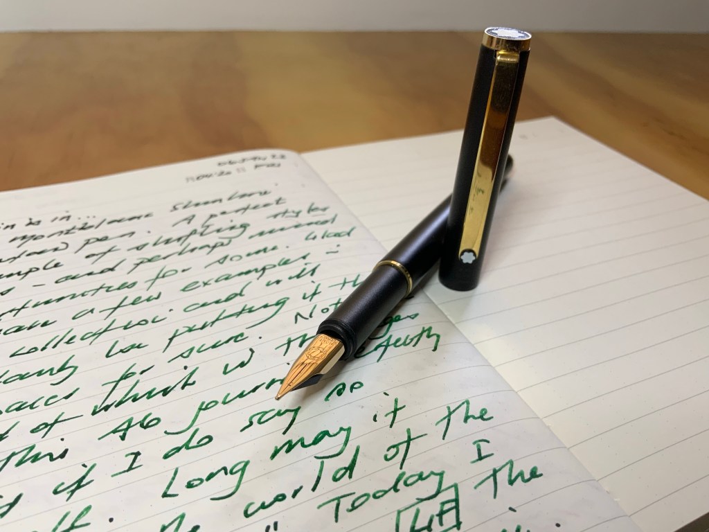
The pen? Well I’ve written about it before, even making the bold suggestion my first fountain pen was actually my grail pen. As pens go it was a fairly ambitious entry into the world of fountain pens. A Montblanc Meisterstuck Classique, in your standard black with gold trim. I don’t see many Montblancs recommended in the best beginner fountain pen lists out there — and for good reason of course.

The fact is though, I loved it then and I love it now. I get it, of course there are plenty of “more appropriate” beginner pens, though whether a more appropriate pen exists to mark the best day of your life? That I’m not so sure, but maybe I’m a little biased. In many ways it also leads directly to the point doesn’t it? These types of purchases are just as emotional as they are technical. Perhaps even more than we think.

The Classique along with another small anniversary getaway project. I probably wouldn’t recommend spending all weekend building the Death Star or the Millennium Falcon…

Little did I know the extent to which that pen would eventually contribute to a deeper dive into pens themselves, the internet of pens, and the genesis of this very blog. To say it developed an ongoing affinity for the brand is probably not too far from the truth either.

I’ve been fortunate enough to acquire a good number of pens since that day, on varying ends of the price spectrum, however there can only be one original, and I’m pleased to have had a certain naivety in the process of acquiring it. There were no apparent choices in size, nib, colour, filling systems or anything else that becomes a consideration the further into the pen world you go. Nope. Of course there were indeed quite a few options, however it was always this one and only this one. Even knowing what I know now about pens, I’ve never felt that pang of: I wish I’d picked a …….. instead.

So how is it fairing after 25 years? Well I’d have to say it’s doing very, very well, and firmly maintains its place in the standard in and out rotation of pens along with the rest of my collection. It’s faultless medium nib has never failed me and has now seen both the wisdom and folly of thousands of words from the mind of its owner, having long forgiven my stumbling first few months of ownership.

How sensible people enjoy the afternoon sun on an anniversary weekend getaway…
…while silly people with pens get a cramp in their hand from holding a phone weirdly for that “perfect shot”

The notebook

And the notebooks? Well, at the current time they remain in the yet to be used category, given I have a few others on the go currently. Their time will come. I say notebooks in plural, as the purchase involved one for each side of this anniversary occasion. I’m not sure what my wife might have planned for hers (the navy if you’re curious), however I’m thinking my black one will be up next as my home desktop notebook. When using an “occasion” notebook, there may be the tendency to designate it for a “special” project or use. The birthday notebook I mentioned above has indeed been assigned the duties of my long form writing project, and there is certainly benefit to that — possibly even from an increased significance or meaning to the notebook itself.

Mind you, I’m here to also sing the praises of getting them into general use as well. The same as my pens. The significance or sentimental value in my mind is not lessened by using them in this way. I’m sure many of you are the same, it’s often by use that the connection is strengthened: the patina on a pen or leather; the change of a page from crisp and blank to crinkled and full; flipping back through bold, colourful, ink filled pages.

…and yes, I emboss on the back cover, preferring a more subtle acknowledgement of the occasion.

Its fairly evident from the images in this post that the notebooks themselves are of the Montblanc variety, and are a little more expensive than your average notebook, however again, the spend doesn’t necessarily equal (or need to) the significance. I’m sure that affinity for the brand I mentioned earlier certainly influences my decisions here, and also further illustrates the myriad of factors which may go into this type of purchase.

In closing

Such a peaceful place

I guess one of the real joys of a pen and stationery habit is that there is always a “list” from which to choose when the time comes for either gifts or gift suggestions. Occasions like birthdays and anniversaries are of course prime candidates to cross something off that list and there will no doubt be a wide budgetary spectrum at play.

In the end it may be something expensive, or not so much, but the value to each of us will be inherent in the occasion it represents. Sometimes that will be a planned purchase for a life “milestone” but might just as easily be simply what you were using when a certain “thing” happened.

However it might occur, that significance will never be lost, regardless of cost, grandeur, or even whether or not it shows up on social media or written in a blog. It might even come to you out of the blue, say, four months past the event it commemorates, and that’s okay.

Just don’t wait four months after the date to remember your actual anniversary. No. Don’t do that.

Never an Unusable Pen

Perhaps that’s not entirely true, however I’ve been a pen and stationery enthusiast long enough to not only have a fair idea of what suits my writing style and taste best, but to also know exactly where to deploy pens which may not quite fit that ideal window on my usability spectrum.

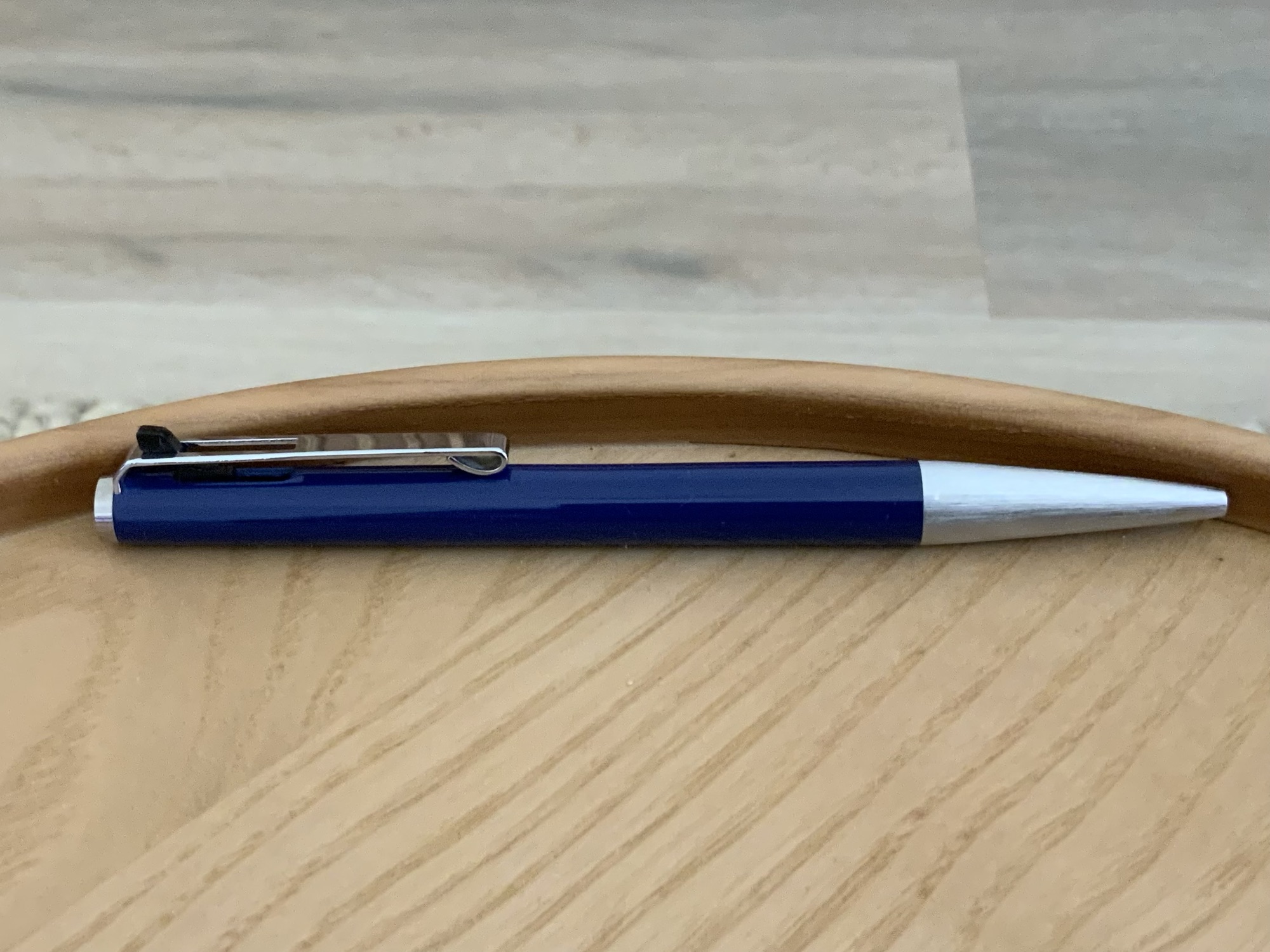
While there are a couple of ballpoints in the mix here, the slimline black Montblanc and to a lesser degree the Montblanc Noblesse (top) are at the centre of the discussion. Pencil for a little scale.

The slimline fountain pen of the 70’s and 80’s being one example, however there are quite a few others which sit squarely outside my typical usability criteria mentioned below. I remarked recently to a good (pen)friend that much of the “pen discussion” which occurs in our correspondence would make great blog posts, so here I am putting that theory into practice. You see, accompanying a recent letter, I also returned a few pens generously passed on to me by said friend, in the knowledge they would be forwarded on and re-homed to a user perhaps more suited to them.

On a brief side note, I have written about this gentleman before, and truth be told he is one of the most helpful, generous, knowledgeable, and selfless people I’ve had the good fortune of getting to know as a result of writing this blog.

Back to matters at hand, and as it turns out, most of those pens were slimline (read, very slim and narrow) fountain pens which were in their heyday in the 1970’s and 1980’s. Whilst they may not be what I’d reach for to write a thousand words, they were certainly far from unusable, and a few have certainly remained in my collection, to be enjoyed and put to good use. As I wrote in my correspondence, I’ve found there are not too many pens I cannot use in some form or another.

A Usability Window

Don’t get me wrong. We are not talking “unusable” pens with faults or defects that render them, well… non-functional and unable to be used at all. No, here I’m simply referring to those pens which at first glance, hold, or use, give us the: ”well… ah… yeah… not sure how this is going to go for any significant writing…” type of feeling. I suppose it’s the fine line between less-suitable and unsuitable. One of the joys in talking about this stuff is when writing those previous two sentences, I know with 100% certainty that anyone reading this knows exactly what I’m talking about with no further explanation necessary.

I’m sure we all have pens that if we were to sit down and write a few thousand words in longhand, would be the first pulled from the pen pot or case and we’d be eagerly scribing away. Others not so much, where even the thought of making it to the bottom of an A5 page begin those muscle fibre fasciculations which precede writers cramp. It may be size, weight, balance, or many other factors alone or in combination telling us that even beginning with a full cartridge of optimism simply won’t cut it.

For me? Well its usually related to:

  • length: too long or too short (I’m generally not a cap poster, so aside from your pocket pens designed to be the appropriate size upon posting – a la the Kaweco Sport which I love – posting generally makes them feel too long to me). Your smaller pens such as the Pilot Prera and Pelikan 205 I can get away with, however prefer something a little larger if the writing task is looking similarly sizeable.
  • body thickness or diameter: no doubt we all have a sweet spot here. Slimline fountain pens of the 70’s being a little outside mine. That being said, personally I find this to be a wide, wide spectrum
  • taper: I find this an interesting one. Thin and straight – not so great. The same thin diameter at the grip which has come down in a taper – much better. My usual preferred thickness but in a gun-barrel straight body? Sometimes not as good. As I said, I find this an interesting one…
  • finish: I typically find metal barrels a little on the slippery and hard to manage side. That said, the humidity of a Brisbane summer generally affords a bit of tackiness in that regard.
  • weight: often not a deal breaker on its own, given you are of course also thinking this is inextricably linked to balance (as is posting the cap more often than not). A mid to lower centre of gravity if you don’t mind. Combined with the above point — a weighty metal pen can present a challenge.
  • appearance: yeah, I said it… looks. Not in the way you might think though. I’m talking about the output on the page. Those times when the pen doesn’t feel right but your writing just looks fantastic. I’ve typically had most of these experiences with pens I’d have considered a little on the thin side. To be honest it’s often quite a “wow – this goes well” type of moment. Yet, and perfectly illustrative of the point to this post, “wow” is soon replaced with “oh, starting to struggle here — that’s getting a bit messy…” if any sustained writing needs doing beyond maybe a few minutes.

I’ve kept the above list devoid of the even more finicky aspects of nib type/size/grind or liquid ink vs ballpoint, with these really beyond what the post is about. And granted, the above are exceedingly obvious and far from groundbreaking to anyone reading this. In its simplest form we are merely talking about those ”oh this is too big/small/thick/thin/long/short/heavy/unbalanced/slippery/knurled/smooth moments that first flood your mind upon picking up and using whatever writing instrument it may be.

Tale of the tape out of interest: 8mm at the grip section, running to 10mm on the barrel

But of course, all is not lost…

Strategic Deployment

It is here the crux of the argument lies. I’m sure none of us will put up with something we genuinely don’t like using, and with various online marketplaces or simply exchanging with others, there are plenty of ways to offload something of that nature. I guess what I’m referring to though is the genuine joy that exists in having a certain amount of variety available in our day to day tools. Also, it’s not hard to see most of us in this pen caper have some sort of “rotation” in use at any given time. The variety may therefore come weeks to months later, depending on just how many pen soldiers are in storage before they are called to active duty.

I wax and wane as far as numbers in the rotation are concerned (largely depending on when I decide to clean and refill), however I’ve also noticed a trend in having a secondary group — a “special teams” if you will. It’s in this group where the slimline fountain pen sits. Or the outrageously heavy pen. Or the pen that is too short. I think you get the idea.

A short A6 journal page entry? No problem.

This secondary group exists in parallel with the main group for two main reasons. One, they perform what I’d call “writing support” functions (more on this below) and two, they get a run in the main group when the urge to clean isn’t strong enough to reinforce the dwindling ranks of the “in-rotation” group. The funny thing is, it’s the latter of these two scenarios which frequently reminds me that many of the pens assigned a support role deserve a spot in the main rotation, and that is often a change I make moving forward.

So what of these writing support functions? We all have them I’m sure, and I present a second exceedingly obvious list for your reading pleasure:

  • markup: perhaps the most common of them all. Editing your 2014 NaNoWriMo novel for example — a task that remains unfinished (errr… I mean tasks like that anyway, surely no-one is that slow… right?). Those office ”can I get your thoughts on this” type of queries — often printed, hand-written feedback applied and returned (or at the very least hand written for my own thoughts before applying tracked changes and returning a digital document)
  • lists: not much to be said here. If I cannot use a certain type/style of pen for a few pages, I can generally use it for a dozen one or two word bullet points
  • index: essentially the point immediately above
  • headings: where you might prefer the analogue equivalent of H1, H2… etc
  • contrasting text: colours, underline, highlight. Some of this blends into markup, yes, however I also often use different colours in the primary text of a notebook for ease of emphasis or finding something upon scanning through pages
  • injection of joy: not the artistic type by any stretch, however at times I’ll add a little flourish such as the one in the image below if I’m so inclined (“flourish” considerably overstates what you see below, however that’s about as good as it gets — notwithstanding the numerous Bujo YouTube videos I watch at times…)
Merry Christmas one & all…

You’ll have your own lists with far more in them than mine, and I’ve likely forgotten a couple I use as well, however I just want to emphasise one thing: “strategic deployment” is by no means a synonym for “begrudging use”. If I really don’t like a writing instrument, then yes, it will see no use and will leave the collection. It’s just that with all the possible uses, this very rarely occurs, and that is something which gives me considerable satisfaction.

What has always worked for me is loading them up with atypical colours (if you write with all the colours of the rainbow then it won’t matter anyway) to utilise the benefits for markup and contrasting text; having them located at their assigned task (ie coupled with the notecards or notebook in which the list is made); ensuring horses for courses (no free flowing nibs with feather heavy inks in a pocket notebook or on cheap paper if I have too use it — long live the ballpoint!!! — that’s genuine praise, don’t get me started, I love them).

Signing Off

In wrapping things up after taking far too long to say that I rarely can’t find a good use for a pen, there really is nothing more satisfying than having an arsenal of pens, with a reasonable amount of variety, which all see their fair share of use. Use them and love them I say.

And a final word to the generous soul now back in possession of those pens — I’m sure they’ll bring as much joy to the next new home as they did to mine, and as always I am forever grateful to you. And that folks, is an expansion of my letter, as a blog post — unsurprisingly it works pretty well.

Pen collection thoughts – niche or narrow?

When it comes to a pen hobby, some may consider it niche, others not so much. Sure, there are plenty of folk who love their stationery, however the more “nerdy” pen types likely fit the niche descriptor one way or another. From there, well I guess it is just a matter of how far you go down the rabbit hole, which in many ways brings me to my point.

Depending on your approach, going deep into any hobby or interest carries with it the inherent risk of limiting the breadth you may experience across that same endeavour. Specialising, or carving out your own… ok — niche, indeed has many benefits, however again, there are sacrifices in this approach if we begin to take a broader view. There is of course no right or wrong to any of this, simply the path(s) you choose. Further, that old adage you don’t know what you don’t know springs to mind as well.

Why am I writing about this? Well as with anything reflective in nature, the trigger is often some occurrence which makes us ponder things a little. Where you ultimately arrive with those thoughts may be a side tangent you hadn’t necessarily seen coming. I guess that’s the thing about serendipity.

It’s around nine years or so since I started this blog, and it was only a little before that I found myself revelling in the discovery that many likeminded people shared their love of pens online. What was one to do? Dive right in of course.

You begin poking around online, one blog links to another, and progressively a nice cache of RSS feeds mounts within the “Pen” folder in your reader. The associated social media and podcast(s) inevitably follow. You immerse yourself further. These are your people! There may be a local group or two where online becomes face to face, and as good as that may be, for the introverted amongst us that aspect may just as quickly fall away. Again, nothing wrong with that — we are each to our own. Online though, it’s all there. All around.

Fast forward a few years, and as your interactions broaden a little, you begin to see that despite all you’ve opened your eyes to across the entire (or so it seems) internet, your view may be a little narrower than first thought. I guess all that’s left to do is chuckle as you are reminded large parts of your hobby are actually unknown to you. You’ve completely missed them.

Why?

Well I’ve probably answered my own question earlier in the post: …one blog links to another… All well and good, however there is the tendency for things to work their way around in a nice circle as a result. Podcasts at times can be similar. Opinions somehow become fact and we all end up hearing or writing similar things. We buy the same things from the same companies. Is it FOMO? Maybe, or perhaps so we can contribute to the conversation?

Whatever the reason it can certainly stifle any natural growth which may occur in directions other than everyone else’s well worn path. Maybe there is a fine line between community and echo chamber. Perhaps it’s one and the same. Mind you, I say that with the utmost respect, for I think there is simply a natural tendency for things to develop in such a way.

So what is this serendipitous event I speak of? Well the mere existence of a large swathe of pen models by a certain large pen manufacturer which existed through the 70’s and 80’s which I knew absolutely nothing about, yet are certainly out there if you care to look. I’m talking of the Montblanc Generation, Noblesse, and Carrera. Throw in another slim line two-colour twist mechanism ballpoint for good measure. Bringing these types of pens into a collection certainly results in a little background research, and it is only then you begin to realise the extent of the gaps in your knowledge.

img_0519

The exact pens themselves aren’t the point here (they certainly may be in a future post of course…). The narrow-ish field of view I’ve somehow developed to this point is.

I understand many of us live in the “now” or “next release” of the pen world, and do not necessarily seek “vintage”, or have any interest in it, which is absolutely fair enough. I hadn’t really ever planned on doing it either, however found the main benefit to be a richer and broader overall view as a result. That being said, the point of this post is not even to sing the praises of vintage pens, but to simply explain the catalyst of putting pen to paper which ended up being what you are reading now.

The moral here? If I could speak from experience and with brevity: No matter what you think you know, or who you choose to read, watch or listen to, there is far, far more out there which may indeed be of interest — perhaps surprisingly so.

If everyone else has/wants/suggests a certain pen, might it be worth casting the net a little wider and  considering something different instead? You never know what you might find.

A Few Montblanc Ballpoint Refills

img_3813

I’m not really sure why I began accumulating various refill colours in the Montblanc ballpoint range. Assuming of course you call a grand total of six colours an accumulation – it certainly isn’t a collection by any stretch of the imagination.

A pen requires a refill of course, and with over 12 months of daily Montblanc M ballpoint use well and truly behind me, a single shade throughout that time was never going to suffice. To those fond of their writing instruments, a pen without interesting ink…

Generally speaking

As I’ve mentioned, while this particular list of refills fall short of a comprehensive list, they are a few I’ve rotated through using on a daily basis in the office. The performance of each has been without issue, and I’ve enjoyed blob and skip free output the entire time. In my experience at least, they are high quality, reliable refills.

The pen itself has also been rock solid in terms of performance over that time, and I certainly cannot fault it as an everyday workhorse.

Paper has been your typical office copy variety, with daily task lists housed in a variety of notebooks, recent examples include Baron Fig’s Vanguard and Confidant, and also a Field Notes Byline. More extensive note taking during meetings or conference days occurs in a Leuchtturm 1917 B5 soft cover notebook. Phone numbers, ideas and working notes typically end up on a $4.00 per 400 page jumbo A4 lecture pad.

As you’d expect of a ballpoint, all paper types are managed with ease, and as I’ve alluded to above, no ink blob build up develops on the tip — even on the cheaper, low-end stuff.

The inks

img_4004

Below you’ll find a couple of thoughts, an example, what I use it for and how much use it gets. I’m not an ink reviewer, and perhaps some may argue ballpoint refills are not worth writing about at all — yet I beg to differ, and here we are.

The illustrations you see are a product of a far more talented hand than mine — my daughter Emily, whom I sincerely thank for contributing a far more interesting take on each colour than I could have imagined (or produced) myself.

For reference, filter by “Ballpoint” on Montblanc’s Refill page. I would recommend proceeding with caution though, for of course nothing but temptation awaits. With the James Dean Great Characters Edition Rebel Red being added since I initially picked up that link, for ”completeness” it was necessary to go out and buy that one as well, and you will find it included below.

img_1582

All purchases were made at either the Montblanc Boutique, Brisbane, or Pen and Paper, Brisbane.

Pacific Blue

img_3995

A safe, and perhaps somewhat predictable choice.

Given the choice at the time of a pen purchase, I usually go with blue — and the Montblanc M was no different.

Living on the east coast of Australia, I could probably say Pacific Blue is the most appropriate of any shade to use in the M. Of your “standard” office colours I tend to use blues a little more often than black, which is also the case with my fountain pens. Perhaps I find them a little less overpowering than a page full of black on white. A little calmer perhaps?

In any event, the Pacific Blue would certainly be described as your mid-spectrum shade, and what I’d call a standard blue – if one indeed exists. Lighter? Well I guess there is the UNICEF Blue, and heading towards a greener shade is the Barbados Blue. If you add the Homer Writers Edition into the mix, there is no shortage of options. I can’t imagine there not being something to suit most tastes.

In choosing a blue, I tend to favour mid to darker shades, with the those on the lighter side sometimes coming across a little washed out. The Pacific Blue certainly packs enough punch to hold its own on any page, and also through a copier or scanner should that be part of a page’s journey.

Mystery Black

img_3990

For a bold, strong, executive flourish.

That is, far from anything I really require in a pen, however if you were looking for something like that — this would do it.

With Pacific Blue included in the pen, I also picked up a twin pack of broad Mystery Black refills, in the knowledge the pen would see the majority of its use in the office.

The broad designation is true to its name, and combined with the deep black ink colour, a thick, full line results. It’s black. Very black. What you see is what you get.

There are times when I find the broad tip a little too overpowering (perhaps in conjunction with the deep black), yet on other occasions not so. More so on smaller notebook pages for example. If I had to pick one size and live with it for the rest of my writing days, it would be medium. If you were to then require me to nominate a colour for the same purpose, it would be a much harder choice – though next on the list below would be a contender.

The Beatles Psychedelic Purple

image 2

Come for the packaging, stay for the refill colour.

If I’m completely honest about this one, it was more about the box than the refill – at least initially. I imagine anyone fond of a little colour may be of similar thinking. When The Beatles Great Characters limited edition range was released a couple of years ago, I was immediately drawn to the colourful stripes which were part of the branding and design (those pens…). It’s a look I’ve been fond of over many years in the product lines from Paul Smith, providing a little escape from boring business black.

With one of my favourite designs front and centre, and keeping in mind the last time I spent over $1000 on a pen was approximately never, it was time to scan the product line for something else. While my common default in taking this option would typically be fountain pen ink, on this occasion, enter the ballpoint refill.

Psychedelic is indeed a good descriptor, for this one is a “lively” purple – electric you might say? However you describe it, there is enough similarity for this one to sneak by in place of your standard office blue, though as you can see in the associated image it is far from that. It’s The Beatles – there can only ever be one (or four I guess — but you know what I mean).

Performance is everything I’ve mentioned so far, and I do love this colour.

Le Petit Prince Orange

img_3993

Something a little unusual.

One of the more recent in Montblanc’s Limited Edition releases, and is more an orangey-brown if you will. Based on the colour of a fox, it does makes sense we are not talking too bright an orange. For that, I assume you head towards Lucky Orange. I do wonder whether the fact it is not really brown nor is it really orange may hinder the popularity of this colour, though it probably won’t. I guess there are enough people out there like myself looking for something a little different.

img_3814

The best part about this refill? The smile it puts on my face when I’m swapping it into the barrel. While not perfect, the accents are certainly a great match, and sometimes — no, most times — it is the little things.

I am quite fond of this colour, despite the fact it is perhaps the least used of the bunch I’ve written about here. As I’ve mentioned, the Beatles Purple is close enough to blue in many cases, however an orange doesn’t lend itself to much of the “official” office work. The same can also be said of the Fortune Green. Nonetheless, it isn’t hard to pick up one of my black gel pens for signing a document if the M contains one of these allegedly “outlandish” refill colours at the time.

You know, the more I doodle about with this colour as I’m writing this, the more I think Montblanc nailed the shade. Fox colour alignment aside, it is strong and definitive in its own right. I wouldn’t call it a bold colour necessarily, however it knows what it is, and faithfully lays down on the page with confidence.

Yep – I like it.

Fortune Green

img_3994

Because I didn’t have green. Enough said.

Bought this one on a whim because, well… again — I’m not sure really. The opening statement above is pretty close to the truth. I am very lucky to have the Montblanc boutique and two other specialist pen shops within two blocks of the office, For impulse purchases just to brighten my day a little (exactly what I needed on that particular day if I recall), there is nothing like a new ink colour — be it bottle or refill. Of course the added benefit of such purchases being they do not break the bank like other emotionally charged retail therapy (the Apple Store is within the same radius from the office, and I’ve indeed brought myself back from the brink numerous times there…). I’m yet to make my fortune, so the green refill it was.

At the time I had no particular colour in mind, and compared a couple of greens (I think the other being Emerald Green), finding the Fortune Green to be that little bit deeper in colour compared with the Emerald version. That being said, although it’s a nice green, still pales compared to the Irish Green fountain pen ink which is one of my favourites. Of course I’m not comparing the ballpoint output to a fountain pen, they are merely at different points of the colour shade spectrum, irrespective of the delivery mechanism.

I tend to use this one for markup notes on longer documents, not necessarily wishing to slash across the pages with a cheap red. I wouldn’t say I’m not fond of this one, however haven’t used it quite as much as the others, likely due to the recency of its purchase.

James Dean Rebel Red

img_3991

I have to admit — a purchase completely without cause…

Yep — this is what happens when you poke about checking links for a post. You stumble upon yet another colour release which more than likely fills a gap in your current line up.

Montblanc describe the colour of this particular Great Characters edition as being inspired by the red leather jacket worn by James Dean in the 1955 film Rebel Without a Cause.

What can I add here? Well, it is indeed red, though a little more subtle than your typical fire engine type red ballpoint pens, though also a touch brighter than a red velvet or the like. Although it’s early days with this one, I do quite like it.

Perhaps I feel like marking up in red after all…

Signing off

If there is one thing I’m reminded of when I pick up one of these new refills from the array on offer, it’s that I made the correct decision to go with an M ballpoint – despite my fondness for rollerballs. It would seem the ballpoint market is quite healthy, and perhaps more limited editions in this format are sold given it is the cheapest price tier for the pens. I can only assume it isn’t people such as myself poking around looking for different colours which make or break the market segment.

img_3797

In any event, I cannot argue with the popularity of the ballpoint pen – Montblanc or otherwise. They perform well, are easy to swap (say, if you are someone who likes to accumulate a few different colours…), and offer an extremely practical everyday solution. Sure, most of us in the pens-are-a-passion realm probably aren’t in it for practicality, though when times require it, why not be using something just that little more unique or enjoyable?

You’ll find me with blue, black, or something very close for standard office use, but for anything else it’s open season, and I’d be hesitant to suggest those above will be the last…


My Ultra Black Montblanc M Ballpoint

img_1584

A little time spent searching online doesn’t return much in the way of Montblanc M Ballpoint reviews, a notable exception being this recent post by Mike Dudek. I guess I shouldn’t really be surprised. Perhaps I should be embarrassed about spending this type of money on a ballpoint pen. Money which should be spent on taking me deeper into the unique designs, materials, or custom nib grinds of a fountain pen.

Whether or not the lack of reviews in existence say anything about the hobby itself perhaps missing a beat is a question not really requiring an answer. I think we’d all concede the inexorable draw of the fountain pen is pretty tough to resist, however perhaps comes at the expense of missed opportunity elsewhere? The number of times whether, perhaps, and maybe pop up in these types of posts all point to one thing of course: personal preference. Some might agree with what I have to say below, others wouldn’t be caught dead with a ballpoint. The burgeoning popularity of indie designer and Kickstarter pens is perhaps (there it is again) a sign of interest in broader horizons.

In any event, following on below you’ll only find discussion about a ballpoint pen — one finished in black at that — and certainly no embarrassment. You may recall embarrassment was covered in the initial post about this pen, though squarely in relation to trying to buy the pen, not about buying such a pen.

That said, market analysis or philosophy this post is not. What it is though, is a slightly more detailed look at my Montblanc M Ultra Black Ballpoint. So on with the show.

Look and Feel

Appearance

Yes, it is indeed black, though as I touched on in my previous post, I have a certain fondness for matte and brushed type finishes — think the Baron Fig Squire, Lamy aion, or the Makralon of the Lamy 2000. With the majority of Montblanc pens out there on the glossy side of the ledger, the Ultra Black finish which now exists through some of the range was always going to well and truly tick this box, and I certainly would not have added the M to the fold without it.

One thing to note here though — and plan for it if you are considering a purchase — after some use, your hand will polish a “sheenier” look to the area it comes in contact with (i.e. the middle of the barrel). I’ve gone with this description because while I wouldn’t call it shiny, let’s say it will become less matte – particularly evident when the now slightly contrasting cap is placed back on. And that, friends, is where this pen earns a whole new level of affection from this owner at least.

img_1552

A little less matte on the barrel after a few months use

I love it. It’s the polished wood grain on a well-worn tamper handle; the softened, worn leather spine on your notebook cover, or even the small callus on my finger from hours of a resting a pen. It is a sign of earning its keep — a tale of words gone by and thoughts recorded.

Should that process take a little longer than a few months? Maybe, though I’ll take it either way. Is it likely to bother you? Perhaps, however that is something only you can answer. Certainly worth noting though if that sort of thing might be a problem. Particularly so, given the vendor from whom this pen was purchased confirmed seeing this on other Ultra Black finished pens. I’ll assume it is a standard occurrence unless there are a majority of Ultra Black users out there who have not seen such a thing happen with theirs.

Most of you reading would already be aware the M design is a collaboration between Montblanc and designer Marc Newson, with more information available about this through the next link.

The overall design gives an outward impression of solid build, and the aesthetic is one of… yes I’ll say it: simplicity. The appeal of the M design for me has always been the balanced end to end uniformity, offset with that emblem plateau. For those more in tune with design – from Montblanc on Marc Newson’s work:

When his trademark biomorphic style meets the iconic design cues of Montblanc, the result is both unique and timeless.

…the writing instruments’ fluid lines flow gently into one another. Moving from the Montblanc emblem on the cap, along the platinum-plated clip, which magnetically aligns with a white precious resin Montblanc emblem on the perfectly flat “plateau” of the barrel, consummate forms express visionary design.

As I’ve alluded to already, I like it a lot, however I do tend to enjoy what I’d consider “clean, modern design” for want of a better term. While I understand the appeal of colourful swirls and the like, here (whether gloss or matte), I can only ever see this design in uniform colour. I don’t make the decisions of course, and I’m certainly glad Montblanc gave the green light to the Ultra Black version.

Combined with the accents of a gently knurled, gunmetal grip section and a platinum-coated clip, the overall colour palette befits the design and a Montblanc modern aesthetic. The little flair of orange where the section meets the barrel almost has the appearance of an o ring seal, however is simply a deliberate decision to extend the plastic lining from inside the barrel and section for a little flash of colour. I doubt my appreciation wanes without it, however again, I love that it’s there.

img_1830

Magnetic cap alignment – almost…

The M is a decent size without being an overly large pen, and I suppose you’d call it a cigar shape, though the ends are a little more blunted than say a Sailor 1911 by comparison. For reference, with the exception of the end taper, the dimensions are quite similar to the Lamy 2000. The snap-on cap and clip are solid, without being overtly flashy. The hero feature of the cap, of course, being the magnetic alignment of the clip with the plateau emblem, which prevents the cap being secured in anything but “perfect” alignment. This feature works almost perfectly, with my clip aligning about 10–15 degrees to the left of the emblem plateau — something which should bother me, however after noticing it in the initial few days after purchase, I’ve not thought about it since, except to raise it in this post.

I’ll touch on my main reasons for picking up the ballpoint version below, however I don’t find any single thing to be the killer feature for the M line of pens. To use that old adage, it is a champion team, which will — they say — always beat a team of champions. It is a pen best taken whole. Probably not the clearest description of things, though sums up my thoughts well enough.

With the Montblanc M range (ballpoint or otherwise) I think it is definitely a case of what you see is what you get. Even from online images, I think you can be fairly confident in your initial impressions of either being fond of the design or not. As always, being able to pick up and hold a pen is certainly an advantage with any consideration around purchasing.

In the hand

So outwardly it is a solid looking pen — what about in the hand? I’d say pretty much the same really.

This is definitely one of those “solid, yet light” pens — even when posted, which apparently was not possible in the initial release, however the M pens now sport a “plateau magnet” to enable posting. In a purely subjective preference, I’m not a poster of any pen (save for those requiring it such as a Kaweco Sport), and here it just doesn’t feel right. I’d say at least 90% of the time the cap is on my desk anyway (another reason the magnetic alignment doesn’t bother me). Other times it will be beside my notebook in a meeting or failing that – in my pocket. If I’m stepping into a meeting within the office, I’ll often carry the pen sans cap anyway.

I’m aware the area around the grip section tends to be another opinion divider with the M line of pens. Heading towards the tip, there is a staged series of steps from the barrel to the section, another down to the convergence nearing the tip, before the refill makes its appearance. The latter two are of no real significance, however the barrel to section transition may be, depending on your grip and preference.

img_1529

To some, that flash of orange I mentioned may be a “warning — do not proceed,” however I’ve never really found pens with a step down at the grip to be a problem (though again, it goes without saying that will depend on your grip). In fact, I’ve found this one even less so, for the ballpoint refill gives you a 360-degree option in positioning and practically unlimited angle positions. Essentially every spot is the sweet spot. Choking down on the grip a little results in all my fingers residing on the knurled section, or moving further up the barrel, my index finger controls the section, thumb and middle finger above it. I tend to fluctuate between the two, and as you can imagine, use the step as a reference point.

For the type of money we are talking about, I’d say everything certainly does need to be just about perfect — so if you have any reservations at all about this feature in the design, I’d recommend an in-person inspection and test prior to purchase. Bear in mind I refer to “perfect” as perfectly suited to your preference and grip style, rather than some sort of “absolute” perfection.

If these aspects don’t align with your expectations or requirements, then that is simply that. I think we need to get past any suggestion the manufacturer has “blown it” or made some “serious error in judgement” for their design choices at least — regardless of the company. The fact this pen suits me perfectly makes it no more designed for me than not designed for you. The finished product is simply how Montblanc – or for that matter, Marc Newson – designed it.

Unposted, I find the M very well balanced, regardless of a grip above or below the step, and it is a pen which will handle longer writing sessions should they be required, doing so with a high level of comfort for the user.

More on this when we get to writing below.

Specifications

  • Model: Montblanc M Ballpoint
  • Finish: Ultra Black; Platinum trim
  • Barrel: Black precious sandblasted resin; inlaid emblem on plateau
  • Cap: Black precious sandblasted resin; inlaid emblem
  • Closure: Magnetic snap on
  • Weight capped: 27 grams
  • Weight uncapped: 19 grams
  • Length capped: 140 mm
  • Length uncapped: 123 mm
  • Diameter: 13 mm
  • Refills: Montblanc Ballpoint or compatible
  • Price: AUD$610.00 (Montblanc International 2 Year Warranty)

Note the measurements above are my own, so assume they are approximate, yet will be pretty close if not exact — difficult to find any documented specs anywhere.

img_1835

The pen was purchased from Pen & Paper in Brisbane, Australia, in December 2017.

Writing Performance

The refill

I for one will say these Montblanc ballpoint refills write like a dream — well yes… a dream ballpoint. This not being a debate on the merits of ballpoint/gel/rollerball/nib – I purchased a ballpoint for a reason, and everything I need it to do, it does in spades.

I’ve rotated through three different types so far: the standard Pacific Blue in medium and the Mystery Black in broad. Although only available in medium, I could not go past The Beatles psychedelic purple — love the colour, love the refill box. Incidentally, the availability of many of the special edition colours is another factor weighing heavily in favour of the ballpoint version of the M compared to the rollerball. If that is of any importance to you it is certainly worth considering.


psychedelic purple peeps

Refill colour options are numerous compared to the rollerball version of the M


The medium is definitely my preferred width. While I enjoy the richness of the broad’s line (the medium holds up well here in any event), with all of that ink being laid down I find things get a little slippery, and the pen skates away from me a little on the page.

Irrespective of width, when talking refills, there are a couple of deal-breakers for me when it comes to writing with ballpoints. Firstly, ink build up on the tip. I used to regularly find this with Parker refills, or cheaper no-name brands. I have not used either of these recently so perhaps things have improved.

I also very much dislike it if the refill rattles around, moves or makes an audible click when the pen contacts or leaves the surface of the page. That thing has to be well-held, and held in perfect or at least near-perfect alignment — not too proud of the housing nor stuck too deep, for either will annoy me during use. It does, of course, help that the M is capped, removing the need for any click or twist knock mechanism which may contribute to play in the refill fit.

img_1583

My fondness for this pen would suggest Montblanc have these areas well covered, and I can confirm they certainly have. The spring tension and refill tip alignment are perfect, and the Montblanc refills I’ve been using these past six months or so have all been flawless in their writing. Smooth, rich and vibrant lines in their respective colours, with no skips, hard starts or clumping in any way, shape or form.

Finally, there is something very satisfying about simply unscrewing the section from the barrel, swapping in another refill and away you go — all in about 20 seconds. Call me a heathen if you like, however I’ve always enjoyed the convenience of ink cartridges in my fountain pens as well, notwithstanding a required flush when changing colours.

Comfort and use

As with any writing instrument, your intended use will really determine whether the M — and the M in ballpoint for that matter — will indeed suit that purpose.


img_1831

Whether many words or a few… the M Ballpoint has it all covered


Personally, I’ve used this thing for meeting notes, letters, and report mark up, however 90% of the time it is on my desk ready to jot down a phone number, take a few notes to organise my thoughts or sign a document. If I consider the uses I put this pen to at the office (often with less than ideal writing conditions), the ballpoint format I consider just about perfect. Conversely, if I were after something to use at home, on my paper of choice for page after page after page, a nice fountain pen may be a better fit. The right tool for the job.

Does this imply some form of compromise in what I am using at the office? Far from it. I have quite a few fountain pens, and as you are probably aware, enjoy using them immensely. While generally fluid and effortless writers, they do less well in some of the situations I put them in at work (think dry time on a document passed around a table for multiple signatures, or sub-par office copy paper). At home, I’m more inclined to pick up one of the more balanced fountain pens in my collection (Sailor 1911 Large, Pilot Custom Heritage 823 or Pelikan 805) if I plan to churn through several hundred to a thousand words or more in a sitting.

One thing I can say is I’ve found the M ballpoint to be considerably more comfortable over an extended writing session than I had originally expected. It is extremely well balanced, has an always-in sweet spot, and provides an effortless experience between writer and page. From both a practicality and usability perspective, it is really everything I could ask for.

Signing off

Well, that folks, is my Montblanc M Ballpoint in Ultra Black.

Sure, it might roll away if placed down uncapped, the finish wear to a slight sheen, and the cap not quite align with the emblem plateau. You might (quite validly) argue that for the price, no such comments should appear in this post, let alone be flippantly dismissed. I wouldn’t disagree, however as you can gather, none of these aspects bother me, and I quite like the subtle change in finish. Once, they probably — no definitely — would have bothered me, however over recent years I’ve come to learn what really matters to me.

Of course, appearance and design are what draw me to a pen in the first place, however in my deal-breaker categories of balance, grip and refill performance, in my experience, the M sits squarely in my sweet spot for all. There is no compromise in seeking and finding a ballpoint — of all things — to be the right tool for the job.

Not only that, the Montblanc M ballpoint is a joy to use, and let’s be honest — if you are writing without joy? That right there is the real compromise.