Gain, Fail, or Shine – A Less Ultra Black Montblanc M

The Ultra Black finish. My Montblanc M ballpoint. Certainly a love at first sight situation when I first came across it in a display case a few years ago. Admittedly I was not entirely sure what the “ultra” really was at the time. A finish? A colour? The mostest or blackest of blacks? In any event, it was different to the standard shiny black “precious resin” of the Montblanc line.

While Montblanc describes it as ”black precious sandblasted resin”, it’s probably fair to call this one “matte black” if we’re trying to provide some context or perspective. While I do enjoy the lustrous deep black shine that is the standard precious resin finish, something a little different is always nice to have, particularly when it’s not at Montblanc’s Great Characters or Writers Edition prices.

So why the post? Well, really only to mention a change I’ve seen in that Ultra Black finish over time. You see, my Ultra Black M ballpoint, when compared with the standard precious resin of the M fountain pen I own — is decidedly less Ultra than it used to be.

I’ll say up front it doesn’t really bother me, however knowing we are all somewhat different in our tolerance for these sorts of things, thought I’d put down a few words outlining what I’ve seen.

The Pens

I’ve written before of my experience with the Montblanc M Ultra Black ballpoint, and it remains close to the the top of my all time favourite and most used pens (perhaps explaining what follows). When it comes to its fountain pen sibling, well I have to say my fondness for the M design lineage continues. I’ve had the M fountain pen for a shorter period of time (though also a good while now), so its long term position in the “inked” pen pot is still being assessed, though to date it has demonstrated quite a strong showing.

My workhorse Montblanc M ballpoint

After all, fountain pens aren’t necessarily the universal truth compared with a ballpoint are they. With nib placement, angle, and balance, there is a reasonable combination of “getting it right” required before you end up with a decent writing experience. Compare that with the uncap-and-dash world of the ballpoint. In my experience so far, the M fountain pen deserves some kudos, at least in this medium nib version I have in my hand.

So, the pens? All good there — love them. The real question being have they lost some of their “shine” given what follows below. Maybe, maybe not — again, it depends on your perspective I guess.

On Shade

Now, onto matters of shade, hue, finish, or at least the “Ultra” of the equation here. To be honest, had I not had both pens out side by side recently I might not have noticed anything different…

Having the M’s tucked away next to each other in a Nock Co Lookout pen case, it was easy to distinguish between the two by the cap finishes peeking out the top. One, a shiny, lustrous piano black in precious resin. The other, a decidedly matte version of well… black. The point being, its a simple task to tell them apart. Funny thing was, after using both, I accidentally recapped them incorrectly as the barrels looked pretty much the same. Upon comparing a little closer, I was somewhat surprised to see that for all intents and purposes the barrel finishes carried essentially the same sort of gloss finish.

The all gloss standard “precious resin” on the left, the Ultra Black on the right – well the cap at least…

Confused yet? Well I feel as though I’m writing my way around in circles here so I wouldn’t blame you. Where I’d usually refer you to a picture that speaks a thousand words, here I’ve found it incredibly difficult to capture what is clearly visible to the naked eye. In any event, the upshot here is that after a few years heavy use, the barrel of my Ultra Black ballpoint, pretty well matches the barrel of the decidedly non-Ultra Black fountain pen.

Now strictly speaking there is somewhat of a gradient here. That is, the cap remains the truest version of Ultra Black, not having the constant buffing of my hand wrapped around it, unlike the now-glossier barrel does. Another step along the continuum is the actual precious resin of the fountain pen finish. I guess if we liken it to interior house paint, we’d be talking matte (the Ultra Black cap); semi-gloss (the Ultra Black barrel) and gloss (the standard black precious resin). I’ve gotta say though, those barrels are pretty close.

An unordered gradient of sorts – the standard precious resin pen and cap on left; the Ultra Black yet semi-gloss body far right, and Ultra Black cap centre right

Call it patina, shine, wear and tear, or whatever you like, I simply thought it worth putting down in a post should this sort of thing worry you. Of course it may not be a concern at all. It isn’t to me, however I cannot say for certain that would have always been the case. Perhaps it’s age (as in mine), experience, or something else, but I have this underlying feeling I may not have been overly happy early in my pen journey to notice the removal of the Ultra aspect of my Ultra Black pen simply through the friction of use. I guess this may be somewhat moderated by the fact it didn’t come with any premium addition to the price when I bought it (other then the brand premium of course…), although that is perhaps not entirely the point.

The truest form of Ultra Black remains in the cap – on the right here of course.

Signing off

There are times I feel I”ve written a “What??? Who cares about that???” type of post, and this is one of them. But let’s face it, we all write thousands of words about pens and it simply becomes the nature of a blog at times. There will be those posts that are probably irrelevant to many, yet interesting or useful to some. Hopefully this one finds a place.

One final point in the hypothetical and mostly irrelevant (to me at least) bucket: If I wanted to sell this pen, could I really do so as an Ultra Black model? Perhaps not, though technically that is indeed the model you’d be buying. Again, an interesting question, though as I say, decidedly hypothetical given it is certainly not going anywhere.

So there you have it, the Ultra Black Montblanc M that becomes decidedly non-Ultra Black over time. Make of that what you will.

A Few Montblanc Ballpoint Refills

img_3813

I’m not really sure why I began accumulating various refill colours in the Montblanc ballpoint range. Assuming of course you call a grand total of six colours an accumulation – it certainly isn’t a collection by any stretch of the imagination.

A pen requires a refill of course, and with over 12 months of daily Montblanc M ballpoint use well and truly behind me, a single shade throughout that time was never going to suffice. To those fond of their writing instruments, a pen without interesting ink…

Generally speaking

As I’ve mentioned, while this particular list of refills fall short of a comprehensive list, they are a few I’ve rotated through using on a daily basis in the office. The performance of each has been without issue, and I’ve enjoyed blob and skip free output the entire time. In my experience at least, they are high quality, reliable refills.

The pen itself has also been rock solid in terms of performance over that time, and I certainly cannot fault it as an everyday workhorse.

Paper has been your typical office copy variety, with daily task lists housed in a variety of notebooks, recent examples include Baron Fig’s Vanguard and Confidant, and also a Field Notes Byline. More extensive note taking during meetings or conference days occurs in a Leuchtturm 1917 B5 soft cover notebook. Phone numbers, ideas and working notes typically end up on a $4.00 per 400 page jumbo A4 lecture pad.

As you’d expect of a ballpoint, all paper types are managed with ease, and as I’ve alluded to above, no ink blob build up develops on the tip — even on the cheaper, low-end stuff.

The inks

img_4004

Below you’ll find a couple of thoughts, an example, what I use it for and how much use it gets. I’m not an ink reviewer, and perhaps some may argue ballpoint refills are not worth writing about at all — yet I beg to differ, and here we are.

The illustrations you see are a product of a far more talented hand than mine — my daughter Emily, whom I sincerely thank for contributing a far more interesting take on each colour than I could have imagined (or produced) myself.

For reference, filter by “Ballpoint” on Montblanc’s Refill page. I would recommend proceeding with caution though, for of course nothing but temptation awaits. With the James Dean Great Characters Edition Rebel Red being added since I initially picked up that link, for ”completeness” it was necessary to go out and buy that one as well, and you will find it included below.

img_1582

All purchases were made at either the Montblanc Boutique, Brisbane, or Pen and Paper, Brisbane.

Pacific Blue

img_3995

A safe, and perhaps somewhat predictable choice.

Given the choice at the time of a pen purchase, I usually go with blue — and the Montblanc M was no different.

Living on the east coast of Australia, I could probably say Pacific Blue is the most appropriate of any shade to use in the M. Of your “standard” office colours I tend to use blues a little more often than black, which is also the case with my fountain pens. Perhaps I find them a little less overpowering than a page full of black on white. A little calmer perhaps?

In any event, the Pacific Blue would certainly be described as your mid-spectrum shade, and what I’d call a standard blue – if one indeed exists. Lighter? Well I guess there is the UNICEF Blue, and heading towards a greener shade is the Barbados Blue. If you add the Homer Writers Edition into the mix, there is no shortage of options. I can’t imagine there not being something to suit most tastes.

In choosing a blue, I tend to favour mid to darker shades, with the those on the lighter side sometimes coming across a little washed out. The Pacific Blue certainly packs enough punch to hold its own on any page, and also through a copier or scanner should that be part of a page’s journey.

Mystery Black

img_3990

For a bold, strong, executive flourish.

That is, far from anything I really require in a pen, however if you were looking for something like that — this would do it.

With Pacific Blue included in the pen, I also picked up a twin pack of broad Mystery Black refills, in the knowledge the pen would see the majority of its use in the office.

The broad designation is true to its name, and combined with the deep black ink colour, a thick, full line results. It’s black. Very black. What you see is what you get.

There are times when I find the broad tip a little too overpowering (perhaps in conjunction with the deep black), yet on other occasions not so. More so on smaller notebook pages for example. If I had to pick one size and live with it for the rest of my writing days, it would be medium. If you were to then require me to nominate a colour for the same purpose, it would be a much harder choice – though next on the list below would be a contender.

The Beatles Psychedelic Purple

image 2

Come for the packaging, stay for the refill colour.

If I’m completely honest about this one, it was more about the box than the refill – at least initially. I imagine anyone fond of a little colour may be of similar thinking. When The Beatles Great Characters limited edition range was released a couple of years ago, I was immediately drawn to the colourful stripes which were part of the branding and design (those pens…). It’s a look I’ve been fond of over many years in the product lines from Paul Smith, providing a little escape from boring business black.

With one of my favourite designs front and centre, and keeping in mind the last time I spent over $1000 on a pen was approximately never, it was time to scan the product line for something else. While my common default in taking this option would typically be fountain pen ink, on this occasion, enter the ballpoint refill.

Psychedelic is indeed a good descriptor, for this one is a “lively” purple – electric you might say? However you describe it, there is enough similarity for this one to sneak by in place of your standard office blue, though as you can see in the associated image it is far from that. It’s The Beatles – there can only ever be one (or four I guess — but you know what I mean).

Performance is everything I’ve mentioned so far, and I do love this colour.

Le Petit Prince Orange

img_3993

Something a little unusual.

One of the more recent in Montblanc’s Limited Edition releases, and is more an orangey-brown if you will. Based on the colour of a fox, it does makes sense we are not talking too bright an orange. For that, I assume you head towards Lucky Orange. I do wonder whether the fact it is not really brown nor is it really orange may hinder the popularity of this colour, though it probably won’t. I guess there are enough people out there like myself looking for something a little different.

img_3814

The best part about this refill? The smile it puts on my face when I’m swapping it into the barrel. While not perfect, the accents are certainly a great match, and sometimes — no, most times — it is the little things.

I am quite fond of this colour, despite the fact it is perhaps the least used of the bunch I’ve written about here. As I’ve mentioned, the Beatles Purple is close enough to blue in many cases, however an orange doesn’t lend itself to much of the “official” office work. The same can also be said of the Fortune Green. Nonetheless, it isn’t hard to pick up one of my black gel pens for signing a document if the M contains one of these allegedly “outlandish” refill colours at the time.

You know, the more I doodle about with this colour as I’m writing this, the more I think Montblanc nailed the shade. Fox colour alignment aside, it is strong and definitive in its own right. I wouldn’t call it a bold colour necessarily, however it knows what it is, and faithfully lays down on the page with confidence.

Yep – I like it.

Fortune Green

img_3994

Because I didn’t have green. Enough said.

Bought this one on a whim because, well… again — I’m not sure really. The opening statement above is pretty close to the truth. I am very lucky to have the Montblanc boutique and two other specialist pen shops within two blocks of the office, For impulse purchases just to brighten my day a little (exactly what I needed on that particular day if I recall), there is nothing like a new ink colour — be it bottle or refill. Of course the added benefit of such purchases being they do not break the bank like other emotionally charged retail therapy (the Apple Store is within the same radius from the office, and I’ve indeed brought myself back from the brink numerous times there…). I’m yet to make my fortune, so the green refill it was.

At the time I had no particular colour in mind, and compared a couple of greens (I think the other being Emerald Green), finding the Fortune Green to be that little bit deeper in colour compared with the Emerald version. That being said, although it’s a nice green, still pales compared to the Irish Green fountain pen ink which is one of my favourites. Of course I’m not comparing the ballpoint output to a fountain pen, they are merely at different points of the colour shade spectrum, irrespective of the delivery mechanism.

I tend to use this one for markup notes on longer documents, not necessarily wishing to slash across the pages with a cheap red. I wouldn’t say I’m not fond of this one, however haven’t used it quite as much as the others, likely due to the recency of its purchase.

James Dean Rebel Red

img_3991

I have to admit — a purchase completely without cause…

Yep — this is what happens when you poke about checking links for a post. You stumble upon yet another colour release which more than likely fills a gap in your current line up.

Montblanc describe the colour of this particular Great Characters edition as being inspired by the red leather jacket worn by James Dean in the 1955 film Rebel Without a Cause.

What can I add here? Well, it is indeed red, though a little more subtle than your typical fire engine type red ballpoint pens, though also a touch brighter than a red velvet or the like. Although it’s early days with this one, I do quite like it.

Perhaps I feel like marking up in red after all…

Signing off

If there is one thing I’m reminded of when I pick up one of these new refills from the array on offer, it’s that I made the correct decision to go with an M ballpoint – despite my fondness for rollerballs. It would seem the ballpoint market is quite healthy, and perhaps more limited editions in this format are sold given it is the cheapest price tier for the pens. I can only assume it isn’t people such as myself poking around looking for different colours which make or break the market segment.

img_3797

In any event, I cannot argue with the popularity of the ballpoint pen – Montblanc or otherwise. They perform well, are easy to swap (say, if you are someone who likes to accumulate a few different colours…), and offer an extremely practical everyday solution. Sure, most of us in the pens-are-a-passion realm probably aren’t in it for practicality, though when times require it, why not be using something just that little more unique or enjoyable?

You’ll find me with blue, black, or something very close for standard office use, but for anything else it’s open season, and I’d be hesitant to suggest those above will be the last…


My Ultra Black Montblanc M Ballpoint

img_1584

A little time spent searching online doesn’t return much in the way of Montblanc M Ballpoint reviews, a notable exception being this recent post by Mike Dudek. I guess I shouldn’t really be surprised. Perhaps I should be embarrassed about spending this type of money on a ballpoint pen. Money which should be spent on taking me deeper into the unique designs, materials, or custom nib grinds of a fountain pen.

Whether or not the lack of reviews in existence say anything about the hobby itself perhaps missing a beat is a question not really requiring an answer. I think we’d all concede the inexorable draw of the fountain pen is pretty tough to resist, however perhaps comes at the expense of missed opportunity elsewhere? The number of times whether, perhaps, and maybe pop up in these types of posts all point to one thing of course: personal preference. Some might agree with what I have to say below, others wouldn’t be caught dead with a ballpoint. The burgeoning popularity of indie designer and Kickstarter pens is perhaps (there it is again) a sign of interest in broader horizons.

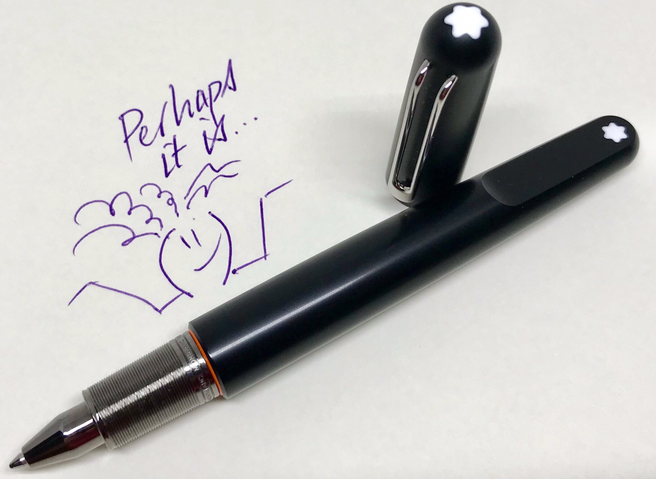
In any event, following on below you’ll only find discussion about a ballpoint pen — one finished in black at that — and certainly no embarrassment. You may recall embarrassment was covered in the initial post about this pen, though squarely in relation to trying to buy the pen, not about buying such a pen.

That said, market analysis or philosophy this post is not. What it is though, is a slightly more detailed look at my Montblanc M Ultra Black Ballpoint. So on with the show.

Look and Feel

Appearance

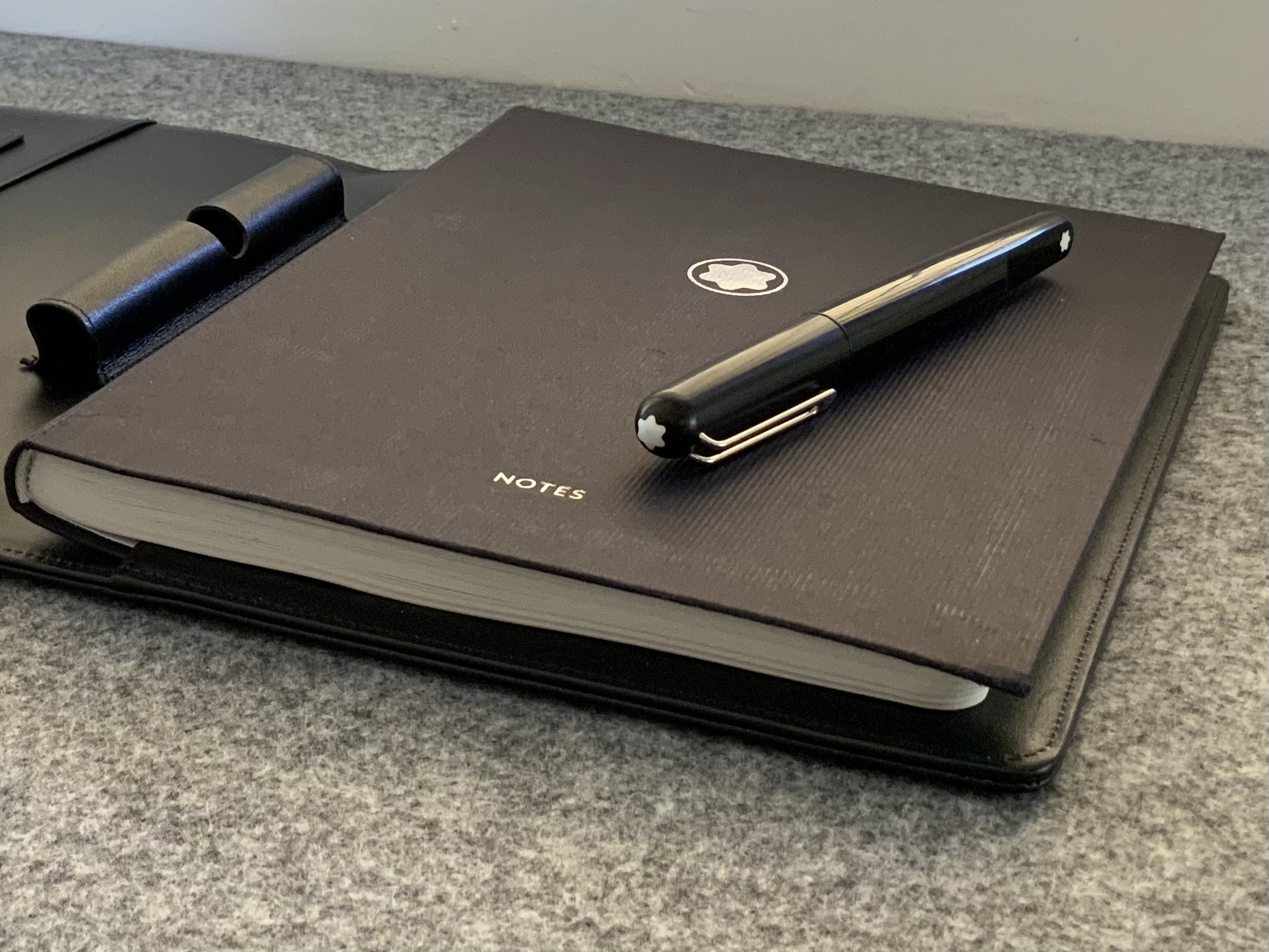
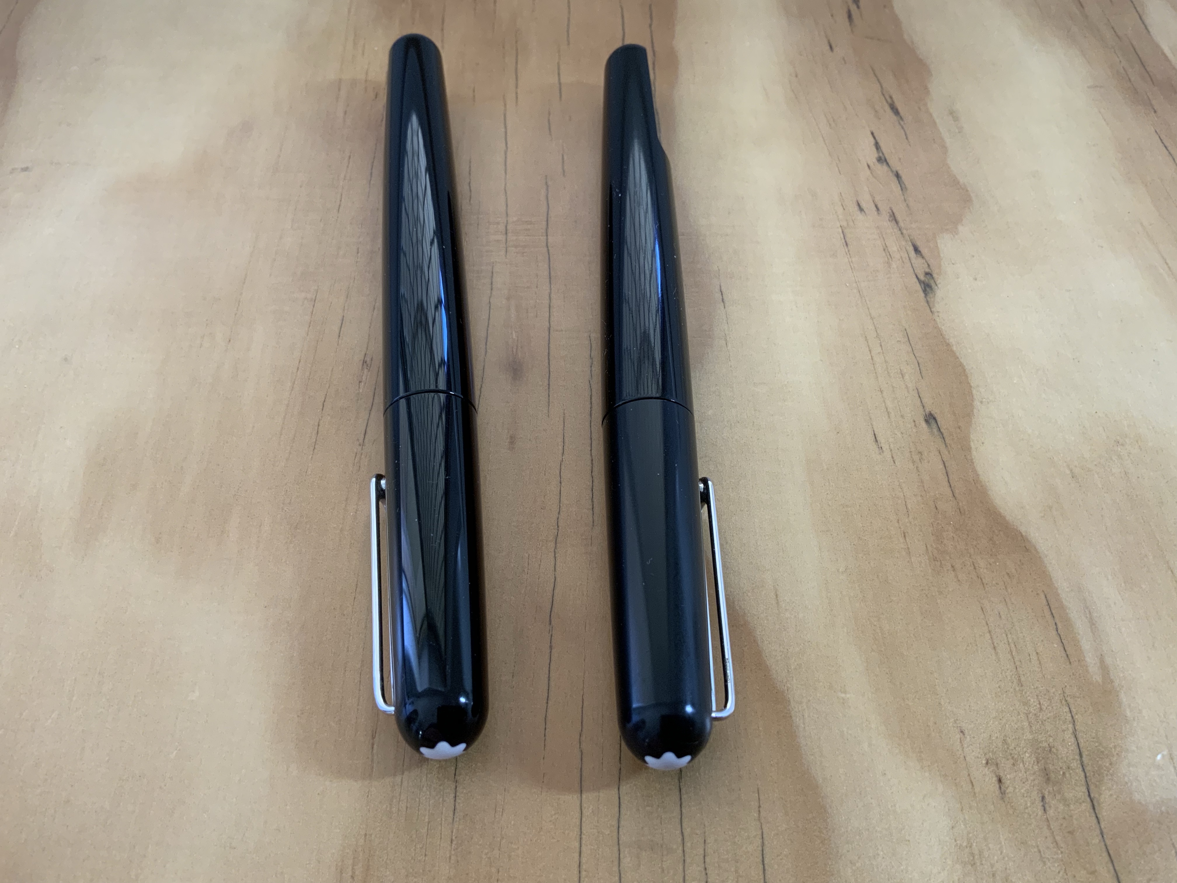
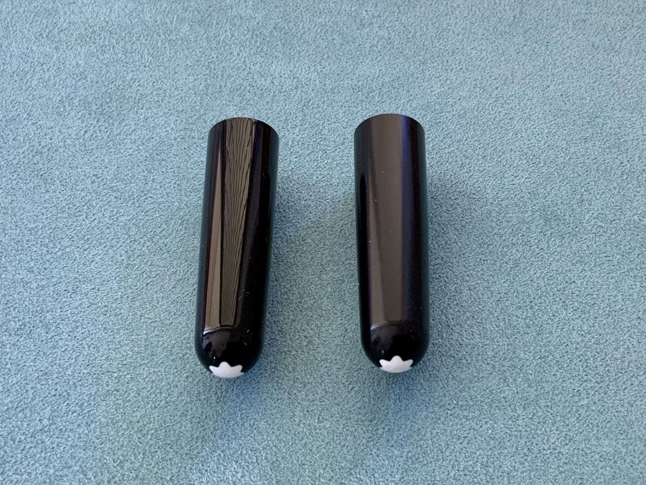
Yes, it is indeed black, though as I touched on in my previous post, I have a certain fondness for matte and brushed type finishes — think the Baron Fig Squire, Lamy aion, or the Makralon of the Lamy 2000. With the majority of Montblanc pens out there on the glossy side of the ledger, the Ultra Black finish which now exists through some of the range was always going to well and truly tick this box, and I certainly would not have added the M to the fold without it.

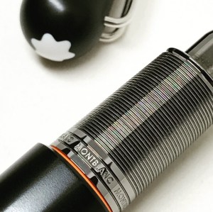
One thing to note here though — and plan for it if you are considering a purchase — after some use, your hand will polish a “sheenier” look to the area it comes in contact with (i.e. the middle of the barrel). I’ve gone with this description because while I wouldn’t call it shiny, let’s say it will become less matte – particularly evident when the now slightly contrasting cap is placed back on. And that, friends, is where this pen earns a whole new level of affection from this owner at least.

img_1552

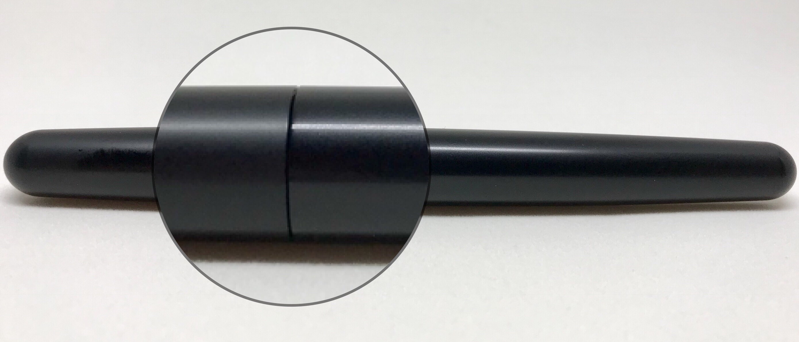
A little less matte on the barrel after a few months use

I love it. It’s the polished wood grain on a well-worn tamper handle; the softened, worn leather spine on your notebook cover, or even the small callus on my finger from hours of a resting a pen. It is a sign of earning its keep — a tale of words gone by and thoughts recorded.

Should that process take a little longer than a few months? Maybe, though I’ll take it either way. Is it likely to bother you? Perhaps, however that is something only you can answer. Certainly worth noting though if that sort of thing might be a problem. Particularly so, given the vendor from whom this pen was purchased confirmed seeing this on other Ultra Black finished pens. I’ll assume it is a standard occurrence unless there are a majority of Ultra Black users out there who have not seen such a thing happen with theirs.

Most of you reading would already be aware the M design is a collaboration between Montblanc and designer Marc Newson, with more information available about this through the next link.

The overall design gives an outward impression of solid build, and the aesthetic is one of… yes I’ll say it: simplicity. The appeal of the M design for me has always been the balanced end to end uniformity, offset with that emblem plateau. For those more in tune with design – from Montblanc on Marc Newson’s work:

When his trademark biomorphic style meets the iconic design cues of Montblanc, the result is both unique and timeless.

…the writing instruments’ fluid lines flow gently into one another. Moving from the Montblanc emblem on the cap, along the platinum-plated clip, which magnetically aligns with a white precious resin Montblanc emblem on the perfectly flat “plateau” of the barrel, consummate forms express visionary design.

As I’ve alluded to already, I like it a lot, however I do tend to enjoy what I’d consider “clean, modern design” for want of a better term. While I understand the appeal of colourful swirls and the like, here (whether gloss or matte), I can only ever see this design in uniform colour. I don’t make the decisions of course, and I’m certainly glad Montblanc gave the green light to the Ultra Black version.

Combined with the accents of a gently knurled, gunmetal grip section and a platinum-coated clip, the overall colour palette befits the design and a Montblanc modern aesthetic. The little flair of orange where the section meets the barrel almost has the appearance of an o ring seal, however is simply a deliberate decision to extend the plastic lining from inside the barrel and section for a little flash of colour. I doubt my appreciation wanes without it, however again, I love that it’s there.

img_1830

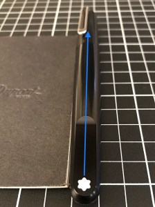
Magnetic cap alignment – almost…

The M is a decent size without being an overly large pen, and I suppose you’d call it a cigar shape, though the ends are a little more blunted than say a Sailor 1911 by comparison. For reference, with the exception of the end taper, the dimensions are quite similar to the Lamy 2000. The snap-on cap and clip are solid, without being overtly flashy. The hero feature of the cap, of course, being the magnetic alignment of the clip with the plateau emblem, which prevents the cap being secured in anything but “perfect” alignment. This feature works almost perfectly, with my clip aligning about 10–15 degrees to the left of the emblem plateau — something which should bother me, however after noticing it in the initial few days after purchase, I’ve not thought about it since, except to raise it in this post.

I’ll touch on my main reasons for picking up the ballpoint version below, however I don’t find any single thing to be the killer feature for the M line of pens. To use that old adage, it is a champion team, which will — they say — always beat a team of champions. It is a pen best taken whole. Probably not the clearest description of things, though sums up my thoughts well enough.

With the Montblanc M range (ballpoint or otherwise) I think it is definitely a case of what you see is what you get. Even from online images, I think you can be fairly confident in your initial impressions of either being fond of the design or not. As always, being able to pick up and hold a pen is certainly an advantage with any consideration around purchasing.

In the hand

So outwardly it is a solid looking pen — what about in the hand? I’d say pretty much the same really.

This is definitely one of those “solid, yet light” pens — even when posted, which apparently was not possible in the initial release, however the M pens now sport a “plateau magnet” to enable posting. In a purely subjective preference, I’m not a poster of any pen (save for those requiring it such as a Kaweco Sport), and here it just doesn’t feel right. I’d say at least 90% of the time the cap is on my desk anyway (another reason the magnetic alignment doesn’t bother me). Other times it will be beside my notebook in a meeting or failing that – in my pocket. If I’m stepping into a meeting within the office, I’ll often carry the pen sans cap anyway.

I’m aware the area around the grip section tends to be another opinion divider with the M line of pens. Heading towards the tip, there is a staged series of steps from the barrel to the section, another down to the convergence nearing the tip, before the refill makes its appearance. The latter two are of no real significance, however the barrel to section transition may be, depending on your grip and preference.

img_1529

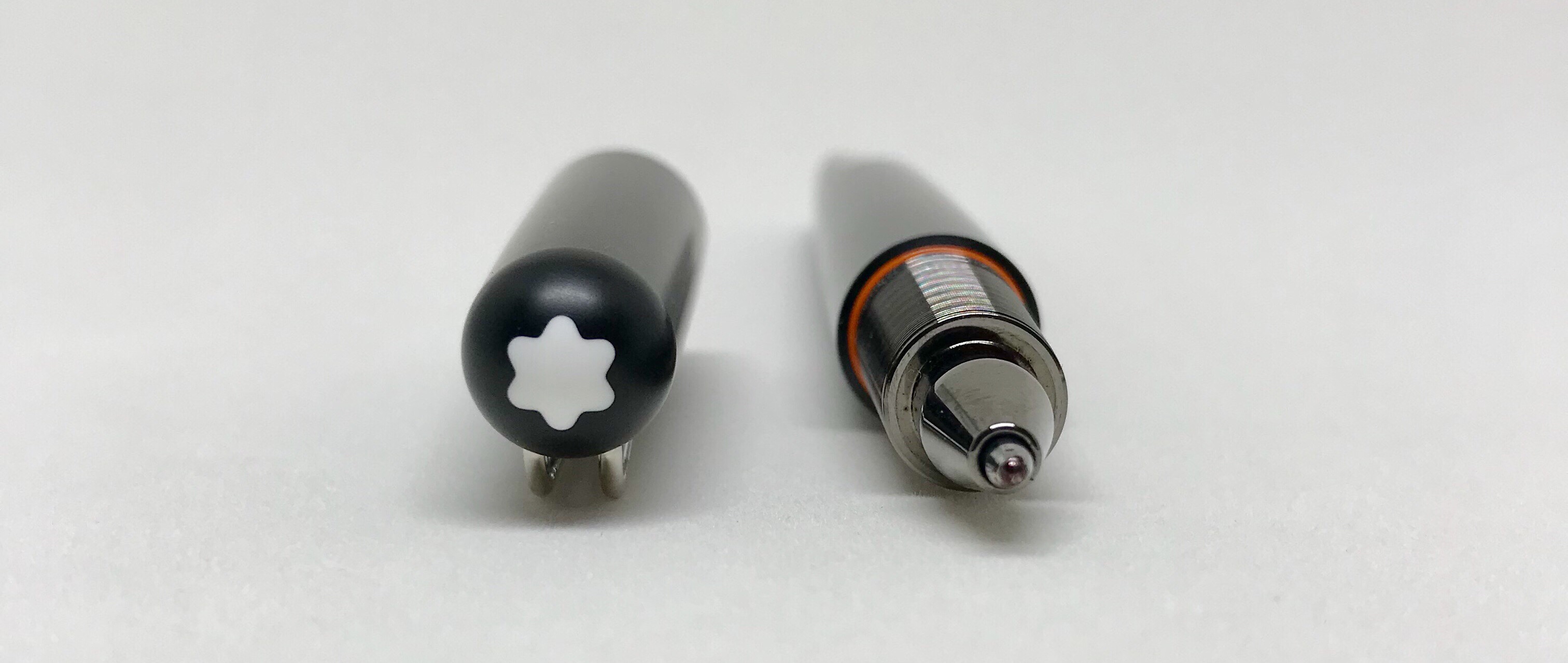
To some, that flash of orange I mentioned may be a “warning — do not proceed,” however I’ve never really found pens with a step down at the grip to be a problem (though again, it goes without saying that will depend on your grip). In fact, I’ve found this one even less so, for the ballpoint refill gives you a 360-degree option in positioning and practically unlimited angle positions. Essentially every spot is the sweet spot. Choking down on the grip a little results in all my fingers residing on the knurled section, or moving further up the barrel, my index finger controls the section, thumb and middle finger above it. I tend to fluctuate between the two, and as you can imagine, use the step as a reference point.

For the type of money we are talking about, I’d say everything certainly does need to be just about perfect — so if you have any reservations at all about this feature in the design, I’d recommend an in-person inspection and test prior to purchase. Bear in mind I refer to “perfect” as perfectly suited to your preference and grip style, rather than some sort of “absolute” perfection.

If these aspects don’t align with your expectations or requirements, then that is simply that. I think we need to get past any suggestion the manufacturer has “blown it” or made some “serious error in judgement” for their design choices at least — regardless of the company. The fact this pen suits me perfectly makes it no more designed for me than not designed for you. The finished product is simply how Montblanc – or for that matter, Marc Newson – designed it.

Unposted, I find the M very well balanced, regardless of a grip above or below the step, and it is a pen which will handle longer writing sessions should they be required, doing so with a high level of comfort for the user.

More on this when we get to writing below.

Specifications

  • Model: Montblanc M Ballpoint
  • Finish: Ultra Black; Platinum trim
  • Barrel: Black precious sandblasted resin; inlaid emblem on plateau
  • Cap: Black precious sandblasted resin; inlaid emblem
  • Closure: Magnetic snap on
  • Weight capped: 27 grams
  • Weight uncapped: 19 grams
  • Length capped: 140 mm
  • Length uncapped: 123 mm
  • Diameter: 13 mm
  • Refills: Montblanc Ballpoint or compatible
  • Price: AUD$610.00 (Montblanc International 2 Year Warranty)

Note the measurements above are my own, so assume they are approximate, yet will be pretty close if not exact — difficult to find any documented specs anywhere.

img_1835

The pen was purchased from Pen & Paper in Brisbane, Australia, in December 2017.

Writing Performance

The refill

I for one will say these Montblanc ballpoint refills write like a dream — well yes… a dream ballpoint. This not being a debate on the merits of ballpoint/gel/rollerball/nib – I purchased a ballpoint for a reason, and everything I need it to do, it does in spades.

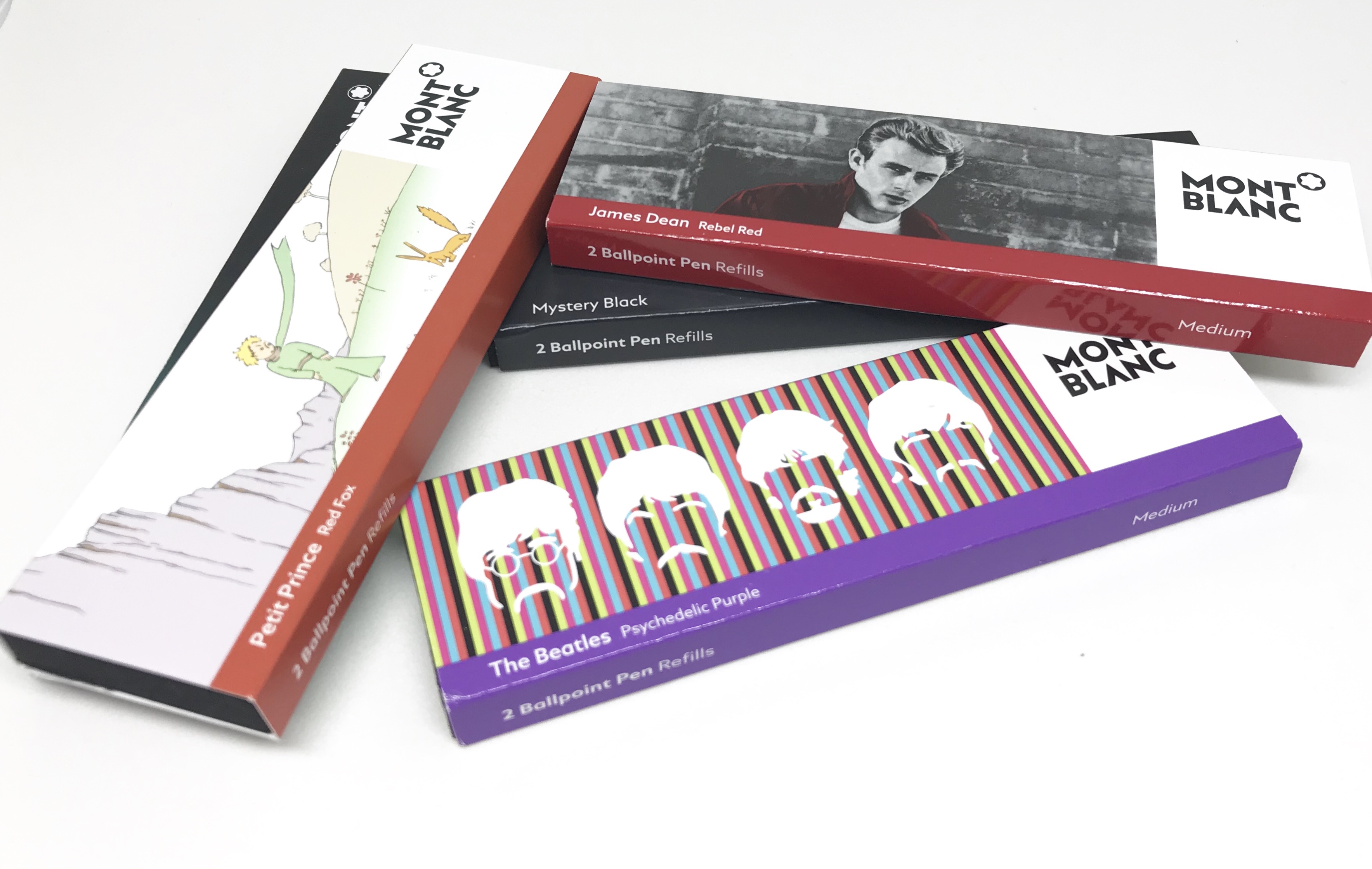
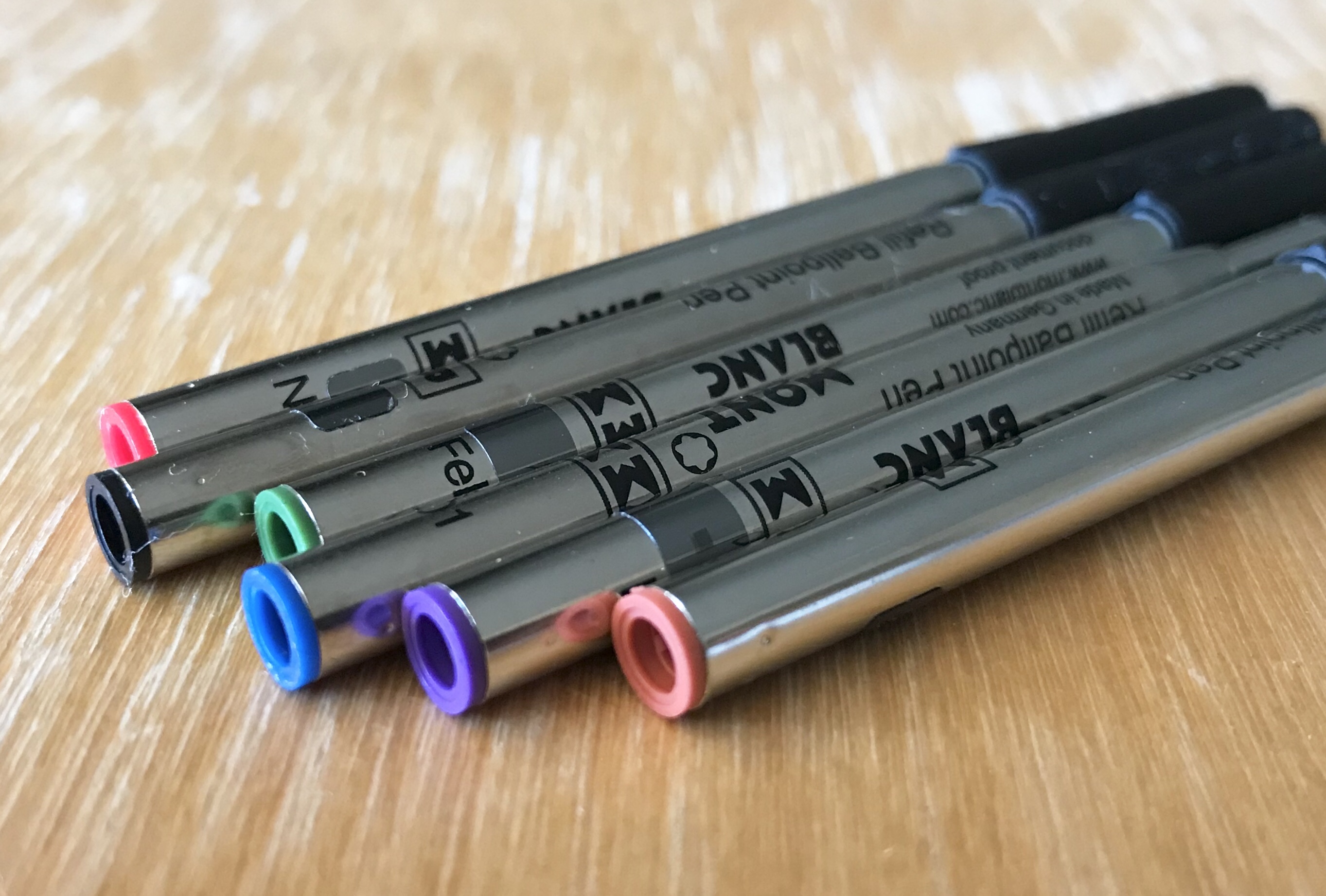
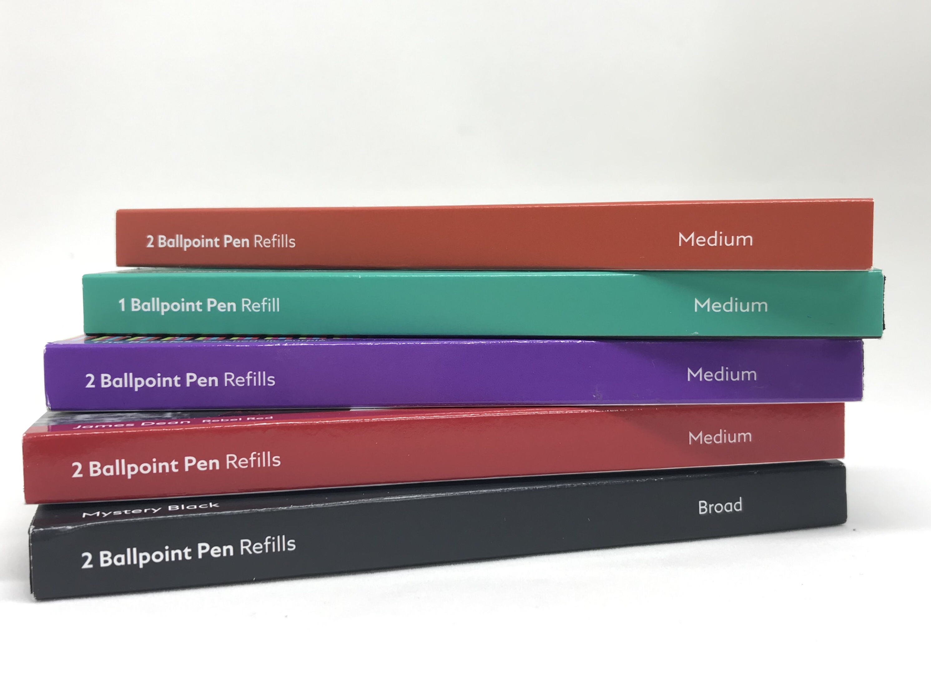
I’ve rotated through three different types so far: the standard Pacific Blue in medium and the Mystery Black in broad. Although only available in medium, I could not go past The Beatles psychedelic purple — love the colour, love the refill box. Incidentally, the availability of many of the special edition colours is another factor weighing heavily in favour of the ballpoint version of the M compared to the rollerball. If that is of any importance to you it is certainly worth considering.


psychedelic purple peeps

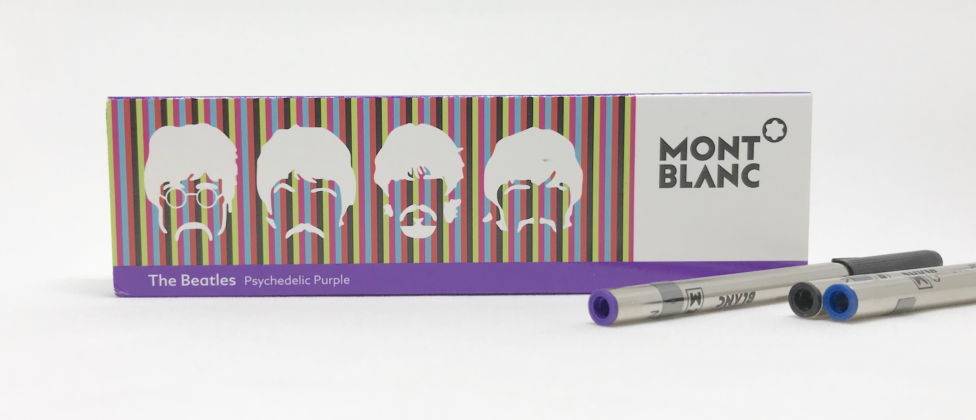
Refill colour options are numerous compared to the rollerball version of the M


The medium is definitely my preferred width. While I enjoy the richness of the broad’s line (the medium holds up well here in any event), with all of that ink being laid down I find things get a little slippery, and the pen skates away from me a little on the page.

Irrespective of width, when talking refills, there are a couple of deal-breakers for me when it comes to writing with ballpoints. Firstly, ink build up on the tip. I used to regularly find this with Parker refills, or cheaper no-name brands. I have not used either of these recently so perhaps things have improved.

I also very much dislike it if the refill rattles around, moves or makes an audible click when the pen contacts or leaves the surface of the page. That thing has to be well-held, and held in perfect or at least near-perfect alignment — not too proud of the housing nor stuck too deep, for either will annoy me during use. It does, of course, help that the M is capped, removing the need for any click or twist knock mechanism which may contribute to play in the refill fit.

img_1583

My fondness for this pen would suggest Montblanc have these areas well covered, and I can confirm they certainly have. The spring tension and refill tip alignment are perfect, and the Montblanc refills I’ve been using these past six months or so have all been flawless in their writing. Smooth, rich and vibrant lines in their respective colours, with no skips, hard starts or clumping in any way, shape or form.

Finally, there is something very satisfying about simply unscrewing the section from the barrel, swapping in another refill and away you go — all in about 20 seconds. Call me a heathen if you like, however I’ve always enjoyed the convenience of ink cartridges in my fountain pens as well, notwithstanding a required flush when changing colours.

Comfort and use

As with any writing instrument, your intended use will really determine whether the M — and the M in ballpoint for that matter — will indeed suit that purpose.


img_1831

Whether many words or a few… the M Ballpoint has it all covered


Personally, I’ve used this thing for meeting notes, letters, and report mark up, however 90% of the time it is on my desk ready to jot down a phone number, take a few notes to organise my thoughts or sign a document. If I consider the uses I put this pen to at the office (often with less than ideal writing conditions), the ballpoint format I consider just about perfect. Conversely, if I were after something to use at home, on my paper of choice for page after page after page, a nice fountain pen may be a better fit. The right tool for the job.

Does this imply some form of compromise in what I am using at the office? Far from it. I have quite a few fountain pens, and as you are probably aware, enjoy using them immensely. While generally fluid and effortless writers, they do less well in some of the situations I put them in at work (think dry time on a document passed around a table for multiple signatures, or sub-par office copy paper). At home, I’m more inclined to pick up one of the more balanced fountain pens in my collection (Sailor 1911 Large, Pilot Custom Heritage 823 or Pelikan 805) if I plan to churn through several hundred to a thousand words or more in a sitting.

One thing I can say is I’ve found the M ballpoint to be considerably more comfortable over an extended writing session than I had originally expected. It is extremely well balanced, has an always-in sweet spot, and provides an effortless experience between writer and page. From both a practicality and usability perspective, it is really everything I could ask for.

Signing off

Well, that folks, is my Montblanc M Ballpoint in Ultra Black.

Sure, it might roll away if placed down uncapped, the finish wear to a slight sheen, and the cap not quite align with the emblem plateau. You might (quite validly) argue that for the price, no such comments should appear in this post, let alone be flippantly dismissed. I wouldn’t disagree, however as you can gather, none of these aspects bother me, and I quite like the subtle change in finish. Once, they probably — no definitely — would have bothered me, however over recent years I’ve come to learn what really matters to me.

Of course, appearance and design are what draw me to a pen in the first place, however in my deal-breaker categories of balance, grip and refill performance, in my experience, the M sits squarely in my sweet spot for all. There is no compromise in seeking and finding a ballpoint — of all things — to be the right tool for the job.

Not only that, the Montblanc M ballpoint is a joy to use, and let’s be honest — if you are writing without joy? That right there is the real compromise.


Perhaps M is for Madness

M craziness

Montblanc M ballpoint in Ultra Black

The Montblanc M series of pens.

Are there reasons so compelling we’d happily open our wallet and forgo several hundred dollars for the privilege of owning one? Perhaps some of us may waver a little in answering that question, others definite one way or the other.

Now substitute another make, model and type of pen in the AUD$500 plus price bracket and ask the same question. Heck, substitute another product instead – leather goods, watch, anything you care to think of. Same answer? Maybe, maybe not.

I recently bought one and I love the damn thing. I guess the kicker being I bought the ballpoint.

An obscene amount of money to spend when you won’t even find a nib on the end? Sure is, though if that’s the language we’re using, I’d suggest it’s probably no less obscene regardless of what hits the page at the end of the barrel. Once in the world of pens, we’re really into respecting choices rather than providing judgement aren’t we?

Now is the time to nod if that isn’t what you’re seeing in the reflection of your screen at the moment.

Outlining the rationale of such a purchase to a longstanding office cupboard company-supplied plastic throwaway user? Perhaps a little more challenging. That same challenge probably becomes insurmountable when having the words “oh I just really like using fountain pens” not available to you in said conversation.

Mind you, I have not actually had such a conversation, and were I to find myself in it, probably see it ending fairly quickly as I wandered off with a trailing “ha… yeah, oh well I like my pens, so you get that I suppose…”

I guess that’s why we write about them instead. Looking around, there are many interests, passions, or even vices to indulge us and lighten our wallets a little – or a lot. The online community then provides most of the conversation. So while I do not seek approval for adding a ballpoint pen to the stable, I find it interesting to think about how I ended up here, and what better way than to put you kind people through a blog post.

So what the heck happened?

In the latter part of last year my pen buying plans were non-existent, as they often are at any given time. Being lucky enough to own some outstanding fountain pens, contentment remains the first word that comes to mind when I think about them or what to use next. I have no pending “grail pen” as many do (which more often than not seem to be of the fountain variety, and fair enough), many recent acquisitions have been rollerballs (with the exception of a kindly gifted Lamy aion fountain pen), and as I’ve alluded to, my pen thoughts usually run to next use rather than next buy.

Having said that, there remained a gap to be filled. Not in my collection per se – more so a tool for a specific job. So I regret to advise the remaining applicants, for now at least – the role has been filled.

Working in Brisbane’s CBD, I am lucky enough to have two pen stores, the Montblanc boutique, and Dymocks, all within a couple of blocks from the office. Add to that some outstanding specialty coffee establishments, and the hobbies/interests/passions category of my existence is well and truly catered for within the radius of a 5 minute walk.

I happened to find myself perusing the wall of leather goods in the Montblanc boutique (you know…as you do on any given day), and upon turning to leave, those astute Montblanc marketing people had placed the M Ultra Black series display firmly in my eye-line.

Now, in the original (and high gloss) precious resin upon its initial release, the M design definitely appealed to me, however I have a bit of a thing for matte black and/or brushed type finishes. If you then add accents of silver rather than a gold, I’ll find it extremely hard to resist simply walking past your display.

Seed firmly planted, or if I am entirely honest – it had sprouted.

Do I really need a why?

Here, it would be easy to say no (particularly if I refer to some of my comments above), though in reality, spending not insignificant money on something as self-indulgent as an expensive pen (or alternatively say, an espresso machine) requires at least a few ink smudges in the yes column.

When I bought my first fountain pen (the Montblanc Meisterstück Classique I’ve written about before), I’d always planned to buy a ballpoint “in a few years time” to use as an everyday work writer. Well, a few years turned into twenty, and for the money, it was never going to be a priority any sooner than that. I guess nothing in the category had ever really caught my eye either.

Any list of this is why it isn’t a fountain pen I provide here can easily be refuted, however know that I’ve already considered any options and already done just that myself. In any event, I’m not here for the hard sell – you will no doubt have very good reasons for making your own choices, even if they are a 180 degrees from mine. Put simply, a half-dozen signatures on a document sent around a meeting room table; a number or note scrawled on a Post-It; annotating a folded document or taking meeting notes with a book perched on my knee; a brief comment on a 20 page document quickly closed.

The list of course is not exhaustive, and as I mentioned – yes, all of those and more could easily be the domain of a fountain pen. Personally, for the sake of smudge-free, simple and efficient, I’m simply more comfortable in my office environment for it not to be.

psychedelic purple peeps

B is for ballpoint… not boring

So did I necessarily set out to hunt down and buy a high-end ballpoint (if that in itself is not a contradiction in terms)? No I didn’t, however with my fondness for the M design (with that Ultra Black finish!), those specific (non-fountain pen) requirements, and a sale to boot – the Montblanc stars (well snow-covered peaks at least) were aligned to make this a compelling purchase.

It’s all Monty Python from here

Now as much as I enjoy wandering around the Montblanc boutique, my next port of call a few days later was to discuss my options with Mal and Melissa at Pen and Paper – my absolute favourite establishment in the CBD. For the warmest embrace into the stationery and pen family, a visit is a must if you are ever in Brisbane.

I’m not going into details here (this post is long enough), but let’s just say my decision tree wasn’t functioning in all its efficiency the day I went to actually buy the pen. Or maybe it was, and simply took every ounce of my willpower to stay on track for what I needed. Without the understanding of the two fine people I’ve mentioned above, I would have left the store, not looked back, and never returned. I’m almost not joking either.

You see, I had a torrid time deciding between the rollerball and the ballpoint. Maybe that’s laughable, I mean it’s not as though we are talking about fine tuning a custom nib grind are we. Anyway, it was an excruciating 20 minutes or so for all three of us I’m sure. Open this, can I see that again, how about the medium, no sorry – I mean the broad, actually can I try the rollerball again? Wow… I don’t know – what do you guys think? (Blank stares). No, no its okay… err, ummm…

And so on, and on… and on.

As someone who likes to think they are at least a little knowledgeable (though I’ve now learned perhaps not always rational) about pens, it was an absolute shambles I tell you. “That’s because you weren’t buying a fountain pen – it was a sign!” I hear you screaming. In many instances, I’d agree with you – but that wasn’t it, and I keep coming back to (as I held myself to on that day also) the right tool for a specific job.

I do thank Mal and Melissa from the bottom of my heart. It wasn’t a transaction that day – it was emotional support. Speaking of support – that’s Pen and Paper in Brisbane’s CBD (or online at the link above) – you know what to do.

Signing off

So what about the pen?

I’ll get to that more specifically in an upcoming post. I’ve kept you long enough this time. For now, I’ll just be content with ticking off quite a few boxes associated with filling that specific need, acquiring something I’d planned many, many years ago, and having something on my desk at the office with a design I very much enjoy taking the occasional moment to pause and stare at.

Just to be clear though – I love it. Yes, for all the reasons I’ve mentioned, however as a hardworking writer both in and outside the office – it is an outstanding pen. Sure, there was an emotional draw and I love the design, and if design didn’t matter we’d all simply be using nondescript nib holders instead of fountain pens.

To sum up this whole surprise, joy, turmoil, and utter contentment experience, I’m very pleased I managed to be objective enough about what I needed, to come away with what is now in use every day at work.

If, after reading all of this, you looked at me and said “Pete… really? It’s a pen mate?!” I wouldn’t disagree with you – yet at the same time that’s precisely the point isn’t it.