Pilot Prera Fountain Pen

Much of what I see online through blog posts, forums and social media forms my initial opinion on a pen, however sometimes I wonder why the reality differs to such a great degree upon having it in my hand. There are of course many times where my perception and the reality are entirely congruous, yet this was certainly not the case with the subject of this post — the Pilot Prera fountain pen.
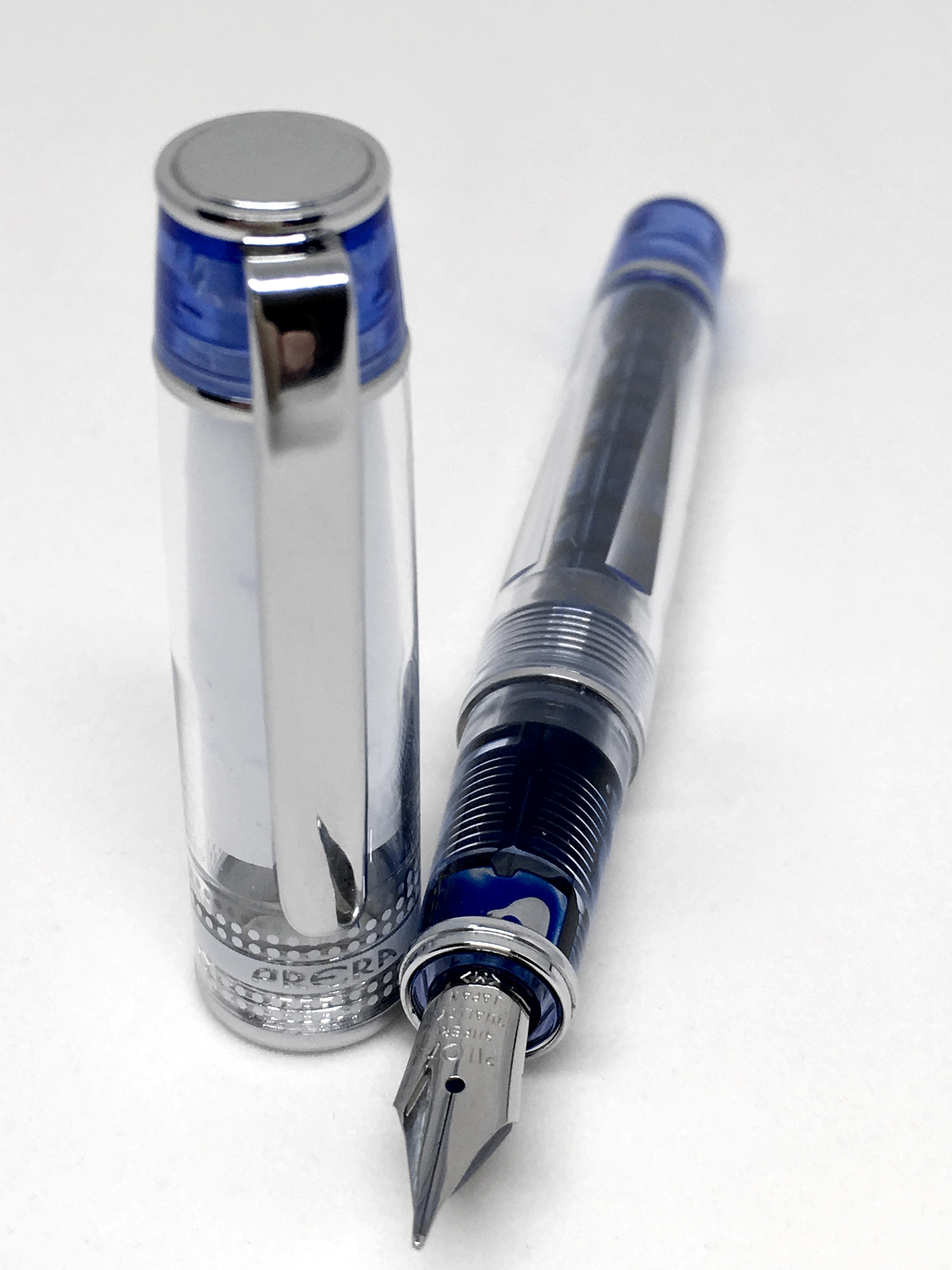
prera_cap_nib

Maybe it was because I haven’t seen a lot of Prera reviews, or perhaps I simply wanted it to be a certain way. In the end, it was simply an erroneous assumption on my part.

What exactly am I talking about here? Well, although pen dimensions are readily available on just about any retail site you care to visit, I had not realised just how small the Prera line of fountain pens are.

The pen you see in this post was passed on to me by a kind reader downsizing his pen collection, after some email correspondence from myself which mentioned I was thinking of buying one. I was therefore lucky enough to add this pen to my collection at no cost. Had I proceeded down the path of purchasing one myself and gone through a more detailed research process, I would have likely ruled it out as a pen for me.

The reason? Well, as I have mentioned in other posts, I prefer to use the majority my fountain pens without the cap posted, and of course a smallish pen likely to render posting a necessity has some convincing to do if I’m going to buy it. To finish up this point and get on with some more details, suffice to say I love this pen, and use it often — posted. Go figure.

Look and Feel

As I’ve mentioned above, the Prera would be classed more so as a “pocket” pen, rather than a “mini” as such, and given its stature, I’d say this is an accurate description. As you’ll see from my post about the Pilot Custom Heritage 92, I do like a pen with blue, silver and transparency in it’s styling.

Given the size of the pen, it’s no surprise the cap and clip are proportionally short. The metal clip is only 40 mm long, which is equivalent in length to the white inner cap sealing the nib, visible through the transparent outer cap. Though not a major issue, it is a pity this prevents the nib being on show through the cap as well.

prera_under_nib

If you are someone who prefers clean simple lines on a pen, the overall appearance of the Prera may not suit entirely, and I think this is a combination both of design — and indirectly — its size. As you can see, the trim, accents and labelling create what is a fairly “busy” looking cap, and with its short stature, may seem a little cluttered for some. The body itself is somewhat less so, however with the cap posted of course you end up with the same look simply on the other end of the pen (a statement straight from the files of the bleeding obvious if ever there was one). I wouldn’t say this bothers me, however for some it might.

The overall aesthetics of the pen in relation to the distribution of accents at each end, metal bands along both cap and body, and transparent demonstrator barrel provide an interesting, yet not over the top look to the Prera. A great looking steel Pilot nib rounds out the pen, complementing the metal clip and banding nicely.

prera_v_sapporoI must admit I do find the sizing and proportions of the Prera to be a just little odd. I have it sitting next to a Sailor Pro Gear Slim (Sapporo) as I write this, and although the two are very similar in size, the truncated finial at the end of the Prera’s cap throws the proportions a little out of balance. With just a couple of mm more after the end of the clip ring similar the Sailor, the entire pen would look a little more — well…balanced.

That said, a good question to ask at this point is why should all pens look the same — a very valid one for of course they shouldn’t. If we all preferred the same style of pens what a boring world it would be.

Key Specifications

Courtesy Jet Pens

  • Manufacturer: Pilot
  • Model: Prera
  • Weight: 0.6 ounces (17 grams)
  • Body Material: Acrylic
  • Cap: Snap On
  • Clip: Metal
  • Diameter Grip: 10.6 mm
  • Diameter Max: 12.0 mm
  • Filling Mechanism: Converter, Cartridge – Proprietary Pilot
  • Grip: Plastic
  • Length Capped: 12.0 cm / 4.7 inches
  • Length Posted: 13.4 cm / 5.3 inches
  • Length Uncapped: 10.8 cm / 4.3 inches
  • Nib: Steel

Prices at time of writing:

  • JetPens $US38.00 ($AU52.00)
  • Cult Pens £33.29 ($AU70.00)
  • Engeika $US29.70 ($40.00)
  • similar prices to be found with eBay sellers

Writing performance

I made mention in a recent Wiser Web Wednesday post about the positive aspects of a nib that simply writes perfectly (in that case a review of the Pelikan P200 on the Pelikan’s Perch), and does so each and every time you pick it up. I’ve typically found Pilot nibs are generally part of this group.

prera_writingIt is for this very reason (and the snap on cap), I have found the Prera to be a fantastic day to day office pen1. In a daily writer, I need something reliable (no false starts, skips, ink blobs or leaks), which I can keep capped (to ensure it remains reliable), yet is quick to pick up and use — which pretty well ensures my go-to’s will be caps of the non-threaded variety. As you can imagine, the domain of the Prera, Pilot Metropolitan, and Lamy 2000 (a joyful every day pen if ever there was one). The rotation here also includes an ever-changing roster of gel pens, rollerballs and my trusty P8126 filled Retro 51.

prera_nibI don’t really have a great deal more to say specifically about the medium, steel Pilot nib on this Prera, apart from the fact it is a beautiful writer and performs straight out of the blocks every time. As you’d expect, the medium nib is somewhat finer than those on my European pens, and although quite resistant to flex, there is just enough “give” to make it extremely comfortable to use over longer periods.

There is a very small step down to the section from the barrel, however the absence of threads given the snap-on design of the cap ensures a very smooth grip. Personally I feel the surety of the grip is enhanced by this step, as well as providing a feedback point to align your fingers and thumb. I cannot see this being an issue regardless of your preference or grip style.

Whether or not a pen will work for me posted, is of course about balance rather than overall weight, though a very heavy pen will take its toll over a longer writing session. I’d say I have a fairly broad range of pen weights I find comfortable, with only very, very light or overly heavy pens a problem.

The Prera is well weighted at 0.6oz (17 grams), and reasonably well-balanced when posted — a necessity given its size. A point to note here is a good proportion of the weight is distributed fairly high on the pen with the cap posted, given its metal clip, final, and rings. As a result, the centre of gravity seems a little high, so depending on your particular style of grip and pen alignment, is something to keep in mind. In its favour here though is the short overall length, which places most of the pen down in the hand of the user rather than out the top — the main reason I found the Prera quite a useable pen when posted.

A final note on the size and posting brings us back to the Sailor Sapporo I mentioned earlier — a far better balance for me when posted, despite weighing in at 19.7 grams. Ok — time to move on.
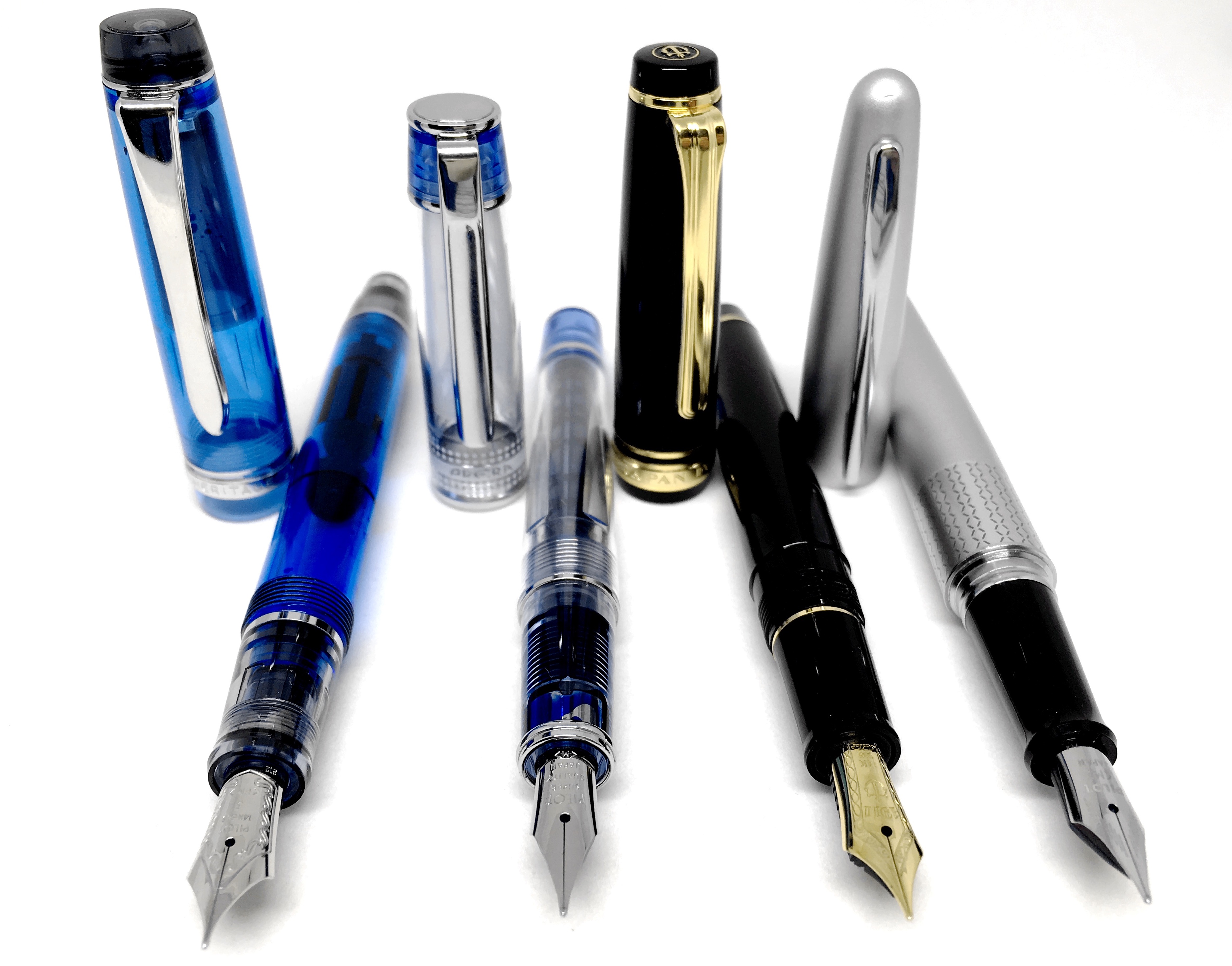
L to R: Pilot Custom Heritage 92; Prera; Sailor Sapporo; Pilot Metropolitan

L to R: Pilot Custom Heritage 92; Prera; Sailor Sapporo; Pilot Metropolitan

A couple of days ago I returned to the Pilot Metropolitan (M Nib) after the cartridge in the Prera ran out, and the change was probably a little telling.

Hands down I find the Metropolitan is a far better pen for me, fitting my preference for use without posting the cap, having a nib essentially the equal of the Prera’s, and of course the price. The Metropolitan can be picked up for less than half the cost of the Prera, and for me, is a better overall pen. So if you are looking for value for money without needing to compromise, I think the Metropolitan is definitely the way to go.

Closing thoughts

My advice if you are thinking about picking up a Prera? Know you will be buying a high quality fountain pen — just know it will be on the small side when comparing to many others in your collection, and if you are a strict non-poster, this pen most likely won’t be for you.

As I’ve mentioned above, for me, and I’d argue for many potential buyers, the Pilot Metropolitan is an equally good pen and offers much better value for money. The two pens could not be more different in size and appearance however, and it is your own particular preferences here that the real choice will be made.

Again just remember (note to self) — the Prera is on the small side.


  1. The paper? At my desk unusually enough are the standard A4 bulk buy Staples legal pads. Miraculously they hold all but the wettest, broadest nibs — and certainly all of the pens listed here. ↩︎

Fountain Pen Nibs: Of Steel and Gold

We’ve all read them, and I’ve certainly written them. Words in praise of the gold fountain pen nib. Certainly not without foundation, however a great writing experience — in my opinion at least, is not the exclusive domain of 14k and beyond.

I should note at the outset what this post is not — in part because of my intention in writing it, and in part because I do not possess the knowledge, nor experience to go deeply into the technical aspects of the subject at hand.

This post is certainly not an in-depth look at nib construction and manufacturing, or the development these aspects as modern pens have evolved. I have also not addressed how things might differ if you prefer very broad, wet nibs as opposed to the medium to fine bunch which make up the majority of my collection. Also, none of the pens I own have had any custom nib work done nor been purchased with specialised nibs (i.e. italic, stub and the like).

No — this post essentially came from a curiosity of mine as to how many of each type of nib I did have, and whether, upon more considered thought, a pattern based on that nib material was evident in the pens preferred writing with.

A little background

If it can be suggested there is a “usual” trajectory in nib experience and acquisition, it would most likely begin with steel in the “low end” or “entry level” pens, and progress along to gold as the user experience, desire, and budget expand a little (or a lot).

Of course there are always outliers or exceptions to the rule. The first fountain pen I bought — a Montblanc Meisterstück Classique, with a 14k nib. It is still my most prized pen possession, for many reasons, most of which are outlined here. Thinking back, that purchase was an exercise in naïvety of the most extreme kind, but boy I’m glad it was made. Anyway, that is another story.

Plenty has been written on the topic of gold versus steel nibs, and for a sound basis of what we talking about in this post, I refer you to a piece by Brian Gray of the Edison Pen Company. Written in 2010, it lays out many of the questions (and answers) that arise when discussion is had around gold and stainless steel nibs.

In the post, Brian outlines the biggest difference between modern stainless steel and gold nibs: flex. If we define flex as a causing line width variation due to spreading of the tines in a nib, gold will generally provide a greater degree of this. Irrespective of flex, I personally find most of my gold nibs to be softer, or possessing more “give” as Brian describes in his post.

As far as the actual tip material on the nib, this is often identical in any event, whether gold or steel is used in the construction. Both have a “tipping” material, often referred to as iridium, which is common for either type of nib for either type of nib, and is what comes into direct contact with the page. Here I’d recommend a little further reading on this in another of Brian’s articles:

Please regard iridium as a synonym for tipping material.  The tip of a pen nib is rarely iridium, and almost never pure iridium.  It is usually plathenium, osmiridium, or a various mixture of metals.  So in the pen industry, understand that iridium is a term used to refer to tipping material, even though there is usually no iridium present.

Aside from the above, most specification pages you might care to look up of the pens you see here will also state the nibs are “rhodium plated” gold or steel — hence the silver appearance of many of the gold nibs, or part thereof. You can probably now see why anything other than a cursory mention of these aspects about nib construction is way beyond both the scope of this post and my knowledge and expertise in such matters.

In summary, if we were to grossly over-generalise things, gold nibs you could say, generally provide more flex, have a little more give (independent of flex), and are usually found on more expensive pens. Clearly they also play a role in the overall aesthetics of a pen — particularly if the gold nib is actually gold in colour as well, remembering not all of them are.

My collection

When the idea struck to take a quick inventory of my own collection, I did so and posted an image to Instagram. I’ve also included images of some of my pens below.

Even from that simple Instagram photo, it is fairly evident pens with gold nibs are almost as numerous in my collection as their steel counterparts. Of the eight in that image however, six were kindly passed on from another fountain pen enthusiast’s collection. I’ll be honest — there is simply no way I would have as many in my collection without this generosity — purely and simply from a financial point of view. The pens? I love each and every one of them — the Custom Heritage 92 (FM) an absolute standout favourite, along with the Meisterstück Classique, as I mentioned above.

gold_nibs_zoom

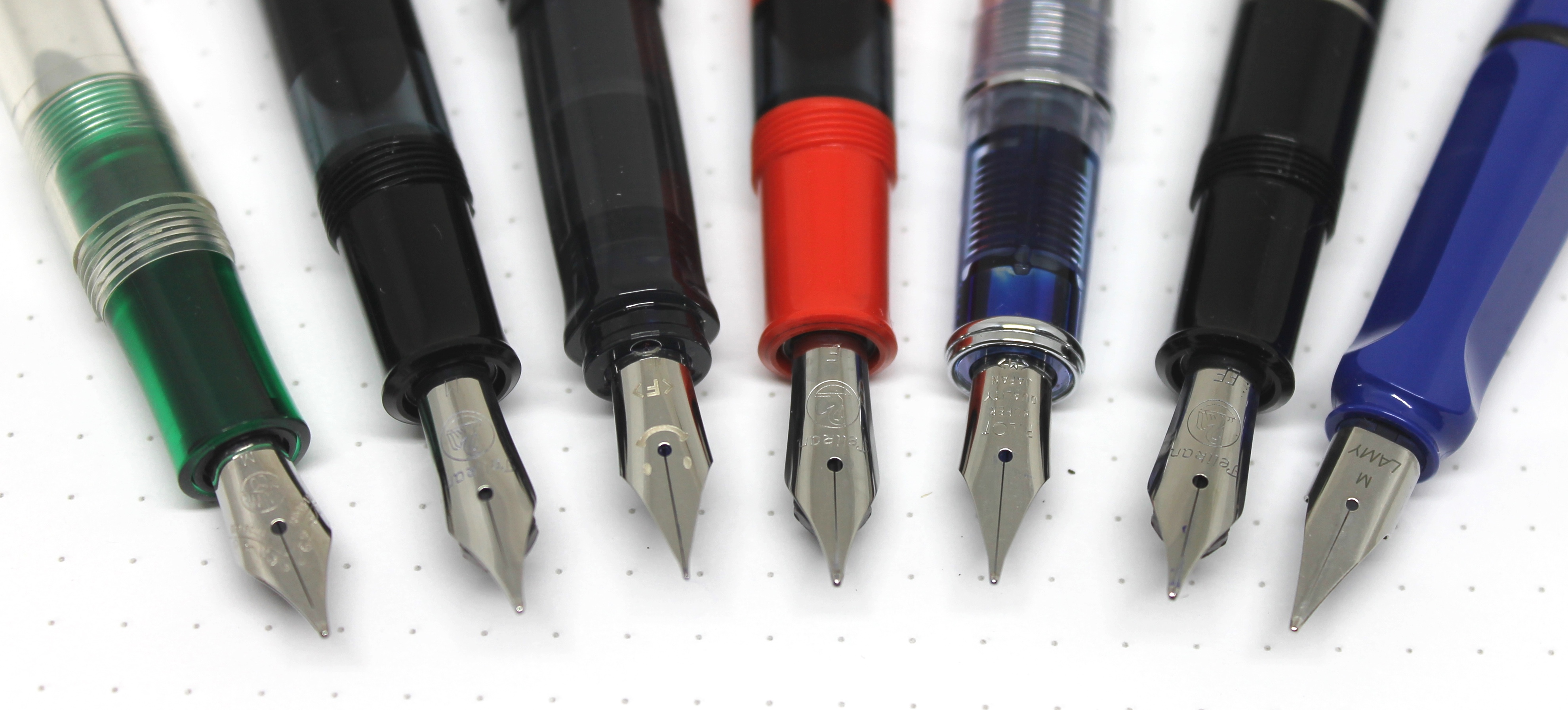
We struck gold – from (L): 1&4 Pelikan; 2 Lamy; 3&5 Pilot; 6 Montblanc

The steel nib pens? These were where I began to build my collection after owning that sole Meisterstück for around 16 years. Was I disappointed with the Kaweco Ice Sport, Pelikan M205, Pilot Metropolitan, Lamy Safari or even the Pilot Petit1? Not in the slightest. One of my absolute favourites — the Pilot Kakuno I bought for my son’s birthday a couple of years ago. The steel nib on that thing is absolutely amazing, and it cost me all of $AUD14.95. The reason it isn’t in the image below is my habit of forgetting to raid my son’s stationery drawer when I take pen photos!

steel_zoom

Pen of steel – from (L) 1 Kaweco; 2,4&6 Pelikan; 3&5 Pilot; 7 Lamy.

In conclusion

If you have made it this far, and are still looking for a definitive answer on whether to shell out a few (perhaps quite a few) more dollars for a gold nib on that pen you are considering, I’m probably going to disappoint.

My honest opinion? I would not advise you to spend more money on gold simply for gold’s sake. Will the writing experience be better if you do? Not necessarily, however it will certainly be different. Would I say any of my steel nibs offer a better writing experience than the gold? Probably not. Asking the same question of the gold however — I’d say probably yes — some of my gold nibs do write more smoothly and effortlessly than the steel.

Bear in mind though, if you are talking day-to-day use, posing this question and seeking a somewhat useful answer, relies on so many other factors, a definitive conclusion might be pretty hard to come by. Am I trying to best show off a new ink for an Instagram post, or scrawling a few hundred words of notes in a meeting? Add to this the numerous other situations in which you may find your fountain pen wielding self and you’ll see what I’m talking about.

In wrapping up — did I answer my (selfish I know) original question about whether there is a preference or pattern in the nibs I prefer? Looking back I believe I have — and it is a fairly resounding no. As my collection continues to grow, both steel and gold nibs will be part of any additions. The difference? The almighty dollar will perhaps see the steel side of the ledger increase a little faster.1

So, I certainly have a definitive answer about steel versus gold when reflecting on my collection and preference. Whether or not any of the above has helped you in any way I’d certainly be less certain. That said, if a steel nib pen has a good reputation, and is at a price you are prepared to pay, I’d be fairly certain you won’t be disappointed.

  1. Of course any arguments around quality versus quantity and saving for a more expensive pen are certainly not irrelevant here. ↩︎

Aussie Fountain Pen Friends on Facebook

A couple of months ago, the Fountain Pen Economist Dr Jonathon Deans (Web, Twitter), mentioned in passing how it might be nice if a local discussion group existed for Australian Fountain Pen enthusiasts. More recently on Twitter, he asked the question whether there were any Facebook groups for such people, with my response indicating there were none I was aware of, perhaps with the exception of the one he was about to start — which I said with tongue only half in cheek.

IMG_4823Since then, start it has, with the Fountain Pens Australia group now up and running on Facebook, with Jonathon and fellow fountain pen enthusiast Yagan Kiely (Instagram, Twitter) kicking things off.

Bear in mind that I had not yet taken the plunge into the land of Facebook at the time, having only recently created my profile with the intention of joining the FPA group. A big call, however one I believe will be well worth it. As I write this on a lazy Saturday afternoon, membership numbers have been steadily rising over the course of the day — very pleasing indeed.

What do I hope to get out of being involved in such a group? Much discussion and information sharing around one of my passions — fountain pens. I have seen the power of the internet and social media in disseminating such information through Twitter, Instagram, various pen blogs, and of course avenues such as The Pen Addict podcast.

A Facebook group such as this, with a local focus, is a fantastic opportunity to learn a whole lot more through discussion with like-minded individuals (most of whom are likely to have vastly more experience than myself), yet be sure the content remains highly relevant to the local market. Discussion has already been active in relation to the upcoming Melbourne Pen Show in November.

Although I’ve been writing here for a couple of years now, with a fair portion of content devoted to pens, I do still consider myself a beginner, with much still to learn about fountain pens. I’m fairly sure I’ll be doing more “learning” than “teaching” in such a group, however am very much looking forward to contributing what I can.

So if you are reading this in Australia, are on Facebook (or think it worth joining like myself), and are at all interested in fountain pens, please click this link and set about joining the Fountain Pens Australia group. Be part of what is bound to be a friendly and productive group discussion on a subject myself and many others derive a great amount of joy from.


Lamy Pur Fountain Pen – 14k Nib

I was very intrigued when this pen arrived, for it immediately brought back memories of my first year of full-time work after university. Back then I was using a Sheaffer ballpoint. I cannot of course remember the exact pen model, however what drew me to it in the first place was the uniformity of the barrel, from end to end. Suffice to say the Sheaffer in question was more slender than this Lamy Pur, and any resemblance only very passing, however that is often all it takes to trigger these types of memories.

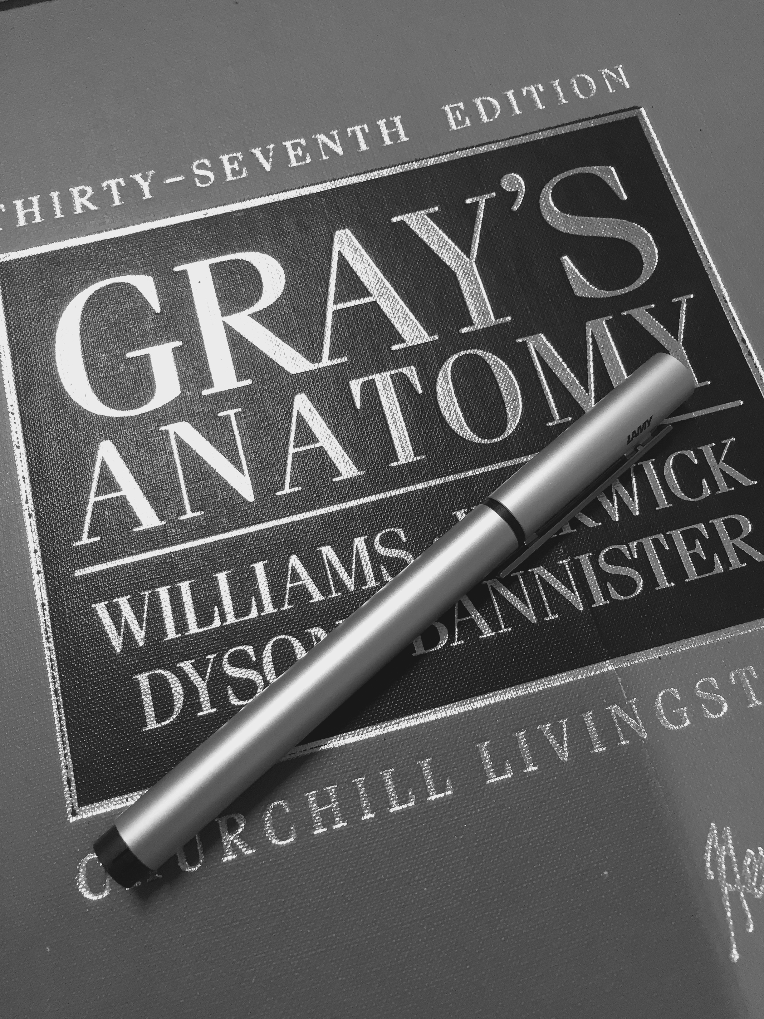
grays_coverThe job? My first year as a physiotherapist in one of Brisbane’s major teaching hospitals. That Sheaffer pen drew a few comments from those who borrowed it, varying from “that’s a nice pen — don’t lose it in this place” to “how can you possibly write with something so small” (read, thin). The latter was from an Orthopaedic Surgeon who was no doubt used to whatever cigar-shaped fountain pen he might have been using at the time.

While we are on the topic of surgery, I mentioned in a previous post about the strong associations I have involving various styles of pens, and this one is no different. The clean, clear lines of the Lamy Pur — I’m thinking surgeons scalpel. A minimalist design for pure function, perhaps not out of place recording post-op notes in a medical chart.

Anyway, moving on to matters at hand — the actual Lamy Pur fountain pen. As quite a few of the pens I have written about recently, I kindly received this from a fellow enthusiast in the process of downsizing his pen collection.

Look and Feel

lamy_bonesNo — it doesn’t really look like a Sheaffer ballpoint, however it is indeed distinct in its taper-less design, with a uniformity of thickness from end to end when capped. As you will read about below, I think Lamy might have been wise to maintain this design right through the grip section as well.

Although the black, knurled plastic grip matches the posting extension at the end of the pen, it somehow seems out of place with the overall finish and aesthetics. Personally, I find the Lamy Pur quite striking with the cap on — a minimalist look of brushed aluminium, marked only by the black plastic at the end of the pen, cap junction, and hidden inside the finial of the cap. Even the metal clip is able to add rather than detract from the geometric uniformity.

Personally, with a new or unfamiliar pen, my mind subconsciously works through three stages. How I initially feel looking at the design; whether or not my excitement increases when I uncap the pen and more closely inspect the section and nib; and finally, whether this increases again when the nib hits the paper. For a great pen, these stages would be thus: “wow”; followed by “oh wow”; and finally “yeeesssss”. An extremely objective analysis!

My point being, even if the first stage is “wow – I like the design of this”, if the second is “oh… um”, then regardless of how the third goes, I am on average going to be underwhelmed, which may influence how I ultimately feel about the writing experience. Such is the case here. I simply keep finding myself imagining how great this pen would look and feel, with that quality Lamy nib sitting at the end of brushed aluminium rather than plastic.

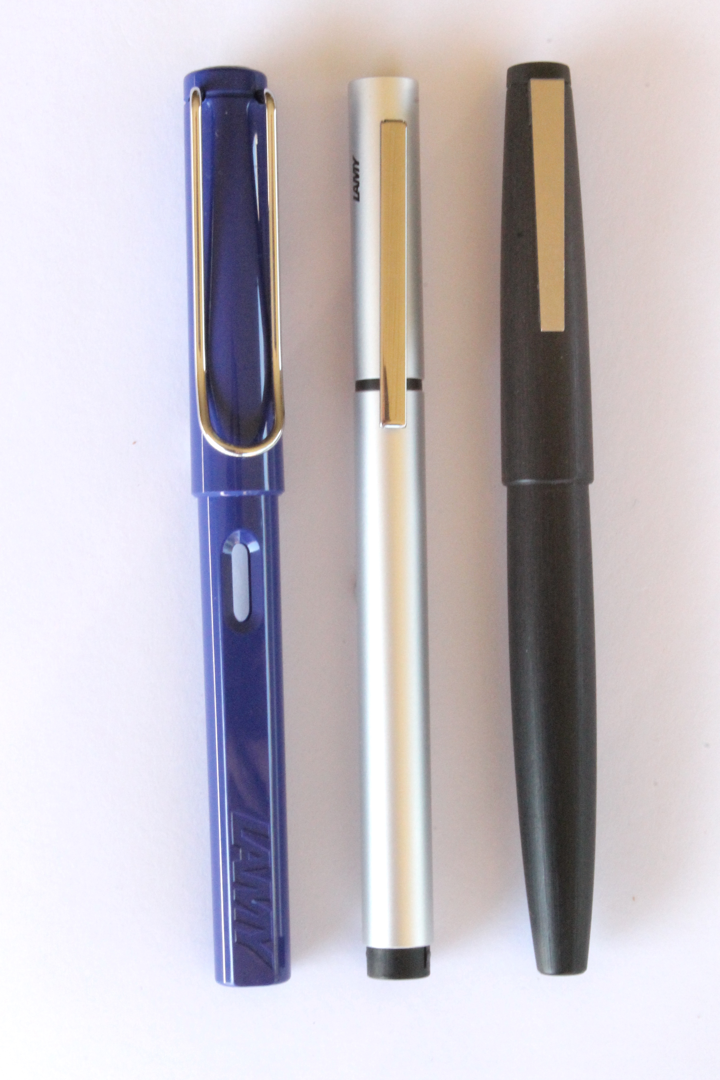
lamy_3_pack

With the Lamy Safari (L) and Lamy 2000 (R)

Clearly I have made my point and need to move on.

To finish things up here, I should add the pen is quite light and very easy to hold, and the cap snaps on very firmly either to close or post for writing (however relative to its thickness does make for a comically long pen if the cap is posted). The metal clip is solid and compliments the pen nicely, crossing past the cap/barrel junction, which adds to the smooth lines and gives the overall appearance of a little more length.

There is an understated black Lamy logo adjacent to the clip which rounds things out nicely.

I’ve said it before and I’ll say it again, I think this is a really attractive pen when capped and sitting on a desk — it’s just that pens aren’t really made for that are they? Mine certainly aren’t anyway.

Specifications

Information courtesy Cult Pens:

  • Material: Aluminium, Metal, Plastic
  • Refill Type: Lamy Z26 Converter (supplied) / Lamy T10 Ink Cartridge
  • Nib: Steel (Standard); Current model: 14k bi-colour gold
  • Length Capped: 5.4 inches (13.7 cm)
  • Length Uncapped: 4.9 inches (12.4 cm)
  • Length Posted: 6.7 inches (17 cm)
  • Diameter: 0.4 inches (1.1 cm)
  • Currently available at Cult Pens for £30.54 ($AUD65.30)

I received the Lamy Pur with a Lamy Z26 converter in place, and have found filling to be a breeze, however the pen can also to be used with the T10 ink cartridges produced by Lamy.

The pen comes with a polished steel Lamy nib as standard, and no doubt many a reader would be familiar with such a nib. As I have already noted, the model at the subject of this review has a 14k bi-colour gold Lamy nib fitted in EF width ($AUD119.95 at the time of writing from LarryPOST). The appearance of the nib itself is quite understated, which I like, as the gold runs only from the breather hole down to the tip of the nib inside each adjacent tine.

On Paper

When I uncap a Lamy fountain pen and begin writing, there is a certain expectation around how the nib is going to feel and perform. As you can imagine, every expectation was met here — and I expect this would have been the case with the standard steel nib fitted rather than the 14k gold nib I have on this pen. There is no doubt, Lamy do make great nibs, and I don’t believe I’ve ever heard of any quality control issues with them — nor am I likely to.

IMG_4523

The 14k nib is a dream to write with

The 14K gold EF nib on this Lamy Pur is exceptional. As smooth across the page as you’ll find, with just a little spring (I wouldn’t say flex) to add some character to the words flowing from the nib. Compared with a Lamy steel nib, I find the 14k a little wetter, softer and therefore broader than a comparable width steel nib, or even my steel F Lamy nib for that matter. The 14k nib was certainly a joy to write with, and more than once when choosing which pen to pick up it has been the nib which has drawn me to the Pur.

The only problem is — remember that black, knurled plastic grip section? Yes, I think you might recall it from the paragraph above — I also have a small issue with it when writing. As beautiful as the nib is, I’m unable to quite do it justice as I find the grip section provides me with very little control over the pen itself.

As my fingers want to slide down the section towards the nib, it is an ongoing conscious effort to keep the pen in the position I want it while writing. As you can imagine, that detracts somewhat from the writing experience, which is unfortunate, for a nib of this quality and performance deserves to be used for extended writing sessions. For my personal preference, either the knurls need more knurling to provide better grip, or the slight taper would need removing.

So as far as specific use cases are concerned for this pen, I am therefore looking at shorter bursts of writing such as list making or perhaps a few notes here and there whilst listening to a podcast or the like.

I probably should be quite clear about one thing — I am still yet to encounter a fountain pen I put down and say: “Well I won’t be using that again”. The reason my explanations of certain issues can be a little lengthy is simply so you, the reader, have an understanding of why a certain pen is the way it is — for me at least. Not to overemphasise there is something inherently wrong with it — nor to suggest you would necessarily find it the same. With any pen, I simply ask myself: Is there anything that could be changed to make this pen better for me?

Final Thoughts

IMG_4525Sleek. Minimalist. Futuristic. Space-age. Austere. These are the kinds of words which spring to mind when I think about how I would describe the overall aesthetic of the Lamy Pur. It is certainly not your typical looking fountain pen, and although the words I’ve described above might suggest it lacks character, that would be very far from the truth. It is both striking yet understated at the same time, if that makes any sense at all.

In my opinion this is quite an attractive pen — true, it loses a little of this lustre when uncapped and the black plastic grip section is exposed. This same section also sees it lose a little more of its merit when in use, through a lack of grip control requiring a little more effort while writing.

Do I enjoy using it? Absolutely — it’s a great fountain pen with an exceptional nib (remembering in this case a 14k gold Lamy nib). It is simply a matter of that little bit of extra effort I’m required to use while I write.

The truly superb instruments? They become part of my hand as I write. No conscious thought required. It is indeed a very fine line, but one which remains apparent with the Lamy Pur.


Pilot Custom Heritage 92 Fountain Pen

IMG_0922This pen became an instant favourite the first time I laid eyes on it a few months ago, and has remained so since that day. Received from a kind gentleman who was downsizing his collection, I’m still very often reminding myself how lucky I am to have been given the opportunity to add a Blue Pilot Custom Heritage 92 (FM nib) to mine.

There is of course a rationale behind the Pilot Custom series numbering, succinctly explained in this Fountain Pen Network review of the Custom 748. Essentially, a model number (XXY) indicates the number of years (XX) since the foundation of Pilot in 1918, and the price in yen (Y) of the pen at release multiplied by 10,000 (i.e. 10,000Y). Not all models carry the three digit nomenclature, as is the case with the Custom Heritage 92 – released in 2010.

Look and Feel

To my eye and taste, this pen has just about the perfect marriage of form and function. I immediately notice the combination of colour, trim, and overall symmetry and proportion. It evokes an association of a deep blue ocean, a black rocky outcrop, and the shimmering line of the sun up the silver clip to the horizon.1

IMG_0923What a fantastic blue, and in combination with the black and silver is just about perfect. The transparent deep blue resin provides enough colour to support the contrasting silver and black at each end of the pen, yet still allows visualisation of the internals. The nib itself however is shrouded in an additional sheath to seal the nib when the cap is in place.

I had not owned any demonstrator pens prior to coming into ownership of this Custom Heritage 92. For those unfamiliar with the term, a demonstrator pen being one which is partially or mostly transparent, allowing the internals and of course the ink to be seen through the barrel. A way of demonstrating the pen and its features to potential buyers. Personally I quite like them, and this particular model, given its blue colour, lies somewhere in the middle of the transparency spectrum — a transition of sorts.

As I have touched on above, the overall symmetry of the pen is very appealing to me, formed by the black at each end along with thin silver bands, and the added effect of the thick central band on the cap — again silver, with the Pilot Japan and Custom Heritage 92 inscription. The silver metal clip also adds to the appearance and overall balance.

When uncapped, the gorgeous 14k gold (no. 5) nib is evident, silver in colour, again perfectly aligning with the colour scheme, as does the section, with the black feed and silver ring showing at the cap threads, which inconspicuously merge into the blue resin of the barrel.

As expected with the construction materials, the pen is quite light (see specifications below), in line with those of similar construction, which incidentally, is perfectly balanced for the size of my hand and grip type with the cap not posted. A larger hand may find the pen a little short, however would likely find using the pen posted more comfortable, which to me feels a little top-heavy.2

Specifications

Much of the following courtesy of Goulet Pens:

  • Body Colour: Blue – demonstrator
  • Body & Grip Material: Resin
  • Cap Type: Screw-cap
  • Filling Mechanism: Piston
  • Nib Material: 14k Gold (silver in colour)
  • Nib Size: Fine/Medium
  • Trim: Silver
  • Diameter – Body: 11.7mm
  • Diameter – Cap (without clip): 14.1mm
  • Diameter – Grip: 9.75mm
  • Length – Body: 122mm
  • Length – Cap: 64mm
  • Length – Nib: 19mm
  • Length – Overall (Closed): 136mm
  • Length – Overall (Posted): 151mm
  • Weight – Overall: 20g (Body = 12g)
IMG_0920

Size comparison with Pelikan M600

As seen from the specifications above, this particular pen is a piston filling pen for bottled ink, and does not accommodate ink cartridges. Incidentally, the filling mechanism performs flawlessly. The 14k gold nib of this particular pen is a fine/medium (FM), and as you will hear further on below, is simply fantastic.

As I mentioned, I was fortunate enough to come into ownership of the pen through the generosity of another fountain pen user, and do not therefore have my specific purchase details, however some prices (current at time of writing):

  • Engeika $US122.00 ($AU156.00) + shipping
  • Goulet Pens $US220.00 ($AU283.00) + shipping
  • Jet Pens $US133.00 ($AU171.00) + shipping
  • Cult Pens £124.00 ($AU253.00) + shipping
  • Various eBay sellers $AU110 — $AU150.00) + shipping

Performance and use

In a word — superb.

Every expectation I had about the performance of this pen was met the moment the nib hit paper. I’ve always been fond of Pilot nibs, and this one is no different. The 14k nib starts immediately, and glides flawlessly until lifted. I can tolerate a false start or occasional skip in a lot of pens, however these characteristics will tend to limit them to certain situations or specific paper types to be enjoyable.

The Custom Heritage 92, while not suiting every possible paper type (as no fountain pen does), will suit pretty well every situation — that is, from extended longhand writing sessions to short and intermittent note taking (courtesy of no false starts). It’s an absolute gem — no doubt about it. I always find it somewhat exhilarating when a pen I adore the look of, exceeds all expectations upon hitting the page.

IMG_0921The FM nib has a just a little flex to be noticeable, however not to really influence the resulting line width very much without exerting more force than you’d probably prefer. In any event, that isn’t what this pen is for. As far as the line width is concerned, again I’d say this sits squarely in my fountain pen sweet spot. It is a touch finer than both the F nib on my Pelikan M600 and the Lamy EF I currently have inked. It is fine enough to allow my everyday writing to sit in the “somewhat legible” range on a standard Rhodia No. 16 Pad, however also carries enough ink to smoothly handle paper with a little more tooth, for example a Baron Fig Confidant.

The pens I write about on these pages have usually been in use for some time before they appear here. Of course, overall impressions are formed far more quickly, however I prefer to see how my overall use patterns are either sustained or change over time, with different paper, notebooks and use cases. The Custom Heritage 92 is a pen which has been consistently picked up and used since I came into ownership of it. It is a pen I enjoy having in my collection, yes, however it is also a pen which compels me to use it — again and again.

Conclusion

IMG_0924It is fairly safe to say the Pilot Custom Heritage 92 is one of, if not the favourite pen I currently have in my collection, and I highly doubt it will ever be pushed too far from the top.

As I write with the Custom Heritage 92, I find my eye drawn from the nib towards the barrel as it sits in my hand, and often admire the way the colour transitions from black and silver into the vibrant blue resin, before disappearing into the darkness as it enters my hand.

Although more striking in appearance than many of my other pens, I wouldn’t describe the Custom Heritage 92 as flashy. The performance however, is unsurpassed, and with the quality of the nib and overall workmanship being what they are, even full retail price I believe is reasonable, let alone the great value for money you might find from shopping around.

If you are after a magnificent looking pen which performs well beyond its price range, the Pilot Custom Heritage 92 would be well worth placing on your list of those to consider. There are pens which draw your eye, and those which draw your hand — the Pilot Custom Heritage 92 to me at least, is highly adept at both.

  1. There is clearly much I could write about my thoughts on pens and the associations I have very clear in my mind, however perhaps that is for its own post.
  2. I always find that statement interesting when I write it. If you generally use pens without posting the cap, I cannot see how you would not find posted pens “top heavy” — regardless of the overall pen balance. Anyway, I guess it is worth stating as part of the opinion, though is likely to appear in just about every post I write on full size fountain pens.