My Lamy Safaris: Fountain Pen and Rollerball

Although discussed here together, these two Lamy Safari pens have been in my collection for vastly different lengths of time. Similarly, on the like/dislike spectrum they tend to be placed fairly widely apart.

Top: Lamy Safari Fountain Pen - Blue; Bottom: Lamy Safari Rollerball - Matt Charcoal

Top: Lamy Safari Fountain Pen – Blue; Bottom: Lamy Safari Rollerball – Matt Charcoal

The rollerball was purchased about 2 years ago, with the fountain pen becoming part of the collection last October. Which do I prefer? I could say “read on and find out”, however to cut a long story short – though not one of my favourites, the fountain pen I do enjoy using, whereas the rollerball I have never really taken to.

Over and above the most obvious difference between the two, the reason for the disparity ironically lies in the grip section – a part of the pen which is very similar (though not identical) on both pens. However again if we cut to the chase – the grip section will rule me out of buying another of either type – it’s just not suited to my writing style.

Look and Feel

I’d have to say the Lamy Safari (or AL Star) range would surely have to be one of the most widely recognised pen designs around. The brand has enjoyed pride of place in the pen and stationery section of many Australian department stores for some time. I tend to find if a retailer stocks Moleskine, you will invariably find the Lamy stand not too far away.

Personally, as far as the design of these pens is concerned, I again have mixed feelings. I wouldn’t say I don’t like the design – but I don’t love it either. Although similar in size to many of my other pens – to me – they look bigger, which I expect is mostly to do with the circumference of the cap, and size of the metal clip.

On the official Lamy website, the Safari range is listed in the Young Writer section, and a handy timeline listing all of the Lamy pens indicates the Safari was introduced in 1980. Although the Safari is popular these days in the entry-level market segment across all ages, Lamy were clearly aiming at the younger demographic1:

The new LAMY safari is a school fountain pen like no other. It is in a class of its own. At the beginning of the 1980s this is the message which quickly spreads in the new, young Lamy target group: the ten to fifteen-year-olds.

On reading the above excerpt from Lamy, I now realise this probably best describes my own thoughts.

IMG_4047Overall, I feel the design lacks some of the more classic touches demonstrated in other pens, and is somewhat reminiscent of a learners pen – that is, the size; contoured grip to encourage correct technique; large clip which won’t catch or snag; and a variety of colours to appeal to many different tastes. I honestly do not mean this in a negative sense, as my opinion here probably is more an overall feeling than an objective list of facts. You would also be correct in suggesting my design credentials are a bit thin on the ground!

None of this of course detracts from the overall writing performance, and the Safari is not an ugly pen by any stretch. The design was clearly very well thought out and aimed at a specific market, and continues to be very successful today – it is simply not a favourite of mine.

Specifications

Courtesy of NoteMaker:

Lamy Safari Fountain Pen

  • LENGTH: 13.8cm
  • REFILL: LAMY T 10 giant ink cartridge or a Z 24 LAMY converter and bottled ink.
  • MATERIALS: Stainless steel, sturdy plastic & chrome
  • SOURCE: Made in Germany. Designed by Wolfgang Fabian.
  • PRICE: $AU49.00

Lamy Safari Rollerball

  • LENGTH: 13.8cm
  • TIP: Medium 1mm
  • REFILL: M 63 LAMY rollerball refill
  • MATERIALS: Stainless steel, sturdy plastic & chrome
  • SOURCE: Made in Germany. Designed by Wolfgang Fabian
  • PRICE: $AU35.00

Writing Performance

As I’ve already mentioned, of course any discussion on the Lamy Safari range would be nothing without addressing the triangular contour of the grip section. Widely – it is either loved or loathed – generally with not much in between.

Somewhat surprising to me was the difference in opinion I have about the rollerball and the fountain pen versions of what is almost the same grip section. The rollerball? Loathe it. The fountain pen? Here is where I land somewhere in the middle. Generally I have no real problem picking up the fountain pen and writing – in fact, I do enjoy it.

I say the grip sections are almost the same in the paragraph above, for there is a key difference if we compare the rollerball and fountain pen. True, both have flattened areas in this section of the pen, however the rollerball contains three (thumb, finger and underside); whereas the fountain pen has two only (thumb and finger), which assists in orienting the nib correctly if held at these points. The underside of the fountain pen remains curved, in the natural contour of what would be a round barrel. This ultimately results in a slightly larger overall circumference at the point of your grip when compared with the rollerball.

So, after putting the fountain pen to good use over the past couple of months, I again tried very hard to like the rollerball grip, but alas – not so. On thinking about this, I put it down to a couple of things.

One, and I expect the main difference, is the fairly major variation in the dynamics of my grip and downward pressure when writing with rollerballs (or anything other than fountain pens really). Although I have made efforts to ease up on the pressure I apply, I generally begin to drift into old habits when the pen allows, and it is with this increased pressure I find myself wanting to adjust my grip ever so slightly, and the triangular nature of the Safari prevents this.

Perhaps I am wrong, however the two (fountain) versus three (rollerball) flattened sections did not feel as though it were the difference here.

Round underside of fountain pen grip section (R)

Round underside of fountain pen grip section (R)

To a lesser degree, the subtle differences between the finishes on the two pens is also quite noticeable to me. The gloss finish on the fountain pen seems to provide a crisper edge and a nicer feel. The matt finish of the rollerball is a little softer on the edges – and for want of a better description – seems to encourage me to feel for a different grip constantly. This is obviously dependent on which particular model and finish of the pen you may be using.

I realise these are quirks perhaps unique to me, however is probably the best I can come up with to explain my feelings on the differences in the grip between these two particular models.

To sum up this point though, what I really need to be asking myself is – if, given the grip – I would buy another (of either) in future, particularly with the many enticing Limited Edition colours rolling through the line up periodically. In all honesty, the answer is no. Don’t get me wrong – I am not suggesting these aren’t great pens – they simply aren’t great pens for me.

The fountain pen itself is a very smooth writer, and although the medium stainless steel nib is fairly stiff, it performs well with no skips or false starts – generally. However on the odd occasion it can take a little “warming up” for want of a better term, with the uniformity in ink laid down a little inconsistently.

Rollbahn Writing

Comparisons on Delfonics Rollbahn notebook


This was certainly apparent as the paper absorbency increased (e.g. Baron Fig Confidant), though as expected, was far less evident on Clairefontaine notebooks or Rhodia note pads.

Fountain pen example in Baron Fig Confidant

Example in Baron Fig Confidant

The rollerball, with its 1.0mm M63 refill writes as well as any refill I’ve used (note here I have not used them all of course) – with the only notable exception being the Schmidt Retro 51 (P8127) which I believe is the medium 0.7mm (I have not tried the finer 8126, which many have high praise for).

Retro 51 and Lamy Safari Rollerball comparison

Retro 51 and Lamy Safari Rollerball comparison

On comparing the two in consecutive writing tests, I expect this is due to the Retro 51 laying down a little more ink for the size of the tip – so by extrapolation the M63 should probably serve you a little longer before needing to refill. Head to head – the Retro 51 provided a far smoother writing experience, with much more feedback from the paper felt through the Safari.

Both are quite light and well-balanced in the hand, with my preference to use both unposted. Depending on what you are used to, the rollerball perhaps might feel a little too light for some, however I did not necessarily find this to be the case.

In summary then, I enjoy writing with both of these pens from the perspective of the tip or nib – though as I have already said, my main issues are with what lies above – and write well they might, however this will not overcome the lack of suitability in the grip for my particular style.

Use Case

As you’d expect – the answer here will vary for each of these two pens, however the distinction is perhaps not as wide as I might have expected.

The Safari fountain pen worked well during the time I tested it as a journaling pen when on a beachside holiday in January; as an EDC type pen to jot down notes in a Field Notes pocket notebook or similarly sized Baron Fig Apprentice, and also as a meeting notetaker on a couple of occasions in the office.

The Safari rollerball – well – was much the same, seeing use in all of the above situations, with the added advantage of not having to worry about what paper I might encounter, which might need a signature or markup of notes (mainly with reference to meetings here).

Overall, both pens performed just about equally well in all of the above situations. The construction and stainless steel nib of the fountain pen in particular certainly gives an air of robustness that makes it equally useable as an EDC type pen, providing the paper you use is suitable – and of course I am mindful of the size if you were planning to carry one on a daily basis for this purpose.

Conclusion

If you’ve made it this far, then it is pretty clear I do believe both the Lamy Safari Fountain Pen, and Rollerball, are two fine pens – particularly for the price points at which they are sold.

"What's your point?' | "That's just how I roll"

“What’s your point?’ | “That’s just how I roll”

Did the grip section make or break them for me? Of course it did – as it has for many others. I certainly find the fountain pen more forgiving here, however if given the choice of other pens at similar price points, I would pick up my Retro 51 before the rollerball, and my Kaweco Ice Sport before the fountain pen.

That said, these pens are a great entry point into a more stylish and better quality rollerball or fountain pen for many, and I expect this will stay that way for some time to come. For those more experienced who either love or at the very least have no issue with the grip? They will simply continue to buy a high quality, well performing pen – and the impressive Limited Edition Colour releases continue to sweeten the deal.

Overall, I’d happily recommend either of these pens for beginners or the more experienced fountain pen user (though I probably wouldn’t have to), safe in the knowledge they would perform well with little trouble. My advice – try them first or at least be prepared the grip might not quite be to your liking – though for many – it clearly is.

  1. A reasonable aim, given the fact certain European countries (I believe) use fountain pens in the early stages of students learning to handwrite.


Pilot Petit1 Fountain Pen

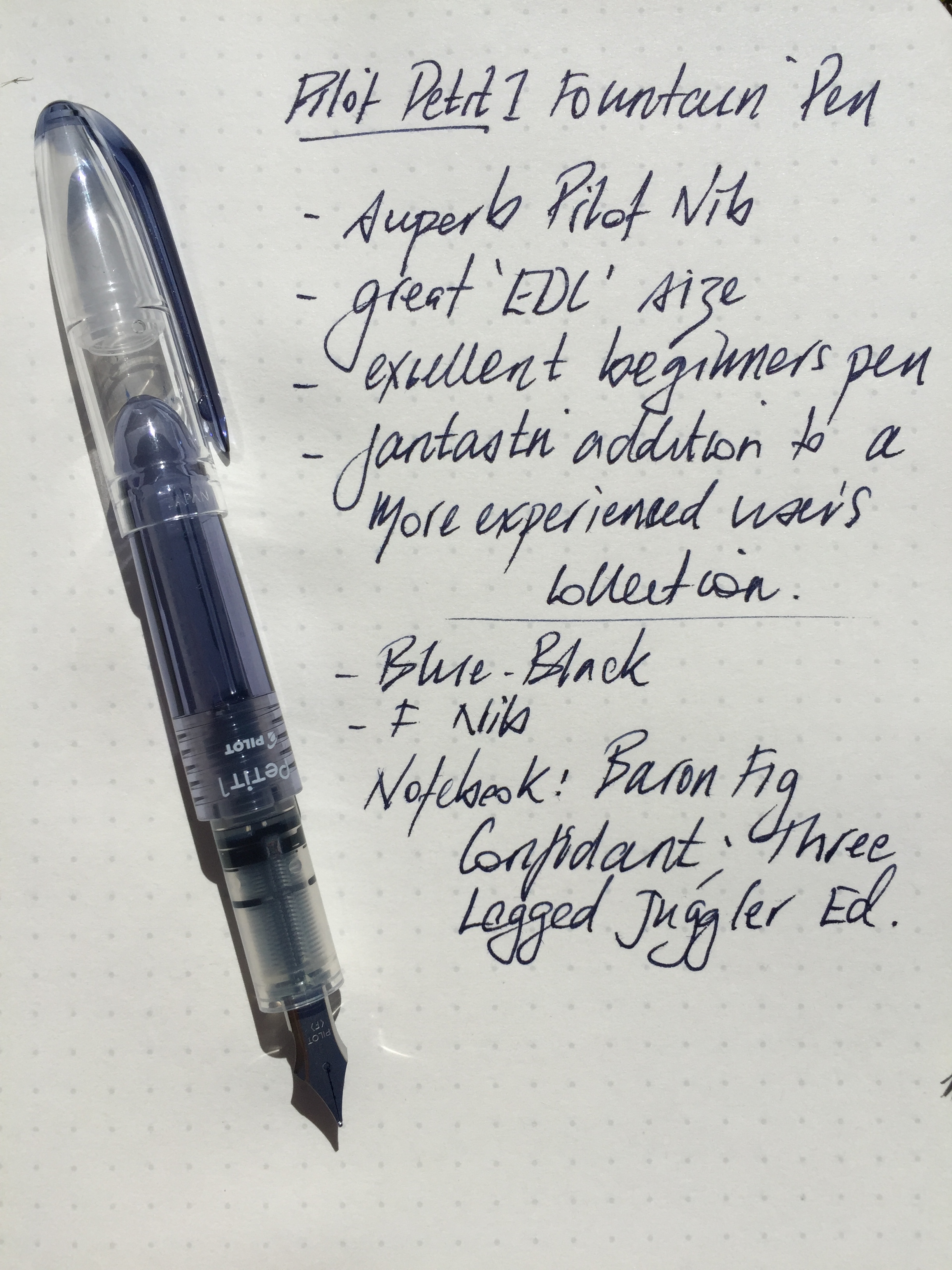
The Pilot Petit1 made my JetPens shopping cart late last year in the form of a bundle of eight in different colours (the order also included a ten-pack of the 0.5 mm Zebra Sarasa Clip) to be included in Christmas gifts for friends. Thankfully, I kept a couple, and as I’ve found with most Pilot nibs, for the price, the Petit1 certainly punches well above its weight.

So much to love about pen and paper when it comes to gift giving.

So much to love about pen and paper when it comes to gift giving.

Look and Feel

The Petit1 is a compact or almost “half-sized” pen, and requires posting to achieve a regular length for writing. Like a Kaweco Sport, once posted, I find these types of pens no less comfortable for writing than those of standard size.

With the Kaweco Ice Sport

With the Kaweco Ice Sport

For those who may be more familiar with the Kaweco Sport range, this is indeed a good comparison, as the two pens are identical in size, and with the exception of the clip on the Kaweco (assuming you are someone who uses the clip), the plastic construction is very similar in both as well. Though admittedly the Petit1 does not feel as robust as the Kaweco, which given the price, is to be expected.

A full list of specifications for the Petit1 can be found on the JetPens site, however in summary:

  • plastic body, cap and clip
  • metal (presumably steel) nib
  • length capped 10.6 cm; uncapped 9.4 cm; posted 13 cm
  • cartridge fill type
  • variable body and ink colours
  • refill cartridges available
  • eyedropper convertible

Once the sticker is removed (which explains the method of cartridge insertion for anyone unfamiliar with this), the remainder of the body is fairly clear, save for the Petit1 and Pilot branding in the centre of the body. This provides a nice view of the ink from the cartridge down through the feed.

In the wild - a great EDC pen.

In the wild – a great EDC pen.

The clip is moulded plastic arising for the tip of the cap, and although has a little spring to it, I fear is a prime candidate for snapping off. With a pen of this size, a clipless body may find it’s way to the bottom of a pocket, making extraction a little more fiddly than you might otherwise like. Conversely, it is precisely pens like this which I often throw in the bottom of my pocket rather than clip, so in my mind this really doesn’t detract from the pen itself. I suspect if you prefer parts not snapped off your pens it may be an issue.

There is an absence of any taper to the grip section with a significant step down from the body itself, however the plastic construction inherently provides a certain softness to the feel in this particular part of the pen, and I found the step not sharp enough to bother.

The nib construction is described on JetPens as metal, and I can only assume is therefore steel (however this does leave the door open to it being some kind of cheaper alloy, though I’ve no reason to suspect this is the case). Pilot branding and nib size are the only embellishment on an otherwise minimalist looking nib. For the price, this is a fantastic nib.

Writing Performance

What is there to say here really? The nib is as good as any Pilot nib in this price segment of the market (read fantastic), I have used of late, and perhaps even a little better than the fine nib on my Pilot Metropolitan1, which is not quite as smooth on paper with a little more tooth, such as the Baron Fig Confidant notebook.

IMG_3824

Having just completed a 31 day journaling challenge to kick off the year, I found myself picking up the Petit1 on quite a number of occasions during January. It is indeed a joy to write with. Feedback from one of the Christmas gift recipients also indicated a preference for writing with the Petit1 over the Lamy Safari they already owned – another big rap for the nib.

As expected, there is minimal flex in the steel nib, and on smoother paper such as a Rhodia No. 16 pad, is as smooth as any fine steel nib I’ve used. Regardless of storage (often on its side in my pocket), the Petit1 started immediately every time, with a full flow of ink, and no skips.

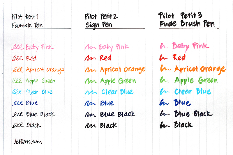
The Petit1 is a cartridge filler, and refills in any of the eight available colours are just $US1.90 for a pack of three. I plan to add a few to my next (and probably each) Jet Pens order for some time to come. One thing to note — the Petit1 only takes the proprietary Petit1 cartridge refills — standard short cartridges do not fit. Something to bear in mind, though with the colours available (and those of you with syringes for refilling out there), I don’t see this as a problem.

Image courtesy JetPens

Image courtesy JetPens

It appears the Petit1 is also convertible to an eyedropper pen, however I’ve not done this myself — perhaps for another day. Should you wish to undertake such an endeavour, JetPens has a tutorial for you on exactly how to do it. Also, as you can see in the image above, the Petit1 is part of a series from Pilot, which also includes sign and brush pens.

Conclusion

For the price of $US3.80 (or a bundle of 8 for $US30.00) on JetPens, there is no better value for money fountain pen out there for the writing experience you get with this nib. Whether or not the shape and size suit you might be another matter, however I wouldn’t consider it a waste of money to find out.

Really, the way this pen performs, I would have no hesitation in recommending it as an entry into fountain pens for someone who has not tried them (my fear of course is in recommending something too cheap which sours the entire experience). In fact, given the price, a pen such as the Petit1 is perhaps more likely to be tried if someone is not prepared to spend $US30.00 on a Lamy Safari or even the $US14.50 for a Pilot Metropolitan.

I have not personally used the Platinum Preppy (currently $US3.00 on JetPens), however find it hard to believe the writing experience would be better than what this Petit1 achieves.

Overall, a great little pen with a big writing experience, and one I will continue to throw in my pocket for some time to come.

  1. Incidentally, the nib gods did not look favourably on a recent slightly heavy-handed upstroke while using my Pilot Metropolitan. The tip of the nib “popped”, a filament of metal came off and I had a somewhat uneven instant stub nib. I’d thought about simply grinding it smooth, however perhaps will simply swap in another nib. A cautionary tale for those who might also apply a little downward pressure!

Wiser Web Wednesday

Wiser Web Wednesday – a weekly link to posts of interest from around the web:

Les Posen’s Presentation Magic
That fabulous world of academia, where a soundly stated and well thought out hypothesis, is tested, confirmed or disproved, then reported and reviewed by peers. Important stuff. The means of presenting of such findings? Apparently much less important if conference presentations are anything to go by, and I’ve been to quite a few.

Some thoughts from a true master of the conference Keynote (yes – that Keynote):
Why Academic conferences need to change, and why Powerpoint is a dead technology walking

April Zero
At the time of writing, San Francisco based entrepreneur Anand Sharma had been “tracking everything about himself” with an iPhone and a few key apps for 107 days. The results are published on a great looking site:
April Zero

Asian Efficiency
The final part of a series by Mike Schmitz for AE on tools for taking care of the quick capture phase of a GTD workflow. This time how to configure Drafts to sync with nvALT on your Mac, allowing effortless iOS capture and transfer of information to your Mac for processing:
Quick Capture Part 4: nvALT & Drafts

Teespring
Sporting one of my favourite tag lines of all time, The Cramped now has an official T-shirt campaign that appears to have reached its funding goal. With only a day to run, show them a little more support and grab one before they are gone. You know you want one:
The Cramped Official T-Shirt

The Cramped
Of course I’d follow it up with this. A brilliant article from a writer about writing, whatever the tool used to get it done. In which you will find:

But it turns out that there’s nothing that motivates quite like the sight of your friend covering pages with ink. Are you going to sit there like a loser, with your blank page? No, you are not.

Always Open To The Possibility of Writing

The Writing Arsenal
If the above article inspired you to get writing by hand, perhaps a new notebook is in order. Tim at The Writing Arsenal reviews the Word notebook, with its built-in bullet point mark-up system:
Word. Notebooks “Indigo” Review

The Pen Addict
An interesting post on two fronts. Firstly, being a fan of felt tip or fineliner type pens in my teens, and was thinking I must give them a run once more. With seven tip sizes and multiple colours, I’m sure there is a Pigma Micron to suit.

Further, Brad discusses how a fascination with finer tip or nib sizes has perhaps seen him miss some great writing experiences with the medium to broader end of the spectrum. I had been thinking along those lines as well recently, however for me the reverse is true. I have traditionally never used anything finer than medium, though am now enjoying an exploration of some finer tips and nibs.

I’d best order some fine Pigma Microns as well then:
Sakura Pigma Micron Blue Black Review

Pens! Paper! Pencils!
Pen buying budgets are interesting things. What next? A big purchase, a bag of cheaper ones or something in between? Whichever one the needle points to when it stops spinning, reliable information is your friend. Ian Hedley with a very well-balanced review of the Kaweco AC Sport fountain pen. Red is probably not for me:
Kaweco AC-Sport fountain pen review

Pens: A Tale of Two Kaweco Sports – Classic and Ice

After planning to write a post on each of these pens separately, I came to the conclusion it would probably be best to combine the two. Although each was purchased for slightly different reasons, I often use them interchangeably, despite one being a rollerball and the other a fountain pen.

Classic Sport Rollerball (L) and Ice Sport Fountain Pen (R)

Classic Sport Rollerball (L) and Ice Sport Fountain Pen (R)

As you will see from the images, I am talking about the Kaweco Classic Sport Rollerball (Black), and the Kaweco Ice Sport Fountain Pen (Green; M Nib). I’ve had both of these pens in regular use for quite some time, with the Classic Sport approximately 12 months old, and the Ice Sport around half that, after a kind member of my family made good on one of my Wish List items last Christmas.

Both pens were purchased (or wish-listed) because they represent great value for money, and German manufacturer Kaweco has quite a good name in pen circles.

My purchase of the Classic Sport Rollerball was made after hearing the Kaweco name mentioned on The Pen Addict podcast, when the episode numbers were still in their 30’s (and orange T-shirts with episode 100 hashtags were unheard of). I believe at the time my intended use suited the Classic Sport rollerball a little more closely, being a compact, easy to carry pen which would write on most paper types without any problems.

My interest in the Ice Sport soon followed after seeing the attractiveness of the Kaweco AL Sport fountain pen line, which in my opinion is even more impressive after the introduction of the new stone washed models. This of course warranted a test run of the Kaweco nib, conveniently achievable at a far lower price point with an Ice Sport model.

After writing many thousands of words with each, I still love both these pens. Here’s why.

Look and feel

If you have not seen a Kaweco pen of this type before, the compact (read short) design is immediately apparent. I was at work when the Classic Sport arrived by post, and still remember my wife calling me and advising it was “very small”, and checking “are you sure that is what you ordered?” Having never had one in my hand at that point either, I was a little concerned, however once I posted the cap and gave it a test run, it was clearly perfect for its intended use.

I love the design of the Kaweco range, and although these lower end models (currently AUD$37.95 for the Sport Classic and AUD$39.95 for the Ice Sport; see links above) have bodies manufactured of plastic, they do not feel cheap in any way. The octagonal shape of the cap and resulting ridges prevent the pen rolling off a desk if used without the clip, which is exactly how I use the Classic Sport (as you can see by the accompanying photos, with the exception of one to demonstrate how it looks with the clip). When capped, these pens measure 10.5cm in length, however when the cap is posted (as intended for writing), the length is a much more writing friendly 13.3cm. Both pens are also quite light at around 10 grams, as you’d expect given the size and construction material. A nice touch on both is the screw-on cap, which in my opinion adds a little more quality to the overall feel.

Kaweco_Ice_crossKaweco_Sport_wclip

The Ice Sport has a transparent plastic body with the grip available in a variety of colours, matching the transparent, coloured cap (mine being green). A silver metal clip, markings, cap inlay and stainless steel iridium tipped nib complete the picture. The Classic Sport, is available in basic solid colour bodies with matching cap, gold coloured clip, cap inlay and markings.

Kaweco_cap_inlayKaweco_nibs

My preference for an EDC (Everyday Carry) type pen is probably the silver (see also the recently introduced Skyline series), as gold in my mind represents a more conservative, classic accessory rather than a rough and tumble “in my pocket” type of one. Perhaps a little silly, however I would feel strange mowing the lawn in a gold watch too. Just me I guess.

Performance and Use

Both pens perform extremely well for their intended purpose. As mentioned above, each was purchased for slightly different reasons, though are often used in much the same circumstances.

Interestingly, both have turned into equally useful EDC type pens, and if I am entirely honest, the Ice Sport gets a little more use, despite it being a fountain pen. More often than not I carry a single pen on my lunch break, usually in conjunction with a Field Notes or some other form of notebook, and it is here a pen of this size really fits the bill. Although the pen goes equally well in my shirt or side pocket, I often find myself turning over the pen in my hand while walking. I simply like the feel of these pens in my hand. There is something comforting in having the familiar feel of the ridges and shape of either Kaweco in my palm. Again, just me I expect, and again, perhaps a little silly. When carried with other pens, it is generally in a Nock Co Hightower, along with two Field Notes, some index cards and more often than not few other folded notes.

Kaweco_side_by_sideAs far as writing performance goes, I have no complaints with either pen. The Classic Sport rollerball has seen many refills, and currently contains a Retro 51 rollerball refill, providing a lovely, consistent deep blue line. The standard Kaweco rollerball that ships inside the pen also performed extremely well from what I recall, and I believe fitted a little more snugly, as there is a small amount of play in the current set-up. Not irritating enough to discourage me from using it however something to be mindful of if you are considering one of these models. It is only through ease of access to a pen store near my office that I have migrated to a Retro 51 refill.

The medium nib of the Ice Sport is fantastic. Having heard and read opinions that the medium nib is probably the least impressive compared with the B or F, I am obviously looking forward to trying out those sizes in the future. As far as the current stainless steel M nib is concerned, ink is laid down well, with no skipping or drag, and if kept capped, will start on the first stroke just about every time. Although probably at its best on my Rhodia Dot Pad, this pen sees most of its use in my Field Notes, and does almost as well there. Admittedly with the seasonal releases of the Field Notes colours editions this will not always be the case, however in the County Fair edition I am currently using there are no problems, and from what I have read, should be safe with the Shelterwood I have coming up next.

Refills for the Ice Sport are standard international cartridges, with Montblanc Irish Green in my current model (yes, matching the green cap and grip). The clear body is a nice touch, keeping the ink visible through the barrel for a nice effect, while providing a visual reference as to the amount of ink remaining. A squeeze converter is available for use with bottled inks at a very reasonable AUD$3.95 from Paper Trader, though for my use case, leaving it as a cartridge refill currently suits my needs.

Conclusion

As you can probably tell, I really enjoy using both of these pens, and using them often. The Classic Sport fits into my day to day office desk pen rotation, however both make the cut equally well as the pen I carry when out and about. If I had to choose between them, I’d probably go with the Ice Sport, simply because I do enjoy writing with a fountain pen, however depending upon what and where you will be writing, a fountain pen may not always be the best choice. If that is the case, the Classic Sport makes a compelling case as the pen you pick up or carry with you.

For a quality, well designed, functional pen that writes really well and is fantastic value for money, either (or both) of these offerings from Kaweco will fit the bill nicely.

~ PD.

Ink – Montblanc Meisterstück 90 Years Permanent Grey

Introduction

MB90_EnsembleHaving seen the odd review or two of grey fountain pen inks, I had never considered grey to be one I would buy for everyday use. Blacks, blues and blue-blacks yes, however grey? Probably not for me. When the Montblanc Meisterstück 90th anniversary year got into full swing there were some great looking products circling the internet (all above my budget). Thankfully, amongst them, the Meisterstück 90 Years Permanent Grey ink.

There was never any question I would buy the ink given the special edition, and the beautiful bottle sealed the deal. The opportunity to try some grey ink was also quite a draw. At AUD$30.00, it also provided a way to leave the Montblanc store with an actual purchase rather than merely having drooled over much of what was inside, only to be thwarted by price tags. To the lovely sales lady (whom probably is titled a Pen or Luxury Goods Consultant – meaning absolutely no disrespect) who suggested I also buy a matching 90 Year Meisterstück pen with rose gold accents – thank you, but at AUD$700, not today. Similar to being asked, would you like a Bentley to go with your can of metallic spray paint sir?

As you can see from the images, the bottle (and box) is adorned with the 90th Anniversary markings, and is shaped in what I would call an “older” or “traditional” style, the design of which is apparently inspired by a historic Montblanc label, where it is written:

This ink fulfills all the demands made on it by a durable, good-working fountain pen

MB90_Box_FrontMB90_Box_Label

The 90th Anniversary celebrates the creation of the Meisterstück fountain pen in 1924, which at the time was thought of as having quite an innovative ink feed system, along with a hand engraved gold, iridium tipped nib. This ink would be a perfect companion to my own Meisterstück Classique fountain pen, which is now in it’s seventeenth year of use.

The Ink

Upon opening the elegant 35ml bottle, the ink looks decidedly black to the naked eye. A gentle dip of my finger and smear across a piece of paper confirmed the “greyness” until I had a chance to ink up a pen a couple of days later.

Once in my pen (the Meisterstück Classique of course) to test, it was time to see how ink fared with the written word. My initial thoughts, unsurprisingly were again “this looks black”. Perhaps due to the combination of my lack of experience with other grey inks and the tendency of the ink to dry a little lighter over time. I would imagine the correct name for an ink that looks “off-black”, would be grey, and that same ink needs to be dark enough to be called Permanent Grey, as is the case here.

The written sample was undertaken on a plain Rhodia No. 16 pad, and the ink performed very well. There was some nice shading many of the letters, with pen speed largely dictating the depth of the grey in each pen stroke. My hand written words darker overall, due to the slower speed used to ensure the words were at least semi-legible. As the speed of the pen increased with what I technically call the “squiggle samples”, the ink became far lighter and was probably closer to what I expected out of the bottle.

MB90_ThoughtsMB90_Test_Data

I probably prefer the fact that words written are darker, as the ink will be more suited to many everyday work applications. It might be interesting for those with a dab hand at sketching (sadly not I), given the different shades achievable. For writing, an F or EF nib perhaps may produce a consistently lighter shade of line. The more I look at this ink on the page, the more I think there may be a perception it is a lower quality black rather than a grey, if the ink type is unknown to the viewer.

The ink flowed well, and although a spectrum of shading was evident, no hints of skipping or too-dry a line were apparent. The line was crisp and sharp at the edges, with no feathering or bleed. Dry time was in line with many inks, at around 20–30 seconds, though at times longer depending on the particular line thickness. A smoother, more consistent hand than mine would no doubt achieve a more defined dry time.

Conclusion

Overall, I think Montblanc have a winner here, with the combination of a great ink and very attractive presentation in a bottle worthy of the Meisterstück 90 Year Anniversary occasion. My first impressions lead me to think this ink will see plenty of use, which is great, as although a special edition is nice to own and display, I would be disappointed to look longingly at the bottle knowing I disliked the ink. For me, an ink is there to be used, and a Special Edition even more so, although a suitable rationing system will no doubt be put in place!