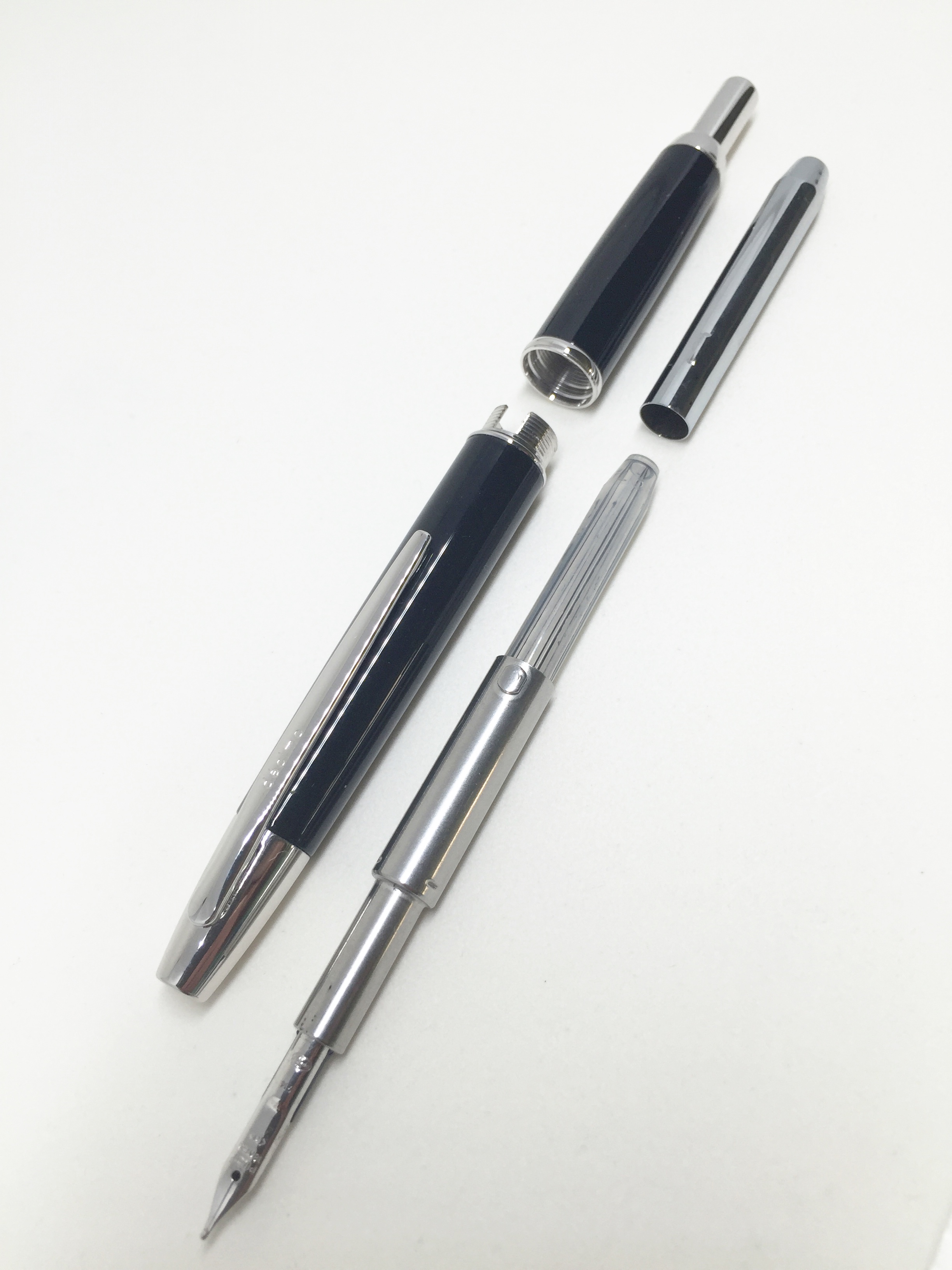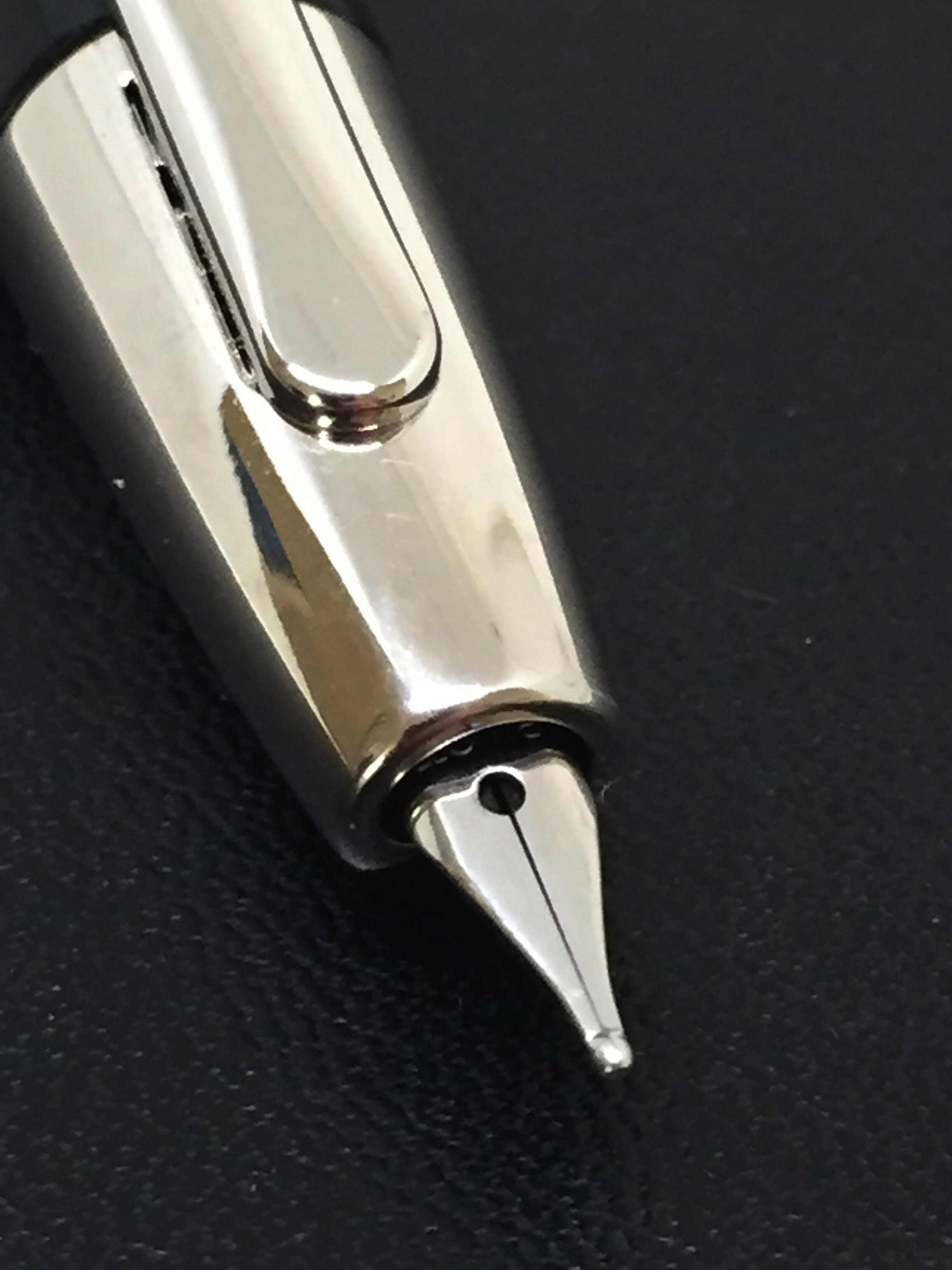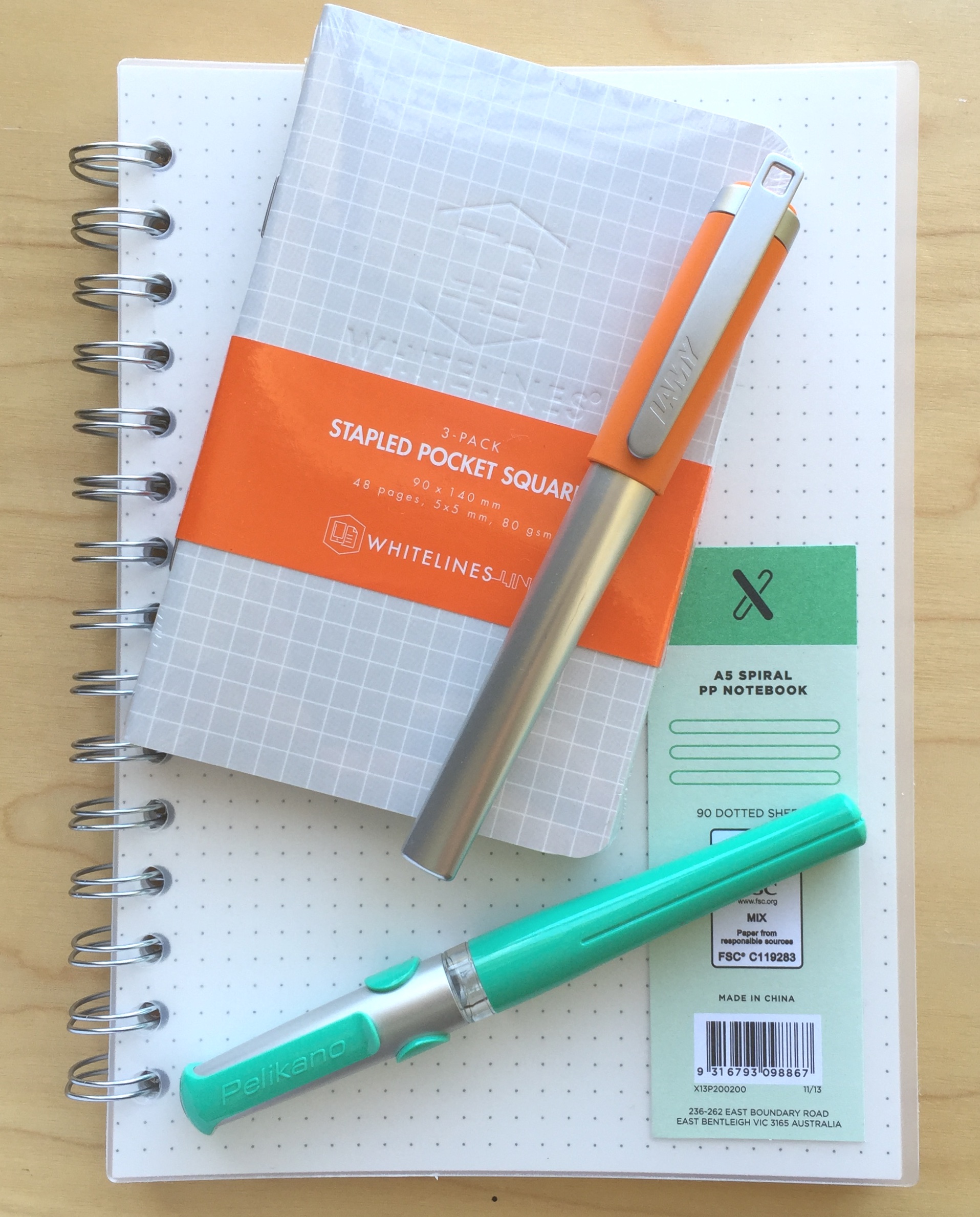
Possible Starters: Lamy Nexx and Pelikan Pelikano Fountain Pens

2016-04-09 pelikano_v_nexx_2

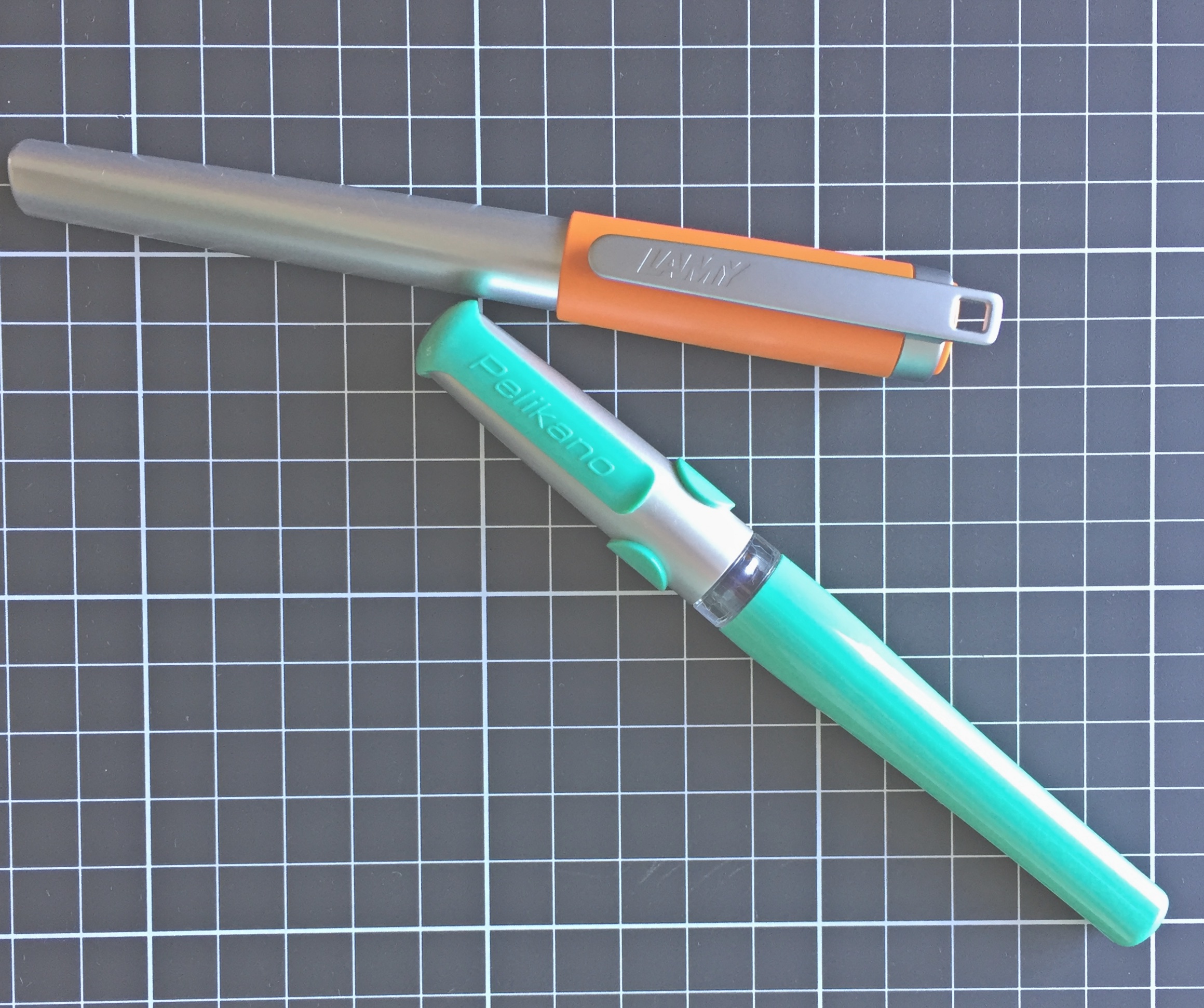
Call them what you will: low-end; entry-level; beginner; learners. Perhaps all true, however these two fountain pens are both pretty solid performers in their own right — for any purpose. They may look a little cheap and cheerful, and although not being for every collection certainly have their place, regardless of your level of fountain pen experience.

The Lamy Nexx and Pelikan Pelikano fountain pens can be found in the “Young Writer” and “Kids/World of School” sections on their respective manufacturer’s websites. Although you won’t see any in schools in this country (I am not sure of the current status regarding other schools around the world), the pens are clearly designed for an early or younger generation entry into the world of writing with fountain pens. That said, I’m certainly no whipper snapper, and I’ve enjoyed using these pens increasingly in recent times when gathering my thoughts for this post.

Those of us who use fountain pens on a regular basis are often the ones who introduce another generation into the habit. Would I use either of these pens with that aim? I’m not sure, and there are perhaps other options I may recommend for that purpose, however I can see these two being great options to offer as possibilities — particularly if a few different options were being considered based on the tastes of the prospective user.

Forced to choose either the Pelikano or the Nexx? A somewhat challenging question, and the answer surprised me a little, though as you’d expect, the ideal pen when comparing two or more generally produces a Frankenstein result — that is, a combination of the best aspects of each. Of course in the absence of that being possible, read on and my final choice will become clear, but really — either of these pens wouldn’t disappoint in their target market.

Look and feel

A point to note here: the current models of both pens have undergone a cosmetic makeover compared with what you see in the photos, which are the pens from my own collection. As far as I can tell, all other aspects of the specifications are essentially the same.

It’s probably in the “feel” more than the “look” that I was most surprised as I used both pens on a more regular basis. I have mentioned in the past I am not a huge fan of the traditional Lamy triangular grip section found on the Safari and AL-Star ranges.
2016-04-09 pelikano_v_nexx_7

Upon uncapping the Lamy Nexx, the first thing I see is another triangular section, this time covered in a rubberised, cushioned coating — somewhat reminiscent of the grip guides of similar material often slipped onto to pens and pencils for younger users. Despite this, I found the section on the Nexx to be far more comfortable to write with than the Safari in my collection. I don’t really have a valid reason for this given the sections are both quite similar in size and shape — the only difference being the rubber coating on the Nexx.

According to Lamy:

The LAMY nexx fountain pen has a soft non-slip grip which makes for extended fatigue-free writing. Its polished stainless steel nib makes writing super easy

All I can really put it down to is the fact that the rubberised overlay softens the edges a little, creating a slightly “rounder” and well… softer feel than the plastic of the Safari.

I would say however the junction of the section and nib looks a little untidy, with the increased diameter of the “stops” on the grip meeting the black plastic collar around the nib and feed. It is the same plastic collar which you also see on the Safari and AL-Star ranges, however on the former it is matched to the barrel colour, and the on the latter matches the darker section a little better. Certainly not a big issue here, and only noticeable as I sit here and review the overall look and form of the pen.

2016-04-09 pelikano_v_nexx_1

The top end of the Nexx barrel begins in a distinctly triangular form factor, rounding out as the barrel increases in diameter and moves towards the section, before returning to the triangular form and tapering slightly at the grip. Uncapped, it carries nice clean lines and I quite like the overall look and shape, however as I mentioned, it is perhaps spoiled a little where it meets the feed.

Capped, the Nexx demonstrates a smooth but steady increase in diameter from end to cap, reaching a maximum at the clip ring. This probably fits the overall funky aesthetic of the colourful cap which also contrasts nicely with the silver aluminium finish of the body. The top of the springy clip sits proud of the actual cap, and while it suits the overall form of the pen, the cap and clip “live a little large” for my taste.

The Nexx appears to be going for a fun, funky and cool aesthetic, rather than portraying itself as the “beginner’s” pen. To that end, I’d say Lamy have probably achieved their goal.

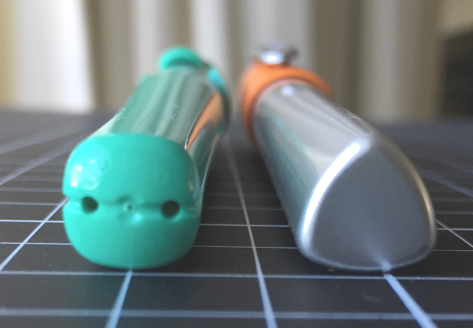
The virtually clipless Pelikano, aside from the cap, carries a certain similarity in shape to the Nexx, and again avoids too much of the “beginner” aesthetic, however I believe it does carry just a little more of that style. This time, the end of the barrel begins in square form, before a similar increase in diameter as it rounds out, before tapering into… wwhaaaaat?? A triangular grip section! I must admit it is more trianguar-ish, than triangular, though the similarity to the Nexx is not lost on me.
2016-04-09 pelikano_v_nexx_3

Again the section has a rubberised coating, however in this instance adds little thickness to the grip. Of the three flattened sides to the grip, the index finger third also has rubberised ridges which run perpendicular to the barrel, I assume to assist with grip and guidance of the nib when writing. A couple of things on this: firstly, they are probably not necessary, as the rubberised coating on the section is more than enough for gripping, and though I didn’t find it noticeable — it may annoy some. Secondly, this could also be used as a baseline grip point of reference in someone learning to write (“index finger here”).

This rubberised overlay sits on a clear section, and therefore prevents any decent view of ink colour or level inside the pen. In contrast to the Nexx, with the Pelikano the nib is held by black plastic “shoulders” at each of its sides. In pointing out above the look of the Nexx at the junction of the nib and section, I’m not really sure this one is an improvement. Personal taste plays a factor with any of the pen designs we prefer, and perhaps I’ve made a bigger deal out of it than it really is. I cannot say when I’ve picked up either pen I have even given it a second thought.

Overall, I marginally prefer the Pelikano’s grip section, though it is the centre of the barrel which raises a few questions for me. Both pens increase in diameter through the middle of the barrel, with the Pelikano doing so just a little more in comparison (1.4 mm more at its maximum, as you can see from the specifications below). This throws the comfort of my grip ever so slightly off, and I’ve found I cannot write for extended periods quite as comfortably as I can with the Nexx.

Aesthetically, the styling of the Pelikano is quite different to that of the Nexx, and to be honest I really have no preference here. The cap of the Pelikano reminds me of a helmet on the Lego Knights I used to have as a child — if you had them you know what I mean. While I enjoyed playing with those knights, I prefer the design as a helmet rather than a pen cap.

I’ve described it as “virtually clipless” above as the moulded plastic forms part of an exoskeleton or … yes, there it is: “helmet” over the cap. This forms a sort of pseudo-clip, however the functional section is very short, and I’d hesitate to use it regularly, being reasonably fearful it might snap as the plastic fatigues through repeated bending.

Although both pens are not what you’d call expensive — both feel sturdy enough to stand up to the usual level of wear and tear. The aluminium barrel of the Nexx may provide a little extra reassurance in this area, however with even a little care in the daily use and carry of, I doubt you’d have trouble with either.

As I’ve mentioned, the clip extending past the end of the cap on the Nexx may provide a snag point, however again I would not anticipate any major problems.

Specifications

Notwithstanding the cosmetic changes I mentioned earlier, following are the specifications in the current available line up from both manufacturers.

Manufacturer Pelikan Lamy
Model Pelikano Nexx
Body Plastic Aluminium
Cap Plastic Snap On Plastic Snap On
Clip Plastic Metal
Fill Cartridge/Converter Cartridge/Converter
Weight 23 g 31 g
Diameter max 14.5 mm 13.1 mm
Diameter grip 12.5 mm 12.2 mm
Length capped 13.6 cm 13.4 cm
Length uncapped 12.5 cm 12.7 cm
Nib type Steel Steel
Price A$ $26-$30 + int postage $54.95

Check the manufacturer’s websites for colours available.

As far as the price is concerned, Australian supplier LarryPost stocks the Lamy Nexx, at the price quoted above. I have not been able to find a local supplier online for the Pelikano, however this of course does not rule out any local brick and mortar stores perhaps stocking them. Fishpond lists the Pelikan at AUD $39.97, however it does state the pen ships from a UK supplier. The price I have quoted above is a conversion from both Jet Pens in the US and Cult Pens in the UK, however you would need to add international postage costs to these of course.

Also worth mentioning is the option of a left-handed nib on the Pelikano, as well as the slightly cheaper Pelikano Junior model.

As far as filling is concerned, I have been using the Nexx with a Lamy Z24 converter (with no issues), and the Pelikan with standard international cartridges, noting the recommended converter here is the C499 from Pelikan.

Writing Performance

I’ve had these pens for about 6 months or so now, intermittently using them in my rotation of pens, and have written more extensively with each over the past few weeks taking notes for this post.

As far as the nibs are concerned, I’ve been happy with both. The stainless steel medium nibs are smooth writers, with the Pelikano having a slightly softer feel in terms of a little give, however there also appears to be a marginally smaller sweet spot than what exists on the Nexx — at least with this particular pen anyway. Overall, both nibs have that firm, steel nib feel — one that I quite like and is not meant as a criticism in any way.

2016-04-09 pelikano_v_nexx_5

The Nexx comes as expected out of the box — the same Lamy nib you’d find in a Safari: firm, reliable and consistent. I say consistent because in mentioning the Pelican’s sweet-spot, the Lamy nib performs well at all points of minor grip and alignment adjustment — however when compared line for line, doesn’t quite match the smoothness and comfort of the Pelikano.

Both lay down a consistent, wet line, and with a little pressure applied, (despite the softer overall feel of the Pelikan) the Lamy nib will give a slightly broader one, though neither of these pens are what you’d be using for any sort of line variation lettering.

2016-04-09 pelikano_v_nexx_6

Overall, as far as the nibs go, points to the Pelikano, as it is a much smoother and more comfortable nib to be using for writing, and the sweet-spot is really not hard to find and then sit comfortably in like your favourite lounge chair.

Both pens I have used without posting the cap, however if you were to do so, the Pelikano retains its overall balance more so than the Nexx, which becomes very top-heavy and cumbersome.

Both pens handle a variety of paper types equally well, which is probably important given what they might be used for, and I’ve not found either wanting on the first stroke when uncapped, nor with extended periods uncapped, for example in writing intermittent notes while researching online and the like.

Only young writer?

Indeed, the young writer aspect of these pens is not to be dismissed, however I don’t believe either necessarily perform this role any better than the Pilot Kakuno, which is far cheaper to buy. The Kakuno also sports the triangular grip section, however the overall balance and feel make it — in my opinion at least — a better buy for this segment of the market.

2016-04-09 pelikano_v_nexx_4

Do either of these pens appeal to the non-young or non-early writers? That of course is a matter of personal opinion. As I’ve hinted at above, I think the Nexx is more likely to fulfil a more universal role across beginner and more experienced users alike, whereas the Pelikano based on looks alone I feel is perhaps relegated to the beginners end of the market.

Given its bright and funky sort of look, the Nexx to me is a pen you might use with a clipboard or reporter style notebook: marking off attendees at a summer camp, scoring a tennis match or perhaps even recording your backyard coffee roasting data — assuming suitable paper was in use of course. At then end of the day, if a pen (which both are), are solid performers, it really is down to personal taste, and that is really where we end up here.

Conclusion

In summing up, both of these pens are pleasant to use and perform as intended. If I had to choose one? Probably the Nexx, simply because I find the overall shape of the body a little more comfortable to use than the Pelikano, which becomes a little too broad in the middle for my grip.

The Frankenstein result if I could? The Pelikano nib in the Nexx body with a smaller version of the Nexx cap and clip. Because that isn’t going to happen any time soon, I’d go with the Nexx simply because of the Lamy nib options you have at your disposal, though with a pen like this, I’d assume you’d have be looking for something specific, otherwise a Safari might be a better choice — particularly at a slightly lower price point.

In any event, either the Lamy Nexx or Pelikan Pelikano won’t fail you as a notetaker, however for the “young writer” I am most likely sticking with the Pilot Kakuno as my go to recommendation.


Officeworks X A5 PP Spiral Notebook

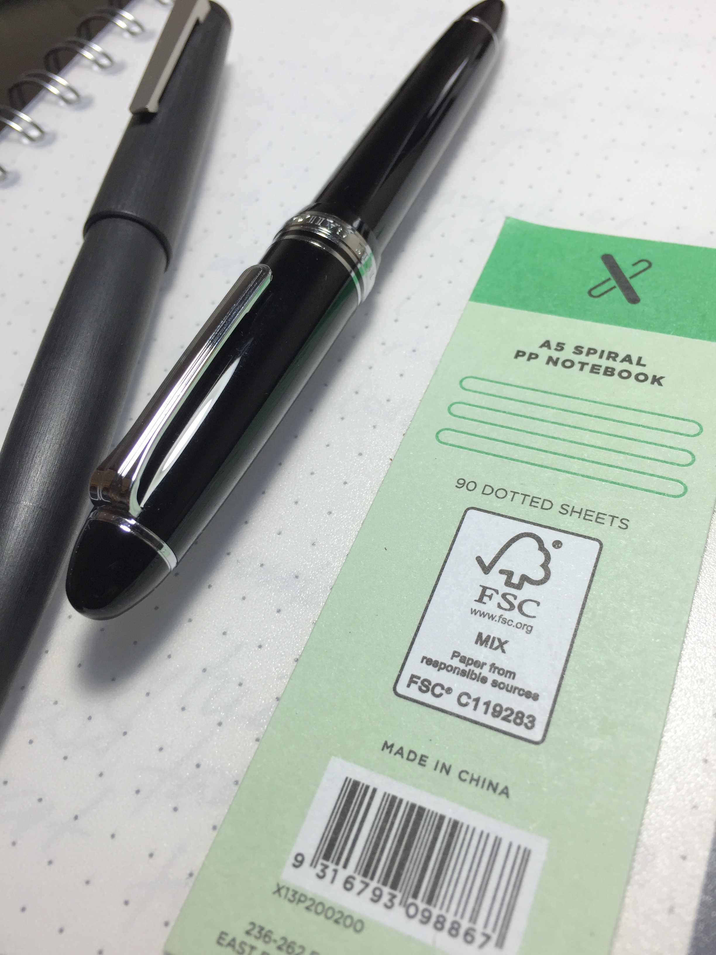
x_a5_pp_post_cover_with_pensI picked up this notebook at my local Officeworks for AU$2.99. That’s right — three bucks. My expectations as to how it might perform under a fountain pen were therefore not overly high, however feeling the paper while in the store suggested it just might be a little better than expected.

Home I went — not expecting much, however in the knowledge at worst it would end up a rollerball or gel pen notebook and at least see some use. What I ended up with was a whole lot more than that.

Design

x_a5_post_X_logoThe X A5 PP Notebook is part of the broader range of ‘X’ series stationery at Officeworks, consisting of notebooks, paper, writing instruments and various other accessories. I believe these are an Officeworks “own brand” type line up. All would be considered reasonably priced, with many downright cheap, as is the case with the subject of this post.

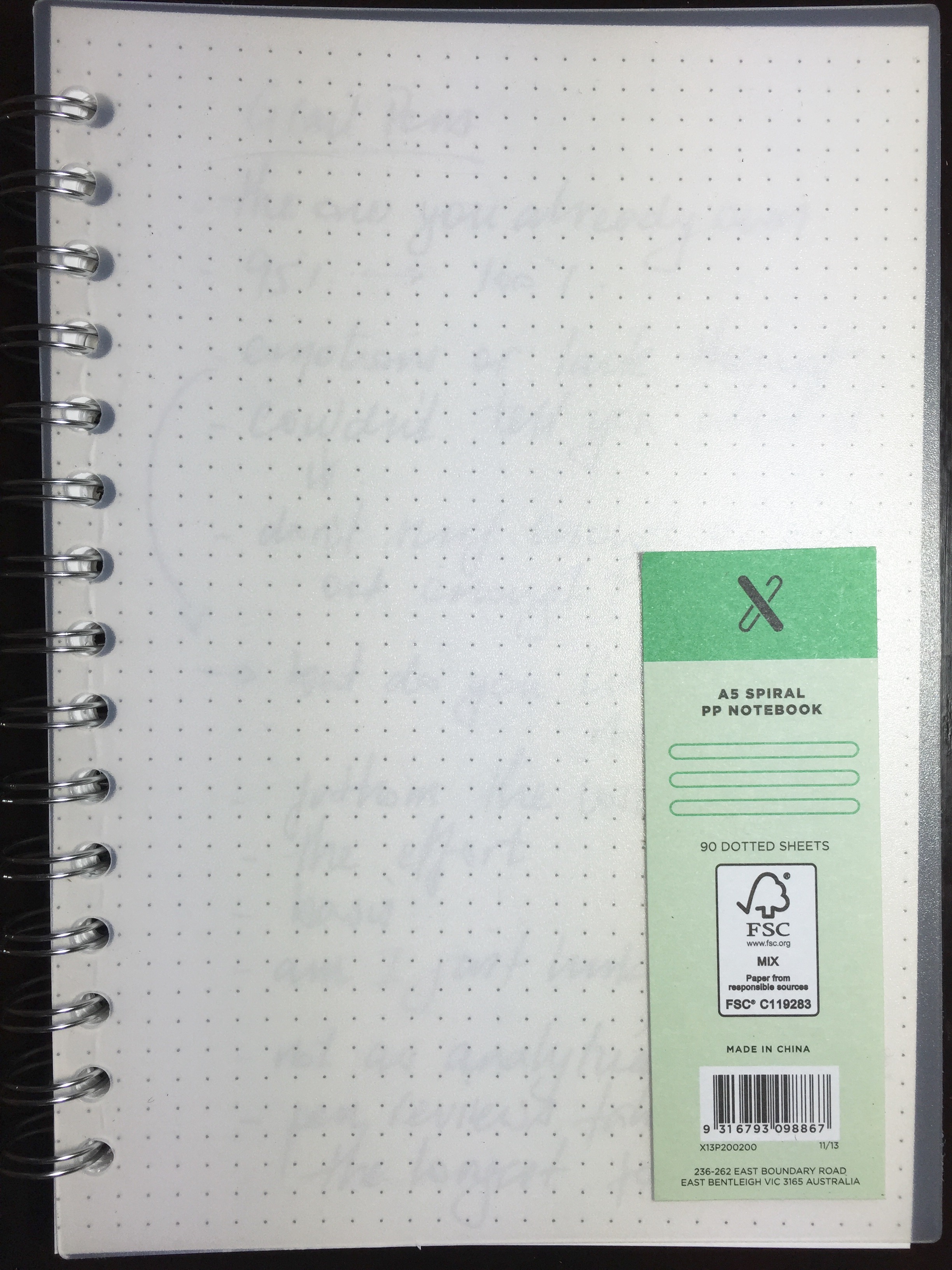
x_a5_pp_post_coverThe A5 is a double spiral or wire bound notebook with slightly frosted, transparent, hard polypropylene (hence “PP”) front and rear covers. Also available is a variant with a ziplock pocket at the front and an elastic enclosure, for the princely sum of AU$4.99.

Apart from the branding sticker in the bottom right hand corner of the front cover, the notebook carries no other features or markings, which suits the simplistic design. Given the cover is transparent, there is of course a great opportunity to decorate the first page as you please, and presto: instant personalised cover design. Commensurate with my overall design and creative abilities, mine remains blank.

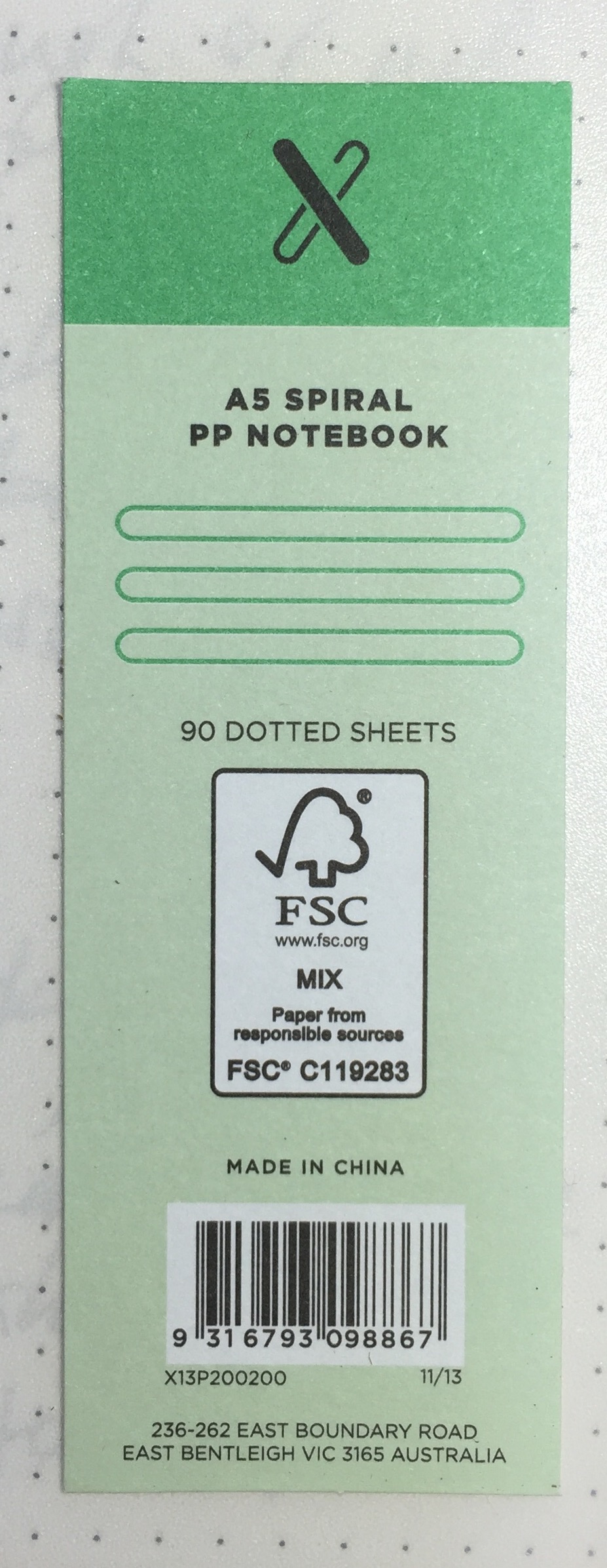
x_a5_pp_post_labelOne other point to note is your usual preferences regarding binding in notebooks will of course apply. I know many find the large wire binding to get in the way of a fluid writing experience — particularly when writing on the left side of the page, or vice versa for left-handers. If that is how you usually find things in these notebooks, you’ll find it here as well. On a positive note, I’d say there is a medium amount of “wiggle” in the page when writing — also something I typically find characteristic of wire bound notebooks, which if excessive, can certainly be a deal breaker for me. They have done a pretty good job here.

Overall, the X A5 has a robust feel to it, and for the price, is certainly not an unattractive notebook. Sure, it’s not likely to set your desk on fire in the style stakes, however the simplicity of the design ensures it won’t necessarily look out-of-place on that desk either — a characteristic often missing from items at the lower end of the market.

Specifications

The specifications listed on the Officeworks website:

  • Cover: frosted clear polypropylene
  • Binding: double wire
  • Pages: 180 (90 sheets)
  • Paper: 80 gsm white
  • Ruling: 5×5 mm dot grid
  • Size: A5
  • FSC certified (Forest Stewardship Council) paper
  • Country of manufacture: China

Paper and performance

As noted in the specifications above, the 80gsm white paper comes with a dot grid ruling and 180 pages — more than enough to keep you going though a few ink chambers of writing. The pages themselves are not perforated, however tear out easily enough, and do not leave the entire edge of the sheet torn to shreds like some wire bound notebooks.

It’s when it comes to writing on these pages that the real value for money here is hammered home. With fountain pens, this paper really does punch well above its price tag. Certainly not as smooth across the surface as say Rhodia paper, however performance-wise it doesn’t suffer.

x_a5_pp_post_writing_1x_a5_pp_post_writing_2

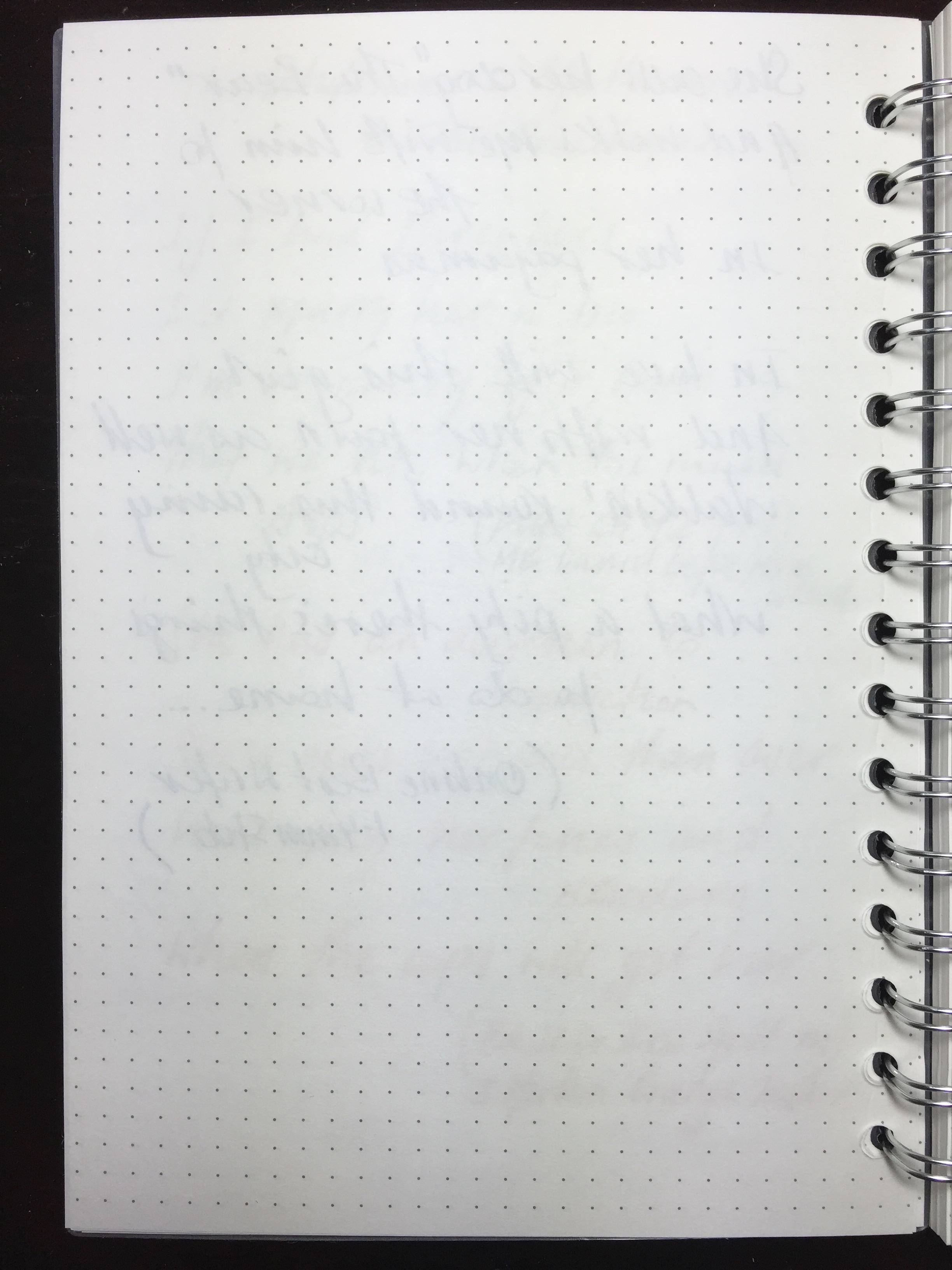
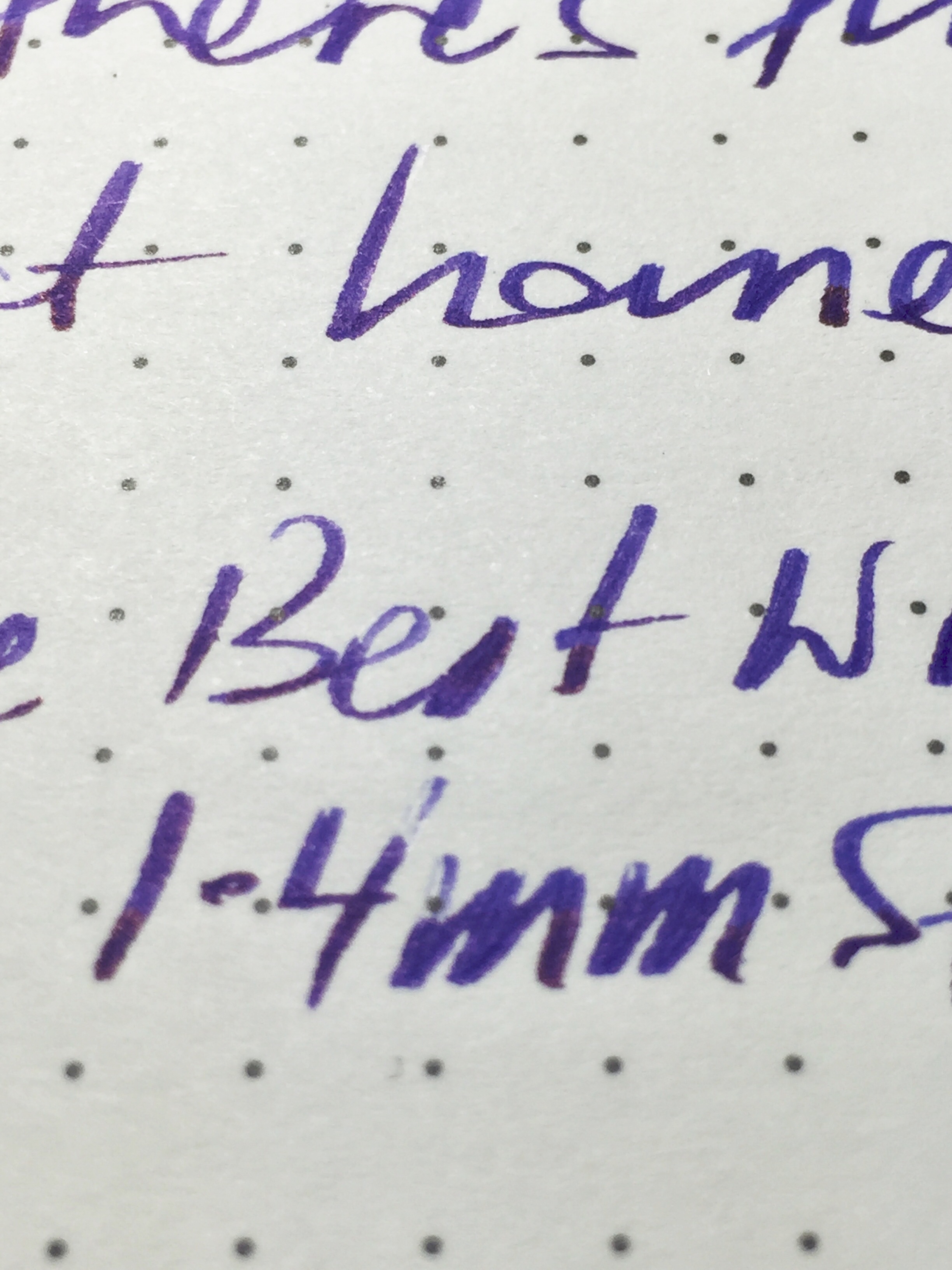
With finer nibs you’ll experience a little tooth on the page (something I prefer, as long as it’s just a little), however I would still describe the overall experience as a smooth one. Wider and wetter nibs only get smoother, with no feathering, show or bleed through the page. I’ve mentioned in the past I can deal with a little bleed or show through, but feathering drives me crazy.

x_a5_pp_post_reverse_pagex_a5_pp_post_stub_macro

Remember I paid three dollars for this notebook.

Of course as with any paper performing in this way, at times there will be issues with dry time if you are powering along, and testing shows typical inks will dry at around the 20-25 second mark, plus or minus 5 seconds or so for wetter or dryer inks. Of course it goes without saying its ability to handle rollerball, gel ink, or your standard ballpoint pens is assured.

This is without doubt some of the best value 80gsm notebook paper going around, and is readily available online or at your local Officeworks store. This post on The Fountain Pen Network would suggest I am not alone in this line of thinking.

Conclusion

Having picked up this X A5 notebook on a whim, when “back to school” shopping at Officeworks with my kids, the hope was it might be a reasonable quality, cheap notebook to have lying around. It turned out to be way more than that.

Of course it won’t replace your Rhodia No. 16, but wow, it’s a heck of a lot closer than you might think, and I’m certainly likely to be back for more. It would indeed be a great option to accompany the purchase of a new Pilot Prera fountain pen if that’s why you entered the store.

Well done Officeworks — extremely well done.


Pilot Decimo Capless Fountain Pen

In taking an active interest in the pen community, it is hard not to notice the enthusiasm surrounding capless fountain pens, the majority of which centres around the Pilot Vanishing Point. Admittedly I too have looked longingly at online retail sites, clicking around the various models and options available in the capless segment of the market.

image

Until a few months ago, I had not even tried a capless pen, nor come to the conclusion I would be happy spending the money to obtain one. What had caught my eye however was the Pilot Decimo, a slightly more slender and lighter version of a capless fountain pen compared to the Vanishing Point. Also made by Pilot, with an 18k gold nib, the same capless mechanism and very similar design — there was a lot to like about the prospect of owning one.

After deciding to go with a Decimo at some point in the future, lo and behold what should turn up in my letterbox but the very Decimo you see in the accompanying images, and the subject of this review. A very kind friend of the blog sent a pre-owned, though no longer used Decimo for me to try, correctly thinking I might enjoy it, and was also interested in my thoughts on the pen itself.

Look and Feel

First and foremost, as I’ve mentioned, my impressions come to you from someone who has not owned nor used a Vanishing Point, and I would therefore keep that in mind as I go about my merry way with this post. Upon reading a little more, I did come across a very helpful comparison piece between the Decimo and Vanishing Point by Michael over at PigPog.

image

As you can see in the accompanying images here, the Decimo I have been using is a black model with silver trim. Not an uncommon combination in my collection, and a preferred one over black and gold. Overall, the look is fairly understated given the colour, however the capless nature of these pens provides a little unique edginess. Something a little out of the ordinary if we are talking traditional fountain pen “looks” at least.

The overall design I would say is generally well-balanced, however one aspect I have never quite taken to is the elongated knock at the top of the pen, though understandably necessary given its required travel to present the nib for writing. The clip of course is down on the grip section — the usual position for a capless pen, and I will comment more on this below when discussing my writing experience. I would note the metal clip is quite long and slender, and can be a little tricky to get over certain fabrics. This, combined with the overall length of the pen at times results in a fairly high “resting place” when clipped.

A little asymmetry exists between the lengths of the top and bottom halves of the pen, however from a visual perspective the relative length of the clip balances the placement of the double joining rings, which sit to the higher side of the centre of the barrel. As for markings, and in keeping with the look of the pen, a small Pilot Japan at the centre rings, and Decimo on the clip are all you will find.

In discussing the look and feel of any pen, clearly the overall balance when the pen is in your hand is an important consideration. Without a cap, there is of course no choice to make regarding whether to post or not. However, that also removes any chance you have of playing around with the overall balance of the pen — not simply length, but weight distribution. The overwhelming majority of my pens I use without posting, however there are a couple which sit on the “lighter” side of the weight spectrum where I do post the cap. They are also a little shorter than some of the others with the Pilot Prera and Sailor Pro Gear Sapporo (or slim) coming to mind.

The Decimo weighs in at just over 21 grams with a full ink cartridge, and when in your hand for writing, feels even lighter. Despite this rather long-winded discussion on weight and balance, I probably should say that I did not find any of this a problem. The overall feel when writing is testament to the balance, design and construction of the pen. Simply put, if you want a heftier feel, this may not be the pen for you, with a Vanishing Point the obvious option should that in fact be the case.

In summary, despite my comments about the asymmetry, and if I had my choice there may be a couple of things I would change — do we really want every pen in our collection looking the same? Of course not. Even if I had (and of course I do not) twenty black and silver fountain pens, I’d like them to show design, size and symmetry differences (whether subtle or overt), which, upon looking at the ones I do have — they generally do.

Specifications

Courtesy of Jet Pens

  • Model: Pilot Decimo Capless Fountain Pen
  • Material: Metal
  • Mechanism: Retractable; push button knock
  • Clip: Metal; on grip section of pen
  • Weight: 0.8 ounces (21 grams)
  • Diameter: Grip 9.9 mm
  • Diameter: Max 12.0 mm
  • Length: Retracted: 13.9 cm / 5.5 inches
  • Filling Mechanism: Converter, Cartridge – Proprietary
  • Grip Material: Metal
  • Nib Colour: Silver
  • Nib Material: 18k Gold (Rhodium-Plated)
  • Tip Length: 7.3 mm

imageThe filing mechanism in the Decimo is from what I understand identical to the Vanishing Point, accomplished either by converter (CON 20 or CON 50 compatible) or Pilot ink cartridge. The pen comes with a metal cap to protect the cartridge from the knock mechanism.

Some of the more competitive pricing on the Decimo can be found at Engeika, with the current listing at the time of writing $US101.70. It is also on Rakuten at a similar price.

Writing

As you’ll note in the list of specifications above, the Decimo comes with an 18k gold nib, and boy is the medium on this particular pen smooth. This nib impressed from the moment the ink primed and ran onto the paper. It is silky smooth, yet firm enough to hold its consistency when powering through a rapid set of notes.


image

There have been no hard starts, skips or any other issues with the nib. It has always performed as expected and on demand, even if left for extended periods “nib out”.

The nib has a degree of softness or give, with a small amount of line variation with changes in pressure, however a pen such as this does not really require an amazing amount of line variation, nor is it why you would buy one.

imageOn to the clip position, which is placed down on the grip section of the pen. Annoying, invisible or somewhere in the middle? Whether you are considering a Decimo or the Vanishing Point, with a capless pen of this type, a decision needs to be made about the clip, and whether it will be a hindrance to how you hold the pen for writing. If possible, try to test one out prior to purchase, at least for a more informed choice.

You may be lucky, and not even notice the clip at all. If you are like me, it is noticeable, though not what I would call annoying. Certainly, your grip and nib rotation is very much determined for you, however with a great nib such as this one that is not really a problem. A good tip I came across in reading a little on these pens, is to hold one of your standard pens upside down with the cap on and see how you find the clip in relation to your grip. At least it will provide some reference point for how you might fare here.

image

In summary, looking at my overall writing experience, I would say the Decimo is very good. I wouldn’t go so far as exceptional, and the reasons for this are not something I could specifically put my finger on. The nib itself is fantastic, though it did take me a little while to get used to its smallish size.

Probably the best way to describe it is that I simply find it a little difficult to get into a good rhythm with this pen. I suspect it is not one thing on its own, but a combination of the size, weight and yes, possibly something to do with the clip. When I pick it up it just takes a little while for things to flow, and it doesn’t feel quite as natural compared to some of the other pens in my collection.

Upon reading the paragraph above on its own, it would be easy to conclude I am not very fond of this pen, which isn’t really the case. I have been happy to pick it up on many occasions when there are others sitting next to it, I feel it just makes me pay a little more attention, and reminds me I’m writing with the Decimo rather than just writing.

Overall Use

It is clear from the overall popularity of the Vanishing Point that capless pens are indeed in demand. As far as use cases are concerned? Personally I find the Decimo to be a great office note taker, particularly for jotting down a quick note, marking up printed documents, or a quick initial or signature, and the ease of the capless, push button mechanism can take a lot of the credit here. Of course, as handy as the mechanism is, the pen still needs to write well, and as I have mentioned above, Pilot certainly has that one covered with this beautiful 18k gold nib.

A couple of aspects I am still not quite comfortable with, or perhaps more correctly put — used to, involve two polar opposites, which are carrying the pen around and storage. The storage is a silly thing really, in that I continually find the Decimo in my pen cup nib down (retracted of course), as I am used to placing pens in there based on “knock up” rather than “clip up”. An issue? Not at all, I simply thought I’d mention the extreme challenge I face every single day when placing this pen in a cup(!).

Carrying the pen is another matter, and is something that makes me a little nervous. Although the reality of how the knock mechanism works essentially renders my concerns needless, I still cannot get them out of my head.

imageWhen I say carry — a good proportion of this occurs in the side pocket of my trousers or jeans, and I have this nagging, uneasy feeling I will somehow engage the knock (by not removing the pen before I sit down for example) and well… you know the rest. I say these concerns are probably unwarranted for the reason I have already stated earlier in this post — the length of the knock, and therefore the corresponding distance of travel to produce the nib is a large one, and something very unlikely to occur by accident. Perhaps I simply need to invest in a pen loop for whichever notebook I am also carrying at the time.

Signing Off

Given the similarities between the two it is perhaps a shortcoming of this piece in that I do not own, nor have I used the more popular Vanishing Point capless fountain pen from Pilot. That said, I am only able to use one pen at a time, and as a capless fountain pen in its own right, the Decimo is a great writing instrument. My favourite one? On that question I’d have to say no.

It is relatively unique in both design and function, with the push button knock working elegantly and effectively, and the 18k Pilot medium nib simply a joy to write with. Although to my eye and taste I wouldn’t describe it as my most attractive pen (a knock button half its current length would be nice, yet in a spectacular functional compromise, would fail to produce the nib), there is a certain elegance in the overall design, asymmetry and proportions of the Decimo that are somehow just right.

For shorter writing sessions or quick notes, it is just about spot on. When in the zone and powering through multiple pages of a longer draft, I’d more likely pick up one of my other pens.

On the question of Vanishing Point or Decimo? That is up to you, however would appear to come down to simply size and weight, notwithstanding some differences in colours and construction materials. To me, a capless pen is functionally about utility and usability, and on that count perhaps the lighter the better, however should also put your mind at ease when it is in your carry. I can certainly see the Decimo as part of my pen rotation moving forward, and suspect it will see its fair share of my desk bound office note taking load.


Monokaki A5 Notebook

Having this Monokaki A5 notebook arrive in my letterbox a little while ago was indeed a pleasant surprise. Picked up in a Japanese stationery store by a friend during a recent trip overseas, I was the lucky recipient of a notebook I had not come across either in stationery stores or online.

image

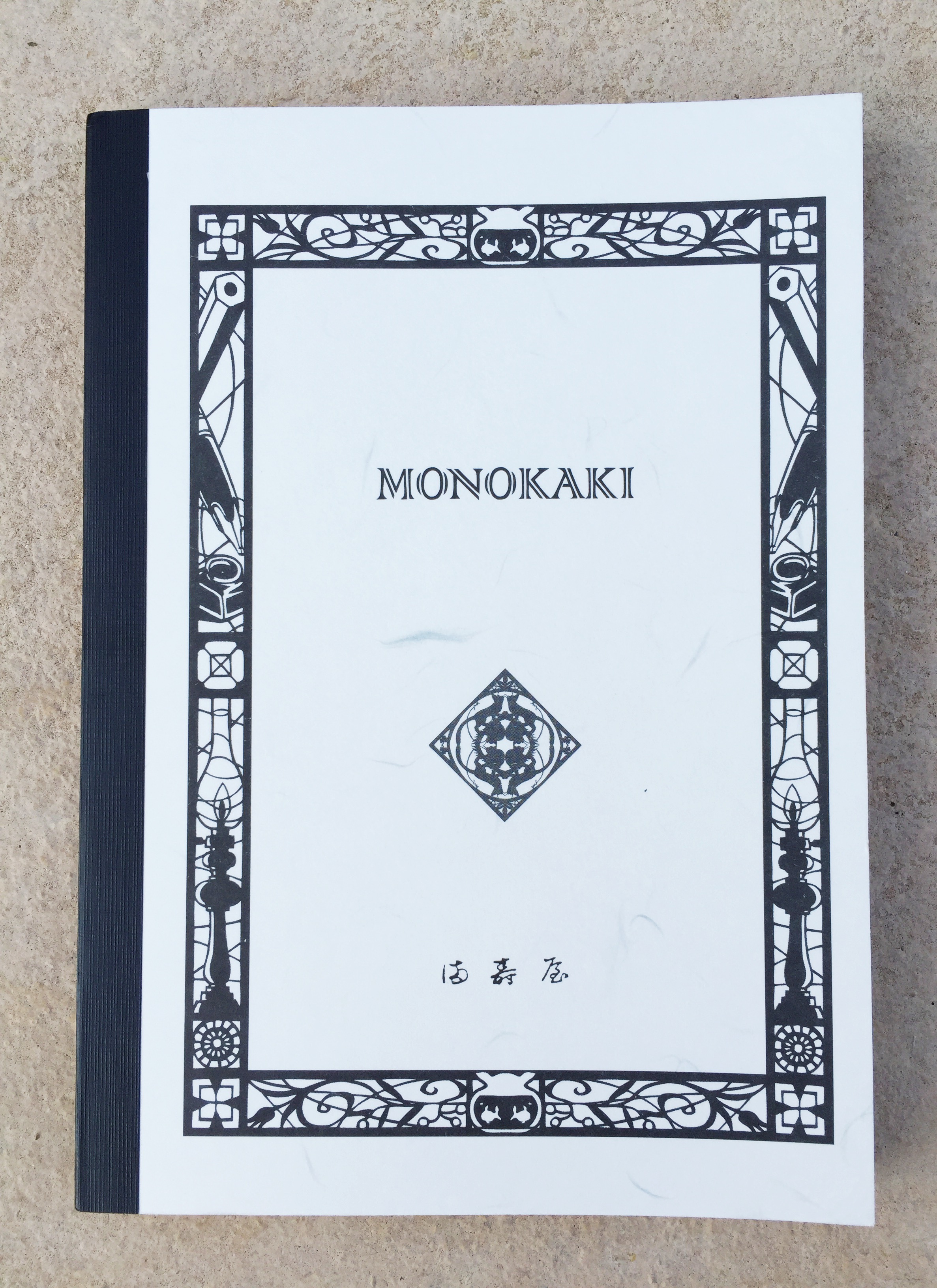
Although I knew nothing about the Monokaki range of notebooks (Monokaki meaning “writer” in Japanese), the quality of both paper and overall manufacturing was immediately apparent. Also, given the decorative border around the front cover included pencil, fountain pen and inkwell motifs, I was further encouraged as to the likely merits of the paper stock, and its ability to handle my favourite writing instruments.

Yes, I was a little excited about this one.

Background

Seeing the unfamiliar Monokaki brand name immediately sent me on an internet search for a little more information, an endeavour which also had me thankful for Chrome’s translation button when viewing the manufacturer’s website. There isn’t as much information readily available compared with some of the more common brands, however what I did find was indeed of interest.

UK store Choosing Keeping (online or 128 Columbia Rd, London) provided some background, which included a little dig at another major brand’s claim about being a notebook for novelists:

The one exception being that while other’s marketing campaigns are entirely fabricated, the Monokaki notebook’s paper – Kotobukiya paper – was really created as a bespoke product for Japanese author Fumio Niwa by the company’s present day owner’s grandmother in 1939 and used by countless authors and poets including no less than two Literature Nobel prize winners and one nominee.

I’d encourage you to click-through and read a little more, as the page also includes information on the company, which continues to operate and manufacture the notebooks from the Sakura district in Tokyo. The 1940’s woodblock cover design apparently comes from Japanese manga artist Ryo Takagi, commissioned to create a design of “traditional Japanese atmosphere – to include familiar stationery and writing instruments”. I think you’d agree the design goal was achieved.

On a more practical note, and certainly of great interest to many of us in the pen community:

The manuscript paper was indeed designed with novelists in mind for its excellent performance when used with fountain pens – no bleeding, no feathering

So all in all, things were looking good, with both first impressions and an initial foray into learning a little more about the brand yielding positive results.

For reference, some links (I’d recommend Chrome for opening those in italics and translating the result):

Update, 13 December 2015: I have now updated the information above which incorrectly stated Choosing Keeping were an online store. The store has been in touch to advise they also have a brick and mortar shop specialising in classic stationery and notebooks at 128 Columbia Rd, London as well. Thanks Julia!

Look and Feel

If I consider what actually is my preferred or favourite “look” for a notebook, I don’t believe I really have one to be honest. There are times when an understated black might be what I am after, yet other times it might be something a little more individual or unique. The Monokaki range is itself a little unique in that it probably fits both these descriptions.

I do enjoy a little variety from time to time in what I am carrying, however not at the expense of the writing experience. Considering this, I do have what I’d call a spectrum of tolerance here. By that I mean certain notebooks I’m happy to use even if it means finer nibs and certain inks only, as long as things are not too restrictive. Mind you, that particular subset of nibs, inks and pens must perform without further compromise, otherwise the notebook will be gently set aside and see no further use.

Although I’ve probably begun to drift a little off track, my intended point is to merely highlight the fact there are no real compromises with the Monokaki’s paper — to any of my pens, nibs or inks, as you’ll read about a little further below.

imageimage

I do love the look of this notebook, with its relatively understated, yet very individual cover design. The contrast of the binding tape complements the unique monokaki_traditional_japanborder and designs contained within it. Even the font used on the cover branding, combined with the central symbol and what I believe to be traditional Japanese lettering (part of manufacturer Asakusa Masuya’s logo) add to the overall design aesthetic of the front cover. The back cover is also not forgotten, containing a central symbol, with both corners also demonstrating fairly intricate detailing.

image


While I am not entirely certain if some of these symbols carry significant meaning over and above their decorative effect, the overall feeling I have about the character of the design is one of old world Japanese tradition or history. I have no specific basis for that, however that is the feeling I keep coming back to when I look at it, and is something I find quite compelling.

In the hand, there is a feeling of quality evident in the construction. With time, I’d expect some wear and tear around the corners of the front and back cover if it were going in and out of a bag on a daily basis, however it would more than likely be filled in short order as well if that were the case. That said, I have no real concerns about the overall durability of the cover, if a little care is taken along the way.

imageThe paper is thread-bound and glued in small sections (apparently to assist flatter opening), and externally reinforced with tape along the spine, which not only provides additional support, but I believe enhances the overall external look. Additional stiffening is also provided by a second sheet of card stock inside the front and back cover, providing a kind of double cover for want of a better term. monokaki_dbl_coverThis again adds to the overall sturdy feel of the notebook, providing additional rigidity to the cover.

The pages themselves are lined, with a larger margin at the top of the page. The only additional markings are 10 mm graduations marked along the top and bottom line (which are themselves bold), allowing the accurate addition of a vertical margin if you so desire. monokaki_vert_margAt a guess I’d say this may be present to allow vertical rulings to be created for a grid of 24×18 boxes, similar to the Masuya manuscript paper from the same manufacturer.

I do not find the absence of other possible additions such as page numbering or date fields detracts in any way from either the look or the usefulness of the page. In fact, the simplicity of what is offered fits with its overall character.

Specifications

Courtesy Choosing Keeping:

  • Monokaki Notebook
  • A5 210 x 148 mm
  • Soft flexible washi paper card cover
  • Acid-free smooth light cream paper
  • Plain or ruled (lines 9 mm apart)
  • 160 pages
  • Fountain pen friendly cream paper
  • Thread-stitch bound in small sections for flat opening throughout
  • Sizes available
    • Large, B5 – 257 x 175 mm
    • Medium, A5 – 210 x 148 mm
    • Small, B6 – 182 x 128 mm
  • Price £12.00 ($AUD24.70)

Also available on Rakuten Global Market with a list price of $AUD12.56.

imageA word about the Masuya paper (English page link), which is used in the Monokaki range of notebooks (also referred to as Kotobukiya paper, with both terms used somewhat interchangeably from what I’ve read). Masuya manufacture 2 types of manuscript paper and have a range of 35 different products. Originally cream, the paper also comes in white, created to better reflect the light source — apparently coming about due to one of the previously mentioned “novelists” writing by a single spotlight.

From the site itself (unaltered):

Masuya in Asakusa is a traditional company successing Japanese hand-writing culture. We have various products made of high quality paper many famous writers have chosen. Japanese traditional design, unique touch…

Along with the rather unusual:

Feel Japaneseness through Masuya’s products.

It has been a little difficult to track down more detailed information about the Masuya paper used in the Monokaki line of notebooks, and you will note the absence of a gsm rating in the specifications above. The paper in this notebook is certainly far thinner than a 90 gsm Rhodia or Clairefontaine notebook, and also the 80 gsm softcover Leuchtturm1917 notebook I have been most recently using — by a considerable margin. Given Tomoe River paper weighs in at 52 gsm, then at a guess — and I repeat this is my own guess-timation only, this paper feels like it would be around 60 gsm. I may be way off the mark here, however it is very thin and very light compared to your standard “fountain pen friendly” notebooks — and is certainly closer in properties to Tomoe River than any other paper I have used to date.

Once written upon, the paper has a little of what I’d call that “crinkle”, reminiscent of Tomoe River paper, and does seem to have properties that lend me to think of it in similar ways. At times I feel I have turned one page when I have actually picked up two.

Needless to say, I like it — a lot.

Writing Performance

From my comments above, you probably can see what is coming here.

This paper is pretty amazing — particularly if you enjoy writing with fountain pens, meaning of course it handles pretty much anything else you care to throw at it as well. The exception of course being Sharpie markers and the like, where thin doesn’t always hold up to such an onslaught of saturated ink. For fountain pens though, this is some of the best paper I have written on since, well… since I’ve been concerned with such matters. As much as I loved my Rollbahn and Apica Notebooks of previous reviews, the paper in this one surpasses those.

monkaki_ink

For my paper requirements and preferences, this one is now certainly a favourite. Beyond the obvious shockers of horrendous feathering (my number one hate and deal-breaker), excessive bleed-though (a slightly lesser evil to me), and show through (perfectly acceptable to me for the most part), I’m sure we all have our favourites for various reasons.

monokaki_reverse_pageThe paper in this notebook has what I’d call a moderate amount of show through for darker and more saturated colours you might use. So in all likelihood, many of your fountain pens. Again if we compare it to Tomoe River, it has possibly a little more — but only just, assuming my eyes aren’t deceiving me.

Because the paper is so lightweight, although it has a little tooth to a gliding nib, there is no sinking in feeling from toothier, heavier-weighted paper. I’ve also noted in the past how on some heavier paper such as a Clairefontaine notebook, I feel as though the nib skates away from me a little, and what I gain in less resistance, also results in less control. There is none of that here — even with more rapid writing. To me it really is the best of both worlds. As far as feathering goes – what feathering? None of that here.

IMG_5250As far as the shade of paper is concerned, I’m a little picky here. Every time I try a notebook in the off-white/cream/yellowish spectrum, I begin by thinking: gee, this would be fantastic in white. However this is typically followed by filling up the notebook with all manner of ink colours and not thinking another thing of it. As you can see from the writing sample page, all of your colours will vividly show in all their glory.

One point I should make here, is that this is not a flat opening notebook, even through the middle third of the book. I have doubled it back and left it open in attempts to coax it a little flatter through the spine to no avail. While not a deal breaker for me, it is noticeable, and something which does get in the way of the writing experience somewhat. Something to consider in any event.

In summary, the writing experience is as close to a Tomoe River experience as you can get. Why is that relevant? Well, Tomoe River paper is popular and well regarded for a reason. Light weight paper, smooth without the slip, handles pretty much every ink and nib, a little show through yet no bleed or feathering. Sound familiar? Indeed it does, however applies equally well to the Masuya paper in this Monokaki notebook.

Probably the one thing about these types of paper that can sometimes be an issue is ink drying time. By comparison, the Monokaki on average dried a few seconds faster for a given ink — often at around the 15 seconds mark, versus 18-20 seconds for the Tomoe River. So again I found the overall performance quite similar.

Without a doubt this is great paper, and if you are at all able to get your hands on some, I highly recommend trying it out — whether in notebook or manuscript page format.

Conclusion

imageThe Monokaki A5 Notebook is indeed a joy to use, largely due to the writing experience of the Masuya paper itself — and isn’t that pretty much the key to our love of pens and paper? True, I have a little flexibility as far as my specific paper requirements for writing, and this Monokaki Notebook sits very close to the favourite end of that spectrum.

To make it pretty much perfect? There is probably nothing I’d change about the properties of the paper — for fountain pens it is pretty much spot on. I’d perhaps tweak the binding to allow truly flat opening; opt for a truer white in paper shade; and finally, have a local store or online seller stock the range so I can easily replenish my supplies when they dwindle!

This is certainly a great notebook, and with 160 pages to play with, will serve me well for a little while longer — and that can only be a good thing. I often get the impression there is a whole world of Japanese stationery that I am entirely oblivious to — which is also a good thing, for it simply means there will always be more to discover.


A Great Day

As I sit and write this on a quiet Sunday morning, it is two days after Fountain Pen Day, now celebrated since 2012 on the first Friday in November.

A fantastic idea, celebrating a wonderful hobby, interest or obsession — depending on your particular inclination. Perhaps in some ways it is also a timeless representation of days gone by, yet one which endures with a great deal of vigour today.

With so many well-timed and eloquent tributes both by word and photograph appearing in my social media feeds on Friday, why a post two days after the fact? I had the inkling of a post in my mind early in the week when the countdown was on in earnest, various giveaways and reminders teeming through the online pen community. Truth be told, I simply didn’t get my act together and actually write something in time. A quick handwritten post to Twitter or Instagram perhaps? Well, I sort of missed that as well.

To me, that indicates two things. The first that springs to mind is I have the luxury of writing — or not — as I please, given the nature of, and lack of any formal commitments I have with this blog. That very fact is something for which I am often thankful. Probably more important though, and relevant to the topic at hand, is the very nature of the fountain pen itself.

You see, from what I can tell, using (or even the act of buying) a fountain pen is something that clearly brings great joy and excitement to many, many people. And so it might, for I include myself in this group. The online pen communities are such a big part of things, and at times it seems these analogue and digital worlds are so intertwined that one could not exist without the other. In reality of course that is probably more a one way street.

The online world however is the ultimate enhancement to this great hobby of ours, yet the very nature of something like a fountain pen is also quite a personal and at times introspective object. Many of us take time to handwrite correspondence in a time when an email or tweet provides an immediacy not available some years ago. Some of the best discussions I have had involving pens have been through handwritten letters with those who have no social media presence at all. The irony of this — and back to my enhancement point above, is these friendships were initially formed via this very blog, and would almost certainly have never occurred without it (the discovery of course, not the friendship).

So how did I celebrate fountain pen day? Well, I picked up one of my favourites and wrote with it. Which one? That doesn’t really matter. What did I write? Looking back it was a couple of quotes, both of which are apt in relation to this post, so those I will share:

None of us can have as many virtues as the fountain pen, or half its cussedness; but we can try.

– Mark Twain

So true, for at times these joyous instruments might be a little high maintenance— yet all of that pales, whether it be when the nib hits paper in the arc of a flourishing tail, or seeing familiar handwriting on the envelope face in your letterbox. So I do not deny it might occasionally be about the perfect Instagram shot, yet at the end of the day it’s really about the pen, and equally so about the people:

Enjoy the little things in life, for one day you’ll look back and realise they were the big things.

– Robert Brault

I hope you had a great Fountain Pen Day on Friday, I know I certainly did.


Update, 8 November 2015: I had originally attributed the second quote above to author Kurt Vonnegut, however it was kindly brought to my attention this is incorrect, and was originally written by freelance writer Robert Brault