Faber-Castell Ambition OpArt Fountain Pen

IMG_1192fc_ambition

Upon first seeing this pen and turning it over in my hand as all pen enthusiasts tend to do, I wasn’t sure exactly how much use it would see in the grand scheme of my pen usage. It soon became clear the answer to that question was a lot more than I’d envisaged on that first impression.

I have a certain fondness for uniformly cylindrical or straight-barrelled pens, the origin of which I’m a little unclear on, though it is present nonetheless. Perhaps it is the variety in appearance from the usual tapered, cigar-shaped form, or perhaps there is some suitability to my grip and writing style. Further consideration and rumination about such things in preparing this post brings me to the conclusion both are relevant, however I suspect it is more likely form rather than function.

The Faber-Castell Ambition OpArt is another addition to this subset of pens, and became regularly inked over the subsequent months.

Look and Feel

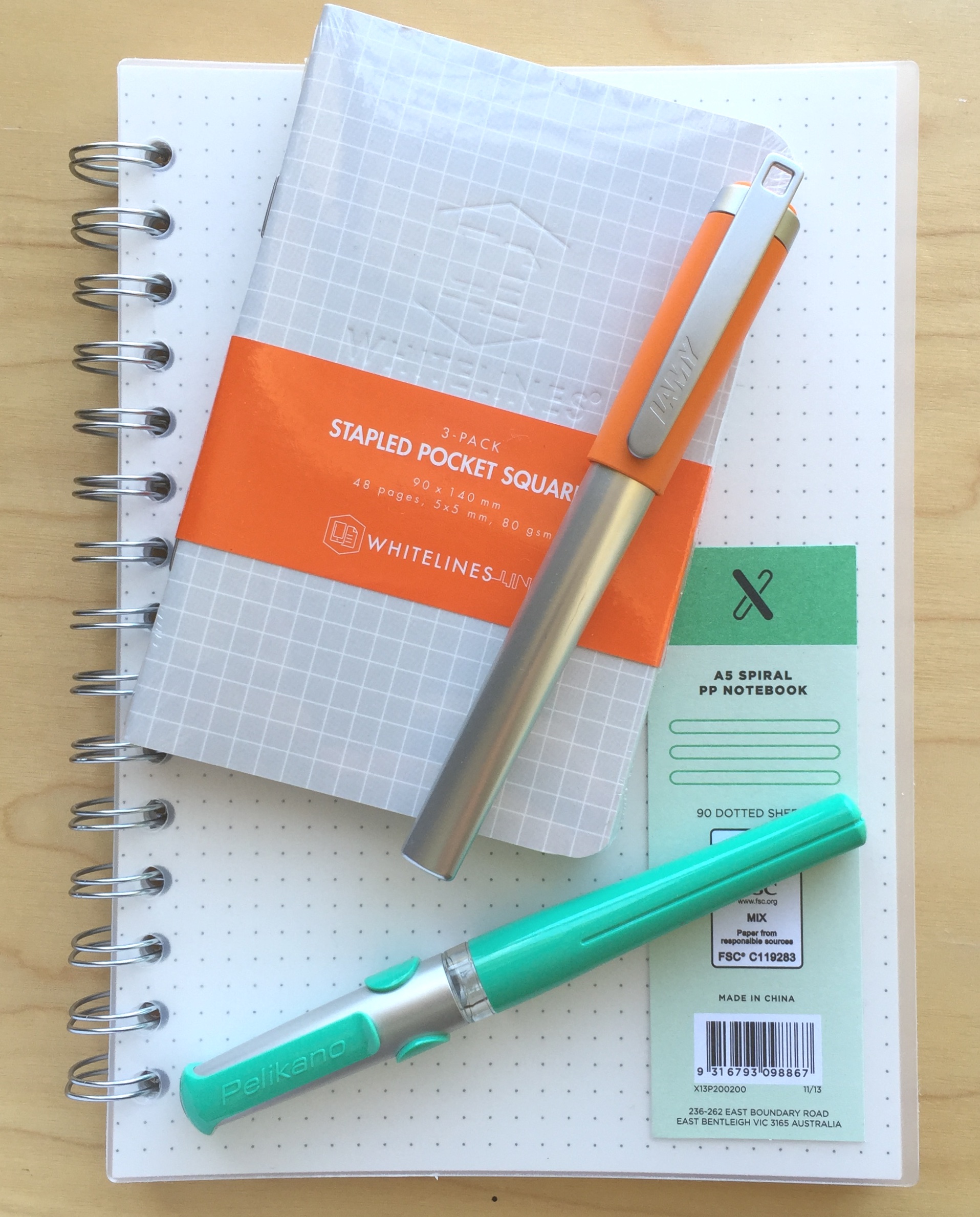
I’ve touched on the form factor a little above, however it bears repeating here. Of course I do enjoy the aesthetics and feel of my tapered pens as well, however find those uniform in diameter end to end pleasing to look at, and comfortable enough during use. As you can see from the images, the Ambition carries such a form factor, as does the Lamy Pur, which I wrote about a little while ago.

FullSizeRender 2fc_ambition

In the case of the Ambition, to accommodate the cap within this style creates both a substantial step down to the grip section, and a very short section once there. In this particular case the step transition is low enough on the pen (due to the very short section) not to worry me. If your particular grip style results in finger placement further down the barrel, there may be an issue. Alternatively, and again depending on your preference, this may provide a means of grip stability or a balance point, which I find occurs with the step on the section of a Pilot Metropolitan.

The overall diameter of the pen is not overly large, giving the impression of more length than there probably is, which incidentally measures 12 centimetres when uncapped, and almost 14 with the cap on (an identical length to a capped Lamy Safari for reference). The overall feel in the hand is one of lightness and even balance, which is unlikely to lead to any undue hand fatigue. Post the cap however and that is another story — more on this below.

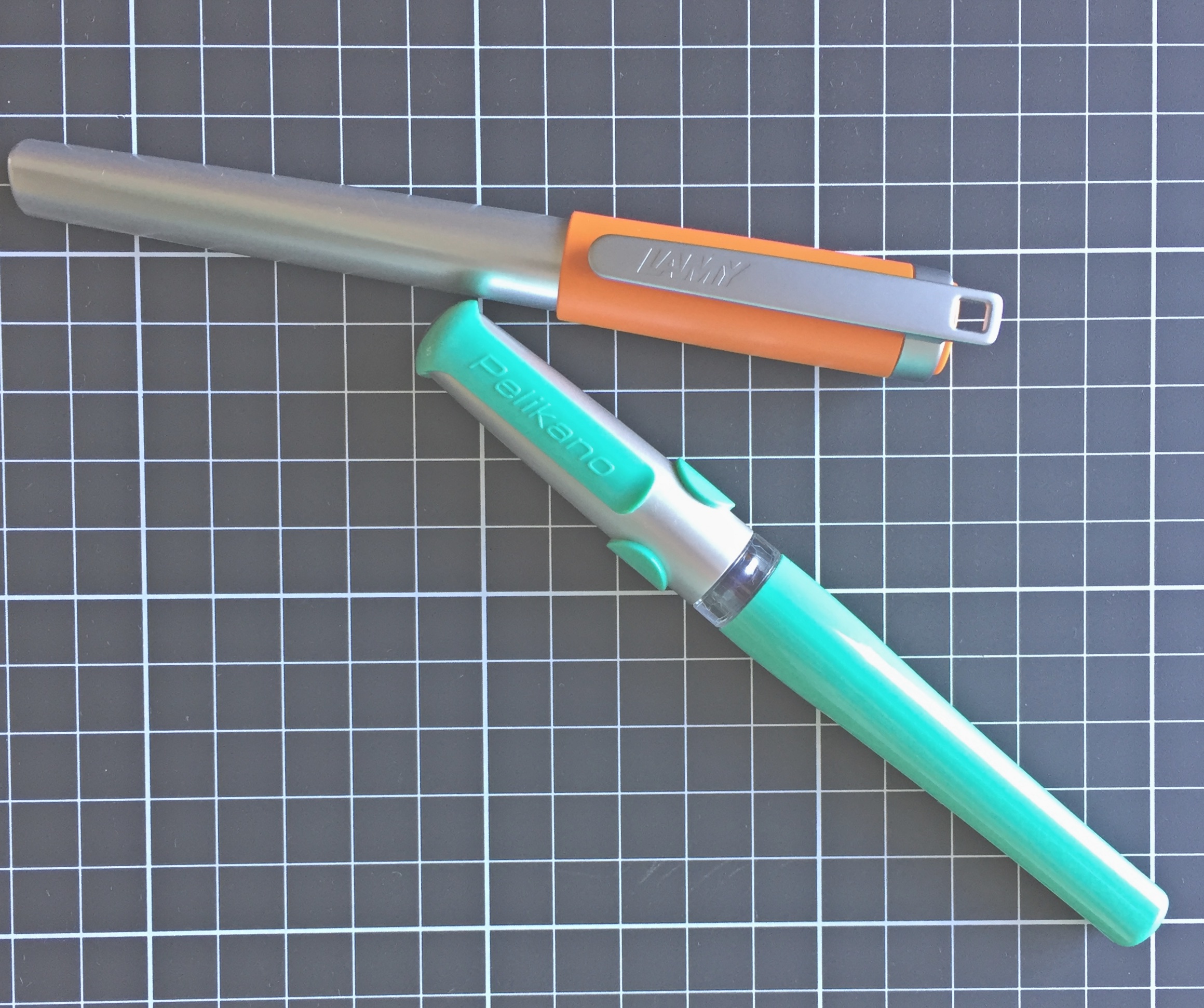
The chrome-plated cap and bridge-shaped clip are certainly sturdy enough, and being on the shorter end of the spectrum suit the overall look of the pen. The cap fits flush with the barrel to create the appearance of one smooth form, contrasted only by the colour and texture of the barrel.

FullSizeRender 7fc_ambition


Speaking of which, it is in the guilloche texturing of the barrel which really gives this pen its character. The green colour you see here is listed on the Faber-Castell Australian site as the OpArt Curry edition. Though understandable, in the context of the some of the other colour names like Blue Ocean and Black Sand — it is a somewhat curious choice.

FullSizeRender 4fc_ambition
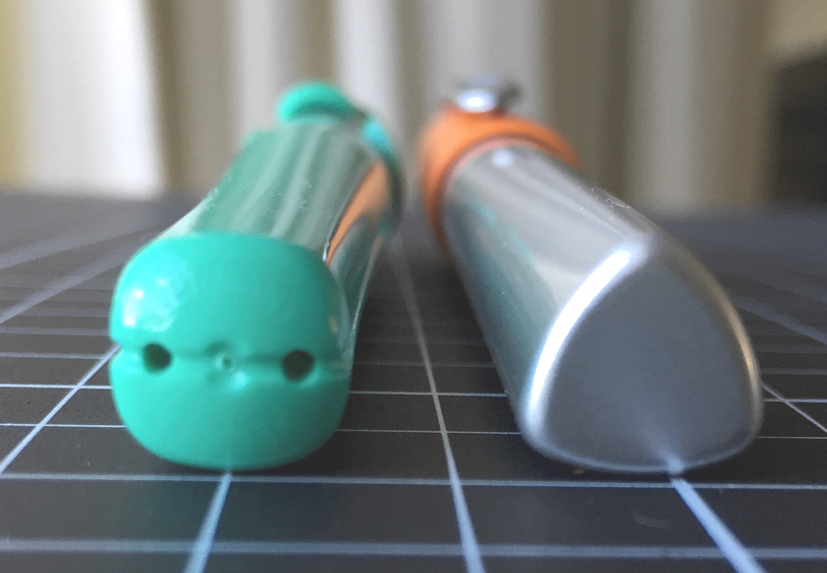
The design of the pen gives the appearance the chrome-plated posting knob and section run continuously through the centre of the pen, however of course these are merely fixed to either end of the resin barrel, which ensures the overall weight remains low. In the case of the section, a threaded attachment allows access to the cartridge or converter.

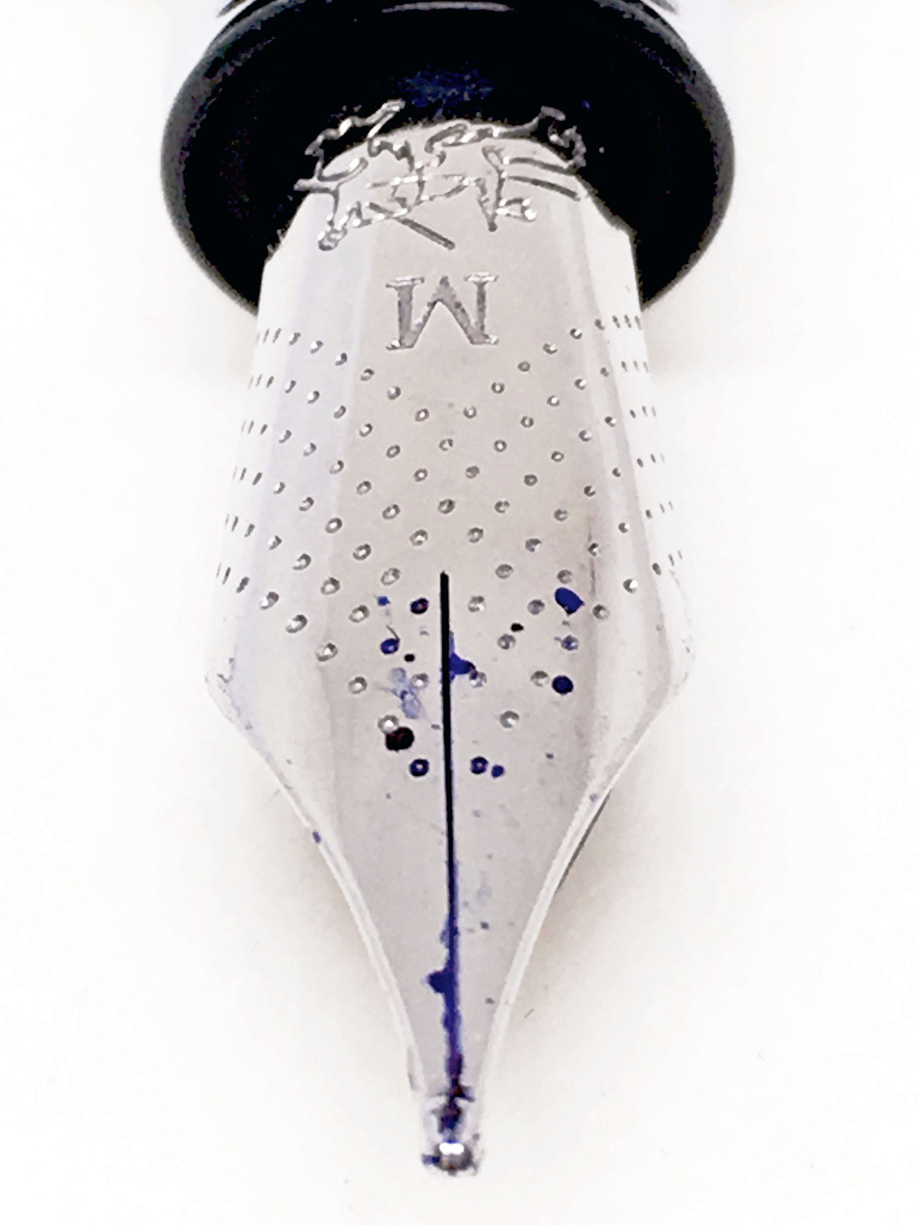
Uncapped, the barrel is bookended by the chrome-plated posting knob and very small section — both of which are proportional in size. With the cap posted, you have a perfect mirror of the capped symmetry of the pen, with the exception of the exposed nib ready for use. The section flows on to the stainless steel nib, which has an attractive pinhole dot patterning, and although not overly elaborate — suits me fine.

Specifications

The following specifications courtesy Cult Pens:

  • Model: Faber-Castell OpArt Ambition Fountain Pen
  • Material: Metal and matt engraved guilloche resin
  • Cap: snap on, chrome-plated (very secure posting)
  • Clip: chrome-plated spring-loaded
  • Weight: 28g
  • Length: 138mm capped, 120mm uncapped, 156mm posted.
  • Stainless-steel nib.
  • Filling mechanism: Standard International Cartridge; Converter
  • Nib: Stainless Steel

As noted above, the Ambition uses a standard international cartridge, or Faber-Castell converter. As is often the case, other converters are likely to fit, however I haven’t specifically tested this.

As far as cost and availability are concerned, the Ambition can be found in variants of colour and barrel design/material at various online retailers:

My local pen stores Pen & Ink (AU$145.00) and The Pen Shoppe (AU$135.00) also have some listings. I would note the quoted prices here are for slightly different finishes, and can approach AU$300.00 for the Coconut Wood model for example.

Writing

The Ambition comes with a stainless steel nib, and it is a beauty. Equal to any of the other steel nibs in my collection, and better than many.

FullSizeRenderfc_ambitionBeing stainless steel, you expect a reasonably firm nib, and is certainly what you find here. A little pressure will provide some give, however a good deal of pressure is required for a minimal amount of line variation, and of course if that is what you are after this pen wouldn’t be high on your shopping list anyway.

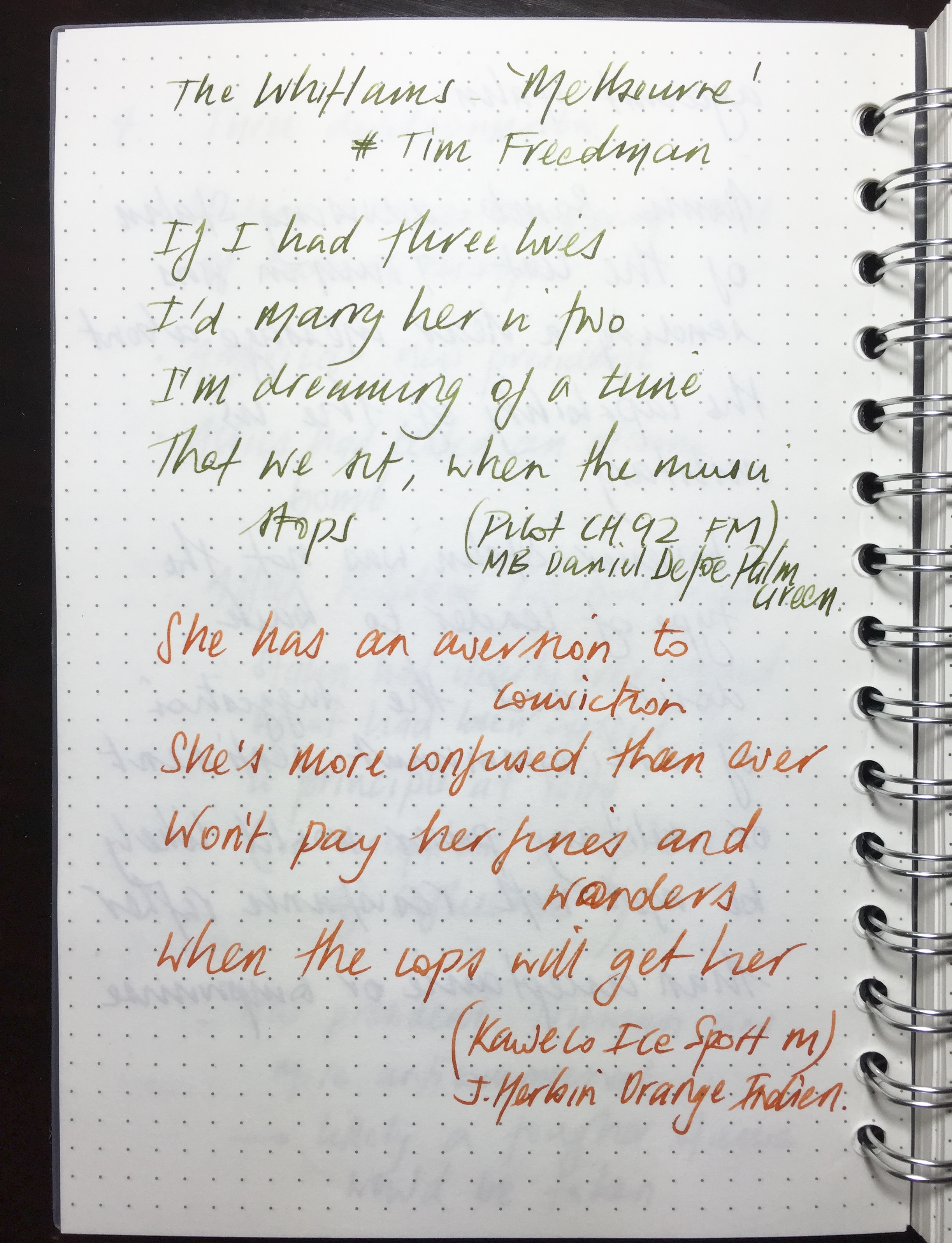
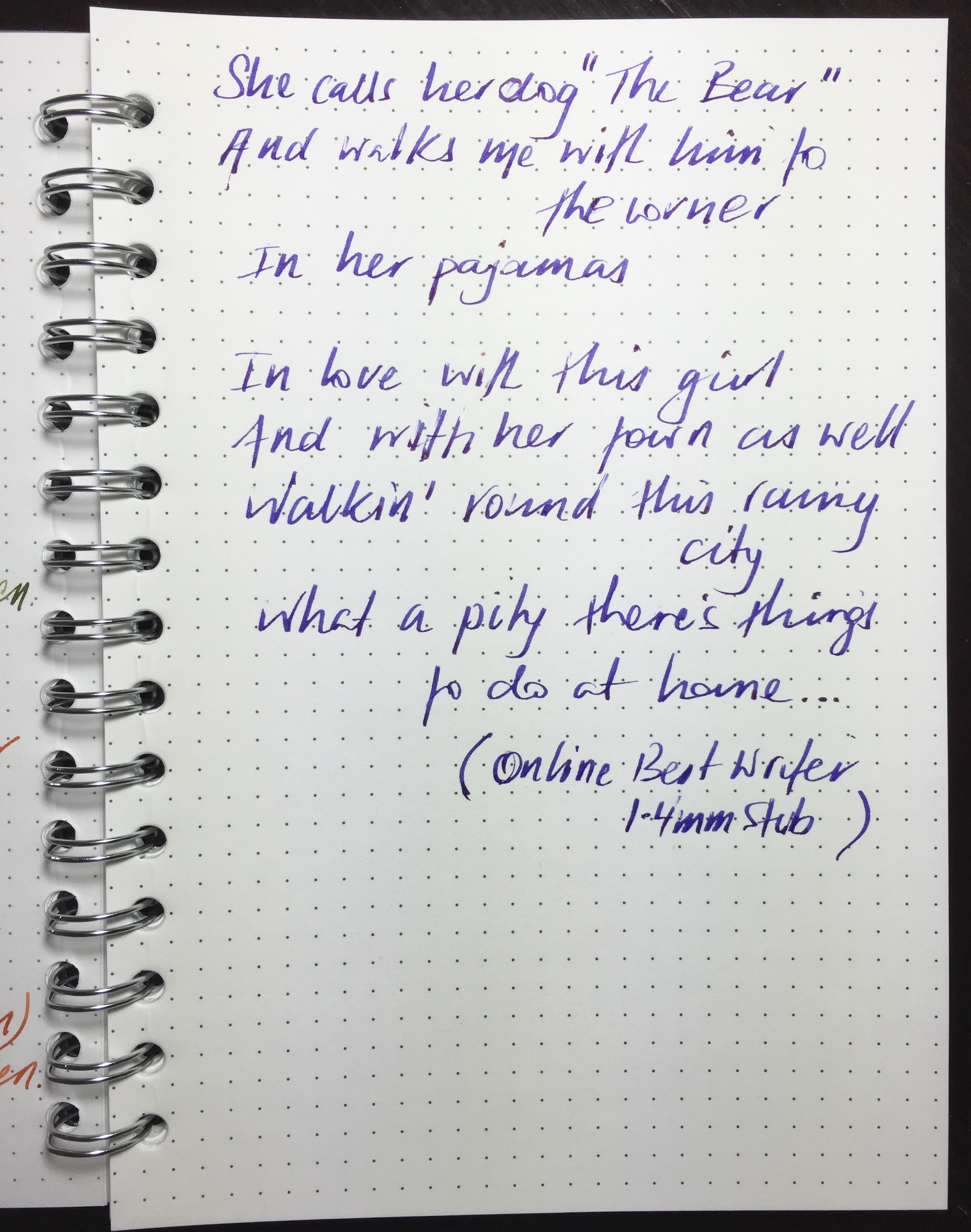
The medium nib on the model I own is as smooth as they come, and I don’t believe I’ve seen a single line of a single letter ever skip — from the first stroke onward. Depending on your individual style, the firmness of the nib may dig in a little on softer paper, however with the medium nib I’ve not had any problems across a broad range from office copy paper through to Rhodia or Tomoe River.

The nib is not what you’d call spectacular in appearance, sporting a very small Faber-Castell two jousting knights logo and series of pinholes patterned in V-shaped alignment with the nib, rather than a single breather hole. Finishing things off is the M nib width designation.

Although not a large nib, it is a little longer for its size than some of my others, which suits the overall balance of the pen when writing. As I’ve mentioned, the very short section on the pen will, for many, necessitate a grip above this point a little further up the barrel. The length of the nib assists the balance of this arrangement by providing a little extra reach towards the page.

I do not typically post many of my pens, and I would think the weight of the cap will likely prevent that with the Ambition, even if posting was your usual preference. Once posted, the pen’s centre of gravity is shifted to the join between the cap and the barrel, which is very high, and well above the webspace of your hand. Upon writing this way it almost feels as though the nib constantly wants to lift off the page.

Comparing the weight of the cap in one hand and the pen in the other, the two feel reasonably similar, and upon checking, the cap itself weighs in at over 14 grams. Perhaps not astounding in itself, however if we refer back to the specifications above, the entire pen is listed as 28 grams (I make it 27 however you get the idea)! That is over 50% of the entire weight in the cap alone (many of my other pens are around 30-40%). Although considerable, it is not surprising given the dramatic change in balance when posted — which I would not really think is an option unless you have fairly large hands.

FullSizeRender


Over longer writing sessions, the Ambition is probably not quite as comfortable as some larger diameter pens with a tapered form, however here I am referring to a three or four A4 pages before I began to have those thoughts. As a result, I found most use occurred with tasks such as outlining a post over two or three A5 pages, or using a coloured ink to mark up printed documents and the like. For longer conference call note taking or handwritten first drafts, the level of hand fatigue I’d say was probably a little higher than some of my other pens. Of course that is exactly why I have more than one — and I’m happy this is one of them.

Signing Off

How to sum things up with the Faber-Castell Ambition?

FullSizeRender 3fc_ambitionOverall, it is a well-balanced (sans posting) pen with one of the smoothest stainless steel nibs I own, housed in an unusual and eye-catching finish. I’m quite find of the uniformity in the cylindrical form of the pen, and have no problem with the shortness of the section when it comes to writing. If you are perhaps hesitant to spend in the mid one hundreds, I wouldn’t be concerned in relation to the nib. If the design suits your taste, I’m sure you’ll find the nib an absolute bargain given its performance.

A great combination of attractive form and superb function, though as always, particularly if you have concerns about that section — always best to try before you buy (often difficult I know). I personally found it better for short to medium length writing sessions, and will be happy to pick it up often for such occasions in the future.

Now, I’m off to do other things — I have ambition you know.


The DanDa Stationery Aisle – cheap, cheerful and useful

danda_post_add

Although not likely to replace your favourite online stationery supplier, nor is it Officeworks, Japanese discount store DanDa has a few options which might be handy to those interested in pen and paper. Cheap, locally available, and carrying some items not found in other brick and mortar stores in town all make for a place worth visiting next time you find yourself in the Brisbane’s CBD.

Located in Adelaide Street (opposite City Hall), it’s an easy walk from most places you may be visiting should you find yourself in the CBD.

What might you find here which may be of interest? Quite a few gel pens for starters, including Uniball’s Signo DX, some Zebra’s Sarasa, Pilot’s G-2, and Pentel’s Energel among many others. The predominant tip size is medium and finer, although for those who prefer a wider line you will likely find something for your preference as well.

IMG_5928danda_post

DanDa has been my go to supplier for Pilot Hi-Tec-C Coleto multi-pen refills for some time now, and if you buy three refills, you only pay for two. Speaking of payment — it is of course one of those stores where everything is a universal price (apart from the occasional item marked otherwise – though this is rare). Everything you pick up is A$2.80.

For the fountain pen user? Here, there is probably a little less (read zero) as far as pens are concerned, however I have picked up the fountain pen friendly Campus notebooks by Kokuyo (in multiple sizes); a 3 ml syringe for cartridge refills (you’ll find this in the cosmetics aisle); and a couple of magnifying glasses (albeit not the most powerful) for peering a little more closely at some nibs. Again all at a cost of A$2.80 a piece.

IMG_5929danda_post

As I said, DanDa probably won’t become your go-to stationery store, however there are a couple of aisles of pen and paper well worth checking out — and it certainly won’t do your credit card too much damage in the process.


A Small Tale of Pen Grail

For quite a long time I have been a little uncertain about the “grail” pen thing. No doubt the concept is a valid one — what I am referring to is just how it might relate to my particular thinking on the subject, and perhaps what my grail pen might actually be. Further, given I have often struggled with that very question — whether I even have one at all.

Occasionally I think about the where I might start in search of such a pen, and it is usually when reading others thoughts on the topic. For example, the post published earlier this year by Dr Jonathon Deans at Pen Economics on this very topic, in which a fairly clear conclusion is reached about the author’s grail pen — a pen which subsequently has been added to said author’s collection. Another more recent post by Thomas R Hall on Penucopia, describes the amazing and lengthy process of coming up with the design of, and having manufactured, a custom designed grail pen from scratch.

If you have not done so, I would highly recommend reading both posts, which are quite different in nature, yet together in many ways encapsulate the concept of a grail pen, in that the technical and emotional aspects may carry equal weight — yet we all are no doubt influenced differently by each.

The notion of grail

In times gone by, when the question arose (podcasts, discussions, or blog posts) as to what my grail pen might be, truth be known I could never really come up with an answer.

The first possibility of course is that my journey of discovery in the pen world, though I’ve logged a few miles — has not gone far enough to uncover a suitable candidate. The more I think about the concept though, the more I lean towards a second possible scenario: in the truest sense of what a grail pen means to me — I already own it.

Although most have a good idea of what we are referring to in speaking of a “grail” pen, the online Oxford Dictionary offers two meanings for grail. The first, a reference to the cup or platter used by Christ at the last supper, and a second, more relevant one to the topic at hand:

A thing which is eagerly pursued or sought after

Simple — but accurate. It’s the pen we so very much want, the one that draws us towards it — the one calling our name. The pen we will go to great lengths in seeking out and acquiring — dare we call it a quest?

In considering the grail pen, I wonder what particular criteria need to be fulfilled for inclusion in this much sought after group. Clearly this will (and should) be different for everyone, and any list of check boxes relating simply to pen specific criteria, will likely not be enough — however for some it might.

There is something else. Some other significance, meaning, or purpose. Again you will find evidence of this in both the posts I’ve mentioned above.

For me?

Writing a post like this one can sometimes pose new questions of yourself, or perhaps expose some new realisations. In doing so, my thinking has been clarified somewhat on the notion of a grail pen, and what it represents most clearly to me.

Are there are any pens out there I’ve always wanted or dreamed of owning? One out there calling my name that I simply have to seek out, plan for, and buy? A pen I am constantly coming back to, over and over?

At the current time the answer to those questions is no, however there is one pen which repeatedly springs to mind in considering them.

I still vividly remember the feeling of how badly I needed to have this particular pen. Of repeatedly entering the pen shop and fawning over it in the display case, then going home to come up with a strategy to save and eventually make a purchase. Whether the pen was worth the price1 was never in question.

In some strange twist to all this, the only pen that has ever engendered these sorts of feelings in me is already in my collection. I’ve written a little about it before: my Montblanc Meisterstück Classique. It was a gift from my now wife of 18 years on our wedding day. It was also my very first fountain pen.

To those who would suggest there is a difference between “sentimental value” and “grail pen”, I certainly don’t disagree with you, however prior to having that pen in my hand, let me tell you, it was a quest, and a pretty obsessive one. For a number of years I had wanted a great fountain pen, and it always had to be a Montblanc.

In the many years since, my preferences and experience with fountain pens have certainly evolved, and granted, there are better performing and more attractive pens both “out there” — and for that matter, in my own collection as well. However I know how much it meant to obtain that pen, how much it means to me today, and what it will continue to mean in the future.

Not that I’m saying there will never be another, although at the current time I would still struggle to answer you if asked what pen I might buy were price and availability unlimited. Personally, my search for a grail pen is certainly more Monty Python than spiritual at the current time. That said, the search only needs to go as far as my pen storage drawer to find at least one that I know of.

To those who are yearning for, planning a strategy to acquire, and actively searching for their grail pen, I wish you every success in finding it. I consider myself pretty lucky to conclude in all likelihood I already own mine.


  1. A$435.00 circa 1997 ↩︎

Possible Starters: Lamy Nexx and Pelikan Pelikano Fountain Pens

2016-04-09 pelikano_v_nexx_2

Call them what you will: low-end; entry-level; beginner; learners. Perhaps all true, however these two fountain pens are both pretty solid performers in their own right — for any purpose. They may look a little cheap and cheerful, and although not being for every collection certainly have their place, regardless of your level of fountain pen experience.

The Lamy Nexx and Pelikan Pelikano fountain pens can be found in the “Young Writer” and “Kids/World of School” sections on their respective manufacturer’s websites. Although you won’t see any in schools in this country (I am not sure of the current status regarding other schools around the world), the pens are clearly designed for an early or younger generation entry into the world of writing with fountain pens. That said, I’m certainly no whipper snapper, and I’ve enjoyed using these pens increasingly in recent times when gathering my thoughts for this post.

Those of us who use fountain pens on a regular basis are often the ones who introduce another generation into the habit. Would I use either of these pens with that aim? I’m not sure, and there are perhaps other options I may recommend for that purpose, however I can see these two being great options to offer as possibilities — particularly if a few different options were being considered based on the tastes of the prospective user.

Forced to choose either the Pelikano or the Nexx? A somewhat challenging question, and the answer surprised me a little, though as you’d expect, the ideal pen when comparing two or more generally produces a Frankenstein result — that is, a combination of the best aspects of each. Of course in the absence of that being possible, read on and my final choice will become clear, but really — either of these pens wouldn’t disappoint in their target market.

Look and feel

A point to note here: the current models of both pens have undergone a cosmetic makeover compared with what you see in the photos, which are the pens from my own collection. As far as I can tell, all other aspects of the specifications are essentially the same.

It’s probably in the “feel” more than the “look” that I was most surprised as I used both pens on a more regular basis. I have mentioned in the past I am not a huge fan of the traditional Lamy triangular grip section found on the Safari and AL-Star ranges.

2016-04-09 pelikano_v_nexx_7

Upon uncapping the Lamy Nexx, the first thing I see is another triangular section, this time covered in a rubberised, cushioned coating — somewhat reminiscent of the grip guides of similar material often slipped onto to pens and pencils for younger users. Despite this, I found the section on the Nexx to be far more comfortable to write with than the Safari in my collection. I don’t really have a valid reason for this given the sections are both quite similar in size and shape — the only difference being the rubber coating on the Nexx.

According to Lamy:

The LAMY nexx fountain pen has a soft non-slip grip which makes for extended fatigue-free writing. Its polished stainless steel nib makes writing super easy

All I can really put it down to is the fact that the rubberised overlay softens the edges a little, creating a slightly “rounder” and well… softer feel than the plastic of the Safari.

I would say however the junction of the section and nib looks a little untidy, with the increased diameter of the “stops” on the grip meeting the black plastic collar around the nib and feed. It is the same plastic collar which you also see on the Safari and AL-Star ranges, however on the former it is matched to the barrel colour, and the on the latter matches the darker section a little better. Certainly not a big issue here, and only noticeable as I sit here and review the overall look and form of the pen.

2016-04-09 pelikano_v_nexx_1

The top end of the Nexx barrel begins in a distinctly triangular form factor, rounding out as the barrel increases in diameter and moves towards the section, before returning to the triangular form and tapering slightly at the grip. Uncapped, it carries nice clean lines and I quite like the overall look and shape, however as I mentioned, it is perhaps spoiled a little where it meets the feed.

Capped, the Nexx demonstrates a smooth but steady increase in diameter from end to cap, reaching a maximum at the clip ring. This probably fits the overall funky aesthetic of the colourful cap which also contrasts nicely with the silver aluminium finish of the body. The top of the springy clip sits proud of the actual cap, and while it suits the overall form of the pen, the cap and clip “live a little large” for my taste.

The Nexx appears to be going for a fun, funky and cool aesthetic, rather than portraying itself as the “beginner’s” pen. To that end, I’d say Lamy have probably achieved their goal.

The virtually clipless Pelikano, aside from the cap, carries a certain similarity in shape to the Nexx, and again avoids too much of the “beginner” aesthetic, however I believe it does carry just a little more of that style. This time, the end of the barrel begins in square form, before a similar increase in diameter as it rounds out, before tapering into… wwhaaaaat?? A triangular grip section! I must admit it is more trianguar-ish, than triangular, though the similarity to the Nexx is not lost on me.

2016-04-09 pelikano_v_nexx_3

Again the section has a rubberised coating, however in this instance adds little thickness to the grip. Of the three flattened sides to the grip, the index finger third also has rubberised ridges which run perpendicular to the barrel, I assume to assist with grip and guidance of the nib when writing. A couple of things on this: firstly, they are probably not necessary, as the rubberised coating on the section is more than enough for gripping, and though I didn’t find it noticeable — it may annoy some. Secondly, this could also be used as a baseline grip point of reference in someone learning to write (“index finger here”).

This rubberised overlay sits on a clear section, and therefore prevents any decent view of ink colour or level inside the pen. In contrast to the Nexx, with the Pelikano the nib is held by black plastic “shoulders” at each of its sides. In pointing out above the look of the Nexx at the junction of the nib and section, I’m not really sure this one is an improvement. Personal taste plays a factor with any of the pen designs we prefer, and perhaps I’ve made a bigger deal out of it than it really is. I cannot say when I’ve picked up either pen I have even given it a second thought.

Overall, I marginally prefer the Pelikano’s grip section, though it is the centre of the barrel which raises a few questions for me. Both pens increase in diameter through the middle of the barrel, with the Pelikano doing so just a little more in comparison (1.4 mm more at its maximum, as you can see from the specifications below). This throws the comfort of my grip ever so slightly off, and I’ve found I cannot write for extended periods quite as comfortably as I can with the Nexx.

Aesthetically, the styling of the Pelikano is quite different to that of the Nexx, and to be honest I really have no preference here. The cap of the Pelikano reminds me of a helmet on the Lego Knights I used to have as a child — if you had them you know what I mean. While I enjoyed playing with those knights, I prefer the design as a helmet rather than a pen cap.

I’ve described it as “virtually clipless” above as the moulded plastic forms part of an exoskeleton or … yes, there it is: “helmet” over the cap. This forms a sort of pseudo-clip, however the functional section is very short, and I’d hesitate to use it regularly, being reasonably fearful it might snap as the plastic fatigues through repeated bending.

Although both pens are not what you’d call expensive — both feel sturdy enough to stand up to the usual level of wear and tear. The aluminium barrel of the Nexx may provide a little extra reassurance in this area, however with even a little care in the daily use and carry of, I doubt you’d have trouble with either.

As I’ve mentioned, the clip extending past the end of the cap on the Nexx may provide a snag point, however again I would not anticipate any major problems.

Specifications

Notwithstanding the cosmetic changes I mentioned earlier, following are the specifications in the current available line up from both manufacturers.

Manufacturer Pelikan Lamy
Model Pelikano Nexx
Body Plastic Aluminium
Cap Plastic Snap On Plastic Snap On
Clip Plastic Metal
Fill Cartridge/Converter Cartridge/Converter
Weight 23 g 31 g
Diameter max 14.5 mm 13.1 mm
Diameter grip 12.5 mm 12.2 mm
Length capped 13.6 cm 13.4 cm
Length uncapped 12.5 cm 12.7 cm
Nib type Steel Steel
Price A$ $26-$30 + int postage $54.95

Check the manufacturer’s websites for colours available.

As far as the price is concerned, Australian supplier LarryPost stocks the Lamy Nexx, at the price quoted above. I have not been able to find a local supplier online for the Pelikano, however this of course does not rule out any local brick and mortar stores perhaps stocking them. Fishpond lists the Pelikan at AUD $39.97, however it does state the pen ships from a UK supplier. The price I have quoted above is a conversion from both Jet Pens in the US and Cult Pens in the UK, however you would need to add international postage costs to these of course.

Also worth mentioning is the option of a left-handed nib on the Pelikano, as well as the slightly cheaper Pelikano Junior model.

As far as filling is concerned, I have been using the Nexx with a Lamy Z24 converter (with no issues), and the Pelikan with standard international cartridges, noting the recommended converter here is the C499 from Pelikan.

Writing Performance

I’ve had these pens for about 6 months or so now, intermittently using them in my rotation of pens, and have written more extensively with each over the past few weeks taking notes for this post.

As far as the nibs are concerned, I’ve been happy with both. The stainless steel medium nibs are smooth writers, with the Pelikano having a slightly softer feel in terms of a little give, however there also appears to be a marginally smaller sweet spot than what exists on the Nexx — at least with this particular pen anyway. Overall, both nibs have that firm, steel nib feel — one that I quite like and is not meant as a criticism in any way.

2016-04-09 pelikano_v_nexx_5

The Nexx comes as expected out of the box — the same Lamy nib you’d find in a Safari: firm, reliable and consistent. I say consistent because in mentioning the Pelican’s sweet-spot, the Lamy nib performs well at all points of minor grip and alignment adjustment — however when compared line for line, doesn’t quite match the smoothness and comfort of the Pelikano.

Both lay down a consistent, wet line, and with a little pressure applied, (despite the softer overall feel of the Pelikan) the Lamy nib will give a slightly broader one, though neither of these pens are what you’d be using for any sort of line variation lettering.

2016-04-09 pelikano_v_nexx_6

Overall, as far as the nibs go, points to the Pelikano, as it is a much smoother and more comfortable nib to be using for writing, and the sweet-spot is really not hard to find and then sit comfortably in like your favourite lounge chair.

Both pens I have used without posting the cap, however if you were to do so, the Pelikano retains its overall balance more so than the Nexx, which becomes very top-heavy and cumbersome.

Both pens handle a variety of paper types equally well, which is probably important given what they might be used for, and I’ve not found either wanting on the first stroke when uncapped, nor with extended periods uncapped, for example in writing intermittent notes while researching online and the like.

Only young writer?

Indeed, the young writer aspect of these pens is not to be dismissed, however I don’t believe either necessarily perform this role any better than the Pilot Kakuno, which is far cheaper to buy. The Kakuno also sports the triangular grip section, however the overall balance and feel make it — in my opinion at least — a better buy for this segment of the market.

2016-04-09 pelikano_v_nexx_4

Do either of these pens appeal to the non-young or non-early writers? That of course is a matter of personal opinion. As I’ve hinted at above, I think the Nexx is more likely to fulfil a more universal role across beginner and more experienced users alike, whereas the Pelikano based on looks alone I feel is perhaps relegated to the beginners end of the market.

Given its bright and funky sort of look, the Nexx to me is a pen you might use with a clipboard or reporter style notebook: marking off attendees at a summer camp, scoring a tennis match or perhaps even recording your backyard coffee roasting data — assuming suitable paper was in use of course. At then end of the day, if a pen (which both are), are solid performers, it really is down to personal taste, and that is really where we end up here.

Conclusion

In summing up, both of these pens are pleasant to use and perform as intended. If I had to choose one? Probably the Nexx, simply because I find the overall shape of the body a little more comfortable to use than the Pelikano, which becomes a little too broad in the middle for my grip.

The Frankenstein result if I could? The Pelikano nib in the Nexx body with a smaller version of the Nexx cap and clip. Because that isn’t going to happen any time soon, I’d go with the Nexx simply because of the Lamy nib options you have at your disposal, though with a pen like this, I’d assume you’d have be looking for something specific, otherwise a Safari might be a better choice — particularly at a slightly lower price point.

In any event, either the Lamy Nexx or Pelikan Pelikano won’t fail you as a notetaker, however for the “young writer” I am most likely sticking with the Pilot Kakuno as my go to recommendation.


Officeworks X A5 PP Spiral Notebook

x_a5_pp_post_cover_with_pensI picked up this notebook at my local Officeworks for AU$2.99. That’s right — three bucks. My expectations as to how it might perform under a fountain pen were therefore not overly high, however feeling the paper while in the store suggested it just might be a little better than expected.

Home I went — not expecting much, however in the knowledge at worst it would end up a rollerball or gel pen notebook and at least see some use. What I ended up with was a whole lot more than that.

Design

x_a5_post_X_logoThe X A5 PP Notebook is part of the broader range of ‘X’ series stationery at Officeworks, consisting of notebooks, paper, writing instruments and various other accessories. I believe these are an Officeworks “own brand” type line up. All would be considered reasonably priced, with many downright cheap, as is the case with the subject of this post.

x_a5_pp_post_coverThe A5 is a double spiral or wire bound notebook with slightly frosted, transparent, hard polypropylene (hence “PP”) front and rear covers. Also available is a variant with a ziplock pocket at the front and an elastic enclosure, for the princely sum of AU$4.99.

Apart from the branding sticker in the bottom right hand corner of the front cover, the notebook carries no other features or markings, which suits the simplistic design. Given the cover is transparent, there is of course a great opportunity to decorate the first page as you please, and presto: instant personalised cover design. Commensurate with my overall design and creative abilities, mine remains blank.

x_a5_pp_post_labelOne other point to note is your usual preferences regarding binding in notebooks will of course apply. I know many find the large wire binding to get in the way of a fluid writing experience — particularly when writing on the left side of the page, or vice versa for left-handers. If that is how you usually find things in these notebooks, you’ll find it here as well. On a positive note, I’d say there is a medium amount of “wiggle” in the page when writing — also something I typically find characteristic of wire bound notebooks, which if excessive, can certainly be a deal breaker for me. They have done a pretty good job here.

Overall, the X A5 has a robust feel to it, and for the price, is certainly not an unattractive notebook. Sure, it’s not likely to set your desk on fire in the style stakes, however the simplicity of the design ensures it won’t necessarily look out-of-place on that desk either — a characteristic often missing from items at the lower end of the market.

Specifications

The specifications listed on the Officeworks website:

  • Cover: frosted clear polypropylene
  • Binding: double wire
  • Pages: 180 (90 sheets)
  • Paper: 80 gsm white
  • Ruling: 5×5 mm dot grid
  • Size: A5
  • FSC certified (Forest Stewardship Council) paper
  • Country of manufacture: China

Paper and performance

As noted in the specifications above, the 80gsm white paper comes with a dot grid ruling and 180 pages — more than enough to keep you going though a few ink chambers of writing. The pages themselves are not perforated, however tear out easily enough, and do not leave the entire edge of the sheet torn to shreds like some wire bound notebooks.

It’s when it comes to writing on these pages that the real value for money here is hammered home. With fountain pens, this paper really does punch well above its price tag. Certainly not as smooth across the surface as say Rhodia paper, however performance-wise it doesn’t suffer.

x_a5_pp_post_writing_1x_a5_pp_post_writing_2

With finer nibs you’ll experience a little tooth on the page (something I prefer, as long as it’s just a little), however I would still describe the overall experience as a smooth one. Wider and wetter nibs only get smoother, with no feathering, show or bleed through the page. I’ve mentioned in the past I can deal with a little bleed or show through, but feathering drives me crazy.

x_a5_pp_post_reverse_pagex_a5_pp_post_stub_macro

Remember I paid three dollars for this notebook.

Of course as with any paper performing in this way, at times there will be issues with dry time if you are powering along, and testing shows typical inks will dry at around the 20-25 second mark, plus or minus 5 seconds or so for wetter or dryer inks. Of course it goes without saying its ability to handle rollerball, gel ink, or your standard ballpoint pens is assured.

This is without doubt some of the best value 80gsm notebook paper going around, and is readily available online or at your local Officeworks store. This post on The Fountain Pen Network would suggest I am not alone in this line of thinking.

Conclusion

Having picked up this X A5 notebook on a whim, when “back to school” shopping at Officeworks with my kids, the hope was it might be a reasonable quality, cheap notebook to have lying around. It turned out to be way more than that.

Of course it won’t replace your Rhodia No. 16, but wow, it’s a heck of a lot closer than you might think, and I’m certainly likely to be back for more. It would indeed be a great option to accompany the purchase of a new Pilot Prera fountain pen if that’s why you entered the store.

Well done Officeworks — extremely well done.