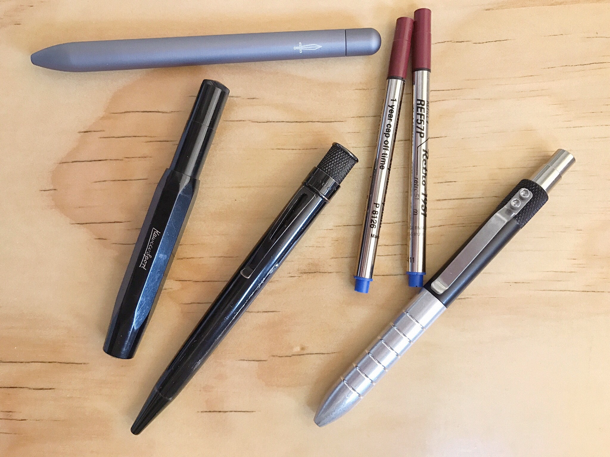
Clockwise from top: Baron Fig Squire, P8126 & Retro 51 refills, Karas Kustoms EDK, Retro 51 Stealth Tornado, Kaweco Classic Sport
The nature of intermittent pen-related posts appearing on this blog would lead you to believe my pen-life is mostly fountain and little else. Inherently there would be nothing wrong with that, however in reality it’s not all nibs and pistons. There is quite some variety in the writing instruments I use on a day-to-day basis, and on that score I’m sure I’m not alone.

Retro 51 or P8127 refill – 0.7mm
A big part of that variety is the rollerball, or if you prefer — liquid ink pen (for consistency and convenience we’ll go with the term rollerball from here on in). Although the specifics of my rollerball history are varied in themselves (more on this below), in recent times my usage has largely revolved around the “capless” rollerball refills of both the Retro 51 (at times stamped with the P8127 designation), and Schmidt P8126 variety.
The refills

The Schmidt P8126 refill – 0.6mm
Like many before me, and no doubt many after — my initiation into said refills came through The Pen Addict podcast, although the exact episode number is not known to me. I’m sure there is an enthusiast or two out there able to pinpoint the actual number, however given Retro 51 pens are mentioned at least every few episodes, specifics are probably not relevant. With a little trepidation (the hype surely couldn’t be matched by reality) I ordered a Retro 51 Tornado pen (the all black Stealth model), and upon receipt was pleasantly surprised. This was a fine-looking and equally stellar-performing pen, and that refill? Yes – it’s a beauty, and has been a regular purchase of mine ever since.

The 0.6mm P8126 refill (left); and 0.7mm Retro 51 (right)
Although you may find interchanging use of the Retro 51/P8127 and Schmidt P8126 designations when searching online, they definitely are different beasts when talking line widths. If I had to pick my favourite? Probably the ever so slightly thinner line of the 0.6mm P8126, however to be honest I’m happy with either, and my local pen store (Brisbane’s Pen and Paper) which I often visit when refills are required, stock the Retro 51 branded P8127 (0.7mm) version.
A description of the P8126 refill from Jet Pens tells us the following:
- the refills use a ceramic ball in the tip
- they are available in black, blue, green and red (the Retro 51 refills in black and blue only)
- “capless” means a one year cap off time without drying out
- the P8126 refill is 3.9″ (10 cm) long. It is not the same as the Schmidt 8126 refill, which is 4.3″ (11 cm) long.
Probably worth noting that last point as far as ordering the correct refill size when the time comes. Speaking of which, when it comes to refills and options for them, you could do no better than to consult an epic guide on such matters, aptly titled The Epic Refill Reference Guide: Rollerball, Gel and Ballpoints by Ana Reinert of The Well-Appointed Desk.
Once you’ve taken a look at Ana’s post, the realisation dawns of the multitude of options out there — many of which I have yet to explore myself. Just prior to finalising this post today, I came across Joe’s review of the Steel and Flint Kickstarter pen on The Gentleman Stationer, which contained the following:
For some reason, I’ve never had the opportunity to use the Schmidt Easyflow 9000 ballpoint refill, and that’s a shame. After using this pen for a few days, I ordered a pack of six, and have since swapped out all my Retro 51 / Schmidt liquid ink rollerball refills for the EasyFlow. It’s that good…
Stay tuned for my future ”Having an absolute ballpoint” post perhaps…
Some current pens
Anyway, the rollerball refills in question are known to many within the pen enthusiast world, and are accommodated by an array of pen housings, with Kickstarter often fertile ground for additions to the list. There are quite a few pen options to choose from really, a couple of which I have previously written about (links below), and the others in the list I’ll no doubt look at in future posts as well.
Again, certainly not an exhaustive list, however the pens I commonly rotate these refills through, provide a good example of the variety at your disposal in terms of overall design, weight and feel in the hand. The writing experience however is of course consistent and familiar.
My pens themselves, in no particular order:
- Retro 51 Tornado Stealth (Post Link; Product Link)
- Baron Fig Squire (Product Link)
- Karas Kustoms EDK (Aluminium and Black) (Product Link)
- Kaweco Classic Sport (Black) (Post Link; Product Link)
- Nova Minimal Pen (Aluminium; Comet Grey) (Kickstarter Link; Namisu Website)

The Nova Minimal pen by Namisu – a recent Kickstarter arrival
Rollerballs past
As with many in this hobby, the memories of where specific points of interest or phases began are quite vivid. I distinctly remember dabbling in a few different types of pens through high school, and in my university years beyond that (student budget permitting). There were no fountain pens to be seen at that time, with the first to come almost a decade later, however you would definitely have found a rollerball or two on my desk.
Although it’s a bit of a stretch to remember exactly what they all were, I do recall sampling a good few of your disposable varieties, like the Uni-Ball Eye Rollerball, and I believe some Pentel variants of whatever specific moniker they carried at the time. In attempting to become a little classier (I guess), the Parker Vector made an appearance, along with a Diplomat (the model escapes me), creating my most distinctive memory of them all — it ran out so quickly I was driven back to ballpoints for a while.
Clearly unfazed, over the next two decades (yes, its been that long) I dabbled here and there, however in recent years with a renewed vigour and enthusiasm for writing instruments in general, the rollerball has made a somewhat triumphant return.
Why the attraction?
There are probably two main reasons I attribute my fondness for rollerballs: my writing style primarily; and the saturation and vibrancy of the liquid ink a rollerball produces.
My writing style does not lend itself well to ballpoints or gel inks below about 0.5mm in tip size. At times depending on what I’m specifically doing, even 0.5mm is a stretch. Of course your average ballpoint or gel ink pen will typically write drier than say an EF fountain pen nib. The angle and stroke of my natural writing provides a very scratchy experience with finer non-fountain pens (and certain very fine fountain pen nibs as well), however a rollerball in the usual 0.7mm or 0.6mm is just about perfect.
As for the saturation and vibrancy of the ink, this speaks for itself really. A good rollerball will often provide output (once on the page at least) not dissimilar to what you might see with a fountain pen. The blues are deep, saturated and hold their colour over time, the reds and blacks are generally the same.

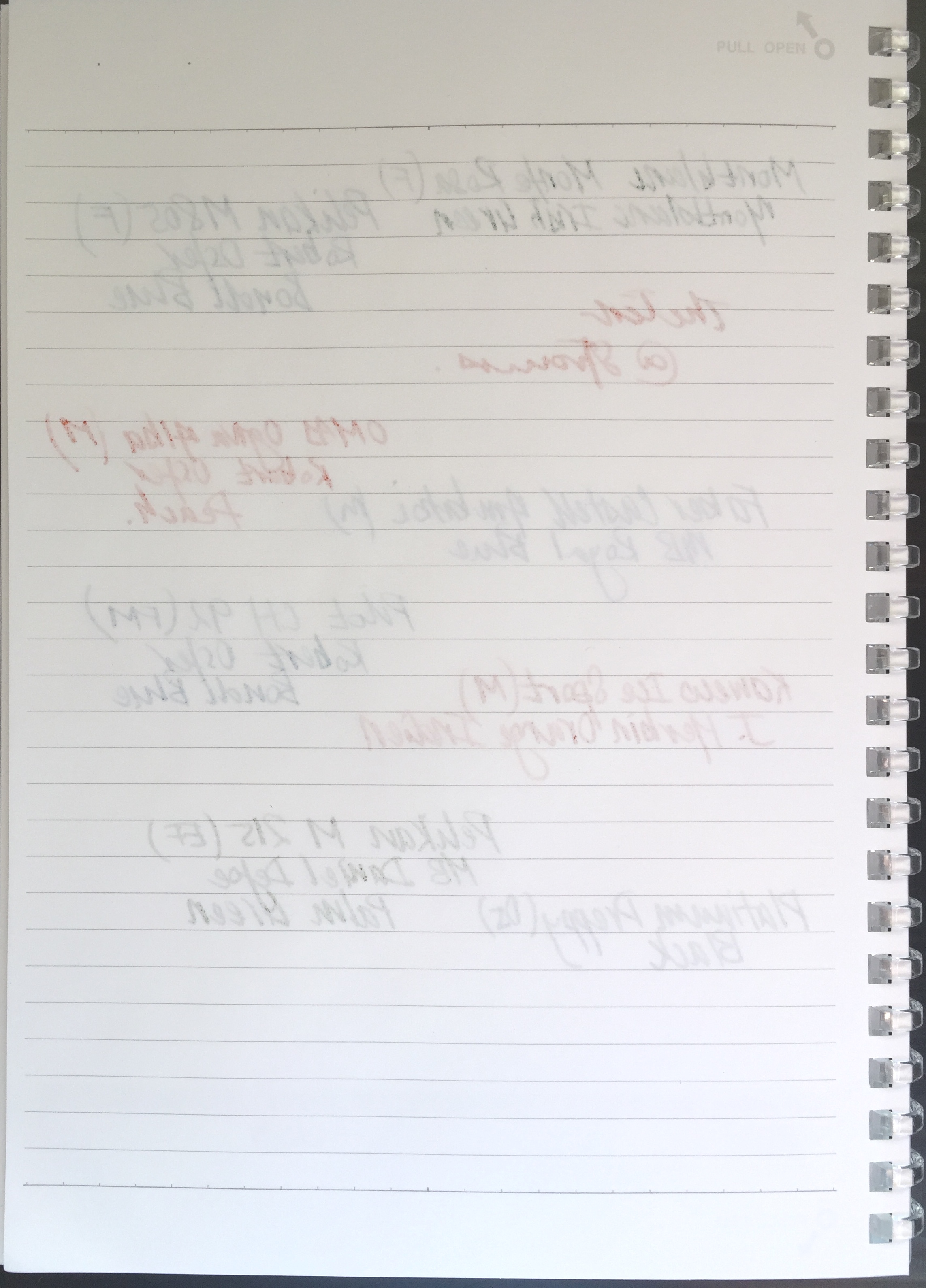
Quite a vibrant blue on the page (Rhodia No. 16 Dot Pad)
Of course it goes without saying that your colour choices are generally somewhat limited, unless you look further afield to something like the J. Herbin rollerball pen, which I’ve not personally tried, and accepts standard international ink cartridges. Personally, for the uses mine see, I’ve no real need for a vast selection of ink colours, and the basics do just fine.
Typical usage
Here the immediate thought of: “well for lots of things where fountain pens dare not tread” is probably not 100% accurate. As you probably know, rollerballs — while perhaps more versatile in some ways than fountain pens — still do not have the ubiquitous acceptance a ballpoint might.
On very glossy paper or card stock, they can be just as bad if not worse than a fountain pen. In addition, poor quality standard paper will see feathering typically less than fountain pens, however the ghosting and/or bleed through can actually be worse. If you are anything like me, and unintentionally take a rollerball as a ticket to writing with a firmer hand — this effect can be exaggerated significantly.
That said, there is a pretty decent range of paper types that will provide a fantastic writing experience with one of these capless rollerball refills. Personally, I’ve found some of the best to be on slightly toothier paper, such as Baron Fig’s Confidant, or your typical Field Notes for example. Even the standard copy paper we use at the office is a pretty good match, upon which I print out an Emergent Task Planner for the day’s tasks and scheduled activities, and a Cornell notes formatted printout for general note taking.
Although I find the writing performance of these capless refills quite an enjoyable experience, longer form writing is not something I choose to use them for. For various reasons, the pens are either a little thin, fairly heavy, or a combination of both. I say that not in a negative way, simply to point out I’d probably choose one of my fountain pen options were I to sit and churn out a few thousand hand-written words.
That being the case — where do they excel? As short form note takers. That is, for meeting notes, recording phone calls, daily planning and brainstorming, or outlining blog posts. They are hardy enough to withstand a drop, or lend to others without the need for undue concern. Perfect office pens really, which as I’ve mentioned, is mostly where you’ll find mine. I’ve also been known to have them rolling around on the shed workbench while recording coffee roasting data — a task for which they are more than hardy enough.
Signing off
The benefit of having so many choices available for these great refills is just that — the choices. The variety of pens available should see something suitable for just about any particular preference — all the while retaining the same great writing experience between refill tip and page.
Of course there are other great rollerball or gel based refills around, and I’m not suggesting the Retro 51/Schmidt’s are the be-all and end-all in this category, however are a standard and favourite for me, seeing some form of use pretty much every day. With the newly arrived Nova Minimal pen, I now have five options — perhaps a ready-made Monday to Friday rotation! More likely though is that I will simply continue what I’ve done for some time — use one for a while, and switch when the desire to do so hits me.
One thing remains a certainty — although the housing may differ, the smooth, rich, and vibrant writing experience certainly won’t.
 Whether or not you subscribe to the

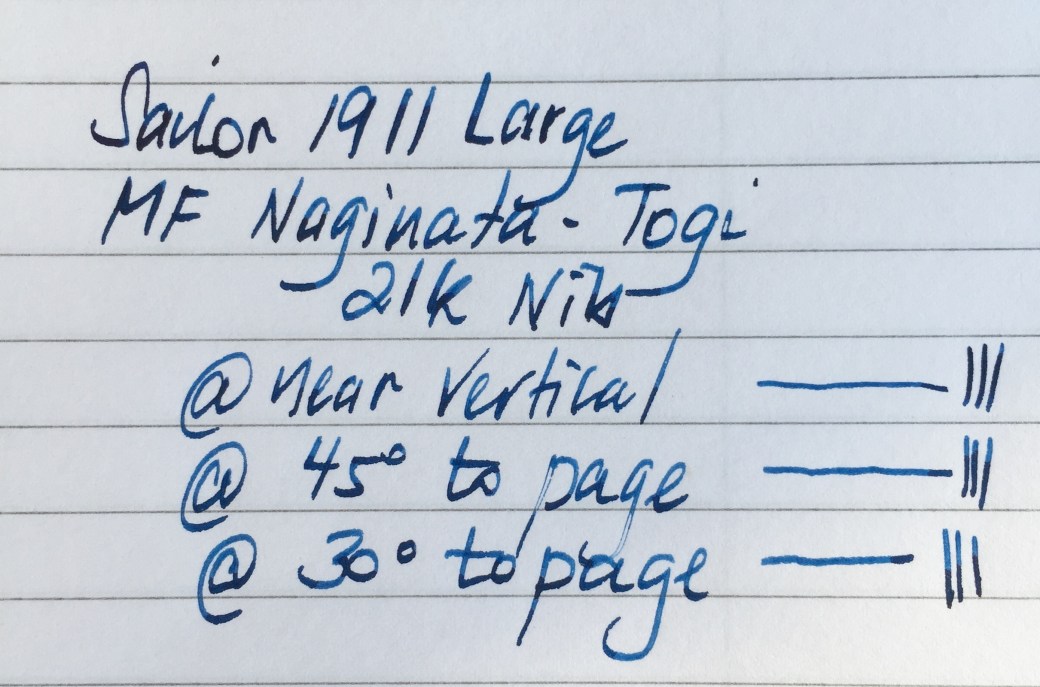
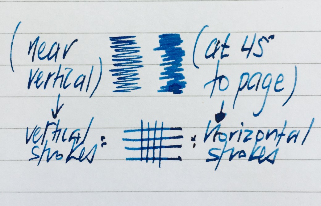
 The variation in line width is achieved by a larger than standard amount of tipping material on the nib, which is ground towards a finer point at the tip, widening as it moves away from the actual nib point. Thus, as the pen is lowered towards horizontal, a greater portion of that wider tipping comes into contact with the paper and provides a thicker line. The opposite of course being true as the pen approaches a vertical position. To be honest there is not an overly large amount of line variation, and it is seen mostly on horizontal strokes when comparing near vertical and 45 degree pen angles.