Recommended Reading: Raw Materials – Matt Gemmell

My favourite writer on the internet is Matt Gemmell, by far. How does a former software engineer who now writes full-time write so well? Significant talent and untold amounts of effort and hard work most likely play a large part.

61e6rBgR4sL._SL1000_Gemmell has recently published an eBook titled Raw Materials, comprising selected essays from his personal blog, updated with authors notes and includes an additional piece written specifically for this collection. After picking up (well…downloading) the book on the day of release, a rainy Saturday seemed perfect to proceed from cover to digital cover.

Many of these intensely personal essays recount memories of a childhood perhaps not unlike many others. Where the real power lies in this collection is not from the content alone, rather, the feelings which inevitably surface as you read. Some may make you squirm a little; perhaps say “ah…yes!”; some may change your entire mood – and to me, that is great writing.

Although the specific events, family situation and upbringing described in these stories could not have been further from my own, similar feelings, emotions and fears were (are) all there, somewhere, though manifest differently in adulthood.

Gemmell sure knows they are still there, as he writes in Paths:

And if you glance over your shoulder, well… you won’t see anything. But your own memories are there nonetheless.

Believe me, many times during Raw Materials, you will find yourself glancing over your shoulder. Not intentionally, but inadvertently, sometimes surprisingly so. With these glances come fear (Staying Afraid); sensory engagement through smells of “dryness and age” (Stories); and innocent optimism where your wish might just come true – just this once (Wishes). Then there is the physical or emotional pain we all feel and recall all too readily (Relative).

It’s. All. There. And this man knows exactly how to write about it. In an utterly compelling way. Every time.

It matters not that our childhoods were markedly different, a decade or so apart, on opposite sides of the world. We are not so different Matt and I, nor are we different to countless others who grow up with memories so indelibly burned into our consciousness (or subconsciousness as the case may be).

Those memories are always there, whether we allow ourselves to engage them or not.

I highly recommend this short but powerful collection of essays. They are written with such clarity and precision, you cannot help but join Gemmell on his “travels” back to those moments where these very memories were made. It is also inevitable your thoughts will turn to the end product of such memories. You. Today.

Years whip by when your back is turned, leaving you standing on familiar streets that are nevertheless unsettlingly different. We all have troubling experiences hidden inside, and they shape us more than we realise. The news brings us fresh fears every day. The future is uncertain, and it’s coming whether you like it or not.

Authors notes – Whispers

Raw Materials is available now from Amazon, though I’d suggest first visiting mattgemmell.com, adding it to your bookmarks or RSS feed, then clicking through to Amazon for your copy of the collection (AUD$3.72).

Matt Gemmell’s debut novel Changer will be published later this year, and if there were already a queue, I would be in it.

A Pilot G-2 Experience

G2_FullThe Pilot G–2, one of the most widely available and affordable gel ink pens on the market, which, according to the Pilot USA site, is America’s “best selling gel ink pen”. It would be reasonable to therefore assume the G–2 is quite a good pen. Many would no doubt say it is, and I do not necessarily disagree, however would suggest things are not quite as simple as that, with affordability and availability playing a big part here.

My issue with this assumption is best explained in terms of other markets, for example, is the best-selling album necessarily the best album? The best-selling app necessarily the best app? More often than not the answer is no. Best selling – the sales numbers don’t lie (though it can depend on when, what and how you measure them). Best – a whole other argument, where subjectivity, personal preference, opinion and emotion often rule the day. And rightly so, we are the consumer putting our hard-earned down for a product. Personally I’ll only keep doing that for something I really enjoy using.

Background

I first wrote about my impressions of the G–2 some time ago, in a post comparing it with the uni ball Signo 207 and Jetstream. At that time, the comparison involved 0.7mm models, and I had always planned on testing out the finer end of the G–2 spectrum at some point in the future.

A month or so ago I found myself standing in an Officeworks store wondering what my answer might be if asked: What is the best pen I can buy here, right now? Would I suggest a Pentel Energel, uni ball Jetstream or 207, a Pilot G–2 or something else? To be honest, I never really answered the question (though it would most likely not have been the G–2), however gave further thought to which tip size I might then suggest. Unsurprisingly, the G–2 was available in four sizes, not so any other pen in the store (in fact no others had more than two sizes available). What was I saying about affordability and availability above?

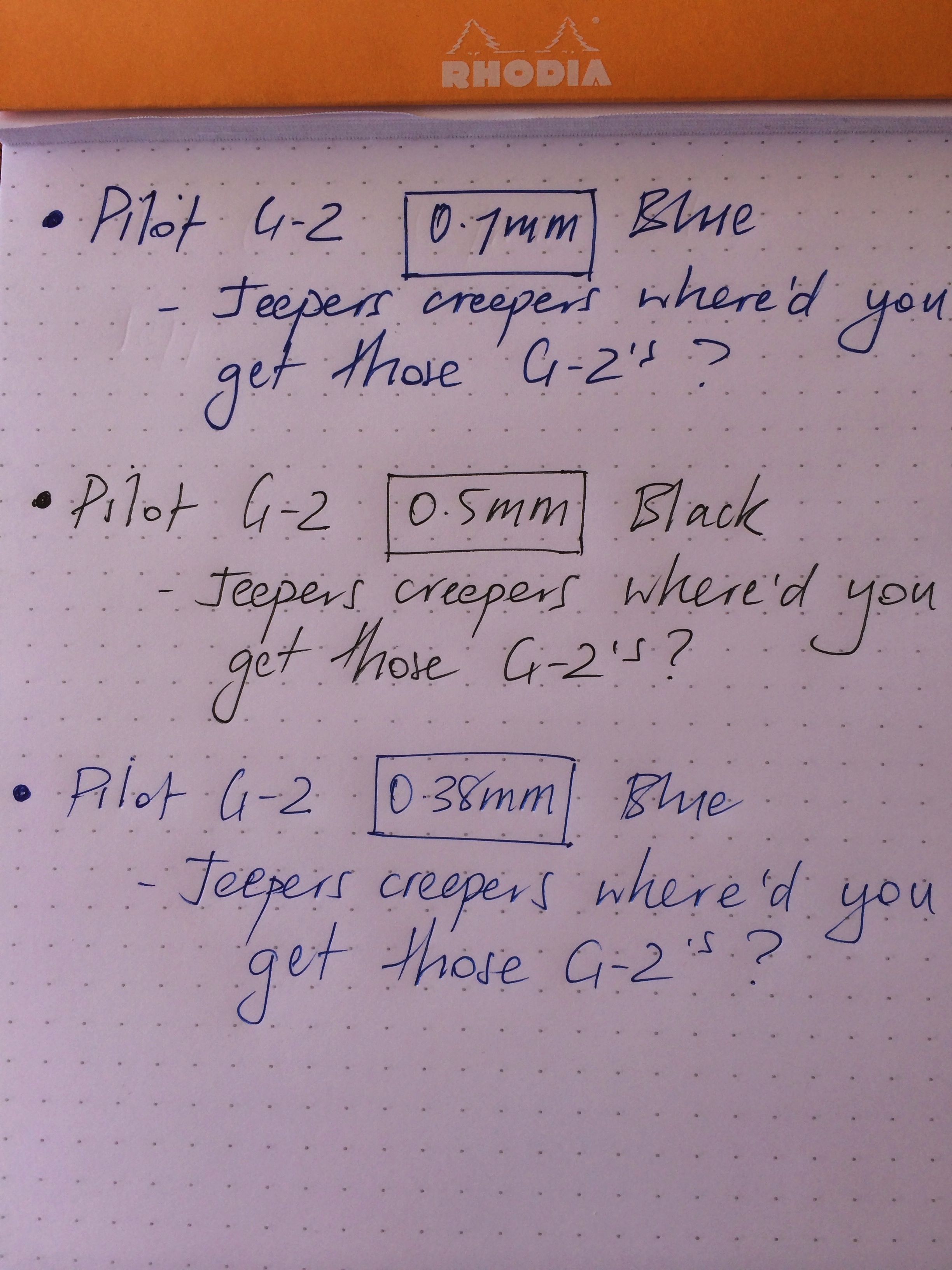
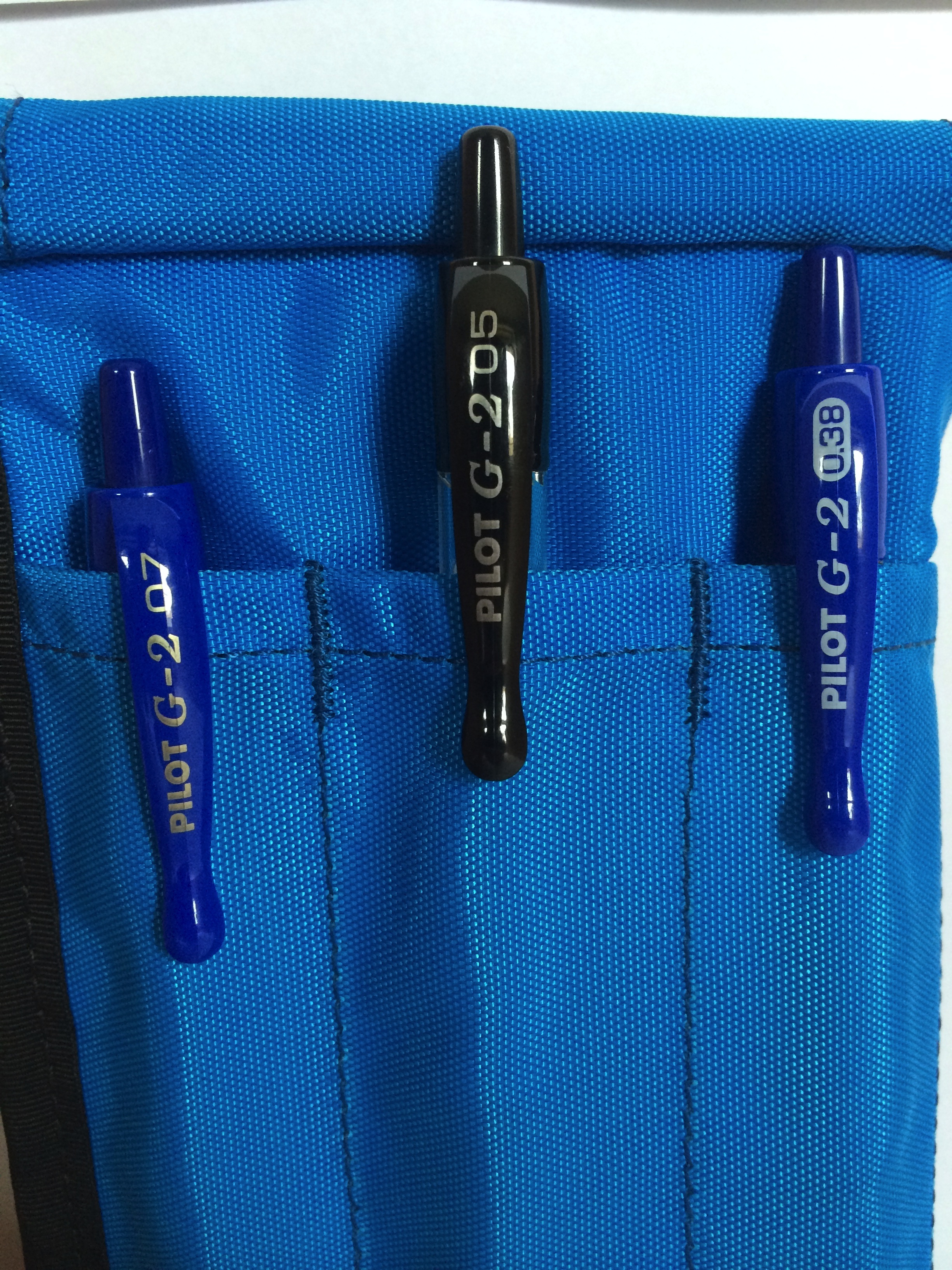
For the price, the G–2 is undoubtedly a reasonably good pen. One of my favourites? No. In spite of this, upon arriving home from the store, I filled one side of my Nock Co Sassafras with the 0.7mm (blue), 0.5mm (black) and 0.38mm (blue) G–2 models. Having previously used the 0.7mm, there was no need to include the 1.0mm in this comparison, having ruled out using anything broader then the 0.7mm. The next two weeks would then determine which size G–2 I preferred, and whether this would sway my previous opinion on the G–2 in general.

Look and Feel

Looking back on that original post, I had written the G–2 was “not the best looking pen out there”. I’d have to say that view still stands. Look, I am under no illusion that a sub $5.00 pen will necessarily end up as an icon of design, however some models at this end of market definitely look better than others to my eye.

IMG_4386

L to R: Jetstream, Signo 207, Pilot G-2

When viewed alongside a Jetstream or Signo 207, aesthetically, the G–2 probably ends up last in line. When placed alongside a Pentel Energel? The contest is much closer, however I still find the G–2 in last place. What is it in particular? I would say the majority of my dislike is both the clip and knock at the top end of the pen. The combination of a clip which reminds me of dripping candle wax, and the long, tapering knock on the end of the pen are just not to my liking. Compare that with the sleek lines of both the Jetstream and 207 in the image at right. The remainder of the pen I have no major aesthetic issues with.

Lets face it though, the simple aesthetics of a pen are so subjective, and a few photographs in a review are probably the last thing that should sway your own opinion.

How the pen feels in my hand? Another matter entirely. I absolutely love the G–2’s very slight taper at the rubber grip section. Having a quick look at some of the other pens on my desk here right at this moment, all of which I love using – a nice taper on the section is present in all. Although only a few millimetres of taper is enough, pens without one I find pretty uncomfortable and generally struggle where the size of the barrel and section are uniform through to the taper at the very tip.

Performance and Use

How does the G–2 perform when writing? The answer to that question lies, I believe, in your particular style of writing. It is here the variation in tip size has the potential to make all the difference to your writing experience. I find the broader tips more forgiving, whereas those on the finer end not so. My writing style is one where the pen is approximately 45º to the page (fountain pen or otherwise – this is standard for me). I have often found such a position not suited to finer tip pens, particularly when reasonably speedy writing is required. At times my slightly heavy handedness does me no favours, however again, that’s me, and my pens need to perform within that set of conditions.

G-2_Compare

Needless to say, I have at times challenged myself to use a finer tip pen, with the aim of somehow(?!) encouraging my brain to note down relevant points only, however mostly end up simply scratching out the same amount of text anyway, resulting in a less than enjoyable writing experience.

The main issue I had here was the amount of feedback from the paper with the 0.38mm, ranging from fairly minimal (Rhodia No. 16 Pad), to a moderate degree (office copy paper, Field Notes Shelterwood) to an annoyingly high degree (office supply spiral bound notebooks).


Completed_ETPStaples pic

Whilst my use of copy paper and office supply note books may be seen as heresy, I am sure I am not alone in using these types of items, for without going into great detail, there are certain office based workflows that simply require them in my current role. A story for another day perhaps.

G-2_TripointTo that end, I don’t believe the 0.38mm G–2 is necessarily inferior to the 0.5mm, however the fit with my writing style is not as good. If I am entirely honest though, at times the 0.38mm was my preference, for example when taking a few quick notes in my Field Notes (Shelterwood at the time) or on a tear off shopping list. It just wasn’t as good for slightly longer form writing.

As you would expect, the line production and inkflow of all three sizes performed flawlessly. There were no skips or false starts, and the ink produces a nice, vivid line, however given the fineness of its output, the blue 0.38mm occasionally seemed to fade a little “into” certain shades or even sizes of paper (for example when taking notes in an A4 sized office supply notebook).

Though also blue, the 0.7mm laid down far more ink, yielding a much more vivid line which stood out on the page. The 0.5mm is perhaps where the science of my comparison falls down a little, having only the black in this size, however I found no issues with the ink output and line production.

Conclusion

Medal ceremony. Unofficially brought to you by Nock Co.

Medal ceremony. Unofficially brought to you by Nock Co.

So, was there a sweet spot for me across the range of G–2’s? I’d probably say the 0.5mm overall. Though I didn’t reach for it quite as much as the 0.38mm. I think I shot myself in the foot a little by having the 0.5mm in black, as for some reason I have been enjoying using blue ink a little more recently. Were I to have a 0.5mm blue at my disposal, I’m sure this would have been the one to see the most use.

A photo I posted on Instagram recently with the three G–2’s in my Nock Co Sassafras, drew a few comments and suggestions recommending the Pentel Energel 0.5mm and the uni ball Signo 207. Funnily enough, both are two pens I do prefer over the G–2 (“taperless” sections aside).

I can understand why the G–2 is such a popular pen, however, always in the back of my mind is the fact that there are pens of equal cost and specs out there that are better. Some of these I have tried (Signo 207 and Energel), some I have not (Zebra Sarasa). I suspect affordability, availability and market awareness are the main reasons for the popularity of the G–2, however I cannot discount the fact that people do really like them.

To sign off, this past couple of weeks was an experiment in tip size as much as a G–2 “experience”, and probably brought me to the conclusion 0.5mm (or perhaps 0.4mm) is as fine as I’d probably go. For my writing style, anything beyond a couple of bullet points in a list became hard work with the 0.38mm G–2. Perhaps a similar sized pen with a smoother inkflow may sway me to go finer, and if anyone has any suggestions along these lines I will certainly give them a try.

What happens with the G–2’s? Retired. Probably for good I’d say.


Wiser Web Wednesday

Wiser Web Wednesday – a weekly link to posts of interest from around the web by those far wiser than myself:

A little more digital than analogue this week, perhaps I’ve caught September fever

The Newsprint
I wrote some of my thoughts on the iOS note taking app Vesper a little while ago, however here’s a better review with some beautiful photos to match:
Vesper

The Sweet Setup
I found this tip to be quite helpful if you have a desire to get rid if those pesky contact suggestions showing up in Messages – particularly those you have already deleted from your Contacts:
Quick Tip: Clear unwanted contacts from Messages

Macstories
Dispatch is my iPhone email app of choice at the moment, and though I don’t use many of the app integrations, the few I do certainly are handy. Federico Viticci outlines some new features added in the recent 2.1 update:
Dispatch 2.1 Adds “Export as PDF”, Bulk Edit, More App Integrations

While at Macstories, well worth a look is the updated guide to iOS automation using Launch Center Pro. Sure, I don’t use even half of the actions, though for reference, nothing beats this guide by Alex Guyot, or @The_Axx to his Twitter peeps:
Automating iOS: A Comprehensive and Updated Guide to Launch Center Pro

Scribomechanica
A pen and pencil blog I have recently come across, and having received my own Pilot Metropolitan Fountain Pen (which I m loving) from Jet Pens in the mail last week, a timely review:
Pilot Metropolitan M nib Fountain Pen Review

Relay FM
The triumphant return of Myke Hurley’s voice to the podcasting airwaves. Whilst many of the faithful have eagerly awaited this new joint venture by Hurley and Steven Hackett, if you are considering delving into the fascinating and entertaining world of podcasts yourself, this is the place to start.

With topics ranging from Apple to pens and paper, Relay FM brings together some of the most influential — and unique — voices on the Internet together to create powerful content, each and every week.

Being a bit of a pen nerd, my favourite of course is The Pen Addict, though my subscription runs the gamut of every show on the network. Browse the shows and have a listen – you won’t be sorry.
Relay FM

Wiser Web Wednesday

Wiser Web Wednesday – a weekly link to posts of interest from around the web by those wiser than myself:

Craft
With my Rhodia Ice 80th Anniversary Notebooks on their way, a timely interview with Scott Druce, Co-founder of Notemaker, one of Australia’s premier on-line stationery stores, from which my order has been shipped:
Craft Cubed Interview – Notemaker

Baristafail
An introspective piece from Josh Russell of Brisbane Specialty Roaster Cup Coffee, now 5 years on. I can happily say I have the opportunity to enjoy superb coffee roasted by Cup on a daily basis, for which I am eternally grateful. What else am I grateful for? Sentiment such as this:

Good coffee is putting people before the product. The product is then made better because of this.

I’ve met Josh a few times, and do not know him well, though I would put money on him achieving and sustaining the three personal goals he lists at the end of the post. A stand up local guy done good:
Long Term Goals

The Weekend Edition
Whether or not the events alluded to in this article about the merger of Cup Coffee (refer Cup link in Baristafail above for more information) and Coffee Supreme in any way relate to the sentiment above is not my business. In any event, as a keen consumer of coffee in Brisbane, I look forward to any step in the evolution of the industry as a whole (if it must change so be it, though I’ve always loved the Cup branding):
Cup Coffee Roasters pairs up with Coffee Supreme

Asian Efficiency
Although I find mind mapping incredibly useful, I probably don’t use the technique as much as I should. The guys at AE have posted a great article on a specific use of the technique to condense and consolidate information:
Mind Mapping for Condensing Material

Pennaquod
Over the past 6 months I have been furiously Pinboarding pen, paper and ink reviews for the time I may need to refer back before a future purchase. Perhaps Ian Hedley has now saved me the trouble, recently launching this “penblog search engine”, which aims to avoid the many ad listings which confront any product search these days, with pens and paper no different. There are some great sites already signed up, and I’m sure many more to follow. What a fantastic idea (and already in my favourites bar of course):
Pennaquod: The pen blog searcher

Pens! Paper! Pencils!
I must admit I clicked the Twitter link to this review yesterday from Ian with a little trepidation, as I had purchased a bottle of De Atramentis Permanent Blue a few hours before seeing it. As the link was loading my thoughts were of course – oh no, what if this is really bad?. Thankfully it seems to be a decent ink, and I do like the colour. By the way, if you need a few (hundred) other opinions, type this ink into the search engine at Pennaquod and have at it:
De Atramentis Document Ink Blue ink review

Jet Pens
I’ve been working my way through a trio of Pilot G–2’s recently, seeing if I can find a sweet spot out of the 0.38mm, 0.5mm or 0.7mm. It’s looking like the 0.5mm, however the G–2 is not my first choice for a cheap everyday pen (at the time they were the only locally available brand in three sizes). One I have not tried as yet is the Zebra Sarasa, which is high on my list. No doubt I will have a quick flick through the following guide prior to any purchase:
Zebra Sarasa: A Comprehensive Guide

Pen Paper Ink Letter
I’ve often thought I must test or at least seek out some nice brown ink. Perhaps due to a subconscious desire to combine my love off coffee and pens, though more likely simply because there are some great brown inks out there. Heath from PPIL has been hard at work looking at some recently, and, as you will see in the accompanying images to each post, some inks are brown (perhaps with a hint of red), and some, well…, aren’t. Thankfully inks are not bought on name alone:
Fountain Pen Ink Review: Waterman Absolute Brown
Fountain Pen Ink Review: Noodler’s Burma Road Brown

The Typist
Reviewing my app purchases for any business related expenses at tax time just about drives me crazy, so I cannot even imagine the amount of effort that went into this post. As I read the article this made me cringe:

To my surprise, there was no easy way to export all iTunes & App Store purchases to a spreadsheet. So yes, I’ve gone through 90 e-mail receipts that contained 126 purchases, adding the above metadata to each individual purchase.

Of particular interest is the overall amount spent on Apps over a four year period, and just how many remain on the device. A fascinating article and definitely one worth reading:
Four Years in Apple’s Ecosystem: An Expenses Report

The World Atlas of Coffee – James Hoffmann

Upon first hearing of the upcoming release of this book by renowned barista and coffee mind James Hoffmann (Twitter), I immediately went to Amazon looking for an ‘eBook’ version, which, had one been available, I would most likely have purchased (or at least pre-ordered, as the title is published in October 2014) there and then.

WorldAtlasofCoffeeHowever the more I think about it, the more I realise a collection of electronic pages would not do the subject matter of The World Atlas of Coffee justice. Whilst it is not my intent to dismiss the eBook format, my point is simply this, coffee is such an organic and sensory product, I feel it would be a shame to read about it without holding a physical, hard copy of this book in your hands. I simply believe it would add to the reading (read, my) experience.

The content of the book? From Amazon:

Taking the reader on a global tour of coffee-growing countries, The World Atlas of Coffee presents the bean in full-color photographs and concise, informative text. It shows the origins of coffee – where it is grown, the people who grow it; and the cultures in which coffee is a way of life – and the world of consumption – processing, grades, the consumer and the modern culture of coffee.

I have mentioned on one or two occasions before that James Hoffmann’s blog is one I especially enjoy reading, noting I am the typical end consumer, with a viewpoint decidedly external to the industry itself. For that reason, I was particularly happy to read the following from Hoffmann himself referring to the content of the upcoming book:

More than both of this, I wanted to write something for all our customers – the people who go out and buy, brew, drink and enjoy coffee every day. I believe that understanding something more can make it more enjoyable, and I wanted to make more of coffee accessible rather than make it more mysterious and exclusive. I want to help people to understand what they like, explore what they don’t know yet, and feel more confident in the somewhat intimidating world of specialty coffee.

At the end of the day, is there anything better than a coffee table book about coffee? Why of course, a high quality coffee table book about coffee.