Wiser Web Wednesday

Wiser Web Wednesday – a regular link to posts of interest from around the web by those far wiser than myself:

The Clicky Post
A question often asked by those deeply enthusiastic about any particular passion involving the accumulation of ‘things’ – in the case of Mike Dudek, pens. Whether you have too many, are seeking too many, or simply can’t tell. The answer? For you and you alone:
Liking Pens: Hobby or Obsession?

Shawn Blanc
There are an infinite number of possible links from the September 9 Apple event, of which I will offer just two. The first, an even keeled account with some thoughtful commentary from Shawn Blanc:
On Apple’s New iPhone and Watch

Reckoner Podcast
Secondly, three Aussies providing local context on the announcements by Apple last week. Although significant, I am glad others don’t see the inclusion of NFC and Apple Pay as something crazy amazing (that said, I certainly see the potential for added security). These guys are also probably the only reason my weekly Monday morning commute does not seem quite like a ride to the gates of hell:
Episode 60 | U2 Hacked my iPhone

The Newsprint
Of course there is always ink. Josh at The Newsprint tests out that perennial favourite blue – Pilot’s Iroshizuku Kon-Peki:
Pilot Iroshizuku Kon-Peki

Field Notes Brand
The Fall Colors Limited Edition is now available to all and sundry, and I will be hitting the checkout button soon enough. The Night Sky interior paper has always been a favourite of mine, and with a random selection of external colours unknown to the buyer – I am sure to receive a pleasant surprise come delivery day:
Field Notes Colors: Unexposed Edition

Pen Paper Ink Letter
Heath reviews the TWSBI 580AL – in my humble opinion, a fantastic looking pen. Now that the Pelikan M205 is in my collection, this is likely next on the list:
TWSBI Diamond 580AL Fountain Pen Review

Kickstarter
The fairly well-known Bullet Journal system now hits Kickstarter. If you are unfamiliar with the system itself, check out the video – then back it:
Bullet Journal: Journaling at the Speed of Life

Montblanc
The Montblanc ScreenWriter stylus is an attractive crossover between analogue and digital. Particularly as the stylus tip can be replaced by rollerball or fineliner refills, giving you a pretty good (if pricey at $605 USD) conventional pen:
StarWalker Extreme Steel ScreenWriter

The Pancake Epidemic
A really enjoyable 15 minute documentary on a visit to origin by Brandon Davenport in another instalment of the Caffeination series. Here we see the J. Hill Mill along with 5th generation coffee producer Aida Battle, Cup of Excellence winner, as she shows us around the farm in the shadow of the Santa Ana volcano:
Caffeination: El Salvador

My Pelikan M205 Fountain Pen

The opportunity to pick up this Pelikan Tradition M205 was a little too hard to pass up back in May of this year, with Pen Chalet offering the model at half price during a period of The Pen Addict podcast sponsorship.

I was looking to add to my collection of quality fountain pens, and snapped up a black model with chrome trim and an EF nib. Ordering and shipping from Pen Chalet in the US over to Australia was quite fast, and in rapid time I was inking up the newest member of my pen family.

Look and Feel

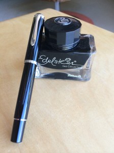
There is no doubt the M205 is a great looking pen, with the black and chrome combination providing a classic, elegant look. It makes a great business pen – perhaps a little small in stature to be signing million dollar cheques, however I don’t sign many (who are we kidding – any) of those. It is also manufactured in Taupe, White and Red.

Image courtesy Pen Chalet

Image courtesy Pen Chalet

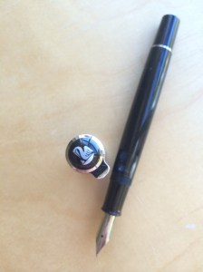
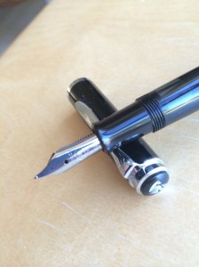
When capped, I find a certain appeal to the overall symmetry of the pen, and although not a large pen, the body diameter through the pen barrel is perfect relative to its length. The cap itself sits proud of the body when screwed on, further accentuating the central chrome band bearing the Pelikan and Germany insignia. An additional chrome band at the clip attachment, and another towards the end of the pen at the piston filler control, provide evenly spaced breaks to the shiny black finish of the barrel and cap.
M205_FinialM205_Nib_Cap_CrossM205_ink_bottle_pen_better

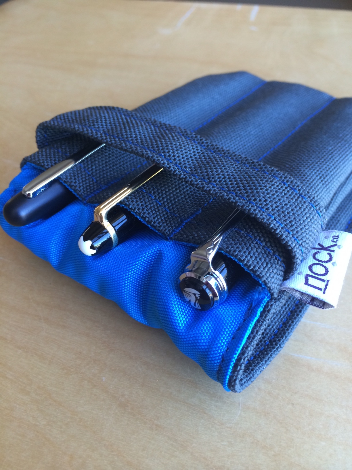
The finial sports the elegant Pelikan (pelican) bird and baby logo, with the clip shape recreating a long curved Pelikan (pelican) bill. The clip itself functions well, with suitable spring, yet is smooth enough to avoid snagging on either my shirt pocket, placket, or the Nock Co. Lookout in which it usually resides.

M205_LookoutWhen uncapped, with the exception of the fine chrome ring at the top end of the pen, and the dark tinted ink window adjacent to the grip section thread, the body of the pen is solid black, right through to the stainless steel nib. The nib itself is plain, polished stainless steel, with the logo, Pelikan name and EF inscription. Perhaps another chrome ring near the section may have been a nice addition, however would run the risk of creating a less seamless grip, and for the sake of appearance only is probably best left alone.

Constructed of a plastic resin, the pen is quite light (14.8g fully inked), particularly when used un-posted (9.9g), which I tend to prefer for extended writing sessions. Larger hands may find the barrel a little short for use without posting. A three-quarter turn will remove the threaded cap, which posts securely for writing and in no way affects the overall balance of the pen.

Performance

Great purchase deals aside, this is a $200.00 pen at standard retail pricing, and the expectation is that the writing experience will be commensurate with the price tag – that is, exceptional.

Others experiences

This is where things get a little interesting. Generally, when deciding on a pen purchase which will set me back a decent sum, I tend to consult the opinions of a number of pen bloggers who have tested and reviewed the pen in question. In this instance, that was not the case, as the podcast recommendation and great deal were encouragement enough to click the purchase button.

Subsequent to my purchase, I then read the opinions of those I hold in high regard who found the M205 not to their liking, and had I read these reviews prior to ordering, may never have picked up the M205 at all.

Boy am I glad that didn’t happen. I love this pen.

The reviews:

Pelikan M205 (the Illustrious) Fountain Pen – F Nib (The Clicky Post)
Pelikan M205 (the Illustrious) Fountain Pen – Update (The Clicky Post)
Review: Pelikan M205 Fountain Pen (The Well Appointed Desk)

I’d encourage you to read through the articles above for a full appreciation of the issues raised, however if I could summarise, others have found the nib “sweet spot” to be quite small, requiring a good deal of concentration to keep the pen within it, if the writer is even able to do that at all. This obviously places a question mark over whether the pen is suited to all writing styles.

Conversely, other reviewers have found the pen a delight to use, living up to every expectation, straight out of the box. Luckily I found myself in this camp.

Pelikan M205 Review (The Pen Addict)
I heart you: Pelikan M205 and Levenger Shiraz Ink (From the Pen Cup)
Pelikan Tradition M205 Fountain Review (Pen Paper Ink Letter)

On balance, it is therefore difficult for me not to recommend this pen, particularly at the discounted sale price, which is again available from Pen Chalet at the time of writing.

My experience

Sweet spot troubles? Myself, not so, and I would put forward a couple of theories on why that is. Firstly, although it is 17 years since I began using a fountain pen, my experience has not been widespread across different brands and nibs. Further, I have recently begun using pens with nibs a little finer than what I was previously used to, and in part appreciate the increased feedback of the finer nibs on the page. Here I am also acutely aware of the fine line between “feedback” and “scratchy”, believing I can appreciate the difference, however my experience on this may differ to a more experienced hand.

M205_BoxWhen testing further to get my thoughts together on this, I wrote with a more expensive pen (Montblanc Meisterstück Classique 14K gold M nib) and a couple of cheaper ones (Pilot Kakuno steel F nib and Pilot Metropolitan steel F nib) on a rotational basis line by line down a page for quite some time. There was a clear difference in feedback from the Pelikan and Pilot nibs when compared with the Montblanc, likely due in part to  the change in nib size, though of course material and manufacture no doubt play a part.

I could go on and about the ins and outs of these comparisons, however at the end of the day, my point is – for me, this is a great pen, and one I enjoy using very much. This is a fact I am certainly thankful for, as again, great “50% off” deals aside, $100 of my money still went on this pen. Whether or not $100 is too much for a stainless steel nib is for you to decide, however perhaps just shy of $200 is.

Writing

In my experience, the M205 writes extremely well, and I have not had any false starts, skips or unintended line variation in the three months I have used the pen, irrespective of the ink used.

As expected, the stainless steel European EF nib was still broader than the Japanese Pilot F nibs in a direct comparison. The writing sample below shows the Pelikan EF compared with a Pilot Kakuno F (Metropolitan F results equivalent) and Montblanc M, along with line variation achievable with varying levels of pressure, as the nib does demonstrate a small amount of flex.
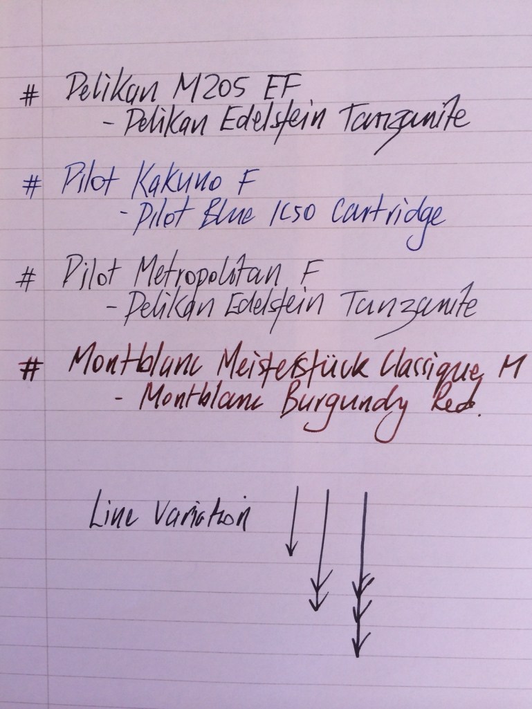
Line width comparison

Line width comparison


I would also point out here that when inked with something like De Atramentis Permanent Blue, which I have found to be a fairly wet ink, the line is considerably wider than seen with the Pelikan Edelstein Tanzanite used in the image below.

Writing sample

Writing sample

Conclusion

The Pelikan M205 is a pen I am very glad to have in my collection, and is one I could happily write with all day. Its looks are commensurate with the writing performance, and it is a pen I use at times in the office, given it’s classic, elegant style.

As I have indicated above, I found no issues with the nib, however others have, so perhaps that is a caveat to consider before purchasing. Whether there is perhaps a question mark on the overall value of the pen if assessed at full price, given the plastic body and stainless steel nib is a personal choice (despite the gold nib, my Montblanc is also a plastic resin).

Personally, I would have no hesitation in recommending the Pelikan M205 to someone looking for a quality pen, and if you can pick one up on a fantastic deal like I did – go for it.

Coffee Roasting: Development-time Ratio

Although not for everyone from either a time or inclination perspective, one of the benefits of roasting coffee at home can also be it’s simplicity. True, there are many variables to consider (and hopefully control), however, if a few core principles are followed, it is certainly a process achievable to many.

In saying this, I mean no disrespect to the many professional specialty roasters out there. My point is simply this: for the home roaster, there are a few key inherent markers which occur when roasting, providing the ability to roast by “sight and sound” (as opposed to computerised tracking), without the necessity for complicated equipment. If you have a suitable means of applying enough heat to green beans, they will crack, you pull them out some time after that, and assuming this is done within a reasonable time, you end up with drinkable brew.

I have previously written about my home roasting set up, which although needs updating in a new post, is beyond the scope of what I wish to talk about here. The remainder of this post will look at one element of roasting which I have recently read about, and decided to apply myself: the development-time ratio.

Development-time ratio

One aspect of my roasting I have always tried hard to achieve is some level of consistency between batches. I was therefore particularly interested to read a guest comment on the Cropster blog by Scott Rao, who is highly regarded in the coffee industry, and has published numerous books on many aspects of coffee preparation, and most recently, roasting.

From the post:

Roasters have traditionally referred to the time from the onset of first crack until the end of a roast as “development time.” Lengthening development time to mute acidity or increase development is a common practice, especially when roasting coffee intended for espresso. However, adjusting development time without considering it in the context of the entire roast profile often destroys sweetness and creates “baked” flavors.

Rao goes on to say:

After collecting roast data of over 25,000 batches over 20 years, I noticed a pattern among the very best batches: in all of them, first crack began at between 75%–80% of total roast time. Alternatively, development time was always between 20%–25% of total roast time.

I recommend reading the original post, which also demonstrates the concept graphically with a typical roast profile.

Upon reading the article, it became clear the development-time ratio might provide a means of achieving the level of consistency I had been aiming for, or at the very least, give some indication my roasting criteria approximate some accepted parameters.

Application to my home roasting

Reading Rao’s post may at first seem to refute my point that home coffee roasting can be a simple process, however I am not suggesting we all need to rush for our calculators either. I would also note the above percentages are saying the same thing, so if you have the inclination to look at your own data, there is no need to calculate both.

In searching for some element of consistency in my roast batches, I have typically been a little uncertain around exactly which variables were the most important. Total roast time, time to first crack, development time, or a combination?

The principle of development-time ratio provides a consistent approach to every roast batch, notwithstanding changes in other variables. It requires no additional equipment, nor recording or measurement beyond the data I currently have in a log of my previous roasts.

My historical roast data

Given I have recorded sufficient data about my past roasts to assess the development-time ratio retrospectively, with the assistance of a spreadsheet, I proceeded to analyse 30 of my most recent roast batches. My initial thinking was along the lines of “these roasts will mostly fall within the 20–25% parameter”.

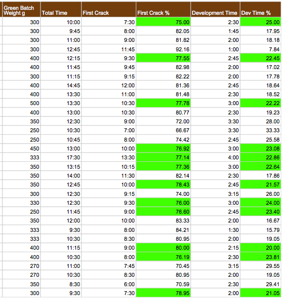
The result could not have been more different, and highlight the inherent flaw in assumption. Of those 30 roasts, only 11 fit Rao’s recommendation for a development-time ratio of 20–25% of total roast time (range 9.8 – 33.3%). Although the average was 21.6%, this is not particularly relevant when we are considering individual batches. A couple of things to point out here. One, I am an amateur remember! Secondly, further 17 batches were within a band of + or –5% (that is either 15–20% or 25–30%), and a number of these were pretty close to the 20 or 25% cut-off.

You will note from the data these figures are based on varying batch sizes, with considerable variation in overall roast time. As I roast outdoors with an open “drum”, I have found variation exists due to ambient temperature, time of day and the cumulative heat of the drum with successive roasts.

As expected, considerable variability in the cup was evident in relation to differing origin, processing method, roast level and brewing technique. Naturally, some were better than others, and I have not had the opportunity to compare the development-time ratio findings with my tasting notes on the particular coffees in this sample. I do not plan to spend a significant amount of time on this, as any valid results would rely on assessing the same coffee roasted in separate batches, standardising the variables from the previous paragraph. I doubt I have any current data fitting this criteria.

I have included a snapshot of the data below. As you can see, it contains both time of first crack as a percentage of total roast time, and development time as a percentage of total roast time. As I have noted above, there is no need to measure both, however for completeness I have included them here. Roasts falling within the criteria (by either measure) are shaded green.

Table 1: Development-time ratio (historical data).

Table 1: Development-time ratio (historical data).

Where to next?

There are probably a few answers to this question, the first being further reading, with Scott Rao’s The Coffee Roasters Companion high on my list. Although a good deal of the content may relate to far more sophisticated setups than mine, I find the science behind coffee roasting quite a fascinating topic. A review of the book can be found on James Hoffmann’s blog.

I thought I would also use the development-time ratio to standardise the total roast time in future batches, and determine whether this influences the overall quality of my roasting, and ultimately, drinking. Yet another spreadsheet here, this time to avoid the need for any complicated maths during the critical part of a roast (a printout of which is fixed firmly inside my roast record notebook).

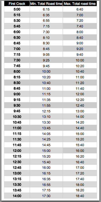
The table below uses time to first crack (column 1), to produce the range of minimum (column 2), and maximum (column 3) roast times required to fall within Rao’s criteria for the ideal development-time ratio.

Screenshot 2014-09-07 21.03.35

Table 2: Total roast time guide based on time to first crack.

Finally, the weekend’s roast data utilising the above prediction chart (Table 2) to cease the roast based on desired development-time ratio:

RoastData_2

Table 3: Roast data from 6 September 2014 using Table 2 prediction chart.

Conclusion

Although this post is a little more lengthy than originally planned, the development-time ratio is a concept well worth exploring. In finding additional ways to assess, influence and standardise my roasting parameters, my skills in this area can only improve.

In the end, the proof will be in the cup, which I am looking forward to testing out.

Wiser Web Wednesday

Wiser Web Wednesday – a weekly link to posts of interest from around the web by those far wiser than myself:

NoteMaker
Although the Melbourne Writers Festival has now come and gone, some interesting insights into the art itself from one of Australia’s best, Nick Earls. Discussion turns to the new novel Analogue Men, and Nick’s penchant for Moleskine notebooks and a good pencil:
Interview with Analogue Man, Writer and Endless Story Starter Nick Earls

Brett Terpstra
Taken some notes as a plain text list and wished it were a mind map? Develop them further by way of a handy script for converting indented Markdown or plain text to a mind map application of your choice. I also love the integration with popclip, a handy Mac application I use heavily for one click copy and paste (which itself now has 126 different extensions):
Converting Markdown to a mind map

The Weekend Edition
In some decidedly local news, Brisbane is set to see the launch (October 1 this year) of the worlds first NEXT Hotel, on the site of the old Lennon’s on the Queen St Mall. Should we be excited? Maybe, maybe not, however sounds as though there is a nice little bit of tech thrown into the mix:

…guests can download the NEXT Hotel Smart App, using it to adjust lighting, room temperature, music and television channels without needing to leave their super comfy bed.

A perfect place to stay (awake) after the next Strauss coffee cupping evening:
World’s first NEXT Hotel launches in Brisbane

A Penchant for Paper
Although I certainly don’t need an excuse, here are 10 reasons to use pen and paper and get writing by hand. Sketching always seems such a noble and therapeutic undertaking, however it is such a pity I have the exact opposite to a ‘dab hand’, for such an activity:
10 Ways To Use Your Pens and Write By Hand More Often

The Clicky Post
Although perhaps not an everyday colour, the Iroshizuku Yama-budo (Crimson Glory Vine) ink looks fantastic in this Pilot Custom Heritage 92 Demonstrator. A great review by Mike Dudek, and as usual, great photography to match:
Pilot Custom Heritage 92 Demonstrator Fountain Pen – M Nib

Pens! Paper! Pencils!
Speaking of fantastic looking inks, there aren’t too many more striking than the subject of this post by Ian Hedley. If you like your orange with a good measure of substance, check out the link, or alternatively search for “deep orange ink” in Ian’s fantastic new pen blog search engine, Pennaquod:
Diamine Cult Pens Deep Dark Orange ink review

Finer Things in Tech
David Chartier with an elegant piece on…well, the inelegant state of inter app communication and integration courtesy of the walled gardens currently in existence:

But even on OS X, where apps have always had ways to work together, I had to manually copy and paste the title and body of this piece from the Evernote, erm, note where I scribbled my initial ideas into Write. Like an animal. As much as I am a fan of Evernote, it’s a tedious, hindering experience that makes me curious about alternatives.

This is hopefully all about to change with iOS 8 and OS X Yosemite – not long to wait now:
iOS, Mac App Extensions offer some hope for walled gardens

Austin Kleon
Not commandments per se, though a list of ten nonetheless. Manifesto?, Declaration? Creed? Call it what you will, though Notes to self was the author’s choice. My picks – numbers 1 and 10:
Notes to self

Quotebook 3 for iOS

The sign of a great app? It does what it sets out to do, does it reliably and efficiently, and looks great while doing it.

Icon SmallWhen news of a major update to the iOS app Quotebook appeared in my Twitter feed recently, it made me realise what a great app Quotebook is. Why? Because it fits all the above criteria, and made me immediately think “an update, that’s always most welcome, but it didn’t really need one”. Further, though I was happy to retweet this news noting it was one of my “favourite apps”, I could not recall specifically the last time I had used it. Oh, it will never be deleted, and contains some of my favourite quotes, however again the sign of a great app – it is there for a purpose, and there when I need it.

What initially drew me to Quotebook (probably a couple of years ago now) was the specificity of it’s purpose. Sure, I could have saved some quotes in a notebook or with a tag in Evernote; kept them as text files in Dropbox or Drafts; or even tabled them in a spreadsheet, which I have also done in the dim distant past. Quotebook seemed like the perfect solution to keep these pieces of text together with their author and source if necessary.

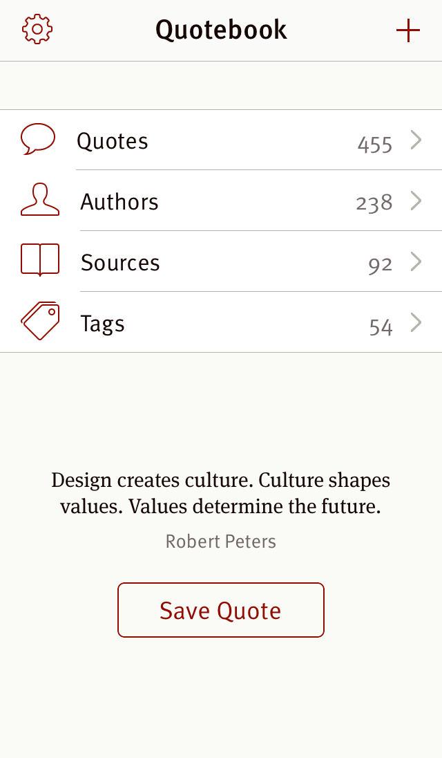
I admit, at times specificity in an app can be limiting, however in this case it is spot on. Look at what you need after all: the quote; the attribution for the author or speaker; the source; and tags to group quotes should you desire. Add a great looking interface and seamless syncing between my iPad and iPhone, and there you have it – a favourite app. Remember, that was before the update.

We now welcome Quotebook 3, which has been completely redesigned from the ground up, by developer Lickability:

Quotebook 3 is our biggest release ever. We’ve completely redesigned and rewritten the app, making it easier than ever to collect your favourite quotes and give them context and personality.

  • Fully rewritten iCloud syncing
  • Add images and descriptions to authors and sources
  • Information about your authors and sources is automatically downloaded from Wikipedia
  • Auto-complete authors, sources, and tags from within the app, your contacts, and your music library
  • Import quotes from your Tumblr posts and Facebook profile
  • Tap into any author or source from the quotes screen to see more quotes from them
  • Discover and save random quotes from the app’s main screen
  • Share quotes to Tweetbot, Tumblr, and Day One
  • Improved Auto-Detection of quotes on your clipboard (including from iBooks)
  • x-callback-url support for the Quotebook URL scheme so other apps can add quotes seamlessly
  • Simplified settings

As you can see from the above list, the update is indeed a big one. I must admit the most pleasing thing I have found in using Quotebook 3 in the couple of days since the update is the fact that it works equally as reliably and consistently as the previous version, but is faster, looks better, and I agree, has a little more personality, to quote the developer. Although I guess consistent and reliable only gets you so far, as (searches Quotebook):

“Consistency is the last refuge of the unimaginative.”
— Oscar Wilde

See – there when I need it, just like I said.

54

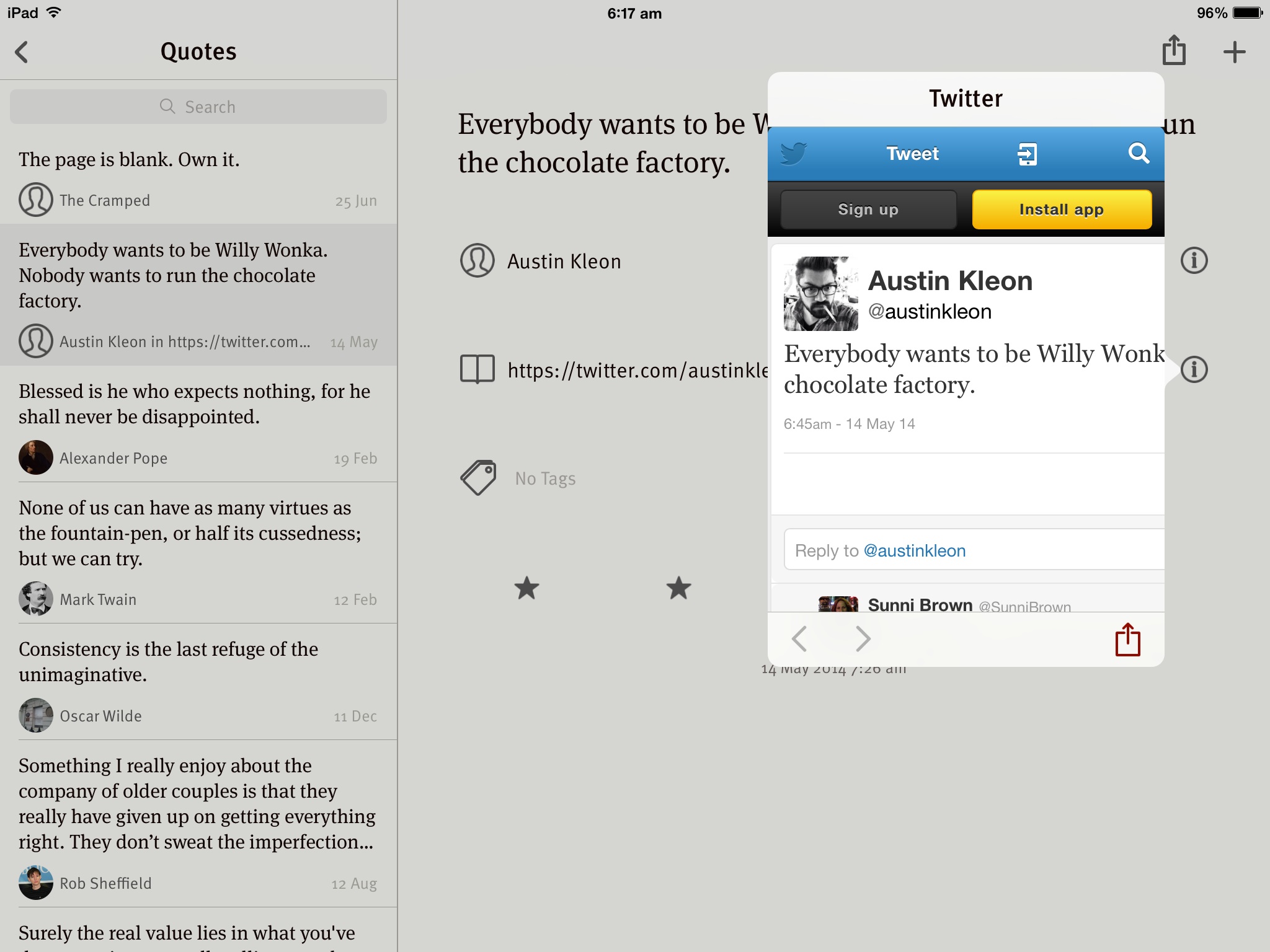
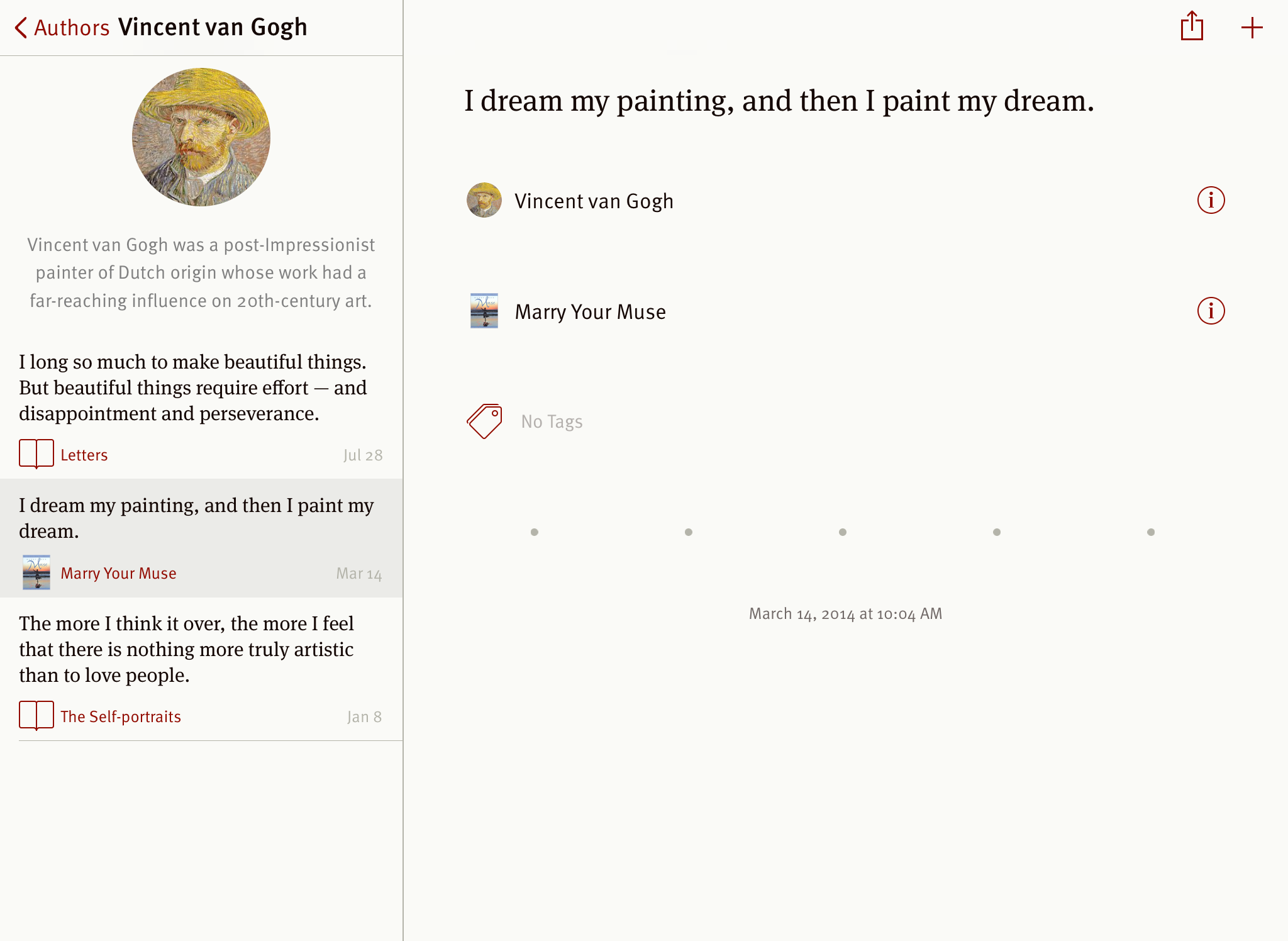
Probably my favourite aspects of the update include the complete overhaul of the user interface, which is elegantly minimal; direct sharing to Tweetbot and Day One through the standard sharesheet; the ability to see information and other quotes from an author, or the information popover from the source (see screenshot below); also, the functionality of the clipboard auto-detection seems to have improved. A nice touch is also the ability to save random quotes now appearing on your main screen.

Quotebook_pop

Quotebook 3 is a beautiful, yet highly functional app which appears to be in for the long haul. Lickability have added enough bells and whistles with the new update to please many a power user, however have repackaged and improved the robust and delightful features that worked elegantly and efficiently all along.

3

Developers say many things in press releases, however on this point from Lickability I most certainly concur:

Lickability has been and will always be concerned with all the small details that make apps great.

Must save that quote somewhere…


Also be sure to check out the review of Quotebook 3 by Federico Viticci at Macstories.

Quotebook 3 is available on the App Store for AUD$6.99, and is a universal app for both iPad and iPhone.