Wiser Web Wednesday

Wiser Web Wednesday – a semi-regular link to posts of interest from around the web – by those far wiser than myself:

Fountain Pen Quest
Here Ray looks at his own fountain pen collection with reference to the Brand Taxonomy post on Fountain Pen Economics (refer next link).

I have not applied the “taxonomy” to my own pens, nor thought about it in relation to pen companies I am familiar with. Certainly an interesting question to pose:
Comments on Fountain Pen Innovation

Fountain Pen Economics
Thanks to Ray’s post above, I clicked through to read the original post and found another pen related site I was previously unaware of, this time with a considerable twist on the usual content. I enjoy reading blogs where the author is able to utilise their professional background as a basis for opinion (in this case, Dr Jonathan Deans, a University Economics lecturer).

There is some great discussion and business analysis on the Pen Economics site. The best part? A fellow Aussie to boot:
Brand Taxonomy
I have linked to the first post in a series on Brand Taxonomy. Be sure to follow through and read the others as well.

The Federalist
This post again highlights the level of debate that will in some ways always be levelled at cursive writing. As a backer of the recently successful CursiveLogic Kickstarter project, I am of course a supporter of cursive handwriting.

Although the article points to the benefits of cursive handwriting, many will continue to point out that a significant portion of the purported benefits pertain to handwriting in general, not necessarily cursive handwriting. I am merely playing devil’s advocate a little here, however I believe those of us in the pen world will be hearing a lot more of this debate in the near future:
Ten Reasons People Still Need Cursive

The Newsprint
As you may have heard – The Newsprint, where you come for the articles and stay for the photography — though I’d say both are on equal (read superb) footing.

Using both digital and analogue tools, Josh has done the hard yards of a year’s worth of journaling.

In short, journaling has made a more complete and rounded me, but it has taken an immense amount of focus and determination to complete.

Effort? Yes. Reward? Absolutely.

One more thing — to those who formed that illustrious group of wisecrackers about the author keeping a diary – I know what I would rather have to look back on after a year; and unlike yourselves, it isn’t solely my highest score on Crossy Road.

Stand tall and journal Mr Ginter, we’re with you:
A Reflection on One Year of Daily Journaling

Three Staples
Some more great photos and journaling inspiration. Wow – some beauty in these entries! Check out the rubber stamp for the Field Notes – perfect.

It’s definitely a time-consuming commitment but I really enjoy and value the time I sit down with it. I get to exercise parts of my brain that have been lazy for so long. It’s rekindled my old hobbies, e.g. rubber stamping, as well.

Field Notes and Hobonichi – arguably a killer combination:
Update on My Journaling Set-Up
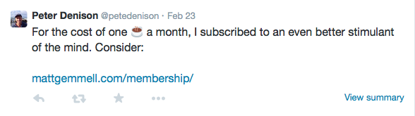
Bean Brewding
It is again time for the Bean Brewding Walking Coffee Tour of some fine establishments in Brisbane’s Fortitude Valley. Having attended the corresponding tour last year, I can highly recommend it.

I wrote some thoughts after last year’s tour here.

Although I cannot make the event this coming Saturday 7 March – I see the “Beans” are offering discounts to previous attendees as part of their Frequent Flyer program. Such a fantastic idea, and if they keep it up, surely an initial tour then becomes an investment — reaping you significant returns in future.

A great bunch of guys doing their bit for the Brisbane coffee scene, and I wish them every success. You’d be well served to book in and go along:
Bean Brewding Specialty Coffee Tours

The Gentleman Stationer
Although it is beginning to interest me more and more, I have not yet entered the waters of the vintage pen world, however this post certainly offers excellent advice – particularly:

Accept that you will get burned at least once, but probably a few times.

When I do begin my foray, it will be after reviewing much of Joe’s advice here:
Vintage Pen Primer, Part I

David Hewson
For those who write in Ulysses for Mac, author David Hewson offers up another tip on maximising the features within the app, this time in relation to opening a second window within the same project:

Use one window for writing — in other words leave it in the sheet you’re working on. Use the second window to navigate the whole project, finding earlier references, doing searches, browsing and adding notes to the management sheets.

Wise words indeed, from someone with ample qualifications to speak:
How to double your manuscript control in Ulysses

World Aeropress Championships
Now that friends, is a venue. This year, those vying for the title of master of the plastic fantastic – the Aeropress, will be in Seattle, Washington, to show their style.

And…um:

As WithinSodo is a licensed wedding venue, and has copious experience in performing nuptials, any couples wanting to finally realise their dream of a group wedding held in conjunction with the World Aeropress Championship final — and frankly, who doesn’t? — should get in touch about the very attractively priced spectacle that we can make of your special day.

I can see it now: one groom, a choice of three brides, A,B or C, and the judges could determine – no… wait – that’s the coffee judging! Good luck to all:
2015 World Aeropress Championship – April 9th


Memberships: money in – value out?

Last week I signed up as a paying member to a site I regularly read.

Startling news? Hardly. It is simply something I have not done before, and all in all, the decision to do so was not as straightforward as I’d imagined.

In the end, I’m very pleased I signed up, and will now receive the member’s only newsletter (amongst other things) from Matt Gemmell, my favourite online writer/author going around.

In the context of what this post is about, the actual site in question is not important, however credit where credit is due – if you have not read any of Matt’s work, I suggest you do so, as there is wealth of frequently updated, quality content at the link above.

The following are simply my thoughts on membership in general and a few other things that were a consideration along the way.

You can read Matt’s introduction to his particular membership here.

The Cost

My online purchases, whether memberships, eBay, backing Kickstarter, or buying coffee or pens, all come from the same bucket – our household income. Irrespective of whether money is put aside for such indulgences, it is still money that could be put to very good use elsewhere.

At first glance, a membership such as this seems a fairly insignificant monthly cost (as my Tweet below demonstrates), and certainly a competitive one as far as other memberships I’ve seen. However it is a cost nonetheless – and a recurring one at that.

Oh very clever Peter!

Oh very clever Peter!

A couple of points here. Living in Australia, or wherever currency exchange is involved, the actual purchase price is never the actual purchase price. For example, standard membership is $US4.00. The cost at checkout to me was $AU5.32. Not a deal breaker, however one consideration1, and again, a factor in all site memberships – not solely the one in question.

Clearly not relevant on this particular occasion, however shipping costs are a significant consideration in just about every other purchase I make online. Shipping costs at times can be a little unkind, however I am not about to shout too loudly, for after all, there are UK customs charges, and from what I hear are the embodiment of the devil incarnate.

With Kickstarter in particular, I have backed more than one project just under the first reward tier to provide my support for what I consider are worthy projects. This of course means I miss out on the actual product, however also avoid the postage – which sometimes adds almost 50% to the total cost.

Please note that none of the above is written in the context or tone of poor me – every purchase, which I’m sure is also the case with you – involves decisions. Some of these decisions simply relate to logistical factors, some of which I have described here.

The benefit

The clincher really isn’t it.

How do we determine what value we receive from laying down our hard-earned cash? I’d say this determination is relatively easy when considering a physical product which arrives on your doorstep.

Perhaps not so easy when considering “content” we consume on a daily basis – much of which is on the internet for free. Although I doubt it, perhaps there is free content out there I could access, similar in quality and topic to what I have just signed up for.

Even if that were true, I would say it is entirely missing the point.

In part, I have signed up for high quality, member’s only content through a regular newsletter.

I’d also like to think I’ve signed up and although not necessarily paid for, at least acknowledged, the high quality content I have already read – and which is freely available – on Matt’s site.

Finally, and probably most importantly, I have signed up on a promise. As a show of faith in what is to come. As a way to express (over and above any links, mentions or the like – which from myself are such a small, small drop in a very big ocean) the sentiment: “I love what you do, I believe you are great at it, keep doing it, and I’m looking forward to more”.

On balance, after reading the first newsletter and accessing the additional content which came with it – I’d say the real winner in all of this is definitely yours truly. I get to feel part of something, yet do none of the hard work. I see another side of quality workmanship, and at the same time, see a little more than what everyone else does.

But most importantly, I have more access to many things I am confident will assist my own writing to improve, and what price would I really place on that.

To finish

In summary, paid membership is of course so much more than: “What will I get for my few bucks”. To be honest, there are so many more thoughts I could throw in here, however I did not set out to write a 900 word post on why I subscribed to a particular site, and I think this is probably enough. In any event, not all would be relevant to your particular case.

Suffice to say, if you do find something which aligns with your interests, has proven longevity and quality2, paid membership is something well worth considering – provided of course it fits your particular criteria for committing your dollars.

I hope my contribution – which I feel very satisfied in making – goes a small way in assisting a great writer produce more great writing, though of course that will occur anyway.

So in that case, I’m happy to contribute to the next bottle of The Balvenie DoubleWood.

Cheers Matt – and thanks in advance.


  1. In fairness to Matt, there are options above and the below the standard $4.00 membership – down to as low as $1.00. I considered a $3.00 option, bringing my $AU price to $3.99. Somehow it just didn’t feel right – so the standard $4.00 / $5.32 it was.
  2. Again imposing my own standards here. I have been reading Matt’s work for a couple of years now, however I believe he is up to 12 continuous years updating his blog!


What’s Brewing: Guatemala Las Illusiones

It’s been a little while between What’s Brewing posts, with the last one profiling my Fifty K Christmas Blend. Despite this, it certainly hasn’t been more than a few hours between drinks — of coffee friends — of coffee.

The Region

Looking back through my previous posts, coffees from Guatemala have always been kind to me, both roasting well and tasting even better. This offering from the Las Illusiones farm is no different.

I must admit, part of my enjoyment in putting together these posts is also in learning a little more about the geographical and cultural aspects of the regions in which these farms reside.

I’ve previously written a little on the Huehuetenango (of course I cannot pronounce that) municipality in a post on the Guatemala Don Antonio last September, so this time I’m zooming out, and from Wikipedia, a little on this Central American country itself:

Image courtesy Wikipedia

Image courtesy Wikipedia

  • Officially the Republic of Guatemala (Spanish: República de Guatemala);
  • Bordered by Mexico to the north and west, the Pacific Ocean to the southwest, Belize to the northeast, the Caribbean to the east, Honduras to the east and El Salvador to the southeast;
  • Area of 108,890 square km (42,043 square miles);
  • Estimated population of 15,806,675, making it the most populous state in Central America;
  • The capital and largest city is Nueva Guatemala de la Asunción, also known as Guatemala City.

The Coffee

Information courtesy Melbourne Coffee Merchants:

  • Country: GUATEMALA
  • Region: Huehuetenango
  • Town: El Pajal, San Antonio Huista
  • Altitude: 1,200 – 1,500 metres above sea level
  • Variety: Bourbon and Caturra
  • Processing: Fully Washed and sun-dried on patio
  • Owner: Emma del Carmen Munoz and daughters
  • Tasting Notes: Juicy and sweet, with stone fruit, orange and chocolate

Green beans purchased from Ministry Grounds – $AU20.50 per kilogram

The Brew

As time has passed and my palate has somewhat improved, I have drifted away from the one size fits all roast from my humble beginnings, and now roast specifically for either my espresso machine or filter based brew methods (V60, Aeropress).

The Las Illusiones was aimed squarely at the espresso machine, and roasted to suit. Given my roasting is often done in the late afternoon, upon opening the bag a few days later to use, I noticed (in the fuller light) the roast was probably a fraction lighter than what I was aiming for.

As a latte or flat white, the coffee definitely had a subtle choc-orange taste when used with milk. Fruity? Not so much. A medium to full body pushed the finish along nicely as well. Certainly a pleasant way to start the morning.

On its own as espresso, a lovely mix of honey and cocoa was apparent. Less perceptible was the orange, though a hint of stone fruit peeked through at times. A very nice mouthful, natural sweetness and a nice long finish completed the picture. Very pleasant.

A future post will look at a new app for tracking coffees and their origins – Press. For now, a couple of sample images after putting in the Las Illusiones as the first record:

image 2

image

The Finish

My expectations with most coffees from Guatemala are generally met with results pretty close to the mark, and the Las Illusiones was no different.

For a single origin which works well as espresso or mixed with milk, you could certainly do a lot worse – a very enjoyable coffee.

Wiser Web Wednesday

Wiser Web Wednesday – a semi-regular link to posts of interest from around the web by those far wiser than myself:

Tom Bihn Blog
Modern Stationer’s Doug Lane, continuing to go from strength to strength with some great posts – this time a guest on the Tom Bihn blog:

But if it’s been a while, give writing by hand another try. You may be surprised by how pens and paper can shift your brain into a forgotten gear and give you the break from the connected world that you may not even realize that you need.

Perfect.

You owe it to yourself to read the whole post:
The Right Kind of Friction

From the Pen Cup
Judging by the response on Twitter, this post from Mary resonated with quite a lot of people – myself included. The challenge now, will be for those (us) who wholeheartedly agreed with the sentiment, to follow-up in practice – a much more difficult prospect.

It’s easy to get caught up in your friends’ purchases and recommendations…

Indeed it is:
On Not Buying Pens

An Inkophile’s Blog
I’ve thought quite a bit about my own storage and sampling of inks lately, though I must admit the small collection I have certainly doesn’t require anything too extensive. This system of using Mnemosyne cards for ink samples provides a great quick reference:
Keeping Track Of Ink And Pens

Gentleman Stationer
The Lamy Safari is often the introductory fountain pen for many users, however not so here – nor was it with myself:

Many people, like me, come to Safaris later, after they have been using (much more expensive) fountain pens for a while, only to realize that the Safari is a flat-out good pen, irrespective of its price range.

Mind you, I am always astonished by the fact I have quite taken to the triangular nature of the grip section on my Safari fountain pen, yet somehow am not as fond of the very same grip on my rollerball. Go figure:
Basic Black: One Week with the Lamy Safari

COVERED Podcast
In the hope of improving my own writing in some way, I’ve taken more of an interest recently in what authors have to say on the subject.

A conversation about books with the people who write them.

Harry Marks does a fantastic job hosting this podcast, and if you are at all interested in writing and/or reading, go listen:
COVERED with Harry C Marks

Johnny Anypen
After a recent run with the Pilot Petit1, I mentioned my next (very) low-end fountain pen purchase would be the Platinum Preppy. Now I know what to expect:
Review: Platinum Preppy M Nib

Tools & Toys
There are many, many coffee apps on the App Store – timers, orders, recipes, brand awareness and/or online shopping, and some – all of the above. As Tools & Toys points out, Press looks a little different. Although there are indeed timers, Press also has a section (with integrated location map) to record your favourite single origins and tasting notes. Go and create your own global coffee map:
Press Coffee for iPhone

Brisbane Café Explorer
Having managed to get along to last year’s event, it was nice to read how things turned out in the 2015 QLD AeroPress Championships, held at the Wooloongabba Social Club. A nice write-up on Brisbane Café Explorer:
QLD Aeropress championship

James Bond 007 YouTube Channel
Although not usually critically acclaimed, I’ve always loved a good Bond film. A bonus – the stunning scenery from places I’m certainly never likely to visit:
Here’s the first behind the scenes footage of SPECTRE

Pilot Petit1 Fountain Pen

The Pilot Petit1 made my JetPens shopping cart late last year in the form of a bundle of eight in different colours (the order also included a ten-pack of the 0.5 mm Zebra Sarasa Clip) to be included in Christmas gifts for friends. Thankfully, I kept a couple, and as I’ve found with most Pilot nibs, for the price, the Petit1 certainly punches well above its weight.

So much to love about pen and paper when it comes to gift giving.

So much to love about pen and paper when it comes to gift giving.

Look and Feel

The Petit1 is a compact or almost “half-sized” pen, and requires posting to achieve a regular length for writing. Like a Kaweco Sport, once posted, I find these types of pens no less comfortable for writing than those of standard size.

With the Kaweco Ice Sport

With the Kaweco Ice Sport

For those who may be more familiar with the Kaweco Sport range, this is indeed a good comparison, as the two pens are identical in size, and with the exception of the clip on the Kaweco (assuming you are someone who uses the clip), the plastic construction is very similar in both as well. Though admittedly the Petit1 does not feel as robust as the Kaweco, which given the price, is to be expected.

A full list of specifications for the Petit1 can be found on the JetPens site, however in summary:

  • plastic body, cap and clip
  • metal (presumably steel) nib
  • length capped 10.6 cm; uncapped 9.4 cm; posted 13 cm
  • cartridge fill type
  • variable body and ink colours
  • refill cartridges available
  • eyedropper convertible

Once the sticker is removed (which explains the method of cartridge insertion for anyone unfamiliar with this), the remainder of the body is fairly clear, save for the Petit1 and Pilot branding in the centre of the body. This provides a nice view of the ink from the cartridge down through the feed.

In the wild - a great EDC pen.

In the wild – a great EDC pen.

The clip is moulded plastic arising for the tip of the cap, and although has a little spring to it, I fear is a prime candidate for snapping off. With a pen of this size, a clipless body may find it’s way to the bottom of a pocket, making extraction a little more fiddly than you might otherwise like. Conversely, it is precisely pens like this which I often throw in the bottom of my pocket rather than clip, so in my mind this really doesn’t detract from the pen itself. I suspect if you prefer parts not snapped off your pens it may be an issue.

There is an absence of any taper to the grip section with a significant step down from the body itself, however the plastic construction inherently provides a certain softness to the feel in this particular part of the pen, and I found the step not sharp enough to bother.

The nib construction is described on JetPens as metal, and I can only assume is therefore steel (however this does leave the door open to it being some kind of cheaper alloy, though I’ve no reason to suspect this is the case). Pilot branding and nib size are the only embellishment on an otherwise minimalist looking nib. For the price, this is a fantastic nib.

Writing Performance

What is there to say here really? The nib is as good as any Pilot nib in this price segment of the market (read fantastic), I have used of late, and perhaps even a little better than the fine nib on my Pilot Metropolitan1, which is not quite as smooth on paper with a little more tooth, such as the Baron Fig Confidant notebook.

IMG_3824

Having just completed a 31 day journaling challenge to kick off the year, I found myself picking up the Petit1 on quite a number of occasions during January. It is indeed a joy to write with. Feedback from one of the Christmas gift recipients also indicated a preference for writing with the Petit1 over the Lamy Safari they already owned – another big rap for the nib.

As expected, there is minimal flex in the steel nib, and on smoother paper such as a Rhodia No. 16 pad, is as smooth as any fine steel nib I’ve used. Regardless of storage (often on its side in my pocket), the Petit1 started immediately every time, with a full flow of ink, and no skips.

The Petit1 is a cartridge filler, and refills in any of the eight available colours are just $US1.90 for a pack of three. I plan to add a few to my next (and probably each) Jet Pens order for some time to come. One thing to note — the Petit1 only takes the proprietary Petit1 cartridge refills — standard short cartridges do not fit. Something to bear in mind, though with the colours available (and those of you with syringes for refilling out there), I don’t see this as a problem.

Image courtesy JetPens

Image courtesy JetPens

It appears the Petit1 is also convertible to an eyedropper pen, however I’ve not done this myself — perhaps for another day. Should you wish to undertake such an endeavour, JetPens has a tutorial for you on exactly how to do it. Also, as you can see in the image above, the Petit1 is part of a series from Pilot, which also includes sign and brush pens.

Conclusion

For the price of $US3.80 (or a bundle of 8 for $US30.00) on JetPens, there is no better value for money fountain pen out there for the writing experience you get with this nib. Whether or not the shape and size suit you might be another matter, however I wouldn’t consider it a waste of money to find out.

Really, the way this pen performs, I would have no hesitation in recommending it as an entry into fountain pens for someone who has not tried them (my fear of course is in recommending something too cheap which sours the entire experience). In fact, given the price, a pen such as the Petit1 is perhaps more likely to be tried if someone is not prepared to spend $US30.00 on a Lamy Safari or even the $US14.50 for a Pilot Metropolitan.

I have not personally used the Platinum Preppy (currently $US3.00 on JetPens), however find it hard to believe the writing experience would be better than what this Petit1 achieves.

Overall, a great little pen with a big writing experience, and one I will continue to throw in my pocket for some time to come.

  1. Incidentally, the nib gods did not look favourably on a recent slightly heavy-handed upstroke while using my Pilot Metropolitan. The tip of the nib “popped”, a filament of metal came off and I had a somewhat uneven instant stub nib. I’d thought about simply grinding it smooth, however perhaps will simply swap in another nib. A cautionary tale for those who might also apply a little downward pressure!