Wiser Web Wednesday

Wiser Web Wednesday – a semi-regular link to posts of interest from around the web by those far wiser than myself:

Tom Bihn Blog
Modern Stationer’s Doug Lane, continuing to go from strength to strength with some great posts – this time a guest on the Tom Bihn blog:

But if it’s been a while, give writing by hand another try. You may be surprised by how pens and paper can shift your brain into a forgotten gear and give you the break from the connected world that you may not even realize that you need.

Perfect.

You owe it to yourself to read the whole post:
The Right Kind of Friction

From the Pen Cup
Judging by the response on Twitter, this post from Mary resonated with quite a lot of people – myself included. The challenge now, will be for those (us) who wholeheartedly agreed with the sentiment, to follow-up in practice – a much more difficult prospect.

It’s easy to get caught up in your friends’ purchases and recommendations…

Indeed it is:
On Not Buying Pens

An Inkophile’s Blog
I’ve thought quite a bit about my own storage and sampling of inks lately, though I must admit the small collection I have certainly doesn’t require anything too extensive. This system of using Mnemosyne cards for ink samples provides a great quick reference:
Keeping Track Of Ink And Pens

Gentleman Stationer
The Lamy Safari is often the introductory fountain pen for many users, however not so here – nor was it with myself:

Many people, like me, come to Safaris later, after they have been using (much more expensive) fountain pens for a while, only to realize that the Safari is a flat-out good pen, irrespective of its price range.

Mind you, I am always astonished by the fact I have quite taken to the triangular nature of the grip section on my Safari fountain pen, yet somehow am not as fond of the very same grip on my rollerball. Go figure:
Basic Black: One Week with the Lamy Safari

COVERED Podcast
In the hope of improving my own writing in some way, I’ve taken more of an interest recently in what authors have to say on the subject.

A conversation about books with the people who write them.

Harry Marks does a fantastic job hosting this podcast, and if you are at all interested in writing and/or reading, go listen:
COVERED with Harry C Marks

Johnny Anypen
After a recent run with the Pilot Petit1, I mentioned my next (very) low-end fountain pen purchase would be the Platinum Preppy. Now I know what to expect:
Review: Platinum Preppy M Nib

Tools & Toys
There are many, many coffee apps on the App Store – timers, orders, recipes, brand awareness and/or online shopping, and some – all of the above. As Tools & Toys points out, Press looks a little different. Although there are indeed timers, Press also has a section (with integrated location map) to record your favourite single origins and tasting notes. Go and create your own global coffee map:
Press Coffee for iPhone

Brisbane Café Explorer
Having managed to get along to last year’s event, it was nice to read how things turned out in the 2015 QLD AeroPress Championships, held at the Wooloongabba Social Club. A nice write-up on Brisbane Café Explorer:
QLD Aeropress championship

James Bond 007 YouTube Channel
Although not usually critically acclaimed, I’ve always loved a good Bond film. A bonus – the stunning scenery from places I’m certainly never likely to visit:
Here’s the first behind the scenes footage of SPECTRE

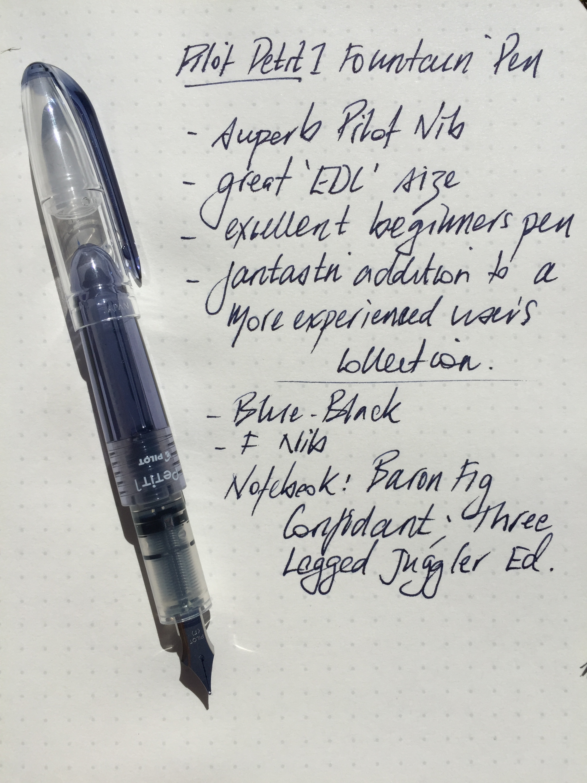
Pilot Petit1 Fountain Pen

The Pilot Petit1 made my JetPens shopping cart late last year in the form of a bundle of eight in different colours (the order also included a ten-pack of the 0.5 mm Zebra Sarasa Clip) to be included in Christmas gifts for friends. Thankfully, I kept a couple, and as I’ve found with most Pilot nibs, for the price, the Petit1 certainly punches well above its weight.

So much to love about pen and paper when it comes to gift giving.

So much to love about pen and paper when it comes to gift giving.

Look and Feel

The Petit1 is a compact or almost “half-sized” pen, and requires posting to achieve a regular length for writing. Like a Kaweco Sport, once posted, I find these types of pens no less comfortable for writing than those of standard size.

With the Kaweco Ice Sport

With the Kaweco Ice Sport

For those who may be more familiar with the Kaweco Sport range, this is indeed a good comparison, as the two pens are identical in size, and with the exception of the clip on the Kaweco (assuming you are someone who uses the clip), the plastic construction is very similar in both as well. Though admittedly the Petit1 does not feel as robust as the Kaweco, which given the price, is to be expected.

A full list of specifications for the Petit1 can be found on the JetPens site, however in summary:

  • plastic body, cap and clip
  • metal (presumably steel) nib
  • length capped 10.6 cm; uncapped 9.4 cm; posted 13 cm
  • cartridge fill type
  • variable body and ink colours
  • refill cartridges available
  • eyedropper convertible

Once the sticker is removed (which explains the method of cartridge insertion for anyone unfamiliar with this), the remainder of the body is fairly clear, save for the Petit1 and Pilot branding in the centre of the body. This provides a nice view of the ink from the cartridge down through the feed.

In the wild - a great EDC pen.

In the wild – a great EDC pen.

The clip is moulded plastic arising for the tip of the cap, and although has a little spring to it, I fear is a prime candidate for snapping off. With a pen of this size, a clipless body may find it’s way to the bottom of a pocket, making extraction a little more fiddly than you might otherwise like. Conversely, it is precisely pens like this which I often throw in the bottom of my pocket rather than clip, so in my mind this really doesn’t detract from the pen itself. I suspect if you prefer parts not snapped off your pens it may be an issue.

There is an absence of any taper to the grip section with a significant step down from the body itself, however the plastic construction inherently provides a certain softness to the feel in this particular part of the pen, and I found the step not sharp enough to bother.

The nib construction is described on JetPens as metal, and I can only assume is therefore steel (however this does leave the door open to it being some kind of cheaper alloy, though I’ve no reason to suspect this is the case). Pilot branding and nib size are the only embellishment on an otherwise minimalist looking nib. For the price, this is a fantastic nib.

Writing Performance

What is there to say here really? The nib is as good as any Pilot nib in this price segment of the market (read fantastic), I have used of late, and perhaps even a little better than the fine nib on my Pilot Metropolitan1, which is not quite as smooth on paper with a little more tooth, such as the Baron Fig Confidant notebook.

IMG_3824

Having just completed a 31 day journaling challenge to kick off the year, I found myself picking up the Petit1 on quite a number of occasions during January. It is indeed a joy to write with. Feedback from one of the Christmas gift recipients also indicated a preference for writing with the Petit1 over the Lamy Safari they already owned – another big rap for the nib.

As expected, there is minimal flex in the steel nib, and on smoother paper such as a Rhodia No. 16 pad, is as smooth as any fine steel nib I’ve used. Regardless of storage (often on its side in my pocket), the Petit1 started immediately every time, with a full flow of ink, and no skips.

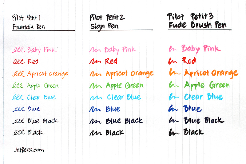
The Petit1 is a cartridge filler, and refills in any of the eight available colours are just $US1.90 for a pack of three. I plan to add a few to my next (and probably each) Jet Pens order for some time to come. One thing to note — the Petit1 only takes the proprietary Petit1 cartridge refills — standard short cartridges do not fit. Something to bear in mind, though with the colours available (and those of you with syringes for refilling out there), I don’t see this as a problem.

Image courtesy JetPens

Image courtesy JetPens

It appears the Petit1 is also convertible to an eyedropper pen, however I’ve not done this myself — perhaps for another day. Should you wish to undertake such an endeavour, JetPens has a tutorial for you on exactly how to do it. Also, as you can see in the image above, the Petit1 is part of a series from Pilot, which also includes sign and brush pens.

Conclusion

For the price of $US3.80 (or a bundle of 8 for $US30.00) on JetPens, there is no better value for money fountain pen out there for the writing experience you get with this nib. Whether or not the shape and size suit you might be another matter, however I wouldn’t consider it a waste of money to find out.

Really, the way this pen performs, I would have no hesitation in recommending it as an entry into fountain pens for someone who has not tried them (my fear of course is in recommending something too cheap which sours the entire experience). In fact, given the price, a pen such as the Petit1 is perhaps more likely to be tried if someone is not prepared to spend $US30.00 on a Lamy Safari or even the $US14.50 for a Pilot Metropolitan.

I have not personally used the Platinum Preppy (currently $US3.00 on JetPens), however find it hard to believe the writing experience would be better than what this Petit1 achieves.

Overall, a great little pen with a big writing experience, and one I will continue to throw in my pocket for some time to come.

  1. Incidentally, the nib gods did not look favourably on a recent slightly heavy-handed upstroke while using my Pilot Metropolitan. The tip of the nib “popped”, a filament of metal came off and I had a somewhat uneven instant stub nib. I’d thought about simply grinding it smooth, however perhaps will simply swap in another nib. A cautionary tale for those who might also apply a little downward pressure!

ChefSteps Coffee Class

I created a ChefSteps login a little while ago, on the assumption I would find some coffee related goodness along the way. This just released offering, the ChefSteps Coffee Class, with world-renowned experts James Hoffmann (former World Barista Champion and founder of Square Mile Coffee) and Ben Kaminsky (US Cup Tasters Champion) looks the business.

For a very reasonable $US14.00, you can avail yourself of:

  • Unlimited Access
  • 12 HD Videos
  • Step-by-step techniques for the best French Press, Chemex, Aeropress, and Cold Brew coffee ever
  • Amazing tricks for smoother coffee
  • 4 recipes for cooking with coffee

Alternatively, you might like to start with the free Espresso Course (12 HD videos).

Either way, get watching – and thereafter – brewing!

Cursive – cursed again?

On the same day last week, two very different points of view on cursive writing appeared in my Twitter timeline. The first, yet another news article suggesting the demise of hand written cursive in schools, and in contrast, a Kickstarter project purporting to have developed a new and more efficient means of teaching the very cursive supposedly on the way out.

You can probably guess on which side of the fence my allegiance was on, however after calming down and scrapping my original plans for a “that’s ridiculous” post here, I came to realise the views were not necessarily diametrically opposed.

The downstroke

The first, and of course, most striking piece to me, was an Australian ABC News story titled Finland scraps cursive writing lessons, sparking discussion over future of handwriting in classrooms. The discussion in question, was of the Australian curriculum, and the future of hand writing which may, or ultimately may not, be taught in Australian classrooms.

For someone who loves pens, and fountain pens in particular, I have mixed feelings about an article such as this. Australia’s board of education was noted to have said:

…learning to type was “more relevant to everyday life”, a skill that Australian experts agreed was a better use of school time.

Before you begin quoting the numerous studies showing the benefits of handwritten note taking in learning, many of the education experts quoted made the distinction between teaching children to write, and teaching children the style of cursive handwriting.

Senior lecturer in English and Literacy Education at the University of Queensland, Dr Eileen Honan agreed that while the Australian curriculum put emphasis on both handwriting and keyboard skills, cursive writing was irrelevant.

Being able to write in beautiful script has got nothing to do with the ability to read and write productively, creatively and intelligently

Thankfully, the conclusion made was for further discussion on the matter in relation to the Australian curriculum, as here in Australia, we were unlikely to “follow Finland’s lead” — well not yet anyway.

The upstroke

The next, and infinitely more positive piece in my timeline was first shared by two pen and stationery bloggers I follow (Doug at Modern Stationer, and Ray at Fountain Pen Quest) — the CursiveLogic Kickstarter project.

Of course after looking at the Kickstarter project page myself, I also instantly shared the link, and began planning my rant post, thinking ”I’ll show you — just try to get rid of cursive”.

As I sat and thought a little more, I realised something like the CursiveLogic programme goes a long way towards solving one of the main issues many of the experts raised as a problem in continuing to teach cursive writing — that of the time spent with students practising the correct formation of letters. Senior lecturer in Language Literacy at the University of Canberra, Dr Misty Adonious:

I just don’t think it’s worthwhile spending school time teaching kids … cursive writing.

In the CursiveLogic programme, we have the makings of a solution. A way of learning cursive writing more efficiently, and therefore much faster than standard methods of instruction, through two key features — letters grouped by shape:

By teaching all of the similar letters together, CursiveLogic captures the natural synergy of the alphabet itself, allowing each letter in the series to reinforce the proper formation of all the others.

and letter strings:

CursiveLogic’s letter strings teach students to connect letters from the first lesson, allowing students to internalize the flow of cursive handwriting even before they have learned all 26 letters.

Both the project page and the CursiveLogic website have further information and the scientific basis behind the programme. I’d also encourage you to watch the inspirational video of Josh, a 23-year-old student with learning disabilities who wanted to learn cursive to be able to sign his name.

My thoughts

If the argument against maintaining cursive in the school curriculum is as much a time based one as it is a relevance one — then let’s teach it faster.

To me, a system or programme such as the one proposed by CursiveLogic which aims to teach cursive in a more efficient way, seems like the perfect starting point for keeping alive such an important aspect of educational development in the classroom.

The assumption here is that the methods and outcomes of the CursiveLogic system are as reported on the project page and website, and I have no reason to believe otherwise. Of course I acknowledge I have not had any experience with the methods of CursiveLogic, nor seen it used first hand.

One other aspect I find interesting in all of this, is that although most agree cursive writing is outdated, children will still be taught to write. If this is the case, and the writing is not cursive — then what will it be? Surely it must be based on some form of script to maintain a standardised curriculum does it not? To date I have found the mention of any alternative to cursive completely absent from the discussion.

I see it like any skill — learn the foundations and deviate with your own style from there. My own handwriting has drifted far from its humble beginnings in primary school, however when attempting to produce some better quality handwriting (say for an invitation or card), the slope, letter formation and overall style certainly reverts closer to the cursive I learnt as a youngster.

I’m hoping that if the handwriting component of the curriculum does change, we do not simply see a generation of children who can perfectly reproduce by hand the stock standard upper case letters we see on a keyboard.

Finally

While this post is clearly too late for Finland – Australia, not so. Although the CursiveLogic project is based in the US, and may not necessarily directly influence any discussion locally, the project creators aims of raising public awareness about a more time efficient means of developing the skill of cursive writing is surely worth supporting.

Head over to the Kickstarter page and consider backing the CursiveLogic project. It is time to reinforce that stake in the ground and ensure the passage of certain skills through the generations continues.

A final point from the ABC News:

We actually don’t use fountain pens and ink anymore, so maybe we should think differently about where we put our attention now.

Says who?

Wiser Web Wednesday

Wiser Web Wednesday – a regular link to posts of interest from around the web by those far wiser than myself:

Three Staples
A great comparison post on three white Colors Editions of Field Notes notebooks (with a couple of white special editions thrown in the mix as well). I found this an interesting post as I do not own any of the editions featured here. Also worth a look for the images alone:
Field Notes Color Comparison: White

Design Observer
Although there are numerous posts around on why things such as books still matter, I’ve not seen some of those listed here. Not the least of which is the “social” function — that is, people can see what we are reading, rather than having to tweet about what we are reading. All in all though, some very compelling reasons for maintaining the physicality of the printed word, including leaflets, cartoons and the like:
Books Matter

Write Analog
Over at Write Analog, Mark has big plans for the site, and I for one am quite excited about them. Interviews, a newsletter, giveaways and more — head on over and sign up, or at least take a look at what’s coming.

Towards the end of the post Mark kindly takes the time to thank some fellow bloggers for their support during the early phases of getting the Write Analog site up and running. A nice touch, and again evidence of the great online pen and paper community. I am not sure what it makes me by linking to a post that I myself am linked in — why self-serving I guess! Or maybe that’s only if I click it – I didn’t — er…promise:
Some Site News & Special Thanks

Matt Gemmell
A nicely set up introduction to this post occurs before the big reveal, so no, I am not about to spill the beans on the exact item in question here. With so much being rolled into one universal gadget these days, every time we do, a little of the polished edges are taken away. This is a great reminder that not only do certain tools stand far better on their own, but also that it is okay to — and we should — still use them.1
Dedicated

On Fountain Pens
As always there are so many great posts to link to for pen reviews it’s difficult to pick just one, or a few at that. Maybelline takes a look at a couple of Namiki’s with contrasting nibs:
Two Namiki Falcon fountain pens

Rolling Stone
Not a new article though an enjoyable read from last October. In particular, King’s views on elitism in reviews:

It was this assumption that if fiction was selling a lot of copies, it was bad. If something is accessible to a lot of people, it’s got to be dumb because most people are dumb. And that’s elitist. I don’t buy it.

Hear, hear. I acknowledge we are all a product of what we consume and learn, with reading a big part of that. I am all for literary classics — but believe me, that high-brow tome in your hands doesn’t automatically make you any better than me.
Stephen King: The Rolling Stone Interview


  1. Footnoted to again hopefully avoid spoiling the piece – reading this post, I could not help but think of Louis Litt from Suits – a show I enjoy very much. Fake model numbers aside, there are times when we’ve all been Litt up.