Two of a Kind: Pilot Metropolitan and Tombow Object Fountain Pens

IMG_3427

Silver Zigzag Pilot Metropolitan (L), and red Tombow Object (R)

With a Pilot Metropolitan having been in my collection for almost 12 months now, upon recently receiving a Tombow Object, I was struck by how similar these two pens actually are.

My original Metropolitan had a fine nib, which met its demise after about 11 months of use, when a very small part of the nib tip popped off while writing. Although I then had an instant stub nib, it was a little jagged for writing! The Metropolitan you see here came with a medium nib.

Both of these particular pens were received from the very kind gentleman I wrote about in a previous post.

Look and Feel

FullSizeRender 14The similarities in these pens were immediately apparent in relation to appearance; to some degree the design, and how both felt in the hand while writing — I see am not alone in thinking this.

When capped, both are of a very similar length and shape, tapering towards both ends. The Tombow remains a little larger in diameter at the end of the body and cap, whereas the Metropolitan continues to a slightly finer taper.

The Metropolitan is noticeably the heavier of the two, however both are quite well-balanced when putting pen to paper. Both have sturdy, well-functioning clips, with the Metropolitan sporting a feature band of decorative patterning around the centre of the barrel. This particular one being the Silver Zigzag model. A nice touch, however probably adds no more aesthetic value to my eye.

Both pens have a metallic, brushed aluminium looking finish on the entire exterior (with the exception of the zigzag addition to the Metropolitan) — a type of finish I do like, and particularly suits some of the more colourful options available in the Tombow Object series.

IMG_3433

Differences can be seen in overall nib length; step at the junction of section and barrel of the Metropolitan; and the Tombow’s matte finish on the section.

You could say the similarities end once the snap on/off caps are removed and the grip sections are exposed. The Metropolitan’s shiny gloss plastic (resin?) grip section is immediately apparent, whereas the Tombow sports a more subdued matte finish.

Both have visible and palpable lines running the length of the grip section from the manufacturing process, and although virtually unnoticeable, are not evident on more expensive pens. Certainly not an issue and I only mention it as I analyse the grip sections a little more closely for comparison. The taper, length and step of the grip section is the biggest difference I find in these pens, and I will elaborate further in Writing Performance below.

Overall, I like the look of both for sturdy, everyday use pens, and given the similarity, if I like one, it goes without saying I like the other. On appearance alone, I really couldn’t pick a favourite between the two.

Specifications

Specifications below courtesy Jet Pens:

Pilot Metropolitan

  • Country of origin: Japan
  • Weight: 3.7 ounces (105 grams)
  • Grip diameter: 9.8 mm (max diameter 13.3 mm)
  • Length Capped: 13.8 cm
  • Length Posted: 15.3 cm
  • Length Uncapped: 12.5 cm
  • Nib: steel
  • Fill: international standard cartridge/converter
  • Price: Approximately $AU18.00 (Jet Pens US + shipping)
  • My pen: Silver Zigzag model; M nib

Tombow Object

  • Country of origin: Japan
  • Weight: 3.0 ounces (85 grams)
  • Grip diameter: 9.3 mm (max diameter 13.0 mm)
  • Length Capped: 13.8 cm
  • Length Posted: 15.6 cm
  • Length Uncapped: 12.2 cm
  • Nib: steel
  • Fill: international standard cartridge/converter
  • Price: Approximately $AU48.00 (Cult Pens UK + shipping)
  • My pen: Red model; F nib

As you’ll note from the lists above, it is certainly not hard to see why these pens are very, very similar in look and feel — the most obvious difference being of course the weight.

For overall balance, I honestly could not pick one over the other despite this obvious difference, however if you were someone who posted their pens — for me at least — this would make things a little top-heavy with the Metropolitan.

You’ll also notice both are sold as cartridge/converter fillers. Not being overly adept with the included squeeze mechanism converter included with the Metropolitan, I swapped in the CON-50 converter which I’ve always found easy to use and very reliable. I have only used a standard international cartridge in the Tombow.

Writing Performance

When putting pen to paper, it is again quite amazing just how similar these pens are, even more so with the medium nib of the Metropolitan and fine of the Tombow.

IMG_3428

Despite the Metropolitan’s M nib and Tombow’s F – the line characteristics were very similar.

From what I recall, this would certainly not have been the case with the fine nib of my previous Metropolitan. At times I found the fine nib a little scratchy on certain paper types, and overall it was probably too fine for my writing style. The medium nib on this model is a far better fit for me.

The line widths, nib feel and smoothness are very, very close. Both lay down ink very well, with the only real difference in feel the marginally stiffer nib on the Tombow. Even with slightly more flex to the Metropolitan, both pens showed minimal (and pretty even) line variation with changes in pressure. There is no doubt these are really great nibs — both of them.

I keep harping about the similarities in these pens, so we should probably have a look at some of the differences as well.

My standard grip as shown with the Metropolitan.

My standard grip as shown with the Metropolitan.

That grip section. Here is where the suitability of each pen might vary widely depending upon your particular writing grip and style. I believe I would call mine a fairly standard pen hold, and with that, the Metropolitan suits my hand better than the Tombow.

With the Metropolitan, there is a significant step down from the barrel to the section, which in itself may be a problem for some, however suits my grip perfectly. As my middle finger hooks around the step, it provides a perfect platform to balance the pen, with my index finger and thumb able to rest lightly on the top and side. I’ve found this facilitates a lighter grip nicely — particularly in someone who is making a conscious effort to be a little less heavy handed (remember that broken Metropolitan F nib I was talking about?).

With the Tombow, at that same point in the grip section, although there was no step, the continuous taper towards the nib and smooth plastic finish left me wanting a little more control most times I wrote with it. This was most evident early in the mornings when both hand and pen barrel/section were cool, and I found my fingers sliding around a little on section. Not a deal breaker, however I certainly had less control, and was forced to grip a little more tightly, something I am consciously making an efforts not to do.

IMG_3437IMG_3436

Of course I then began thinking how the Tombow would make a perfect summer pen, when the Queensland humidity would ensure the grip section became nice and tacky — and just like that my pens started to become seasonal. What has become of me?

Overall, I’d say these pens are quite similar (again!) in writing performance, particularly from the perspective of the nib. My preference simply comes down to the shape of the section on the Metropolitan being more suited to my particular grip.

Use case

The most obvious answer here of course, is anywhere you would use a fountain pen, although there are a couple of other points I’d like to add. Although I have differing nib widths for both pens (a reminder: M on the Metropolitan; F on the Tombow), as you can see from the accompanying writing samples, both are on what you’d call the finer side of line widths.

IMG_3424

In a Baron Fig Confidant Journal.

This allows these pens to function very well on paper where a broader, wetter nib might bleed and feather its way out of favour. A case in point being the Baron Fig Confidant notebook. Otherwise, my usual Rhodia pads have seen the most of both these pens for both meeting and general notes I have made at my desk in the office, a task for which I have found both pens well suited, given their understated look.

That said, it has been nothing to carry either one in my pocket or shirt placket for use in a coffee shop note taking or planning session either. True, I notice the Metropolitan’s extra weight in doing so, however I wouldn’t say enough for me to avoid doing so. Both have again performed well, whether it be a few quick words written between sips, or a few pages written when ideas are flowing a little more freely.

Either of these pens can be anything you need them to be.

Conclusion

Put simply these are both great pens.

The Pilot Metropolitan is widely recognised as one of the best value for money pens out there. That very statement ”value for money” typically infers compromise, yet I certainly do not necessarily see that to be the case here — for either pen.

For the respective price points, the materials are of course not high-end, however I think for both cases here, that simply adds to the satisfaction when using these pens. You have a great pen in either case and have spent only a modest sum for the privilege.

If I had to pick, it would be the Metropolitan. Largely based on the better suitability of the grip for my particular style, and the lower price point really hammering home the value for money aspect.

That being said, I would (and will) be happy to continue using both on a regular basis.


Wiser Web Wednesday

Wiser Web Wednesday – a semi-regular link to posts of interest from around the web by those far wiser than myself:

The Finer Point
There is indeed something to be said for the no-frills original:

If you want a more subdued look, to ignore the latest hipster craze or just enjoy an original, no fluff Field Notes memo book, pick up a Kraft book and give it another go.

A notebook is simply for writing in, after all:
The Original Field Notes

Ink and Flour
Yes there are fountain pens, and pencils as well, though reading this great post, it was also all about the break — the breather, and it took me out of a dreary workday (while on a break of course!) reading about it.

A really enjoyable post and some fantastic pics too:
Breathing Space/NYC Vacation

Pens! Paper! Pencils!
Having recently acquired a Faber Castell fountain pen myself (the Guilloche model), I was very interested to hear Ian’s thoughts on the writing experience with this nib.

Which, incidentally were exactly as I had been thinking:

Faber-Castell steel nibs are pretty much the best out there: incredibly smooth and easy flowing.

Personally, when I began writing with the medium nib on mine, it was definitely one of those moments of “wow”, where you lift up the pen and look at the nib in amazement, and it looks like… well – just a nice nib – so you put it back down and continue to be further amazed as it writes. Incredibly smooth.

The Basic is clearly great value at the bottom end of the range:
Faber-Castell Basic Fountain Pen Review

The Fountain Pen Quest
Here Ray provides an update on his Favourite 5 Vintage and Modern fountain pens. The criteria being manufacture either before or after his birth.

Some very nice pens here, on either list:
Favorite 5: Modern Pens
Favorite 5: Vintage Fountain Pens

The Pencilcase Blog
Along with a great review of Kaweco Al Sport Stonewashed pen, a saying I had not heard before:

There’s this French saying that I really like: ‘On ne discute pas des goûts et des couleurs’ Which, in essence, means as much as: there’s no need to argue about taste or personal preference.

Not a truer word spoken. In saying that, I could not even decide whether I liked the bronze clip or not. The more I looked at the accompanying images, the more I think I probably do – and that surprised me a little:
Kaweco AL Sport Stonewashed Fountain pen Review

Matt Gemmell
One of the more read and shared pieces around in relation to the new Apple Watch. Why? Great writing for one, but that is a given if you’ve ever read any of Matt’s work. No – the key here is a description of not merely what the watch does, but its intersection with other devices and interaction with – and influence on – the wearers behaviour.

The Watch’s greatest strength is that it lets you put your phone in your pocket – and then does just enough to encourage you to leave it there.

Certainly not just another, ”week with the Apple Watch”:
Distractions

Fraser Speirs
Speaking of the Apple Watch, Fraser Speirs on using it to control a Keynote presentation.

Also, for the next few months at least, you’re going to be That Speaker Who Controlled Their Presentation With Their Watch And Was A Bit of a Douche rather than the Speaker Who Was Awesome

Though the above would certainly be lessened if you heed the writer’s advice and hold rather than wear the watch, and of course make it through the presentation with no technical hiccups. That possibility however, is apparent regardless of the devices used. Again, a different perspective on the watch:
Presenting with Apple Watch

From the Pen Cup
Given my fondness for some of the cheaper gel or hybrid ink refills out there, I’ve often thought I must look at housing them in a nicer looking pen than the usual cheap rubber and plastic. Perhaps the Tactile Turn Mover could fit the bill.

A great review by Mary, who also proposes a nice way to differentiate the two models in your mind. Applying the same logic, Mary’s Twitter handle would suggest she is both Mover and Shaker:
I’ve Been Remiss: TactileTurn’s Mover & Shaker

University of Queensland
Where is the coffee this week? Well, not so much a coffee link as a public service announcement to the coffee drinkers of Brisbane. Researchers at my old stomping ground the University of Queensland appear to be looking into coffee tasting, and have put out the call for those who wish to participate – and be paid for their trouble.

All in the name of science, people. Register your interest here:
The University of Queensland  – Coffee Consumer Research


What’s Brewing: Panama Elida Estate Green-tip Geisha

Having recently published a post on generosity, how I came to brew some of this amazing coffee also fits that exact sentiment.

I was kindly given 100 grams or so of this coffee from the award-winning Elida Estate in Panama by current 2015 Queensland Barista Champion Adam Metelmann (Twitter, Instagram). To say I have been pretty lucky lately is somewhat of an understatement.

What follows is a little about this great region, farm and coffee, along with an attempt at describing how the best coffee I have had to date tasted in the cup.

The Region

The Boquete region of Panama is, according to Wikipedia: “in the green mountain highlands of Panama, in western-most Chiriquí Province, about 60 kilometres from the border with Costa Rica. Because of its elevation … its climate is cooler than that of the lowlands. Its scenic location, temperature, and natural environment make it popular with Panamanians and attracts tourists from all over the world”.

Lonely Planet calls it the Napa Valley of coffee(?!):

Boquete is known throughout Panama for its cool, fresh climate and pristine natural setting. Flowers, coffee, vegetables and citrus fruits flourish in Boquete’s rich soil

Onto the farm and coffee itself:

The Coffee

Elida Estate is of course located in the Boquete region of Panama, and lies in the shadow of the active Baru volcano (3475m). At 1700 – 2500m above sea level, it is the highest coffee farm in Panama.

Because of the high altitudes where the coffee is grown the beans are very dense and uniform and they are mild with a medium body, good aroma and high acidity. These estate coffees are considered among the best in the world.

The Lamastus family have been farming coffee in Panama since 1918, of whom three generations continue to run the farm (and nearby El Burro Estate) today.

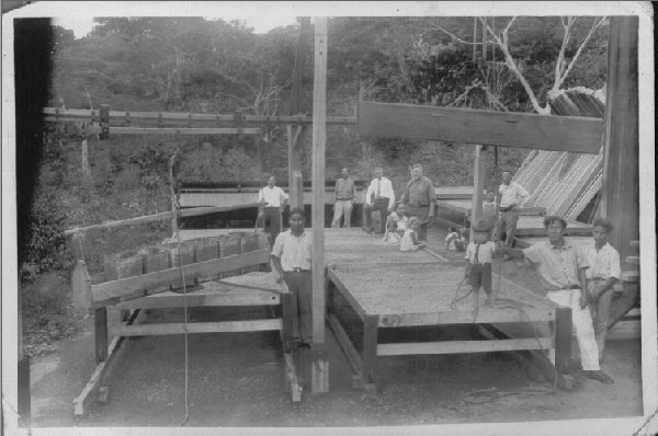
Sun drying in drying screens (bastidores) has been a Family Tradition.  Robert Louis Lamastus (dark clothes, 4th from left) and Elida (sitting) owners of Elida Estate, picture taken in 1932. Image courtesy Boquete Coffee.

Sun drying in drying screens (bastidores) has been a Family Tradition.  Robert Louis Lamastus (dark clothes, 4th from left) and Elida (sitting) owners of Elida Estate, picture taken in 1932. Image courtesy Boquete Coffee.

The details:

  • Farm Name: Elida Estate Coffee
  • Coffee Name: Elida Geisha Natural
  • International Jury Cupping Score: 91.90
  • Crop Year(s): March 2014
  • Variety: Geisha
  • Process: Natural
  • Elevation: 1800m (farm up to 2,200m)
  • Growing Region: Alto Quiel, Boquete
  • Owner/Exporter/Mill: Lamastus Family

Information above courtesy Stoneworks Specialty Coffee Auction

An interesting detail on how the “green-tip” came to be, from Verve Coffee Roasters:

Verve’s green buyer, Colby Barr, determined that the coffee from the green-tipped plants produced a far superior cup compared to those of the bronze-tipped plants. Subsequently Thatcher Lamastus separated these premium beans, and by doing so, the advent of an entirely new cultivar.

I’d bet on the fact the “bronze-tip” wouldn’t be too bad in the cup either!

The Brew

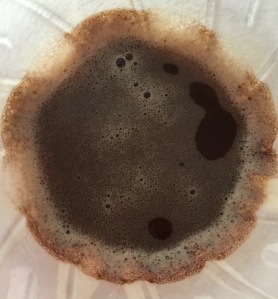
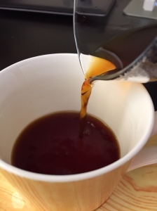
FullSizeRender 12The coffee Adam so kindly provided me with was a filter roast, and as such I brewed through the Hario V60 drip filter. Although I have been writing these posts and sampling many different coffees over the past few years, the following probably isn’t as technically sound a description as you’d get elsewhere, however I think I’ll get the message across.

This is simply the best coffee I have ever had — bar none.

Opening the bag was like sticking my face into fresh fruit salad, let alone the aroma after grinding (complex fruit and berry notes).

In general, medium in body, with the complexity, richness and depth of flavour the first thing to stand out, yet maintaining a clean, crisp character at the same time. As for specific flavours, the most prominent in my limited range was pineapple, perhaps a little orangey citrus, with some smooth berry notes coming through as well.

If I compare it to some of the better coffees I have had in the past, probably the most noticeable aspect was in relation to the flavour change over time as the brew cooled. Most of the coffees I try routinely change as this occurs, some quite substantially. The green-tip? Not so much, and rather than peak in what is sometimes a fairly narrow range, maintained the same rich complex flavours all the way through — an absolute joy from start to finish.

The Finish

I think it is quite apparent how much I enjoyed this coffee, and remain thankful for the opportunity to have tried it. Reading a little about the farm and family, it is no surprise such high quality comes out of Elida Estate on a consistent basis.

IMG_3309I’d highly recommend a little further reading for the full Elida Estate Story:

The Lamastus Family Estates

Best of Panama 2014 Grower Profile

Speciality Coffee Association of Panama Member Profile

With cupping underway in the Best of Panama 2015 at the time of writing, I am sure more fantastic coffee will be coming from the region — the only problem will be getting your hands on some.

A very special thank you to Adam Metelmann for generously providing me with both the opportunity to try this wonderful coffee, and happily sharing his knowledge about the farm and its owners. Adam can be found serving what I would consider the best coffee in Brisbane at Strauss in Elizabeth St in the CBD


Generosity

Time, money, objects, advice — to name but a few. Generosity can be demonstrated in many forms.

You might usually find greater expression of it amongst friends and family. Between complete strangers? Perhaps less often, yet a little more likely where there are common interests.

What follows below continues to amaze me as I write and read through it, yet also reinforces to me there are some wonderful people out there, and I have been indeed lucky enough to recently become acquainted with one.

Initial contact

Readership of this blog has built slowly and steadily over the two years I’ve been writing here. I do receive feedback occasionally on what I write — not a lot — but enough. Some offer encouragement, others push me to think a little differently about what I have written, though it is always well-intentioned and respectful. I consider myself very lucky in this regard.

Earlier this year I received some kind words from a reader on a couple of my pen related posts. I of course responded with thanks as is usually the case. Thankfully, he also reached out via email, through the contact page of this blog.

What the email contained is something I’ll never forget.

A most generous offer

Earlier in the year I had concluded I would be satisfied with my current pen collection in the short-term — and convinced myself I wouldn’t be making any significant purchases (perhaps only a bottle of ink here or there) until the second half of the year.

Not long after, I received the email which contained an offer I must admit left me somewhat stunned upon my initial reading.

I know what you are thinking — the email contained an unbeatable deal and I broke my current and future planned budget restrictions all at once.

No. It was much more than that. Way more.

The writer of the email mentioned owning a number of pens, and considering himself a user rather than a collector — was looking to pass on some of the pens he no longer regularly used to someone who might use and appreciate them.

Somewhat more significantly for myself, he went on to say he enjoyed reading this blog and would like to do something to support that. Very kind words and encouragement which in themselves already more than made my day. Being offered these pens was… well — you can imagine how that felt.

I continued reading.

The list of pens here was nothing short of amazing — particularly to someone like myself looking to expand a fairly limited collection. An endeavour that was to date progressing — though fairly slowly. Remember we are talking about doubling my fountain pen collection overnight — with each of these pens worth more than any (bar one) I already owned.

Needless to say I was somewhat flabbergasted.

A few emails back and forth later — and I had provided an address for the pens to be sent.

Arrival

A little excited at this point.

A little excited at this point.

Needless to say, an exciting few days wait ensued before an express post package arrived at my desk in the office. Being the somewhat private person I am, waiting until people were off in meetings and such for a quiet time to open it was one of the hardest things I have done in recent times.

Again. Totally amazed.

Although through the previous email exchanges I had known what was coming — actually having them in my hand was unbelievable.

At no cost to me, I had just received: a Pelikan M400 (green; EF nib); Pelikan M215 (black and rhodium; M nib); Pelikan M205 (red; F nib); Lamy 2000 (F nib); Tombow Object (red; F nib); Platinum Multi-pen; and a selection of ink cartridges.

IMG_3170

In all their glory.


I think anyone familiar with pens will see the value in those above, and anyone who isn’t — well let us just say we are looking at a significant amount of money if I were to buy them.

What can I say?

Having received the pens in the middle of March, I have only now been able to sit and write some thoughts on this act of kindness, with the extent of my good fortune having finally sunk in.

To me, it goes way beyond the monetary value which can be calculated from the list above. The kind gentleman who made contact can certainly be assured the pens have been warmly welcomed into my collection, and no amount of thanks could ever be sufficient, though I will indeed give it my best shot.

He has made no money, has no blog, Twitter or Instagram account to link back to — and even if there were – I get the impression a link would be politely declined. Also, my query as to whether he wished to be mentioned by name, and to read this post before it went up — politely declined. To me, it is a very real reminder of the kind and generous people in the world (and within the pen community) that we may never see nor hear from. Or at least if we do, not often.

These are the people I write for.

As this piece of writing nears conclusion, something else has struck me you know. I mentioned time and advice in opening of this post. Two very valuable things I have also received far more of from this kind gentlemen than I’d ever hope to receive, and to that end, I look forward to each and every email.

As far as this generous gift I have received?

I can only hope that someday — if I am in a similar position – I would do the same, but it mightn’t be with any of these particular pens. No, these I’ll likely be keeping as reminder of the immeasurable kindness and generosity that still exists in the world.


Wiser Web Wednesday

Wiser Web Wednesday – a semi-regular link to posts of interest from around the web by those far wiser than myself:

The Pen Addict
All roads lead to Atlanta – well at least they did over the weekend — with episode 150 of The Pen Addict Podcast coming live from the Atlanta Pen Show. I had collected some links from blog posts of those who attended the show, however came up with essentially the same list Brad compiled here. Lots of fun for all by the looks:
I Know It’s Over, Still I Cling…

Pens! Paper! Pencils!
A nice comparison post from Ian of differing Pentel Energel models. From my limited experience, the 0.7mm refill is one of the best going around.

The main issues I encountered in the standard 0.7mm retractable were also a bit of a rattle, and for me at least, I prefer a tapered or sightly thinner grip section. In view of this the Tradio might be worth a try:
A Review of Three Pentel EnerGel Gel Ink Pens

BeanScene Magazine
Not since Paul Bassett’s win in 2003 has an Australian won the World Barista Championship. A nice article reflecting on Sasa Sestic’s recent victory in Seattle:
Australia’s Sasa Sestic of Ona Coffee wins 2015 World Barista Championship

Mother Nature Network
Some information on a one year study into the effect coffee farms may have on insects and migratory birds. Interesting to note the increasing use of Australian native trees — obviously non-native in the areas they are being used:
The surprising link between migratory birds and coffee

Alt. Haven
It certainly looks the part, and from these words I’d say writes in kind:

I must say the Platinum 3776 Century really surprised me. I didn’t expect to like the pen as much as I am loving it. The Platinum 3776 Century will be definitely be making an appearance in my Top 5 fountain pens for 2015!

Such a fantastic colour:
Review: Platinum 3776 Century

Dramming
Whilst it continues in any part of society, it will continue in any subset as well. Really? Still?

Despite all efforts to interest more women in it, whisky is still very much dominated by men. And apparently it is a natural law that where there is an abundance of men, there is also sexism.

I’d argue it doesn’t even take an abundance — merely one or two, and you have everything you need to belittle, degrade or offend women without a second thought. Light-hearted? More light-minded if you ask me:
The Ugly Side Of Whisky Geekery

The Clicky Post
The good old $50-$100 price range. One in which I am looking for my next purchase, and must admit I did not know of this model from Sailor. As someone who prefers a little feedback through nibs, this appeals:

They are wet enough, but definitely have some feedback. They almost feel dry, but they aren’t. I actually find them to be in almost my perfect range.

Certainly one to keep in mind:
Sailor Young Profit Fountain Pen – M Nib – Black with Silver Trim