Image: Matt Gemmell
After putting in my two cents worth on the day iOS 7 was unveiled at WWDC 2013, I have had the opportunity to read quite a number of articles examining Apple’s overhaul of it’s mobile operating system. Two pieces I felt best captured the essence of the planned transition, over and above the usual nuts and bolts lists, were written by Federico Viticci and Matt Gemmell.
In iOS 7 Thoughts and Questions, Federico provides some very thoughtful and in-depth analysis on both the design and function of iOS 7, indicating how the changes go well beyond a surface only re-design, noting iOS 7 provides a good platform for even further growth and future development of the operating system:
And that is, I believe, why Apple said that iOS 7 isn’t simply change, it’s a new beginning. It’s not an understatement: iOS 7 is not about the icons, labels as buttons, translucency, questionable Lock screen gestures, or a new Spotlight as design choices taken individually – it’s about a single, precise idea: to make iOS simpler and more enjoyable, but at the same time more useful.
and:
But there’s one thing I’m sure of: to paraphrase yesterday’s demo, we should look beyond the icons. iOS 7 will be defined by its overall design language, user features, and developer technologies. In many ways, this is version 1.0 of an OS for the next five years.
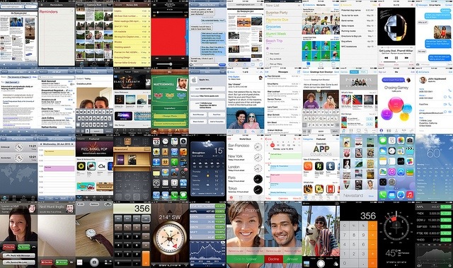
While acknowledging iOS 7 is indeed more than just a new look, Matt provides a fantastic side by side comparison of the differences between what we currently use in iOS 6 and what was unveiled a couple of days ago at WWDC. In his usual eloquent way, Matt explains while many of the changes may appear related simply to colour, flatness or borders for example, these are very specific changes that were made to enhance function first, and were achieved through very well thought out changes in form.
iOS 7 is a decluttering of the most exciting, profitable, desirable mobile operating system available. It’s a shift away from artefact, and back to essence. It indicates a clarity of vision, and a continued willingness to pursue simplicity ruthlessly.
Gone are embellishments like gloss and bevelled edges, shadows and borders. Visually dead areas that provoke tension rather than inspiring relaxation. Weight that suffocates, rather than open air to breathe.
On the issue of unfamiliarity, and “alienating” current users (some 600 million at last count):
The thing is, we’ve grown up. We don’t require hand-holding to tell us what to click or tap. Interactivity is a matter of invitation, and physical cues are only one specific type. iOS 7 is an iOS for a more mature consumer, who understands that digital surfaces are interactive, and who doesn’t want anything getting in the way of their content.
Both articles provide insightful and well considered analysis, after the crash and bash of initial opinions that were fired out immediately after the WWDC keynote address two days ago.
iOS 7 : Thoughts and Questions by Federico Viticci
iOS 7 by Matt Gemmell

Pingback: Time for an iOS app spring clean? | dept4