An interest in fountain pens inherently carries with it a similar level of attention to paper. Although I’ve written about some budget friendly notebook options on one or two occasions, I’m not averse to paying a little more for them either.
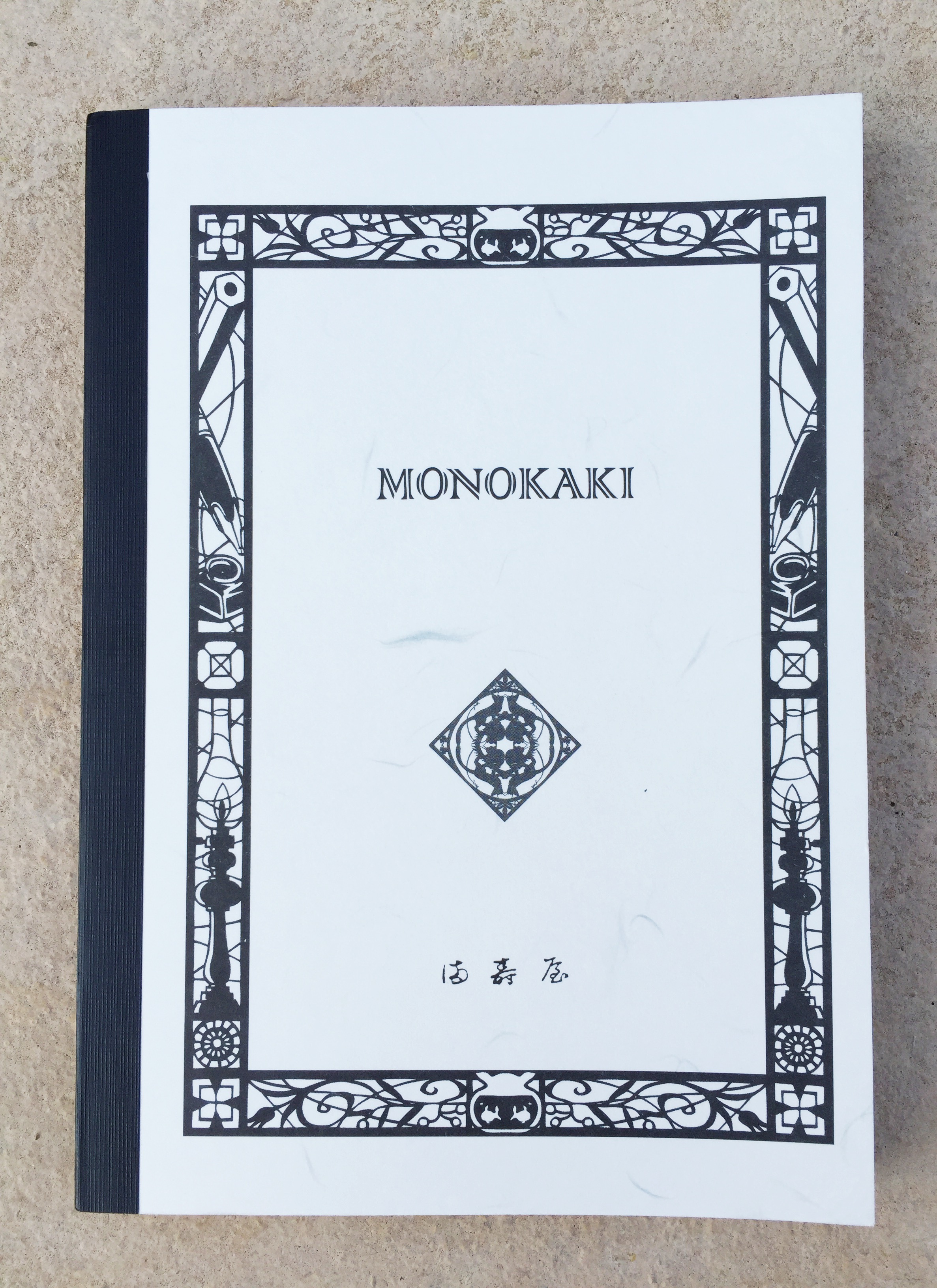
One such notebook — while not prohibitive in cost — is the L!fe Symphony N93 Spiral Bound A5 currently sitting on my desk. For the remainder of this post, I will mostly use Life rather than L!fe, as I do find it a little distracting, and an online search term of Life Symphony Notebook will bring up what you are looking for.
Look and feel
In summary, I’d say the Symphony notebook has no bells and minimal whistles — just high quality design, construction and performance.
Though technically a soft cover notebook, the Symphony carries very thick, stiffened card stock front and back which is about as hard as you’d find in a soft-cover notebook. As the images in this post show, I purchased what is described on various retail sites as the “grey” version. The front cover features some intricate detailing reminiscent of a dense vine, and is quite attractive to my eye. The back cover matches in colour, however is unadorned with any detailing or labelling.

A colour
To be honest I’m not sure how I’d describe this colour. At the time of purchase, I was drawn to the contrast between the prominent brass coloured double spiral binding and the deeper, slightly more mysterious looking cover. Something enigmatic to provide a little mystery, and shroud what would ultimately be a collection of fairly superficial writing you might say.
Speaking of the binding, those brassy double spirals follow the lead of the cover, in that they are very stiff, providing a solid backbone to the book in a way befitting the overall quality throughout. There is a little wiggle room or “play” in the pages, however I’ve not noticed this when writing, and believe me I would, for it is a pet peeve of mine with spiral bound notebooks.

Those spirals!
Referring back to the “no bells” statement above — rather than a criticism, is more a reference to a design which appears focused on the essential requirements, and doing them exceedingly well. There are no pockets, bookmark ribbons, elastic enclosures or pre-formatting on the paper other than the 8mm ruling in subtle grey.
I do tend to use ribbon markers if they are in a notebook, however equally don’t mind if they aren’t — avoiding the need to get them out of the way once the notebook is open to write. Pre-formatted page numbering and perhaps a date field? Again, generally used when present, though inconsequential if not. Plain, grid or ruled? Personal preference, for which I’ll take ruled nine times out of ten these days.
Specifications
The subject of this post:
- L!fe Symphony N93 Notebook
- Size: A5 (15x21cm)
- Cover: Thick, stiffened card stock front and back
- Pages: 200 (100 Sheets) acid-free paper; estimated at 80-90gsm
- Binding: Brass coloured double ring
- Style: 8mm Ruled
- Features: Fountain pen friendly paper, hand-made
- Source: Made in Japan
- Purchased: Pen and Paper, Brisbane CBD, AU$26.95 (December 2016)
Looking around online, you’ll find A5, B5 and A4 variations, available in grey, red, and blue covers. I was unable to find a specific gsm weight rating, however the paper feels very similar to your usual Clairefontaine/Rhodia type weighting. Searching around reveals 8mm ruled, 5mm grid, and plain paper variations, however I am not sure how widely available these options are.
Some online retailers:
- Rakuten Global (where the above paper variations were found at the time of writing)
- NoteMaker
- Skribr
Writing Performance
Of course most of the notebooks you see on these pages from time to time are great for writing, and whether they reach the “just about perfect” status is really a matter of personal preference isn’t it. I’ve written ad nauseam about my preference for a little feedback on the page, rather than skating about one a little too slick. No surprises the same thoughts will be applied here.

Bookbinders Snake Inks Ground Rattler (l) and Eastern Brown (r)
As I write this, I am 130 pages in of the 200 available to me in this notebook, and I’ve certainly no intention of not continuing right through to the last.

Whether running a finger down the page or forming letters along a line — the paper is quite smooth. Not Clairefontaine notebook smooth (a skater for me) by any stretch, and not quite Rhodia smooth either — however probably not far behind. Therefore, on the feedback/tooth scale I’d say it sits squarely in the upper end of my preferred window.
Currently in my hand is a Pilot Custom Heritage 92 (FM nib), containing Bookbinders Snake Ink Red Belly Black. On cheaper, softer paper, the CH 92 will occasionally want to “dig in” a little, however that is certainly not the case here. Both the sensory and auditory feedback (on a quiet pre-dawn morning), are pleasing to say the least. I’d be happy enough if restricted to this paper for the rest of my writing days.

Bookbinders Snake Ink Red Belly Black
Using a stiffer nib, such as my medium Platinum President, I find more of that “skating across the top” feel, highlighting the nib and paper interaction, which influences the perception of all our writing experiences. Add to that the usual differences in writing on the left hand page atop the stack of 65 or so filled sheets versus the harder, compressed, yet to be written sheets on the right. Whatever your particular preference or thoughts here — this is great paper for fountain pens.
 Feathering, show through, or bleed are nowhere to be found, and I feel you’d have to use a very broad nib containing extremely saturated, very wet ink to change that to any great degree. You will be safe with most general writing pens. Dry time is commensurate with my Rhodia notepads, or a perhaps a touch faster with certain inks.
At this point I am probably meant to test and demonstrate numerous different pen types to illustrate how this paper handles them all (and I am thankful to those who do), however looking back through those 130 pages, I can find all of about three with non-fountain pen markings (Retro 51/Schmidt rollerball from a Baron Fig Squire out of interest). As you’d expect, handled with aplomb by the paper.
In a notebook bought on the basis of being great for fountain pens, that can hardly come as a surprise, and call this a “review” if you like, however this post is written merely as a reflection on how I’ve found using rather than “testing” — the Symphony notebook over the past few months.
In Use
One of the more common uses for my notebooks is to carry them on my lunch break, perch on a stool at the bar of my favourite cafe, and do some writing. Having purchased the Symphony notebook with this activity in mind, I soon found its suitability for the task was not quite spot on.

With that iPad Air 2
The notebook itself is fantastic of course, however given its thickness, something as simple as the size of the spirals prevents it sitting nice and flat against my iPad Air 2 when carried together. A big deal? Hardly – though why bother when I don’t have to, particularly when there is plenty of flatness in say, the Baron Fig Vanguard of similar size (not thickness) which is currently fulfilling lunch break longhand duties.
Beyond such silly personal eccentricities, the Life Symphony No. 93 is what I’d consider a perfect desk book, where weight, thickness and spiral size matter less. It’s perfect for long form writing, with the A5 size constraining my hand, which at times can become a little unwieldy and careless on a larger sized page. Brief notes or meeting minutes – all perfect as well, however to me, a notebook like this begs for something a little grander. Perhaps some poetry, elegant prose, or even a your next novel.
In rounding things out here, I’d have to say from a construction and aesthetic perspective, the Symphony is more than well equipped to handle just about anything you could throw at it. Perhaps you’d see some wear and tear from repetitive backpack in/out cycles, though I think it would stand up pretty well.
Signing off
I’m certainly enjoying the quality of both overall construction and paper of this Symphony notebook from Life Stationery. It’s traditional without being staid; functional yet solid; and clean without feeling underdone or sparse. While it doesn’t suit my particular style of carry, it makes a fantastic desk notebook, and if you are someone who always uses a bag, my concerns are a moot point.
Whether a notebook like this represents value for money really comes down to how you personally value quality of construction and overall aesthetics. It is a notebook I consider represents excellent value for money, and would certainly buy one again – for my desk of course.