In taking an active interest in the pen community, it is hard not to notice the enthusiasm surrounding capless fountain pens, the majority of which centres around the Pilot Vanishing Point. Admittedly I too have looked longingly at online retail sites, clicking around the various models and options available in the capless segment of the market.

Until a few months ago, I had not even tried a capless pen, nor come to the conclusion I would be happy spending the money to obtain one. What had caught my eye however was the Pilot Decimo, a slightly more slender and lighter version of a capless fountain pen compared to the Vanishing Point. Also made by Pilot, with an 18k gold nib, the same capless mechanism and very similar design — there was a lot to like about the prospect of owning one.
After deciding to go with a Decimo at some point in the future, lo and behold what should turn up in my letterbox but the very Decimo you see in the accompanying images, and the subject of this review. A very kind friend of the blog sent a pre-owned, though no longer used Decimo for me to try, correctly thinking I might enjoy it, and was also interested in my thoughts on the pen itself.
Look and Feel
First and foremost, as I’ve mentioned, my impressions come to you from someone who has not owned nor used a Vanishing Point, and I would therefore keep that in mind as I go about my merry way with this post. Upon reading a little more, I did come across a very helpful comparison piece between the Decimo and Vanishing Point by Michael over at PigPog.

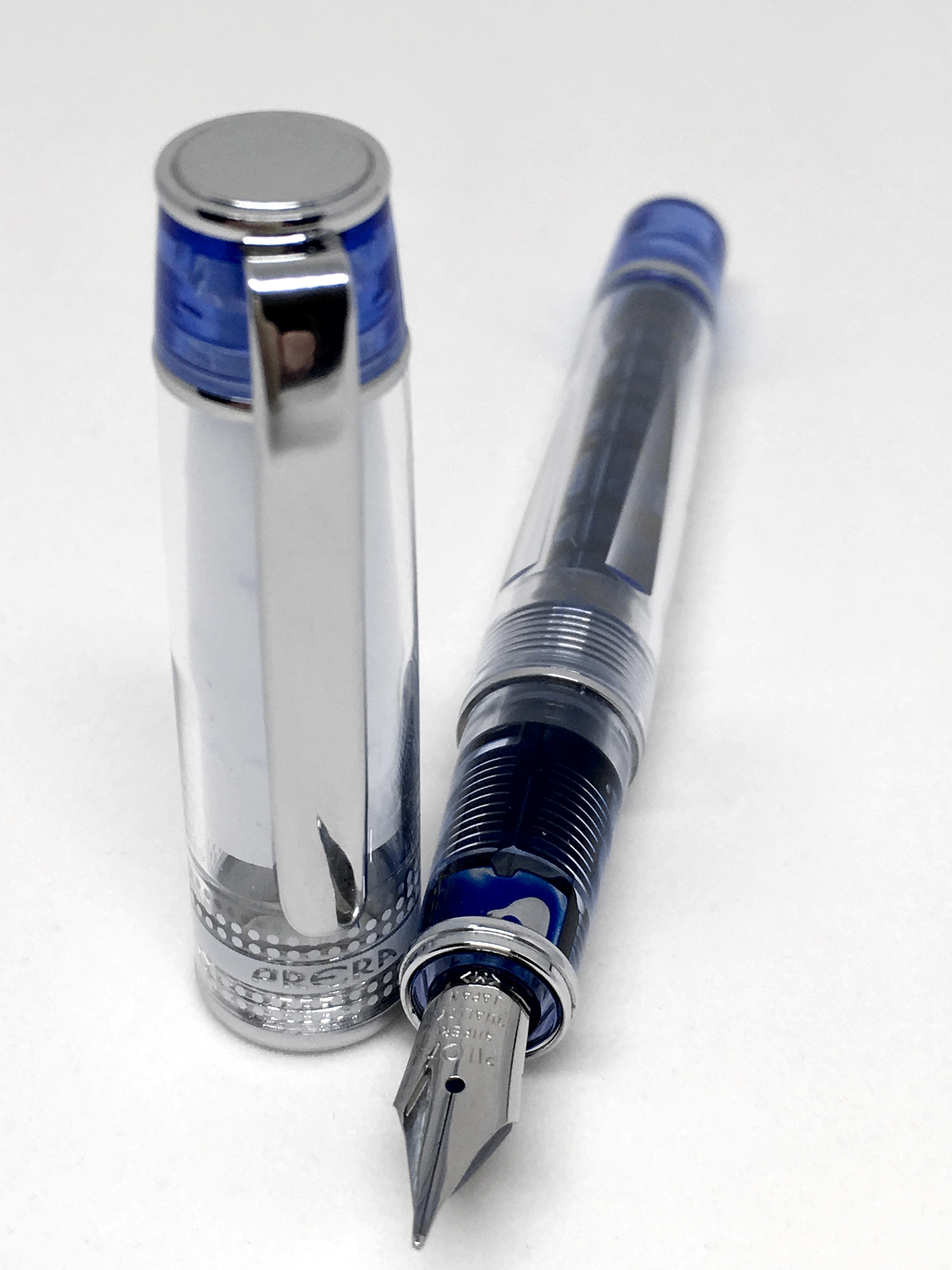
As you can see in the accompanying images here, the Decimo I have been using is a black model with silver trim. Not an uncommon combination in my collection, and a preferred one over black and gold. Overall, the look is fairly understated given the colour, however the capless nature of these pens provides a little unique edginess. Something a little out of the ordinary if we are talking traditional fountain pen “looks” at least.
The overall design I would say is generally well-balanced, however one aspect I have never quite taken to is the elongated knock at the top of the pen, though understandably necessary given its required travel to present the nib for writing. The clip of course is down on the grip section — the usual position for a capless pen, and I will comment more on this below when discussing my writing experience. I would note the metal clip is quite long and slender, and can be a little tricky to get over certain fabrics. This, combined with the overall length of the pen at times results in a fairly high “resting place” when clipped.
A little asymmetry exists between the lengths of the top and bottom halves of the pen, however from a visual perspective the relative length of the clip balances the placement of the double joining rings, which sit to the higher side of the centre of the barrel. As for markings, and in keeping with the look of the pen, a small Pilot Japan at the centre rings, and Decimo on the clip are all you will find.
In discussing the look and feel of any pen, clearly the overall balance when the pen is in your hand is an important consideration. Without a cap, there is of course no choice to make regarding whether to post or not. However, that also removes any chance you have of playing around with the overall balance of the pen — not simply length, but weight distribution. The overwhelming majority of my pens I use without posting, however there are a couple which sit on the “lighter” side of the weight spectrum where I do post the cap. They are also a little shorter than some of the others with the Pilot Prera and Sailor Pro Gear Sapporo (or slim) coming to mind.
The Decimo weighs in at just over 21 grams with a full ink cartridge, and when in your hand for writing, feels even lighter. Despite this rather long-winded discussion on weight and balance, I probably should say that I did not find any of this a problem. The overall feel when writing is testament to the balance, design and construction of the pen. Simply put, if you want a heftier feel, this may not be the pen for you, with a Vanishing Point the obvious option should that in fact be the case.
In summary, despite my comments about the asymmetry, and if I had my choice there may be a couple of things I would change — do we really want every pen in our collection looking the same? Of course not. Even if I had (and of course I do not) twenty black and silver fountain pens, I’d like them to show design, size and symmetry differences (whether subtle or overt), which, upon looking at the ones I do have — they generally do.
Specifications
Courtesy of Jet Pens
- Model: Pilot Decimo Capless Fountain Pen
- Material: Metal
- Mechanism: Retractable; push button knock
- Clip: Metal; on grip section of pen
- Weight: 0.8 ounces (21 grams)
- Diameter: Grip 9.9 mm
- Diameter: Max 12.0 mm
- Length: Retracted: 13.9 cm / 5.5 inches
- Filling Mechanism: Converter, Cartridge – Proprietary
- Grip Material: Metal
- Nib Colour: Silver
- Nib Material: 18k Gold (Rhodium-Plated)
- Tip Length: 7.3 mm
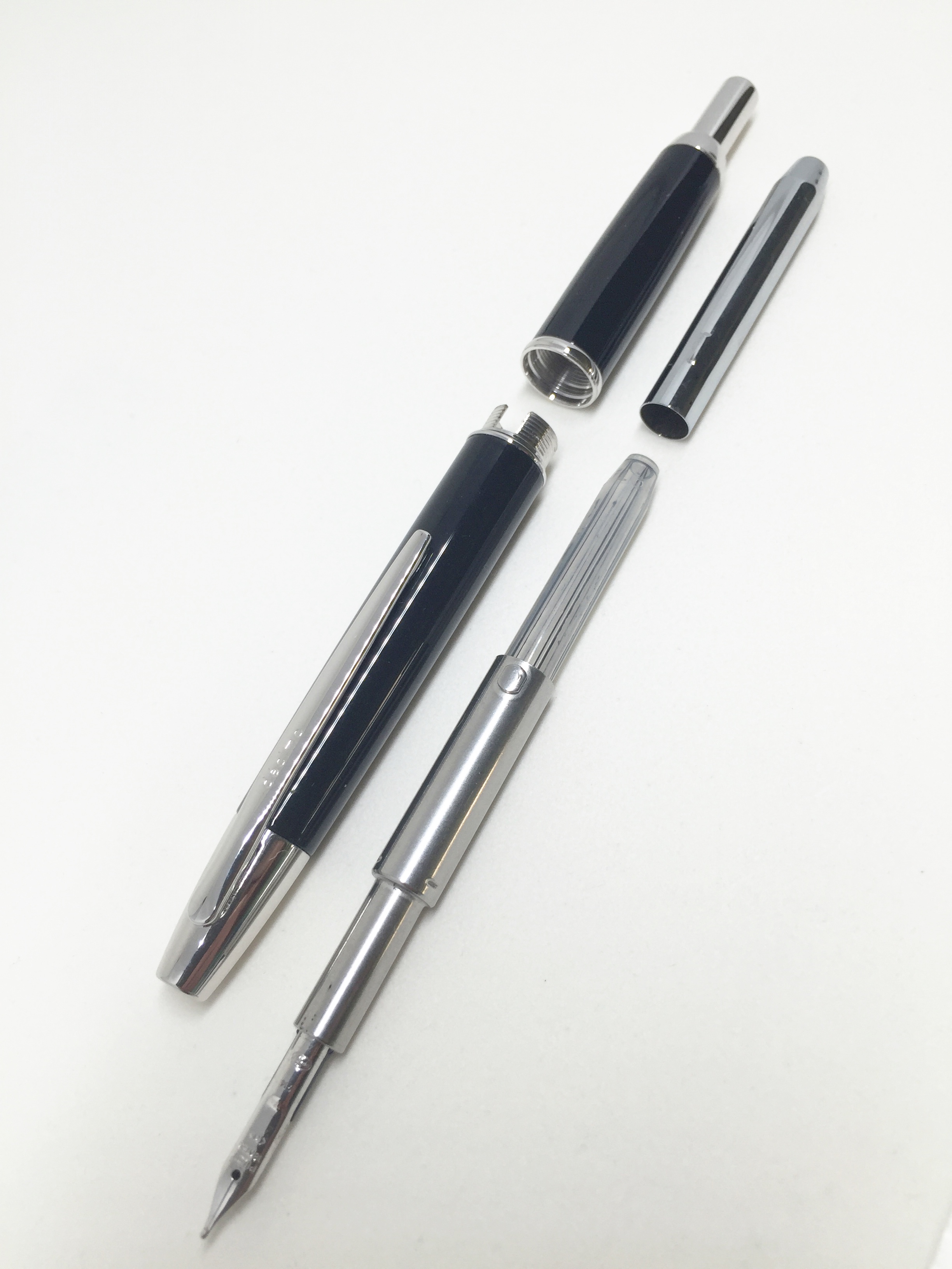 The filing mechanism in the Decimo is from what I understand identical to the Vanishing Point, accomplished either by converter (CON 20 or CON 50 compatible) or Pilot ink cartridge. The pen comes with a metal cap to protect the cartridge from the knock mechanism.
Some of the more competitive pricing on the Decimo can be found at Engeika, with the current listing at the time of writing $US101.70. It is also on Rakuten at a similar price.
Writing
As you’ll note in the list of specifications above, the Decimo comes with an 18k gold nib, and boy is the medium on this particular pen smooth. This nib impressed from the moment the ink primed and ran onto the paper. It is silky smooth, yet firm enough to hold its consistency when powering through a rapid set of notes.
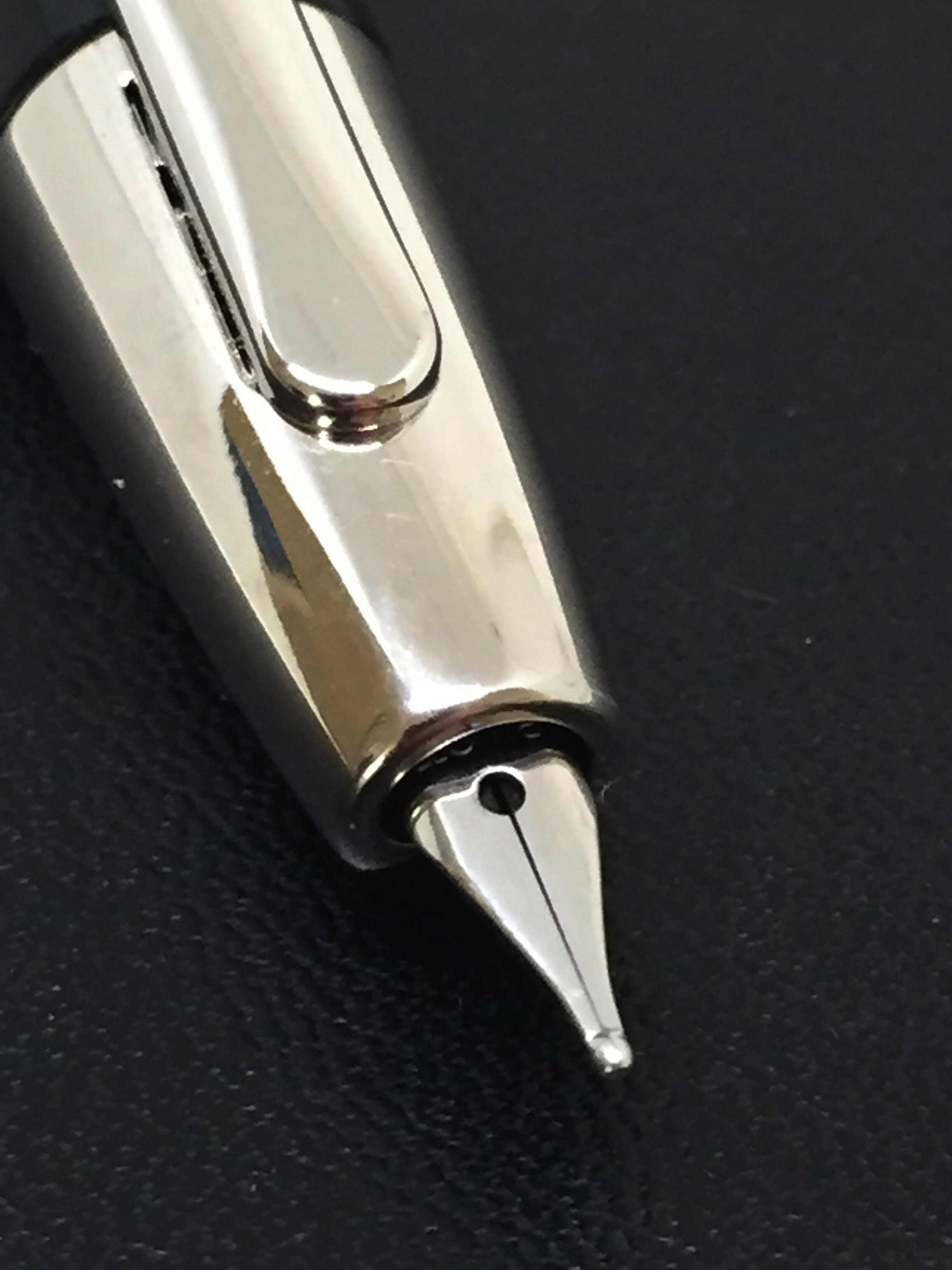
There have been no hard starts, skips or any other issues with the nib. It has always performed as expected and on demand, even if left for extended periods “nib out”.
The nib has a degree of softness or give, with a small amount of line variation with changes in pressure, however a pen such as this does not really require an amazing amount of line variation, nor is it why you would buy one.
 On to the clip position, which is placed down on the grip section of the pen. Annoying, invisible or somewhere in the middle? Whether you are considering a Decimo or the Vanishing Point, with a capless pen of this type, a decision needs to be made about the clip, and whether it will be a hindrance to how you hold the pen for writing. If possible, try to test one out prior to purchase, at least for a more informed choice.
You may be lucky, and not even notice the clip at all. If you are like me, it is noticeable, though not what I would call annoying. Certainly, your grip and nib rotation is very much determined for you, however with a great nib such as this one that is not really a problem. A good tip I came across in reading a little on these pens, is to hold one of your standard pens upside down with the cap on and see how you find the clip in relation to your grip. At least it will provide some reference point for how you might fare here.

In summary, looking at my overall writing experience, I would say the Decimo is very good. I wouldn’t go so far as exceptional, and the reasons for this are not something I could specifically put my finger on. The nib itself is fantastic, though it did take me a little while to get used to its smallish size.
Probably the best way to describe it is that I simply find it a little difficult to get into a good rhythm with this pen. I suspect it is not one thing on its own, but a combination of the size, weight and yes, possibly something to do with the clip. When I pick it up it just takes a little while for things to flow, and it doesn’t feel quite as natural compared to some of the other pens in my collection.
Upon reading the paragraph above on its own, it would be easy to conclude I am not very fond of this pen, which isn’t really the case. I have been happy to pick it up on many occasions when there are others sitting next to it, I feel it just makes me pay a little more attention, and reminds me I’m writing with the Decimo rather than just writing.
Overall Use
It is clear from the overall popularity of the Vanishing Point that capless pens are indeed in demand. As far as use cases are concerned? Personally I find the Decimo to be a great office note taker, particularly for jotting down a quick note, marking up printed documents, or a quick initial or signature, and the ease of the capless, push button mechanism can take a lot of the credit here. Of course, as handy as the mechanism is, the pen still needs to write well, and as I have mentioned above, Pilot certainly has that one covered with this beautiful 18k gold nib.
A couple of aspects I am still not quite comfortable with, or perhaps more correctly put — used to, involve two polar opposites, which are carrying the pen around and storage. The storage is a silly thing really, in that I continually find the Decimo in my pen cup nib down (retracted of course), as I am used to placing pens in there based on “knock up” rather than “clip up”. An issue? Not at all, I simply thought I’d mention the extreme challenge I face every single day when placing this pen in a cup(!).
Carrying the pen is another matter, and is something that makes me a little nervous. Although the reality of how the knock mechanism works essentially renders my concerns needless, I still cannot get them out of my head.
 When I say carry — a good proportion of this occurs in the side pocket of my trousers or jeans, and I have this nagging, uneasy feeling I will somehow engage the knock (by not removing the pen before I sit down for example) and well… you know the rest. I say these concerns are probably unwarranted for the reason I have already stated earlier in this post — the length of the knock, and therefore the corresponding distance of travel to produce the nib is a large one, and something very unlikely to occur by accident. Perhaps I simply need to invest in a pen loop for whichever notebook I am also carrying at the time.
Signing Off
Given the similarities between the two it is perhaps a shortcoming of this piece in that I do not own, nor have I used the more popular Vanishing Point capless fountain pen from Pilot. That said, I am only able to use one pen at a time, and as a capless fountain pen in its own right, the Decimo is a great writing instrument. My favourite one? On that question I’d have to say no.
It is relatively unique in both design and function, with the push button knock working elegantly and effectively, and the 18k Pilot medium nib simply a joy to write with. Although to my eye and taste I wouldn’t describe it as my most attractive pen (a knock button half its current length would be nice, yet in a spectacular functional compromise, would fail to produce the nib), there is a certain elegance in the overall design, asymmetry and proportions of the Decimo that are somehow just right.
For shorter writing sessions or quick notes, it is just about spot on. When in the zone and powering through multiple pages of a longer draft, I’d more likely pick up one of my other pens.
On the question of Vanishing Point or Decimo? That is up to you, however would appear to come down to simply size and weight, notwithstanding some differences in colours and construction materials. To me, a capless pen is functionally about utility and usability, and on that count perhaps the lighter the better, however should also put your mind at ease when it is in your carry. I can certainly see the Decimo as part of my pen rotation moving forward, and suspect it will see its fair share of my desk bound office note taking load.
Follow @petedenison