Monokaki A5 Notebook

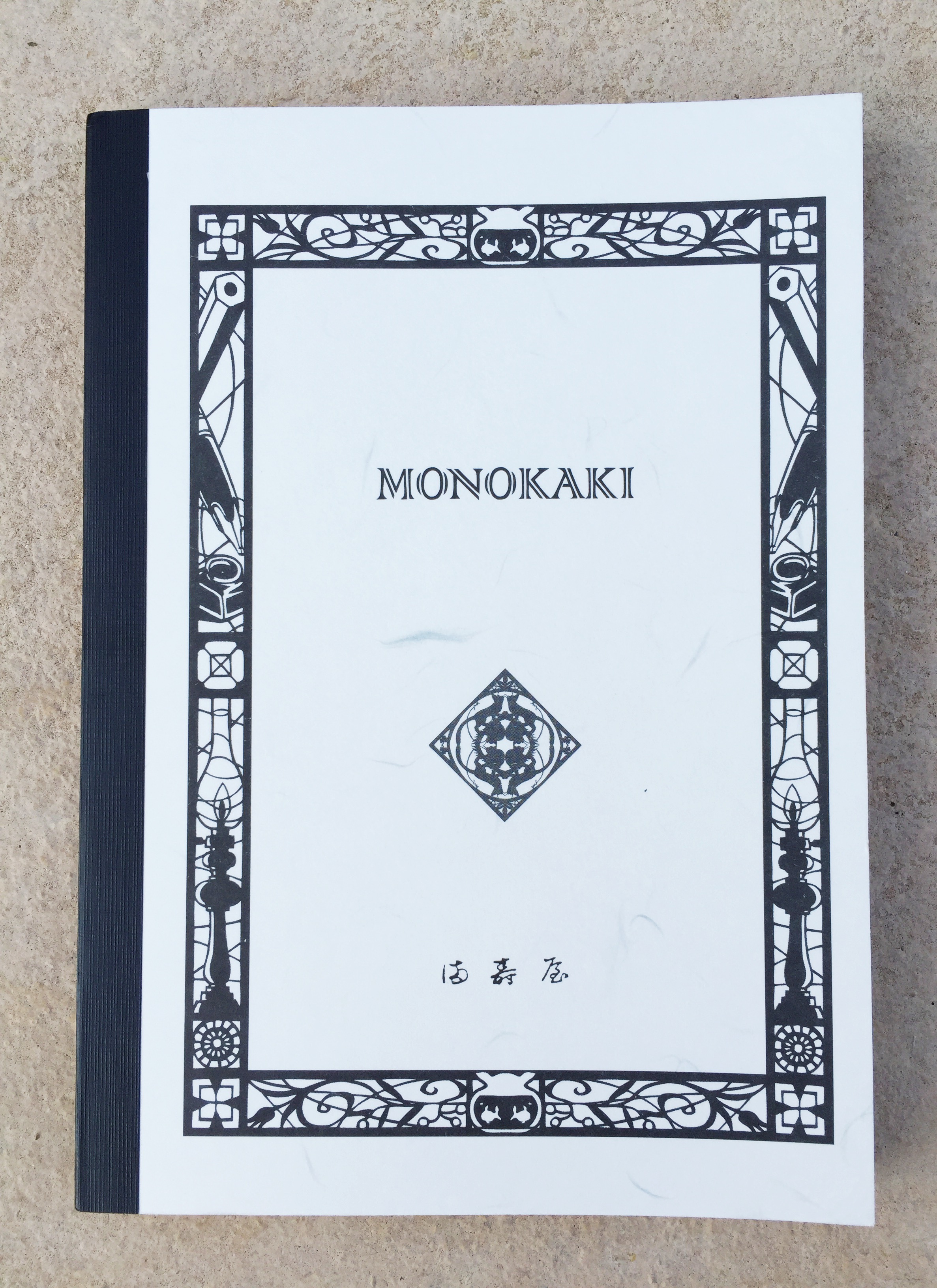
Having this Monokaki A5 notebook arrive in my letterbox a little while ago was indeed a pleasant surprise. Picked up in a Japanese stationery store by a friend during a recent trip overseas, I was the lucky recipient of a notebook I had not come across either in stationery stores or online.
image

Although I knew nothing about the Monokaki range of notebooks (Monokaki meaning “writer” in Japanese), the quality of both paper and overall manufacturing was immediately apparent. Also, given the decorative border around the front cover included pencil, fountain pen and inkwell motifs, I was further encouraged as to the likely merits of the paper stock, and its ability to handle my favourite writing instruments.

Yes, I was a little excited about this one.

Background

Seeing the unfamiliar Monokaki brand name immediately sent me on an internet search for a little more information, an endeavour which also had me thankful for Chrome’s translation button when viewing the manufacturer’s website. There isn’t as much information readily available compared with some of the more common brands, however what I did find was indeed of interest.

UK store Choosing Keeping (online or 128 Columbia Rd, London) provided some background, which included a little dig at another major brand’s claim about being a notebook for novelists:

The one exception being that while other’s marketing campaigns are entirely fabricated, the Monokaki notebook’s paper – Kotobukiya paper – was really created as a bespoke product for Japanese author Fumio Niwa by the company’s present day owner’s grandmother in 1939 and used by countless authors and poets including no less than two Literature Nobel prize winners and one nominee.

I’d encourage you to click-through and read a little more, as the page also includes information on the company, which continues to operate and manufacture the notebooks from the Sakura district in Tokyo. The 1940’s woodblock cover design apparently comes from Japanese manga artist Ryo Takagi, commissioned to create a design of “traditional Japanese atmosphere – to include familiar stationery and writing instruments”. I think you’d agree the design goal was achieved.

On a more practical note, and certainly of great interest to many of us in the pen community:

The manuscript paper was indeed designed with novelists in mind for its excellent performance when used with fountain pens – no bleeding, no feathering

So all in all, things were looking good, with both first impressions and an initial foray into learning a little more about the brand yielding positive results.

For reference, some links (I’d recommend Chrome for opening those in italics and translating the result):

Update, 13 December 2015: I have now updated the information above which incorrectly stated Choosing Keeping were an online store. The store has been in touch to advise they also have a brick and mortar shop specialising in classic stationery and notebooks at 128 Columbia Rd, London as well. Thanks Julia!

Look and Feel

If I consider what actually is my preferred or favourite “look” for a notebook, I don’t believe I really have one to be honest. There are times when an understated black might be what I am after, yet other times it might be something a little more individual or unique. The Monokaki range is itself a little unique in that it probably fits both these descriptions.

I do enjoy a little variety from time to time in what I am carrying, however not at the expense of the writing experience. Considering this, I do have what I’d call a spectrum of tolerance here. By that I mean certain notebooks I’m happy to use even if it means finer nibs and certain inks only, as long as things are not too restrictive. Mind you, that particular subset of nibs, inks and pens must perform without further compromise, otherwise the notebook will be gently set aside and see no further use.

Although I’ve probably begun to drift a little off track, my intended point is to merely highlight the fact there are no real compromises with the Monokaki’s paper — to any of my pens, nibs or inks, as you’ll read about a little further below.

imageimage

I do love the look of this notebook, with its relatively understated, yet very individual cover design. The contrast of the binding tape complements the unique monokaki_traditional_japanborder and designs contained within it. Even the font used on the cover branding, combined with the central symbol and what I believe to be traditional Japanese lettering (part of manufacturer Asakusa Masuya’s logo) add to the overall design aesthetic of the front cover. The back cover is also not forgotten, containing a central symbol, with both corners also demonstrating fairly intricate detailing.

image


While I am not entirely certain if some of these symbols carry significant meaning over and above their decorative effect, the overall feeling I have about the character of the design is one of old world Japanese tradition or history. I have no specific basis for that, however that is the feeling I keep coming back to when I look at it, and is something I find quite compelling.

In the hand, there is a feeling of quality evident in the construction. With time, I’d expect some wear and tear around the corners of the front and back cover if it were going in and out of a bag on a daily basis, however it would more than likely be filled in short order as well if that were the case. That said, I have no real concerns about the overall durability of the cover, if a little care is taken along the way.

imageThe paper is thread-bound and glued in small sections (apparently to assist flatter opening), and externally reinforced with tape along the spine, which not only provides additional support, but I believe enhances the overall external look. Additional stiffening is also provided by a second sheet of card stock inside the front and back cover, providing a kind of double cover for want of a better term. monokaki_dbl_coverThis again adds to the overall sturdy feel of the notebook, providing additional rigidity to the cover.

The pages themselves are lined, with a larger margin at the top of the page. The only additional markings are 10 mm graduations marked along the top and bottom line (which are themselves bold), allowing the accurate addition of a vertical margin if you so desire. monokaki_vert_margAt a guess I’d say this may be present to allow vertical rulings to be created for a grid of 24×18 boxes, similar to the Masuya manuscript paper from the same manufacturer.

I do not find the absence of other possible additions such as page numbering or date fields detracts in any way from either the look or the usefulness of the page. In fact, the simplicity of what is offered fits with its overall character.

Specifications

Courtesy Choosing Keeping:

  • Monokaki Notebook
  • A5 210 x 148 mm
  • Soft flexible washi paper card cover
  • Acid-free smooth light cream paper
  • Plain or ruled (lines 9 mm apart)
  • 160 pages
  • Fountain pen friendly cream paper
  • Thread-stitch bound in small sections for flat opening throughout
  • Sizes available
    • Large, B5 – 257 x 175 mm
    • Medium, A5 – 210 x 148 mm
    • Small, B6 – 182 x 128 mm
  • Price £12.00 ($AUD24.70)

Also available on Rakuten Global Market with a list price of $AUD12.56.

imageA word about the Masuya paper (English page link), which is used in the Monokaki range of notebooks (also referred to as Kotobukiya paper, with both terms used somewhat interchangeably from what I’ve read). Masuya manufacture 2 types of manuscript paper and have a range of 35 different products. Originally cream, the paper also comes in white, created to better reflect the light source — apparently coming about due to one of the previously mentioned “novelists” writing by a single spotlight.

From the site itself (unaltered):

Masuya in Asakusa is a traditional company successing Japanese hand-writing culture. We have various products made of high quality paper many famous writers have chosen. Japanese traditional design, unique touch…

Along with the rather unusual:

Feel Japaneseness through Masuya’s products.

It has been a little difficult to track down more detailed information about the Masuya paper used in the Monokaki line of notebooks, and you will note the absence of a gsm rating in the specifications above. The paper in this notebook is certainly far thinner than a 90 gsm Rhodia or Clairefontaine notebook, and also the 80 gsm softcover Leuchtturm1917 notebook I have been most recently using — by a considerable margin. Given Tomoe River paper weighs in at 52 gsm, then at a guess — and I repeat this is my own guess-timation only, this paper feels like it would be around 60 gsm. I may be way off the mark here, however it is very thin and very light compared to your standard “fountain pen friendly” notebooks — and is certainly closer in properties to Tomoe River than any other paper I have used to date.

Once written upon, the paper has a little of what I’d call that “crinkle”, reminiscent of Tomoe River paper, and does seem to have properties that lend me to think of it in similar ways. At times I feel I have turned one page when I have actually picked up two.

Needless to say, I like it — a lot.

Writing Performance

From my comments above, you probably can see what is coming here.

This paper is pretty amazing — particularly if you enjoy writing with fountain pens, meaning of course it handles pretty much anything else you care to throw at it as well. The exception of course being Sharpie markers and the like, where thin doesn’t always hold up to such an onslaught of saturated ink. For fountain pens though, this is some of the best paper I have written on since, well… since I’ve been concerned with such matters. As much as I loved my Rollbahn and Apica Notebooks of previous reviews, the paper in this one surpasses those.

monkaki_ink

For my paper requirements and preferences, this one is now certainly a favourite. Beyond the obvious shockers of horrendous feathering (my number one hate and deal-breaker), excessive bleed-though (a slightly lesser evil to me), and show through (perfectly acceptable to me for the most part), I’m sure we all have our favourites for various reasons.

monokaki_reverse_pageThe paper in this notebook has what I’d call a moderate amount of show through for darker and more saturated colours you might use. So in all likelihood, many of your fountain pens. Again if we compare it to Tomoe River, it has possibly a little more — but only just, assuming my eyes aren’t deceiving me.

Because the paper is so lightweight, although it has a little tooth to a gliding nib, there is no sinking in feeling from toothier, heavier-weighted paper. I’ve also noted in the past how on some heavier paper such as a Clairefontaine notebook, I feel as though the nib skates away from me a little, and what I gain in less resistance, also results in less control. There is none of that here — even with more rapid writing. To me it really is the best of both worlds. As far as feathering goes – what feathering? None of that here.

IMG_5250As far as the shade of paper is concerned, I’m a little picky here. Every time I try a notebook in the off-white/cream/yellowish spectrum, I begin by thinking: gee, this would be fantastic in white. However this is typically followed by filling up the notebook with all manner of ink colours and not thinking another thing of it. As you can see from the writing sample page, all of your colours will vividly show in all their glory.

One point I should make here, is that this is not a flat opening notebook, even through the middle third of the book. I have doubled it back and left it open in attempts to coax it a little flatter through the spine to no avail. While not a deal breaker for me, it is noticeable, and something which does get in the way of the writing experience somewhat. Something to consider in any event.

In summary, the writing experience is as close to a Tomoe River experience as you can get. Why is that relevant? Well, Tomoe River paper is popular and well regarded for a reason. Light weight paper, smooth without the slip, handles pretty much every ink and nib, a little show through yet no bleed or feathering. Sound familiar? Indeed it does, however applies equally well to the Masuya paper in this Monokaki notebook.

Probably the one thing about these types of paper that can sometimes be an issue is ink drying time. By comparison, the Monokaki on average dried a few seconds faster for a given ink — often at around the 15 seconds mark, versus 18-20 seconds for the Tomoe River. So again I found the overall performance quite similar.

Without a doubt this is great paper, and if you are at all able to get your hands on some, I highly recommend trying it out — whether in notebook or manuscript page format.

Conclusion

imageThe Monokaki A5 Notebook is indeed a joy to use, largely due to the writing experience of the Masuya paper itself — and isn’t that pretty much the key to our love of pens and paper? True, I have a little flexibility as far as my specific paper requirements for writing, and this Monokaki Notebook sits very close to the favourite end of that spectrum.

To make it pretty much perfect? There is probably nothing I’d change about the properties of the paper — for fountain pens it is pretty much spot on. I’d perhaps tweak the binding to allow truly flat opening; opt for a truer white in paper shade; and finally, have a local store or online seller stock the range so I can easily replenish my supplies when they dwindle!

This is certainly a great notebook, and with 160 pages to play with, will serve me well for a little while longer — and that can only be a good thing. I often get the impression there is a whole world of Japanese stationery that I am entirely oblivious to — which is also a good thing, for it simply means there will always be more to discover.


Wiser Web Wednesday

Wiser Web Wednesday – a semi-regular link to posts of interest from around the web, by those far wiser than myself:


Vox
Ahh yes, remember those? The real video store? No doubt many of us spent a good few hours wandering the aisles picking out the perfect film on that perfect delivery vehicle – the VHS tape.

The decision to leave a movie behind on the next technological leap is market-driven, which makes video stores the last safety net for things our corporate overlords discard. (That’s why the chain stores died first — like Netflix, they peddled convenience and “all new, all the time” — Netflix came along and just did what they did more efficiently.) A real video store buys a movie and saves it, regardless of such considerations.

A lot has been said about the merits of “curation” in music streaming over the past year or so. Although unfortunately a tale of demise, it could be said this is an example of curation at its finest:
I worked in a video store for 25 years. Here’s what I learned as my industry died


Femsplain
Although only a few of those listed align with my own, as a father, I have an equal number of triggers which may set me off on varying degrees of sternly worded explanation and rationale to my children.

I finally understand, that he only gets as upset as he does, because he really really cares. About his family, his country, his home, his responsibilities — the care runs DEEP.

Unsurprisingly, all for much the same reasons mentioned above:
Papa Loco


James Greig
Sound familiar?:

Option 1: Pull out your phone, and automatically tap Twitter open. Scroll through your feed for a few minutes, the usual stuff, nothing that interesting. Then Instagram. Ditto for that feed. Then Facebook. Baby photos. More baby photos. Then you look up, and ten minutes have evaporated, and your train is pulling up in front of you.

Option 2: Pull out a book, and read for ten minutes.

Not such a bad idea:
Can’t concentrate? Try swapping your ‘smart’ phone for a monotasking device


Pens! Paper! Pencils!

While it is nice to uncap and let loose with a pricey pen, in the mayhem leading up to Christmas, I’d agree that finding value at the other end of the dollar spectrum can be equally, if not more rewarding.

Top end pens are exclusive and, thereby, excluding, and whilst I do like some really rather pricy pens I do much prefer it when I find a bargain

As a bonus in this link you will also see one of Ian’s fine sketches:
Dorset Countryside


The Pen Haul
Sometimes the cheap ones just do the trick. Although not to be confused with the Red and Black notebooks available at Officeworks in Australia (or perhaps they may perform equally well, I’m not sure), these appear to have the key criteria covered:

The characteristics that we look for are all there. No feathering, no bleed through (besides the above exception), fairly smooth with a tiny bit of tooth, and best of all you can still see the full depth of the ink, such as shading and sheen.

You never know where the next hidden gem will come from:
Black n’ Red Notebooks


The Clicky Post
Ok I admit it – part of me wanted this review conclude the Dyson pen wasn’t so great. Then we could at least say it sucked couldn’t we?

My apologies, and I will now show myself to the door. Before I go, at least read this great review of a pen it would appear not many of us are likely to find in our hand:
Dyson Biro Ballpoint Pen Review


Pentulant
There is something fairly satisfying in knowing exactly what writing experience you will get when purchasing a familiar notebook. In this case, the quality Rhodia experience. After that, you are left to experiment with external appearance at will, and I do love this Silver edition.

A great review, with images to match, capturing the essence of that gorgeous silver finish.
NOTEBOOK REVIEW: Rhodia Webnotebook Silver Edition


Macdrifter
How will you ever find these gems unless they are shared?

As usual, the documentation is the weakest part of the product. Every week I find some new reason to love my big phone.

Sometimes I get the feeling every OS update (whether i for X) simply brings a few more features I remain unaware of:
The Hidden Convenience in iOS 9


MacStories
Federico Viticci on Dropbox announcing a shutdown of the email app Mailbox and photo management service Carousel. No sooner had I read this than the official Saying Goodbye email came through from the Mailbox team.

Knowing this was coming (lack of development; rumours), the goodbye email was ironically one of the first I read using Spark mail by Readdle, having installed it on my iPhone that morning. Now that is indeed a great app.

Another one (or two) bites the dust:
Dropbox Is Shutting Down Carousel and Mailbox


Perfect Daily Grind
Although discussion on traditional Vietnamese coffee often focuses on the unusual sweet brew:

It’s a super concentrated shot of coffee – around 25 g of coffee with a small amount of water – and served with sweetened condensed milk. It can be enjoyed hot or cold, and this preference can vary from region to region.

A nice reminder here of the ritual involved in preparing a cup.

The Vietnamese coffee ritual is almost a revolution against our fast-paced modern lives. It goes against takeaway coffee culture, rushing in and out of shops to sip your coffee in environmentally unfriendly cups.

It’s for everyone who understands that good things take time. It makes you take a step back and enjoy the little things.

Isn’t that what we should all be doing — enjoying the little things:
Time to Slow Down and Rediscover Vietnamese Coffee?


HUH
This one via Ben Brooks.

Yes one of those unsurprising conclusions. I have been on Facebook for less than year, joining for a specific and very worthwhile reason.

I’ll continue, however it’s not hard to understand why quitting what is on many days, an endless feed of either “look at me” or conversely, a chronology of whinging, moaning and complaining might make you a little happier:
Study Finds Quitting Facebook Makes You Happier and Less Stressed


Wiser Web Wednesday

Wiser Web Wednesday – a semi-regular link to posts of interest from around the web, by those far wiser than myself:


The Brooks Review
Ben Brooks considers the merits of his digital vs analogue note taking, and amongst other things, concludes:

And despite my contempt for searching analog notes, as I will explain in the next section, it turns out it really doesn’t matter — because I just don’t search my notes that often.

Although I generally index my notebooks in the opening pages and also use the fantastic Indxd web service (in both cases recording only information I consider I might want to look back on), I too find the need to search extensively back through my hand written notes is fairly rare:
Handwritten Notes


Everyday Carry
Although I’m not the most prolific Instagrammer going around, any tips I can get on improving my analogue tool photography I’ll gladly accept.

Some very helpful information here:
How to Take Better EDC Photos in 7 Easy Steps


Whsky.buzz
Mark Bylok on the subsequent fallout after the release of Jim Murray’s Whisky Bible 2016, which offers up a Canadian rye as whisky of the year.

Most media outlets got it wrong. The Internet, in its outrage, got it right

All valid points here, and of course equally relevant regardless of the country of origin the winning whisky emanates from. All you can really be sure of is that the Crown Royal North Harvest Rye will be in pretty short supply now and in the immediate future. Thankfully though, there are some other great Canadians in the mix that will now be able to bask just a little bit in the glow.

Canadian whisky is the single most creative category in the whisky world because of the freedom given to whisky makers. If anything, Canadian whisky has been held back by the stereotype that it’s smooth and clean in flavour. The new era of Canadian ryes are anything but smooth, and I mean that in the best of ways.

I guess one man’s Crown Royal Reserve is another man’s treasure:
Canadian Whisky Takes Centre Stage With Controversial “Win”


Informal Scribble
Stuart Hazley looks at a very affordable, yet attractive fountain pen from Platinum. I have a Platinum Preppy in the pen cup on my desk which I use intermittently for taking down quick notes or numbers, and every time I use it I smile at how such a cheap pen still provides that great fountain pen writing experience.

More of the same here, perhaps with just a little more class:
Platinum Plasir Fountain Pen (Blue)

If you are seeking some sort of consensus, Ian Hedley also reviews the Plasir at Pens! Paper! Pencils!


Eclectidbits
It is never a good thing to hear a fountain pen manufacturer is in financial trouble, much less one that has been operating for 90 years, as is the case with Italian brand OMAS.

OMAS is a wonderful fountain pen brand, with a rich history; be a part of history and join me in crossing pens and wishing them an even better future.

A call to arms from one dedicated OMAS enthusiast (some great looking pens in this post as well). Although perhaps I feel a little guilty in not owning one myself — I’m there in spirit:
OMAS -tars! Save OMAS – use one!


Futurity
Having two teenagers has certainly taught me one thing — we are long past a separation between the online and offline worlds. It’s all just life these days. Kids do some amazing things, and often technology plays a big part in that.

Being involved also gets you that much closer to the action, as well as some improved communication with those you are trying to guide into adulthood.

So, yes — my Snapchat account sees a good deal of use:
Kids Addicted To Phones: Why Parents Shouldn’t Worry


Digital Life – SMH
The Sydney Morning Herald offers a list of 14 Aussie podcasts. Like many of us, I’m flat-out getting through what is currently in my queue without adding more.

By the same token, there might just be that gem that turns out to be a favourite, like the fantastic Reckoner Podcast for local tech news and opinion.

Perhaps there are one or two here to broaden your mind, knowledge — or both:
Fourteen of our favourite Australian podcasts


The Gentleman Stationer
When the going gets tough, the tough finish by hand. A month-long NaNoWriMo odyssey ends in success.

A big congratulations are in order, not only for finishing, but for hammering home with nib and ink for the last 10k — and certainly for the following sentiment:

I’d definitely consider participating again next year

I remember my first words upon finishing last year were “I’m not doing that again”. Nice one Joe:
Done.


Fraser Speirs
It has certainly been all iPad Pro recently.

There has been a lot of talk in recent weeks about the MacBook Pro and, in particular, whether it can replace an iPad Pro for getting real work done.

Read that sentence again, and then read this very clever and timely piece from Fraser Speirs:
Can the MacBook Pro Replace Your iPad?


Five Senses Coffee Blog
An interesting take on the current state of filter coffee offerings, often a point of difference for specialty coffee establishments.

At the end of the day, a core tenant of the speciality coffee industry is to push boundaries and coffee cultures into places where it has not been. However, our opinions need to evolve and they most definitely should not be constrained in a way that limits experiences that should be approachable and quite simply, enjoyed by many

The suggestion perhaps that in trying to broaden access to speciality coffee, the result has been to essentially create a fairly narrow view of what filter coffee can offer. Interesting indeed:
What Is Good Filter Coffee?


Crop to Cup: The Complete Series

A little over two years ago I published a series of five posts outlining my initial foray into coffee processing. The technique I used at the time was a wet or washed method of taking recently picked coffee cherries through various stages to the point of roasting. While the end result was not outstanding in the cup, having been given the cherries with no information as to their exact source, type or quality, the whole process was always going to be a little hit and miss.

In saying that however, I was quite happy with how the actual processing techniques proceeded. I must admit to having quite an experienced mentor in the form of my mother, who has now been processing the coffee grown in the backyard for a number of years, culminating in a first place at the local Agricultural Society annual show just a few weeks ago.

As I am currently in the middle of experimenting with some natural processing methods, I thought it might be worthwhile combining those five posts (originally titled Crop to Cup Parts 1 through 5) and republishing them together. Hopefully what follows will provide a little context, and also highlight some of the differences between the two styles of processing when I eventually write about what I currently have underway.

Although none of the original posts were excessive in length, I have included a table of contents should you wish to jump to any particular section of the article.

What follows is essentially unedited from what was originally published, except to improve the formatting and for clarity. I hope you find it as interesting to read as I found it going through the process.

Table of Contents:

1. Introduction, Pulping, and Fermentation

2. Transition to drying

3. Drying

4. Parchment Removal (Hulling) and Roasting

5. Tasting

1. Introduction, Pulping, and Fermentation (Top)

photo (1) While the title of this post may sound rather exotic, the reality is I have been lucky enough to be given a small, recently harvested crop of beautiful red coffee ‘cherries’. Receiving such a gift carries significant responsibility, and I am determined to process, roast and cup the resulting brew with all the dedication and care I can muster. As regular readers will know, I have been roasting at home for some time now (purchasing green beans online), however to this point have not processed beans straight from the tree.

This is a whole new ball game for me. How to proceed?

photo (3)photo (2)

The first step was a call to my parents, who grow, and therefore regularly process, roast and drink their own crop. Next, an internet search to see what is out there on this topic. I was surprised to find the most helpful instructions on my state government’s Department of Agriculture, Fisheries and Forestry website. For additional reading on the types of processing methods, the International Coffee Organisation (ICO) provides a good summary.

Wet or Dry Processing

Firstly, there are two options, wet or dry processing. What follows in the section below outlines the wet processing method I plan to use, said to “better preserve the intrinsic qualities of the bean”. This method is the one outlined on the state government website, and also the one my parents use.

In the dry processing method, the entire coffee cherries are dried in the sun for approximately 4 weeks (to a minimum 12.5% moisture content), followed by removal of all outer layers around the bean by hulling equipment. States the ICO:

The dry method is used for about 90 percent of the Arabica coffee produced in Brazil, most of the coffees produced in Ethiopia, Haiti and Paraguay, as well as for some Arabicas produced in India and Ecuador. Almost all Robustas are processed by this method.

Wet processing generally follows the procedure outlined below, though obviously on a fairly large scale for commercial operators. As opposed to the dry method, the seed is extracted and fermented first, the drying process then follows, again until the beans reach 12.5% moisture content. The beans are then stored, and the hulling process is completed just prior to export. Again from the (ICO):

The wet method is generally used for Arabica coffees, with the exception of those produced in Brazil and the Arabica-producing countries mentioned above as users of the dry method. It is rarely used for Robustas.

My wet processed micro lot

The wet processing technique I am using involves the following steps:

  • Pulping
  • Fermentation
  • Drying
  • Parchment removal (hulling)
  • Roasting
  • Brewing

Comparing the method my parents use with those online saw many similarities, with only some of the time frames differing a little in each stage. Today we will look at Pulping and Fermentation, and return in future posts as my drying process proceeds.

Pulping

Seed extraction in the pulping phase.

Seed extraction in the pulping phase.

Here we are removing all of the skin and pulp (flesh) from the cherry, and extracting both halves of the coffee ‘seed’ from inside, and should occur as soon as possible after harvesting. Be sure to discard any under-ripe (green) or overripe (black) fruit which will reduce the quality of what ends up in the cup.

This process can either be done by hand (squeezing each cherry between your thumb and finger), or in the bottom of a bucket using a piece of wood to squash the fruit, resulting in the seeds being forced out from the flesh. Adding water will then allow removal of the skins and one other critical element – any floating beans. Good coffee beans will not float, and those that do should be discarded as they are unusable, and will spoil the batch.

Removal of floating beans (left); fermentation (right).

Removal of floating beans (left); fermentation (right).

Fermentation

There is not a lot to say about this step, apart from the fact it should last anywhere from 18-48 hours to a few days, and involves natural enzymes breaking down the ‘mucilage’ (the outer slippery substance) around the parchment layer. Fermentation should be done in a plastic bucket or container (metal may affect the taste), with the entire bean mass covered by water. To test for completeness of this phase, washing a small amount of beans should see the ‘slippery’ coating disappear, resulting in a clean, gritty feel. If so, agitate and wash the remaining beans until he water is clear (again removing any that float), which may take several washes. Once washed and clean, the beans are then ready for drying.

At the time of writing this post, the pulping is completed, and the beans are sitting fermenting…

2. Transition to drying (Top)

Coffee drying in the sun. Dolka Plantation Cos...

Coffee drying in the sun. Dolka Plantation Costa Rica (Photo credit: Wikipedia)

With the fermentation phase now complete, we move on to the drying phase of processing. You may remember from the first part of this series, coffee processing is broken up into the following stages, as described by both the Queensland Department of Agriculture, Fisheries and Forestry, and my mother, who is very experienced and knowledgeable in these matters:

  • Pulping
  • Fermentation
  • Drying
  • Parchment removal (hulling)
  • Roasting
  • Brewing

At the completion of Crop to Cup Part 1, we left the beans fermenting in water at stage 2 above. I was a little unsure of how long this may take (72 hours or up to a week), though armed with the knowledge this phase would be complete when the mucilage (slippery outer layer) was easily rubbed away. Daily testing was undertaken, until on day 7 (exactly as predicted by my mother), rubbing one of the beans between thumb and finger resulted in a slightly gritty/pebbly feel rather than a slippery one.

Time to move on to drying.

Drying

Once the beans have fermented for long enough, they are required to undergo a final wash and rinse, before being laid out on drying beds. In aid of passing down the coffee loving tradition to the next generation, my son was enlisted to rub off the mucilage, with repeated washes then performed to remove any remaining on the outside of the bean. Agitating the beans and replacing the water over three washes was sufficient to achieve this. Washing

Looking back to our Department of Agriculture guide, the drying process is described as follows:

The beans should be spread out in a thin layer no more than 3 cm thick, stirred three times a day, and be protected from rainy weather. Drying in this way can take 5-30 days, depending on the seasonal weather pattern.

As you can see below, an initial drying of the beans was done on a small towel, before transfer to a drying rack to allow plenty of airflow around the beans. The rack is situated under cover to avoid any weather or dew, however sees the mid to late afternoon sun, which should assist with drying. Given the small crop I am processing, a single layer of beans was placed on the drying bed, with little chance of any mould formation (the reason for stirring daily), though I aim to ensure the beans are turned regularly.

Drying

I hope you will join me in a couple of weeks for the next post in this series, where we will be up to removing the remaining parchment layer and roasting our crop!

3. Drying (Top)

photo (4)

The first two stages of this process were outlined in Parts 1 and 2 of this series, along with the initial phase of stage 3, in which today we learn that patience is indeed a virtue.

Drying continued…

Every day I walk past my drying rack, checking (and turning) the beans, as the remaining moisture is drawn out, courtesy of the great weather we have been having of late in South East QLD. No rain to speak of (though many gardens need it), and fairly low humidity (compared to usual levels) have made for what I would consider perfect ‘bean drying’ weather. Although the beans have been undercover and would not be directly affected by rain, the increased humidity and overall moisture in the air would likely have required a longer period of drying.

The ideal drying time?

For further information here we again refer to our two main sources: The Department of Agriculture, Forestry and Fisheries (DAFF)

Whichever method of drying you use, the parchment on the coffee bean will dry to a pale straw colour and be brittle to touch. At this stage, test the dryness of the beans by removing the parchment by hand off several coffee beans. If dry, the bean inside should be greyish blue in colour, hard, and likely to break when bitten between the teeth, if not soft and chewy. If soft, continue the drying process.

The “methods” of drying referred to above include the natural sun drying method I am following, or alternatively, a food dehydrator, which must be kept at 40 degrees celsius over the course of several days to complete the drying. Whilst a dehydrator may be a more rapid method of drying, some of the romance is lost, if I imagine hundreds of square metres of beans drying in the sun on a Colombian hillside. Though the strength of this argument wanes a little when my entire crop fits into my palms cupped together. Anyway, for the current crop, sun drying it shall be.

…and from my mother:

I usually leave it at least two weeks to dry out. Sometimes you might get away with 10 days or so, but two weeks just to be safe. Your best guide is to crack off the parchment layer with your thumbnail, and if you get a good split or cracking noise you can be fairly sure it is dry enough. Once I have removed this layer and simply have the green bean, a couple of days more drying will really finish them off.

We agreed that my planned two further weeks (making four in total) drying time would not be to the detriment of the end result (that is, be too long). The four-week time frame is due to a holiday occurring in the middle of this process, rather than specifically planning a drying time of this length. I do note however this does coincide with the upper end of the 5-30 day recommendations of the DAFF.

Drying – Two Weeks In

As noted above, after two weeks I am now half way through my planned drying time and testing a couple of the beans would appear to show that everything is on track. You will see in the picture below that the outer parchment is quite dry (it also comes away from the inner bean with a nice crack when pressure from my thumb is applied).

photo (5)

Referring to the DAFF instructions above, the bean is blue/grey in colour and feels reasonably hard, though I did not see the need to give it the ‘bite test’. In another two weeks I would expect the beans will be well and truly dry and begging to be roasted, at which time I will provide an update with another post.

In the mean time, have a look at my magazine Brew – Ways of Coffee on Flipboard for some great articles I have collected from around the web.

4. Parchment Removal (Hulling) and Roasting (Top)

The fourth instalment in this Crop to Cup series looks at the final steps of processing, followed by the roasting of our “microlot” of coffee, kindly received straight off the tree from a barista friend about a month ago. As with anything, good things come to those who wait, and four weeks after starting, we are almost to the point of tasting the fruits of our labour.

To date, we have worked our way through Pulping, Fermentation (Crop to Cup – Part 1), Drying (Crop to Cup – Part 2), Drying again (yep – it took a while) (Crop to Cup – Part 3), and we continue on below.

Parchment Removal (Hulling)

In Part 3 of this series, drying continued in preparation for the final “hulling” or parchment removal prior to roasting. After a further two weeks drying (four in total) it was time to remove the parchment layer.

As I have written in previous posts, the beans being “dry enough” and the parchment ready for removal, is determined both by observing an appropriate drying time (approximately two weeks to a month), and having the parchment split easily off the inner bean upon attempted removal. According to the Department of Agriculture, Fisheries and Forestry (DAFF):

Inadequate drying – greater than 12 per cent moisture – will cause mouldiness and stale aroma during storage.

Upon proceeding with the hulling by hand (or rather thumbnail and finger), it is clear this is quite a labour intensive undertaking. After 1 hour, the parchment layer was removed from our crop, and we were a step further along in the process.

Photo 13-10-2013 5 41 17 am

Given the time and labour intensive nature of this part in the process, the DAFF suggests the following:

Place the beans, a small quantity at a time, in a food processor or similar type of blender. Use plastic blades to avoid breaking the coffee beans. Blend at low speed for approximately 30 seconds to remove the parchment from the beans.

My mother uses a similar approach, blending on low-speed for 8-9 seconds, which she finds removes much of the parchment layer without damaging the green bean inside. Whether done by hand or machine, you will be left with a fine outer layer of “silver skin” remaining on much of the bean. Enlisting the assistance of my son to provide a quick rubbing of the beans between his hands removed this final layer. Blowing away any remaining silver skin completes the process.

Photo 13-10-2013 5 47 51 am

We were now ready for roasting!

Roasting

With a dry weight of 35 grams, there was certainly no margin for error, and had me thinking I really should be calling this a “nanolot”, as “micro” probably doesn’t go far enough (yes an hour of hulling for 35 grams of green beans – as I said – very labour intensive!).

So proceed with care I did.

Photo 13-10-2013 6 01 02 am

The roast was undertaken via my usual breadmaker / heat gun set up which I have previously written about. The heat ramp was very slow, and the total roast time 12 minutes, with the beans pulled out 3 minutes after first crack. The result looked like a pretty even roast, and was cooled and bagged. A few days rest and it will be ready for tasting.

Photo 13-10-2013 6 07 14 am

Check back soon for the much-anticipated taste test!

5. Tasting (Top)

Photo 22-10-2013 4 25 25 am

Here we go, the finale in the Crop to Cup series, where we sample the end result of the past 6 weeks caring for and nurturing (let’s be honest – processing) our microlot of coffee beans. As you can see by the image above, it was going to go one of two ways. Over this time we have worked through pulping and fermentation (Crop to Cup – Part 1); drying (Crop to Cup – Part 2, and Crop to Cup – Part 3); and hulling (Crop to Cup – Part 4) prior to roasting.

After such a long process, my concern was that I would be somewhat biased about the result. Also, given I had such a small amount, how was I going to brew? After setting aside half of the massive 27 gram (roasted) crop to return to the generous barista who gave me the coffee cherries in the first place, only enough remained for a single brew, whichever method I chose.

After much deliberation, I went with my Hario V60. My rationale being I wanted a method that would allow me to assess the coffee on its own merits rather than being combined with milk, and in the knowledge that the returned beans to my barista friend would be tasted as espresso. The V60 seemed like a good fit as I would be able to enjoy six or so weeks worth of care and attention for a little longer, rather than having an espresso that was both created and consumed in a flash. Though in saying that, I would also be in for a longer period of disappointment and torture if the resulting brew was horrible.

Photo 22-10-2013 4 30 44 am
So, how did it turn out?

The Taste Test

The coffee

Jen’s Australian Microlot
Harvest Year: 2013
Wet processed; sun-dried
Sorry, no further information regarding the exact origin of these beans!

Method

Hario V60 Pourover

The Result

The section I have been waiting to get to for some time now!

In summary, the resulting brew was fairly ordinary, however drinkable nonetheless. Overall, it lacked any real body and had minimal sweetness, even as the brew cooled. Underneath there were some very mild floral and herby notes doing their best to be tasted. Accompanying these were some earthy flavours which thankfully did not overpower the brew, though lingered in an aftertaste that was a little, shall we say … strange.

Generally speaking, none of the flavours really overpowered the brew, making it a little “flat” overall. Given the light to medium roast of the beans, perhaps in retrospect I should have roasted them a little darker.

Feedback from my barista friend on the espresso experience was not positive at all. The concentrated form of an espresso shot seemed to magnify everything that was wrong with the beans, particularly the lack of any discernible body. I am told it was quite a flavourless experience.

Conclusion; Know This

In conclusion, although a little labour intensive, processing from the original cherries into something I could roast and then brew was a very satisfying experience. Yes, the taste test above did not reveal anything outstanding, however the brew was certainly drinkable and knowing that both the roast and brewing variables could be tweaked and improved if more of the “raw materials” were available was a promising sign for any future attempts.

I must also note here that I am comparing this with some fairly high quality beans I routinely purchase from Ministry Grounds Coffee, my usual supplier.

If you have followed this 5 part series, thanks for sticking with it over the past couple of months. I hope it has given some insight into small batch coffee processing had you not already experienced it yourself. For me it will be back to the usual roasts and posts. I’m not sure if the labour intensive nature of processing from scratch suits my lifestyle. Then again, my mother did say there is a nice young coffee tree in a pot she is saving until my next visit.

Perhaps I am about to become a grower as well…


Wiser Web Wednesday

Wiser Web Wednesday – a semi-regular link to posts of interest from around the web, by those far wiser than myself:


BBC News
Although producing about a third of the world’s coffee, much of Brazil’s output is of lower value at the commodity end of the market. Some farmers are keen on making a change:

We want to be in a smaller market, but that does not depend just on demand. In the specialty market, it is not the global demand that drives prices. It is the quality of the product that you put

With locally produced specialty coffee to be served in tourism venues at next years Rio Olympics, the sport on offer won’t be the only thing worth sampling:
Brazilian farmers wake up to their own specialist coffee


Sprudge
A look at the results of a recent remodelling of one of LA’s specialty coffee establishments – G&B:

With four sides of counters around an island of minimalistic gadgetry, the bar serves customers from anywhere along the perimeter. The effect is a 360° service model that fosters intimacy and familiarity among patrons, while facilitating efficient, high-quality service from the staff

A great looking space and an interesting service model which has been put in place. It does make me think however about some of the best cafes in Australia, and their ability to nail a high standard of service, both at the bar, adjacent tables, and in outside laneways — day in, day out. Something we probably shouldn’t take for granted it appears:
Inside The G&B Coffee Remodel In Downtown Los Angeles


Erin Brooks
Only recently have I begun some attempts to improve through better post processing the images I add to posts on this blog. For convenience, along with the fact I was never much of a photographer, many continue to be taken with my iPhone.

There is probably no better time to do the same if photography has never been your strong suit — the hardest part is working out which apps might best assist you to do this. Some expert guidance here:
Mextures, Snapseed and Pixelmator


Macdrifter
The most used widgets in my today view are OmniFocus, Day One (random photos from past entries) and of all things the Find Friends app, which is a great way to check the location of family members without having to open the app itself.

Despite downloading Launcher some time ago, I never really took the time to set up and use it to its full capabilities. As I find myself in the today view more and more it seems timely to revisit this (if nothing else than for the shortcuts to dialling and texts where I don’t wish to publicly speak to Siri). If you are considering the same, there are a few pointers here which may be helpful:
A Few Launchers for iOS 9


Macsparky
At $AU199, the new Magic Trackpad 2 —isn’t cheap, and to be honest, I haven’t even nudged up against the old model’s limits, let alone added more options through something like Better Touch Tool. Perhaps a good time to download and configure it, giving me a “new” feeling minus the cost outlay.

Here, David Sparks configures the Force Touch gestures on his shiny new Trackpad 2:
The Magic Trackpad 2 and Better Touch Tool


Robb Lewis
As if search and discovery of decent apps in the iOS store isn’t random enough, away we go with another platform without an easy way for reviewers to link to featured apps. Unless of course a few ground rules are followed.

Come to think of it I’m not sure why I added this here, as I’m fairly certain there isn’t a hotbed of frenzied developer interest every time I publish a post.

Because, dear reader, we are well-rounded and widely read individuals — all of us:
Tips for Apple TV App Developers


Ink on Hand
Speaking of such individuals, yet another explanation on the often debated merits of the Oxford or serial comma. Worth its price of admission here and taken completely of context I present the following:

Serial comma = better party

Go on, Tweet that:
The Serial (Oxford) Comma: When and Why To Use It


The Finer Point
I do find the combination of colour and design quite attractive in the 580RB from TWSBI. Although Jenny is reminded of the French flag, of course the colours translate quite well to the Australian flag also.

This is a pen I can rely on and know it will just work

Not only a winner in looks, but in performance as well it appears:
TWSBI Diamond 580RB – EF Nib


Pens! Paper! Pencils!
I do have more than a passing interest in mechanical pencils, however have not owned one since my technical drawing classes in the middle of high school, my equipment dominated back then by the Rotring logo (nothing too expensive of course).

Recently it has been nothing more than occasionally picking up the cheaper models my kids have for school. Now there’s a strategy — I really think you children need better quality pencils… now just let me check online… click, click…

The knurled grip is good looking and is grippy without digging into my sensitive never-done-a-real-day’s-work fingers

Ian reviews a solid (though perhaps not outstanding contender):
Cult Pencil Mechanical Pencil Review

Remember – for a fantastic online resource for all things pencil and pen, look no further than the Pennaquod site Ian set up and maintains.


Whsky Buzz
Mark Bylok provides a very well-balanced first impression of the Norlan whisky glass which has more than doubled its $75,000 Kickstarter funding goal, and with 34 days remaining will go a long way further than that. Although providing a nice “pop” on the first pour:

If you don’t find whisky harsh on the nose, or regularly drink whisky at higher proofs, this might not be the glass for you

I must admit though, I am intrigued, and aside from that, though I’m sure the design isn’t for everyone, I actually quite like it. I have a little thinking to do over the next month or so.

If you watch the Kickstarter video, be sure to temper things with the full piece by Mark here:
First Impressions Drinking from a Norlan Whisky Glass


Kickstarter – Baron Fig
Did someone say Kickstarter? While you are checking out the whisky glass, those penclined (awfully sorry) should also check out the newest venture from Baron Fig: the Squire pen. The campaign has gone live a couple of minutes ago, though of course it is 10pm Tuesday evening here as I write this.

I’m interested — particularly as I am looking to put together a decent collection of everyday rollerballs with some uniqueness to compliment my Retro 51 (starting with the recent Karas Customs EDK on Massdrop), without well… simply buying another couple of Retro 51’s:

As I check again this morning, the $15,000 funding goal has been more than doubled already:
Squire – The pen is a might sword


The Sweet Setup
The Sweet Setup’s Shawn Blanc outlines what is contained in his Day One journaling app, and unsurprisingly, it’s a lot more than a few simple journal entries. In mine? Looking at the list of tags, we have, amongst other things: workout logs, holidays, coffee logs, a record of currently inked pens, and some other miscellaneous snaps of various family items of significance to me.

One of the things I love about Day One is the sheer diversity of possible entries and uses. No, I don’t religiously sit down and reflect on each day as many do, however even without that, it remains one of my most used apps.
What’s In My Day One?

Which brings me to the following eBook, co-authored by Shawn and the Sweet Setup team. Just about everything you need to know about this fantastic Mac and iOS app, perhaps with the exception of any in-depth look at integration with other apps such as Drafts and Launch Centre Pro, however there is a link to the Day One website for more information on these.

This is the most detailed and extensive guide to Day One available today. Featuring in-depth reviews that cover every function and feature found within Day One, our handbook goes line-by-line showing you how to make the most of this award-winning journaling app.

After downloading the iBook yesterday, I have had a quick skim through, and this is an extremely well put together and informative collection on both the Mac and iOS versions of the app:
Day One In Depth