Wiser Web Wednesday

Wiser Web Wednesday – a semi-regular link to posts of interest from around the web, by those far wiser than myself:


The Pencilcase Blog
Making a pen display cabinet like this one is certainly an impressive feat. Filling it with hand-made inlays as well? Even more amazing.

Wow! Job well done I’d say:
Tinkerink: Making A Pen Display


The Gentleman Stationer
I put down a few thoughts about my blue Custom Heritage 92 a little while ago. It is a pen which remains one of my absolute favourites, and I cannot see that changing any time soon. Looking at the orange model in this review gives me an inkling I may want another someday.

Pilot makes a “FM” nib (or a Fine-Medium), which is the perfect width for me to use as a daily writer. On more absorbent paper, the FM nib leans more to the medium side; on Rhodia or Clairefontaine, the nib writes more like a Western fine.

Judging by the review, Joe quite likes it as well:
Pen Review: Pilot Custom Heritage 92

Without making this a Gentleman Stationer link-a-thon, Joe also wrote a great post outlining some resources to encourage and inspire the analogue side of your life, which of course should assist in balancing the digital we all have our heads buried in a lot of the time:
10 Resources to Help You Improve the Digital-Analog Balance in Your Life

Oh — and incidentally, this ties in well with Digital Divide, a special monthly edition of the TGS Newsletter Joe will be sending out, addressing that very analog and digital balance.

Ok I’m done now. Moving on.


The Ink Smudge
Although you’ll find many reviews of the TWSBI Eco through an online search (which should always begin at Pennaquod of course), I particularly thought this was an apt description for such a pen:

What I mean by beginner pen isn’t necessarily the first pen, but the pen you get when you aren’t afraid of buying a whole bottle of ink.

Or perhaps the one you get to try out a stub nub:
Review: TWSBI ECO 1.1 Stub Nib


The Pelikan’s Perch
A great early scoop on a possible limited edition Pelikan M1000 coming this year.

Thanks to an anonymous source out of Japan, we may just have our first look at the rumored but as yet unannounced Pelikan M1000 Raden Sunrise.

Looking at it (though I’d never be in the market to buy), this is one of those pens I’m not sure if I like it or not. Whenever this situation arises, with time it often hits me one way or the other.

For now, I’ll reserve my decision:
News: M1000 Raden Sunrise


John Scullen
A nice overview of Spark, an email app for iOS which seems to be quite popular at the moment — and for good reason. Like many others, I switched over during the twilight of Mailbox and have stayed on since — both on my iPhone and iPad.

Everyone has a different approach to email, so flexibility is important. There’s not much that you can’t configure in Spark

Agreed, there is certainly scope for customisation so, however for me, it is also just an attractive, functional app that suits how I deal with email:
Spark: The Innovative Way To Fly Through Your Email


9to5Mac
Speaking of Spark, here is a list for going a little deeper into the details:
How-To: 50 getting started tips for new Spark users


Macdrifter
Most of us need to redact and/or annotate screenshots on iOS from time to time.

While there’s a wealth of options on the Mac for image annotation, there are very few complete options on iOS.

A great idea — why not go with a fairly powerful app when you do need one?
Redaction and Annotation With Pixelmator for iOS


Daily Coffee News
A phenomenon not unique to used coffee capsules I’m sure. Still, an unsurprising yet no less unfortunate scenario:

When the pods are not visible in the trash or recycling bin, people care less.

Compounding things is the popularity of capsule machines and the subsequent volume of waste produced. A simple “solution” it appears is not about sustainability, but simply invisibility.

As consumers are we really that simplistic and it must be said — disappointing in our attitude?
The ‘Out of Sight, Out of Mind’ Solution to the Capsule Sustainability Problem


Perfect Daily Grind
An interesting discussion on improving the criteria for identifying the ripest coffee cherries for harvesting. Looking at factors such as colour change, pulp softening, sugar content and aromatic compounds, the study resulted in an interesting finding:

We compared the color of the 1,000-day lots to their cupping score and found a strong correlation. In fact, we found it to be the most significant out of the three variables

That’s right, the highest correlation with cupping scores was found in the colour of the coffee cherry — something readily identifiable by an experienced harvester, and in many ways the traditional means of assessing fruit:
Coffee Science: How Can We Identify & Improve Cherry Ripeness?


The Guardian
A plausible explanation from two of the world’s largest coffee companies: Nestlé and Jacobs Douwe Egberts?

…both companies – whose brands include Nescafé, Nespresso, Dolce Gusto, Coffee-mate and Senseo – admit that while they do not buy beans directly from “blacklisted” plantations where human rights abuses are known to take place, they cannot rule out that slavery-like conditions may exist in their supply chain

Or an overlooked issue perhaps not addressed until it had to be:
Nestlé admits slave labour risk on Brazil coffee plantations


The Fumbally
What happens when someone in a cafe thinks: “Surely there’s something we can do with the milk we tip out of these jugs all day”.

We get about 1kg of cheese from 8 litres of milk which we then season and mix with herbs and spices for our sandwiches and specials, or give it to our baker to use in some of the cakes as a cream cheese substitute.

Nicely done:
Fresh cheese from waste milk


Wiser Web Wednesday

Wiser Web Wednesday – a semi-regular link to posts of interest from around the web, by those far wiser than myself:


Cardiogram: What’s your ♡ telling you?
Perhaps I should be more interested, however I’ve never felt the need to track my incidental movement or exercise.

In cardiovascular terms, the drop in heart rate from 1000 steps/day to 2000 steps/day is significant: a full 3 bpm decrease. And as step count increases, resting heart rate steadily drops—until you reach about 5000 steps per day. After that—6000, 7000, even up to 10,000 steps—the curve flattens.

For those that do, perhaps the threshold for benefit is lower than first thought — or at least the minimum effective dose, in any event. Of course a reduced resting heart rate is only one benefit of increased movement — if you’re aiming for weight loss, the more movement the better:
Do you really need 10,000 steps a day?


WhiskyCast
Following on from last year’s request by the Scotch Whisky Association for Compass Box to remove age information from marketing materials:

Today, they took that fight to the whisky community with an online petition drive aimed at persuading the European Union to change the current regulations to allow whisky producers the option to provide full disclosure on the component whiskies used in a specific product.

It’s only transparency after all:
Compass Box Launches Scotch Whisky Transparency Campaign

An initiative then immediately endorsed by fellow distillery Bruichladdich:

We believe that our customers should be able to find out the age, provenance and proportions by volume of all the casks that make up the different vattings of The Classic Laddie, bottles of which do not carry an age statement.

Sounds fair:
Bruichladdich Stands Behind Compass Box in Scotch Whisky Transparency Campaign


Harry Marks on Medium
My favourite literary podcaster Harry Marks on filling those empty notebooks sitting on your shelf:

There’s only so much joy you can get out of looking at an unopened pack of notebooks before that joy is replaced with longing. Longing for stories untold and lists un-checked, for ideas and phone numbers and ephemera that whips across your face like a blizzard as you go about your day.

I’d agree, and argue far more joy can be had from looking at the worn spines and swollen pages of full cover-to-cover writings:
How Many Notebooks Do You Really Need?


MacStories
For anyone who follows Federico and Macstories, a piece such as this comes as no surprise.

The tide, however, is turning. Over the past year, it’s been fascinating to observe how, gradually, using an iPad as the primary or only computer has turned from a nerd chimera into an acceptable narrative.

One thing I have (I think?) noticed is a significant increase in iOS and iPad love across the internet since the release of the iPad Pro. A better iOS experience or just a bigger one? Of course those concepts probably aren’t mutually exclusive.

It doesn’t really matter, for the Viticci iPad train continues to charge along, regardless of screen size:
Working on the iPad: One Year Later, Still My Favorite Computer


Study Hacks – Cal Newport
Cal Newport on why you might need an “attention charter”:

And yet, in my own experience, I find that the occasions when I most despair about the tattered state of my schedule are almost always the result of the accumulation of a dozen yeses that each made perfect sense in isolation.

And an “attention charter” is?

An attention charter is a document that lists the general reasons that you’ll allow for someone or something to lay claim to your time and attention. For each reason, it then describes under what conditions and for what quantities you’ll permit this commitment.

I’m sure we all have some vague concepts or intentions in our minds, however perhaps a more formal approach to something like this might bring greater success in its application:
Write an Attention Charter


Diana Urban
Some straightforward advice on cutting a little cruft from your word count.

While this might not be the ultimate list of all words you should remove, these are the ones I look for when I’m doing revisions

Upon reading this, please don’t apply the concepts to any of my posts. I’ll improve – I promise:
43 Words You Should Cut From Your Writing Immediately


Sanspoint
I made the switch from OmniFocus to 2Do a couple of months ago, as I have mentioned more than a few times on these pages.

There have been times when I found OmniFocus too restrictive, and times I’ve found 2Do not restrictive enough in my short time with it. Still, for anyone else in the same boat, I offer you my brief guide to moving from OmniFocus to 2Do.

Far from being a recommendation for you to switch or even a negative reflection on OmniFocus itself, I merely find these types of posts useful. Perhaps you might as well:
2Do for OmniFocus Users


The Gentleman Stationer
Using fountain pens invariably leads to cleaning fountain pens — or at least it should anyway. I’d say I fall into camps (1) and (2) below, depending on how long a pen has been inked.

Pen cleaning is one of those things people do either (1) all the time, such as, after they finish every fill of ink; (2) semi-regularly, such as whenever they change colors or every 1-2 months; or (3) whenever the pen clogs up and stops writing.

Whatever the approach you may take, Joe has put together a great post on the different fountain pen filling types and the joys (or not) of cleaning them:
Cleaning Pens: Meditative, or Just Annoying?


Eclectidbits
I’m guessing most readers interested in this will be well aware of the sad demise recently of a 90-year-old fountain pen manufacturer OMAS. As good a tribute to OMAS as you’re likely to see — not to mention the images:
A tribute to O-MAStery


Pen Economics
Further analysis on the possible “why” of the OMAS decline:
Vale Omas


The Clicky Post
As someone who probably doesn’t really even have a “grail” pen in mind, I can only look on in wonder at these uniques sets of pens.

Maybe they only made a very small number and there are few surviving examples… Whatever your grail quest is about, it can be your own.

Exactly. Whatever it is — or isn’t, it is indeed your own:
When Grail Pens Become Grail Sets – Collecting The Impossible


Perfect Daily Grind
Since I’ve been experimenting with a little natural processing myself (a part 2 post is well underway I promise), all I seem to come across are articles on that very topic.

It’s always been a cheap, simple processing method: all you need is sunlight and a flat surface.

…yet it’s also one of the most difficult ways to produce good coffee.

Things generally turned out pretty well in my backyard experiment, which is of course, a far cry from specialty grade coffee processed naturally:
Processing Improvements: The Key to Specialty Grade Naturals

Also from Perfect Daily Grind, a handy guide to the coffee growing regions of Guatemala.

Guatemala: a tiny country of 108,890 square kilometers producing some of the world’s best coffee. Let me put that into perspective for you. That’s less than half the size of the UK. Less than a third of the size of Malaysia. And less than 1/70th the size of Australia.

Size isn’t everything:
Barista Guide: 8 Different Coffee Regions of Guatemala


Wiser Web Wednesday

Wiser Web Wednesday – a semi-regular link to posts of interest from around the web, by those far wiser than myself:


Bookbinders Online
As well as recently introducing some fine Tomoe River paper products, Bookbinders have now added some interesting looking inks to fill them up with.

Bookbinders Snake Ink was inspired in design by the wily snake oil salesmen of the early 1900’s, and in colour by the beautiful and dangerous snakes of the world.

The Snake Ink range comes in five colours, is produced and bottled in Australia, and has some great names, including my favourite — the Red-Belly Black. Though I never enjoyed seeing them in the wild, I certainly wouldn’t mind an up close encounter with a 30 ml bottle of this “venom”:
Snake Ink – Red-Belly Black


My Pen Needs Ink
A nice comparison of a good cross-section of D1 refills.

Most pen manufacturers just don’t make a lot of variety in mini refills. One ubiquitous refill is the somewhat universal D1 size used in many different pens.

And the winner is… over at My Pen Needs Ink:
D1 Pen Refill Shootout


Scrively
A nice addition to the Kaweco Sport fountain pen range:

“Finally”, I am sure many will say. After quite an amount of adventurous posts on the web on how to use bottled ink with any of the SPORT-series fountain pens (including eye-dropper conversion) and after quite some discontent with the current Squeeze Converter, Kaweco has now released a piston converter to fit the SPORT-series fountain pens.

I guess I won’t need to refill quite so many cartridges now:
News from Kaweco: STUDENT Demonstrator Fountain Pen and (long awaited!) SPORT Series Piston-Converter


That One Pen
This is it: the final list — and a varied one it is. To me, the content of a list like this is symbolic of one thing — how different we all are in our tastes. Wouldn’t it be boring if we all liked the same pens (or pencils as it were).

Great series of posts Todd:
I Know What I Like – Top 10 Pens and Pencils


JetPens Blog
A nice guide from Jet Pens which would make a good starting point for someone looking to get into fountain pens:
Choosing a fountain pen


The Pelikan’s Perch
Speaking of getting started in fountain pens, judging by some of the comments on this post, Pelikan is about to price itself squarely out of any entry-level recommendations — let alone talking about the higher end pens.

Nobody likes to read headlines of a cost increase but I think that this round of new fees in particular won’t sit well with the community at large.

When reading news such as this, I do often wonder just how big the “loyal fan base” is from a revenue perspective, and whether that even has an impact on the decisions of a company such as Pelikan (a genuine thought as I have absolutely no idea):
News: Pelikan Price Increases 2016


Pen Economics
While the above post isn’t great news, this won’t exactly brighten your day either.

I’m the first to admit I don’t spend much time at all on the Fountain Pen Network. The basis for this is I’ve simply found I have enough to keep up with through other sources. In any event, a lot has been going on in relation to some posts about upcoming Montblanc releases, some deleted threads and a censored flow of information.

As usual with posts highlighting issues such as these, the comments are well worth reading, as will an upcoming follow-up pice looking more closely at Montblanc’s role in all this:
The Craven Submission of the Fountain Pen Network


The Urban List
I typically find when reading lists such as these I’m thinking: “mmmm… yeah… I don’t know about that one” for about a third of the inclusions.

Although personal preference and individual opinion play a large part — in my humble one, this list is decidedly accurate and fairly complete:
Who Does The Best Coffee In Brisbane?


Sprudge
Things are hotting up in the AeroPress world, especially the usual promo poster wars that ensue in the lead up to each years competition.

WAC events will happen hot and heavy between now and June, leading up to the 2016 World AeroPress Championship event in Dublin, Ireland

Aussies out there will surely appreciate Ned “AeroPress” Kelly in the Victorian competition poster:
The 2016 World AeroPress Championship Is Popping Off


Steven Pressfield
In a follow-up to last weeks link to some compelling ideas around theme in your writing, this time a look at the difference between theme and subject.

Some practical examples to boot:
The Difference Between Subject and Theme


James Croft on Medium
I’m certain we’ll eventually be wearing these, it’s just a question of when, how, and how much. James Croft outlines a few simple requirements for successfully putting together a pair of truly wireless earbuds.

Requirements which I’m sure many would agree with:
Apple, Here’s How To Make A Pair Of Amazing Wireless Earbuds


Whisky Cast
Releasing its first single malt nine years after coming into existence, the Ailsa Bay master blender has apparently been doing a little experimenting with maturation methods.

“We knew we couldn’t out-Islay Islay,” Abrook said in a telephone interview. “What we wanted to do was celebrate that at a modern distillery using the latest methods but still obviously adhering to the traditions that are in single malt whisky.”

…the “cask-starting” process uses small casks previously used at New York’s Tuthilltown Spirits for Hudson Baby Bourbon to give the new make spirit an initial boost for several months before the whisky is transferred to a mix of traditional-size refill, first-fill, and Virgin Oak barrels for the rest of the maturation period.

Reading this in Australia, the main disappointment comes in seeing the availability will be UK retailers and several Nordic countries. Oh well, I guess there are plenty of others to try:
Cask Finishing: Ailsa Bay Turns the Process on its Head


Officeworks X A5 PP Spiral Notebook

x_a5_pp_post_cover_with_pensI picked up this notebook at my local Officeworks for AU$2.99. That’s right — three bucks. My expectations as to how it might perform under a fountain pen were therefore not overly high, however feeling the paper while in the store suggested it just might be a little better than expected.

Home I went — not expecting much, however in the knowledge at worst it would end up a rollerball or gel pen notebook and at least see some use. What I ended up with was a whole lot more than that.

Design

x_a5_post_X_logoThe X A5 PP Notebook is part of the broader range of ‘X’ series stationery at Officeworks, consisting of notebooks, paper, writing instruments and various other accessories. I believe these are an Officeworks “own brand” type line up. All would be considered reasonably priced, with many downright cheap, as is the case with the subject of this post.

x_a5_pp_post_coverThe A5 is a double spiral or wire bound notebook with slightly frosted, transparent, hard polypropylene (hence “PP”) front and rear covers. Also available is a variant with a ziplock pocket at the front and an elastic enclosure, for the princely sum of AU$4.99.

Apart from the branding sticker in the bottom right hand corner of the front cover, the notebook carries no other features or markings, which suits the simplistic design. Given the cover is transparent, there is of course a great opportunity to decorate the first page as you please, and presto: instant personalised cover design. Commensurate with my overall design and creative abilities, mine remains blank.

x_a5_pp_post_labelOne other point to note is your usual preferences regarding binding in notebooks will of course apply. I know many find the large wire binding to get in the way of a fluid writing experience — particularly when writing on the left side of the page, or vice versa for left-handers. If that is how you usually find things in these notebooks, you’ll find it here as well. On a positive note, I’d say there is a medium amount of “wiggle” in the page when writing — also something I typically find characteristic of wire bound notebooks, which if excessive, can certainly be a deal breaker for me. They have done a pretty good job here.

Overall, the X A5 has a robust feel to it, and for the price, is certainly not an unattractive notebook. Sure, it’s not likely to set your desk on fire in the style stakes, however the simplicity of the design ensures it won’t necessarily look out-of-place on that desk either — a characteristic often missing from items at the lower end of the market.

Specifications

The specifications listed on the Officeworks website:

  • Cover: frosted clear polypropylene
  • Binding: double wire
  • Pages: 180 (90 sheets)
  • Paper: 80 gsm white
  • Ruling: 5×5 mm dot grid
  • Size: A5
  • FSC certified (Forest Stewardship Council) paper
  • Country of manufacture: China

Paper and performance

As noted in the specifications above, the 80gsm white paper comes with a dot grid ruling and 180 pages — more than enough to keep you going though a few ink chambers of writing. The pages themselves are not perforated, however tear out easily enough, and do not leave the entire edge of the sheet torn to shreds like some wire bound notebooks.

It’s when it comes to writing on these pages that the real value for money here is hammered home. With fountain pens, this paper really does punch well above its price tag. Certainly not as smooth across the surface as say Rhodia paper, however performance-wise it doesn’t suffer.

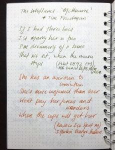
x_a5_pp_post_writing_1x_a5_pp_post_writing_2

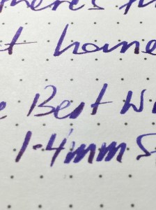
With finer nibs you’ll experience a little tooth on the page (something I prefer, as long as it’s just a little), however I would still describe the overall experience as a smooth one. Wider and wetter nibs only get smoother, with no feathering, show or bleed through the page. I’ve mentioned in the past I can deal with a little bleed or show through, but feathering drives me crazy.

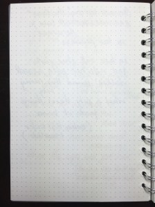
x_a5_pp_post_reverse_pagex_a5_pp_post_stub_macro

Remember I paid three dollars for this notebook.

Of course as with any paper performing in this way, at times there will be issues with dry time if you are powering along, and testing shows typical inks will dry at around the 20-25 second mark, plus or minus 5 seconds or so for wetter or dryer inks. Of course it goes without saying its ability to handle rollerball, gel ink, or your standard ballpoint pens is assured.

This is without doubt some of the best value 80gsm notebook paper going around, and is readily available online or at your local Officeworks store. This post on The Fountain Pen Network would suggest I am not alone in this line of thinking.

Conclusion

Having picked up this X A5 notebook on a whim, when “back to school” shopping at Officeworks with my kids, the hope was it might be a reasonable quality, cheap notebook to have lying around. It turned out to be way more than that.

Of course it won’t replace your Rhodia No. 16, but wow, it’s a heck of a lot closer than you might think, and I’m certainly likely to be back for more. It would indeed be a great option to accompany the purchase of a new Pilot Prera fountain pen if that’s why you entered the store.

Well done Officeworks — extremely well done.


Wiser Web Wednesday

Wiser Web Wednesday – a semi-regular link to posts of interest from around the web, by those far wiser than myself:


Whsky.buzz
Probably not something I’m ever likely to do, however interesting reading nonetheless:

Barrel maturation at home is a good experiment to perform. I’ve done it, and there are entire groups dedicated to this process. Like with any craft, it’s not likely to be successful on your first go, and it will require frequent tastings to see how the product is maturing. There are, however, larger elements at play that are difficult to time and simulate in a home environment.

Introducing concepts such as the barrel as a semi-permeable membrane, and balancing oxidation and oak extraction — this does however serve as a great primer for a lot more reading:
The Challenges Of “Do-it-Yourself” Whisky Maturation


John Scullen
I had the good fortune to see these spaces first hand during an open day at Griffith University’s Nathan Campus last year. They are truly something to behold.

At the time I remember thinking: where would you even start in creating something like this? Now I know:
The high-tech space that will make you see red


Steven Pressfield
Hacking your way through NaNoWriMo does not a writer make, and speaking personally I’ve never had any illusions otherwise. That however, doesn’t stop me having a certain fascination with the process. The first in what I believe will be short series of posts on the concept of theme, this makes fascinating and entertaining reading. It’s pretty important too:

Am I boring you yet? If this is tedious to you, if you feel your eyes glazing over as they might in some soporific graduate seminar, may I suggest that you release all hope or ambition of succeeding (or even having fun) as a writer.

So if you are currently writing, of course you have a theme. Right?
Writing Wednesdays: What is Your Novel About?


AppleInsider
Following up on a previous WWW link to a post on an AppleScript which exported from Evernote to the native Notes app, comes news of upcoming native support within Notes for directly importing .enex (Evernote) files.

Brought to my attention by a friend of the blog (thank you kind sir), it appears the remaining notes I have yet to extract will perhaps find their way that little bit easier:
Apple’s Notes for Mac to support Evernote file imports in OS X 10.11.4


Three Staples
Ha — how about that! Of course you can — and of course Jinnie did:
DIY Blackwing Erasers


Ink & Flour
I remember the first time I tried a Kaweco Liliput I couldn’t believe how small it actually was — yet at the same time how comfortable it was to use. Although not really a contender for me to purchase at the current time, I do find them intriguing and a joy to look at:
An Unlikely Love, the Kaweco Liliput Brass Wave


Pen Pursuit
I love my Sailor Sapporo, and it is one of only a few pens I use posted, providing perfect balance to the overall feel of the pen which is quite short in stature.

An intriguing nib, which is similar to one I have on the larger 1911 model and very enjoyable to use:
Sailor Sapporo Zoom Nib Review


Ed Jelley
When writing about my own pens I’ve noted certain grips are a little less, well…grippy. I consider these “seasonal pens” — in the warmer months with a little humidity, my fingers grip a little better, and the issue of less control goes away.

Granted, actually stating I have “seasonal pens” sounds ridiculous when I actually write it — however the increased use of my Lamy Pur over the past month or so can attest to it being a “thing” for me. Perhaps the Lamy Studio might fit a similar categorisation were it in my collection

The super shiny, fingerprint magnet of a grip is incredibly slippery. It makes it hard to hold the pen for long writing sessions, and even then it takes me a few tries to find a comfortable grip where I don’t feel as though I’m going to drop the pen.

A classic, timeless looking pen:
Lamy Studio Platinum Grey 14k Nib Fountain Pen Review


United Inkdom
I like the idea of these meta reviews. Multiple viewpoints and opinions formulating a single, well-considered summary on the subject.

In this case a collaboration between Cult Pens and Kaweco:
Cult Pens mini fountain pen review


Perfect Daily Grind
My coffee roasting is a decidedly analogue affair, right down to recording notes about the roast using a notebook with a pen.

…roasting isn’t easy. Coffee is a complex product, and becoming an excellent roaster will require dedication, practice, and experimentation.

I may not measure things as precisely, nor record as much data, though I certainly enjoy reading about it:
The S-Curve Roast Profile: Exploring Roasting Basics


The Specialty Coffee Chronicle
I’ve included a link to the revised coffee flavour wheel previously — a system looking to provide a more uniform basis for description in tasting.

While imaginative descriptors and flights of fancy are great, sometimes they make communication more difficult.

Although written as a how-to guide, these simple steps also help develop a broader understanding of where both your senses and mind should be heading when applying these principles to taste coffee.

Of course it is also fine by me if you just brew it, drink it and enjoy it:
How to Use the Coffee Taster’s Flavor Wheel in 8 Steps


I Need Coffee
I find it quite interesting to read about traditional:

…parts of Southern India, namely Tamil Nadu and Karnataka, where coffee has been enjoyed for generations. This is the region where, so the story goes, Baba Budan smuggled in his seven coffee beans from Yemen in the 17th century while returning from pilgrimage, beginning the cultivation of coffee in India.

Or emerging coffee culture:

Whether you prefer to sip your traditional kaapi standing at a street café in Karnataka, or take selfies with your friends in a trendy establishment in Mumbai, it seems that coffee culture is here to stay.

If you are the same — here is what’s happening in India:
The New Culture of Coffee in India