Wiser Web Wednesday

Wiser Web Wednesday – a semi-regular link to posts of interest from around the web, by those far wiser than myself:


512 Pixels
This time of year there is much ado about the Atlanta Pen Show, and of course The Pen Addict podcast community as an ever-increasing subset of attendees. Although I cannot see myself ever getting over there, I’ll chip in for the Live Podcast Video while each year it continues to run on Kickstarter.

I like the challenges presented by producing a live podcast. The tech requirements are different, as is the environment. The Pen Addict community is amazing, and it’s always fun to do something new and exciting with them.

Here Relay FM co-founder Stephen Hackett with a little of what goes on behind setting and recording the live show:
Behind the Scenes at The Pen Addict 200


The Pencilcase Blog
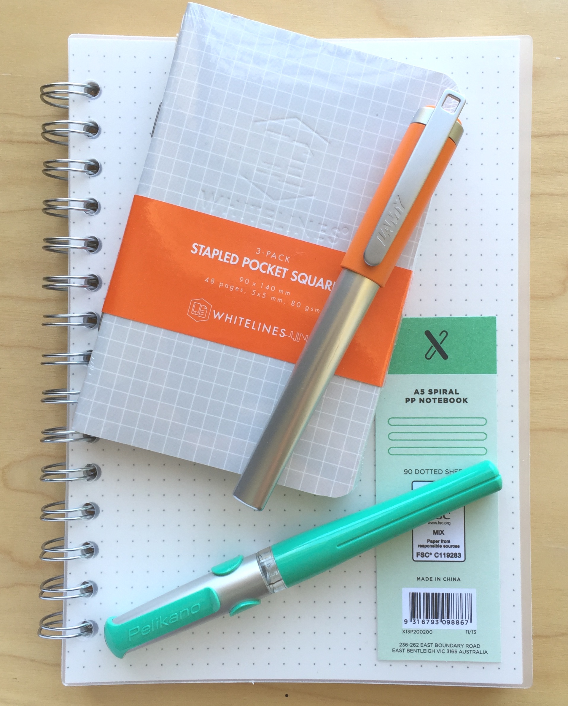
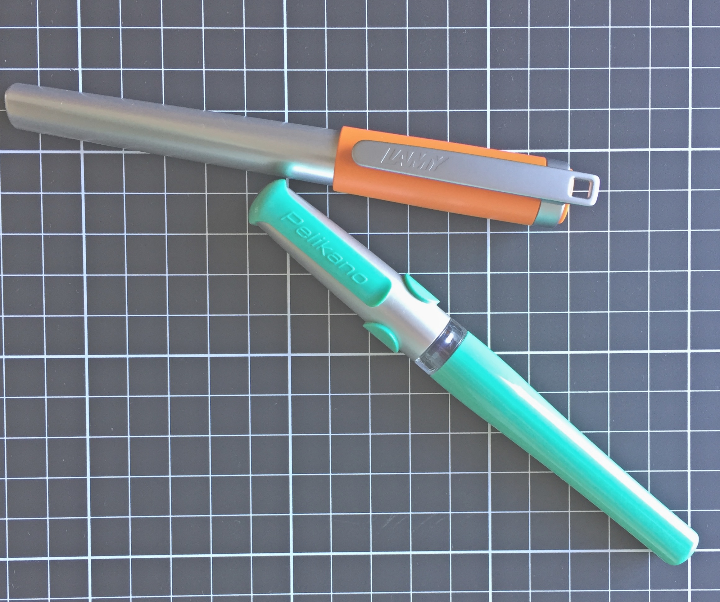
Pocket-sized pens do hold some allure for me, as I’m often walking from office to writing spot (read:cafe) with a pen in my pocket.

Of course having a demonstrator pen eyedroppered is awesome, but the folks over at FC went beyond that, and added a custom, rough finish to the inside of the barrel and cap. This texture adds a lot of visual interest to the pen, with ink sloshing around inside, that gets stuck on the texture.

There is even more allure with a pen that looks like this one. A great review, and also check out the associated giveaway:
Franklin-Christoph Pocket 40 Review


Peaceable Writer
I still find Patrick Ng’s Chronodex system to be one of the more attractive ways of managing time and tasks in an analogue system.

After trying it a few years ago, I couldn’t quite make it stick. That may have had something to do with me drawing freehand the graphical dial at the heart of the system on occasions when I ran out of printed templates.

There were some areas of Patrick’s Daily Scheduler that didn’t resonate for me, and so I, uh, took them out.

As described here, probably a little modification of the template is perhaps as far as one should go with any “mods”:
Tale of a Vandal Notebook User: More #Chronodex


The Clicky Post
I must admit some of my favourite posts are those celebrating some of the cheaper options in this hobby of ours.

Whilst it may seem that the only writing instruments I use are fancy fountain or machined barreled pens, I actually use my fair share of your normal, everyday, “over-the-counter” pens for much of my general writing and note taking

I’m with Mike. Despite the blog posts and Instagram feeds full of fountain pens, fancy nibs and inks – I’m sure a lot of gel, felt tip and “roller-balling” goes on in the day-to-day of many:
Inexpensive Pens That I Reach For Often


Dot Cross Dot
After seeing this Indian-manufactured pen reviewed by Ian Hedley on Pens! Paper! Pencils!, I remain no less intrigued upon seeing it again.

The level of craftsmanship involved in making this pen is amazing, the finish looking as good as an Edison even if the design is not as well refined

In keeping with that initial post, more words of praise from this thorough review:
Fosfor Bangalore


Crónicas Estilográficas
A summary of some recent “issues” that have played out, and continue to do so in many ways within the “enthusiast” segment of the pen community.

I have always argued that we, stylophiles, were a small group, economically weak, almost irrelevant in the economic balance of pen makers when compared to the group of occasional pen buyers.

Highlighting what I have often pondered: which is whether — as a community of enthusiasts — the collective weight of the “little guy” has much sway in the thinking of larger companies, given the market afforded them by the volume of casual purchasers.

I also wonder if we will ever really know the answer:
Signs of Change


Macstories
Being fairly entrenched with Spark for iPhone and iPad, and the Gmail web interface on the Mac for my email needs, I’m not inclined to shake things up again. One thing I will say though, for something I spend a bit of time in each day – design is a little more important to me than what the following suggests:

While Airmail’s iPad design won’t win any design awards, its support for iOS 9 technologies is some of the finest on the platform. Alongside integration with Split View for iOS 9 multitasking, Airmail for iPad comes with fantastic keyboard shortcuts which highlight how the app strives to provide desktop-class versatility to its users.

I guess for those looking for the full iOS and OS X suite – it’s now all there:
With Version 1.1 and an iPad App, I’m Switching to Airmail


Finer Things in Tech
David Chartier on the iOS file system:

After working in various forms of customer support, campus laptop rental support, classic computer sales, and ‘friends and family support’ throughout the years, and doing my fair share of people watching in cafes, businesses, and Apple Stores, I believe the file system never actually worked for regular folks who don’t live and breath technology. The Windows and even Mac file systems were something they barely tolerated or, most often, simply avoided by saving everything to the desktop.

I’d agree with the above, and when you read enough tech writing, it’s easy to think every user is at least a little interested, which of course could not be further from the truth:
Apple made the right decision in hiding iOS’s file system, and now we have the tools to make everyone happy


You Tube – USA Network
After initially being a little hesitant about whether I’d enjoy Season 1 of Mr Robot, that was soon resolved after a couple of episodes.

Looking forward to Season 2:
Mr Robot Season Two Trailer


That Inking Feeling
Now headlong into an Olympic year – come the August opening ceremony in Rio, stories such as this will probably be more common than we think.

Some time, some perspective and some travel have reminded me of a few things. If I’m going to define myself as a hockey player – and maybe even as a person – based on whether I’ve played in the Olympics, I’ve realised I’m devaluing myself

So close, yet a champion all the same:
The Story of a Not-Quite Olympian


CRS Coffeelands Blog
After a flurry of writing on the slave labour in Brazil’s coffee industry, it’s nice to see some follow-up.

It won’t be easy.  But thanks to more than 20 years of relentless innovation by leaders in Brazil’s public, private and non-profit sectors, the path to total eradication of slave labor may be shorter there than anywhere else in the world.

Interesting reading in relation to what this all might mean for policy makers, coffee companies and consumers:
Stamping out slavery in Brazil’s coffee sector


Brisbane Times
Firmly in the camp of just because you can doesn’t necessarily mean you should, we have a Sunshine Coast cafe serving coffee made on camel milk.

The milk is very accessible and because it is a tourism area near the Australia Zoo we have people interested in camel milk

Yes… of course they are. So – for your $14.50 — I guess only one question remains: One hump or two?
Sunshine Coast cafe serving up camel milk coffees


Perfect Daily Grind
Sometimes I think the great coffee which comes from many countries is in at least some ways because of the challenges faced in bringing it to the consumer.

Don’t get me wrong, great coffee is great coffee — and some grown virtually on our doorstep in Papua New Guinea fits that description.

If you could design the perfect country for growing coffee, it would look something like Papua New Guinea. With its vast mountain ranges, tropical climate, and fertile volcanic soils, it has the ideal mix of environmental factors.

It certainly looks like a tough slog in producing it though:
Poor Roads: Are They the Biggest Issue Facing Papua New Guinea’s Coffee?


Sprudge
With an increasing amount being said on the topic of gender diversity in the coffee industry, this piece I found particularly interesting, given the views on traditional roles and societal norms playing a large part in where things stand today.

Our own gender expectations—and what classifies as public/skilled work, typically classified as male, as opposed to private/service work, typically classified as female—can lead to this sexism problem, e.g. men being expected to have more technical proficiency than women, and women to be better at hospitality.

An interesting read:
Gender & Coffee: Challenging The Status Quo


The Whisky Sponge
Angus MacRaild on perhaps the passing of what made great whisky, well… great. Settle in (with your favourite dram of course) – this one is an interesting read though certainly not a short one.

How connected can you feel to a product when your role in its creation becomes solitary and related to the correctly timed pushing of buttons? There are undoubtedly many good malt whiskies still produced in Scotland but it has become an industry of factories. An industry long divorced from true notions of craft, authenticity or tradition; except in the abstract as instruments of marketing. The very worst aspects of capitalism emerge when it is allowed to unleash the natural hunger of human greed without checks or balance. A vast corporation is a machine in which each individual can contribute but in which so few can regulate. The greed of the whole is greater than the sum of its parts.

Posts on The Whisky Sponge typically bring about a smile or chuckle, however it’s all business this time. In the midst of corporate efficiencies, large-scale production and the dreaded distiller’s yeast, thankfully there appears some remaining hope for greatness again:
Whisky: The Past & The Possible


A Small Tale of Pen Grail

For quite a long time I have been a little uncertain about the “grail” pen thing. No doubt the concept is a valid one — what I am referring to is just how it might relate to my particular thinking on the subject, and perhaps what my grail pen might actually be. Further, given I have often struggled with that very question — whether I even have one at all.

Occasionally I think about the where I might start in search of such a pen, and it is usually when reading others thoughts on the topic. For example, the post published earlier this year by Dr Jonathon Deans at Pen Economics on this very topic, in which a fairly clear conclusion is reached about the author’s grail pen — a pen which subsequently has been added to said author’s collection. Another more recent post by Thomas R Hall on Penucopia, describes the amazing and lengthy process of coming up with the design of, and having manufactured, a custom designed grail pen from scratch.

If you have not done so, I would highly recommend reading both posts, which are quite different in nature, yet together in many ways encapsulate the concept of a grail pen, in that the technical and emotional aspects may carry equal weight — yet we all are no doubt influenced differently by each.

The notion of grail

In times gone by, when the question arose (podcasts, discussions, or blog posts) as to what my grail pen might be, truth be known I could never really come up with an answer.

The first possibility of course is that my journey of discovery in the pen world, though I’ve logged a few miles — has not gone far enough to uncover a suitable candidate. The more I think about the concept though, the more I lean towards a second possible scenario: in the truest sense of what a grail pen means to me — I already own it.

Although most have a good idea of what we are referring to in speaking of a “grail” pen, the online Oxford Dictionary offers two meanings for grail. The first, a reference to the cup or platter used by Christ at the last supper, and a second, more relevant one to the topic at hand:

A thing which is eagerly pursued or sought after

Simple — but accurate. It’s the pen we so very much want, the one that draws us towards it — the one calling our name. The pen we will go to great lengths in seeking out and acquiring — dare we call it a quest?

In considering the grail pen, I wonder what particular criteria need to be fulfilled for inclusion in this much sought after group. Clearly this will (and should) be different for everyone, and any list of check boxes relating simply to pen specific criteria, will likely not be enough — however for some it might.

There is something else. Some other significance, meaning, or purpose. Again you will find evidence of this in both the posts I’ve mentioned above.

For me?

Writing a post like this one can sometimes pose new questions of yourself, or perhaps expose some new realisations. In doing so, my thinking has been clarified somewhat on the notion of a grail pen, and what it represents most clearly to me.

Are there are any pens out there I’ve always wanted or dreamed of owning? One out there calling my name that I simply have to seek out, plan for, and buy? A pen I am constantly coming back to, over and over?

At the current time the answer to those questions is no, however there is one pen which repeatedly springs to mind in considering them.

I still vividly remember the feeling of how badly I needed to have this particular pen. Of repeatedly entering the pen shop and fawning over it in the display case, then going home to come up with a strategy to save and eventually make a purchase. Whether the pen was worth the price1 was never in question.

In some strange twist to all this, the only pen that has ever engendered these sorts of feelings in me is already in my collection. I’ve written a little about it before: my Montblanc Meisterstück Classique. It was a gift from my now wife of 18 years on our wedding day. It was also my very first fountain pen.

To those who would suggest there is a difference between “sentimental value” and “grail pen”, I certainly don’t disagree with you, however prior to having that pen in my hand, let me tell you, it was a quest, and a pretty obsessive one. For a number of years I had wanted a great fountain pen, and it always had to be a Montblanc.

In the many years since, my preferences and experience with fountain pens have certainly evolved, and granted, there are better performing and more attractive pens both “out there” — and for that matter, in my own collection as well. However I know how much it meant to obtain that pen, how much it means to me today, and what it will continue to mean in the future.

Not that I’m saying there will never be another, although at the current time I would still struggle to answer you if asked what pen I might buy were price and availability unlimited. Personally, my search for a grail pen is certainly more Monty Python than spiritual at the current time. That said, the search only needs to go as far as my pen storage drawer to find at least one that I know of.

To those who are yearning for, planning a strategy to acquire, and actively searching for their grail pen, I wish you every success in finding it. I consider myself pretty lucky to conclude in all likelihood I already own mine.


  1. A$435.00 circa 1997 ↩︎

Wiser Web Wednesday

Wiser Web Wednesday – a semi-regular link to posts of interest from around the web, by those far wiser than myself:


The Pen Addict
It was only recently I was thinking I must put my thoughts together on one of the pens which makes me smile every time I use it: the Faber-Castell Ambition – a really great pen.

The model I own is the green variation, here Susan Piggot reviews the Blue Ocean edition for The Pen Addict:
Faber-Castell Ambition Blue Ocean OpArt Fountain Pen: A Review


The Finer Point
I must admit to only occasionally browsing through both the genuine and non-Midori options for housing the Traveller’s Notebook system. No, I don’t use them – however like many, I have a strange fascination with what others are using.

I have two Field Notes memo books in my Raydori, my Midori passport sized clear pocket and my Midori passport sized monthly calendar.

For those who do, this looks like a decent option from a UK-based supplier:
My Life All in One Place Leather Notebook Cover (or the Raydori)


The Gentleman Stationer
Of course it’s all pen show action this week leading up to Atlanta — particularly for readers/writers in and around The Pen Addict podcast community.

Happy hunting to all those attending:
Pen Show Primer, Volume 1: Why Visit a Pen Show?
Pen Show Primer, Volume 2: Getting Ready for a Pen Show


The Well-Appointed Desk
Ana with a review of the Baron Fig Squire pen, and having just received my shipping notice, I’ll soon be in possession of the charcoal version I backed in the Kickstarter campaign.

But in the end, I am really quite pleased. I suspect I will use it regularly. Its aesthetically appealing, comfortable in the hand and allows me plenty of refill options since I’m a great big picky-pants about that. And isn’t that what you want from a good pen? Something that feels good in the hand and writes the way YOU want it to write?

Again, as with other first impressions I’ve read to date, things sound promising — reassuring to note given mine is on its way:
Review: Baron Fig Squire

More from Ana — this time some packing tips on the topic of the moment: pen shows. Probably not surprising a “Fashionable Friday” post relegates the fishing vest to the not-to-pack list:
Fashionable Friday: The Pen Show Edition – The Well-Appointed Desk


Pen Habit
An impressive looking pen with an interesting filling system.

You fill the pen by depressing the metal “arc” protruding from the top of the pen’s barrel. Pressing down on the arc compresses a metal bar inside the pen which in turn compresses the sac. When released, the sac re-expands, sucking ink up into the pen

As noted in the post — I am not entirely sold on the lock collar appearance either, however am not sure what a better alternative might necessarily be as far as material and colour:
Visconti Millennium Arc Moonlight


CBS News
It’s easy to forget the direct effects our coffee habits have on the growers and farmers who produce it.

That cup of coffee — and I’ve seen it — changes the life of those growers. That’s a massive, massive difference. It is one cup of coffee, but it’s changing a life

Out of context quotes like these are often simply seen as hyperbole, however celebrity or otherwise, the means to effect change for the greater good is something to celebrate and support.
​Hugh Jackman: Changing lives, one cup of coffee at a time


Smart Girls Make Coffee
Indeed they do, and there are lots of them. Unfortunately the experiences are not always positive:

I’ve been treated like garbage by male colleagues because they just can’t seem to fathom that I am delegating as a manager, rather than being an emotional woman.

Taylor Browne shares her story of hard-earned success, and it is well worth reading (link via the Barista Hustle Newsletter)
The person, the story and the hard work I knew…


The Singleton Argus
The Australian made Starward Malt Whisky was my favourite among those I received as gifts over Christmas. Although not the double-gold medal winning wine cask matured single malt, it was a mighty enjoyable drop, in no small way attributable to Melbourne’s variable weather according to founder David Vitale.

Our four-seasons-in-a-day is our secret weapon. It creates a richer, mellower whisky in a shorter time frame because those barrels are working so hard every day.”

Apparently, said barrels worked hard enough to get Starward over the line at the recent San Francisco Global Spirits Competition, along with fellow Aussie Four Pillars Gin.

A congratulatory dram is in order:
Victorian whisky Starward strikes gold at Global Spirits Competition


Herald Scotland
Speaking of Aussies, there are probably not many of us with the inclination to buy a Scottish distillery — though I expect the means to do so may have something to do with it as well. One man who did, and had, of course proceeded to buy the Bladnoch distillery in Newton Stewart.

While Pure Scot is hoped to be the distillery’s main volume driver – it currently retails for A$80 (£43) in Australia – Bladnoch single malt will launch in Australia later this year, with the US and UK to follow in 2017

I’ve yet to taste the drink itself, and perhaps the Pure Scot blended might be the way to go while waiting for the Bladnoch single malt to arrive:
Australian yoghurt mogul aims to return Bladnoch distillery to former glories


Macdrifter
A considerable amount of words have been spoken and written about the recent changes to TextExpander – the Mac and iOS app which has now moved to a subscription service model.

Smile has a new business model for TextExpander 6. They call it a subscription model but I’m going to call it app renting. I think of a subscription as a recurring fee for ownership. When I rent, I get an access and usage permission but I get nothing to keep. It’s pedantic and probably wrong but it’s how my mind keeps track of value. They can call it what they want and I can call it what I want. We’re good.

Although quite a long post in its entirety, I think the above quote pretty well sums I up. Various monetisation models within the app-sphere are defined differently and mean different things to different people. The result? Different views on the value of such changes and whether they are worthy of our money. However you may define it – the decision to pay up is yours to make:
TextExpander and App Rental

Further, a possible alternative:

I’ve discovered weaknesses in my systems for shortcut expansion as my collection grows. I just can’t remember all of them. Even worse, accidental triggers eliminate all of the efficiency gains for shortcuts. So, I started using organized lists of snippets and Copied.app is great for this.

Whether or not a full featured worthwhile alternative exists across both the Mac and iOS remains to be seen, however I don’t believe we’ll be short of suggestions:
Copied App for Snippet Management


Macsparky
Though I’ve not had the need to nest any folders in the Apple Notes app to date, as the number grows it will most likely come in handy.

Open Apple Notes on your Mac and simply drag an existing folder on top of another. That adds a disclosure triangle to the folder and placed the moved folder inside the destination folder. Then open up the Apple Notes application on your iPhone or iPad and give it a second to synchronize and you’re good to go.

Glad I have a Mac to do it though (or alternatively, it can be done by logging into iCloud on the web):
Nesting Folders in Apple Notes — MacSparky


Possible Starters: Lamy Nexx and Pelikan Pelikano Fountain Pens

2016-04-09 pelikano_v_nexx_2

Call them what you will: low-end; entry-level; beginner; learners. Perhaps all true, however these two fountain pens are both pretty solid performers in their own right — for any purpose. They may look a little cheap and cheerful, and although not being for every collection certainly have their place, regardless of your level of fountain pen experience.

The Lamy Nexx and Pelikan Pelikano fountain pens can be found in the “Young Writer” and “Kids/World of School” sections on their respective manufacturer’s websites. Although you won’t see any in schools in this country (I am not sure of the current status regarding other schools around the world), the pens are clearly designed for an early or younger generation entry into the world of writing with fountain pens. That said, I’m certainly no whipper snapper, and I’ve enjoyed using these pens increasingly in recent times when gathering my thoughts for this post.

Those of us who use fountain pens on a regular basis are often the ones who introduce another generation into the habit. Would I use either of these pens with that aim? I’m not sure, and there are perhaps other options I may recommend for that purpose, however I can see these two being great options to offer as possibilities — particularly if a few different options were being considered based on the tastes of the prospective user.

Forced to choose either the Pelikano or the Nexx? A somewhat challenging question, and the answer surprised me a little, though as you’d expect, the ideal pen when comparing two or more generally produces a Frankenstein result — that is, a combination of the best aspects of each. Of course in the absence of that being possible, read on and my final choice will become clear, but really — either of these pens wouldn’t disappoint in their target market.

Look and feel

A point to note here: the current models of both pens have undergone a cosmetic makeover compared with what you see in the photos, which are the pens from my own collection. As far as I can tell, all other aspects of the specifications are essentially the same.

It’s probably in the “feel” more than the “look” that I was most surprised as I used both pens on a more regular basis. I have mentioned in the past I am not a huge fan of the traditional Lamy triangular grip section found on the Safari and AL-Star ranges.

2016-04-09 pelikano_v_nexx_7

Upon uncapping the Lamy Nexx, the first thing I see is another triangular section, this time covered in a rubberised, cushioned coating — somewhat reminiscent of the grip guides of similar material often slipped onto to pens and pencils for younger users. Despite this, I found the section on the Nexx to be far more comfortable to write with than the Safari in my collection. I don’t really have a valid reason for this given the sections are both quite similar in size and shape — the only difference being the rubber coating on the Nexx.

According to Lamy:

The LAMY nexx fountain pen has a soft non-slip grip which makes for extended fatigue-free writing. Its polished stainless steel nib makes writing super easy

All I can really put it down to is the fact that the rubberised overlay softens the edges a little, creating a slightly “rounder” and well… softer feel than the plastic of the Safari.

I would say however the junction of the section and nib looks a little untidy, with the increased diameter of the “stops” on the grip meeting the black plastic collar around the nib and feed. It is the same plastic collar which you also see on the Safari and AL-Star ranges, however on the former it is matched to the barrel colour, and the on the latter matches the darker section a little better. Certainly not a big issue here, and only noticeable as I sit here and review the overall look and form of the pen.

2016-04-09 pelikano_v_nexx_1

The top end of the Nexx barrel begins in a distinctly triangular form factor, rounding out as the barrel increases in diameter and moves towards the section, before returning to the triangular form and tapering slightly at the grip. Uncapped, it carries nice clean lines and I quite like the overall look and shape, however as I mentioned, it is perhaps spoiled a little where it meets the feed.

Capped, the Nexx demonstrates a smooth but steady increase in diameter from end to cap, reaching a maximum at the clip ring. This probably fits the overall funky aesthetic of the colourful cap which also contrasts nicely with the silver aluminium finish of the body. The top of the springy clip sits proud of the actual cap, and while it suits the overall form of the pen, the cap and clip “live a little large” for my taste.

The Nexx appears to be going for a fun, funky and cool aesthetic, rather than portraying itself as the “beginner’s” pen. To that end, I’d say Lamy have probably achieved their goal.

The virtually clipless Pelikano, aside from the cap, carries a certain similarity in shape to the Nexx, and again avoids too much of the “beginner” aesthetic, however I believe it does carry just a little more of that style. This time, the end of the barrel begins in square form, before a similar increase in diameter as it rounds out, before tapering into… wwhaaaaat?? A triangular grip section! I must admit it is more trianguar-ish, than triangular, though the similarity to the Nexx is not lost on me.

2016-04-09 pelikano_v_nexx_3

Again the section has a rubberised coating, however in this instance adds little thickness to the grip. Of the three flattened sides to the grip, the index finger third also has rubberised ridges which run perpendicular to the barrel, I assume to assist with grip and guidance of the nib when writing. A couple of things on this: firstly, they are probably not necessary, as the rubberised coating on the section is more than enough for gripping, and though I didn’t find it noticeable — it may annoy some. Secondly, this could also be used as a baseline grip point of reference in someone learning to write (“index finger here”).

This rubberised overlay sits on a clear section, and therefore prevents any decent view of ink colour or level inside the pen. In contrast to the Nexx, with the Pelikano the nib is held by black plastic “shoulders” at each of its sides. In pointing out above the look of the Nexx at the junction of the nib and section, I’m not really sure this one is an improvement. Personal taste plays a factor with any of the pen designs we prefer, and perhaps I’ve made a bigger deal out of it than it really is. I cannot say when I’ve picked up either pen I have even given it a second thought.

Overall, I marginally prefer the Pelikano’s grip section, though it is the centre of the barrel which raises a few questions for me. Both pens increase in diameter through the middle of the barrel, with the Pelikano doing so just a little more in comparison (1.4 mm more at its maximum, as you can see from the specifications below). This throws the comfort of my grip ever so slightly off, and I’ve found I cannot write for extended periods quite as comfortably as I can with the Nexx.

Aesthetically, the styling of the Pelikano is quite different to that of the Nexx, and to be honest I really have no preference here. The cap of the Pelikano reminds me of a helmet on the Lego Knights I used to have as a child — if you had them you know what I mean. While I enjoyed playing with those knights, I prefer the design as a helmet rather than a pen cap.

I’ve described it as “virtually clipless” above as the moulded plastic forms part of an exoskeleton or … yes, there it is: “helmet” over the cap. This forms a sort of pseudo-clip, however the functional section is very short, and I’d hesitate to use it regularly, being reasonably fearful it might snap as the plastic fatigues through repeated bending.

Although both pens are not what you’d call expensive — both feel sturdy enough to stand up to the usual level of wear and tear. The aluminium barrel of the Nexx may provide a little extra reassurance in this area, however with even a little care in the daily use and carry of, I doubt you’d have trouble with either.

As I’ve mentioned, the clip extending past the end of the cap on the Nexx may provide a snag point, however again I would not anticipate any major problems.

Specifications

Notwithstanding the cosmetic changes I mentioned earlier, following are the specifications in the current available line up from both manufacturers.

Manufacturer Pelikan Lamy
Model Pelikano Nexx
Body Plastic Aluminium
Cap Plastic Snap On Plastic Snap On
Clip Plastic Metal
Fill Cartridge/Converter Cartridge/Converter
Weight 23 g 31 g
Diameter max 14.5 mm 13.1 mm
Diameter grip 12.5 mm 12.2 mm
Length capped 13.6 cm 13.4 cm
Length uncapped 12.5 cm 12.7 cm
Nib type Steel Steel
Price A$ $26-$30 + int postage $54.95

Check the manufacturer’s websites for colours available.

As far as the price is concerned, Australian supplier LarryPost stocks the Lamy Nexx, at the price quoted above. I have not been able to find a local supplier online for the Pelikano, however this of course does not rule out any local brick and mortar stores perhaps stocking them. Fishpond lists the Pelikan at AUD $39.97, however it does state the pen ships from a UK supplier. The price I have quoted above is a conversion from both Jet Pens in the US and Cult Pens in the UK, however you would need to add international postage costs to these of course.

Also worth mentioning is the option of a left-handed nib on the Pelikano, as well as the slightly cheaper Pelikano Junior model.

As far as filling is concerned, I have been using the Nexx with a Lamy Z24 converter (with no issues), and the Pelikan with standard international cartridges, noting the recommended converter here is the C499 from Pelikan.

Writing Performance

I’ve had these pens for about 6 months or so now, intermittently using them in my rotation of pens, and have written more extensively with each over the past few weeks taking notes for this post.

As far as the nibs are concerned, I’ve been happy with both. The stainless steel medium nibs are smooth writers, with the Pelikano having a slightly softer feel in terms of a little give, however there also appears to be a marginally smaller sweet spot than what exists on the Nexx — at least with this particular pen anyway. Overall, both nibs have that firm, steel nib feel — one that I quite like and is not meant as a criticism in any way.

2016-04-09 pelikano_v_nexx_5

The Nexx comes as expected out of the box — the same Lamy nib you’d find in a Safari: firm, reliable and consistent. I say consistent because in mentioning the Pelican’s sweet-spot, the Lamy nib performs well at all points of minor grip and alignment adjustment — however when compared line for line, doesn’t quite match the smoothness and comfort of the Pelikano.

Both lay down a consistent, wet line, and with a little pressure applied, (despite the softer overall feel of the Pelikan) the Lamy nib will give a slightly broader one, though neither of these pens are what you’d be using for any sort of line variation lettering.

2016-04-09 pelikano_v_nexx_6

Overall, as far as the nibs go, points to the Pelikano, as it is a much smoother and more comfortable nib to be using for writing, and the sweet-spot is really not hard to find and then sit comfortably in like your favourite lounge chair.

Both pens I have used without posting the cap, however if you were to do so, the Pelikano retains its overall balance more so than the Nexx, which becomes very top-heavy and cumbersome.

Both pens handle a variety of paper types equally well, which is probably important given what they might be used for, and I’ve not found either wanting on the first stroke when uncapped, nor with extended periods uncapped, for example in writing intermittent notes while researching online and the like.

Only young writer?

Indeed, the young writer aspect of these pens is not to be dismissed, however I don’t believe either necessarily perform this role any better than the Pilot Kakuno, which is far cheaper to buy. The Kakuno also sports the triangular grip section, however the overall balance and feel make it — in my opinion at least — a better buy for this segment of the market.

2016-04-09 pelikano_v_nexx_4

Do either of these pens appeal to the non-young or non-early writers? That of course is a matter of personal opinion. As I’ve hinted at above, I think the Nexx is more likely to fulfil a more universal role across beginner and more experienced users alike, whereas the Pelikano based on looks alone I feel is perhaps relegated to the beginners end of the market.

Given its bright and funky sort of look, the Nexx to me is a pen you might use with a clipboard or reporter style notebook: marking off attendees at a summer camp, scoring a tennis match or perhaps even recording your backyard coffee roasting data — assuming suitable paper was in use of course. At then end of the day, if a pen (which both are), are solid performers, it really is down to personal taste, and that is really where we end up here.

Conclusion

In summing up, both of these pens are pleasant to use and perform as intended. If I had to choose one? Probably the Nexx, simply because I find the overall shape of the body a little more comfortable to use than the Pelikano, which becomes a little too broad in the middle for my grip.

The Frankenstein result if I could? The Pelikano nib in the Nexx body with a smaller version of the Nexx cap and clip. Because that isn’t going to happen any time soon, I’d go with the Nexx simply because of the Lamy nib options you have at your disposal, though with a pen like this, I’d assume you’d have be looking for something specific, otherwise a Safari might be a better choice — particularly at a slightly lower price point.

In any event, either the Lamy Nexx or Pelikan Pelikano won’t fail you as a notetaker, however for the “young writer” I am most likely sticking with the Pilot Kakuno as my go to recommendation.


Wiser Web Wednesday

Wiser Web Wednesday – a semi-regular link to posts of interest from around the web, by those far wiser than myself:


Daily Coffee News
As suggested in this post, coffee batch brewing has evolved in many areas with the possible exception of reinventing the actual brewing process itself. Whether or not it needs reinventing is perhaps another matter, however the Ground Control brewer by Voga Coffee is aiming to do precisely that.

Every time you eliminate all the water from the grounds, you establish a new solid-liquid phase partition equilibrium. In advanced chemistry labs, this technique is used to enhance extraction efficiency. This addition of new, fresh solvent to dried grounds essentially ‘re-starts’ the extraction, putting you at the beginning of the extraction curve. You can get at all the flavor you left behind in the prior brew cycles, but also remove all the brewed coffee from the grounds before it ever gets to the point of the extraction curve where bitter tannins are significantly pulled out.

An interesting approach, and as always, the proof will in the cup:
Voga Coffee Readies Ground Control, a Reinvention of Commercial Batch Brewing

Also from Daily Coffee News

This new release grinder from Baratza only needs to work as well as their reputation and grinders which precede it to be a hit.

To this point, conical burr grinders have always functioned with a stationary outer ring burr and a rotating conical inner burr. The Etzinger Mechanism works oppositely. The inner burr is stationary, and the ring burr spins around it, driven by a proprietary direct gear-drive system Baratza has licensed from another Swiss company and tested for strength and durability

A beautiful looking machine indeed:
Baratza Reveals the Sette: One Rotating Ring to Rule Them All


Nick Cho on Medium
There are certainly more and more coffee brewers around these days, with another version appearing (it seems) every other day, be it on Kickstarter or by direct production.

Problem is, when the next new machine comes out, your machine has now been made obsolete because your new machine was good at being new, not good at making coffee.

A sobering thought for the new next big thing:
On designing new coffee equipment


Jim Seven
James Hoffmann with some high level analysis and comment on dark versus light roasting, and the overall philosophies that have developed relating to same in this current “wave”.

My point is that we are scathing to anyone who lets a roast run a little too deep, while utterly forgiving of those who make the opposite mistake. I would like that to change. I believe they are both equal mistakes, both impact the enjoyment of the end cup (though I would argue light roasting is perhaps worse as it seems to discourage consumption more. Also a painful truth: dairy and sugar do little to make a grassy, sour cup of coffee palatable…)

True enough. Even if you enjoy variety and consider all roasts are equal, there are many who consider some are more “equal” than others — a fact likely to be explained for the most part by footnote two in the post:
Lightness and Darkness in Roasting


The Gentleman Stationer
I’d say the following is pretty accurate in the eyes of many who are familiar with both brands of notebooks:

I always think of the Leuchtturm 1917 notebook as the fountain-pen friendly option for those who like the Moleskine aesthetic but hate Moleskine paper.

Leuchtturm is certainly a good place to start when looking for a notebook to handle a far greater variety of inks if you are currently a Moleskine user — assuming you need it to of course. Its only when the search continues you find even more options out there, such as Rhodia and Quo Vadis which Joe mentions in the post — or even this Monokaki Notebook for example.

Wherever you end up, and with so many great colours available, the Leuchtturm 1917 is well worth a run if you haven’t tried one already. A reliable source (me — in store on Monday) tells me you can pick one up for AU$31.99 from your local Dymocks, or the slim version for AU$24.99:
Leuchtturm 1917 A5 Notebook: The Fountain-Pen Friendly Basic Black Notebook

Now is also a good time to remind you Joe’s Newsletter, the Digital Divide is going from strength to strength. The current edition discusses that age-old conundrum of multitasking, in the context of Cal Newport’s theories on “deep work”. Or as I like to call it: focus.

Joe also shares his thoughts on how his analogue tools fit into the mix.


The Fountain Pen Quest
A pen I am certainly unlikely to ever be pulling out and using, though I agree with Ray: what a beauty.

Look at it! It’s said that beauty is in the eyes of the beholder. Well, the Regency Stripe is beautiful in my eyes. While I wouldn’t normally go for something so shiny, this was conservative bling.

Just enough of the shiny, which is held in check by the contrasting black. Perfectly balanced. Love it! A fantastic review by Ray as always:
Review: Sailor Pro Gear Regency Stripe


The Well Appointed Desk
I’m always interested in “sketchbooks” from the perspective of trying them as notebooks, given I’m certainly no “sketcher”. In this post Ana also explains the origins of the 140 gsm “cartridge paper” which I was unaware of before now.

Viewed from the reverse of the writing sample, the only show through was the Pilot Envelope pen and a bit of the panda drawing…

Sounds like an extensive and varied testing process to me:
Review: Seawhite of Brighton A5 Starter Sketchbook


Matt Gemmell
As I’d expect, there are more eloquent turns of phrase here than pretty much anything else you’ll read on productivity and in particular — task management systems.

And I most definitely think that if you’re using something with a load of bells and whistles that you never touch, it’s a red flag. There’s a cognitive load there, and I bet it’s a bit ego-depleting too. Like you’re playing at being an adult, and hoping no-one notices. I like simple things that I can use elementally and idiosyncratically.

Although I’ve switched over from OmniFocus to 2Do fairly recently, part of that process also involved asking myself whether or not I just needed a list rather than a task management system. I went with 2Do and it’s working well for me.

A compelling argument here though for changing your philosophy and approach — if this resonates with your thinking:
Power Unused

In addition, Matt has just re-released his 5000 word e-book: Writing in Markdown, which is well worth checking out if you already do, or are perhaps considering that format for your writing.


Lauren Gemmell
For peak technology awareness and analysis, you needn’t go past the Gemmell household. Here Lauren Gemmell comments on a recent episode of television’s The Good Wife, shown here in Australia on Channel 10.

We all like to think of technology being clean and separate from these human concerns, however the problem with technology is humans.

The piece also mentions diversity in technology, something very relevant to us all.

The episode makes a very clear dig at the lack of diversity in technology and how it influences the products that are built and the knock-on consequences in the real world. It is easy to forget but so important for everyone in technology to keep in mind.

The topic of diversity is also making a frequent appearance in my listening and readings around the coffee industry. That’s two out of the three broad topics I generally link to each week, and is no less important in the third.

This point is also not lost on me in looking through the origins and authors of many of today’s — and previous Wiser Web Wednesday posts:
Data Scientists: if you watch one thing this week make it this


Reckoner
If you have a spare $1000 to put down on a Tesla Model 3 electric car, before you do, perhaps check out this comparison by Anthony Agius with the good old Toyota Corolla.

For $60,000 that’s really the domain of a Mercedes A250, BMW 318i, Lexus IS200 or countless other entry level prestige cars I’d normally not give a rats arse about because I can’t justify the extra cost over a more conventional Toyota, Mazda, Kia or Hyundai. But a Tesla, man, I could treat myself and go against every cheapskate bone in my body.

Always an entertaining read, however also a pretty definitive and in-depth look at the potential running costs and possible savings made by owning one of these (eventually) — also, it might run longer between charges than your iPhone:
A Close Look at Tesla’s Model 3 Potential Cost in Australia


Macworld
Jason Snell writing for Macworld, in the context of Apple’s recent 40th birthday. Count me in as one of the late adopters, entering the ecosystem through an iPod and soon after, an iPhone 3Gs.

The Mac was so groundbreaking that it deserves a lot of credit, but the iPhone is a product that has transformed Apple. There are many, many people who never used an Apple product before they bought an iPhone

The above quote carries similar sentiment about the Mac to many who have been Apple users far longer than that:
My life as an Apple guy


Analog Senses
In contrast to the above, comments were made by Apple at the recent product event last month, stating the 600 million PC’s over 5 years old currently still in use was “sad”.

Writing on his blog at Analog Senses, Álvaro Serrano takes that sentiment to task, mostly likely using either his 2008 or 2010 Mac — as mentioned in the post.

Yes we all like new and shiny stuff, but replacing a perfectly working computer just for the sake of owning the latest is a luxury at best, and irresponsible at worst. In any case, there’s absolutely nothing sad about owning your machines long-term, until they reach the end of their useful life.

Certainly food for thought:
Morning Coffee


Fraser Speirs
In putting down my thoughts on making the decision to go with an iPad Air 2 recently, I made a point about the relative merits of the “Pro” accessories, and how they fit (or not) into the overall purchasing decision.

Teaching with, and responsible for the deployment of iPads on a 1:1 basis for a school in Scotland, Fraser Speirs makes a great point about such a decision at scale:

My problem is that, processor performance aside, many of the Pro features just aren’t that important to us. The Pencil support is the biggest one but, if that’s all that really leads us to the Pro, the effective price of getting access to, say 20 Pencils is 20x£79 for the Pencils themselves plus 120x£70 to buy into owning the iPad Pro that supports them. Is access to 20 Apple Pencils in the school really worth nearly £10,000?

Whether its 120 or one — it depends on that all important budget:
Deployment Diary: iPad Pro or iPad Air 2?