Ballyhoo (noun): excited commotion.
Yes, there has certainly been a considerable amount of that recently. However, I guess the real question lies in whether that’s all there is. Rarely do I see a pen and think it would make for a good blog post. The uniball Zento Signature Model was no different. When you get around to writing about the pens you’ve owned (often for many years), it’s very unlikely a consideration of whether you’ll be simply “adding to the hype” needs to be made.
So when it does come up, what do you do? Well, what any self-respecting blogger does: come up with some sort of hype-stoking title and get on with it. The longer (and yes… more infrequently) I do this, the more convinced I become that these aren’t objective reviews. None of them are. They are clearly just opinions, preferences, or more simply: I like it, or I don’t. We perhaps shouldn’t kid ourselves into thinking there is much objectivity here.
Do we really need another post on this pen? No, we don’t, so let’s get to it.
Origins
Strolling the floors of the Itoya stationery store in Ginza (me sounding like that’s a typical Monday…) with a new A5 Orange Plotter and a stack of associated refills, I stumbled across a display of the uniball Zento line of pens. First thought on the Signature model? Oh, that looks cool. Assuming it wouldn’t be too unreasonably priced, I sought a staff member in the hope of purchasing one. Even back then (our family trip to Japan in March 2025), I received polite laughter in response, and a “sold out everywhere” answer.
Only since have I realised the futility of my question that day, and the expectation I might actually find one in stock during the months that followed.
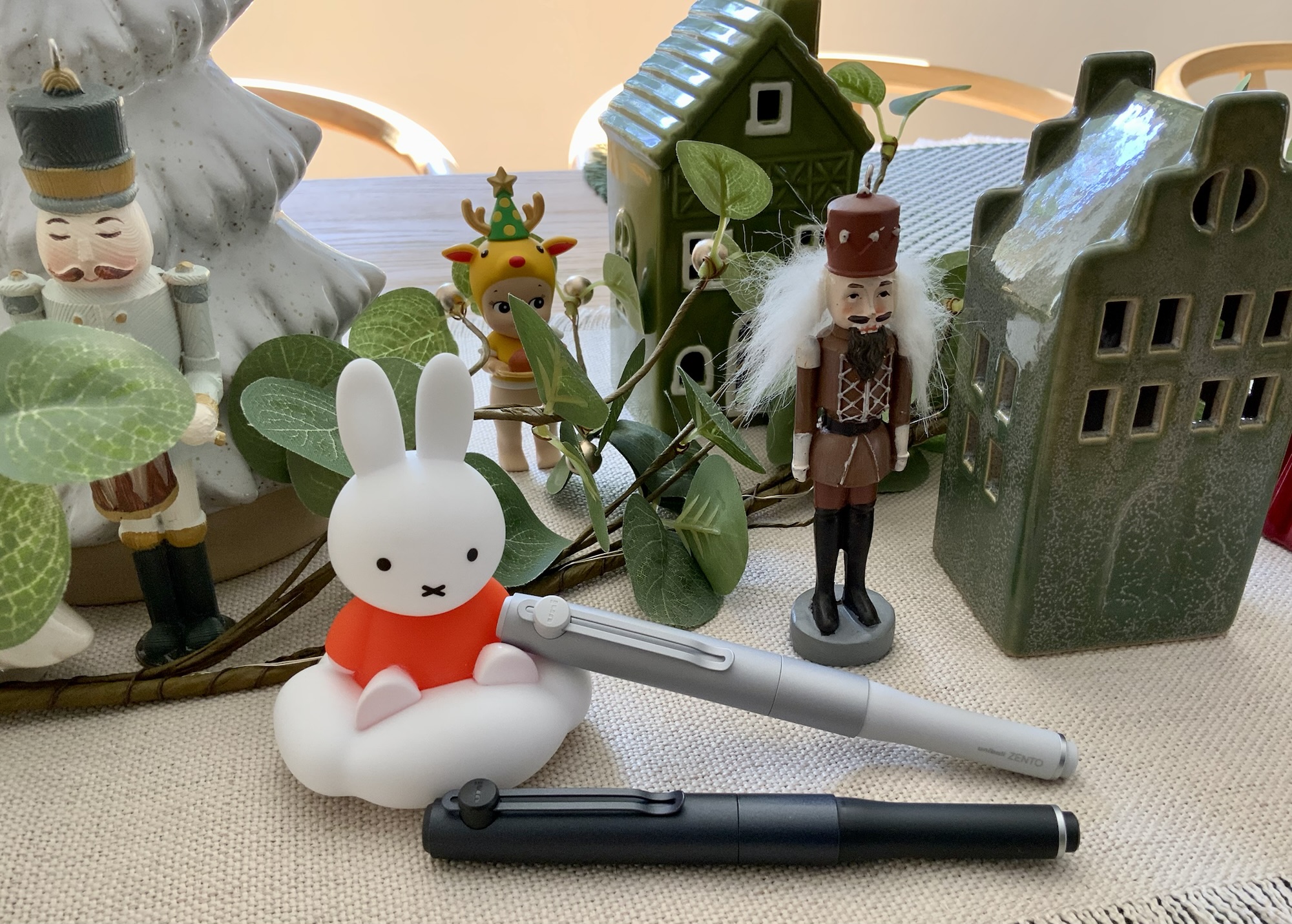
I was fortunate enough to have received the Signature models you see here from a generous friend who tracked them down online, with considerable more nous than myself: I’ll just wait until they’re back in stock (precisely never at my usual retailers for as long as I’d kept checking). So, here’s to great friends that look out for you, for whom I am forever grateful and appreciative.
With a champagne gold colour and 0.7 mm refill size having recently dropped, I’ve not really continued following along to see if availability has improved to any great degree. A cursory glance online suggests it hasn’t.
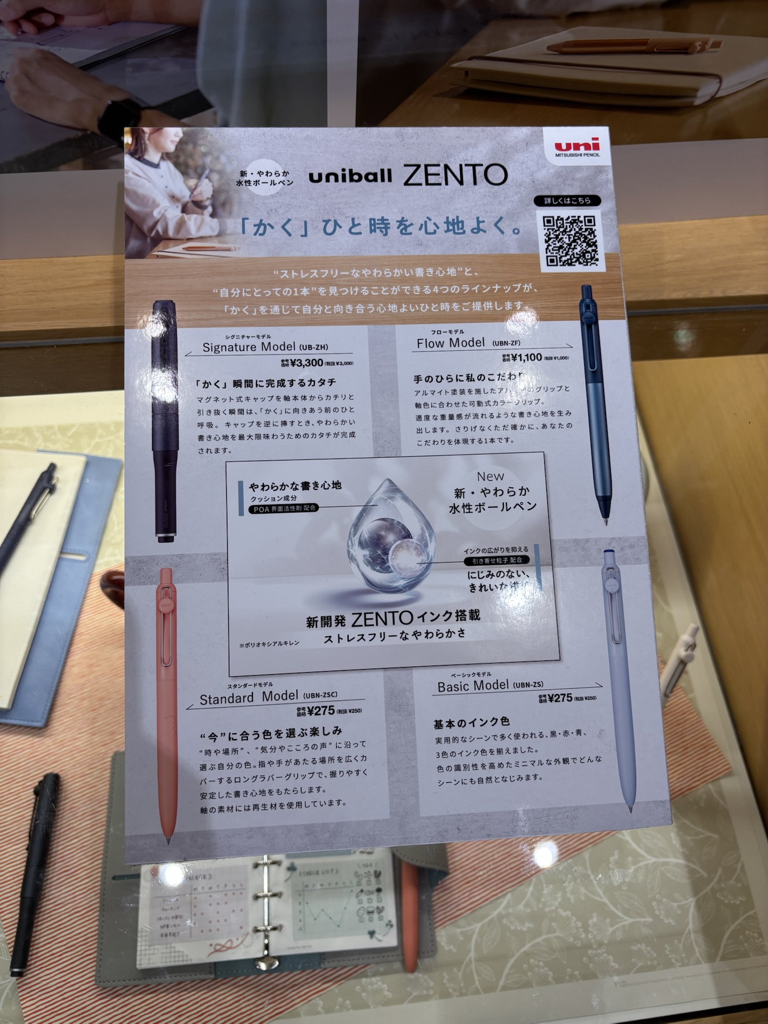
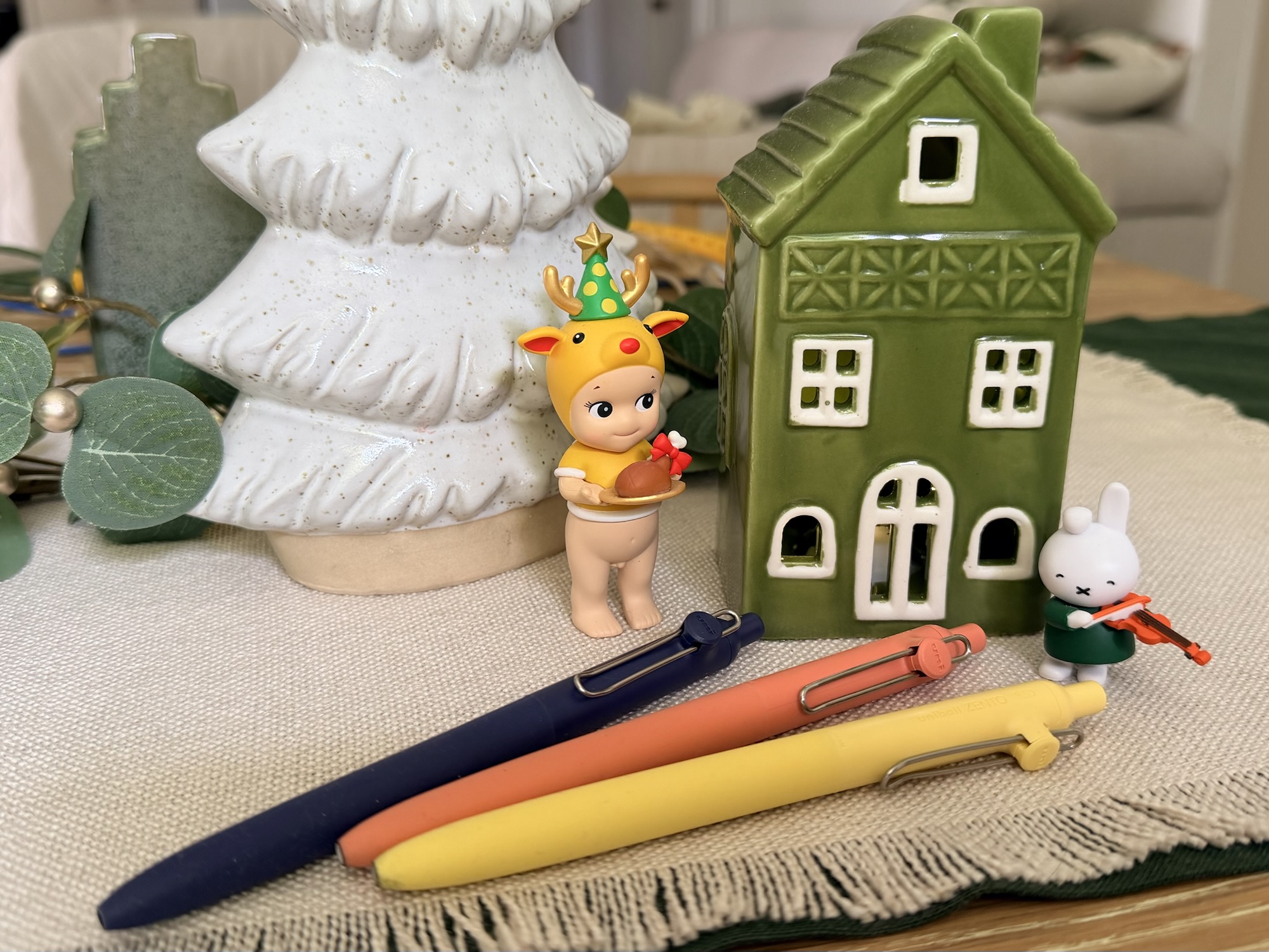
The Design
My “oh that looks cool” thinking on that cold, wet day in Ginza? Probably two things: the compact design (reminiscent of uni’s Kuru Toga Dive mechanical pencil), and the stark contrast to the three other variants in the Zento lineup. Looking at other more “premium” barrel manufacturer variations on gel pens has never really piqued my interest, given the refills are the same as in their plastic siblings: “well… it’ll be heavier…” and that’s about it.
Side by side, the difference between the other variants and the Signature model is of course striking. Different on its own isn’t enough, and I refer to my earlier point. We are either attracted to, intrigued by, or indifferent to any pen design. The Zento Signature? Colour me intrigued at the time, a sentiment amplified by not being able to get my hands on one. All I could do therefore was create some sort of scenario in my mind about its feel, practicality, and overall vibe in the hand.
Upon feeling, toying with, and using the Signature model? Same, better, or worse than the scenario in my mind? Probably about the same. I don’t think I’ve ever had a pen feel exactly as I’d imagined after seeing images or reading about it online. The exception in this case being the refill — I mean, it’s a uni gel refill of some form and was therefore never going to be a big surprise, nor most likely, a disappointment.
The overall length, weight, and balance are usually where any surprises (be they joy or disappointment) lie. Overall, it’s probably a shade lighter than I expected; un-posted, carries just enough length to be usable on a slanted grip (better if held upright); and posted of course is to my hand, a perfect length.
As for balance?
It’s what I’d call very good. In the past, that might rate a perfect though as my pen journey and thoughts have matured over the years, I’ve come to the realisation there probably isn’t an objectively perfect balance to any pen out there. Particularly as your preferred grip will likely be a degree/millimetre or two (dozen) different to mine. You hold your pen upright and print. I mostly am a 45-degree pen to paper hold, and write in some weird print/cursive hybrid of my own making. Who’s right? Well, you are, of course — but then again, so am I — which is precisely the point.
Given the magnets work perfectly to both cap the pen closed and post it for writing, I’d assume posted is the form of use the manufacturer intended. I’m pleased it does either pretty well, and as a long time non-poster of caps, I almost exclusively post the Zento cap when I use it.
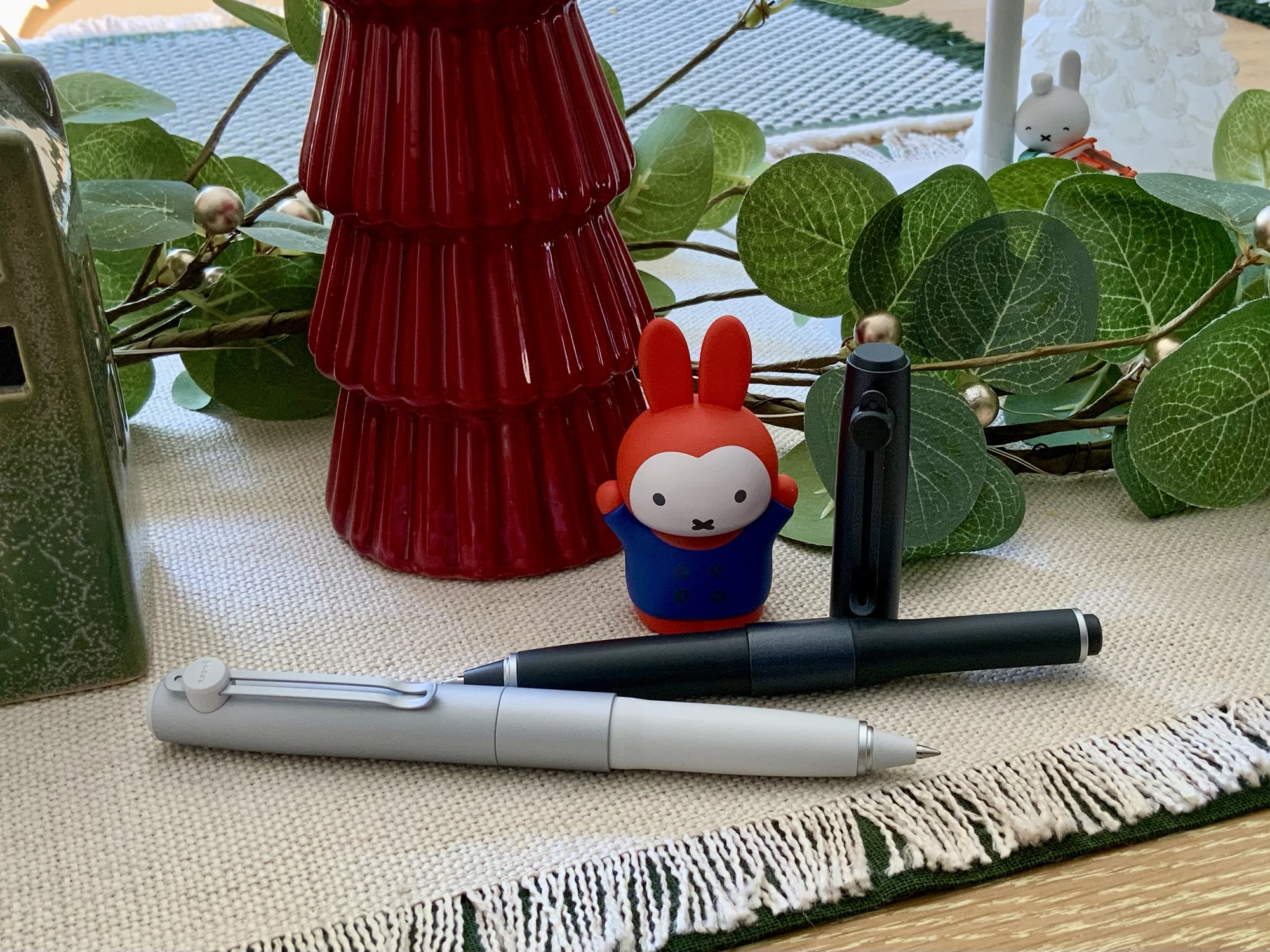
Speaking of the cap, the clip which adorns it is very much a fixed proposition compared with the spring-loaded hinging mechanism on the cheaper models. I don’t find it to be an issue, however have noticed the difference occasionally when clipping over a few pages of paper or notebook cover. Aesthetically, I guess it does suit the design of the Signature model a little better, and the “fidgetability” you lose from the springy clip is more than made up for by the magnetic cap closure.
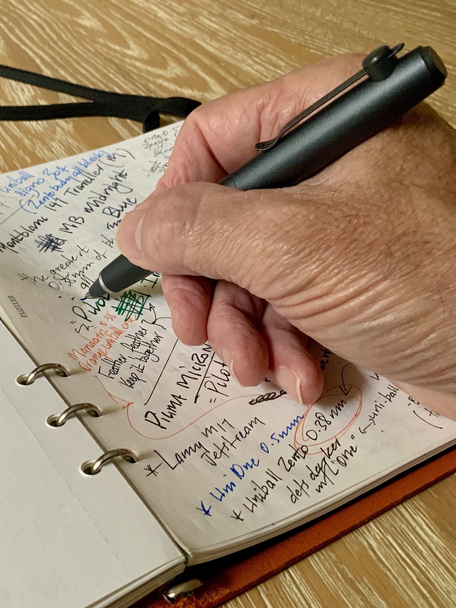
The Refill
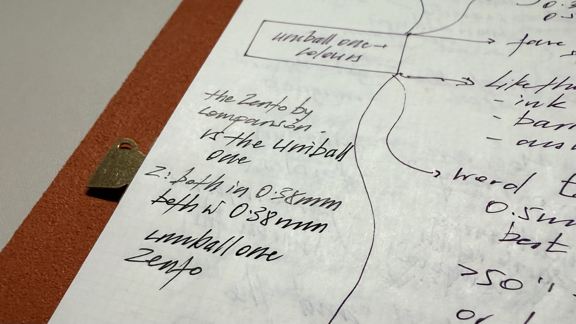
Another hype-first hook here might be to lead with: here is where things get interesting… But to be honest, they don’t. They really don’t. It’s another solid liquid gel-based refill, which I find ever so slightly less enticing than the uniball one refills I’ve been using a lot since that same trip to Japan. Though if I’m honest, sometimes I can’t really decide which I prefer.
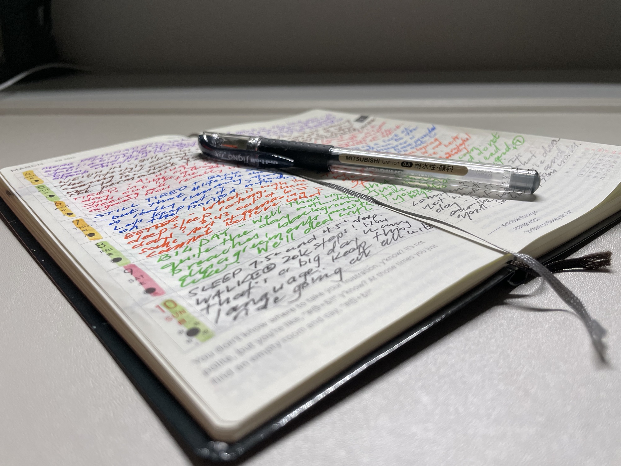
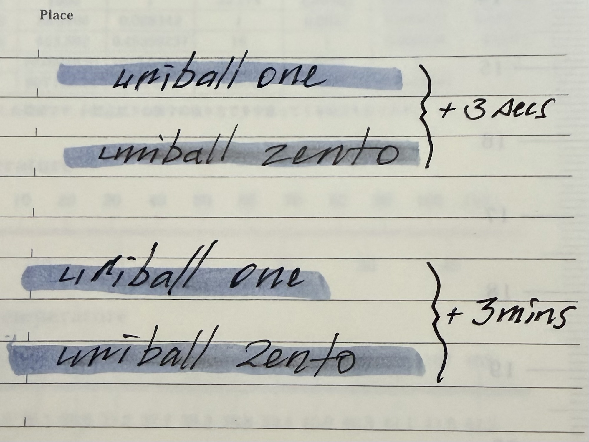
I simply find the uniball one refill a somewhat deeper, darker, more fulsome line at the same tip size as the Zento. In considering how to somehow get this on an image, I think the most striking difference I’ve noticed is when both are subject to an angled view under light. It’s pretty clear the one ink formulation provides a much deeper and darker line. When viewed directly overhead, the difference is pretty negligible, and perhaps why for the most part, I’m happy using either.
So, both great, just a little different to one another. Given the options in the Zento line up, I don’t really see much of a problem in recommending a try before you buy (the Signature model) approach. I mean, no-one is buying the top-tier pen to try out the refill, are they?
Conversely, go crazy and buy the Signature model straight up, in the knowledge the uniball one refills will slot straight in there if that’s what you prefer. Or failing that, a Signo 207 or 307 for example (great office workhorse — ask me how I know). Anyone still reading this is most likely a refill swapper anyway, and while I haven’t sought an exhaustive list, you get where this is headed. I doubt you couldn’t find something to your liking that would fit.
Reddit tells you many things, however in considering what might work compatibility-wise, Jet Pens’ list of compatible pens for the Zento refill surely also works in reverse.
Finally, if you are a highlighter, the Zento ink will streak ever so slightly when you go over it. Whether the ink has had time to dry seems to make no difference. I typically use Zebra Mildliners to highlight with, and even after several minutes of dry time, it will reinvigorate the Zento ink and streak things just a little. Not so the uniball one formulation.
In conclusion
Whether you are part of this whole hyped up Zento world, or perhaps desperately seeking to join it, on the whole the Zento Signature model is indeed a great pen. I love using it and often reach for it when on calls for both note taking and general fidgeting (the size and magnetic cap closure being very well suited to such a practice).
As with anything though — a mismatch of supply and demand inevitably results in one thing: hype. I’m also the first to argue that rarely does anything live up to hype generated solely by supply and demand, and the Zento Signature is no different. Sure, also easy for me to say with two of them sitting on my desk, however do we have an answer to the title of this post? Most definitely.
The Zento Signature hype? It’s pure ballyhoo — all of it. As much as we get nerdy and love our stationery… it’s just another pen. If I made a pretty good pen with an interesting design, I’d continue to control supply as well (whether uni are doing that or they simply cannot make them fast enough, I haven’t a clue).
Beyond the hype and just the pen? It’s brilliant: a fantastic, appealing design that is infinitely fidgetable; pocketable, yet expands to be a comfortable writer; and a great refill, even if others might suit you better.
So, answering my post-title question: it’s both. You just need to separate the pen from the hype, but unfortunately, it’s the ballyhoo that might make it difficult to get your hands on just the pen.
All I would say in wrapping this up, is that the Zento Signature model is worth whatever you’re prepared to pay for it. But of course that applies to everything. Me? I certainly cannot recommend paying above standard retail. Anything more than that and the ballyhoo wins, which is hardly what the Signature model is all about, yet unfortunately is what defines it at the moment.