Much of what I see online through blog posts, forums and social media forms my initial opinion on a pen, however sometimes I wonder why the reality differs to such a great degree upon having it in my hand. There are of course many times where my perception and the reality are entirely congruous, yet this was certainly not the case with the subject of this post — the Pilot Prera fountain pen.
Maybe it was because I haven’t seen a lot of Prera reviews, or perhaps I simply wanted it to be a certain way. In the end, it was simply an erroneous assumption on my part.
What exactly am I talking about here? Well, although pen dimensions are readily available on just about any retail site you care to visit, I had not realised just how small the Prera line of fountain pens are.
The pen you see in this post was passed on to me by a kind reader downsizing his pen collection, after some email correspondence from myself which mentioned I was thinking of buying one. I was therefore lucky enough to add this pen to my collection at no cost. Had I proceeded down the path of purchasing one myself and gone through a more detailed research process, I would have likely ruled it out as a pen for me.
The reason? Well, as I have mentioned in other posts, I prefer to use the majority my fountain pens without the cap posted, and of course a smallish pen likely to render posting a necessity has some convincing to do if I’m going to buy it. To finish up this point and get on with some more details, suffice to say I love this pen, and use it often — posted. Go figure.
Look and Feel
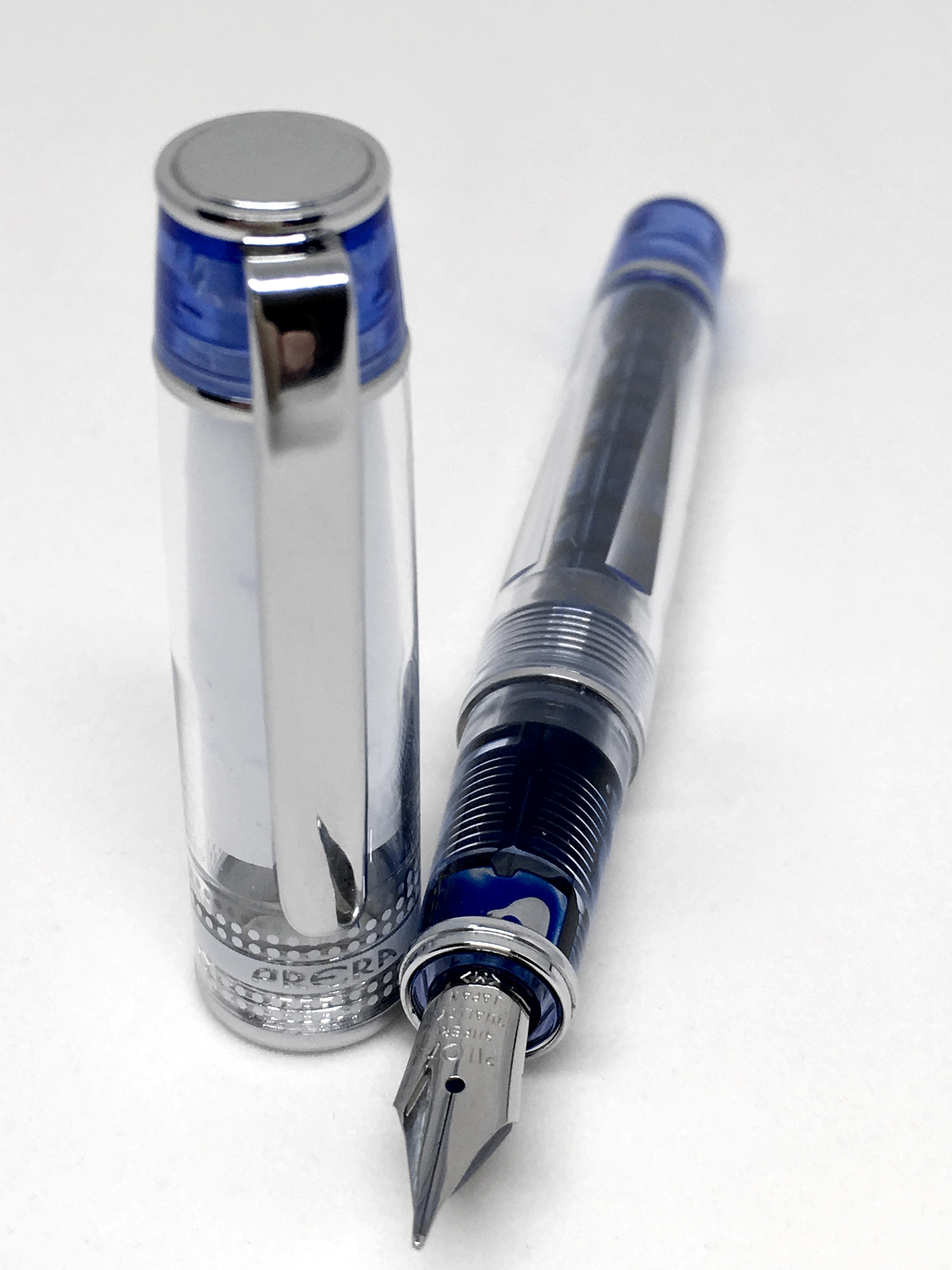
As I’ve mentioned above, the Prera would be classed more so as a “pocket” pen, rather than a “mini” as such, and given its stature, I’d say this is an accurate description. As you’ll see from my post about the Pilot Custom Heritage 92, I do like a pen with blue, silver and transparency in it’s styling.
Given the size of the pen, it’s no surprise the cap and clip are proportionally short. The metal clip is only 40 mm long, which is equivalent in length to the white inner cap sealing the nib, visible through the transparent outer cap. Though not a major issue, it is a pity this prevents the nib being on show through the cap as well.

If you are someone who prefers clean simple lines on a pen, the overall appearance of the Prera may not suit entirely, and I think this is a combination both of design — and indirectly — its size. As you can see, the trim, accents and labelling create what is a fairly “busy” looking cap, and with its short stature, may seem a little cluttered for some. The body itself is somewhat less so, however with the cap posted of course you end up with the same look simply on the other end of the pen (a statement straight from the files of the bleeding obvious if ever there was one). I wouldn’t say this bothers me, however for some it might.
The overall aesthetics of the pen in relation to the distribution of accents at each end, metal bands along both cap and body, and transparent demonstrator barrel provide an interesting, yet not over the top look to the Prera. A great looking steel Pilot nib rounds out the pen, complementing the metal clip and banding nicely.
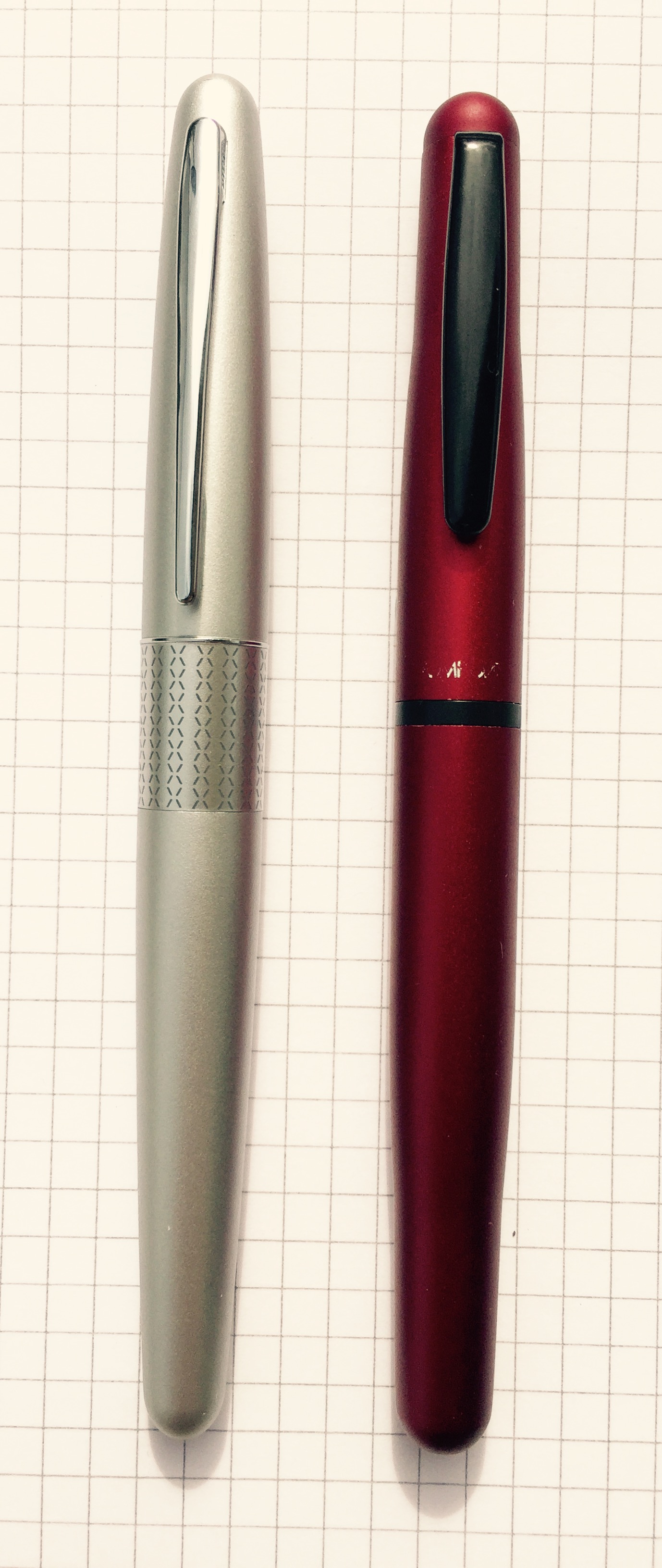
 I must admit I do find the sizing and proportions of the Prera to be a just little odd. I have it sitting next to a Sailor Pro Gear Slim (Sapporo) as I write this, and although the two are very similar in size, the truncated finial at the end of the Prera’s cap throws the proportions a little out of balance. With just a couple of mm more after the end of the clip ring similar the Sailor, the entire pen would look a little more — well…balanced.
That said, a good question to ask at this point is why should all pens look the same — a very valid one for of course they shouldn’t. If we all preferred the same style of pens what a boring world it would be.
Key Specifications
Courtesy Jet Pens
- Manufacturer: Pilot
- Model: Prera
- Weight: 0.6 ounces (17 grams)
- Body Material: Acrylic
- Cap: Snap On
- Clip: Metal
- Diameter Grip: 10.6 mm
- Diameter Max: 12.0 mm
- Filling Mechanism: Converter, Cartridge – Proprietary Pilot
- Grip: Plastic
- Length Capped: 12.0 cm / 4.7 inches
- Length Posted: 13.4 cm / 5.3 inches
- Length Uncapped: 10.8 cm / 4.3 inches
- Nib: Steel
Prices at time of writing:
- JetPens $US38.00 ($AU52.00)
- Cult Pens £33.29 ($AU70.00)
- Engeika $US29.70 ($40.00)
- similar prices to be found with eBay sellers
Writing performance
I made mention in a recent Wiser Web Wednesday post about the positive aspects of a nib that simply writes perfectly (in that case a review of the Pelikan P200 on the Pelikan’s Perch), and does so each and every time you pick it up. I’ve typically found Pilot nibs are generally part of this group.
 It is for this very reason (and the snap on cap), I have found the Prera to be a fantastic day to day office pen1. In a daily writer, I need something reliable (no false starts, skips, ink blobs or leaks), which I can keep capped (to ensure it remains reliable), yet is quick to pick up and use — which pretty well ensures my go-to’s will be caps of the non-threaded variety. As you can imagine, the domain of the Prera, Pilot Metropolitan, and Lamy 2000 (a joyful every day pen if ever there was one). The rotation here also includes an ever-changing roster of gel pens, rollerballs and my trusty P8126 filled Retro 51.
 I don’t really have a great deal more to say specifically about the medium, steel Pilot nib on this Prera, apart from the fact it is a beautiful writer and performs straight out of the blocks every time. As you’d expect, the medium nib is somewhat finer than those on my European pens, and although quite resistant to flex, there is just enough “give” to make it extremely comfortable to use over longer periods.
There is a very small step down to the section from the barrel, however the absence of threads given the snap-on design of the cap ensures a very smooth grip. Personally I feel the surety of the grip is enhanced by this step, as well as providing a feedback point to align your fingers and thumb. I cannot see this being an issue regardless of your preference or grip style.
Whether or not a pen will work for me posted, is of course about balance rather than overall weight, though a very heavy pen will take its toll over a longer writing session. I’d say I have a fairly broad range of pen weights I find comfortable, with only very, very light or overly heavy pens a problem.
The Prera is well weighted at 0.6oz (17 grams), and reasonably well-balanced when posted — a necessity given its size. A point to note here is a good proportion of the weight is distributed fairly high on the pen with the cap posted, given its metal clip, final, and rings. As a result, the centre of gravity seems a little high, so depending on your particular style of grip and pen alignment, is something to keep in mind. In its favour here though is the short overall length, which places most of the pen down in the hand of the user rather than out the top — the main reason I found the Prera quite a useable pen when posted.
A final note on the size and posting brings us back to the Sailor Sapporo I mentioned earlier — a far better balance for me when posted, despite weighing in at 19.7 grams. Ok — time to move on.
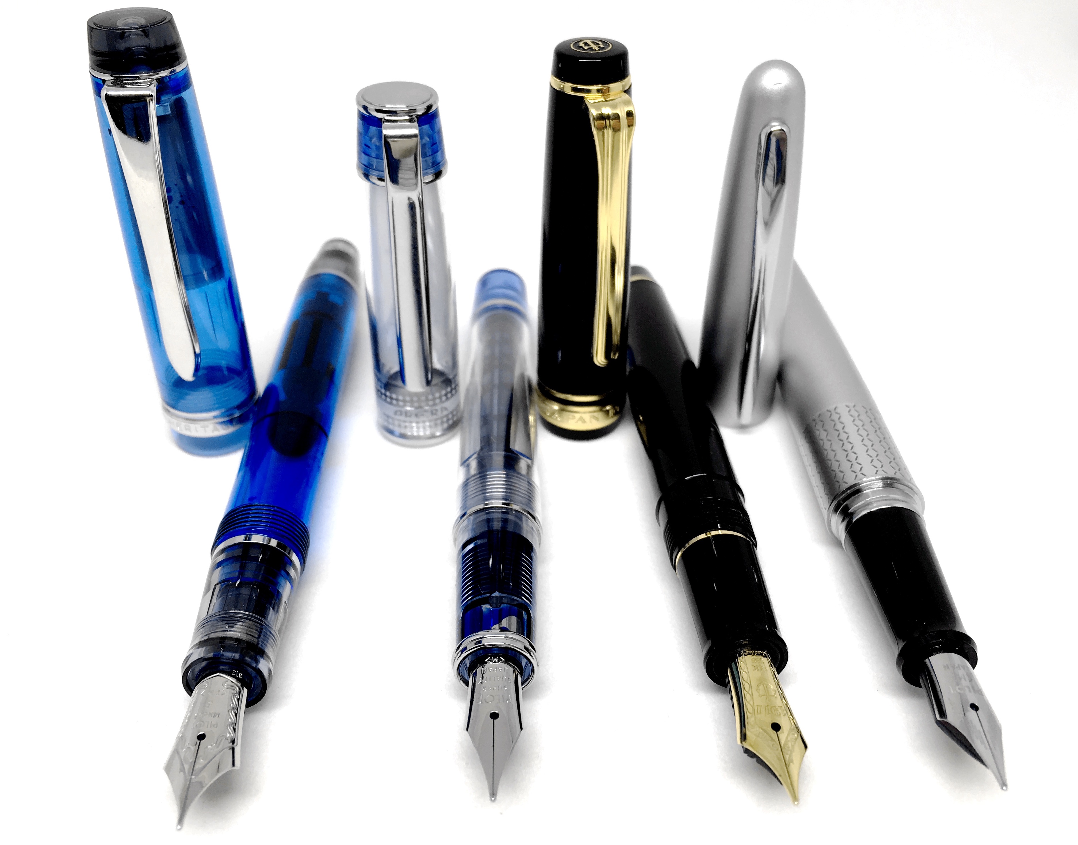
L to R: Pilot Custom Heritage 92; Prera; Sailor Sapporo; Pilot Metropolitan
A couple of days ago I returned to the Pilot Metropolitan (M Nib) after the cartridge in the Prera ran out, and the change was probably a little telling.
Hands down I find the Metropolitan is a far better pen for me, fitting my preference for use without posting the cap, having a nib essentially the equal of the Prera’s, and of course the price. The Metropolitan can be picked up for less than half the cost of the Prera, and for me, is a better overall pen. So if you are looking for value for money without needing to compromise, I think the Metropolitan is definitely the way to go.
Closing thoughts
My advice if you are thinking about picking up a Prera? Know you will be buying a high quality fountain pen — just know it will be on the small side when comparing to many others in your collection, and if you are a strict non-poster, this pen most likely won’t be for you.
As I’ve mentioned above, for me, and I’d argue for many potential buyers, the Pilot Metropolitan is an equally good pen and offers much better value for money. The two pens could not be more different in size and appearance however, and it is your own particular preferences here that the real choice will be made.
Again just remember (note to self) — the Prera is on the small side.
- The paper? At my desk unusually enough are the standard A4 bulk buy Staples legal pads. Miraculously they hold all but the wettest, broadest nibs — and certainly all of the pens listed here. ↩︎
Follow @petedenison