A planner and a plan

Image courtesy Bunbougu

Sure, everyone has long moved on from planner season and even the “my year in review” posts are done and dusted, though I guess you cannot say this blog has ever really been at the cutting edge of anything. So here I am talking of my initial foray into planners. Better late than never, I guess. Surely having been into stationery all your life and written this blog for over ten years now, this can’t be an initiation into the world of planners. Can it? Well, ostensibly friends, the answer is yes.

Yes, there were the yearly, very cheap appointment diaries of many years ago, and the Filofax years (loved my brown leather Timberland cover) in between, however since becoming really invested in all things pen and stationery over the past decade, I had largely been a notebook only kind of person. At least until now. Honestly, this makes me both excited and a little nervous all at the same time.

Why now?

Well, it’s not been a great year to be honest, and during the tougher times the tendency for me is to turn inwards and embrace what brings a little joy. Something to turn your mind to when it needs an outlet. I don’t think anyone will be surprised when I say the very topic themes on this blog (pens, coffee, stationery and the like) are generally the things that help me do that.

Viewing a few planner videos on YouTube (and wow, dangerous as that is…), I began to see a slightly different angle on things. Maybe trying to develop my creative side a little? What began attempting a few basic drawings and sketches, morphed into accumulating a few stickers and templates. I also shifted gears a little from my fountain pens back towards a case full of gel pens. Needless to say, both my favourite Brisbane pen store, Pen and Ink, and online Japanese stationery site Bunbougu facilitated this transition nicely.

How it’s going

I’d have to say I’m fairly pleased so far. Sure, I’ve ultimately realised I’m not great with the drawing, nor am I overly creative, but let’s just call it a work-in-progress. An evolution if you will. Some days I give it a run, others are just words-only as they always were, and that’s more than okay.

If you can’t sketch… then stamp. The Everyday Explorers Currently Inked stamp set

The usual crew

Planner season or not, it’s always notebook season… in some form or another. So, at the current time, things are looking like this:

  1. Daily Journal: Black Leuchtturm1917 A5 Hardcover in dot grid (a left over from a second failed Bullet Journal experiment earlier in the year)
  2. Everyday Notebook: new addition outlined below
  3. Novel Writing Notebook: Montblanc #149 lined notebook (sounds grand, though when your last story was 2014’s NaNoWriMo and this is a follow-up — it has been a long time…)
  4. Pure Capture: a mix of 2. above and a Field Notes Pitch Black
  5. Travel Diary: again, that’s integrated with 2. above as well…
  6. 2024 Diary/Planner: the second new addition, further details below

New additions

Traveler’s Notebook – Olive Regular Size

I guess this is where things get a little more interesting — at least in terms of the purpose of this post. In the context of some of that list (numbers 2,4 and 5) above, it perhaps comes as no surprise I have delved into the world of the Traveler’s Notebook system. Having purchased an Olive Regular size Traveler’s Notebook cover in August before a 10-day trip away, it has now also become my everyday notebook of sorts as well. I’m still tinkering with various inserts and thinking about how I might “section off” various aspects of my writing life (travel, commonplace, general note-taking, writing etc) so I’ll say the TN lifestyle is also still a work in progress.

Notebooks and coffee – that theme thread is strong… the pen is a Caran d’Ache + Nespresso 849 ballpoint pen

Things seem to be working well at the moment though, and I have embraced various pockets, clips, and other accessories in my quest for something a little different to my typical standard notebooks of the past. Inserts are your standard dot grid, blank, and grid, though I’ll be adding a lined version soon. The slimmer, taller nature of the regular inserts seems to suit me fairly well, and a 0.5mm gel pen has turned out to be the tool of choice (currently a couple of Uniball Signo DX, however there are quite a few 0.7mm Pentel Energels’ that emerged from the second drawer when this all began).

Behold the results of sending your sister and niece all over Tokyo searching for additions…

The Olive leather on the Traveler’s cover is certainly something to behold, and is already showing a little lived-in wear which looks fantastic, and will no doubt become even better with age. I do have a matching Traveler’s Company pen loop attached, which is 50:50 both useful and annoying, though I think it will stay given its utility. I of course also could not go past Mal’s perfect monogramming for that personal touch — love it.

First comes the creativity…

You can say I’m very much enjoying the change so far.

Hobonichi Weeks 2024 Hardcover Planner

This one I’m a little less sure about. Not because I have any doubts about the planner itself, just what I’ll use it for. I have a few ideas, and they are mainly around the wellness/habit tracking type of area, and I’ve been noting down some ideas over the past month or so.

Then comes the structure…

I seem to have mostly settled on a combination of personal development/self-improvement/wellness journal/health/habit tracker. I lump them all together because I’d like it to be more than a simple tracker, yet terms like “wellness” though valid, give me Instagram snake oil/supplement seller — vibes. Whilst I realise that sweeping generalisation is unfair; I simply cannot comfortably call this anything ”wellness”, and it will be more than simply a healthy habits’ tracker.

So, in the interests of something meaningful and relevant to the task at hand, the working title which has meandered its way into my consciousness: my TG37 Journal. This is simply based upon the writing of James Clear on “tiny gains”, and the “1% better every day providing a 37-fold improvement at year end” theory. We’ll see how things go.

The tracking options are many

For my first foray into Hobonichi land, I went with a cover design by Japanese illustrator Hiroko Kubota, called Another night of falling star sparklers. I was looking for something a little unique and upon seeing a shared birth year with the cover designer, it seemed a pretty good fit.

Something a little unique for the cover design

I think the challenge here will be not overthinking things, though it has indeed been a while since I’ve entertained the structure of a dated planner in my analogue tools. Overall, I’d say I am fairly optimistic though.

Wrapping Up

It can be a little funny putting together a post like this, in that when summarised on a page, what feels like a significant change in reality, perhaps doesn’t sound as grandiose when outlined on a blog. Then again, it isn’t meant to be either. Our interests, plans, and realities take many forms, and how we document this is unique to each of us. Thankfully, we have as many options for tools as there are approaches to doing it.

I hope the finish to your 2023 is a good one, and 2024 is looking promising as well — however you intend to plan, log, track, or document your own journey.

A pen and notebook – 25 years on

Towards the latter part of last year, my beautiful wife and I celebrated our 25th wedding anniversary. As you can imagine there were gifts exchanged, and among them one suitably appropriate for a household (husband?) with an affinity (obsession?) for stationery. Before we get ahead of ourselves, while there is indeed a pen involved in this story, it is not in the “shiny new” way you might be thinking.

In this case, the “shiny new” is a notebook. In recent times I’ve taken to embossed notebooks to mark certain occasions, firstly a 50th birthday, and now the anniversary I’ve mentioned above. In all the excitement, something else quietly slipped by and has just come to me now. Four months later.

You see the bookend which begins this story is indeed a pen, and it was shiny and new quite a few years ago. It hit me just the other day — the pen I received as a wedding gift from my wife is of course also now 25 years old. My first fountain pen. All the way back then. Before the blog. Before any sort of foray into pen nerdery.

The pen

The pen? Well I’ve written about it before, even making the bold suggestion my first fountain pen was actually my grail pen. As pens go it was a fairly ambitious entry into the world of fountain pens. A Montblanc Meisterstuck Classique, in your standard black with gold trim. I don’t see many Montblancs recommended in the best beginner fountain pen lists out there — and for good reason of course.

The fact is though, I loved it then and I love it now. I get it, of course there are plenty of “more appropriate” beginner pens, though whether a more appropriate pen exists to mark the best day of your life? That I’m not so sure, but maybe I’m a little biased. In many ways it also leads directly to the point doesn’t it? These types of purchases are just as emotional as they are technical. Perhaps even more than we think.

The Classique along with another small anniversary getaway project. I probably wouldn’t recommend spending all weekend building the Death Star or the Millennium Falcon…

Little did I know the extent to which that pen would eventually contribute to a deeper dive into pens themselves, the internet of pens, and the genesis of this very blog. To say it developed an ongoing affinity for the brand is probably not too far from the truth either.

I’ve been fortunate enough to acquire a good number of pens since that day, on varying ends of the price spectrum, however there can only be one original, and I’m pleased to have had a certain naivety in the process of acquiring it. There were no apparent choices in size, nib, colour, filling systems or anything else that becomes a consideration the further into the pen world you go. Nope. Of course there were indeed quite a few options, however it was always this one and only this one. Even knowing what I know now about pens, I’ve never felt that pang of: I wish I’d picked a …….. instead.

So how is it fairing after 25 years? Well I’d have to say it’s doing very, very well, and firmly maintains its place in the standard in and out rotation of pens along with the rest of my collection. It’s faultless medium nib has never failed me and has now seen both the wisdom and folly of thousands of words from the mind of its owner, having long forgiven my stumbling first few months of ownership.

How sensible people enjoy the afternoon sun on an anniversary weekend getaway…
…while silly people with pens get a cramp in their hand from holding a phone weirdly for that “perfect shot”

The notebook

And the notebooks? Well, at the current time they remain in the yet to be used category, given I have a few others on the go currently. Their time will come. I say notebooks in plural, as the purchase involved one for each side of this anniversary occasion. I’m not sure what my wife might have planned for hers (the navy if you’re curious), however I’m thinking my black one will be up next as my home desktop notebook. When using an “occasion” notebook, there may be the tendency to designate it for a “special” project or use. The birthday notebook I mentioned above has indeed been assigned the duties of my long form writing project, and there is certainly benefit to that — possibly even from an increased significance or meaning to the notebook itself.

Mind you, I’m here to also sing the praises of getting them into general use as well. The same as my pens. The significance or sentimental value in my mind is not lessened by using them in this way. I’m sure many of you are the same, it’s often by use that the connection is strengthened: the patina on a pen or leather; the change of a page from crisp and blank to crinkled and full; flipping back through bold, colourful, ink filled pages.

…and yes, I emboss on the back cover, preferring a more subtle acknowledgement of the occasion.

Its fairly evident from the images in this post that the notebooks themselves are of the Montblanc variety, and are a little more expensive than your average notebook, however again, the spend doesn’t necessarily equal (or need to) the significance. I’m sure that affinity for the brand I mentioned earlier certainly influences my decisions here, and also further illustrates the myriad of factors which may go into this type of purchase.

In closing

Such a peaceful place

I guess one of the real joys of a pen and stationery habit is that there is always a “list” from which to choose when the time comes for either gifts or gift suggestions. Occasions like birthdays and anniversaries are of course prime candidates to cross something off that list and there will no doubt be a wide budgetary spectrum at play.

In the end it may be something expensive, or not so much, but the value to each of us will be inherent in the occasion it represents. Sometimes that will be a planned purchase for a life “milestone” but might just as easily be simply what you were using when a certain “thing” happened.

However it might occur, that significance will never be lost, regardless of cost, grandeur, or even whether or not it shows up on social media or written in a blog. It might even come to you out of the blue, say, four months past the event it commemorates, and that’s okay.

Just don’t wait four months after the date to remember your actual anniversary. No. Don’t do that.

My way or the cahier

I have more than a few rough notes laying around containing thoughts on the humble cahier (“ka-yey””)style of notebook. Most are written when its new notebook time, and I start thinking about exactly what I might need. I guess the usual pro’s and the con’s type of thing. While far from exhaustive, the following outlines why the humble cahier more often than not fits the bill — at least for me.

As pen people, we all understand the joy of any writing instrument (fountain or otherwise) is inherently tied to the paper we’re using. Despite quality paper coming in many formats, we’ve probably all been in the “I can’t find the exact thing my ridiculously picky pen-nerding soul wants right now” situation more than once. At times like these a default go-to works more often than not, and for me that has long been a cahier of some kind.

While Dictionary.com tells us the cahier (ka-yey, kah-; French ka-yey) is, amongst a couple of other things, a notebook, paperback book, exercise book or journal, most know it simply as something like this:

There have been a few…

Start Here

Although the adage goes something along the lines of any journey begins with a single step — occasionally it’s a stumble. Though perhaps a little harsh, fountain pen users will know what I am talking about here. My first cahier experience? A set of three from Moleskine. I mean, back in those early days of my stationery exploration, that’s what people who cared about such things used wasn’t it? Well, perhaps according to shrewd marketing, airport gift shops and large department stores — however this soon ran contrary to my paper quality sentiment above.

Since those early missteps there have been quite a few more positive experiences. Familiar to many, there have been Clairefontaine, Rollbahn, Rhodia, Baronfig, Milligram, and currently a set from Lamy which I’m finding very pleasant to use. There are no doubt a good few others in my tried-those list which escape me at the current time.

I refuse to even start down the specifications rabbit hole, and with so many unique dimensions around the place these days, there is hardly a cahier “standard” of any sort when it comes to sizing.

To be honest that doesn’t really bother me too much, however the following would be the general description you would find from most sellers – here, the Dymocks bookstore Moleskine product page:

The medium-sized Moleskine Cahier is a beautifully made Moleskine exercise book. It’s a soft-cover notebook with a flexible cardboard cover and visible thread-bound stitching.

…The plain notebook is the perfect art notebook, university notebook or personal journal, with simple mid-sized blank pages. The Kraft notebook has a beautiful, natural-cardboard cover that will appeal to those who love earthy tones.

…perfect for students, designers and creative people who take a lot of notes. Each has 80pp with 16 perforated pages and an expandable inner pocket.

All shapes, sizes and colours…

Whether you are a stickler for specific definitions or not, a cahier to me is a thin, softcover notebook. Having used thread bound, staple bound, A5 (and A5-ish), B5 (and B5-ish), and up to A4 — my definition is fairly broad.

Cah-yay…

So, why this humble notebook?

A simple answer to that question is found in that sublime interaction of paper quality and utility. I’ve always found most manufacturers who produce quality, fountain pen friendly paper, generally have a cahier in their line up alongside the usual hardcover notebooks. So in most cases, there are numerous choices if paper quality lies anywhere within your key criteria. Again, if you are reading this, I assume it probably does, and if your fountain pen performs well on the paper, generally most other pens will too.

As for utility? Well we could just as accurately substitute mobility here. There is a certain lightness about the cahier which a hardcover notebook will never quite match. Here I’m not talking about simply mass in grams — more so the overall footprint. Absolutely, your typical cahier will weigh less than an equivalent hardcover, though beyond that, a cahier is generally unobtrusive in nature. Tucked beside your iPad or laptop walking to a meeting? In and out of a briefcase or back pack? Stacked on a bookshelf or corner of a desk? The cahier is an easy carry, straightforward in and out, and seamless fit for any space.

Ok, so in praise of this jack of all trades — what about compromises? Generally where significant breadth of application is apparent, we tend to sacrifice depth, or quality and performance in a few key areas. To my why of thinking, the question should relate more to fit for purpose than what may be lacking compared with an arbitrary list of criteria. Any criteria need to be yours don’t they? Further, they should indeed be very specific to you.

For me? Paper is a deal breaker, and I’m sure anyone this far into the post thinks exactly the same. As I’ve mentioned though, with the right brands, there aren’t any real compromises required here. The softer, card-stock covers? As long as they prevent the the front and back pages ripping off as it goes in a bag — all good. Further, they allow each half of the notebook to be folded back on itself — perfect for cramped desk spaces or perhaps when you have no desk at all.

While they perhaps don’t look quite as a good as a hardcover on ”my minimalist desk setup” posts, and may get a little scuffed going in and out of a bag, for my own purposes, I cannot really come up with any significant negatives.

Well that’s me. You? It may be all, all wrong, so thank heavens for the choices we have in this stationery caper, and as usual, that’s why we’re so often invested in the search.

Restocking – a trip to Bookbinders

Although I’ve posted an image to Instagram from yesterday’s visit to the Bookbinders store on Brisbane’s Northside, readers of the blog and my social media following are not one and the same, so I thought I’d share a couple of things in a brief post.

img_7934

It was my second visit to the actual store itself — such a wonderful, calming space amid the chaos of rainy Friday afternoon traffic. The Bookbinders team do a fantastic job, stocking great products and provide outstanding customer service. It was great to hear business is strong, with foot traffic continuing to increase at the store itself.

It is definitely worth a visit if you have yet to do so, and of course if you already have, you don’t need me to encourage you to return — I’m sure that is inevitable.

Though it wasn’t a big haul by any stretch, the few key items on my list were ticked off.

Coffee drinking and roasting logs

I’ve written in a recent post about my thoughts and plans for recording my coffee roasting data, and the main reason for the visit was to pick up the new 33 Roasts log from the 33 Books series.

My only concern (immediately alleviated upon closer inspection) was whether the log contained units in degrees celsius as well as Fahrenheit (being a US publication). All good to go here, with units in celsius appearing on the R hand axis of the roast graph. Key details from each of my roasts will end up in a spreadsheet, and the entire notebook contents scanned, indexed and saved for safe keeping and easy search (perhaps a post for another day).

img_7935

A few drops of coffee in the ink is a nice touch

My coffee drinking habits? Well why not 33 Log those as well? When out, I use a modified version of this Day One / Launch Center Pro template (also available as Workflow app action if that is your preference) to rate the beverages cafes serve me, however when at home I’d like to record a little more often in relation to drinking what I’ve roasted myself. The 33 Cups of Coffee log seems like a good way to go here.

Upon completion, these will also be scanned, and I’m thinking perhaps the 4 and 5 star rated cups are worthy of indexing for future reference. I’ll give that one a little more thought.


Writing

img_7938

Though 40 pages less, a considerable reduction in paper weight from the Life Symphony to the Monokaki

One of the most pleasing aspects of visiting the store was seeing the healthy stock of Monokaki notebooks, which still remain my all-time favourite. Previous posts about those? Yes — here and here if you are interested. Having passed my 50% rule (that is, of usage in my current notebook before searching for another), it wasn’t a hard choice as to what I’d pick up next.

The masuya paper contained therein is a perfect mash-up of Tomoe River-like weight with a little more tooth to the nib. Just the way I like it. In order to share my fondness, some of that very paper will also be going out in handwritten correspondence from the Yuga Letter Pad I picked up as well.

Signing off

Given this was never intended to be a lengthy post, in closing, I think we are very lucky to have the Bookbinders team not only based in Brisbane, but having a brick and mortar presence as well. They are wonderful people with a passion for the industry — something well worth supporting as a consumer.

Happy writing, roasting and drinking.

Life Symphony A5 Spiral Bound Notebook

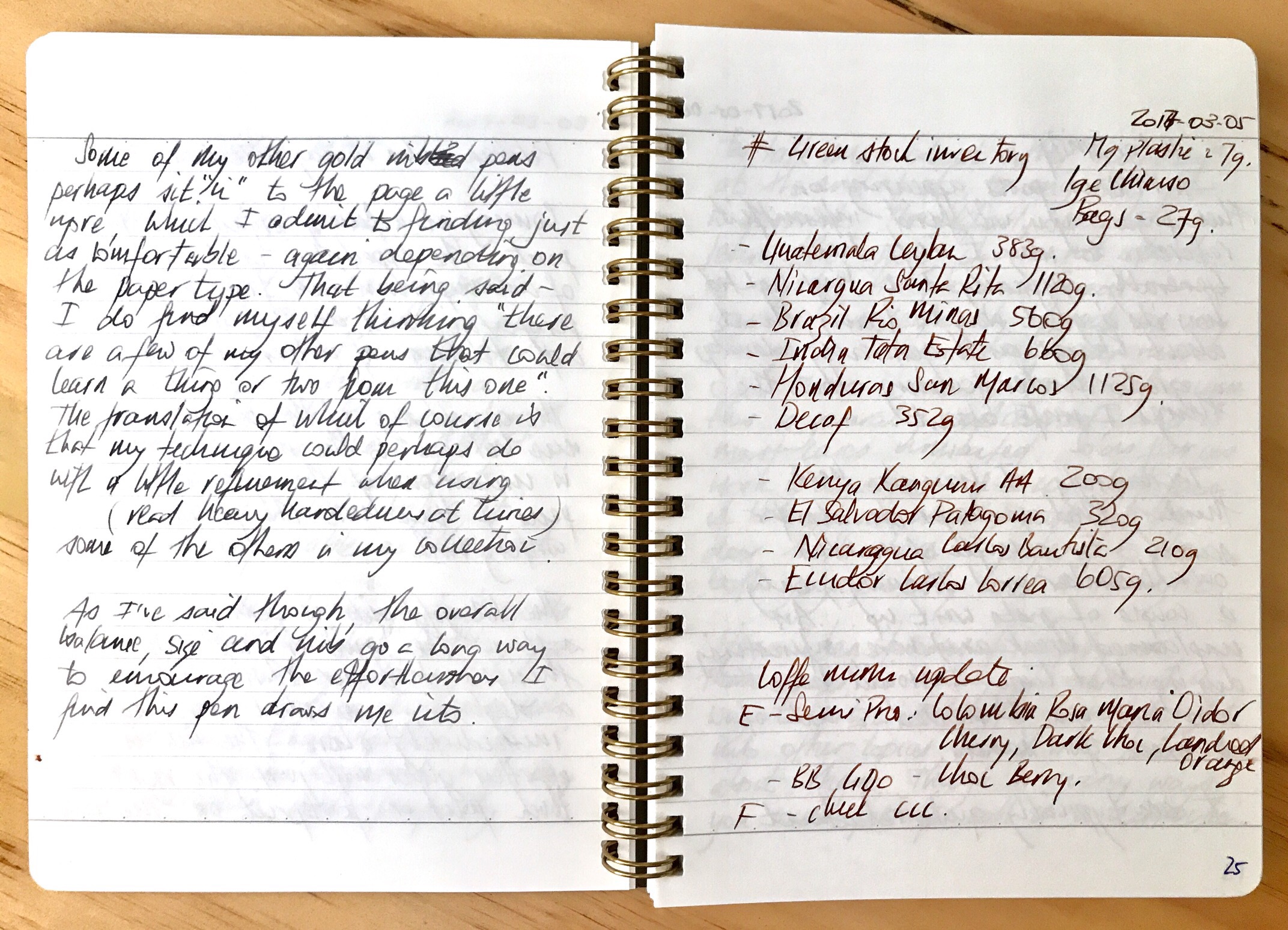
img_7800An interest in fountain pens inherently carries with it a similar level of attention to paper. Although I’ve written about some budget friendly notebook options on one or two occasions, I’m not averse to paying a little more for them either.

One such notebook — while not prohibitive in cost — is the L!fe Symphony N93 Spiral Bound A5 currently sitting on my desk. For the remainder of this post, I will mostly use Life rather than L!fe, as I do find it a little distracting, and an online search term of Life Symphony Notebook will bring up what you are looking for.

Look and feel

In summary, I’d say the Symphony notebook has no bells and minimal whistles — just high quality design, construction and performance.

Though technically a soft cover notebook, the Symphony carries very thick, stiffened card stock front and back which is about as hard as you’d find in a soft-cover notebook. As the images in this post show, I purchased what is described on various retail sites as the “grey” version. The front cover features some intricate detailing reminiscent of a dense vine, and is quite attractive to my eye. The back cover matches in colour, however is unadorned with any detailing or labelling.

img_7808

A colour

To be honest I’m not sure how I’d describe this colour. At the time of purchase, I was drawn to the contrast between the prominent brass coloured double spiral binding and the deeper, slightly more mysterious looking cover. Something enigmatic to provide a little mystery, and shroud what would ultimately be a collection of fairly superficial writing you might say.

Speaking of the binding, those brassy double spirals follow the lead of the cover, in that they are very stiff, providing a solid backbone to the book in a way befitting the overall quality throughout. There is a little wiggle room or “play” in the pages, however I’ve not noticed this when writing, and believe me I would, for it is a pet peeve of mine with spiral bound notebooks.

img_7806

Those spirals!

Referring back to the “no bells” statement above — rather than a criticism, is more a reference to a design which appears focused on the essential requirements, and doing them exceedingly well. There are no pockets, bookmark ribbons, elastic enclosures or pre-formatting on the paper other than the 8mm ruling in subtle grey.

I do tend to use ribbon markers if they are in a notebook, however equally don’t mind if they aren’t — avoiding the need to get them out of the way once the notebook is open to write. Pre-formatted page numbering and perhaps a date field? Again, generally used when present, though inconsequential if not. Plain, grid or ruled? Personal preference, for which I’ll take ruled nine times out of ten these days.

Specifications

The subject of this post:

  • L!fe Symphony N93 Notebook
  • Size: A5 (15x21cm)
  • Cover: Thick, stiffened card stock front and back
  • Pages: 200 (100 Sheets) acid-free paper; estimated at 80-90gsm
  • Binding: Brass coloured double ring
  • Style: 8mm Ruled
  • Features: Fountain pen friendly paper, hand-made
  • Source: Made in Japan
  • Purchased: Pen and Paper, Brisbane CBD, AU$26.95 (December 2016)

Looking around online, you’ll find A5, B5 and A4 variations, available in grey, red, and blue covers. I was unable to find a specific gsm weight rating, however the paper feels very similar to your usual Clairefontaine/Rhodia type weighting. Searching around reveals 8mm ruled, 5mm grid, and plain paper variations, however I am not sure how widely available these options are.

Some online retailers:

Writing Performance

Of course most of the notebooks you see on these pages from time to time are great for writing, and whether they reach the “just about perfect” status is really a matter of personal preference isn’t it. I’ve written ad nauseam about my preference for a little feedback on the page, rather than skating about one a little too slick. No surprises the same thoughts will be applied here.

img_7812

Bookbinders Snake Inks Ground Rattler (l) and Eastern Brown (r)

As I write this, I am 130 pages in of the 200 available to me in this notebook, and I’ve certainly no intention of not continuing right through to the last.

img_7801

Whether running a finger down the page or forming letters along a line — the paper is quite smooth. Not Clairefontaine notebook smooth (a skater for me) by any stretch, and not quite Rhodia smooth either — however probably not far behind. Therefore, on the feedback/tooth scale I’d say it sits squarely in the upper end of my preferred window.

Currently in my hand is a Pilot Custom Heritage 92 (FM nib), containing Bookbinders Snake Ink Red Belly Black. On cheaper, softer paper, the CH 92 will occasionally want to “dig in” a little, however that is certainly not the case here. Both the sensory and auditory feedback (on a quiet pre-dawn morning), are pleasing to say the least. I’d be happy enough if restricted to this paper for the rest of my writing days.

img_7803

Bookbinders Snake Ink Red Belly Black

Using a stiffer nib, such as my medium Platinum President, I find more of that “skating across the top” feel, highlighting the nib and paper interaction, which influences the perception of all our writing experiences. Add to that the usual differences in writing on the left hand page atop the stack of 65 or so filled sheets versus the harder, compressed, yet to be written sheets on the right. Whatever your particular preference or thoughts here — this is great paper for fountain pens.

img_7811Feathering, show through, or bleed are nowhere to be found, and I feel you’d have to use a very broad nib containing extremely saturated, very wet ink to change that to any great degree. You will be safe with most general writing pens. Dry time is commensurate with my Rhodia notepads, or a perhaps a touch faster with certain inks.

At this point I am probably meant to test and demonstrate numerous different pen types to illustrate how this paper handles them all (and I am thankful to those who do), however looking back through those 130 pages, I can find all of about three with non-fountain pen markings (Retro 51/Schmidt rollerball from a Baron Fig Squire out of interest). As you’d expect, handled with aplomb by the paper.

In a notebook bought on the basis of being great for fountain pens, that can hardly come as a surprise, and call this a “review” if you like, however this post is written merely as a reflection on how I’ve found using rather than “testing” — the Symphony notebook over the past few months.

In Use

One of the more common uses for my notebooks is to carry them on my lunch break, perch on a stool at the bar of my favourite cafe, and do some writing. Having purchased the Symphony notebook with this activity in mind, I soon found its suitability for the task was not quite spot on.

img_7814

With that iPad Air 2

The notebook itself is fantastic of course, however given its thickness, something as simple as the size of the spirals prevents it sitting nice and flat against my iPad Air 2 when carried together. A big deal? Hardly – though why bother when I don’t have to, particularly when there is plenty of flatness in say, the Baron Fig Vanguard of similar size (not thickness) which is currently fulfilling lunch break longhand duties.

Beyond such silly personal eccentricities, the Life Symphony No. 93 is what I’d consider a perfect desk book, where weight, thickness and spiral size matter less. It’s perfect for long form writing, with the A5 size constraining my hand, which at times can become a little unwieldy and careless on a larger sized page. Brief notes or meeting minutes – all perfect as well, however to me, a notebook like this begs for something a little grander. Perhaps some poetry, elegant prose, or even a your next novel.

In rounding things out here, I’d have to say from a construction and aesthetic perspective, the Symphony is more than well equipped to handle just about anything you could throw at it. Perhaps you’d see some wear and tear from repetitive backpack in/out cycles, though I think it would stand up pretty well.

Signing off

I’m certainly enjoying the quality of both overall construction and paper of this Symphony notebook from Life Stationery. It’s traditional without being staid; functional yet solid; and clean without feeling underdone or sparse. While it doesn’t suit my particular style of carry, it makes a fantastic desk notebook, and if you are someone who always uses a bag, my concerns are a moot point.

Whether a notebook like this represents value for money really comes down to how you personally value quality of construction and overall aesthetics. It is a notebook I consider represents excellent value for money, and would certainly buy one again – for my desk of course.