Lamy aion Fountain Pen

The title of this post may just as well have been A Surprising and Very Generous Gift, given the pen recently turned up out of the blue in my letter box. These types of things will occasionally happen when good friends stop by the Lamy store in the company’s home town of Heidelberg, Germany, though it certainly doesn’t make me any less grateful a recipient.

Written correspondence between myself and said good friend, is often filled with pen related matters — some of which in recent times has centred around this particular pen when he spotted it at a Lamy exhibition in Frankfurt late last year. It was then titled the JM1 (for reasons now apparent), and slated for release in 2017.

So, on the receiving end of a very kind and generous “this is that pen we were talking about, see what you think” — what follows is, well… what I think.

Look and feel

I’ll be honest with you. Upon arriving home from work and picking up the pen my first thoughts were: wow, its bigger and heavier than I expected; gee I hope I can use this; and I think there will be many who won’t like it. To be entirely honest I wasn’t overly keen on it myself.

In the few days and weeks that followed, much to my absolute surprise, this opinion completely turned around. Ultimately I cannot speak for how it may or may not suit other pen people’s tastes or writing styles, though it quickly aligned with mine.

So right from the outset, I’ll make it clear I’ve many positive things to say about this pen, however didn’t know I’d love it until I used it… a lot. Had you asked me the same question on the first day or two, it would have been a very different story, which perhaps doesn’t bode well for a quick in-store test if someone were considering a purchase.

img_1350

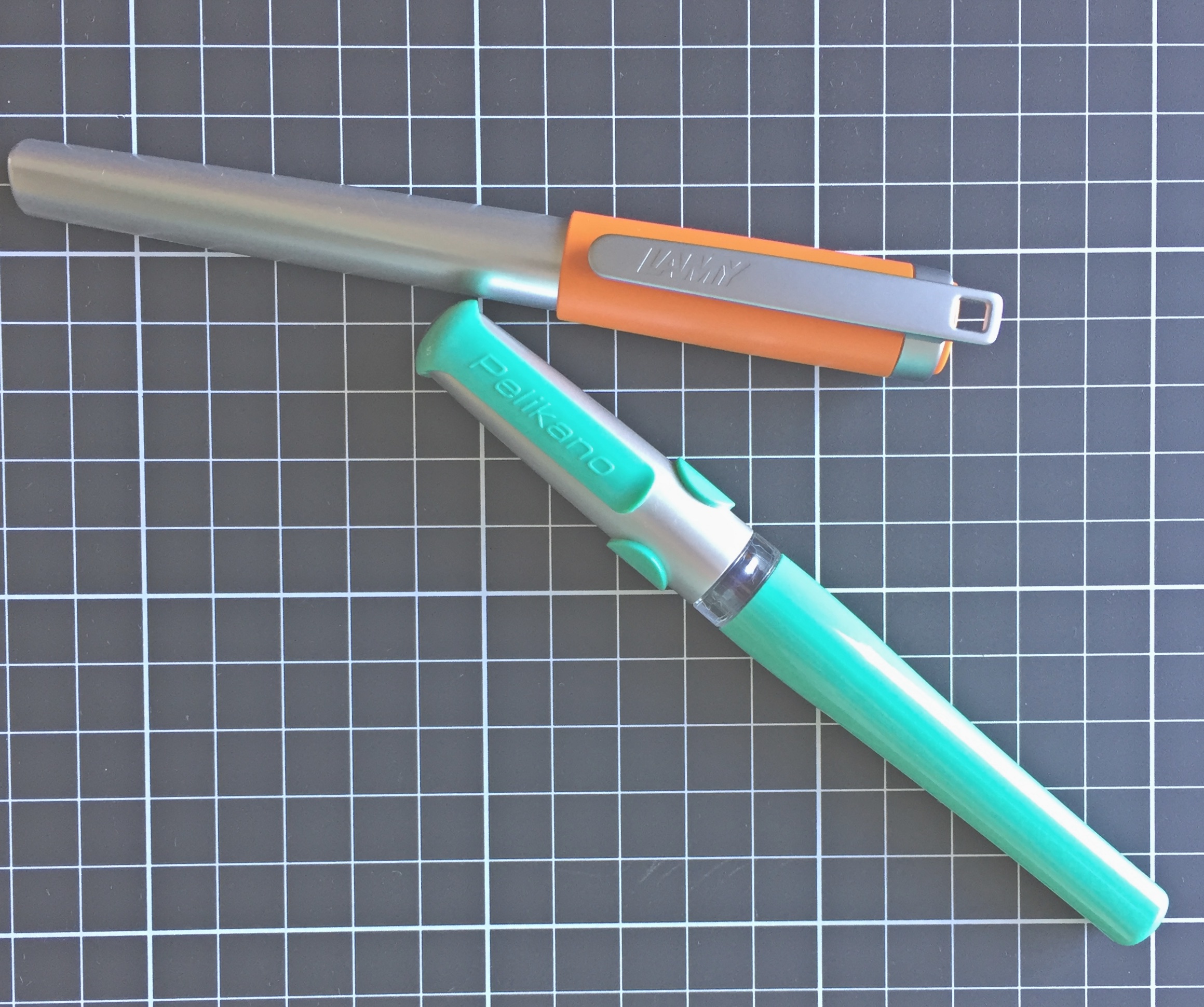
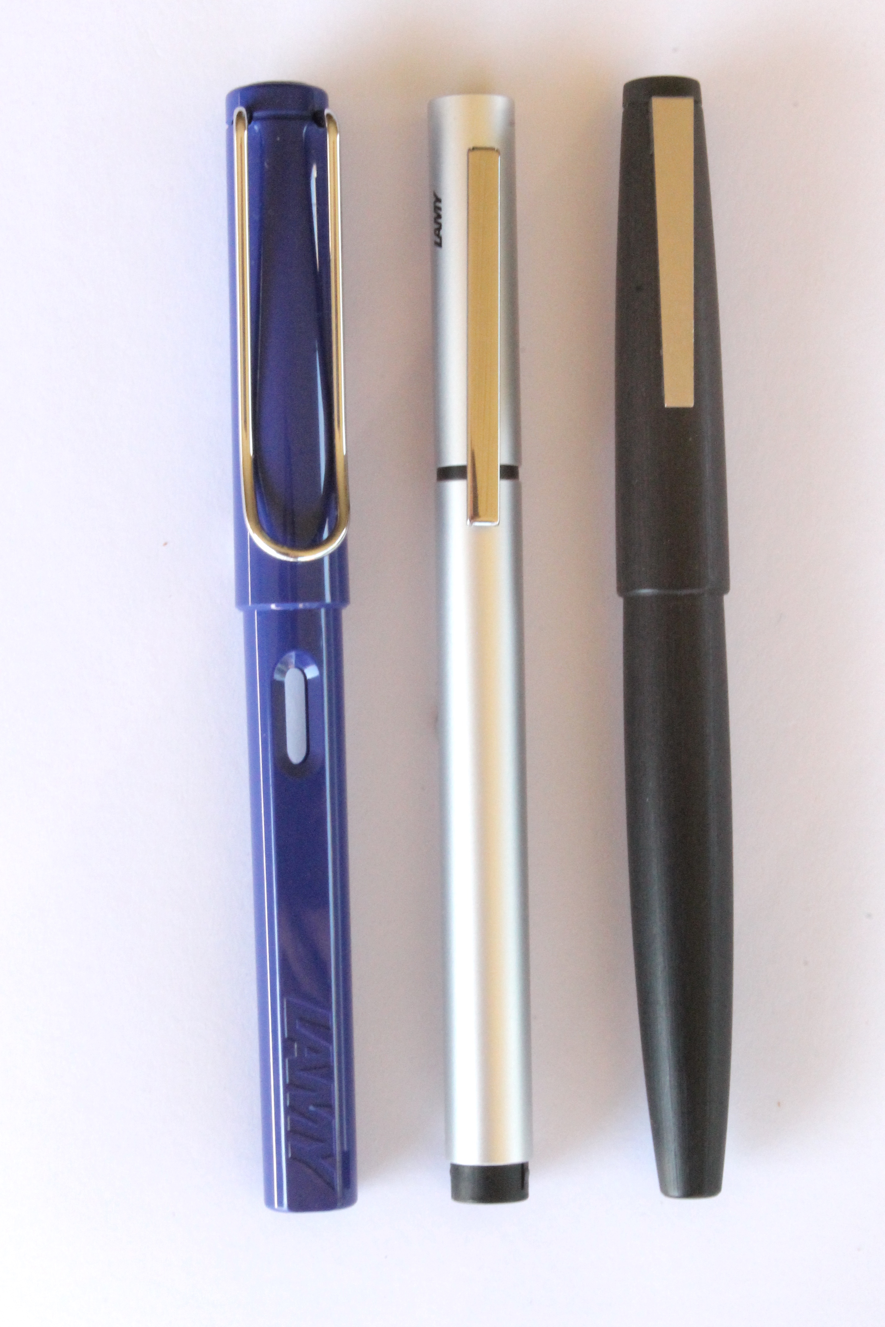
Lamy 2000 (L) and the larger aion (R)

Those initial first impressions were influenced somewhat by the product shots I’d seen, which to me, were of a pen somewhere in the Lamy 2000 size range (comparisons to which are inevitable, and for frame of reference I’ll run with that at times in this post). In reality, its bigger, and a lot heavier. I’d also go so far as to say it feels even bigger and heavier than what it actually is when compared to the 2000.

First thought: this will be too heavy for any long form writing.

Reality after more use: the balance makes it perfect for longer writing sessions and I’ve found it as comfortable as many of my other favourites.

First thought: this design doesn’t seem to be a huge departure from the overall theme you see in some of Lamy’s other pens.

Reality after a little reading: oh… I get it. That’s absolutely spot on then.

A little more on that.

Lamy’s design aims

Sidenote: I am not much of a designer so take the following within that context — though I guess I am a consumer with an opinion.

Probably a relevant question here is whether I should be required to research the manufacturer’s PR release or product sheet about a pen to know whether I like it or not? The answer of course is no, though in doing a little reading I did find I developed a better understanding of what appears to be scope and philosophy of the design behind the Lamy aion.

Whether it is a decent pen or not is another, more straightforward question entirely, which I’ll deal with in other parts of the post. I say straightforward simply because that is largely a matter of personal opinion and preference, and I’m happy to outline my thoughts on that.

Lamy seems to cop its fair share of criticism for releases which may be seen as less than innovative or not different enough for some tastes, and though I could be wrong, think it is inevitable the aion may be seen in the same light.

Again, whether the design and functionality of the pen suit your particular preference is entirely for you to determine, however as for the merits of the design or Lamy’s decisions in general, perhaps a little background and context is helpful.

Disagreeing with the design of something does not make the design wrong, nor prove the company got it wrong, and perhaps most importantly — does not make you wrong. It simply means it’s not suited to your style, taste, or how you may use the particular product from a functional perspective.

In looking at the product sheet from Lamy, a few things stand out:

On the company itself:

Its success story began over 50 years ago with the LAMY 2000: in 1966, the model established the clear and unmistakeable design which still defines the style of all the brand’s products today – the Lamy design.

On working with Jasper Morrison:

Designed by the British industrial designer, Jasper Morrison, this is absolutely in harmony with his conviction that good design is maximally simple – yet, at the same time, maximally functional.

About the aion:

…epitomises the Lamy design

…this is minimalist

An attitude absolutely compatible with the design principles of the LAMY brand…

…uncompromising modernity…

There are many more quotes I could pull from the three pages of information on the pen, and of course any of the above can be debated on their own merit (particularly how maximally functional the pen may or may not be). I do think however, Lamy has — and probably always have — clearly shown their views on what these types of statements represent to them, and largely banked what appears to be a very successful company on them.

If that is the aim, kudos to Lamy. Kudos to Jasper Morrison, who appears to have nailed the brief.

There will invariably be different views on what is modern, minimalist and functional — as there should be. There will be those who prefer pens with perhaps a bit more flair, colour and variety, and not derived from a familiar theme — as there should be.

Notwithstanding the above, I think Lamy has successfully achieved what they set out to create. No pen is for everyone, and individuality both in opinion and purchasing makes this hobby what it is after all.

The Pen

Back to matters at hand.

The aion comes in two colours: black and olivesilver (yes — one word). Though I expect an eyebrow or two to be raised over the naming here — to be honest, does it really matter? I say no — particularly if you’ve checked the names of car colours, house paint or even fountain pen ink offerings lately (none of which I have any issues with either mind you).

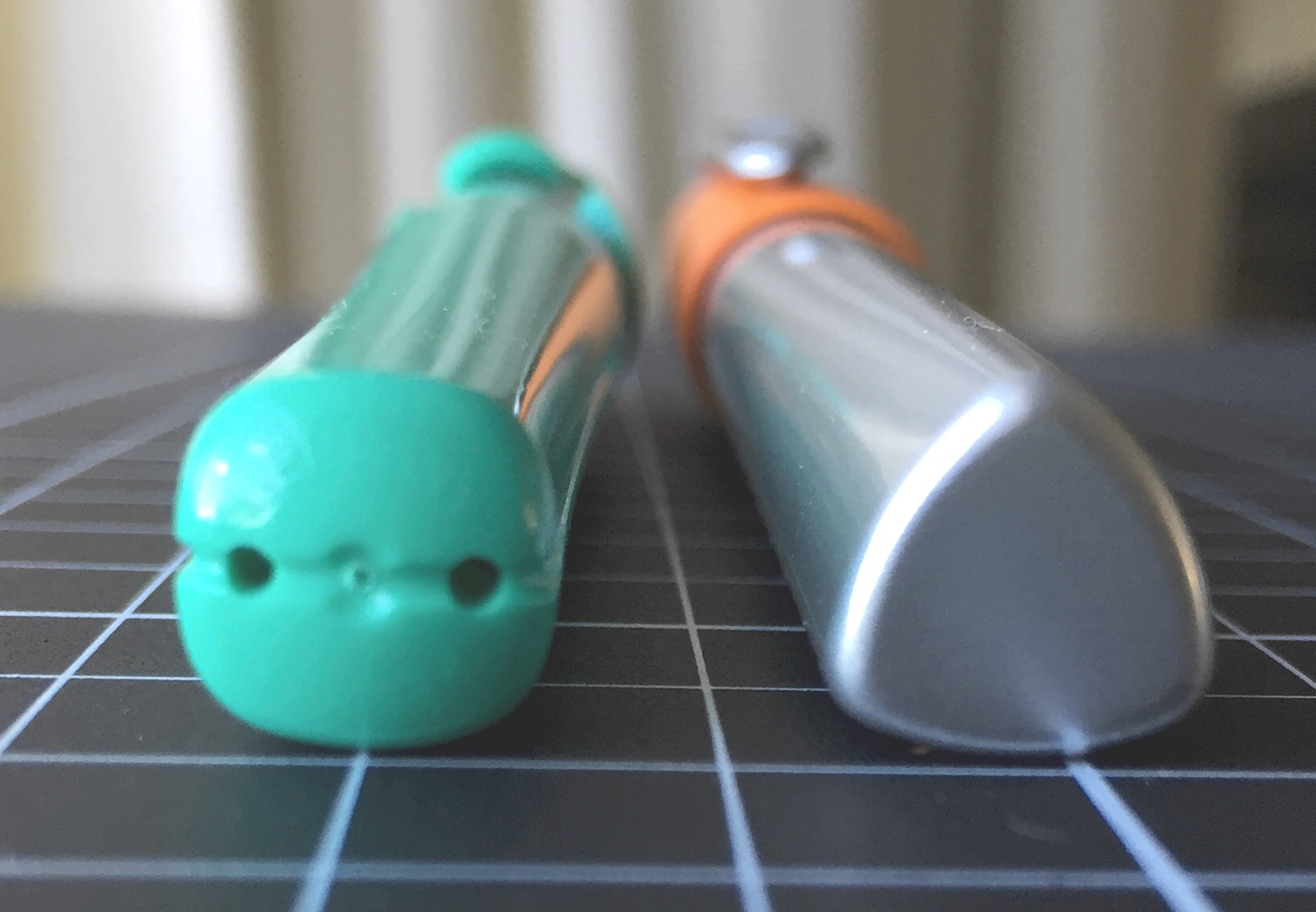
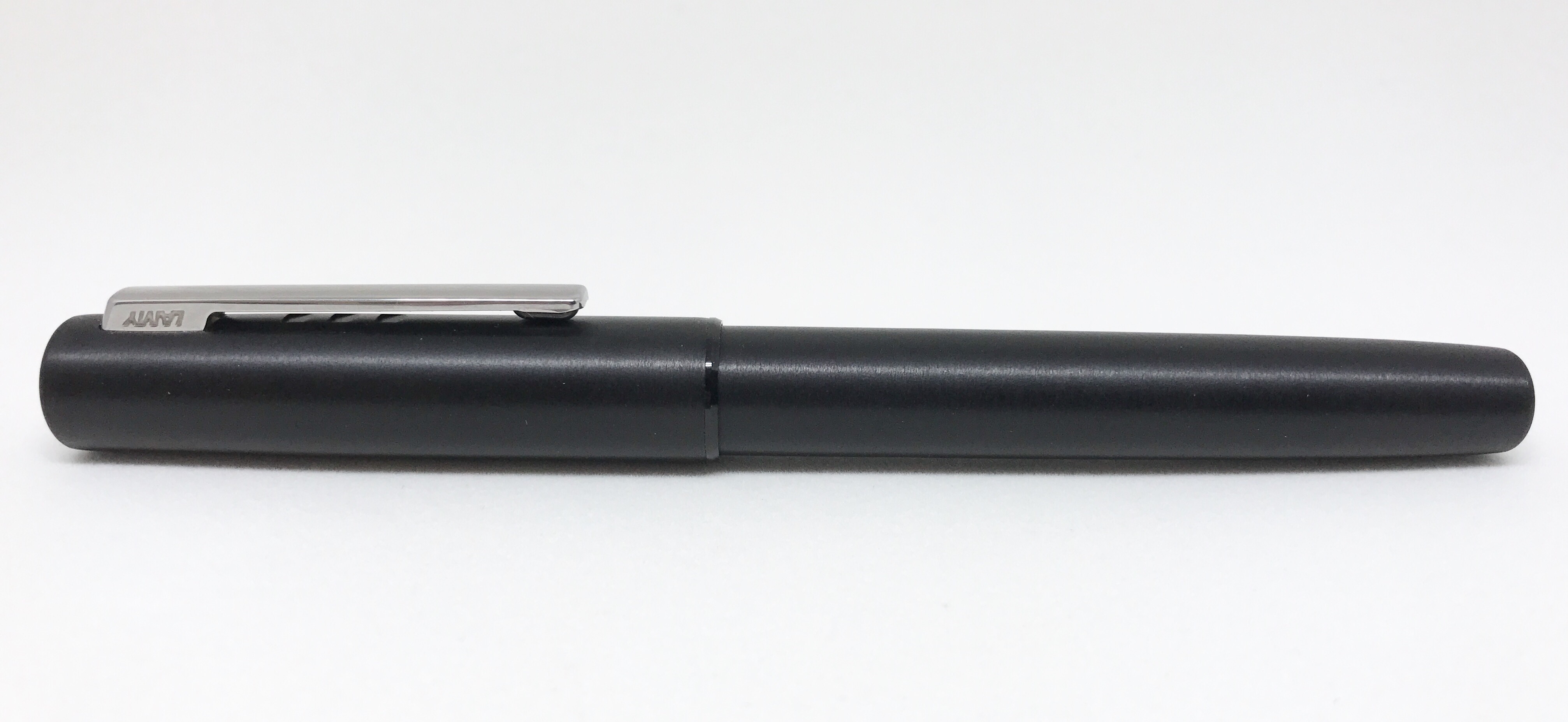
As you can see from the images, the model I have is black, which as you would expect is darker than the 2000’s makrolon. The matte and anodised finish, while not as dark as your high gloss resin pens, as you’d expect doesn’t reflect the light like those either. The only contrast to the barrel are the silver nib and spring-loaded Lamy clip.

Lamy 2000 (top) and aion (below)

As far as the shape is concerned, there is no real taper to speak of in the cap, a minor one nearing the top of the pen, and a slightly more pronounced one as the grip approaches the nib. As you can see from the comparison table and image, at its widest point, the Lamy 2000 carries similar girth to the aion, however once the 2000’s taper begins (towards either end), any similarity quickly ends.

Key size specification comparison with Lamy 2000 (numbers courtesy Goulet Pens):

Specifications Lamy aion Lamy 2000
Diameter – body 12.9mm 13mm
Diameter – cap no clip 14.3mm 14mm
Diameter – cap with clip 17.2mm 16mm
Diameter – grip 10.6mm 7.9mm
Length – body 137mm 125mm
Length – cap 64.3mm 65mm
Length – overall closed 143mm 140mm
Length – overall posted 162mm 154mm
Weight – body 21g 15g
Weight – cap 12g 10g
Weight – overall 33g 25g

I’d tend to agree with the sleek, modern, minimalist group of descriptions you’d find on the Lamy product page. Yes, the aion is created in the spirit of the 2000, however the brushed aluminium and matte finished aion is a very different pen in its own right.

A little more on the construction from Lamy:

…the aluminium housing elements are formed by deep-drawing. The surface structuring is computer-controlled by robot-supported grinding. For its unique finish, the components of the LAMY aion are first brushed, stained, polished and, in the case of the grip, blasted and then finally anodised.

For a firsthand look at the manufacturing process, I refer you to the aion product page which contains a video demonstrating these steps in the pen’s construction. Precision and quality control are words which come to mind when viewing.

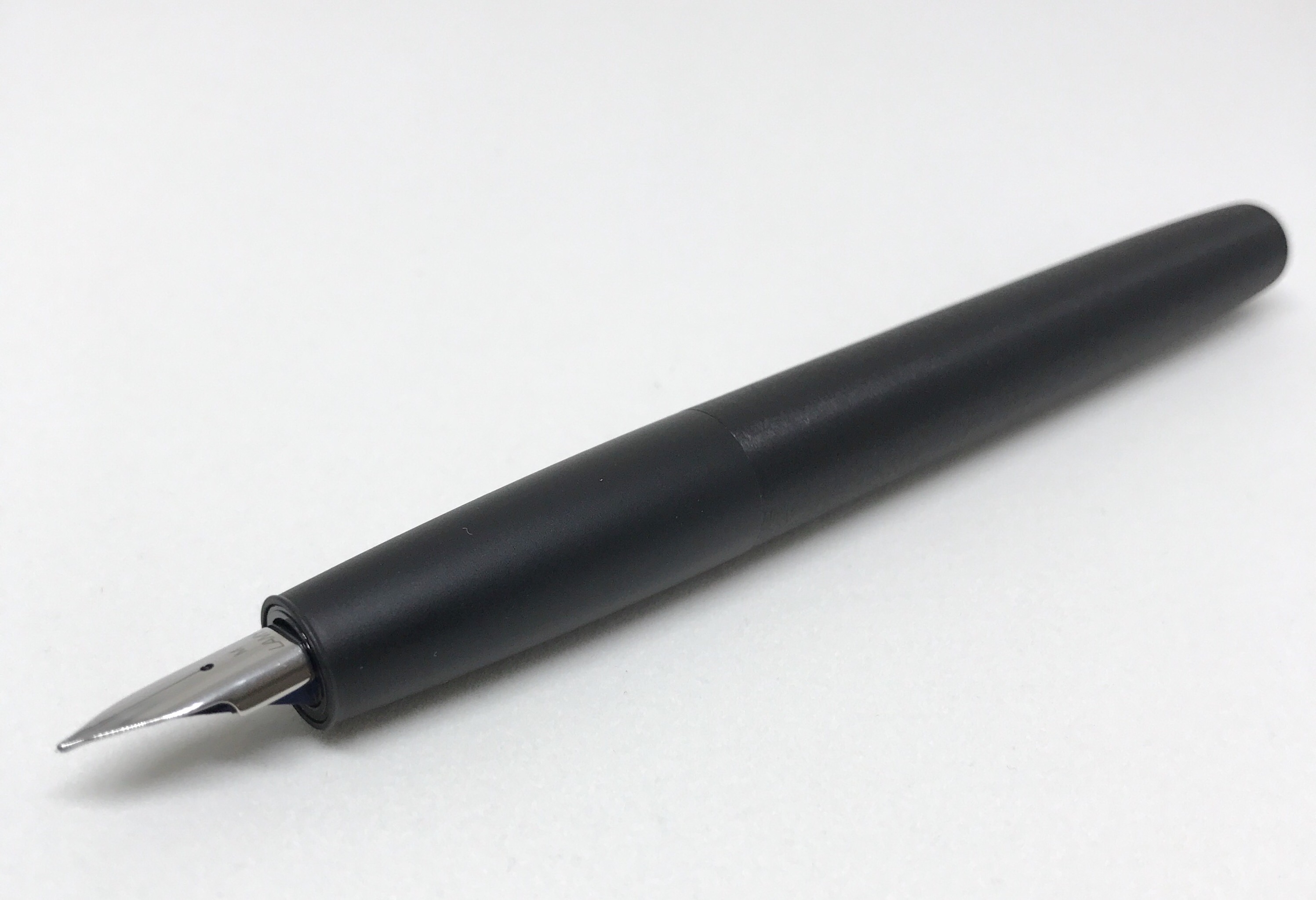
There is slight change in both the appearance and texture between the grip and the rest of the barrel. To me, the anodised grip feels a little smoother than the matte-finished barrel, though I have not found any issues with grip or control when writing.

At the junction of the two (which unscrews to allow access to the cartridge or converter), the small seam can be felt by a finger running back and forth across it, however is imperceptible during use. Given the change in texture, having a seam probably makes no material difference, so to sound somewhat ridiculous, the seam is probably as seamless as you could find, with the exception of those on the 2000 which are effectively invisible when closed.

img_1348The cap can be posted (as Lamy’s product images show), however to do so feels impossibly heavy to write with, and thankfully more than enough length exists in the pen to use it without posting the cap. While we’re on the cap, the snap closure is a very solid one, requiring some force to disengage, almost preventing a thumb and forefinger one-handed snap-off which I tend to do on occasion.

A couple of other points to note here. When snapped on, the cap itself spins freely, and if I shake the pen there is a small rattle between the cap and the body. As I’ve mentioned, there is certainly no danger of it coming loose, however there is some play there. Whether this is the case as standard or simply on this particular pen I’m not 100% sure, however seem to recall something similar mentioned on Reddit. Occasionally when recapping the pen, I need to slightly readjust my direction before the cap snaps home.

Though I point these things out, I have no great issues with them in day-to-day use, where pen performance and writing comfort are more important to me anyway.

The nib

The aion series of fountain pens are fitted with a steel mono colour nib in silver, which although very similar, is a departure from the usual form, as you can see from the comparison image below.

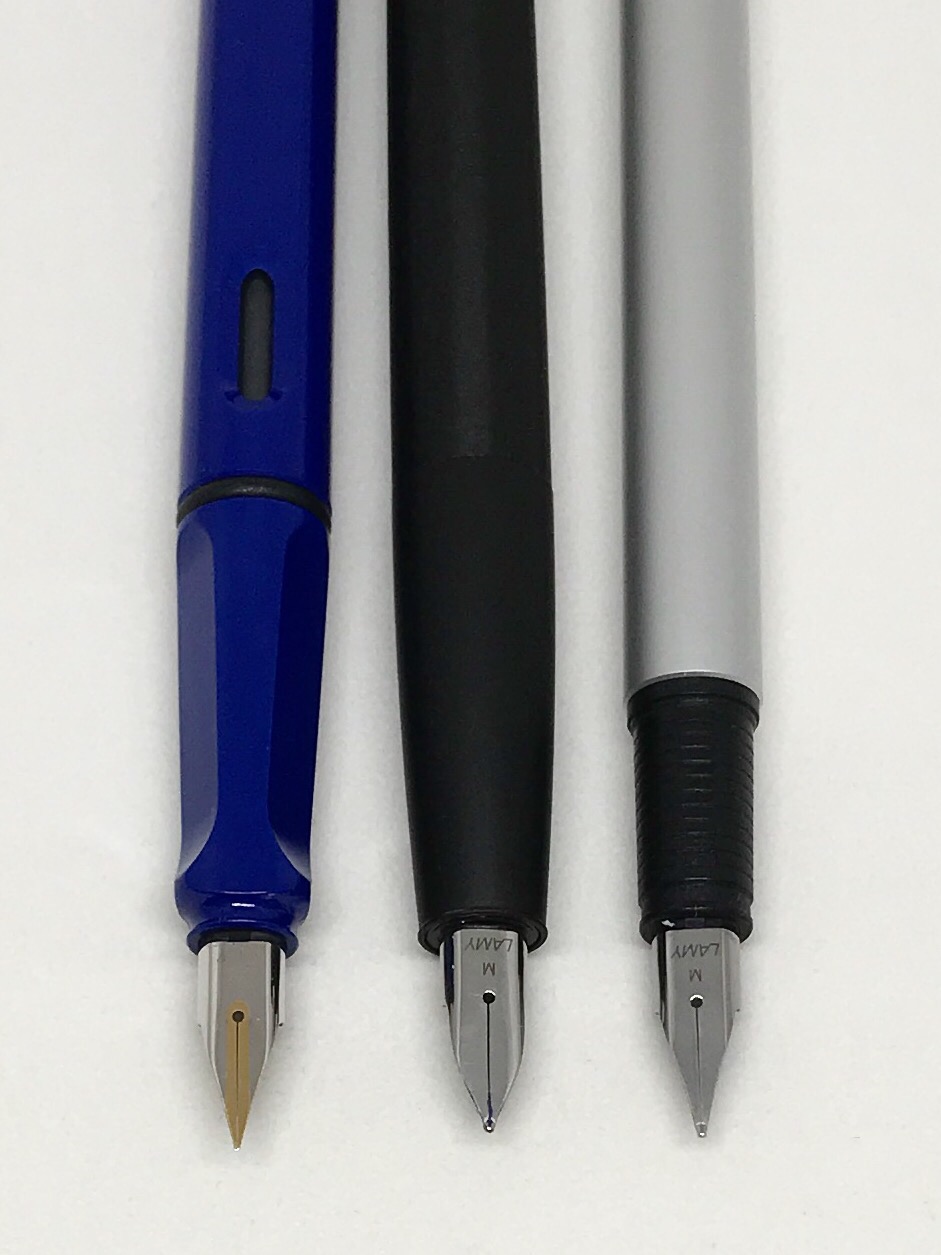
Lamy Safari with 14k nib on (L); aion (centre); Lamy Pur with steel nib (R)

Lamy describes the nib unit:

For the first time, a Lamy fountain pen has been equipped with a series-exclusive, newly-formed nib. Jasper Morrison gave it an unconventionally-proportioned outline, thus giving the writing instrument an avant-garde character

Although I perhaps wouldn’t go that far in my description (don’t think I’ve ever referred to anything as avant-garde), it is certainly something new for Lamy, and I actually quite like the nib shape (more on writing performance later in the post). While I don’t necessary think one of the original Lamy nibs would look out of place on the aion, to my eye the broader “shoulders” of the tines certainly suit the fuller overall profile of the pen.

The remainder of the nib as it fits into the housing appears to be identical to the Lamy nib units we are all familiar with, and from what I have read (again via Reddit), a Lamy rep somewhere has confirmed it can be swapped with other Lamy nibs in the usual way.

In any event, when talking nib shape, a picture certainly will provide you with far more than my words, so I’ll end this here. In doing so though, again even if not something extraordinarily new — kudos to Lamy for providing something different, which I’d say successfully ties in with the overall design of the pen.

Specifications

Full specification list courtesy Goulet Pens

Pen Lamy aion fountain pen
Body Colour Black
Body Material Aluminium
Trim Silver
Cap type Snap on
Refills Bottled ink; proprietary cartridge
Filling Mechanism Cartridge; Converter
Grip Material Aluminium
Nib Colour Silver
Nib Material Steel
Nib Size Medium
Diameter – body 12.9mm
Diameter – cap no clip 14.3mm
Diameter – cap with clip 17.2mm
Diameter – grip 10.6mm
Length – body 137mm
Length – cap 64.3mm
Length – nib 16.5mm
Length – overall closed 143mm
Length – overall posted 162mm
Weight – body 21g
Weight – cap 12g
Weight – overall 33g

Though the key points in relation to the specifications remain the size and overall weight, in isolation these are only chapters of the story. A story which is only complete when balance and function put them together. That said, this certainly isn’t a pen you’d carry in a shirt pocket all day.

If you click-through to the Goblet Pens page, you will see the aion carries a list price of US$71.20 with a MRSP of US$89.00.

Although a conversion to Australian dollars at the time of writing is just over the AU$100 mark, I would be loathe to make any strong prediction as to the actual cost here (which would also be a little unfair to local retailers), given various other factors which may be involved in setting local prices.

At the time of writing, my favourite local retailer in Brisbane’s CBD had not any word through on price or release date.

Writing performance

Or in other words, the money ball. Design scope and brief, construction, finish and marketing aside. Its a pen. It needs to write, and write well or we’ve really got nothing much have we.

Life Symphony notebook

The aion certainly does that — and does it in spades. This is a fantastic nib. A stock standard steel nib (albeit in a newer shape), and it writes like a dream if given the best opportunity. I have a blue Lamy cartridge providing the ink, and as far as I can recall, there have been no false starts, skips, or holidays in any strokes over that time. It produces a wet, full, vibrant line and continues to do so for as long as you need it to.

The overall feel of the nib is firm, and takes some pressure to increase the line widths, however I do not find that aspect much different to the other Lamy steel nibs I use from time to time. I’d also mention here, that the only time I’ve found the sweet spot more difficult to find is when I’ve used a slightly heavier hand with the pen.

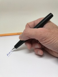
The real joy in using the aion comes from a fairly high, light grip, and having the weight and balance work for you. Don’t choke down and micromanage those letters and I think you’ll likely find the same. It needs a loose rather than tight rein, and is the “opportunity” I mentioned above. In a pen body sans threads, bands or steps, you really have the option of any grip point you like, and its worth adjusting things a little to see what placement suits the balance of the pen.

Of course we all have our own styles of writing, and if the above doesn’t sound like something amenable to yours, I wouldn’t say this pen is not for you, however I’d give it a thorough test prior to purchasing if that is at all possible. I acknowledge though, in many cases it often is not.

In use

I received this pen in the mail on the 1st of August, and as I finalise this post, it has had what is now approaching four weeks of solid use. I mention this simply because that is generally a far shorter time period than for other pens I write about here.

Having been lucky enough to have had the opportunity to use the pen prior to its wider release, I’m hoping this post may be of some assistance to readers who may consider purchasing the pen once it does hit the shelves.

As I’ve mentioned in other posts, most of my pens are either shorter idea-jotters/notetakers, or longer form writers, as I find some pens just aren’t comfortable over longer periods of use. On the day of receipt and for a couple after, I must admit the aion was almost chained immediately to the notetaker pole. There was no way this hefty thing would leave my hand ache-free over a multiple page letter or blog post draft.

Once those initial few days had passed however, it was moved firmly into the long form writer camp, and after a couple of weeks, resides with those pens I’d likely use more often than some of the others. A pen like this one will always default to a notetaker until proven otherwise, which, in continuing to surprise me to this day, is exactly what happened.

I’ve found the overall balance (unposted) to essentially negate the weight of the pen, making it effortless to use over multiple pages. Not only that, it encourages me to use a lighter grip and more fluid writing motion — something which I often struggle a little to maintain. Of course your personal writing style is likely to be vastly different to mine, so consider this simply one viewpoint on the matter.

Is it that good? Well in my view, for the price point it certainly is a great pen with a great nib. Will it be great for you? That I cannot be certain of, and the thing I wish to emphasise here is the key to all of this I guess: for me, the aion is that good because it’s simply that suitable for how I use it to write.

Remember, you are reading the blog of someone who isn’t as fond of the Lamy Safari as many readers probably are. Great pens no doubt — just not a great fit for me. Each to their own, and I think in the coming months we will find strong opinions both ways as the Lamy aion gets into more hands.

Signing off

Whether I’m reading or writing them, I’ve always approached pen posts as tales of subjectivity, with really only a table of specs to the contrary.

After all, the look and feel? My opinion. The weight, balance and what the pen is good for? My opinion — on how it suits me and what I tend to use it for. An underperforming nib is perhaps an exception, but its general characteristics? Just as much what I personally prefer as anything.

And so it continues here. As you can tell from probably too many words above, I like this pen — a lot. Initially? I didn’t like it very much at all. As surprised as I was (and still am), the aion has certainly made an impression by completely flipping my initial views on their head, and I cannot help but think that means something.

Perhaps that is the epitome of great design. Perhaps it is something less profound (ideal weight, a great nib and solid performance). Whatever it is, I’ll take more of it, and although many will say: “this pen is not for me” — I won’t be one of them, and what a positive outcome that is.

My thoughts about Lamy’s design intentions are certainly just that — my thoughts, however regardless of how you view this pen, I’d argue Lamy have achieved what they set out to create. In the end, whether that achievement is enough to add the aion to your collection, only you can answer. In any event, it won’t be long before the question is asked.

Happy writing.

Possible Starters: Lamy Nexx and Pelikan Pelikano Fountain Pens

2016-04-09 pelikano_v_nexx_2

Call them what you will: low-end; entry-level; beginner; learners. Perhaps all true, however these two fountain pens are both pretty solid performers in their own right — for any purpose. They may look a little cheap and cheerful, and although not being for every collection certainly have their place, regardless of your level of fountain pen experience.

The Lamy Nexx and Pelikan Pelikano fountain pens can be found in the “Young Writer” and “Kids/World of School” sections on their respective manufacturer’s websites. Although you won’t see any in schools in this country (I am not sure of the current status regarding other schools around the world), the pens are clearly designed for an early or younger generation entry into the world of writing with fountain pens. That said, I’m certainly no whipper snapper, and I’ve enjoyed using these pens increasingly in recent times when gathering my thoughts for this post.

Those of us who use fountain pens on a regular basis are often the ones who introduce another generation into the habit. Would I use either of these pens with that aim? I’m not sure, and there are perhaps other options I may recommend for that purpose, however I can see these two being great options to offer as possibilities — particularly if a few different options were being considered based on the tastes of the prospective user.

Forced to choose either the Pelikano or the Nexx? A somewhat challenging question, and the answer surprised me a little, though as you’d expect, the ideal pen when comparing two or more generally produces a Frankenstein result — that is, a combination of the best aspects of each. Of course in the absence of that being possible, read on and my final choice will become clear, but really — either of these pens wouldn’t disappoint in their target market.

Look and feel

A point to note here: the current models of both pens have undergone a cosmetic makeover compared with what you see in the photos, which are the pens from my own collection. As far as I can tell, all other aspects of the specifications are essentially the same.

It’s probably in the “feel” more than the “look” that I was most surprised as I used both pens on a more regular basis. I have mentioned in the past I am not a huge fan of the traditional Lamy triangular grip section found on the Safari and AL-Star ranges.

2016-04-09 pelikano_v_nexx_7

Upon uncapping the Lamy Nexx, the first thing I see is another triangular section, this time covered in a rubberised, cushioned coating — somewhat reminiscent of the grip guides of similar material often slipped onto to pens and pencils for younger users. Despite this, I found the section on the Nexx to be far more comfortable to write with than the Safari in my collection. I don’t really have a valid reason for this given the sections are both quite similar in size and shape — the only difference being the rubber coating on the Nexx.

According to Lamy:

The LAMY nexx fountain pen has a soft non-slip grip which makes for extended fatigue-free writing. Its polished stainless steel nib makes writing super easy

All I can really put it down to is the fact that the rubberised overlay softens the edges a little, creating a slightly “rounder” and well… softer feel than the plastic of the Safari.

I would say however the junction of the section and nib looks a little untidy, with the increased diameter of the “stops” on the grip meeting the black plastic collar around the nib and feed. It is the same plastic collar which you also see on the Safari and AL-Star ranges, however on the former it is matched to the barrel colour, and the on the latter matches the darker section a little better. Certainly not a big issue here, and only noticeable as I sit here and review the overall look and form of the pen.

2016-04-09 pelikano_v_nexx_1

The top end of the Nexx barrel begins in a distinctly triangular form factor, rounding out as the barrel increases in diameter and moves towards the section, before returning to the triangular form and tapering slightly at the grip. Uncapped, it carries nice clean lines and I quite like the overall look and shape, however as I mentioned, it is perhaps spoiled a little where it meets the feed.

Capped, the Nexx demonstrates a smooth but steady increase in diameter from end to cap, reaching a maximum at the clip ring. This probably fits the overall funky aesthetic of the colourful cap which also contrasts nicely with the silver aluminium finish of the body. The top of the springy clip sits proud of the actual cap, and while it suits the overall form of the pen, the cap and clip “live a little large” for my taste.

The Nexx appears to be going for a fun, funky and cool aesthetic, rather than portraying itself as the “beginner’s” pen. To that end, I’d say Lamy have probably achieved their goal.

The virtually clipless Pelikano, aside from the cap, carries a certain similarity in shape to the Nexx, and again avoids too much of the “beginner” aesthetic, however I believe it does carry just a little more of that style. This time, the end of the barrel begins in square form, before a similar increase in diameter as it rounds out, before tapering into… wwhaaaaat?? A triangular grip section! I must admit it is more trianguar-ish, than triangular, though the similarity to the Nexx is not lost on me.

2016-04-09 pelikano_v_nexx_3

Again the section has a rubberised coating, however in this instance adds little thickness to the grip. Of the three flattened sides to the grip, the index finger third also has rubberised ridges which run perpendicular to the barrel, I assume to assist with grip and guidance of the nib when writing. A couple of things on this: firstly, they are probably not necessary, as the rubberised coating on the section is more than enough for gripping, and though I didn’t find it noticeable — it may annoy some. Secondly, this could also be used as a baseline grip point of reference in someone learning to write (“index finger here”).

This rubberised overlay sits on a clear section, and therefore prevents any decent view of ink colour or level inside the pen. In contrast to the Nexx, with the Pelikano the nib is held by black plastic “shoulders” at each of its sides. In pointing out above the look of the Nexx at the junction of the nib and section, I’m not really sure this one is an improvement. Personal taste plays a factor with any of the pen designs we prefer, and perhaps I’ve made a bigger deal out of it than it really is. I cannot say when I’ve picked up either pen I have even given it a second thought.

Overall, I marginally prefer the Pelikano’s grip section, though it is the centre of the barrel which raises a few questions for me. Both pens increase in diameter through the middle of the barrel, with the Pelikano doing so just a little more in comparison (1.4 mm more at its maximum, as you can see from the specifications below). This throws the comfort of my grip ever so slightly off, and I’ve found I cannot write for extended periods quite as comfortably as I can with the Nexx.

Aesthetically, the styling of the Pelikano is quite different to that of the Nexx, and to be honest I really have no preference here. The cap of the Pelikano reminds me of a helmet on the Lego Knights I used to have as a child — if you had them you know what I mean. While I enjoyed playing with those knights, I prefer the design as a helmet rather than a pen cap.

I’ve described it as “virtually clipless” above as the moulded plastic forms part of an exoskeleton or … yes, there it is: “helmet” over the cap. This forms a sort of pseudo-clip, however the functional section is very short, and I’d hesitate to use it regularly, being reasonably fearful it might snap as the plastic fatigues through repeated bending.

Although both pens are not what you’d call expensive — both feel sturdy enough to stand up to the usual level of wear and tear. The aluminium barrel of the Nexx may provide a little extra reassurance in this area, however with even a little care in the daily use and carry of, I doubt you’d have trouble with either.

As I’ve mentioned, the clip extending past the end of the cap on the Nexx may provide a snag point, however again I would not anticipate any major problems.

Specifications

Notwithstanding the cosmetic changes I mentioned earlier, following are the specifications in the current available line up from both manufacturers.

Manufacturer Pelikan Lamy
Model Pelikano Nexx
Body Plastic Aluminium
Cap Plastic Snap On Plastic Snap On
Clip Plastic Metal
Fill Cartridge/Converter Cartridge/Converter
Weight 23 g 31 g
Diameter max 14.5 mm 13.1 mm
Diameter grip 12.5 mm 12.2 mm
Length capped 13.6 cm 13.4 cm
Length uncapped 12.5 cm 12.7 cm
Nib type Steel Steel
Price A$ $26-$30 + int postage $54.95

Check the manufacturer’s websites for colours available.

As far as the price is concerned, Australian supplier LarryPost stocks the Lamy Nexx, at the price quoted above. I have not been able to find a local supplier online for the Pelikano, however this of course does not rule out any local brick and mortar stores perhaps stocking them. Fishpond lists the Pelikan at AUD $39.97, however it does state the pen ships from a UK supplier. The price I have quoted above is a conversion from both Jet Pens in the US and Cult Pens in the UK, however you would need to add international postage costs to these of course.

Also worth mentioning is the option of a left-handed nib on the Pelikano, as well as the slightly cheaper Pelikano Junior model.

As far as filling is concerned, I have been using the Nexx with a Lamy Z24 converter (with no issues), and the Pelikan with standard international cartridges, noting the recommended converter here is the C499 from Pelikan.

Writing Performance

I’ve had these pens for about 6 months or so now, intermittently using them in my rotation of pens, and have written more extensively with each over the past few weeks taking notes for this post.

As far as the nibs are concerned, I’ve been happy with both. The stainless steel medium nibs are smooth writers, with the Pelikano having a slightly softer feel in terms of a little give, however there also appears to be a marginally smaller sweet spot than what exists on the Nexx — at least with this particular pen anyway. Overall, both nibs have that firm, steel nib feel — one that I quite like and is not meant as a criticism in any way.

2016-04-09 pelikano_v_nexx_5

The Nexx comes as expected out of the box — the same Lamy nib you’d find in a Safari: firm, reliable and consistent. I say consistent because in mentioning the Pelican’s sweet-spot, the Lamy nib performs well at all points of minor grip and alignment adjustment — however when compared line for line, doesn’t quite match the smoothness and comfort of the Pelikano.

Both lay down a consistent, wet line, and with a little pressure applied, (despite the softer overall feel of the Pelikan) the Lamy nib will give a slightly broader one, though neither of these pens are what you’d be using for any sort of line variation lettering.

2016-04-09 pelikano_v_nexx_6

Overall, as far as the nibs go, points to the Pelikano, as it is a much smoother and more comfortable nib to be using for writing, and the sweet-spot is really not hard to find and then sit comfortably in like your favourite lounge chair.

Both pens I have used without posting the cap, however if you were to do so, the Pelikano retains its overall balance more so than the Nexx, which becomes very top-heavy and cumbersome.

Both pens handle a variety of paper types equally well, which is probably important given what they might be used for, and I’ve not found either wanting on the first stroke when uncapped, nor with extended periods uncapped, for example in writing intermittent notes while researching online and the like.

Only young writer?

Indeed, the young writer aspect of these pens is not to be dismissed, however I don’t believe either necessarily perform this role any better than the Pilot Kakuno, which is far cheaper to buy. The Kakuno also sports the triangular grip section, however the overall balance and feel make it — in my opinion at least — a better buy for this segment of the market.

2016-04-09 pelikano_v_nexx_4

Do either of these pens appeal to the non-young or non-early writers? That of course is a matter of personal opinion. As I’ve hinted at above, I think the Nexx is more likely to fulfil a more universal role across beginner and more experienced users alike, whereas the Pelikano based on looks alone I feel is perhaps relegated to the beginners end of the market.

Given its bright and funky sort of look, the Nexx to me is a pen you might use with a clipboard or reporter style notebook: marking off attendees at a summer camp, scoring a tennis match or perhaps even recording your backyard coffee roasting data — assuming suitable paper was in use of course. At then end of the day, if a pen (which both are), are solid performers, it really is down to personal taste, and that is really where we end up here.

Conclusion

In summing up, both of these pens are pleasant to use and perform as intended. If I had to choose one? Probably the Nexx, simply because I find the overall shape of the body a little more comfortable to use than the Pelikano, which becomes a little too broad in the middle for my grip.

The Frankenstein result if I could? The Pelikano nib in the Nexx body with a smaller version of the Nexx cap and clip. Because that isn’t going to happen any time soon, I’d go with the Nexx simply because of the Lamy nib options you have at your disposal, though with a pen like this, I’d assume you’d have be looking for something specific, otherwise a Safari might be a better choice — particularly at a slightly lower price point.

In any event, either the Lamy Nexx or Pelikan Pelikano won’t fail you as a notetaker, however for the “young writer” I am most likely sticking with the Pilot Kakuno as my go to recommendation.


Lamy Pur Fountain Pen – 14k Nib

I was very intrigued when this pen arrived, for it immediately brought back memories of my first year of full-time work after university. Back then I was using a Sheaffer ballpoint. I cannot of course remember the exact pen model, however what drew me to it in the first place was the uniformity of the barrel, from end to end. Suffice to say the Sheaffer in question was more slender than this Lamy Pur, and any resemblance only very passing, however that is often all it takes to trigger these types of memories.

grays_coverThe job? My first year as a physiotherapist in one of Brisbane’s major teaching hospitals. That Sheaffer pen drew a few comments from those who borrowed it, varying from “that’s a nice pen — don’t lose it in this place” to “how can you possibly write with something so small” (read, thin). The latter was from an Orthopaedic Surgeon who was no doubt used to whatever cigar-shaped fountain pen he might have been using at the time.

While we are on the topic of surgery, I mentioned in a previous post about the strong associations I have involving various styles of pens, and this one is no different. The clean, clear lines of the Lamy Pur — I’m thinking surgeons scalpel. A minimalist design for pure function, perhaps not out of place recording post-op notes in a medical chart.

Anyway, moving on to matters at hand — the actual Lamy Pur fountain pen. As quite a few of the pens I have written about recently, I kindly received this from a fellow enthusiast in the process of downsizing his pen collection.

Look and Feel

lamy_bonesNo — it doesn’t really look like a Sheaffer ballpoint, however it is indeed distinct in its taper-less design, with a uniformity of thickness from end to end when capped. As you will read about below, I think Lamy might have been wise to maintain this design right through the grip section as well.

Although the black, knurled plastic grip matches the posting extension at the end of the pen, it somehow seems out of place with the overall finish and aesthetics. Personally, I find the Lamy Pur quite striking with the cap on — a minimalist look of brushed aluminium, marked only by the black plastic at the end of the pen, cap junction, and hidden inside the finial of the cap. Even the metal clip is able to add rather than detract from the geometric uniformity.

Personally, with a new or unfamiliar pen, my mind subconsciously works through three stages. How I initially feel looking at the design; whether or not my excitement increases when I uncap the pen and more closely inspect the section and nib; and finally, whether this increases again when the nib hits the paper. For a great pen, these stages would be thus: “wow”; followed by “oh wow”; and finally “yeeesssss”. An extremely objective analysis!

My point being, even if the first stage is “wow – I like the design of this”, if the second is “oh… um”, then regardless of how the third goes, I am on average going to be underwhelmed, which may influence how I ultimately feel about the writing experience. Such is the case here. I simply keep finding myself imagining how great this pen would look and feel, with that quality Lamy nib sitting at the end of brushed aluminium rather than plastic.

lamy_3_pack

With the Lamy Safari (L) and Lamy 2000 (R)

Clearly I have made my point and need to move on.

To finish things up here, I should add the pen is quite light and very easy to hold, and the cap snaps on very firmly either to close or post for writing (however relative to its thickness does make for a comically long pen if the cap is posted). The metal clip is solid and compliments the pen nicely, crossing past the cap/barrel junction, which adds to the smooth lines and gives the overall appearance of a little more length.

There is an understated black Lamy logo adjacent to the clip which rounds things out nicely.

I’ve said it before and I’ll say it again, I think this is a really attractive pen when capped and sitting on a desk — it’s just that pens aren’t really made for that are they? Mine certainly aren’t anyway.

Specifications

Information courtesy Cult Pens:

  • Material: Aluminium, Metal, Plastic
  • Refill Type: Lamy Z26 Converter (supplied) / Lamy T10 Ink Cartridge
  • Nib: Steel (Standard); Current model: 14k bi-colour gold
  • Length Capped: 5.4 inches (13.7 cm)
  • Length Uncapped: 4.9 inches (12.4 cm)
  • Length Posted: 6.7 inches (17 cm)
  • Diameter: 0.4 inches (1.1 cm)
  • Currently available at Cult Pens for £30.54 ($AUD65.30)

I received the Lamy Pur with a Lamy Z26 converter in place, and have found filling to be a breeze, however the pen can also to be used with the T10 ink cartridges produced by Lamy.

The pen comes with a polished steel Lamy nib as standard, and no doubt many a reader would be familiar with such a nib. As I have already noted, the model at the subject of this review has a 14k bi-colour gold Lamy nib fitted in EF width ($AUD119.95 at the time of writing from LarryPOST). The appearance of the nib itself is quite understated, which I like, as the gold runs only from the breather hole down to the tip of the nib inside each adjacent tine.

On Paper

When I uncap a Lamy fountain pen and begin writing, there is a certain expectation around how the nib is going to feel and perform. As you can imagine, every expectation was met here — and I expect this would have been the case with the standard steel nib fitted rather than the 14k gold nib I have on this pen. There is no doubt, Lamy do make great nibs, and I don’t believe I’ve ever heard of any quality control issues with them — nor am I likely to.

IMG_4523

The 14k nib is a dream to write with

The 14K gold EF nib on this Lamy Pur is exceptional. As smooth across the page as you’ll find, with just a little spring (I wouldn’t say flex) to add some character to the words flowing from the nib. Compared with a Lamy steel nib, I find the 14k a little wetter, softer and therefore broader than a comparable width steel nib, or even my steel F Lamy nib for that matter. The 14k nib was certainly a joy to write with, and more than once when choosing which pen to pick up it has been the nib which has drawn me to the Pur.

The only problem is — remember that black, knurled plastic grip section? Yes, I think you might recall it from the paragraph above — I also have a small issue with it when writing. As beautiful as the nib is, I’m unable to quite do it justice as I find the grip section provides me with very little control over the pen itself.

As my fingers want to slide down the section towards the nib, it is an ongoing conscious effort to keep the pen in the position I want it while writing. As you can imagine, that detracts somewhat from the writing experience, which is unfortunate, for a nib of this quality and performance deserves to be used for extended writing sessions. For my personal preference, either the knurls need more knurling to provide better grip, or the slight taper would need removing.

So as far as specific use cases are concerned for this pen, I am therefore looking at shorter bursts of writing such as list making or perhaps a few notes here and there whilst listening to a podcast or the like.

I probably should be quite clear about one thing — I am still yet to encounter a fountain pen I put down and say: “Well I won’t be using that again”. The reason my explanations of certain issues can be a little lengthy is simply so you, the reader, have an understanding of why a certain pen is the way it is — for me at least. Not to overemphasise there is something inherently wrong with it — nor to suggest you would necessarily find it the same. With any pen, I simply ask myself: Is there anything that could be changed to make this pen better for me?

Final Thoughts

IMG_4525Sleek. Minimalist. Futuristic. Space-age. Austere. These are the kinds of words which spring to mind when I think about how I would describe the overall aesthetic of the Lamy Pur. It is certainly not your typical looking fountain pen, and although the words I’ve described above might suggest it lacks character, that would be very far from the truth. It is both striking yet understated at the same time, if that makes any sense at all.

In my opinion this is quite an attractive pen — true, it loses a little of this lustre when uncapped and the black plastic grip section is exposed. This same section also sees it lose a little more of its merit when in use, through a lack of grip control requiring a little more effort while writing.

Do I enjoy using it? Absolutely — it’s a great fountain pen with an exceptional nib (remembering in this case a 14k gold Lamy nib). It is simply a matter of that little bit of extra effort I’m required to use while I write.

The truly superb instruments? They become part of my hand as I write. No conscious thought required. It is indeed a very fine line, but one which remains apparent with the Lamy Pur.


Pen Innovation – All Done?

IMG_4386A recent episode of The Pen Addict podcast touched on innovation, with host Brad Dowdy questioning whether certain categories of the pen market had been “solved”. That is, whether innovation on particular market segments had ceased (namely your ballpoint/gel ink end of the market). As far as my thoughts are concerned on this particular topic, I think it is probably a fair question. The answer? Probably yes. Is this a bad thing? Probably no.

A knowledge base

At it’s core, the pen industry is probably no different to any other. At some level, there are “standards”, which provide an overall frame of reference (to both experts and those less so). For example, when recommending a pen better than the average 99c bulk buy office stick, many might suggest a Uni-ball Jetstream, Pilot G2 or Uni-ball Signo 207. (We could debate all day about precisely which is better, and I have previously given my thoughts on this). Another example might be the popularity of the Lamy Safari as an entry level fountain pen.

Without a certain amount of stability (some may read – lack of innovation) in these “go-to” recommendations, the pen landscape in this particular segment would be constantly shifting, and recommendations moderated: “well, you could try a Jetstream however they have recently changed the …….. so I’m not quite sure if they write the way they used to”. The “standard” or well-known frame of reference would no longer exist.

Innovation or simply variation?

How you define innovation will go a long way towards answering this question for you anyway. According to the Oxford Dictionary, to innovate, is to:

Make changes in something established, especially by introducing new methods, ideas, or products

If we are talking about better versions of the same product, new and exciting products, or simply variety in a typical segment of the market, then your answer on the innovation question will likely be different. The many variations in design, materials, nib sizes and inks available to fountain pen enthusiasts (along with after market possibilities such as converters and nib grinding) typically provide an endless array of choice for the consumer. To me, this is not necessarily innovation, simply variation, customisation, and choice, with many pen lovers going down the road of fountain pen experimentation (and often obsession), even if the starting point was gel inks and rollerballs.

Also, innovation generally occurs at the “pointy end” of an industry, and much of what is considered innovation at a manufacturing level is often concerned with better production techniques, efficiencies and overall productivity. Do these changes necessarily mean anything different for the consumer? Sometimes in the form of price point, possibly a better product, however often there may be no real discernible difference.

Conclusion

Essentially, in many ways, I don’t necessarily believe there is a great deal of innovation occurring in pens, regardless of the market segment we are talking about. However, I equally believe this is not detrimental to either the market itself nor the consumer. What we do have is endless variety in the marketplace, from a few dollars for a consistent, good quality gel ink pen, up to a few hundred dollars (plus) for a fountain pen – with many variations in between.

The good old gel ink standby or the customised fountain pen? Entirely up to you, however I guess if you prefer gel inks and rollerballs, that will be where your searches take you. Or perhaps an early foray into fountain pens. Regardless of which, many discoveries will be made on the back of reviews or blog posts on pens, with many of those pens compared to those that have remained unchanged for some time, and are therefore familiar to you (which is exactly why we need them).

At the end of the day we are after a consistent and familiar writing experience with a little bit of choice as to how we achieve this. If products are created simply to “make something new” without this philosophy at the core, I’m not sure that is the way to go. After all, surely no-one here wants to write with a “multi” fountain pen.