Wiser Web Wednesday – a semi-regular link to posts of interest from around the web by those far wiser than myself:
Tom Bihn Blog
Modern Stationer’s Doug Lane, continuing to go from strength to strength with some great posts – this time a guest on the Tom Bihn blog:
But if it’s been a while, give writing by hand another try. You may be surprised by how pens and paper can shift your brain into a forgotten gear and give you the break from the connected world that you may not even realize that you need.
Perfect.
You owe it to yourself to read the whole post:
The Right Kind of Friction
From the Pen Cup
Judging by the response on Twitter, this post from Mary resonated with quite a lot of people – myself included. The challenge now, will be for those (us) who wholeheartedly agreed with the sentiment, to follow-up in practice – a much more difficult prospect.
It’s easy to get caught up in your friends’ purchases and recommendations…
Indeed it is:
On Not Buying Pens
An Inkophile’s Blog
I’ve thought quite a bit about my own storage and sampling of inks lately, though I must admit the small collection I have certainly doesn’t require anything too extensive. This system of using Mnemosyne cards for ink samples provides a great quick reference:
Keeping Track Of Ink And Pens
Gentleman Stationer
The Lamy Safari is often the introductory fountain pen for many users, however not so here – nor was it with myself:
Many people, like me, come to Safaris later, after they have been using (much more expensive) fountain pens for a while, only to realize that the Safari is a flat-out good pen, irrespective of its price range.
Mind you, I am always astonished by the fact I have quite taken to the triangular nature of the grip section on my Safari fountain pen, yet somehow am not as fond of the very same grip on my rollerball. Go figure:
Basic Black: One Week with the Lamy Safari
COVERED Podcast
In the hope of improving my own writing in some way, I’ve taken more of an interest recently in what authors have to say on the subject.
A conversation about books with the people who write them.
Harry Marks does a fantastic job hosting this podcast, and if you are at all interested in writing and/or reading, go listen:
COVERED with Harry C Marks
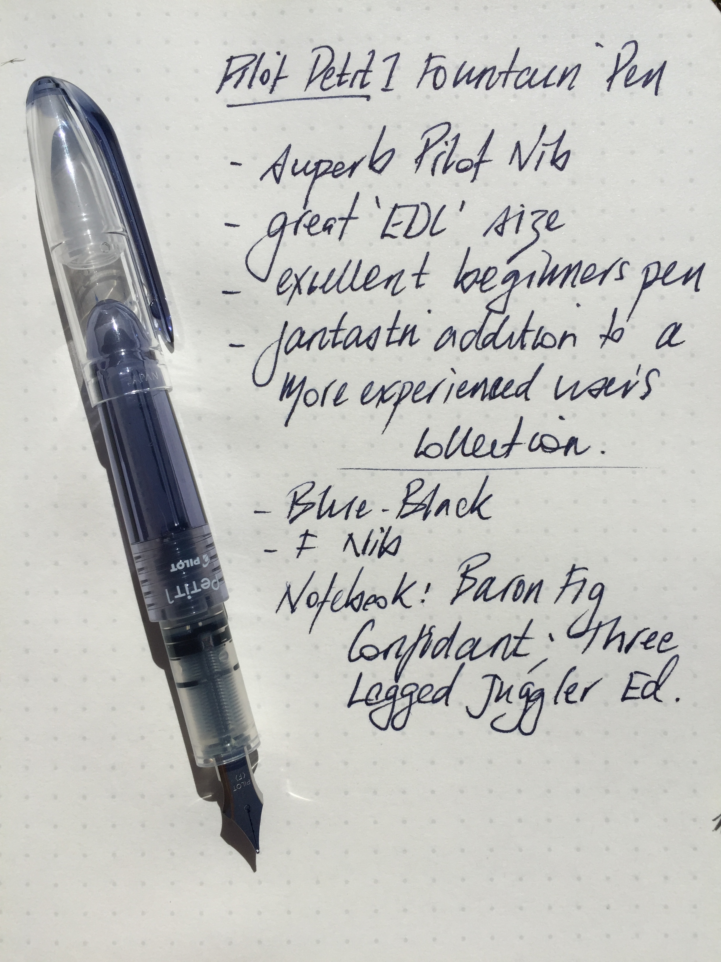
Johnny Anypen
After a recent run with the Pilot Petit1, I mentioned my next (very) low-end fountain pen purchase would be the Platinum Preppy. Now I know what to expect:
Review: Platinum Preppy M Nib
Tools & Toys
There are many, many coffee apps on the App Store – timers, orders, recipes, brand awareness and/or online shopping, and some – all of the above. As Tools & Toys points out, Press looks a little different. Although there are indeed timers, Press also has a section (with integrated location map) to record your favourite single origins and tasting notes. Go and create your own global coffee map:
Press Coffee for iPhone
Brisbane Café Explorer
Having managed to get along to last year’s event, it was nice to read how things turned out in the 2015 QLD AeroPress Championships, held at the Wooloongabba Social Club. A nice write-up on Brisbane Café Explorer:
QLD Aeropress championship
James Bond 007 YouTube Channel
Although not usually critically acclaimed, I’ve always loved a good Bond film. A bonus – the stunning scenery from places I’m certainly never likely to visit:
Here’s the first behind the scenes footage of SPECTRE