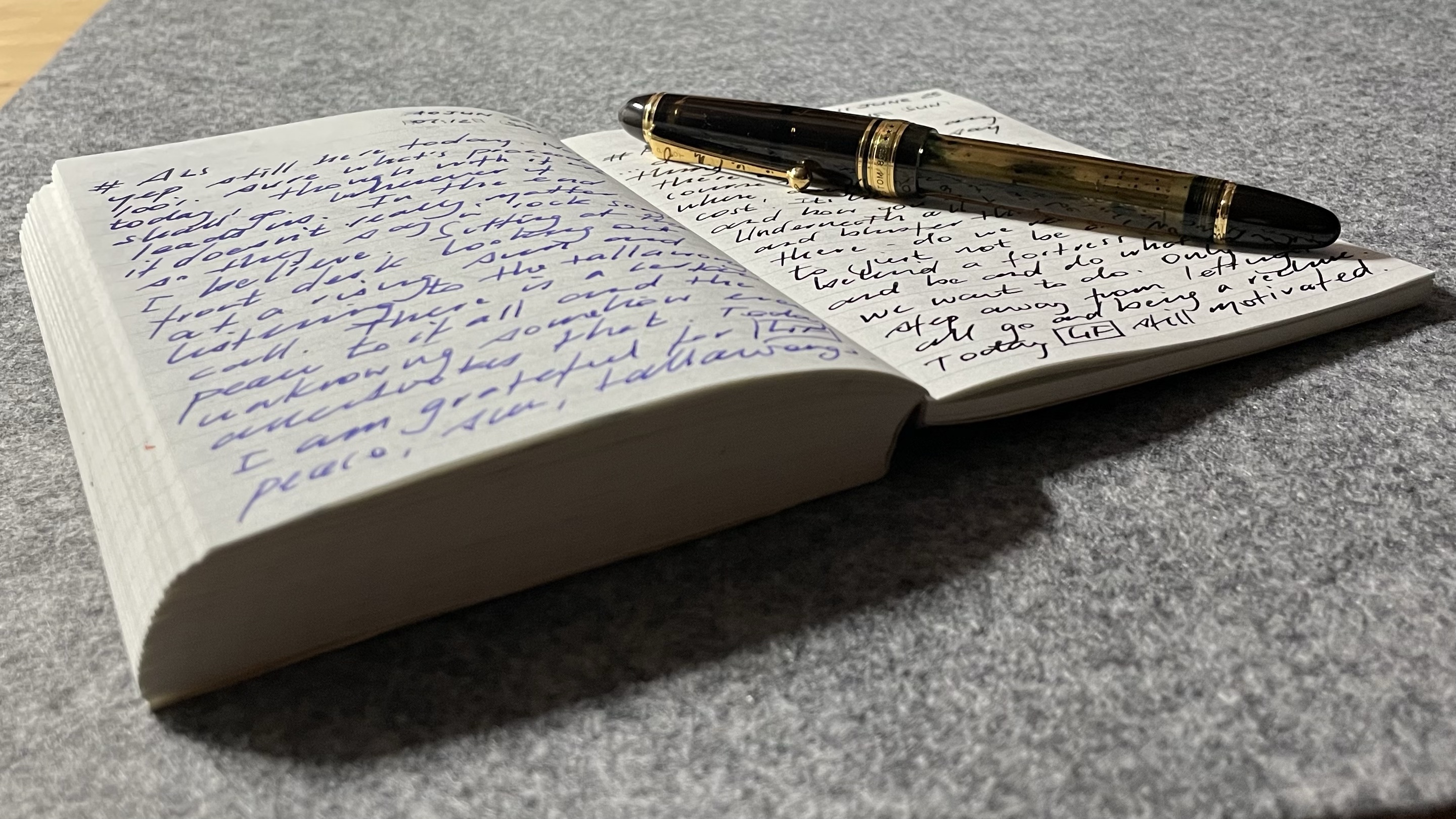
The same morning I read Mary’s account on From the Pen Cup of reaching the milestone of seven years of Morning Pages (well-deserved applause all round), I ended my own daily journalling streak which stood at 1308 consecutive days. A tip of the hat in either direction, perhaps. Congratulations Mary, I wish you many more years, Morning Pages, and words to come.
Myself? Well, I’m guessing it will largely be the same, and while 1308 days is no seven year run, I’m fairly content with my consistency, particularly given there were a few decent consecutive-day streaks (albeit lower in number) before that. If so, why the celebratory “I missed a day” post? It certainly isn’t to decry the act of journalling, and whether it’s a page a day in the Muji A6 notebooks I’ve used these past couple of years, or the mind map I’ve just dumped into a new MindNode document for this post, both have the same effect: thoughts are out (page, screen, blog…) and better for it.
Given the subtext of this post might read: a post related to journalling but not really a post about journalling, forgive me for the confusion. What I’m railing against a little here is becoming too wrapped up in my “streak” for its own sake — or the sake of my “system”. That said, I suspect this journalling example is simply bearing the brunt of a certain level of frustration with my other systems, habits, and routines as they relate to output when sitting at my desk. As the commonly used quote attributed to Peter Drucker states” ”if you can’t measure it, you can’t manage it.” Well, to that I’d counter: “if you can measure it, you can certainly obsess over it” – attribute that one to me…
Journalling is the first thing I do every morning and something I certainly see continuing indefinitely, as I find it a great way to ease into the day. Some days I write about everything, others it’s nothing at all. There are days I’ve Googled and rewritten song lyrics for goodness’ sake, and yes, there have been some significant life events mentioned in those pages as well. As you’d expect, there are (brief) tales of challenging and emotional times, however the last sentence of every entry begins with two letters enclosed in a box: GF (grateful for…). Whatever follows in that final line or two is a simple reminder of the good. Of course, this again runs the gamut: overcoming struggles, life events, a great cappuccino, or just how good the nib is on my Pilot Custom 823. The big and the small — it’s all there.
I guess that is where I’m coming from with my thinking on this — hastily scrawling a date and “nothing to see here” (or similar) on days when I’d missed the morning routine (usually when away from home), just doesn’t feel quite right. Of course, it’s not wrong either — if it had a purpose other than to simply fill in the circle on my Streaks app.
In many ways, the streak needed to be broken simply to put my mind at ease and confirm it could be broken without the earth somehow falling off its axis. It didn’t by the way, with the new streak now sitting at 7 days. I do feel quite ridiculous in saying some sort of weight had been lifted, when after missing the morning routine that day, I made a conscious decision to leave it that way as I walked past the journal sitting on my desk that same night. Be real and end it…
I started a daily journalling habit a good few years ago because I thought I should, though I’ll keep going for any number of great reasons. I never have to decide what the first task or activity is in my day; it is a perfect chance to work through a rotation of fountain pens; it gives the coffee machine time to warm up; and I do feel as though I’ve missed something on the few occasions I haven’t done it.
Now though? Well, I’ll happily continue this helpful and calming daily ritual without the overhead of a 1300+ daily streak to maintain. It is indeed ok to “break the chain” Jerry.
So today, I am indeed grateful for: ending a streak, but continuing one of the more valuable habits I’ve managed to form.
The Ultra Black finish. My Montblanc M ballpoint. Certainly a love at first sight situation when I first came across it in a display case a few years ago. Admittedly I was not entirely sure what the “ultra” really was at the time. A finish? A colour? The mostest or blackest of blacks? In any event, it was different to the standard shiny black “precious resin” of the Montblanc line.
While Montblanc describes it as ”black precious sandblasted resin”, it’s probably fair to call this one “matte black” if we’re trying to provide some context or perspective. While I do enjoy the lustrous deep black shine that is the standard precious resin finish, something a little different is always nice to have, particularly when it’s not at Montblanc’s Great Characters or Writers Edition prices.
So why the post? Well, really only to mention a change I’ve seen in that Ultra Black finish over time. You see, my Ultra Black M ballpoint, when compared with the standard precious resin of the M fountain pen I own — is decidedly less Ultra than it used to be.
I’ll say up front it doesn’t really bother me, however knowing we are all somewhat different in our tolerance for these sorts of things, thought I’d put down a few words outlining what I’ve seen.
The Pens
I’ve written before of my experience with the Montblanc M Ultra Black ballpoint, and it remains close to the the top of my all time favourite and most used pens (perhaps explaining what follows). When it comes to its fountain pen sibling, well I have to say my fondness for the M design lineage continues. I’ve had the M fountain pen for a shorter period of time (though also a good while now), so its long term position in the “inked” pen pot is still being assessed, though to date it has demonstrated quite a strong showing.
My workhorse Montblanc M ballpoint
After all, fountain pens aren’t necessarily the universal truth compared with a ballpoint are they. With nib placement, angle, and balance, there is a reasonable combination of “getting it right” required before you end up with a decent writing experience. Compare that with the uncap-and-dash world of the ballpoint. In my experience so far, the M fountain pen deserves some kudos, at least in this medium nib version I have in my hand.
So, the pens? All good there — love them. The real question being have they lost some of their “shine” given what follows below. Maybe, maybe not — again, it depends on your perspective I guess.
On Shade
Now, onto matters of shade, hue, finish, or at least the “Ultra” of the equation here. To be honest, had I not had both pens out side by side recently I might not have noticed anything different…
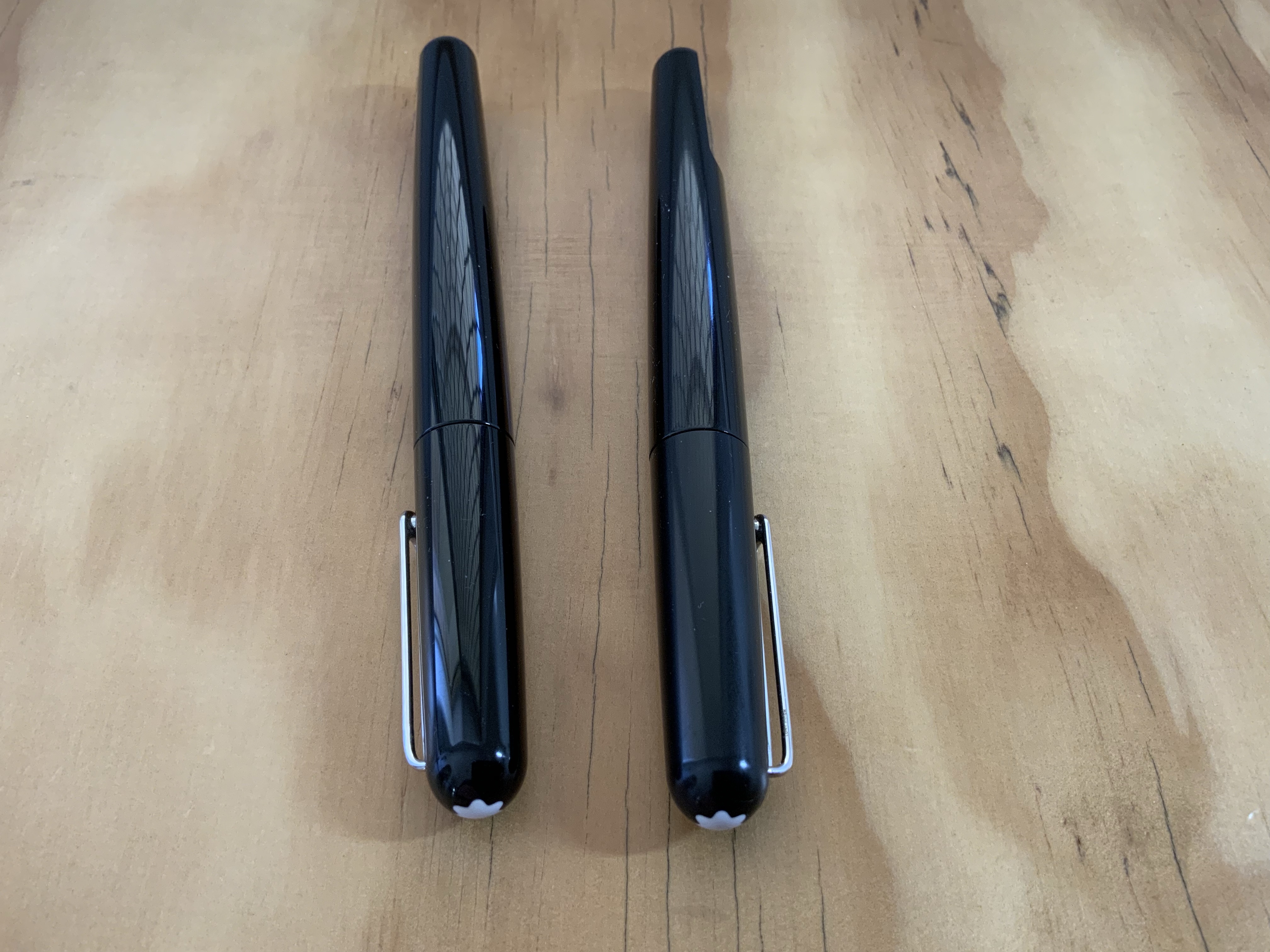
Having the M’s tucked away next to each other in a Nock Co Lookout pen case, it was easy to distinguish between the two by the cap finishes peeking out the top. One, a shiny, lustrous piano black in precious resin. The other, a decidedly matte version of well… black. The point being, its a simple task to tell them apart. Funny thing was, after using both, I accidentally recapped them incorrectly as the barrels looked pretty much the same. Upon comparing a little closer, I was somewhat surprised to see that for all intents and purposes the barrel finishes carried essentially the same sort of gloss finish.
The all gloss standard “precious resin” on the left, the Ultra Black on the right – well the cap at least…
Confused yet? Well I feel as though I’m writing my way around in circles here so I wouldn’t blame you. Where I’d usually refer you to a picture that speaks a thousand words, here I’ve found it incredibly difficult to capture what is clearly visible to the naked eye. In any event, the upshot here is that after a few years heavy use, the barrel of my Ultra Black ballpoint, pretty well matches the barrel of the decidedly non-Ultra Black fountain pen.
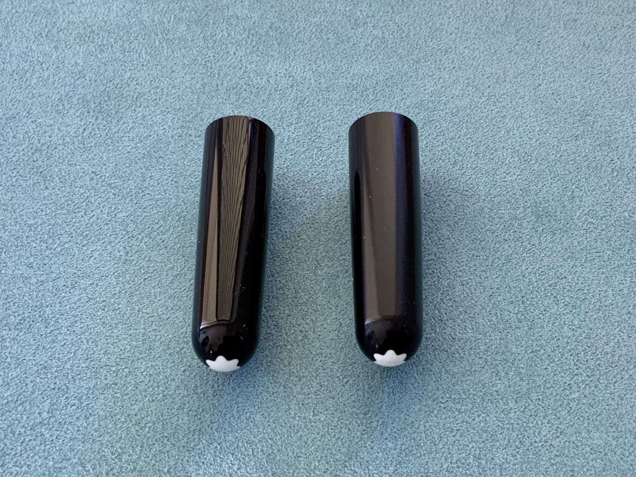
Now strictly speaking there is somewhat of a gradient here. That is, the cap remains the truest version of Ultra Black, not having the constant buffing of my hand wrapped around it, unlike the now-glossier barrel does. Another step along the continuum is the actual precious resin of the fountain pen finish. I guess if we liken it to interior house paint, we’d be talking matte (the Ultra Black cap); semi-gloss (the Ultra Black barrel) and gloss (the standard black precious resin). I’ve gotta say though, those barrels are pretty close.
An unordered gradient of sorts – the standard precious resin pen and cap on left; the Ultra Black yet semi-gloss body far right, and Ultra Black cap centre right
Call it patina, shine, wear and tear, or whatever you like, I simply thought it worth putting down in a post should this sort of thing worry you. Of course it may not be a concern at all. It isn’t to me, however I cannot say for certain that would have always been the case. Perhaps it’s age (as in mine), experience, or something else, but I have this underlying feeling I may not have been overly happy early in my pen journey to notice the removal of the Ultra aspect of my Ultra Black pen simply through the friction of use. I guess this may be somewhat moderated by the fact it didn’t come with any premium addition to the price when I bought it (other then the brand premium of course…), although that is perhaps not entirely the point.
The truest form of Ultra Black remains in the cap – on the right here of course.
Signing off
There are times I feel I”ve written a “What??? Who cares about that???” type of post, and this is one of them. But let’s face it, we all write thousands of words about pens and it simply becomes the nature of a blog at times. There will be those posts that are probably irrelevant to many, yet interesting or useful to some. Hopefully this one finds a place.
One final point in the hypothetical and mostly irrelevant (to me at least) bucket: If I wanted to sell this pen, could I really do so as an Ultra Black model? Perhaps not, though technically that is indeed the model you’d be buying. Again, an interesting question, though as I say, decidedly hypothetical given it is certainly not going anywhere.
So there you have it, the Ultra Black Montblanc M that becomes decidedly non-Ultra Black over time. Make of that what you will.
What began as a couple of lines in a link post quickly morphed into something a little longer, the impetus being a review of the new Cortex Sidekick Notepad which appeared on Writing at Large. Listening to the usual podcasts will provide a fair amount of commentary on the latest Cortex product release, and linked above is an actual review to go with it, which I find to be a very well balanced and honest one.
Straight out of the gate, and as much as I’d like it to be, the Sidekick Notepad isn’t for me. Sure, overall cost is a consideration, however this isn’t unique to the Sidekick, notwithstanding the current noise around price, shipping, alternative (read cheaper) options out there – some which are suggested in the review linked above.
Exchange rates and shipping — all day every day
No, the cost considerations are certainly not unique to the product. Living in Australia, the exchange rate and shipping costs always kill you — on everything. Do I buy from overseas? Absolutely, and I’ve been through a couple of Theme System Journals and a Subtle Notebook from Cortex over the past couple of years, however I hold notebooks and paper to a high standard when considering their value proposition, for the simple reason they run out. Once used they are done. It’s a little different when considering something like a new pen, where yes, the same exchange rate and postage are also likely to be significant, though I’m fairly confident I’ll have the pen for life — or at least as long as I want it.
So how good does it have to be to cross the ok I’ll buy threshold? As always, the answer is — it depends. Occasionally it’s curiosity, other times it’s simply part of a rotation of writing paper which isn’t cheap. That is, a life’s to short to use bad paper approach. That being said, there are plenty of cheap options out there which aren’t bad paper either, making the market somewhat tougher on that score.
Hearing all the noise around the pricing and shipping costs of the Sidekick, merely demonstrates the tolerance level on this is very much what you are used to. As I said, living where I do (for which I’m very thankful mind you…), this sort of thing is the norm, and simply becomes a significant factor in any purchase — stationery or not. A quick check of my options at the time of writing: a Baron Fig Mastermind Desk Pad (list price $USD16.00) delivered in $AUD is $51.00; the Sidekick (list $USD39.00) delivered $AUD90.00. Local options include a Rhodia A3 Desk Pad at $AUD32.00 delivered, or my local Officeworks for a no-name brand at $AUD10.00 picked up.
Quality differences in the above random lots – absolutely, and I’ve spent a considerable amount of time on a factor that isn’t really an issue for the product itself — merely my geography. Suffice to say that if I shouted every time shipping and/or exchange rates tipped over a purchase from yeah that looks good into nah… I can’t pay that — I’d spend all my time shouting.
Again, it’s certainly a consideration, however it’s not about the cost or shipping — because everything is. My apologies for adding to the noise.
Utility, privacy, and cuffs
The real kicker here though isn’t related to any of what appears above, but from experience in giving front-of-keyboard notepads a run in the past. Having tried a similar set up before, I can safely say that for me at least, the logistics of resting my forearms across a notepad while typing just don’t bear out.
Why? Well predominantly, it’s the cuffs. No, the double button barrel variety — not the lockable metal kind. Notwithstanding the downward spiral of business attire these days, surely I can’t be the only one who actually wears business shirts to the office these days? Can I? Perhaps I am. At the very least in the cooler months it’s an Oxford Button Down when working from home, aka something that still has cuffs.
Even now in the office I’ll occasionally reach over my notebook to type a few keystrokes and pick up some ink from the pages on the heel of my hand and/or the cuff of my shirt. That’s with using a ballpoint no less. It’s precisely for that reason my office-based pens comprise the arsenal of ballpoints I own. Things tend to get messy and far less practical throwing fountain pens around. In times gone by when my setup did involve a dedicated desk notepad at the keyboard, I’d find myself constantly picking up an ever-increasing shade of ink smudge on my shirt cuff. I wouldn’t have thought I’d be alone in this, though the fact it never comes up in any commentary, perhaps I am? I sometimes think the typical office warrior such as myself is a thing of a bygone era, and independent creator products perhaps just aren’t intended for me. That said, product descriptions and marketing would seem to suggest they are?
Further, meetings. Apparently I could also take this to meetings. Well, sometimes I could, however a lot times that isn’t the case given space constraints in meeting rooms where table real estate can be at a premium and the standard set up is a small A5 sized notebook on my lap for any notes. Again, depends on the meeting, the attendees, and the topic of discussion.
Next, privacy. Well, granted, this would be the same with any form of hard copy notes taken, however in an office environment, anything I’ve written simply sits on my desk, which may be (and on many occasions is…) a note or to do item I don’t necessarily want seen: ”follow up HR about…” for example. It’s just easier to flip closed a notebook than cover up a slightly sensitive piece of information.
Even in this new way of working — office gossip seems to have remained unchanged…
Signing off
Were I in the market for a a notepad of this nature, well, the Sidekick might just as well be absolutely the one, and for some, it clearly is. I just wonder sometimes whether the products from fantastic independent creators (and I’m all about that — don’t get me wrong), just aren’t meant (or at least tested by) those of us anchored in hot-desking, Office 365, and physical office buildings.
Of course the entirety of each and every point above has an equally (likely more) compelling counterpoint or solution which I’d normally acknowledge in the post, however that misses the point a little, in that this is simply how the pro’s/con’s analysis of whether this is for me ended up. Looks like a fantastic product, however given my previous experiences with this type of setup I know what does and doesn’t work for me.
Towards the latter part of last year, my beautiful wife and I celebrated our 25th wedding anniversary. As you can imagine there were gifts exchanged, and among them one suitably appropriate for a household (husband?) with an affinity (obsession?) for stationery. Before we get ahead of ourselves, while there is indeed a pen involved in this story, it is not in the “shiny new” way you might be thinking.
In this case, the “shiny new” is a notebook. In recent times I’ve taken to embossed notebooks to mark certain occasions, firstly a 50th birthday, and now the anniversary I’ve mentioned above. In all the excitement, something else quietly slipped by and has just come to me now. Four months later.
You see the bookend which begins this story is indeed a pen, and it was shiny and new quite a few years ago. It hit me just the other day — the pen I received as a wedding gift from my wife is of course also now 25 years old. My first fountain pen. All the way back then. Before the blog. Before any sort of foray into pen nerdery.
The pen
The pen? Well I’ve written about it before, even making the bold suggestion my first fountain pen was actually my grail pen. As pens go it was a fairly ambitious entry into the world of fountain pens. A Montblanc Meisterstuck Classique, in your standard black with gold trim. I don’t see many Montblancs recommended in the best beginner fountain pen lists out there — and for good reason of course.
The fact is though, I loved it then and I love it now. I get it, of course there are plenty of “more appropriate” beginner pens, though whether a more appropriate pen exists to mark the best day of your life? That I’m not so sure, but maybe I’m a little biased. In many ways it also leads directly to the point doesn’t it? These types of purchases are just as emotional as they are technical. Perhaps even more than we think.
The Classique along with another small anniversary getaway project. I probably wouldn’t recommend spending all weekend building the Death Star or the Millennium Falcon…
Little did I know the extent to which that pen would eventually contribute to a deeper dive into pens themselves, the internet of pens, and the genesis of this very blog. To say it developed an ongoing affinity for the brand is probably not too far from the truth either.
I’ve been fortunate enough to acquire a good number of pens since that day, on varying ends of the price spectrum, however there can only be one original, and I’m pleased to have had a certain naivety in the process of acquiring it. There were no apparent choices in size, nib, colour, filling systems or anything else that becomes a consideration the further into the pen world you go. Nope. Of course there were indeed quite a few options, however it was always this one and only this one. Even knowing what I know now about pens, I’ve never felt that pang of: I wish I’d picked a …….. instead.
So how is it fairing after 25 years? Well I’d have to say it’s doing very, very well, and firmly maintains its place in the standard in and out rotation of pens along with the rest of my collection. It’s faultless medium nib has never failed me and has now seen both the wisdom and folly of thousands of words from the mind of its owner, having long forgiven my stumbling first few months of ownership.
How sensible people enjoy the afternoon sun on an anniversary weekend getaway…
…while silly people with pens get a cramp in their hand from holding a phone weirdly for that “perfect shot”
The notebook
And the notebooks? Well, at the current time they remain in the yet to be used category, given I have a few others on the go currently. Their time will come. I say notebooks in plural, as the purchase involved one for each side of this anniversary occasion. I’m not sure what my wife might have planned for hers (the navy if you’re curious), however I’m thinking my black one will be up next as my home desktop notebook. When using an “occasion” notebook, there may be the tendency to designate it for a “special” project or use. The birthday notebook I mentioned above has indeed been assigned the duties of my long form writing project, and there is certainly benefit to that — possibly even from an increased significance or meaning to the notebook itself.
Mind you, I’m here to also sing the praises of getting them into general use as well. The same as my pens. The significance or sentimental value in my mind is not lessened by using them in this way. I’m sure many of you are the same, it’s often by use that the connection is strengthened: the patina on a pen or leather; the change of a page from crisp and blank to crinkled and full; flipping back through bold, colourful, ink filled pages.
…and yes, I emboss on the back cover, preferring a more subtle acknowledgement of the occasion.
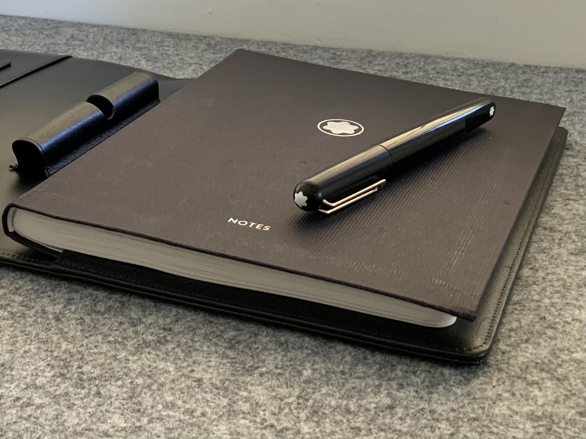
Its fairly evident from the images in this post that the notebooks themselves are of the Montblanc variety, and are a little more expensive than your average notebook, however again, the spend doesn’t necessarily equal (or need to) the significance. I’m sure that affinity for the brand I mentioned earlier certainly influences my decisions here, and also further illustrates the myriad of factors which may go into this type of purchase.
I guess one of the real joys of a pen and stationery habit is that there is always a “list” from which to choose when the time comes for either gifts or gift suggestions. Occasions like birthdays and anniversaries are of course prime candidates to cross something off that list and there will no doubt be a wide budgetary spectrum at play.
In the end it may be something expensive, or not so much, but the value to each of us will be inherent in the occasion it represents. Sometimes that will be a planned purchase for a life “milestone” but might just as easily be simply what you were using when a certain “thing” happened.
However it might occur, that significance will never be lost, regardless of cost, grandeur, or even whether or not it shows up on social media or written in a blog. It might even come to you out of the blue, say, four months past the event it commemorates, and that’s okay.
Just don’t wait four months after the date to remember your actual anniversary. No. Don’t do that.
Perhaps that’s not entirely true, however I’ve been a pen and stationery enthusiast long enough to not only have a fair idea of what suits my writing style and taste best, but to also know exactly where to deploy pens which may not quite fit that ideal window on my usability spectrum.
While there are a couple of ballpoints in the mix here, the slimline black Montblanc and to a lesser degree the Montblanc Noblesse (top) are at the centre of the discussion. Pencil for a little scale.
The slimline fountain pen of the 70’s and 80’s being one example, however there are quite a few others which sit squarely outside my typical usability criteria mentioned below. I remarked recently to a good (pen)friend that much of the “pen discussion” which occurs in our correspondence would make great blog posts, so here I am putting that theory into practice. You see, accompanying a recent letter, I also returned a few pens generously passed on to me by said friend, in the knowledge they would be forwarded on and re-homed to a user perhaps more suited to them.
On a brief side note, I have written about this gentleman before, and truth be told he is one of the most helpful, generous, knowledgeable, and selfless people I’ve had the good fortune of getting to know as a result of writing this blog.
Back to matters at hand, and as it turns out, most of those pens were slimline (read, very slim and narrow) fountain pens which were in their heyday in the 1970’s and 1980’s. Whilst they may not be what I’d reach for to write a thousand words, they were certainly far from unusable, and a few have certainly remained in my collection, to be enjoyed and put to good use. As I wrote in my correspondence, I’ve found there are not too many pens I cannot use in some form or another.
A Usability Window
Don’t get me wrong. We are not talking “unusable” pens with faults or defects that render them, well… non-functional and unable to be used at all. No, here I’m simply referring to those pens which at first glance, hold, or use, give us the: ”well… ah… yeah… not sure how this is going to go for any significant writing…” type of feeling. I suppose it’s the fine line between less-suitable and unsuitable. One of the joys in talking about this stuff is when writing those previous two sentences, I know with 100% certainty that anyone reading this knows exactly what I’m talking about with no further explanation necessary.
I’m sure we all have pens that if we were to sit down and write a few thousand words in longhand, would be the first pulled from the pen pot or case and we’d be eagerly scribing away. Others not so much, where even the thought of making it to the bottom of an A5 page begin those muscle fibre fasciculations which precede writers cramp. It may be size, weight, balance, or many other factors alone or in combination telling us that even beginning with a full cartridge of optimism simply won’t cut it.
For me? Well its usually related to:
length: too long or too short (I’m generally not a cap poster, so aside from your pocket pens designed to be the appropriate size upon posting – a la the Kaweco Sport which I love – posting generally makes them feel too long to me). Your smaller pens such as the Pilot Prera and Pelikan 205 I can get away with, however prefer something a little larger if the writing task is looking similarly sizeable.
body thickness or diameter: no doubt we all have a sweet spot here. Slimline fountain pens of the 70’s being a little outside mine. That being said, personally I find this to be a wide, wide spectrum
taper: I find this an interesting one. Thin and straight – not so great. The same thin diameter at the grip which has come down in a taper – much better. My usual preferred thickness but in a gun-barrel straight body? Sometimes not as good. As I said, I find this an interesting one…
finish: I typically find metal barrels a little on the slippery and hard to manage side. That said, the humidity of a Brisbane summer generally affords a bit of tackiness in that regard.
weight: often not a deal breaker on its own, given you are of course also thinking this is inextricably linked to balance (as is posting the cap more often than not). A mid to lower centre of gravity if you don’t mind. Combined with the above point — a weighty metal pen can present a challenge.
appearance: yeah, I said it… looks. Not in the way you might think though. I’m talking about the output on the page. Those times when the pen doesn’t feel right but your writing just looks fantastic. I’ve typically had most of these experiences with pens I’d have considered a little on the thin side. To be honest it’s often quite a “wow – this goes well” type of moment. Yet, and perfectly illustrative of the point to this post, “wow” is soon replaced with “oh, starting to struggle here — that’s getting a bit messy…” if any sustained writing needs doing beyond maybe a few minutes.
I’ve kept the above list devoid of the even more finicky aspects of nib type/size/grind or liquid ink vs ballpoint, with these really beyond what the post is about. And granted, the above are exceedingly obvious and far from groundbreaking to anyone reading this. In its simplest form we are merely talking about those ”oh this is too big/small/thick/thin/long/short/heavy/unbalanced/slippery/knurled/smooth moments that first flood your mind upon picking up and using whatever writing instrument it may be.
Tale of the tape out of interest: 8mm at the grip section, running to 10mm on the barrel
But of course, all is not lost…
Strategic Deployment
It is here the crux of the argument lies. I’m sure none of us will put up with something we genuinely don’t like using, and with various online marketplaces or simply exchanging with others, there are plenty of ways to offload something of that nature. I guess what I’m referring to though is the genuine joy that exists in having a certain amount of variety available in our day to day tools. Also, it’s not hard to see most of us in this pen caper have some sort of “rotation” in use at any given time. The variety may therefore come weeks to months later, depending on just how many pen soldiers are in storage before they are called to active duty.
I wax and wane as far as numbers in the rotation are concerned (largely depending on when I decide to clean and refill), however I’ve also noticed a trend in having a secondary group — a “special teams” if you will. It’s in this group where the slimline fountain pen sits. Or the outrageously heavy pen. Or the pen that is too short. I think you get the idea.
A short A6 journal page entry? No problem.
This secondary group exists in parallel with the main group for two main reasons. One, they perform what I’d call “writing support” functions (more on this below) and two, they get a run in the main group when the urge to clean isn’t strong enough to reinforce the dwindling ranks of the “in-rotation” group. The funny thing is, it’s the latter of these two scenarios which frequently reminds me that many of the pens assigned a support role deserve a spot in the main rotation, and that is often a change I make moving forward.
So what of these writing support functions? We all have them I’m sure, and I present a second exceedingly obvious list for your reading pleasure:
markup: perhaps the most common of them all. Editing your 2014 NaNoWriMo novel for example — a task that remains unfinished (errr… I mean tasks like that anyway, surely no-one is that slow… right?). Those office ”can I get your thoughts on this” type of queries — often printed, hand-written feedback applied and returned (or at the very least hand written for my own thoughts before applying tracked changes and returning a digital document)
lists: not much to be said here. If I cannot use a certain type/style of pen for a few pages, I can generally use it for a dozen one or two word bullet points
index: essentially the point immediately above
headings: where you might prefer the analogue equivalent of H1, H2… etc
contrasting text: colours, underline, highlight. Some of this blends into markup, yes, however I also often use different colours in the primary text of a notebook for ease of emphasis or finding something upon scanning through pages
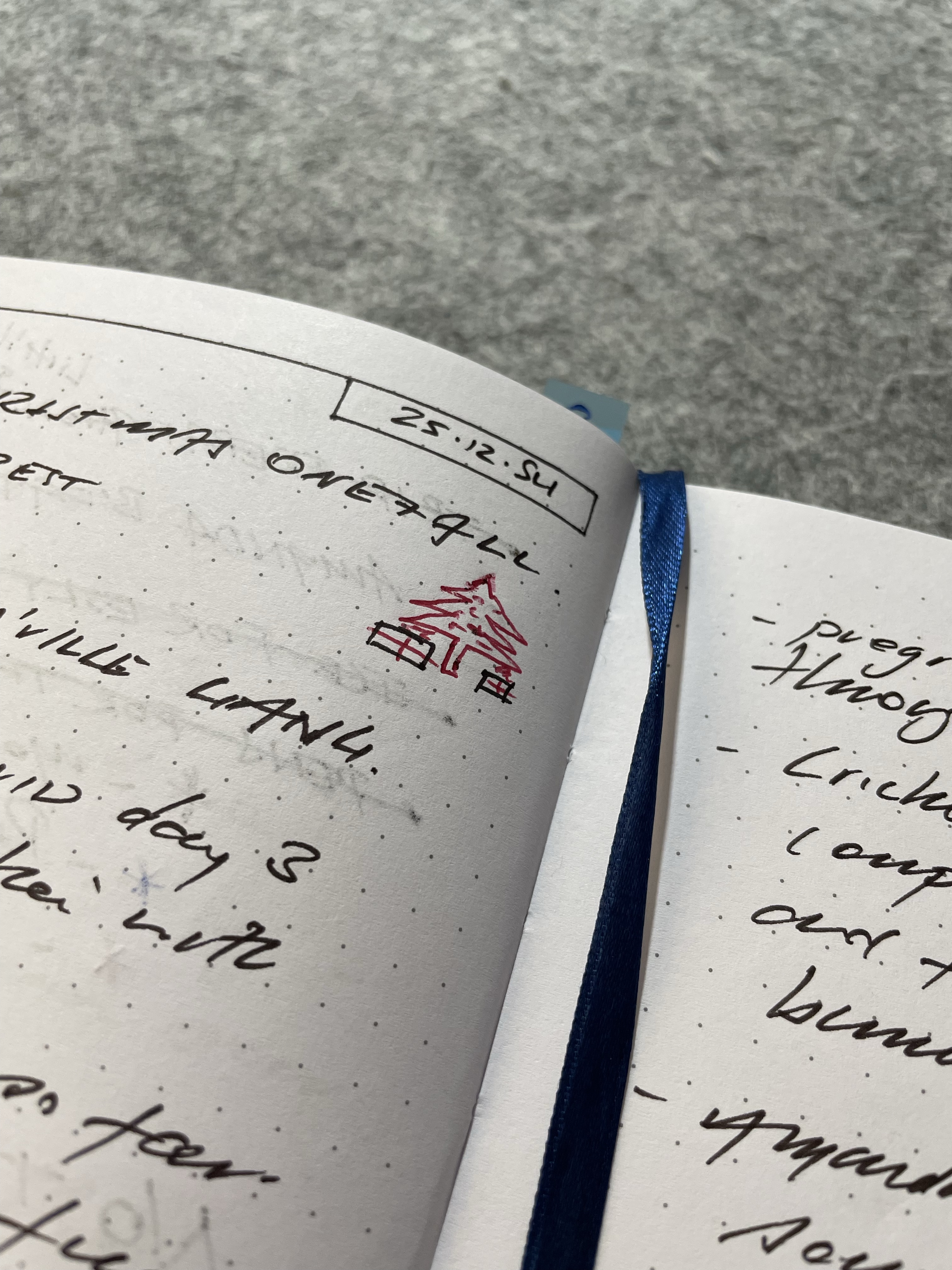
injection of joy: not the artistic type by any stretch, however at times I’ll add a little flourish such as the one in the image below if I’m so inclined (“flourish” considerably overstates what you see below, however that’s about as good as it gets — notwithstanding the numerous Bujo YouTube videos I watch at times…)
Merry Christmas one & all…
You’ll have your own lists with far more in them than mine, and I’ve likely forgotten a couple I use as well, however I just want to emphasise one thing: “strategic deployment” is by no means a synonym for “begrudging use”. If I really don’t like a writing instrument, then yes, it will see no use and will leave the collection. It’s just that with all the possible uses, this very rarely occurs, and that is something which gives me considerable satisfaction.
What has always worked for me is loading them up with atypical colours (if you write with all the colours of the rainbow then it won’t matter anyway) to utilise the benefits for markup and contrasting text; having them located at their assigned task (ie coupled with the notecards or notebook in which the list is made); ensuring horses for courses (no free flowing nibs with feather heavy inks in a pocket notebook or on cheap paper if I have too use it — long live the ballpoint!!! — that’s genuine praise, don’t get me started, I love them).
Signing Off
In wrapping things up after taking far too long to say that I rarely can’t find a good use for a pen, there really is nothing more satisfying than having an arsenal of pens, with a reasonable amount of variety, which all see their fair share of use. Use them and love them I say.
And a final word to the generous soul now back in possession of those pens — I’m sure they’ll bring as much joy to the next new home as they did to mine, and as always I am forever grateful to you. And that folks, is an expansion of my letter, as a blog post — unsurprisingly it works pretty well.