My Pelikan M205 Fountain Pen

The opportunity to pick up this Pelikan Tradition M205 was a little too hard to pass up back in May of this year, with Pen Chalet offering the model at half price during a period of The Pen Addict podcast sponsorship.

I was looking to add to my collection of quality fountain pens, and snapped up a black model with chrome trim and an EF nib. Ordering and shipping from Pen Chalet in the US over to Australia was quite fast, and in rapid time I was inking up the newest member of my pen family.

Look and Feel

There is no doubt the M205 is a great looking pen, with the black and chrome combination providing a classic, elegant look. It makes a great business pen – perhaps a little small in stature to be signing million dollar cheques, however I don’t sign many (who are we kidding – any) of those. It is also manufactured in Taupe, White and Red.

Image courtesy Pen Chalet

Image courtesy Pen Chalet

When capped, I find a certain appeal to the overall symmetry of the pen, and although not a large pen, the body diameter through the pen barrel is perfect relative to its length. The cap itself sits proud of the body when screwed on, further accentuating the central chrome band bearing the Pelikan and Germany insignia. An additional chrome band at the clip attachment, and another towards the end of the pen at the piston filler control, provide evenly spaced breaks to the shiny black finish of the barrel and cap.

M205_FinialM205_Nib_Cap_CrossM205_ink_bottle_pen_better

The finial sports the elegant Pelikan (pelican) bird and baby logo, with the clip shape recreating a long curved Pelikan (pelican) bill. The clip itself functions well, with suitable spring, yet is smooth enough to avoid snagging on either my shirt pocket, placket, or the Nock Co. Lookout in which it usually resides.
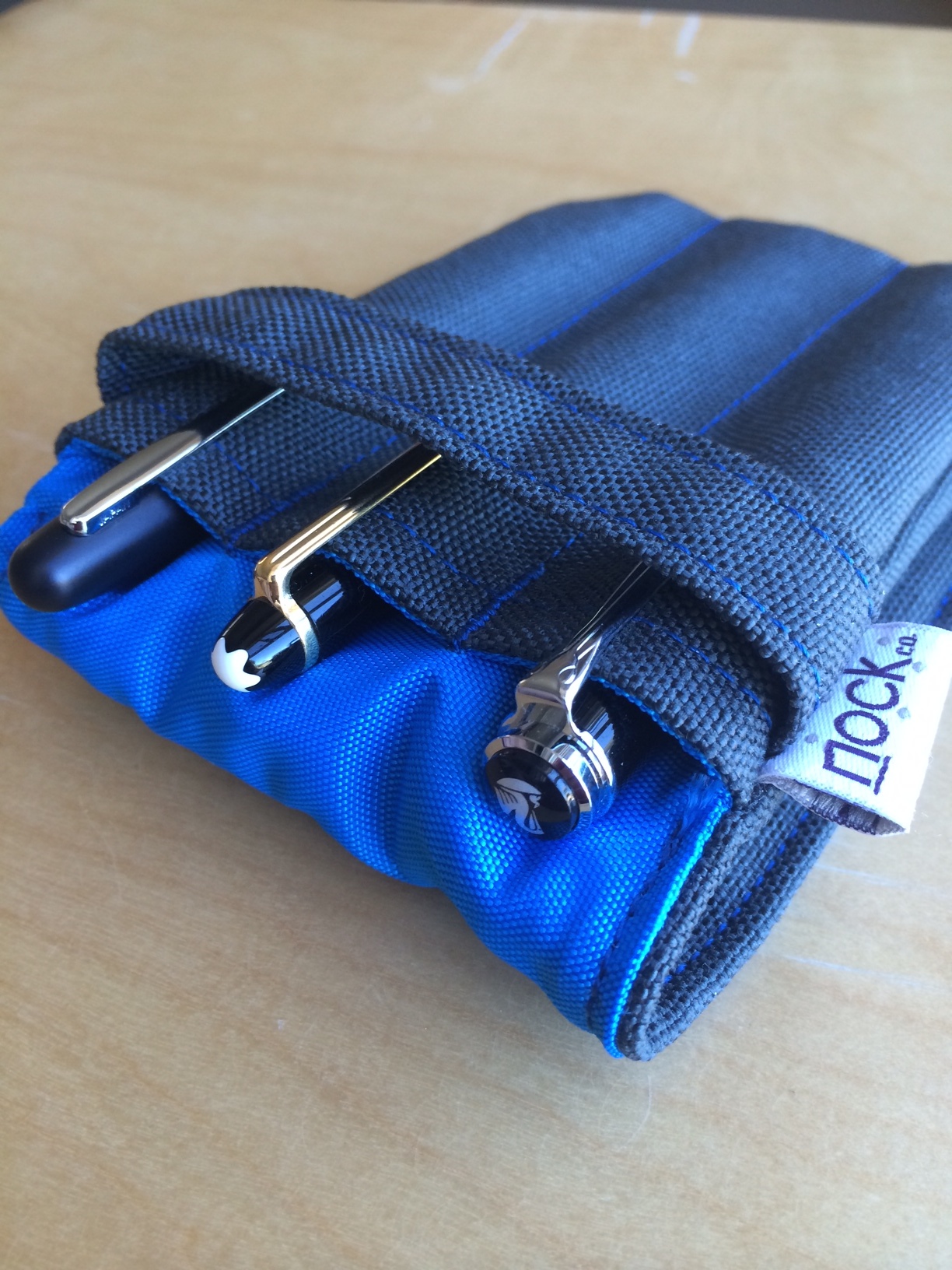
M205_LookoutWhen uncapped, with the exception of the fine chrome ring at the top end of the pen, and the dark tinted ink window adjacent to the grip section thread, the body of the pen is solid black, right through to the stainless steel nib. The nib itself is plain, polished stainless steel, with the logo, Pelikan name and EF inscription. Perhaps another chrome ring near the section may have been a nice addition, however would run the risk of creating a less seamless grip, and for the sake of appearance only is probably best left alone.

Constructed of a plastic resin, the pen is quite light (14.8g fully inked), particularly when used un-posted (9.9g), which I tend to prefer for extended writing sessions. Larger hands may find the barrel a little short for use without posting. A three-quarter turn will remove the threaded cap, which posts securely for writing and in no way affects the overall balance of the pen.

Performance

Great purchase deals aside, this is a $200.00 pen at standard retail pricing, and the expectation is that the writing experience will be commensurate with the price tag – that is, exceptional.

Others experiences

This is where things get a little interesting. Generally, when deciding on a pen purchase which will set me back a decent sum, I tend to consult the opinions of a number of pen bloggers who have tested and reviewed the pen in question. In this instance, that was not the case, as the podcast recommendation and great deal were encouragement enough to click the purchase button.

Subsequent to my purchase, I then read the opinions of those I hold in high regard who found the M205 not to their liking, and had I read these reviews prior to ordering, may never have picked up the M205 at all.

Boy am I glad that didn’t happen. I love this pen.

The reviews:

Pelikan M205 (the Illustrious) Fountain Pen – F Nib (The Clicky Post)
Pelikan M205 (the Illustrious) Fountain Pen – Update (The Clicky Post)
Review: Pelikan M205 Fountain Pen (The Well Appointed Desk)

I’d encourage you to read through the articles above for a full appreciation of the issues raised, however if I could summarise, others have found the nib “sweet spot” to be quite small, requiring a good deal of concentration to keep the pen within it, if the writer is even able to do that at all. This obviously places a question mark over whether the pen is suited to all writing styles.

Conversely, other reviewers have found the pen a delight to use, living up to every expectation, straight out of the box. Luckily I found myself in this camp.

Pelikan M205 Review (The Pen Addict)
I heart you: Pelikan M205 and Levenger Shiraz Ink (From the Pen Cup)
Pelikan Tradition M205 Fountain Review (Pen Paper Ink Letter)

On balance, it is therefore difficult for me not to recommend this pen, particularly at the discounted sale price, which is again available from Pen Chalet at the time of writing.

My experience

Sweet spot troubles? Myself, not so, and I would put forward a couple of theories on why that is. Firstly, although it is 17 years since I began using a fountain pen, my experience has not been widespread across different brands and nibs. Further, I have recently begun using pens with nibs a little finer than what I was previously used to, and in part appreciate the increased feedback of the finer nibs on the page. Here I am also acutely aware of the fine line between “feedback” and “scratchy”, believing I can appreciate the difference, however my experience on this may differ to a more experienced hand.

M205_BoxWhen testing further to get my thoughts together on this, I wrote with a more expensive pen (Montblanc Meisterstück Classique 14K gold M nib) and a couple of cheaper ones (Pilot Kakuno steel F nib and Pilot Metropolitan steel F nib) on a rotational basis line by line down a page for quite some time. There was a clear difference in feedback from the Pelikan and Pilot nibs when compared with the Montblanc, likely due in part to  the change in nib size, though of course material and manufacture no doubt play a part.

I could go on and about the ins and outs of these comparisons, however at the end of the day, my point is – for me, this is a great pen, and one I enjoy using very much. This is a fact I am certainly thankful for, as again, great “50% off” deals aside, $100 of my money still went on this pen. Whether or not $100 is too much for a stainless steel nib is for you to decide, however perhaps just shy of $200 is.

Writing

In my experience, the M205 writes extremely well, and I have not had any false starts, skips or unintended line variation in the three months I have used the pen, irrespective of the ink used.

As expected, the stainless steel European EF nib was still broader than the Japanese Pilot F nibs in a direct comparison. The writing sample below shows the Pelikan EF compared with a Pilot Kakuno F (Metropolitan F results equivalent) and Montblanc M, along with line variation achievable with varying levels of pressure, as the nib does demonstrate a small amount of flex.

Line width comparison

Line width comparison


I would also point out here that when inked with something like De Atramentis Permanent Blue, which I have found to be a fairly wet ink, the line is considerably wider than seen with the Pelikan Edelstein Tanzanite used in the image below.

Writing sample

Writing sample

Conclusion

The Pelikan M205 is a pen I am very glad to have in my collection, and is one I could happily write with all day. Its looks are commensurate with the writing performance, and it is a pen I use at times in the office, given it’s classic, elegant style.

As I have indicated above, I found no issues with the nib, however others have, so perhaps that is a caveat to consider before purchasing. Whether there is perhaps a question mark on the overall value of the pen if assessed at full price, given the plastic body and stainless steel nib is a personal choice (despite the gold nib, my Montblanc is also a plastic resin).

Personally, I would have no hesitation in recommending the Pelikan M205 to someone looking for a quality pen, and if you can pick one up on a fantastic deal like I did – go for it.

A Pilot G-2 Experience

G2_FullThe Pilot G–2, one of the most widely available and affordable gel ink pens on the market, which, according to the Pilot USA site, is America’s “best selling gel ink pen”. It would be reasonable to therefore assume the G–2 is quite a good pen. Many would no doubt say it is, and I do not necessarily disagree, however would suggest things are not quite as simple as that, with affordability and availability playing a big part here.

My issue with this assumption is best explained in terms of other markets, for example, is the best-selling album necessarily the best album? The best-selling app necessarily the best app? More often than not the answer is no. Best selling – the sales numbers don’t lie (though it can depend on when, what and how you measure them). Best – a whole other argument, where subjectivity, personal preference, opinion and emotion often rule the day. And rightly so, we are the consumer putting our hard-earned down for a product. Personally I’ll only keep doing that for something I really enjoy using.

Background

I first wrote about my impressions of the G–2 some time ago, in a post comparing it with the uni ball Signo 207 and Jetstream. At that time, the comparison involved 0.7mm models, and I had always planned on testing out the finer end of the G–2 spectrum at some point in the future.

A month or so ago I found myself standing in an Officeworks store wondering what my answer might be if asked: What is the best pen I can buy here, right now? Would I suggest a Pentel Energel, uni ball Jetstream or 207, a Pilot G–2 or something else? To be honest, I never really answered the question (though it would most likely not have been the G–2), however gave further thought to which tip size I might then suggest. Unsurprisingly, the G–2 was available in four sizes, not so any other pen in the store (in fact no others had more than two sizes available). What was I saying about affordability and availability above?

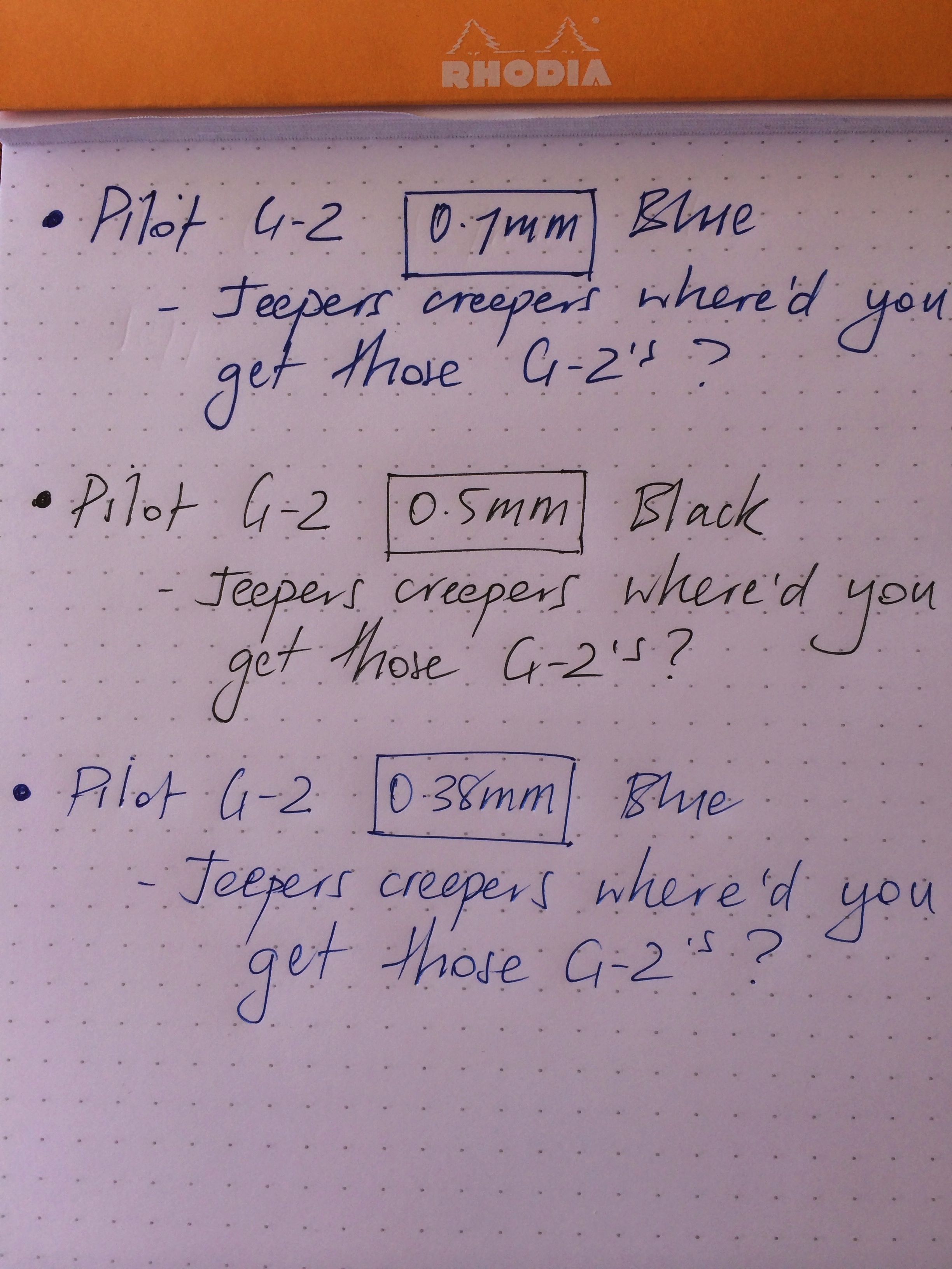
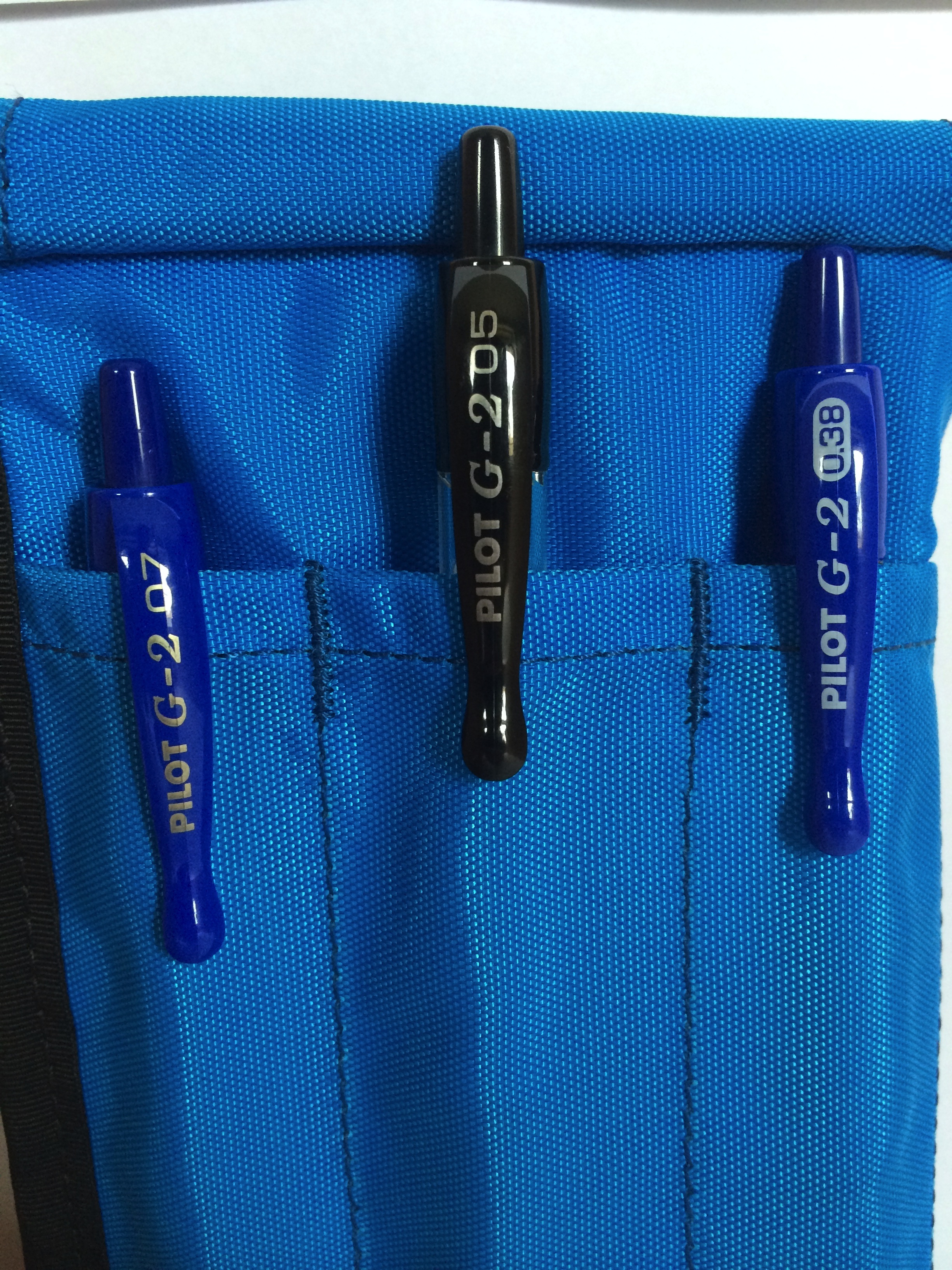
For the price, the G–2 is undoubtedly a reasonably good pen. One of my favourites? No. In spite of this, upon arriving home from the store, I filled one side of my Nock Co Sassafras with the 0.7mm (blue), 0.5mm (black) and 0.38mm (blue) G–2 models. Having previously used the 0.7mm, there was no need to include the 1.0mm in this comparison, having ruled out using anything broader then the 0.7mm. The next two weeks would then determine which size G–2 I preferred, and whether this would sway my previous opinion on the G–2 in general.

Look and Feel

Looking back on that original post, I had written the G–2 was “not the best looking pen out there”. I’d have to say that view still stands. Look, I am under no illusion that a sub $5.00 pen will necessarily end up as an icon of design, however some models at this end of market definitely look better than others to my eye.

IMG_4386

L to R: Jetstream, Signo 207, Pilot G-2

When viewed alongside a Jetstream or Signo 207, aesthetically, the G–2 probably ends up last in line. When placed alongside a Pentel Energel? The contest is much closer, however I still find the G–2 in last place. What is it in particular? I would say the majority of my dislike is both the clip and knock at the top end of the pen. The combination of a clip which reminds me of dripping candle wax, and the long, tapering knock on the end of the pen are just not to my liking. Compare that with the sleek lines of both the Jetstream and 207 in the image at right. The remainder of the pen I have no major aesthetic issues with.

Lets face it though, the simple aesthetics of a pen are so subjective, and a few photographs in a review are probably the last thing that should sway your own opinion.

How the pen feels in my hand? Another matter entirely. I absolutely love the G–2’s very slight taper at the rubber grip section. Having a quick look at some of the other pens on my desk here right at this moment, all of which I love using – a nice taper on the section is present in all. Although only a few millimetres of taper is enough, pens without one I find pretty uncomfortable and generally struggle where the size of the barrel and section are uniform through to the taper at the very tip.

Performance and Use

How does the G–2 perform when writing? The answer to that question lies, I believe, in your particular style of writing. It is here the variation in tip size has the potential to make all the difference to your writing experience. I find the broader tips more forgiving, whereas those on the finer end not so. My writing style is one where the pen is approximately 45º to the page (fountain pen or otherwise – this is standard for me). I have often found such a position not suited to finer tip pens, particularly when reasonably speedy writing is required. At times my slightly heavy handedness does me no favours, however again, that’s me, and my pens need to perform within that set of conditions.

G-2_Compare

Needless to say, I have at times challenged myself to use a finer tip pen, with the aim of somehow(?!) encouraging my brain to note down relevant points only, however mostly end up simply scratching out the same amount of text anyway, resulting in a less than enjoyable writing experience.

The main issue I had here was the amount of feedback from the paper with the 0.38mm, ranging from fairly minimal (Rhodia No. 16 Pad), to a moderate degree (office copy paper, Field Notes Shelterwood) to an annoyingly high degree (office supply spiral bound notebooks).


Completed_ETPStaples pic

Whilst my use of copy paper and office supply note books may be seen as heresy, I am sure I am not alone in using these types of items, for without going into great detail, there are certain office based workflows that simply require them in my current role. A story for another day perhaps.

G-2_TripointTo that end, I don’t believe the 0.38mm G–2 is necessarily inferior to the 0.5mm, however the fit with my writing style is not as good. If I am entirely honest though, at times the 0.38mm was my preference, for example when taking a few quick notes in my Field Notes (Shelterwood at the time) or on a tear off shopping list. It just wasn’t as good for slightly longer form writing.

As you would expect, the line production and inkflow of all three sizes performed flawlessly. There were no skips or false starts, and the ink produces a nice, vivid line, however given the fineness of its output, the blue 0.38mm occasionally seemed to fade a little “into” certain shades or even sizes of paper (for example when taking notes in an A4 sized office supply notebook).

Though also blue, the 0.7mm laid down far more ink, yielding a much more vivid line which stood out on the page. The 0.5mm is perhaps where the science of my comparison falls down a little, having only the black in this size, however I found no issues with the ink output and line production.

Conclusion

Medal ceremony. Unofficially brought to you by Nock Co.

Medal ceremony. Unofficially brought to you by Nock Co.

So, was there a sweet spot for me across the range of G–2’s? I’d probably say the 0.5mm overall. Though I didn’t reach for it quite as much as the 0.38mm. I think I shot myself in the foot a little by having the 0.5mm in black, as for some reason I have been enjoying using blue ink a little more recently. Were I to have a 0.5mm blue at my disposal, I’m sure this would have been the one to see the most use.

A photo I posted on Instagram recently with the three G–2’s in my Nock Co Sassafras, drew a few comments and suggestions recommending the Pentel Energel 0.5mm and the uni ball Signo 207. Funnily enough, both are two pens I do prefer over the G–2 (“taperless” sections aside).

I can understand why the G–2 is such a popular pen, however, always in the back of my mind is the fact that there are pens of equal cost and specs out there that are better. Some of these I have tried (Signo 207 and Energel), some I have not (Zebra Sarasa). I suspect affordability, availability and market awareness are the main reasons for the popularity of the G–2, however I cannot discount the fact that people do really like them.

To sign off, this past couple of weeks was an experiment in tip size as much as a G–2 “experience”, and probably brought me to the conclusion 0.5mm (or perhaps 0.4mm) is as fine as I’d probably go. For my writing style, anything beyond a couple of bullet points in a list became hard work with the 0.38mm G–2. Perhaps a similar sized pen with a smoother inkflow may sway me to go finer, and if anyone has any suggestions along these lines I will certainly give them a try.

What happens with the G–2’s? Retired. Probably for good I’d say.


Analogue and digital: an equal partnership

Digital_analogue

I recently published a post on the merits of improving my handwriting or “penmanship”. This had the flow on effect of triggering some consideration about my note-taking in general, which commonly occurs in both digital and analogue (hand-written) forms.

Digital or Analogue – Why not just choose one?

Why not simply go all in with handwritten notebooks, a manual calendar or perhaps a Bullet Journal type system? I don’t believe this to be possible in the way I like to interact with my work, hobbies, thoughts, and just about everything I either enjoy, or am required to accomplish on a day-to-day basis. In reading that sentence over, more accurately, I choose not to work this way.

I’m sure if I wanted to, I could “go off the grid”, however I enjoy using my digital tools as much as I do my analogue ones, having put a good deal of effort into setting things up so they work well together, as I have seeking out great pens and notebooks. I believe the two can co-exist happily, complementing each other, rather than requiring isolation or resulting in duplication. Just the other day for example, working through a tutorial on the longer form writing Mac application Scrivener, it seemed appropriate to jot down the key points in my Field Notes Arts Edition.

If I am entirely honest, with so much more to learn, I would be pretty disappointed not to pursue greater integration and understanding of my technology, or ongoing expansion and evolution of my pen and paper collection.

Getting the Job Done

ShelterwoodFirst and foremost, the essence of any tool is that it does what you require of it. For note-taking, whether a list, outline, mindmap or draft blog post – it gets the job done with a minimum of friction. True, certain situations dictate only certain tools can be used. For example I cannot check the weather forecast or send a text message with pen and paper (or perhaps I can).

The first half of this very post was drafted on my iPad mini with Editorial, an app which constantly amazes me with its features and automation, though I probably use less than a quarter of them. The latter half of the post with pen on paper, upon which I had written:

…as I sit here in the pre-dawn lamp glow drafting this post in longhand, I cannot think of a more pleasant sound than the Pelikan nib gliding across this Rhodia paper.

Agreed. Probably a little more than simply getting the job done.

The Appeal?

Day_One_SS_1

Day One

Hardware design of both mobile devices and Macs is certainly important, however for most of us remains fairly stable over extended periods of time, and is something I probably take for granted. Thinking about why I enjoy my digital tools, it is generally in terms of the user interface and software features. The beautiful way Day One captures and presents moments in my life; the power of Drafts or nvALT in capturing and processing notes; the automation of Editorial; or elegant simplicity of Vesper.

My analogue tools? More deeply engrained in the senses. Sounds, textures, colours. The feel of blank paper and how this changes when full of words. The wear patterns of a Field Notes notebook by the time the last page rolls around. Once archived, the joy of page one in the next. The different weight and balance, finish or colour of a new pen. The sound of a pen across a page as it crafts a line with the purest ink.

Wrapping Up

The fundamental question for me, is whether or not there is joy, delight or inherent satisfaction in the way I interact with my surroundings or tools, be they analogue or digital.

In the tools I choose to use, the answer is yes, and applies equally to a powerful but beautifully designed iOS or Mac application, as it does an exquisitely honed fountain pen nib gliding across the finest paper.

Some have suggested with technology marching on (which I readily embrace), the death of the pen is nigh.

To those who know the truth? We just post the cap and write on. Smiling.

Pens: A Tale of Two Kaweco Sports – Classic and Ice

After planning to write a post on each of these pens separately, I came to the conclusion it would probably be best to combine the two. Although each was purchased for slightly different reasons, I often use them interchangeably, despite one being a rollerball and the other a fountain pen.

Classic Sport Rollerball (L) and Ice Sport Fountain Pen (R)

Classic Sport Rollerball (L) and Ice Sport Fountain Pen (R)

As you will see from the images, I am talking about the Kaweco Classic Sport Rollerball (Black), and the Kaweco Ice Sport Fountain Pen (Green; M Nib). I’ve had both of these pens in regular use for quite some time, with the Classic Sport approximately 12 months old, and the Ice Sport around half that, after a kind member of my family made good on one of my Wish List items last Christmas.

Both pens were purchased (or wish-listed) because they represent great value for money, and German manufacturer Kaweco has quite a good name in pen circles.

My purchase of the Classic Sport Rollerball was made after hearing the Kaweco name mentioned on The Pen Addict podcast, when the episode numbers were still in their 30’s (and orange T-shirts with episode 100 hashtags were unheard of). I believe at the time my intended use suited the Classic Sport rollerball a little more closely, being a compact, easy to carry pen which would write on most paper types without any problems.

My interest in the Ice Sport soon followed after seeing the attractiveness of the Kaweco AL Sport fountain pen line, which in my opinion is even more impressive after the introduction of the new stone washed models. This of course warranted a test run of the Kaweco nib, conveniently achievable at a far lower price point with an Ice Sport model.

After writing many thousands of words with each, I still love both these pens. Here’s why.

Look and feel

If you have not seen a Kaweco pen of this type before, the compact (read short) design is immediately apparent. I was at work when the Classic Sport arrived by post, and still remember my wife calling me and advising it was “very small”, and checking “are you sure that is what you ordered?” Having never had one in my hand at that point either, I was a little concerned, however once I posted the cap and gave it a test run, it was clearly perfect for its intended use.

I love the design of the Kaweco range, and although these lower end models (currently AUD$37.95 for the Sport Classic and AUD$39.95 for the Ice Sport; see links above) have bodies manufactured of plastic, they do not feel cheap in any way. The octagonal shape of the cap and resulting ridges prevent the pen rolling off a desk if used without the clip, which is exactly how I use the Classic Sport (as you can see by the accompanying photos, with the exception of one to demonstrate how it looks with the clip). When capped, these pens measure 10.5cm in length, however when the cap is posted (as intended for writing), the length is a much more writing friendly 13.3cm. Both pens are also quite light at around 10 grams, as you’d expect given the size and construction material. A nice touch on both is the screw-on cap, which in my opinion adds a little more quality to the overall feel.

Kaweco_Ice_crossKaweco_Sport_wclip

The Ice Sport has a transparent plastic body with the grip available in a variety of colours, matching the transparent, coloured cap (mine being green). A silver metal clip, markings, cap inlay and stainless steel iridium tipped nib complete the picture. The Classic Sport, is available in basic solid colour bodies with matching cap, gold coloured clip, cap inlay and markings.

Kaweco_cap_inlayKaweco_nibs

My preference for an EDC (Everyday Carry) type pen is probably the silver (see also the recently introduced Skyline series), as gold in my mind represents a more conservative, classic accessory rather than a rough and tumble “in my pocket” type of one. Perhaps a little silly, however I would feel strange mowing the lawn in a gold watch too. Just me I guess.

Performance and Use

Both pens perform extremely well for their intended purpose. As mentioned above, each was purchased for slightly different reasons, though are often used in much the same circumstances.

Interestingly, both have turned into equally useful EDC type pens, and if I am entirely honest, the Ice Sport gets a little more use, despite it being a fountain pen. More often than not I carry a single pen on my lunch break, usually in conjunction with a Field Notes or some other form of notebook, and it is here a pen of this size really fits the bill. Although the pen goes equally well in my shirt or side pocket, I often find myself turning over the pen in my hand while walking. I simply like the feel of these pens in my hand. There is something comforting in having the familiar feel of the ridges and shape of either Kaweco in my palm. Again, just me I expect, and again, perhaps a little silly. When carried with other pens, it is generally in a Nock Co Hightower, along with two Field Notes, some index cards and more often than not few other folded notes.

Kaweco_side_by_sideAs far as writing performance goes, I have no complaints with either pen. The Classic Sport rollerball has seen many refills, and currently contains a Retro 51 rollerball refill, providing a lovely, consistent deep blue line. The standard Kaweco rollerball that ships inside the pen also performed extremely well from what I recall, and I believe fitted a little more snugly, as there is a small amount of play in the current set-up. Not irritating enough to discourage me from using it however something to be mindful of if you are considering one of these models. It is only through ease of access to a pen store near my office that I have migrated to a Retro 51 refill.

The medium nib of the Ice Sport is fantastic. Having heard and read opinions that the medium nib is probably the least impressive compared with the B or F, I am obviously looking forward to trying out those sizes in the future. As far as the current stainless steel M nib is concerned, ink is laid down well, with no skipping or drag, and if kept capped, will start on the first stroke just about every time. Although probably at its best on my Rhodia Dot Pad, this pen sees most of its use in my Field Notes, and does almost as well there. Admittedly with the seasonal releases of the Field Notes colours editions this will not always be the case, however in the County Fair edition I am currently using there are no problems, and from what I have read, should be safe with the Shelterwood I have coming up next.

Refills for the Ice Sport are standard international cartridges, with Montblanc Irish Green in my current model (yes, matching the green cap and grip). The clear body is a nice touch, keeping the ink visible through the barrel for a nice effect, while providing a visual reference as to the amount of ink remaining. A squeeze converter is available for use with bottled inks at a very reasonable AUD$3.95 from Paper Trader, though for my use case, leaving it as a cartridge refill currently suits my needs.

Conclusion

As you can probably tell, I really enjoy using both of these pens, and using them often. The Classic Sport fits into my day to day office desk pen rotation, however both make the cut equally well as the pen I carry when out and about. If I had to choose between them, I’d probably go with the Ice Sport, simply because I do enjoy writing with a fountain pen, however depending upon what and where you will be writing, a fountain pen may not always be the best choice. If that is the case, the Classic Sport makes a compelling case as the pen you pick up or carry with you.

For a quality, well designed, functional pen that writes really well and is fantastic value for money, either (or both) of these offerings from Kaweco will fit the bill nicely.

~ PD.

Ink – Montblanc Meisterstück 90 Years Permanent Grey

Introduction

MB90_EnsembleHaving seen the odd review or two of grey fountain pen inks, I had never considered grey to be one I would buy for everyday use. Blacks, blues and blue-blacks yes, however grey? Probably not for me. When the Montblanc Meisterstück 90th anniversary year got into full swing there were some great looking products circling the internet (all above my budget). Thankfully, amongst them, the Meisterstück 90 Years Permanent Grey ink.

There was never any question I would buy the ink given the special edition, and the beautiful bottle sealed the deal. The opportunity to try some grey ink was also quite a draw. At AUD$30.00, it also provided a way to leave the Montblanc store with an actual purchase rather than merely having drooled over much of what was inside, only to be thwarted by price tags. To the lovely sales lady (whom probably is titled a Pen or Luxury Goods Consultant – meaning absolutely no disrespect) who suggested I also buy a matching 90 Year Meisterstück pen with rose gold accents – thank you, but at AUD$700, not today. Similar to being asked, would you like a Bentley to go with your can of metallic spray paint sir?

As you can see from the images, the bottle (and box) is adorned with the 90th Anniversary markings, and is shaped in what I would call an “older” or “traditional” style, the design of which is apparently inspired by a historic Montblanc label, where it is written:

This ink fulfills all the demands made on it by a durable, good-working fountain pen

MB90_Box_FrontMB90_Box_Label

The 90th Anniversary celebrates the creation of the Meisterstück fountain pen in 1924, which at the time was thought of as having quite an innovative ink feed system, along with a hand engraved gold, iridium tipped nib. This ink would be a perfect companion to my own Meisterstück Classique fountain pen, which is now in it’s seventeenth year of use.

The Ink

Upon opening the elegant 35ml bottle, the ink looks decidedly black to the naked eye. A gentle dip of my finger and smear across a piece of paper confirmed the “greyness” until I had a chance to ink up a pen a couple of days later.

Once in my pen (the Meisterstück Classique of course) to test, it was time to see how ink fared with the written word. My initial thoughts, unsurprisingly were again “this looks black”. Perhaps due to the combination of my lack of experience with other grey inks and the tendency of the ink to dry a little lighter over time. I would imagine the correct name for an ink that looks “off-black”, would be grey, and that same ink needs to be dark enough to be called Permanent Grey, as is the case here.

The written sample was undertaken on a plain Rhodia No. 16 pad, and the ink performed very well. There was some nice shading many of the letters, with pen speed largely dictating the depth of the grey in each pen stroke. My hand written words darker overall, due to the slower speed used to ensure the words were at least semi-legible. As the speed of the pen increased with what I technically call the “squiggle samples”, the ink became far lighter and was probably closer to what I expected out of the bottle.

MB90_ThoughtsMB90_Test_Data

I probably prefer the fact that words written are darker, as the ink will be more suited to many everyday work applications. It might be interesting for those with a dab hand at sketching (sadly not I), given the different shades achievable. For writing, an F or EF nib perhaps may produce a consistently lighter shade of line. The more I look at this ink on the page, the more I think there may be a perception it is a lower quality black rather than a grey, if the ink type is unknown to the viewer.

The ink flowed well, and although a spectrum of shading was evident, no hints of skipping or too-dry a line were apparent. The line was crisp and sharp at the edges, with no feathering or bleed. Dry time was in line with many inks, at around 20–30 seconds, though at times longer depending on the particular line thickness. A smoother, more consistent hand than mine would no doubt achieve a more defined dry time.

Conclusion

Overall, I think Montblanc have a winner here, with the combination of a great ink and very attractive presentation in a bottle worthy of the Meisterstück 90 Year Anniversary occasion. My first impressions lead me to think this ink will see plenty of use, which is great, as although a special edition is nice to own and display, I would be disappointed to look longingly at the bottle knowing I disliked the ink. For me, an ink is there to be used, and a Special Edition even more so, although a suitable rationing system will no doubt be put in place!