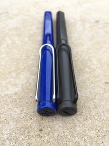
Although discussed here together, these two Lamy Safari pens have been in my collection for vastly different lengths of time. Similarly, on the like/dislike spectrum they tend to be placed fairly widely apart.
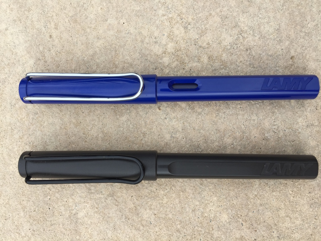
Top: Lamy Safari Fountain Pen – Blue; Bottom: Lamy Safari Rollerball – Matt Charcoal
The rollerball was purchased about 2 years ago, with the fountain pen becoming part of the collection last October. Which do I prefer? I could say “read on and find out”, however to cut a long story short – though not one of my favourites, the fountain pen I do enjoy using, whereas the rollerball I have never really taken to.
Over and above the most obvious difference between the two, the reason for the disparity ironically lies in the grip section – a part of the pen which is very similar (though not identical) on both pens. However again if we cut to the chase – the grip section will rule me out of buying another of either type – it’s just not suited to my writing style.
Look and Feel
I’d have to say the Lamy Safari (or AL Star) range would surely have to be one of the most widely recognised pen designs around. The brand has enjoyed pride of place in the pen and stationery section of many Australian department stores for some time. I tend to find if a retailer stocks Moleskine, you will invariably find the Lamy stand not too far away.
Personally, as far as the design of these pens is concerned, I again have mixed feelings. I wouldn’t say I don’t like the design – but I don’t love it either. Although similar in size to many of my other pens – to me – they look bigger, which I expect is mostly to do with the circumference of the cap, and size of the metal clip.
On the official Lamy website, the Safari range is listed in the Young Writer section, and a handy timeline listing all of the Lamy pens indicates the Safari was introduced in 1980. Although the Safari is popular these days in the entry-level market segment across all ages, Lamy were clearly aiming at the younger demographic:
The new LAMY safari is a school fountain pen like no other. It is in a class of its own. At the beginning of the 1980s this is the message which quickly spreads in the new, young Lamy target group: the ten to fifteen-year-olds.
On reading the above excerpt from Lamy, I now realise this probably best describes my own thoughts.
 Overall, I feel the design lacks some of the more classic touches demonstrated in other pens, and is somewhat reminiscent of a learners pen – that is, the size; contoured grip to encourage correct technique; large clip which won’t catch or snag; and a variety of colours to appeal to many different tastes. I honestly do not mean this in a negative sense, as my opinion here probably is more an overall feeling than an objective list of facts. You would also be correct in suggesting my design credentials are a bit thin on the ground!
None of this of course detracts from the overall writing performance, and the Safari is not an ugly pen by any stretch. The design was clearly very well thought out and aimed at a specific market, and continues to be very successful today – it is simply not a favourite of mine.
Specifications
Courtesy of NoteMaker:
Lamy Safari Fountain Pen
- LENGTH: 13.8cm
- REFILL: LAMY T 10 giant ink cartridge or a Z 24 LAMY converter and bottled ink.
- MATERIALS: Stainless steel, sturdy plastic & chrome
- SOURCE: Made in Germany. Designed by Wolfgang Fabian.
- PRICE: $AU49.00
Lamy Safari Rollerball
- LENGTH: 13.8cm
- TIP: Medium 1mm
- REFILL: M 63 LAMY rollerball refill
- MATERIALS: Stainless steel, sturdy plastic & chrome
- SOURCE: Made in Germany. Designed by Wolfgang Fabian
- PRICE: $AU35.00
Writing Performance
As I’ve already mentioned, of course any discussion on the Lamy Safari range would be nothing without addressing the triangular contour of the grip section. Widely – it is either loved or loathed – generally with not much in between.
Somewhat surprising to me was the difference in opinion I have about the rollerball and the fountain pen versions of what is almost the same grip section. The rollerball? Loathe it. The fountain pen? Here is where I land somewhere in the middle. Generally I have no real problem picking up the fountain pen and writing – in fact, I do enjoy it.
I say the grip sections are almost the same in the paragraph above, for there is a key difference if we compare the rollerball and fountain pen. True, both have flattened areas in this section of the pen, however the rollerball contains three (thumb, finger and underside); whereas the fountain pen has two only (thumb and finger), which assists in orienting the nib correctly if held at these points. The underside of the fountain pen remains curved, in the natural contour of what would be a round barrel. This ultimately results in a slightly larger overall circumference at the point of your grip when compared with the rollerball.
So, after putting the fountain pen to good use over the past couple of months, I again tried very hard to like the rollerball grip, but alas – not so. On thinking about this, I put it down to a couple of things.
One, and I expect the main difference, is the fairly major variation in the dynamics of my grip and downward pressure when writing with rollerballs (or anything other than fountain pens really). Although I have made efforts to ease up on the pressure I apply, I generally begin to drift into old habits when the pen allows, and it is with this increased pressure I find myself wanting to adjust my grip ever so slightly, and the triangular nature of the Safari prevents this.
Perhaps I am wrong, however the two (fountain) versus three (rollerball) flattened sections did not feel as though it were the difference here.
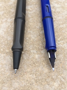
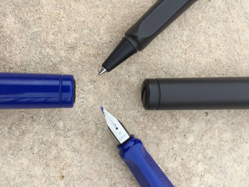
Round underside of fountain pen grip section (R)
To a lesser degree, the subtle differences between the finishes on the two pens is also quite noticeable to me. The gloss finish on the fountain pen seems to provide a crisper edge and a nicer feel. The matt finish of the rollerball is a little softer on the edges – and for want of a better description – seems to encourage me to feel for a different grip constantly. This is obviously dependent on which particular model and finish of the pen you may be using.
I realise these are quirks perhaps unique to me, however is probably the best I can come up with to explain my feelings on the differences in the grip between these two particular models.
To sum up this point though, what I really need to be asking myself is – if, given the grip – I would buy another (of either) in future, particularly with the many enticing Limited Edition colours rolling through the line up periodically. In all honesty, the answer is no. Don’t get me wrong – I am not suggesting these aren’t great pens – they simply aren’t great pens for me.
The fountain pen itself is a very smooth writer, and although the medium stainless steel nib is fairly stiff, it performs well with no skips or false starts – generally. However on the odd occasion it can take a little “warming up” for want of a better term, with the uniformity in ink laid down a little inconsistently.
Comparisons on Delfonics Rollbahn notebook
This was certainly apparent as the paper absorbency increased (e.g. Baron Fig Confidant), though as expected, was far less evident on Clairefontaine notebooks or Rhodia note pads.
Example in Baron Fig Confidant
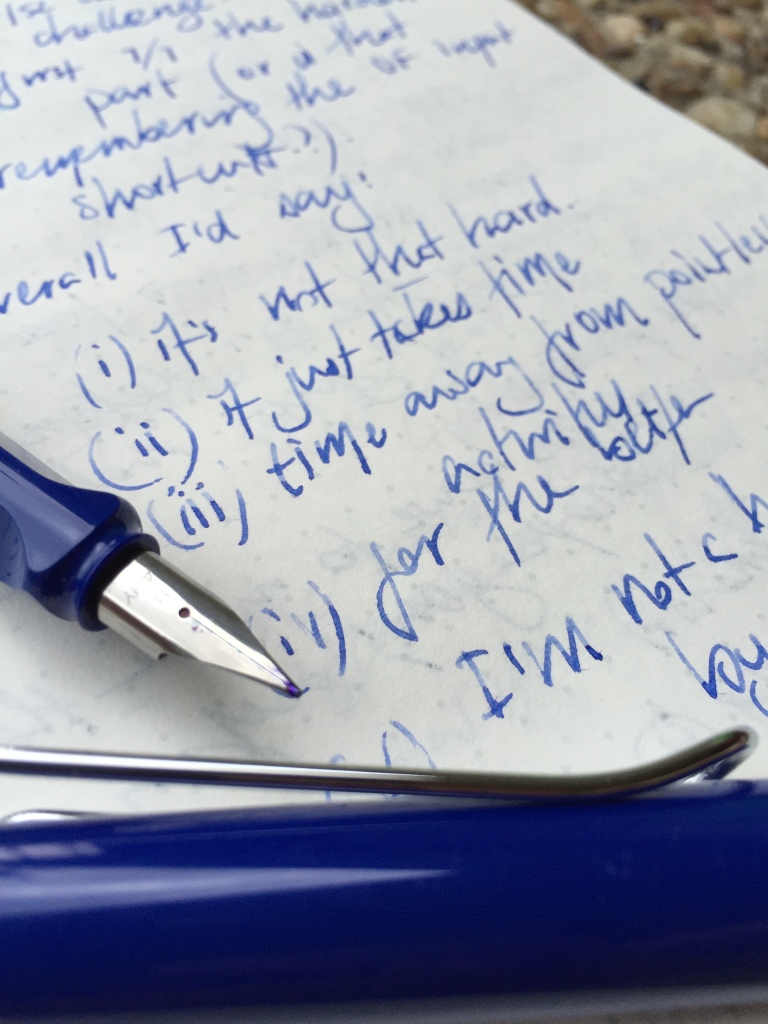
The rollerball, with its 1.0mm M63 refill writes as well as any refill I’ve used (note here I have not used them all of course) – with the only notable exception being the Schmidt Retro 51 (P8127) which I believe is the medium 0.7mm (I have not tried the finer 8126, which many have high praise for).
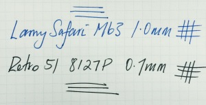
Retro 51 and Lamy Safari Rollerball comparison
On comparing the two in consecutive writing tests, I expect this is due to the Retro 51 laying down a little more ink for the size of the tip – so by extrapolation the M63 should probably serve you a little longer before needing to refill. Head to head – the Retro 51 provided a far smoother writing experience, with much more feedback from the paper felt through the Safari.
Both are quite light and well-balanced in the hand, with my preference to use both unposted. Depending on what you are used to, the rollerball perhaps might feel a little too light for some, however I did not necessarily find this to be the case.
In summary then, I enjoy writing with both of these pens from the perspective of the tip or nib – though as I have already said, my main issues are with what lies above – and write well they might, however this will not overcome the lack of suitability in the grip for my particular style.
Use Case
As you’d expect – the answer here will vary for each of these two pens, however the distinction is perhaps not as wide as I might have expected.
The Safari fountain pen worked well during the time I tested it as a journaling pen when on a beachside holiday in January; as an EDC type pen to jot down notes in a Field Notes pocket notebook or similarly sized Baron Fig Apprentice, and also as a meeting notetaker on a couple of occasions in the office.
The Safari rollerball – well – was much the same, seeing use in all of the above situations, with the added advantage of not having to worry about what paper I might encounter, which might need a signature or markup of notes (mainly with reference to meetings here).
Overall, both pens performed just about equally well in all of the above situations. The construction and stainless steel nib of the fountain pen in particular certainly gives an air of robustness that makes it equally useable as an EDC type pen, providing the paper you use is suitable – and of course I am mindful of the size if you were planning to carry one on a daily basis for this purpose.
Conclusion
If you’ve made it this far, then it is pretty clear I do believe both the Lamy Safari Fountain Pen, and Rollerball, are two fine pens – particularly for the price points at which they are sold.
“What’s your point?’ | “That’s just how I roll”
Did the grip section make or break them for me? Of course it did – as it has for many others. I certainly find the fountain pen more forgiving here, however if given the choice of other pens at similar price points, I would pick up my Retro 51 before the rollerball, and my Kaweco Ice Sport before the fountain pen.
That said, these pens are a great entry point into a more stylish and better quality rollerball or fountain pen for many, and I expect this will stay that way for some time to come. For those more experienced who either love or at the very least have no issue with the grip? They will simply continue to buy a high quality, well performing pen – and the impressive Limited Edition Colour releases continue to sweeten the deal.
Overall, I’d happily recommend either of these pens for beginners or the more experienced fountain pen user (though I probably wouldn’t have to), safe in the knowledge they would perform well with little trouble. My advice – try them first or at least be prepared the grip might not quite be to your liking – though for many – it clearly is.