WWDC 2014 Keynote

It was about this time last year my interest in all things tech took an upward turn. Having just started ‘blogging’, I was keen to find ways of improving my writing workflow, and given my use of Apple’s iPhone and iPad, looked forward to hearing about the changes looming in iOS 7, which I would be viewing on these devices quite often from that point onwards. Overall, despite a few bugs and crashes, I have been happy with what iOS 7 brought us.

Expectations for the announcements at Apple’s Worldwide Developer Conference (WWDC) this year? To be honest, nothing specific other than a keen interest in what Apple has planned for the future. After buying a Mac late last year, my entire (personal) digital existence now lives within this ecosystem.

OS X – Yosemite

Having tuned in early this morning (Australian time) to the live stream of the Keynote presentation kicked of by Tim Cook, the main focus was on both consumer and developer updates to both the OS X and iOS platforms.

We saw the introduction of OS X 10.10 “Yosemite” (available as a free update later in the year), continuing the new naming convention after Mavericks was introduced last year. Featured were a redesigned interface (translucent background, new app icons and sidebars); updates to Safari, Mail, Calendar and Spotlight; a today view in an expanded Notification Center which now has support for widgets; the ability to make phone calls and SMS from your Mac, along with improved interaction with iOS devices. The improvements to iOS communication include having AirDrop now active between Macs and Mobile devices (finally), and iCloud drive with the ability to sync folders on the Mac to iOS and Windows (think Dropbox).

iOS 8

As far as iOS 8 is concerned, as expected, no great change to the interface itself, however some interesting updates were evident to text input, in the form of Quicktype predictive typing and the ability to add system wide third-party keyboards. Also seen were improvements to Spotlight search and Notifcation Center, in line with the changes in OS X; better gestures for Mail; new Message thread features; a Family Sharing feature (to include Apple IDs) and the integration of iCloud drive as note above. Other features that seem very promising include “Handoff” which allows you to pick up on your Mac exactly where you left off on your mobile device, and the “Extensions” feature, allowing developers better access to inter-app communications. Two other areas Apple were rumoured to be exploring were confirmed, with both HealthKit (Personal health and fitness monitoring) and HomeKit (home automation) also shown to developers.

The above is just a small sample of what was presented this morning however I’m looking forward to seeing how these changes might improve the way I do things on both platforms, in particular, how the new integration features will assist in communication between the mobile and desktop operating systems.

A great roundup of this mornings events can be found at the The Unofficial Apple Weblog, and I believe the boys on the Reckoner Podcast will be discussing what was unveiled further this evening.

Ink – Montblanc Meisterstück 90 Years Permanent Grey

Introduction

MB90_EnsembleHaving seen the odd review or two of grey fountain pen inks, I had never considered grey to be one I would buy for everyday use. Blacks, blues and blue-blacks yes, however grey? Probably not for me. When the Montblanc Meisterstück 90th anniversary year got into full swing there were some great looking products circling the internet (all above my budget). Thankfully, amongst them, the Meisterstück 90 Years Permanent Grey ink.

There was never any question I would buy the ink given the special edition, and the beautiful bottle sealed the deal. The opportunity to try some grey ink was also quite a draw. At AUD$30.00, it also provided a way to leave the Montblanc store with an actual purchase rather than merely having drooled over much of what was inside, only to be thwarted by price tags. To the lovely sales lady (whom probably is titled a Pen or Luxury Goods Consultant – meaning absolutely no disrespect) who suggested I also buy a matching 90 Year Meisterstück pen with rose gold accents – thank you, but at AUD$700, not today. Similar to being asked, would you like a Bentley to go with your can of metallic spray paint sir?

As you can see from the images, the bottle (and box) is adorned with the 90th Anniversary markings, and is shaped in what I would call an “older” or “traditional” style, the design of which is apparently inspired by a historic Montblanc label, where it is written:

This ink fulfills all the demands made on it by a durable, good-working fountain pen

MB90_Box_FrontMB90_Box_Label

The 90th Anniversary celebrates the creation of the Meisterstück fountain pen in 1924, which at the time was thought of as having quite an innovative ink feed system, along with a hand engraved gold, iridium tipped nib. This ink would be a perfect companion to my own Meisterstück Classique fountain pen, which is now in it’s seventeenth year of use.

The Ink

Upon opening the elegant 35ml bottle, the ink looks decidedly black to the naked eye. A gentle dip of my finger and smear across a piece of paper confirmed the “greyness” until I had a chance to ink up a pen a couple of days later.

Once in my pen (the Meisterstück Classique of course) to test, it was time to see how ink fared with the written word. My initial thoughts, unsurprisingly were again “this looks black”. Perhaps due to the combination of my lack of experience with other grey inks and the tendency of the ink to dry a little lighter over time. I would imagine the correct name for an ink that looks “off-black”, would be grey, and that same ink needs to be dark enough to be called Permanent Grey, as is the case here.

The written sample was undertaken on a plain Rhodia No. 16 pad, and the ink performed very well. There was some nice shading many of the letters, with pen speed largely dictating the depth of the grey in each pen stroke. My hand written words darker overall, due to the slower speed used to ensure the words were at least semi-legible. As the speed of the pen increased with what I technically call the “squiggle samples”, the ink became far lighter and was probably closer to what I expected out of the bottle.

MB90_ThoughtsMB90_Test_Data

I probably prefer the fact that words written are darker, as the ink will be more suited to many everyday work applications. It might be interesting for those with a dab hand at sketching (sadly not I), given the different shades achievable. For writing, an F or EF nib perhaps may produce a consistently lighter shade of line. The more I look at this ink on the page, the more I think there may be a perception it is a lower quality black rather than a grey, if the ink type is unknown to the viewer.

The ink flowed well, and although a spectrum of shading was evident, no hints of skipping or too-dry a line were apparent. The line was crisp and sharp at the edges, with no feathering or bleed. Dry time was in line with many inks, at around 20–30 seconds, though at times longer depending on the particular line thickness. A smoother, more consistent hand than mine would no doubt achieve a more defined dry time.

Conclusion

Overall, I think Montblanc have a winner here, with the combination of a great ink and very attractive presentation in a bottle worthy of the Meisterstück 90 Year Anniversary occasion. My first impressions lead me to think this ink will see plenty of use, which is great, as although a special edition is nice to own and display, I would be disappointed to look longingly at the bottle knowing I disliked the ink. For me, an ink is there to be used, and a Special Edition even more so, although a suitable rationing system will no doubt be put in place!

In Use – Vesper 2.0 for iPhone

Although I use Evernote for storage and archiving of longer notes, articles, web clippings, PDF’s and the like, many quick notes are just that, short and quick. The type of notes which don’t require any further action, sharing or archiving until I need to refer to them again. When I’m standing in a shop, I don’t want to be searching through my filing cabinet for the pen refill model number, I simply need the notebook in my back pocket where this information is written. To me, if Evernote is my digital filing cabinet, Vesper is the digital notebook in my back pocket.

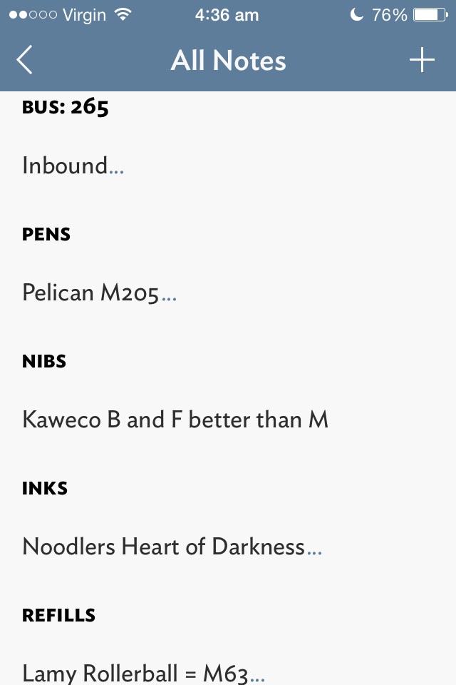
Vesper_Notes_ListVesper_home

I love Vesper, and it has been on my home screen for the past 4 months or so, being a fast and reliable way of taking quick notes with a minimum of fuss inside a great looking interface. If we go back to the notebook example above, Vesper is the book you grab when you may not necessarily need to write down a note, but simply enjoy writing in the pages with your favourite pen anyway. Yes – in my opinion the user interface is that good. I have never been a fan of Apple’s native Notes app, pre or post iOS 7, and if you are in any way similar, go and have a look at Vesper.

Vesper_settingsVesper_in_settings

Vesper supports tags, photo and text notes, has gesture based (L swipe) archiving, and the usual email/message or copy all actions. Notes can also be reordered or “prioritised” through a tap and hold to drag up or down the list.

Vesper_NoteVesper_Share

Have I mentioned Vesper is a beautiful app? From the design, colour scheme and font (love the smallcaps option for note titles), not to mention the understated icon on my home screen. The icon, incidentally, sits right beside Drafts, another app I use extensively for longer form note taking (e.g. notes while listening to podcasts; email drafts), which usually end up being archived to Evernote, Dropbox, or sent to other apps such as Omnifocus for further action. Of course, I acknowledge a great looking app is virtually useless if it does not have the functionality you require, however for the times I use Vesper, I don’t need anything else – and that is precisely it’s strength.

Why write about Vesper now? A recent free update to the app has now added Vesper Sync for your notes, a missing feature pointed out by any as a downside of the original release. Although the sync is essentially a back up as there are no Vesper iPad or Mac apps yet, Vesper will run at 2x on the iPad. Set up for a free (optional) Vesper Sync account is a simple process using an email address and password, and you are up and running. For those suspicious of a “free” syncing service, John Gruber on the Vesper blog:

Vesper Sync is not a free lunch, because Vesper is not a free app. Sync should be a feature, not something you have to pay extra for.

Although my note collection is very small, (I tend to delete or amend the 20 or 30 notes I have on the go), the syncing is fast and unobtrusive, both key aspects for my continued use of Vesper as a primary quick note/recall app (from what I understand the app scales well with larger note collections). This added feature now bodes well for the development of companion apps, and I believe the Mac app is first in line.

Read more on Vesper Sync and future plans on the Q Branch blog, and you can follow Brent Simmons engineering diary at Inessential.

Vesper 2.0 is currently available on the iOS App Store for AUD$6.49 (or the update is free if you already own the App).

Wiser Web Wednesday

Wiser Web Wednesday – a weekly link to posts of interest from around the web:

The Gentleman Stationer
I posted a few thoughts on some of the pen cases from Nock Co. myself, but a trilogy it was not. A great three-part “mega” series on these very products:
Nock Co. Three Part Mega Review: All the Cases, Part I
Nock Co. Mega Review: All the Cases, Part II
Nock Co. Mega Review Part III: Hightower and Brasstown

David Smith
Although I personally tend to seek out cafes to try when travelling, here is a nice in-room option if that is your thing (thankfully in Australia, kettle not required):
My Travel Coffee Kit

The Clicky Post
Although not unique to this AL Sport stone washed version, I have often thought about the shape of my Kaweco Sport and Ice Sport models in the same way:

Almost like you’re not sure whether it is “attractive” or not, but it draws you in and definitely has a beauty all it’s own.

In any event, some great images (and review) demonstrating a masterstroke (in my opinion) of pen body design and finish:
Kaweco Al Sport Fountain Pen Stonewashed Edition

Pens! Paper! Pencils!
Ahh…of course. The Retro 51 Tornado – a long time Pen Addict Podcast staple. A great review by Ian (as usual), which also reminds me I must seek out the Schmidt P8126 refill and given it a spin in my own Stealth model:
Retro 51 Tornado rollerball review

Macsparky
A reminder of times gone by and what the future might bring. My solution to solving the Rubik’s cube as a kid was unfortunately the pull apart and reassemble method:
Inconceivable

Asian Efficiency
It’s all about the OmniFocus 2 for Mac upgrade recently, and I have no hesitation in recommending the update if you currently use this task management programme. I much prefer the new interface, however perhaps this may come from using the iOS versions exclusively for 18 months prior to purchasing the Mac version.

In any event, for those who were not involved in the Beta testing (let’s face it, if you were, you wouldn’t be reading this blog) and OmniFocus 2 is all new to you, I found this 13 minute video from AE immensely helpful to point out the key changes, and the drag and drop workaround is a nice touch – definitely worth a look:
The Differences Between OmniFocus 1 and OmniFocus 2 for Mac

Simplicity Bliss
Speaking of OmniFocus, a nice round-up of a number of reviews and guides out there to help you on your way:
The Big OmniFocus 2 For Mac Round-Up

In Use – Rhodia No. 12 Ruled Notepad

Anyone with half an interest in pens and paper probably owns at least one Rhodia notepad, however my own usage has always involved the No. 16 size (14.8 x 21cm) and up. However on a recent trip to a local bookstore, my lovely wife recognised the familiar orange Rhodia cover, purchased a ruled No.12 notepad for AUD $4.95, and surprised me with this little pocket gem when she returned home. A win for me, as I had another notepad in my drawer, sans the guilt of buying yet another item of stationery.

I was keen to see how a notepad of this sized fitted my usual workflow.

Look and Feel

The Rhodia No. 12 is a small notepad (8.5 x 12cm or 3.3 x 4.7in) containing 80 sheets of acid free 80gsm paper. As with other Rhodia products, it is made in France to the same high quality usually associated with products bearing this name. Each sheet has micro-perforations across the top for easy removal, and everything is held together by a single reinforced staple.

Rhodia12_Cover

Rhodia12_Back

It is available with a black cover or the classic Rhodia orange, in the usual paper variants of Dot Pad, Graph or Lined paper.

Performance

As expected, writing is the smooth enjoyable experience reminiscent of the larger Rhodia variants. One of the real advantages of the paper used in Rhodia notepads is that pretty much all pen types and of course pencils, are well received by the paper. I often use gel ink or fountain pens, and it is a real joy to know that a quick note taken will be captured the way I intended – crisp and clear with no feathering or bleed, and will generally be dry by the time the cover is closed or the page is torn out. At the outside, fountain pen drying time was less than 10 seconds, most often closer to 5, with liquid or gel ink around 3 seconds or less.

Rhodia12_Note_1Rhodia12_Note_2

Although the size of the No. 12 puts it in the same use category (for me) as index cards, where it really shines is in allowing me to bypass such appalling paper as your standard Post It notes. Although my own use case rarely requires me to actually stick or post one of these notes, given their prevalence in the office and ease of scribbling a quick note for someone, they remain in widespread use by all – myself included. Despite the ongoing use of these tacky (yes I went there) pieces of yellow, I have always loathed the paper, the sticky strip on the reverse side, and the fact that when I write on them my pen invariably skips or doesn’t work on the top third where the glue resides underneath. Thank you Rhodia No.12.

The perforation across the top works flawlessly when tearing off each note, a Rhodia feature I found to be a godsend when undertaking InCoWriMo earlier in the year, with all correspondence for that challenge being written on No.16 Dot Pad. It is also nice to have both sides of each page lined, as occasionally the size dictates a second page for a single note.

Use Case

I must admit I don’t purchase many notebooks this size, however this may now change as I have become accustomed to having this little Rhodia with me and put into use for a good many tasks.

It has clearly become a superior option to the dreaded office Post It note referred to above, providing a much nicer writing experience, and removes the need to fold the notes in half to avoid the sticky portion clinging to everything in its immediate vicinity. Here we are talking short notes for colleagues, phone numbers, ideas “filed” in to my Nock Co. Maryapple for later processing, or quick lists if I am going out to the shops in my lunch break.

Rhodia12_MaryappleRhodia12_Maryapple_Close

Rhodia12_GrindersSpeaking of the Maryapple, as this notepad has become more entrenched in my workflow, I have found this case to be a perfect home for the No 12. When carrying between the office and home, my standard Maryapple case formation now consists of 2 Field Notes and a few index cards on one side and the Rhodia No. 12 in the other. With the cover folded back, the lip across the top fold keeps the notebook perfectly above the top of the case pocket. The more I use the Maryapple, the more uses I find for it, and the more I like it.

When sitting on my desk at home, the size of the No. 12 notes again suit quick lists if I’m heading out to the shops; as reference markers in books or magazines (with notes); for notes on my coffee grinders containing coffee type and grind information; and even a few quick sketches if the notepad was closest to hand when an idea struck.

Conclusion

One aspect of this Rhodia No. 12 Notepad which surprised me a little was seeing just how many more notes I have written since adding it to my workflow. Clearly not having a decent notebook of this size in the past decreased the amount of notes I produced this way – never a good thing! This has certainly changed now, and I can see the No. 12 being put to good use for some time to come. I am still using my Field Notes heavily, which will continue, as the two serve distinctly different purposes – the Field Notes unsuited to producing a quick tear out note of this kind.

Things I would change? Probably going for the Dot Grid option, particularly as many notes I write on a notepad of this size are oriented diagonally corner to corner; perhaps a 40 page option would be nice, as writing certainly becomes more comfortable without the large drop from the page to whatever surface it may be resting on, however this is taken care of soon enough by simply writing more notes!

By now it should be fairly clear I am rather taken by the No. 12 sized offering from Rhodia. Having used the No. 16 Dot Grid pads extensively for some time now, the question was never going to be about the paper, but the uses I may or may not have for the size. Over the past few weeks any doubts about when or where I may use notes of this size have certainly been put to rest, with the answer being anywhere and everywhere, which I must admit was a pleasant surprise.

At less than the cost of a cup of good single origin filter coffee, the Rhodia No. 12 is fantastic value for money. If you are a long time Rhodia user of the larger sized notebooks, you may be surprised by how often this smaller size comes in handy. For someone wishing to test out Rhodia paper and see what all the fuss is about without having to purchase a larger size? Perfect.

Me? I’m off to pick up a few No. 12 Dot Grids to leave lying around wherever I might need them.