Having this Monokaki A5 notebook arrive in my letterbox a little while ago was indeed a pleasant surprise. Picked up in a Japanese stationery store by a friend during a recent trip overseas, I was the lucky recipient of a notebook I had not come across either in stationery stores or online.
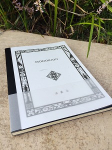
Although I knew nothing about the Monokaki range of notebooks (Monokaki meaning “writer” in Japanese), the quality of both paper and overall manufacturing was immediately apparent. Also, given the decorative border around the front cover included pencil, fountain pen and inkwell motifs, I was further encouraged as to the likely merits of the paper stock, and its ability to handle my favourite writing instruments.
Yes, I was a little excited about this one.
Background
Seeing the unfamiliar Monokaki brand name immediately sent me on an internet search for a little more information, an endeavour which also had me thankful for Chrome’s translation button when viewing the manufacturer’s website. There isn’t as much information readily available compared with some of the more common brands, however what I did find was indeed of interest.
UK store Choosing Keeping (online or 128 Columbia Rd, London) provided some background, which included a little dig at another major brand’s claim about being a notebook for novelists:
The one exception being that while other’s marketing campaigns are entirely fabricated, the Monokaki notebook’s paper – Kotobukiya paper – was really created as a bespoke product for Japanese author Fumio Niwa by the company’s present day owner’s grandmother in 1939 and used by countless authors and poets including no less than two Literature Nobel prize winners and one nominee.
I’d encourage you to click-through and read a little more, as the page also includes information on the company, which continues to operate and manufacture the notebooks from the Sakura district in Tokyo. The 1940’s woodblock cover design apparently comes from Japanese manga artist Ryo Takagi, commissioned to create a design of “traditional Japanese atmosphere – to include familiar stationery and writing instruments”. I think you’d agree the design goal was achieved.
On a more practical note, and certainly of great interest to many of us in the pen community:
The manuscript paper was indeed designed with novelists in mind for its excellent performance when used with fountain pens – no bleeding, no feathering
So all in all, things were looking good, with both first impressions and an initial foray into learning a little more about the brand yielding positive results.
For reference, some links (I’d recommend Chrome for opening those in italics and translating the result):
- Choosing Keeping (online and London store)
- Ginkgo Telegraph (Review – Japanese product site)
- Monokaki Blog
- Monokaki Product Page
Update, 13 December 2015: I have now updated the information above which incorrectly stated Choosing Keeping were an online store. The store has been in touch to advise they also have a brick and mortar shop specialising in classic stationery and notebooks at 128 Columbia Rd, London as well. Thanks Julia!
Look and Feel
If I consider what actually is my preferred or favourite “look” for a notebook, I don’t believe I really have one to be honest. There are times when an understated black might be what I am after, yet other times it might be something a little more individual or unique. The Monokaki range is itself a little unique in that it probably fits both these descriptions.
I do enjoy a little variety from time to time in what I am carrying, however not at the expense of the writing experience. Considering this, I do have what I’d call a spectrum of tolerance here. By that I mean certain notebooks I’m happy to use even if it means finer nibs and certain inks only, as long as things are not too restrictive. Mind you, that particular subset of nibs, inks and pens must perform without further compromise, otherwise the notebook will be gently set aside and see no further use.
Although I’ve probably begun to drift a little off track, my intended point is to merely highlight the fact there are no real compromises with the Monokaki’s paper — to any of my pens, nibs or inks, as you’ll read about a little further below.
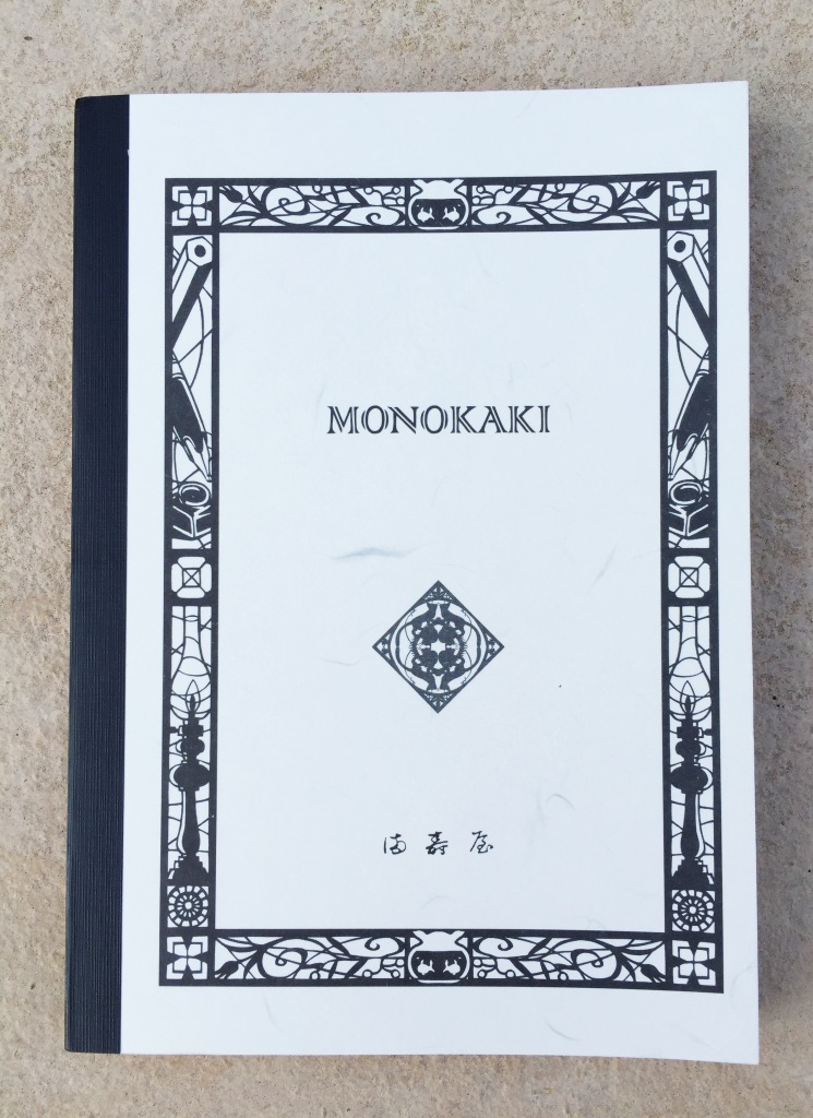
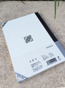
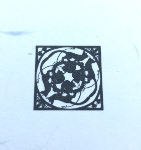
I do love the look of this notebook, with its relatively understated, yet very individual cover design. The contrast of the binding tape complements the unique 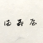 border and designs contained within it. Even the font used on the cover branding, combined with the central symbol and what I believe to be traditional Japanese lettering (part of manufacturer Asakusa Masuya’s logo) add to the overall design aesthetic of the front cover. The back cover is also not forgotten, containing a central symbol, with both corners also demonstrating fairly intricate detailing.
While I am not entirely certain if some of these symbols carry significant meaning over and above their decorative effect, the overall feeling I have about the character of the design is one of old world Japanese tradition or history. I have no specific basis for that, however that is the feeling I keep coming back to when I look at it, and is something I find quite compelling.
In the hand, there is a feeling of quality evident in the construction. With time, I’d expect some wear and tear around the corners of the front and back cover if it were going in and out of a bag on a daily basis, however it would more than likely be filled in short order as well if that were the case. That said, I have no real concerns about the overall durability of the cover, if a little care is taken along the way.
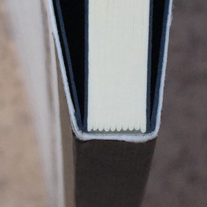 The paper is thread-bound and glued in small sections (apparently to assist flatter opening), and externally reinforced with tape along the spine, which not only provides additional support, but I believe enhances the overall external look. Additional stiffening is also provided by a second sheet of card stock inside the front and back cover, providing a kind of double cover for want of a better term.
 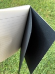 This again adds to the overall sturdy feel of the notebook, providing additional rigidity to the cover.
The pages themselves are lined, with a larger margin at the top of the page. The only additional markings are 10 mm graduations marked along the top and bottom line (which are themselves bold), allowing the accurate addition of a vertical margin if you so desire. 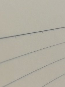 At a guess I’d say this may be present to allow vertical rulings to be created for a grid of 24×18 boxes, similar to the Masuya manuscript paper from the same manufacturer.
I do not find the absence of other possible additions such as page numbering or date fields detracts in any way from either the look or the usefulness of the page. In fact, the simplicity of what is offered fits with its overall character.
Specifications
Courtesy Choosing Keeping:
- Monokaki Notebook
- A5 210 x 148 mm
- Soft flexible washi paper card cover
- Acid-free smooth light cream paper
- Plain or ruled (lines 9 mm apart)
- 160 pages
- Fountain pen friendly cream paper
- Thread-stitch bound in small sections for flat opening throughout
- Sizes available
- Large, B5 – 257 x 175 mm
- Medium, A5 – 210 x 148 mm
- Small, B6 – 182 x 128 mm
- Price £12.00 ($AUD24.70)
Also available on Rakuten Global Market with a list price of $AUD12.56.
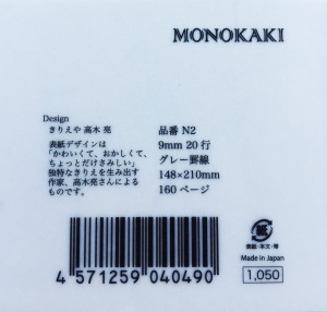 A word about the Masuya paper (English page link), which is used in the Monokaki range of notebooks (also referred to as Kotobukiya paper, with both terms used somewhat interchangeably from what I’ve read). Masuya manufacture 2 types of manuscript paper and have a range of 35 different products. Originally cream, the paper also comes in white, created to better reflect the light source — apparently coming about due to one of the previously mentioned “novelists” writing by a single spotlight.
From the site itself (unaltered):
Masuya in Asakusa is a traditional company successing Japanese hand-writing culture. We have various products made of high quality paper many famous writers have chosen. Japanese traditional design, unique touch…
Along with the rather unusual:
Feel Japaneseness through Masuya’s products.
It has been a little difficult to track down more detailed information about the Masuya paper used in the Monokaki line of notebooks, and you will note the absence of a gsm rating in the specifications above. The paper in this notebook is certainly far thinner than a 90 gsm Rhodia or Clairefontaine notebook, and also the 80 gsm softcover Leuchtturm1917 notebook I have been most recently using — by a considerable margin. Given Tomoe River paper weighs in at 52 gsm, then at a guess — and I repeat this is my own guess-timation only, this paper feels like it would be around 60 gsm. I may be way off the mark here, however it is very thin and very light compared to your standard “fountain pen friendly” notebooks — and is certainly closer in properties to Tomoe River than any other paper I have used to date.
Once written upon, the paper has a little of what I’d call that “crinkle”, reminiscent of Tomoe River paper, and does seem to have properties that lend me to think of it in similar ways. At times I feel I have turned one page when I have actually picked up two.
Needless to say, I like it — a lot.
Writing Performance
From my comments above, you probably can see what is coming here.
This paper is pretty amazing — particularly if you enjoy writing with fountain pens, meaning of course it handles pretty much anything else you care to throw at it as well. The exception of course being Sharpie markers and the like, where thin doesn’t always hold up to such an onslaught of saturated ink. For fountain pens though, this is some of the best paper I have written on since, well… since I’ve been concerned with such matters. As much as I loved my Rollbahn and Apica Notebooks of previous reviews, the paper in this one surpasses those.
For my paper requirements and preferences, this one is now certainly a favourite. Beyond the obvious shockers of horrendous feathering (my number one hate and deal-breaker), excessive bleed-though (a slightly lesser evil to me), and show through (perfectly acceptable to me for the most part), I’m sure we all have our favourites for various reasons.
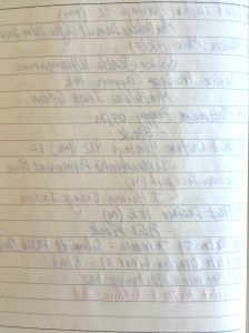 The paper in this notebook has what I’d call a moderate amount of show through for darker and more saturated colours you might use. So in all likelihood, many of your fountain pens. Again if we compare it to Tomoe River, it has possibly a little more — but only just, assuming my eyes aren’t deceiving me.
Because the paper is so lightweight, although it has a little tooth to a gliding nib, there is no sinking in feeling from toothier, heavier-weighted paper. I’ve also noted in the past how on some heavier paper such as a Clairefontaine notebook, I feel as though the nib skates away from me a little, and what I gain in less resistance, also results in less control. There is none of that here — even with more rapid writing. To me it really is the best of both worlds. As far as feathering goes – what feathering? None of that here.
 As far as the shade of paper is concerned, I’m a little picky here. Every time I try a notebook in the off-white/cream/yellowish spectrum, I begin by thinking: gee, this would be fantastic in white. However this is typically followed by filling up the notebook with all manner of ink colours and not thinking another thing of it. As you can see from the writing sample page, all of your colours will vividly show in all their glory.
One point I should make here, is that this is not a flat opening notebook, even through the middle third of the book. I have doubled it back and left it open in attempts to coax it a little flatter through the spine to no avail. While not a deal breaker for me, it is noticeable, and something which does get in the way of the writing experience somewhat. Something to consider in any event.
In summary, the writing experience is as close to a Tomoe River experience as you can get. Why is that relevant? Well, Tomoe River paper is popular and well regarded for a reason. Light weight paper, smooth without the slip, handles pretty much every ink and nib, a little show through yet no bleed or feathering. Sound familiar? Indeed it does, however applies equally well to the Masuya paper in this Monokaki notebook.
Probably the one thing about these types of paper that can sometimes be an issue is ink drying time. By comparison, the Monokaki on average dried a few seconds faster for a given ink — often at around the 15 seconds mark, versus 18-20 seconds for the Tomoe River. So again I found the overall performance quite similar.
Without a doubt this is great paper, and if you are at all able to get your hands on some, I highly recommend trying it out — whether in notebook or manuscript page format.
Conclusion
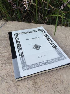 The Monokaki A5 Notebook is indeed a joy to use, largely due to the writing experience of the Masuya paper itself — and isn’t that pretty much the key to our love of pens and paper? True, I have a little flexibility as far as my specific paper requirements for writing, and this Monokaki Notebook sits very close to the favourite end of that spectrum.
To make it pretty much perfect? There is probably nothing I’d change about the properties of the paper — for fountain pens it is pretty much spot on. I’d perhaps tweak the binding to allow truly flat opening; opt for a truer white in paper shade; and finally, have a local store or online seller stock the range so I can easily replenish my supplies when they dwindle!
This is certainly a great notebook, and with 160 pages to play with, will serve me well for a little while longer — and that can only be a good thing. I often get the impression there is a whole world of Japanese stationery that I am entirely oblivious to — which is also a good thing, for it simply means there will always be more to discover.
Follow @petedenison

Pingback: Sunday Notes and Links | Fountain Pen Quest
Great review, Pete. I’ll put this on my “gotta try” list.
I’m heading to Sydney in January, 2016, and wonder if there’s any way to get some of your coffee delivered to my hotel? I’d live to try it!
LikeLike
Thanks Michael. Yes I’m sure we can sort something out with the coffee!
LikeLike
I’ve got a pal who’s going to Japan next month, I might have to have her pick me up a couple of these to pair with my TWSBI Diamond 580! Thanks for the review.
LikeLike
Hi Lewis – Definitely worth trying. I know we all have our preferences but I think most won’t be disappointed with this one. Pete
LikeLike
Pingback: Wiser Web Wednesday – Pete Denison
It looks really well, I might give it a try 🙂 Thank you for the review.
LikeLiked by 1 person
Thanks for this write up. I’d never heard about this paper and needed to research before buying. Your blog came up first in search results. Looks like another paper to contribute to my addiction! 🙂
LikeLike
You’re welcome – it remains one of my absolute favourites!
LikeLike
Pingback: Monokaki Notebooks: Now On My Doorstep – Pete Denison
Pingback: Restocking – a trip to Bookbinders – Pete Denison
Pingback: Yuga Lined B5 Letter Pad – Pete Denison
Pingback: Monokaki – the notebook for novelists | Inky Passion
Pingback: Monokaki – the notebook for novelists — admin